

Sage green has become the go-to fireplace color for a reason: it reads as calm without going cold, and it sits comfortably next to wood, stone, brass, or marble without a fight. But “sage green fireplace” covers a lot of ground — a glossy formal parlor and a plant-packed cottage nook are both technically sage green, and they solve completely different problems. The ten rooms below were chosen because each one answers a different question about how sage green actually behaves in a real living room, so you can figure out which version fits your home instead of just admiring all ten.
Quick Overview
| Style | Sage Green Fireplace Living Rooms |
|---|---|
| Best For | Living rooms in almost any architectural style |
| Budget | Low (paint refresh) to High (marble, stone, custom joinery) |
| Difficulty | Easy DIY paint job to full contractor renovation |
| Maintenance Level | Low for paint, Medium for stone and plants |
A Sage Marble Slab That Turns the Whole Wall Into One Material
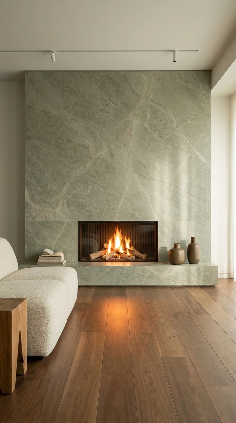
A book-matched sage marble slab turns the fireplace into the room’s only real statement.
This room makes one decision and lets it carry the entire space: a single floor-to-ceiling slab of sage-veined marble runs behind the fireplace with no break, no trim, and no second material competing for attention. The veining itself becomes the decoration — there’s no art, no mantle clutter, nothing layered on top, because the stone is already doing that job. Everything else in the room, from the boucle sofa to the warm walnut floor, is deliberately quiet so the slab reads as sculpture rather than backdrop.
This approach suits homeowners who want a dramatic focal point but don’t want to manage styling it — a slab wall like this looks finished the day it’s installed and stays finished, since there are no shelves or objects to keep arranging. It works best in living rooms with a genuine double-height or full wall run, where the material has room to breathe; chopping this look into a shorter half-wall loses most of its impact. Families who want a fireplace wall that photographs well without ongoing effort will get the most value here, while anyone who likes to rotate seasonal decor around their mantle will find this style restrictive by design.
The biggest advantage is low daily maintenance paired with high visual impact — there’s no mantle to dust or style. The tradeoff is cost and inflexibility: large-format slab is priced by the square foot at a premium most laminate or tile alternatives don’t carry, and once it’s installed, the whole wall’s personality is locked in.
Recommended Materials: Sage-veined marble slab, walnut engineered flooring, boucle upholstery, aged brass vases, glass-front fireplace insert
Main Colors: Sage Green, Warm Walnut, Cream, Aged Brass
Best Lighting: A single linear track light washing the slab from above is what makes the veining visible at night; daylight from a side window does the same job during the day.
Where the Repetition Actually Lives
One reason this room feels resolved rather than decorated is that the sage tone repeats exactly twice — once in the marble, once faintly in the two ceramic vases — and nothing else competes with it. In this case, that kind of restraint is what keeps a bold material from tipping into busy.
Getting the Slab Look Without the Slab Budget
Porcelain slab tile that mimics veined marble costs a fraction of natural stone and installs the same way.
A large-format tile in a single continuous run (rather than a grid of small tiles) preserves the “one material, no seams” effect.
Skip the mantle shelf entirely rather than adding a thin ledge — a shelf breaks the slab’s visual continuity.
Keep floor and furniture tones warm (walnut, cream, tan) so the cool sage doesn’t feel sterile.
Where This One Trips People Up
Using a busier, high-contrast veining pattern that competes with the room instead of anchoring it
Adding a mantle shelf “just in case” and then feeling obligated to style it, which undoes the clean-slab effect
Choosing a glossy stone finish under harsh overhead lighting, which can create distracting glare
Pairing the cool marble with cool-toned furniture, which pushes the whole room toward feeling clinical
A Sculptural Adobe Fireplace That Reads Like Pottery
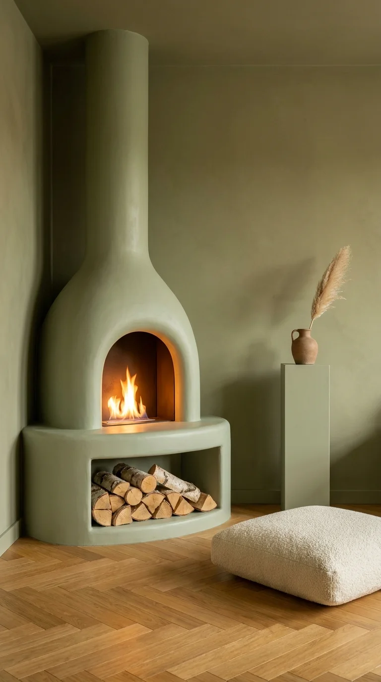
The rounded chimney breast reads more like pottery than construction.
Here the fireplace itself is the sculpture — a hand-plastered, monochromatic sage form with soft, rounded edges that curves up into the chimney and out into a built-in log nook below. There’s no visible seam between “fireplace” and “wall,” because the whole structure is one continuous shape, plastered in the same tone as the room around it. It’s an organic, almost ceramic silhouette that owes more to adobe architecture and Mediterranean plasterwork than to a traditional mantle-and-firebox setup.
This idea is best suited to homeowners who want their fireplace to feel like an art object rather than a fixture, and who are comfortable with a fully custom build rather than a retrofit onto an existing firebox. It fits corner spots particularly well, since the rounded form softens what’s usually an awkward angle. Renters and anyone on a tight timeline should look elsewhere — this can’t be approximated with paint or peel-and-stick anything; it requires actual masonry or plaster fabrication, similar in spirit to the layered boho fireplace builds that also treat the hearth as sculpture rather than infrastructure.
The advantage is a completely unique, non-catalog result — no two plastered forms turn out identical, which is part of the appeal. The compromise is that plaster over a curved substrate is a specialist job, and repairs down the line (a chip, a crack from settling) aren’t a quick patch-and-paint fix the way flat drywall is.
Recommended Materials: Hand-applied lime plaster, built-in birch log storage, terracotta jug, boucle floor pouf, herringbone oak flooring
Main Colors: Sage Green (walls and fireplace, single tone), Natural Terracotta, Bleached Oak
Best Lighting: Soft, warm ambient light rather than a single spotlight — even lighting shows off the plaster’s texture without flattening the curves into shadow.
Maintenance: Lime plaster needs an occasional light reseal to resist hairline cracking, and any exposed corners should be protected from furniture knocks since repairs require blending new plaster into old.
A Small Scale Risk That Actually Pays Off
The chimney’s proportions are noticeably slender for how tall it runs, which is a real visual gamble — a form this narrow could easily look flimsy. It works here because the rounded base widens just enough to visually “root” the shape before it tapers upward.
Making the Monochrome Version Work in a Rental
Try a plaster-effect paint finish on an existing flat fireplace surround instead of new construction.
Keep the wall and fireplace in the exact same paint color to fake the “one continuous material” effect.
Add a rounded, low stool or pouf nearby to echo the curved silhouette without altering the structure.
Skip hard-edged black metal accessories nearby — they undercut the soft, organic feeling.
Common Ways to Get This Wrong
Painting the fireplace a different shade than the wall, which recreates the traditional “mantle and wall” split this design is trying to erase
Adding sharp rectangular furniture nearby that fights the room’s rounded language
Overfilling the log storage nook with mismatched firewood sizes, which looks cluttered against such a clean form
Choosing a high-shine plaster finish, which reads more “spa” than “adobe” and undercuts the earthy intent
A Full Sage Paneling Wall Doing the Work of Traditional Trim
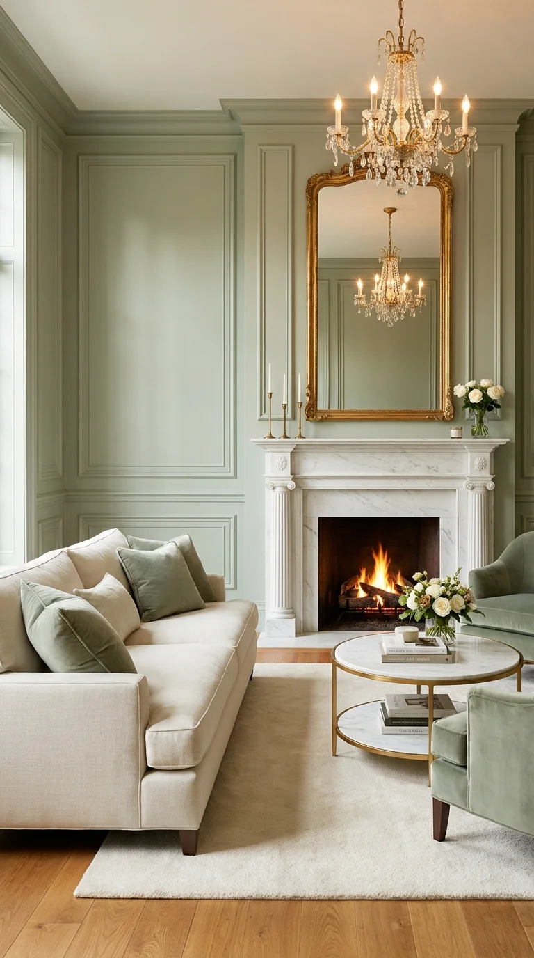
Fluted columns and a gilded mirror pull this fireplace toward full French formality.
This living room commits to sage green as an architectural color rather than an accent — the raised wall paneling, usually left white or a neutral in classic interiors, is painted the same soft green from floor to crown molding. The white marble mantle with fluted columns stays untouched, which lets it read as a genuine contrast material rather than getting lost. A gold ornate mirror and crystal chandelier layer on top of that base, pushing the room from “traditional” into full formal French territory.
This is a strong fit for older homes that already have millwork worth showing off, since the paneling only reads as intentional when the trim detail is real (or convincingly faux). It also suits anyone who wants a formal sitting room that still feels soft rather than stiff — the sage keeps the gold and crystal from tipping into overly ornate. It’s a poor match for open-concept or minimalist homes, where this much millwork and gilding would feel like a costume rather than a style.
The strongest advantage is how well sage bridges “traditional” and “current” — it lets you use genuinely old-world elements (fluted columns, crystal, gilt frames) without the room reading dated. The compromise is scale: painting full wall paneling this way is a bigger job than a simple accent wall, and it only works if the trim is proportionally generous to begin with.
Recommended Materials: White Carrara marble mantle, painted raised-panel millwork, crystal chandelier, gilt-framed mirror, sage velvet upholstery
Main Colors: Sage Green, Carrara White, Antique Gold, Cream
Best Lighting: Layered lighting matters most here — the chandelier for ambiance, candlesticks on the mantle for texture, and daylight from a tall window to keep the deep green from reading dark.
Why the Marble Was Left Alone
One reason the mantle still reads as a focal point despite all the surrounding color is that it’s the only cool-white surface in the room; every other material was chosen to sit near it in warmth or tone, not compete with its brightness.
Worth the Investment?
Painting existing raised paneling is a moderate cost relative to the transformation it delivers, since the millwork itself is often already there in older homes. A crystal chandelier and gilt mirror at this scale, on the other hand, are the two line items that push the budget up fastest — a simpler pendant and a plainer mirror frame will keep most of the room’s character at a fraction of the price, since the paneling color is doing most of the actual work.
Bringing This Look Down in Budget
Paint existing flat walls with faux picture-frame molding applied in strips rather than commissioning full raised paneling.
Swap a crystal chandelier for a simpler drum pendant in an antiqued brass finish.
Source a vintage mirror rather than a new reproduction — flea markets and estate sales carry genuinely old gilt frames for less.
Keep the marble mantle as the one splurge item and economize everywhere else.
Easy Ways to Get This Wrong
Using a stark white mirror or lamp finish instead of warm gold, which breaks the room’s cohesive metal palette.
Choosing a cooler, blue-leaning green that reads more mint than sage under this much gold
Painting the ceiling white when the walls go this saturated, which can make the room feel top-heavy
Skipping the layered lighting and relying only on the chandelier, which leaves the room dim during the day
A Plastered Wall Where the Fireplace Almost Disappears
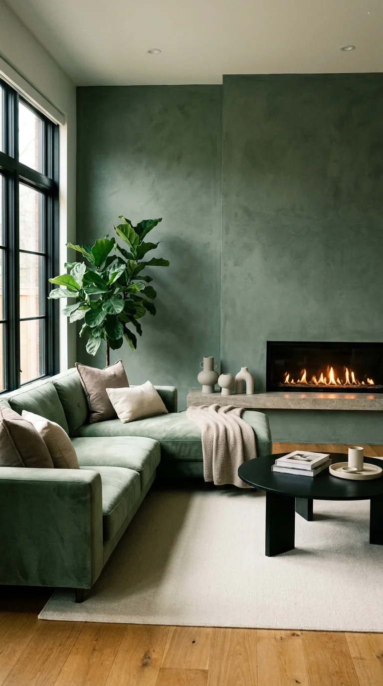
Wall, ledge, and sofa share one tone so the fireplace almost disappears into the room.
This room takes color-drenching to its logical extreme: the Venetian-plaster walls, the built-in fireplace ledge, and the velvet sectional are all within the same narrow sage-to-moss range, so there’s no hard line separating “fireplace zone” from “seating zone.” The linear gas insert sits flush into the plaster with no mantle at all, which is only possible because there’s nothing competing for attention above it — no shelf to fill, no mirror to hang.
This suits people who find traditional mantle styling stressful and would rather commit to a single enveloping color than manage a focal wall full of objects. It’s particularly effective in smaller or narrower living rooms, where a monochrome scheme visually expands the space instead of chopping it up with contrasting zones. Anyone who wants their fireplace to be the obvious hero of the room should look elsewhere — this deliberately mutes it, which reflects the same instinct behind designing a full sage green living room, where the color itself becomes the unifying decision rather than any single piece of furniture.
The advantage is a genuinely calming, cohesive room that photographs beautifully in soft light. The compromise is that a flush, mantle-less fireplace loses the traditional display shelf many people rely on for photos, candles, or seasonal decor — there’s simply nowhere to put anything.
Recommended Materials: Venetian plaster, linear gas fireplace insert, sage velvet upholstery, black steel coffee table, live fiddle leaf fig
Main Colors: Sage Green, Moss, Off-White, Black
Best Lighting: Diffuse daylight from the large window is doing most of the work; recessed ceiling lights keep the monochrome walls from looking flat after dark.
Maintenance: The fiddle leaf fig needs bright, indirect light and an occasional leaf wipe to avoid dust dulling its color against the matte plaster backdrop.
A Room Designed Around Its One Window
The eye goes first to the window, not the fireplace, because it’s the only high-contrast element (light against deep plaster) in an otherwise tonal room. That’s a deliberate flow decision — the fireplace provides warmth, but the window provides the visual anchor.
Where People Trip Up Recreating This
Introducing a second bold color (a bright rug or patterned pillow) that breaks the monochrome effect entirely
Choosing a plaster finish that’s too glossy, which can look more like paint than true Venetian texture
Skipping the flush installation and adding a mantle shelf, which undercuts the whole point of the room
Placing artwork on the fireplace wall, which fights the wall’s job as a single uninterrupted plane
An Oak Mantle and Leather Chairs Doing Classic Cottage Warmth
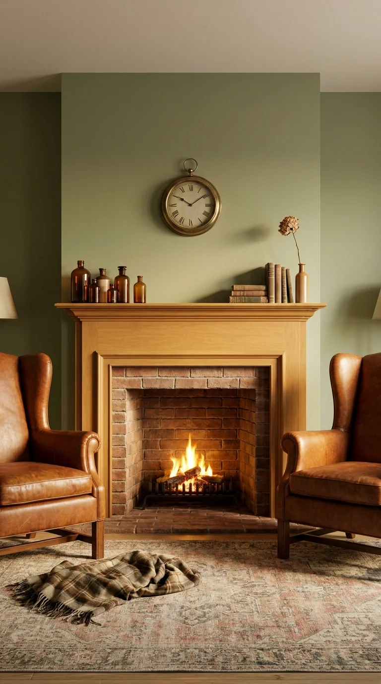
Honey oak and cracked-in leather keep this fireplace feeling lived-in, not styled.
This is the most traditional room in the group — a honey oak mantle over a red brick firebox, flanked by matching cognac leather wingback chairs, with a plaid throw and vintage bottles doing the finishing work. The sage green paint stays entirely on the walls and doesn’t try to compete with the wood or brick; it’s the backdrop, not the feature. That restraint is what makes the room feel like it evolved over years rather than being installed all at once.
This style works best for anyone furnishing an English- or American-cottage-style home who wants a room that photographs as timeless rather than trend-driven. It’s a natural fit for households that actually use their fireplace regularly, since brick and leather both age well with real fires rather than showing wear the way pale fabrics or polished stone might. It’s a mismatch for anyone chasing a sleek, minimalist look — every element here leans toward patina and texture, similar to the layered warmth found in country living rooms built around comfort rather than statement design.
The advantage is longevity — this palette doesn’t chase trends, so it won’t need updating in a few years. The tradeoff is that the look depends on genuine materials aging correctly; a cheap laminate mantle or bonded-leather chair will read as an imitation rather than an heirloom almost immediately.
Recommended Materials: Solid oak mantle, red clay brick, top-grain leather upholstery, wool plaid throw, vintage glass bottles
Main Colors: Sage Green, Honey Oak, Cognac Leather, Brick Red
Best Lighting: Warm-toned table lamps flanking the chairs, plus the firelight itself — this room is meant to be seen mostly in the evening.
Why the Repetition Isn’t Accidental
The cognac leather tone repeats in both wingback chairs and echoes faintly in the amber glass bottles on the mantle, which is what keeps the warm-toned accessories from feeling randomly placed against all that cool sage paint.
Recreating This on a Smaller Budget
Reupholster existing chairs in a faux-leather or leather-look fabric instead of buying new top-grain pieces.
Paint an existing plain mantle in a wood-toned faux finish rather than replacing it with solid oak.
Source vintage glass bottles and books secondhand rather than buying new decorative objects
Keep the brick firebox as-is if it’s already there — repainting or refacing it removes the room’s main texture.
What Trips People Up Recreating This
Choosing chairs that are too matched or new-looking, which undercuts the collected-over-time feeling
Painting the brick firebox white, which is popular elsewhere but removes this room’s core warmth
Using a cool-gray throw instead of a warm plaid, which clashes with the room’s overall temperature
Overcrowding the mantle with too many objects, which competes with the fire itself for attention
A High-Gloss Lacquer Finish That Turns Light Into Decoration
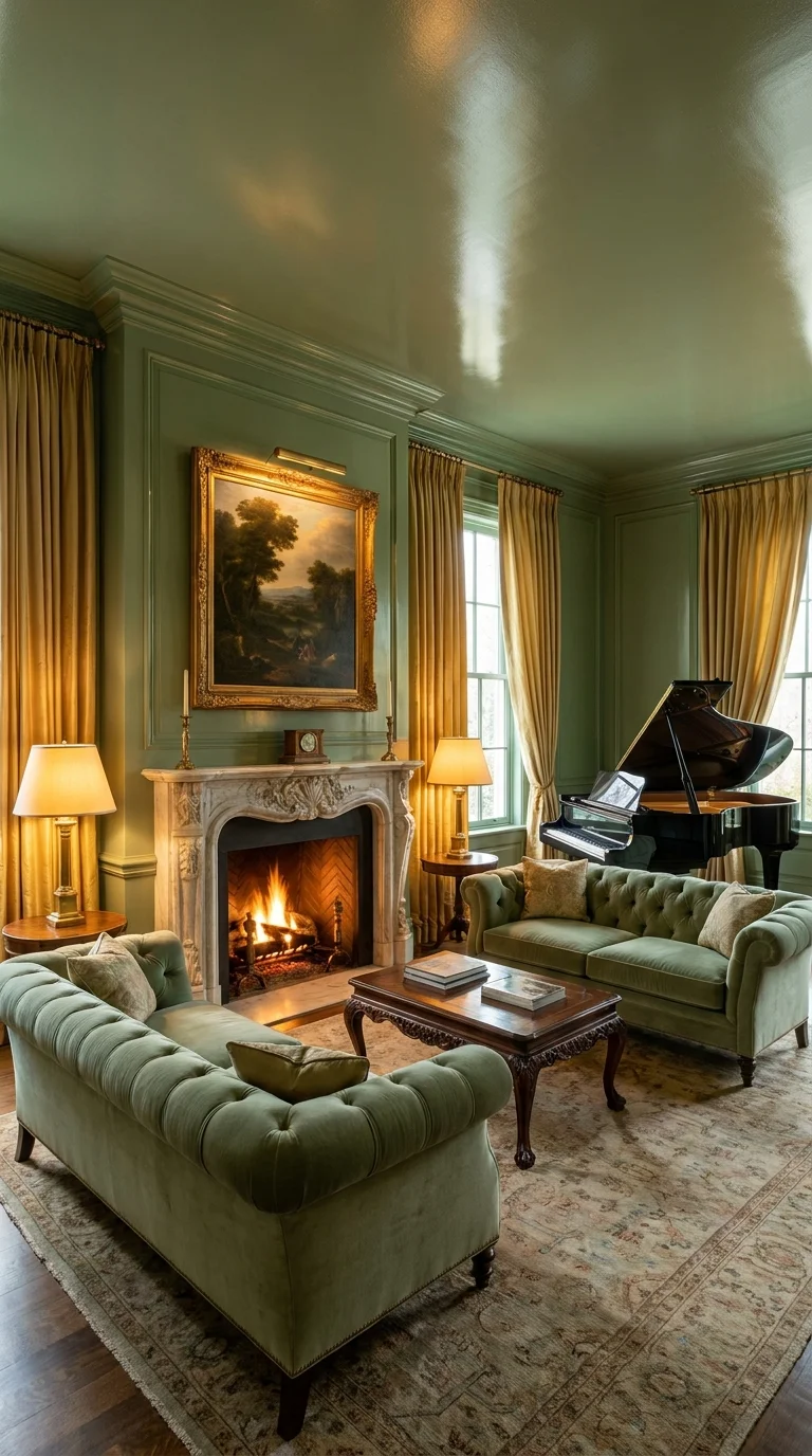
High-gloss walls turn ordinary daylight into a moving reflection across the room.
Nearly everything in this formal parlor — walls, ceiling, trim — is painted in the same saturated sage green in a high-gloss lacquer finish, which is a completely different decision from a matte or eggshell sage room. The gloss catches and bounces every light source in the space, from the gold curtains to the crystal-adjacent lamp bases, so the room feels alive rather than flat even without a single piece of glass or mirror doing the reflecting. A white marble mantle, tufted sage velvet Chesterfields, and a grand piano round out a room clearly built for entertaining rather than everyday lounging.
This approach is best suited to formal, rarely-used sitting rooms or parlors in larger homes, where the drama of a lacquered finish has room to register — it’s overwhelming in a small, everyday family room. It’s a good match for anyone who already owns or wants period furniture (a piano, tufted sofas, oil paintings) since the glossy backdrop makes those pieces look intentional rather than mismatched.
Recommended Materials: High-gloss lacquer paint, white marble mantle, tufted velvet upholstery, silk drapery, gilt-framed oil painting
Main Colors: Sage Green (lacquer), Antique Gold, Marble White, Warm Brown Wood
Best Lighting: Multiple warm-toned lamp sources rather than one overhead fixture — the gloss finish depends on several points of light to reflect, not a single harsh source.
Worth the Investment?
A high-gloss lacquer finish costs meaningfully more than standard paint, both in the paint itself and in the labor — proper lacquer work requires several thin, sanded-between coats to avoid visible brush marks, which most homeowners hire out rather than DIY. It’s worth it specifically in a formal room meant to be seen in evening light with lamps and candles, where the reflective quality has a real payoff; in a room lit mostly by flat daylight, the extra cost buys less visible drama and might not be worth it over a good eggshell finish.
The Repetition That Holds the Room Together
Gold repeats at least three times — the curtains, the piano’s brass hardware, and the lamp bases — which is what keeps a room this saturated in green from feeling one-note; the metal accents give the eye somewhere else to land.
Where This Falls Apart in Practice
Attempting a DIY lacquer finish without proper sanding between coats, which leaves visible brush strokes that a flat paint would have hidden
Using cool-white or silver metal accents instead of warm gold, which flattens the room’s reflective warmth
Choosing this finish for a small, low-light room, where gloss can highlight every wall imperfection instead of hiding them
Skimping on furniture scale — smaller, modern furniture looks lost against a wall treatment this formal.
Brass and Handmade Tile Doing Two Different Jobs at Once
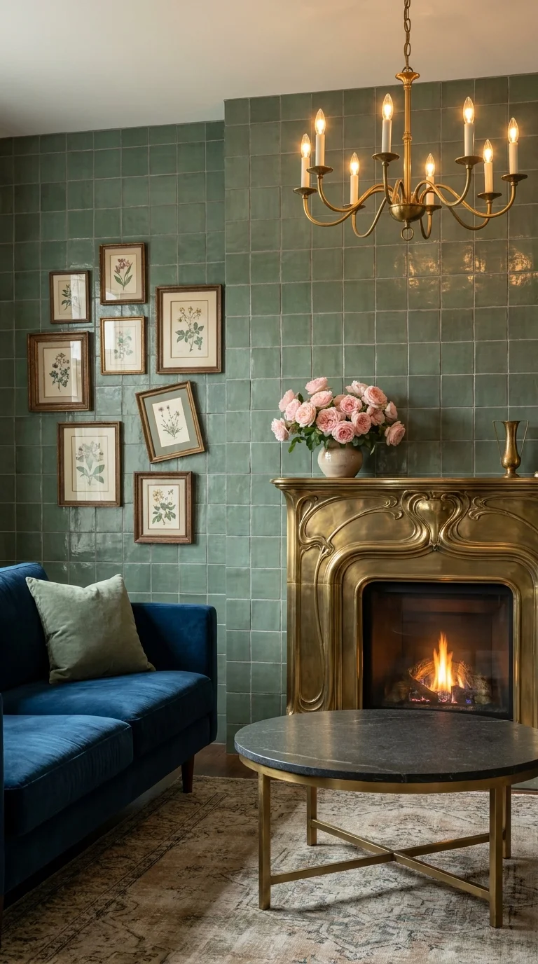
A curved brass surround against handmade tile is doing two jobs the paint alone couldn’t.
This room pairs an ornate, curved Art Nouveau brass fireplace surround with a wall of glossy, handmade-look sage green zellige tile — two decorative languages that don’t usually appear together, but work here because they’re doing different things. The brass brings movement and shine at eye level; the tile brings color and gentle texture behind it, with each individual tile catching light slightly differently thanks to its handmade irregularity. A deep navy velvet sofa and a gallery wall of botanical prints keep the room from reading as one-note despite the strong personality of the fireplace itself.
This is a strong choice for anyone renovating a period home with an existing ornate mantle worth preserving, since the room is essentially built around not hiding that piece under paint. It also suits people who like collecting small framed prints or vintage objects, since the tile wall provides a busy-enough backdrop that a gallery wall doesn’t compete with it — it adds to it. It’s a mismatch for anyone who wants a calm, minimal room; there’s a lot of visual information here between the tile texture, the brass curves, and the framed prints.
The advantage is a genuinely one-of-a-kind result, since handmade zellige tile has natural color and glaze variation no factory tile can replicate. The compromise is cost and installation time — handmade tile is priced and laid differently than standard ceramic, and it typically needs a specialist installer familiar with its irregular sizing.
Recommended Materials: Antique brass fireplace surround, handmade zellige tile, navy velvet upholstery, gilt picture frames, brass chandelier
Main Colors: Sage Green, Antique Brass, Navy, Blush Pink (florals)
Best Lighting: A chandelier with multiple small bulbs, rather than one large fixture, makes the tile’s glaze variation and the brass detailing both catch light from different angles.
What the Eye Finds First
The brass mantle pulls focus before the tile does, purely because of scale and reflectivity — a small, bright, curved object against a larger matte-ish background almost always wins the first glance, regardless of how much color surrounds it.
Easy Ways to Get This Look Wrong
Pairing brass with cooler silver-toned hardware elsewhere in the room, which creates visual competition between two different metals
Choosing a flat, uniform tile instead of handmade zellige, which loses the light-catching irregularity that makes the wall interesting
Overcrowding the gallery wall to the point where it competes with the tile pattern instead of sitting on top of it
Using a pale, cool sofa color that gets visually lost against a wall this busy — the navy here is doing important contrast work
A Black Wood Stove Nearly Buried in Houseplants
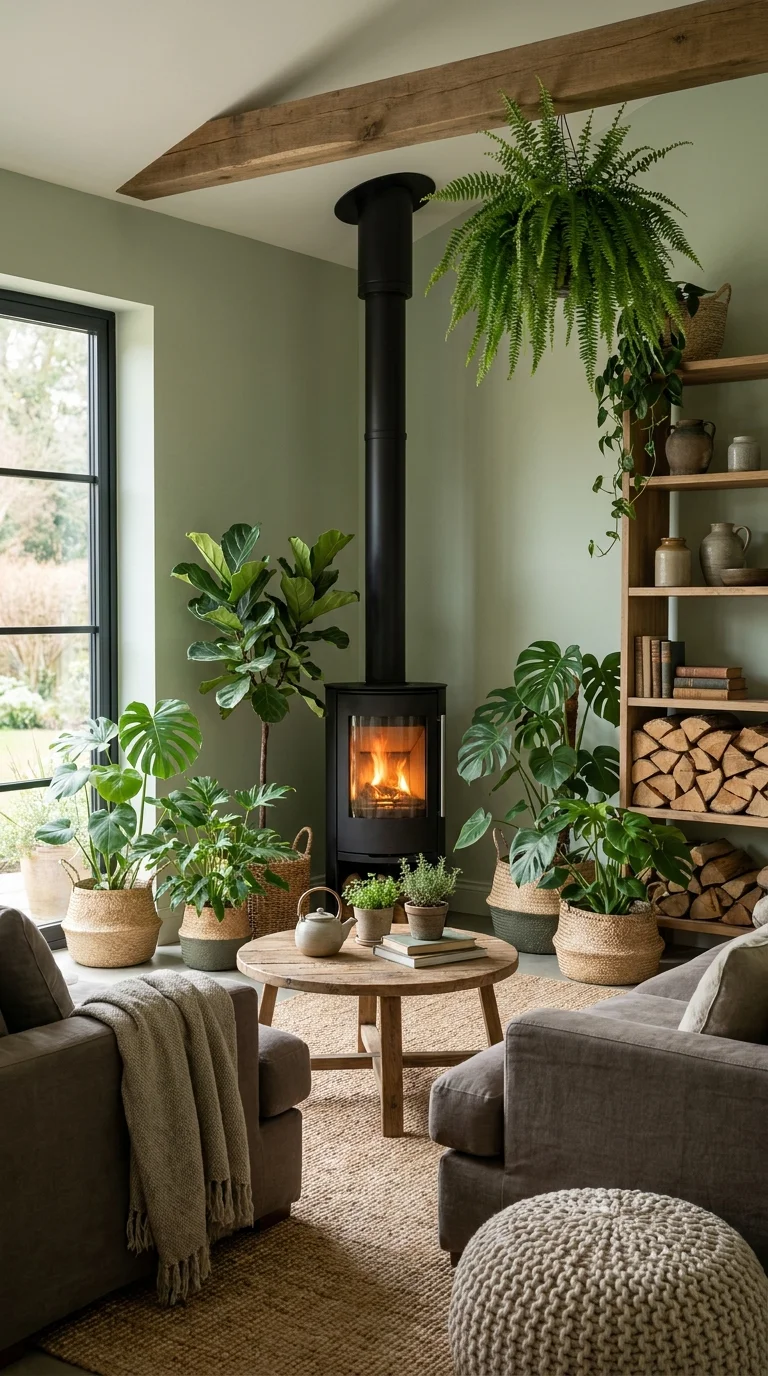
The stove disappears; the plant collection is what actually greets you first.
Unlike every other room in this list, the fireplace here isn’t really the star — a black wood-burning stove sits quietly in the corner while a dense collection of fiddle leaf figs, monstera, ferns, and hanging plants effectively surrounds and softens it. The sage-painted walls act as a neutral backdrop for all that green foliage rather than as the main color statement, and the exposed wood beam overhead ties the whole cottage feel together.
This idea is ideal for plant collectors who want their greenery to be the actual design feature, with the fireplace serving a supporting, functional role rather than a decorative one. It fits farmhouse, cottage, or biophilic-leaning homes especially well, and works in living rooms that get decent natural light from at least one large window, since that many plants simply won’t thrive in a dim room. Houseplants can meaningfully improve indoor air quality alongside their obvious visual benefits, according to agricultural extension research — a reasonable secondary payoff for a room built around this many of them. It’s a poor fit for anyone who travels often or dislikes routine plant care, since a collection this large needs consistent watering and rotation to look this healthy, an idea also explored in more depth in a full biophilic living room guide.
The advantage is a genuinely restorative, calming atmosphere that most people respond to instinctively. The compromise is real, ongoing upkeep — this isn’t a “set it and forget it” style choice.
Recommended Materials: Cast-iron wood stove, exposed timber beam, jute rug, woven storage baskets, mixed houseplants (monstera, fiddle leaf fig, fern)
Main Colors: Sage Green, Charcoal Black (stove), Terracotta, Natural Jute
Best Lighting: A large window is doing the real work here — most of these plant varieties need bright, indirect light to maintain full, healthy foliage.
Maintenance: Expect a weekly watering rotation across varied plant needs, occasional repotting as the larger specimens grow, and regular dusting of leaves so they keep photosynthesizing efficiently near a wood-burning appliance.
Why This Combination Actually Works
One reason the stove doesn’t feel out of place among all this greenery is repetition of shape — the stove’s rounded flue echoes the rounded leaves around it, so the hard metal object doesn’t read as visually foreign in an otherwise soft, organic room.
Simplifying This for Smaller Budgets or Spaces
Start with three or four larger plants rather than a dozen small ones — fewer, bigger specimens read as intentional faster than many tiny pots.
Use baskets you already own for plant covers instead of buying matching ceramic planters.
Choose easy-care varieties (pothos, snake plant) if a fiddle leaf fig’s fussier light needs aren’t realistic for your space.
Skip the wood stove upgrade entirely if you already have a working fireplace — the plants can surround an existing feature just as effectively.
Common Mistakes With This Look
Placing sun-loving plants too far from the window, where they’ll gradually thin out and ruin the “lush” effect
Choosing pots that clash in material or color, which makes a large collection look cluttered instead of curated.
Forgetting that a wood-burning stove generates real heat, which can stress nearby plants if they’re placed too close
Letting the collection grow unevenly, with a few thriving giants next to several struggling smaller plants
Sage Built-Ins Framing a Quiet Marble Fireplace
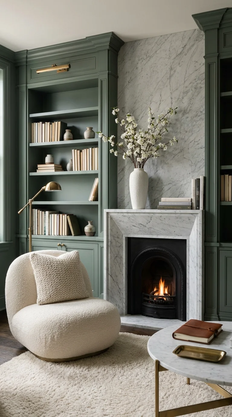
The joinery does more visual work here than the fireplace insert itself.
In this room, the fireplace is almost secondary — a slim white marble surround with a black cast-iron Victorian insert sits between two full-height sage green built-in bookshelves that do the actual heavy lifting for the room’s character. The cabinetry, not the hearth, is what a visitor notices first: the color, the brass reading light mounted on the shelving, and the neatly arranged books and objects all pull focus toward the joinery.
This is an excellent option for book lovers and anyone who wants a study or library-style living room rather than a purely social one. It’s particularly well suited to homes with an existing period fireplace too small or plain to serve as a standalone focal point, since built-ins on either side give the eye somewhere more substantial to land. It’s a poor fit for renters or anyone without built-in cabinetry already in place, since custom millwork like this is a genuine renovation, not a weekend project — the kind of considered cabinetry work that shows up again in sage green kitchen cabinetry done right, where color and joinery carry a room the same way.
The advantage is enormous functional storage paired with real visual impact — this room solves a design problem and a practical one simultaneously. The compromise is the upfront cost and disruption of custom cabinetry installation, plus the ongoing task of keeping open shelving genuinely tidy rather than cluttered.
Recommended Materials: Painted built-in bookshelf cabinetry, white marble fireplace surround, cast-iron Victorian insert, boucle upholstery, brass picture light
Main Colors: Sage Green, Marble White, Cast-Iron Black, Cream
Best Lighting: A dedicated brass picture light or gallery light mounted on the shelving itself, aimed to wash the books and objects rather than the room generally.
Why the Fireplace Recedes on Purpose
The marble surround is intentionally slim and unadorned, with no mantle shelf sticking out — a proportion choice that keeps it from competing with the visually heavier cabinetry on either side, which is where the room wants the eye to travel first.
Getting This Look Without Full Custom Millwork
Use freestanding bookshelves painted to match the wall color instead of built-in cabinetry, positioned flush against the fireplace wall.
Style a few shelves with objects and leave others intentionally sparse, echoing the room’s balanced, edited feel.
Add a single brass clip-on or plug-in reading light rather than a hardwired fixture.
Keep the fireplace surround simple and pale so it doesn’t have to compete with the shelving color.
Where People Trip Up Recreating This
Overfilling every shelf uniformly, which reads as cluttered instead of curated
Choosing a bookshelf color that doesn’t match the wall exactly, which breaks the built-in illusion
Adding a bold mantle treatment that pulls focus away from the cabinetry, undercutting the room’s actual design logic
Skipping task lighting on the shelves, leaving the room’s real focal point dim after dark
A Wall of Raw Fieldstone Against Near-Black Olive Paint
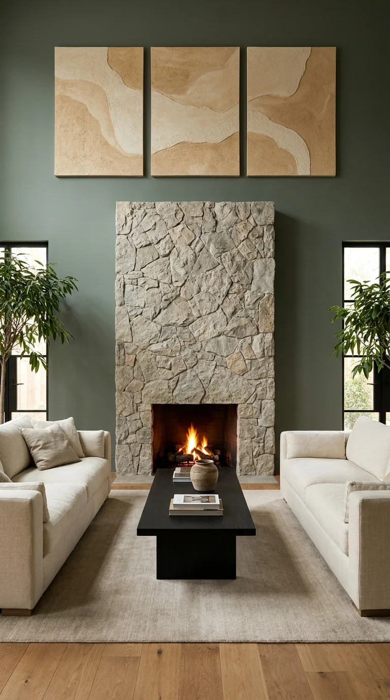
Uncut fieldstone against a near-black olive wall gives the room its only texture.
This is the boldest room in the group in terms of scale: a floor-to-ceiling wall of raw, dry-stacked natural fieldstone rises behind the fireplace, set against walls painted in a deep, near-black olive green. Two identical cream sofas face each other symmetrically, with a low black block coffee table between them, and a triptych of sand-textured abstract art hangs above the stone. Everything about the layout — the symmetry, the deliberately restrained furniture palette — exists to let that one irregular, textured stone wall be the only “loud” element in the room.
This works especially well in homes with genuinely tall ceilings, since a stone feature this scale needs vertical room to read as intentional rather than overwhelming- a scale lesson also covered in fireplace feature walls built around a similar less-is-more idea. It suits people drawn to a more architectural, lodge-adjacent look rather than a soft cottage feel, and it’s a strong option for larger, more formal living rooms meant to host groups rather than intimate everyday lounging. Anyone with a smaller room or lower ceilings should scale this down significantly — this exact treatment can easily overwhelm a modest space.
The advantage is a genuinely dramatic, architectural focal point that needs almost no additional decoration to feel complete. The compromise is weight and cost: real fieldstone cladding is heavy, often requiring structural consideration, and is one of the more expensive fireplace treatments to install compared to tile, paint, or veneer panels.
Recommended Materials: Natural dry-stacked fieldstone, dark olive matte paint, linen sofa upholstery, black block coffee table, textured sand-toned canvas art
Main Colors: Dark Olive Green, Natural Stone Gray-Tan, Cream, Matte Black
Best Lighting: Large windows flanking the stone wall provide the main light source; keep artificial lighting warm and indirect so it doesn’t wash out the stone’s natural texture and shadow variation.
A Proportion Risk That Pays Off Here
The stone wall’s width relative to the ceiling height is unusually generous for a residential space — closer to what you’d see in a hotel lobby — and it works specifically because the room’s ceiling height and furniture scale were sized to match it rather than left at a standard residential proportion.
Scaling This Down for a Standard Living Room
Limit the stone treatment to the fireplace surround itself rather than a full floor-to-ceiling wall.
Use a thinner stone veneer instead of full-depth fieldstone to reduce both weight and cost.
Keep the dark olive paint to one wall rather than the whole room if ceiling height is more modest.
Choose a single sofa facing the fireplace rather than the symmetrical two-sofa layout, which needs more floor area to avoid feeling cramped.
Where This Look Falls Apart
Attempting this at a smaller scale without adjusting the proportions, which can make the stone feel oversized rather than architectural
Pairing the stone with busy, patterned furniture, which fights the room’s intentionally restrained palette
Choosing a stone with too much color variation for a dark wall, which can look chaotic rather than dramatic under mixed lighting
Skipping structural consultation for a full stone-clad wall, since real fieldstone is significantly heavier than drywall or tile
Making the Seating Work Around Any of These Fireplaces
Keep the primary seating piece at least six to eight feet from the firebox opening so upholstery and rugs aren’t exposed to direct radiant heat.
In symmetrical layouts (like facing sofas), center the fireplace exactly between them rather than off to one side, or the symmetry reads as a mistake instead of a choice.
Leave a clear walking path of at least three feet between the coffee table and the hearth for everyday foot traffic.
If the room doubles as a media room, position the TV to one side of the fireplace rather than directly above it, so neither competes for the eye’s attention.
Who Should Choose a Sage Green Fireplace
Best for homeowners who want a color that reads as calm and current without following a short-lived trend
Best for households that already lean toward natural materials — wood, stone, brass, linen — since sage green was chosen across every room here specifically because it doesn’t fight those textures
Not ideal for anyone who wants a fireplace wall to read as bright, saturated, or high-energy, since even the boldest rooms in this group (the lacquer parlor, the fieldstone wall) stay in a muted, earthy register
Budget Summary
| Budget | Expectation |
|---|---|
| Low | Painted walls in a sage or olive shade, existing fireplace left as-is, a few houseplants and secondhand accessories |
| Medium | A refreshed mantle in stained or painted wood, reupholstered furniture, handmade-look tile applied to an existing surround |
| Premium | Full marble or natural stone slab cladding, custom built-in cabinetry, high-gloss lacquer wall finishes, hand-plastered sculptural fireplace forms |
Frequently Asked Questions
Does sage green work with a brick fireplace, or should the brick be painted?
It depends on the brick’s undertone — warm reddish brick pairs naturally with sage the way it does in the oak-mantle cottage room above, while cooler gray-toned brick can look muddy next to green and often benefits from a limewash or paint treatment first.
Is sage green too cool a color for a room without much natural light?
It can be, especially in a north-facing room. Leaning toward the warmer, more olive end of the sage family (rather than a cooler, blue-leaning sage) and pairing it with warm wood tones and brass fixtures, as several rooms above do, helps offset a lack of daylight.
Do I need to match my fireplace surround material to the rest of the room’s finishes?
Not necessarily — several of the strongest rooms here (the brass-and-tile room, the built-in library) deliberately mix an older or different-toned fireplace material against a newer wall treatment, using color rather than material matching to tie the space together.
How do I choose between a bold stone or marble feature wall and a simpler painted fireplace?
Ceiling height and room scale matter more than personal taste here — a large stone or slab treatment needs real vertical and horizontal space to read as intentional, while a smaller or more modest room almost always looks better with a simpler painted surround and a stronger secondary detail, like built-in shelving or a well-chosen mantle.
Can I recreate any of these looks around an existing, non-working or electric fireplace?
Yes — nearly every material and color decision here (the paneling, the plaster color, the tile, the built-ins) is about what surrounds the fireplace opening rather than the heat source itself, so an electric or decorative insert can sit inside almost any of these designs.
About StartechLife Team
StartechLife Team is a home décor and interior design publication written by a team that researches and curates realistic design ideas for real homes, not just aspirational showrooms. For rooms like the ones in this guide, the team focuses on how a single color choice — sage green, in this case — actually behaves across different budgets, architectural styles, and levels of renovation commitment. Every recommendation here is chosen because it’s achievable at more than one price point, not because it looks good in a single photograph.
Conclusion
What separates these ten rooms isn’t really the color — it’s what each one asks sage green to do. Some use it to quiet a dramatic material like marble or stone so that material can shine; others use it as the drama itself, in a glossy lacquer or a sculptural plaster form. A few barely use it as a design statement at all, letting it fade into the background behind houseplants or built-in cabinetry. The right one for your living room depends less on which photo you like most and more on how much of a renovation you’re actually ready to take on, and whether you want your fireplace to be the star of the room or a quiet, confident supporting player.

