
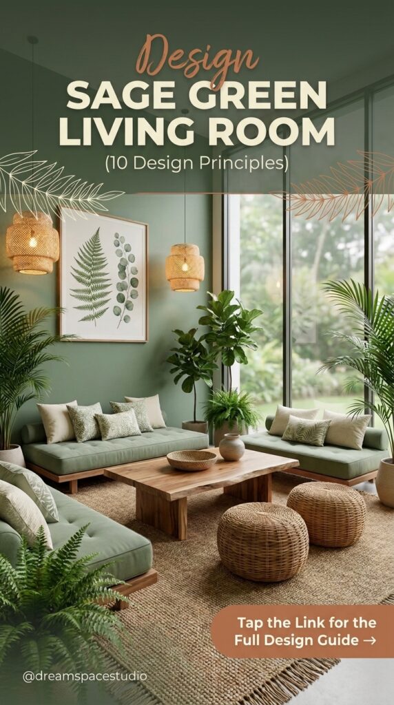
Sage green looks effortless in every photo you save—rightsave—right up until you try to buy the paint and realize the color alone won’t do the work. A sage living room only holds together when the wall color, the furniture shapes, the textures, and the accent colors are all making deliberate decisions together. Skip any one of those, and the same paint that looked calm in a photo starts to feel flat or heavy in real light.
This guide breaks a sage green living room into 10 specific design decisions—notdecisions—not 10 pretty photos to scroll past. Each one teaches a principle you can apply immediately: how to layer plants without it looking cluttered, which accent colors keep sage from reading cold, how much texture a boucle sofa actually needs next to it, and where color drenching works versus where it backfires.
Who this is for: renters and homeowners who already like the idea of a green living room but aren’t sure how to avoid the two most common failures — a sage room that looks washed out, or one that looks like a paint swatch with furniture in front of it.
Quick answer: pair sage with one warm material (leather, oak, or rattan), one metallic (brass or blackened steel), and no more than three total textures in the same sightline. Everything below explains why andwhy and how to apply it room by room.
Let’s start with the decision that shapes everything else—howelse—how you bring green into the room, not just onto the wall.
Quick Overview
| Style | Sage Green / Organic Modern |
|---|---|
| Best For | Living rooms with good natural light, renters and owners alike |
| Budget | Low–Medium |
| Difficulty | Easy–Moderate, DIY-friendly |
| Maintenance Level | Low–Medium (higher if plant-heavy) |
Layer Plants by Height Before Touching Anything Else
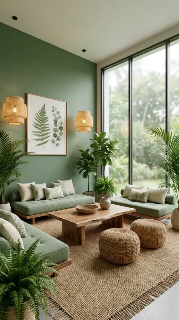
Start with three plant heights in the same corner—acorner—a floor-height fiddle leaf or palm, a mid-height plant on a stand or stool, and a small trailing or potted piece at surface level. Height variation is what separates a “living room with plants” from a room that reads as intentionally biophilic. A single tall plant in a corner looks like an afterthought; three heights working together look like a designed layer of the room.
The reason this matters more in a sage room specifically: a green wall and green foliage sitting at the same visual weight can flatten into one mass if the plants are all clustered at one height. Staggering height gives the eye a path to travel—floor,travel—floor, waist, shelf—andshelf—and not one green blur against another. Professional plant stylists lean on this same three-tier logic in retail and hospitality greenery walls for exactly this reason: it reads as composed and not accumulated.
Once the heights are set, repeat one material across the pots—terracotta,pots—terracotta, ceramic, or woven rattan basket covers—socovers—so the plant collection reads as curated, not mismatched. A rattan pendant light overhead, echoing the woven pot covers below, ties the whole corner into one material story in place of three unrelated ones.
💡 Pro Tip Group odd numbers of plants (three or five), not even ones — even groupings read as symmetrical pairs and lose the organic, gathered feeling that makes biophilic corners work.
Where to Begin If You’re Building This Corner
Buy your tallest plant first and place it before anything else in the corner—everycorner—every other height decision gets measured against it. Add the mid-height piece on a plant stand roughly at coffee-table height, then finish with one trailing plant on a low shelf or side table. Budget Alternative: 💚 Affordable—aAffordable—a faux fiddle leaf and thrifted ceramic pots; 💛 Mid-Range—oneMid-Range—one real floor plant plus two smaller live plants; 💎 Investment—aInvestment—a custom-built plant ladder or shelf unit sized to the corner.
Why This Corner Falls Apart in Practice
- Buying five or six small plants over one or two larger anchor pieces
- Placing every plant at the same tabletop height, so the grouping reads flat from across the room
- Mixing pot materials and colors with no repeated element tying them together
- Positioning the tallest plant somewhere it blocks the room’s main window and fails to frame it
The Reason the Rattan Keeps Reappearing Here
The rattan pendant lights, the woven pot covers, and the jute rug are all doing the same job with three different textures — repeating a natural, woven quality across the lighting, planting, and flooring layers. One reason this corner feels resolved, not assembled, is that repetition: pull the rattan pendant and swap in a plain glass fixture, and the room would likely lean back toward “furnished” more than “styled.”
Recommended Materials
- Rattan (pendant lighting, pot covers)
- Jute (area rug)
- Live-edge or reclaimed wood (coffee table)
- Woven cotton (bench cushions)
- Ceramic (bowls, vases)
Main Colors
- Sage Green
- Warm Oak
- Natural Rattan Tan
- Cream
- Forest Green (foliage)
Best Lighting
- Rattan pendant fixtures with warm 2700K bulbs
- Floor-to-ceiling window as the primary daylight source
- No overhead flood lighting—letlighting—let the pendants create pooled, warm light instead
Maintenance
- Water the floor-height plant weekly, adjusting for season
- Rotate all three plants a quarter-turn every two weeks so growth stays even
- Wipe large leaves monthly so they can photosynthesize properly
- Keep the corner out of direct afternoon sun if any plant has thin or variegated leaves
Pull One Warm Accent Color Against Every Sage Surface
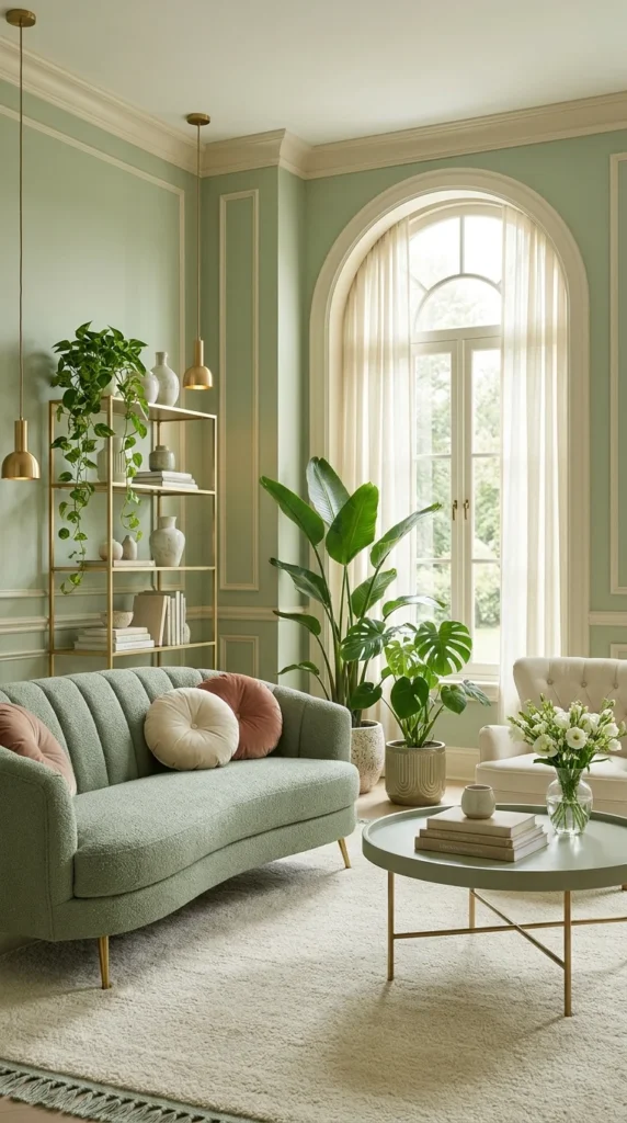
Choose exactly one warm accent — blush pink, terracotta, or dusty rose — and repeat it in at least two places in the room before adding anything else. Sage green is a muted, gray-leaning color, and without a warm counterpoint it can drift toward looking tired rather than calm. One accent color, used twice, keeps the palette from feeling like a single-note paint job.
The professional logic here is about temperature balance, not just decoration. Sage sits cool-to-neutral on the color wheel. A warm accent — especially one with a soft, dusty saturation over a bright one — keeps the room from feeling clinical while still reading as calm, not busy. This is the same reason design showrooms almost never pair a muted green with a second cool color; two cool tones together tend to flatten a room’s warmth entirely.
Brass or gold hardware does a second, related job: it reflects warm light back into the room in a way that matching sage-toned metal never could. Between the blush pillows, the brass pendant, and the wood tones already in the floor, the room ends up with three separate warm touches, so the balance never depends on just one element.
Picking the Right Warm Accent for Your Room
| Factor | Blush / Dusty Rose | Terracotta / Rust |
|---|---|---|
| Best light condition | North-facing, cooler daylight | South-facing, warmer daylight |
| Overall mood | Soft, romantic, gentle | Earthy, grounded, bolder |
| Pairs best with | Brass, cream, pale wood | Brass, walnut, black metal |
| Risk if overused | Can read overly pastel | Can youCan you skew the room orange?orange? |
| Easiest entry point | Throw pillows, a round side table | Woven rug border, ceramic vases |
📌 Important Note This pairing depends on the sage staying muted, not bright — a saturated, true green will fight a warm accent more than it balances it, so test your specific paint swatch against your chosen accent fabric before committing to either.
Recommended Materials
- Boucle or chenille upholstery
- Brass or gold-finished metal
- Painted wood wall paneling
- Sheer linen curtains
- Glass (vase, accessories)
Main Colors
- Sage Green
- Blush Pink / Terracotta
- Cream
- Brass Gold
Best Lighting
- Brass pendant fixtures for warm reflection
- Sheer curtains to diffuse strong daylight and not block it
- Warm 2700K bulbs throughout
Maintenance
- Dust brass fixtures monthly with a soft, dry cloth to prevent tarnish buildup
- Spot-clean boucle upholstery promptly; the woven texture holds stains longer than flat fabric
Choose a Curved Silhouette to Soften a Saturated Wall
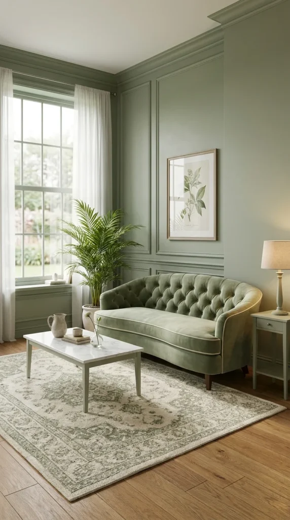
When the wall color is a deep, saturated sage, not a pale tint, choose furniture with rolled arms or a curved silhouette over a boxy, straight-lined sofa. A darker wall already reads as heavy; a soft, curved shape keeps the room from feeling stiff on top of that weight.
Silhouette does more visual work here than most people expect. A tufted, rolled-arm sofa breaks up the wall’s flat plane with its own shadow and curve, while a hard-edged rectangular sofa would simply sit as another flat rectangle against a flat wall — doubling the geometry and not relieving it. Interior designers describe this as breaking up “visual stacking,” where too many straight edges in one sightline start to feel rigid even in a room with soft colors.
The tufting itself adds a second layer of the same logic at a smaller scale: each button creates a small shadow and dimple, so the sofa’s surface catches light unevenly and never reads as one flat mass of color. Against a wall painted the same tonal family, that texture is often the only thing separating “sofa” from “wall” at a glance.
⚠️ Warning Choosing a curved sofa in the exact same sage tone as the wall can cause the furniture to visually disappear into the background from certain angles — keep at least one shade of contrast between wall and upholstery, even within the same color family.
Recommended Materials
- Tufted velvet upholstery
- Marble (coffee table top)
- Herringbone or wide-plank wood flooring
- Wool area rug
- Ceramic accessories
Main Colors
- Sage Green (wall)
- Ivory / Cream (upholstery)
- Warm Wood Brown
- Marble White-Grey
Best Lighting
- A single warm-toned table lamp for ambient evening light
- Tall window as the dominant daylight source
- Sheer curtains to soften direct sun without losing brightness
Maintenance
- Vacuum tufted upholstery weekly using a low-suction brush attachment to avoid pulling threads
- Water a single-accentsingle-accent plant weekly, rotating it toward the window every couple of weeks
Where This Silhouette Choice Goes Wrong
- Matching the sofa fabric to the exact wall paint sopaint so the two blend together and areand are not contrasting
- Choosing a boxy sofa on a saturated wall, doubling up on hard geometry
- Skipping a rug pattern entirely, leaving the floor as flat as the wall above it
- Placing the sofa flush against the wall in place of a few inches out, which flattens its shadow line
Pair One Nubby Texture With One Smooth Surface, Never Three
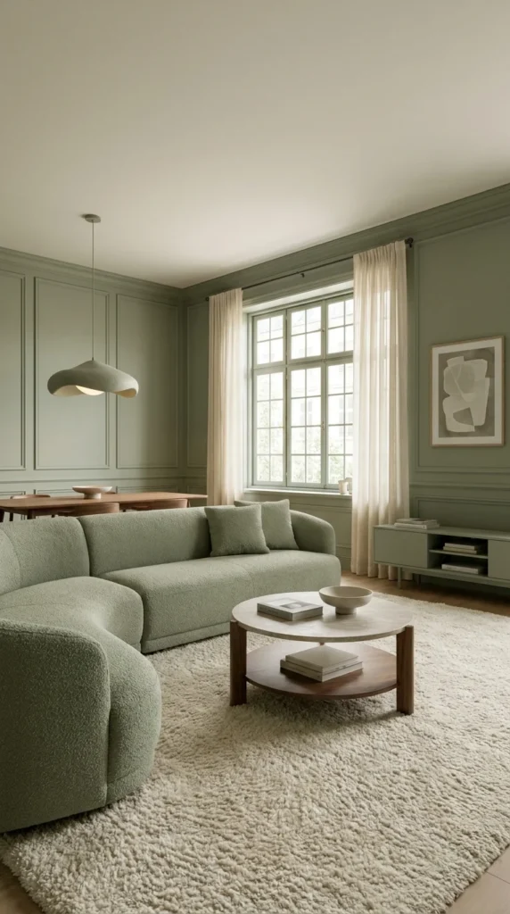
Limit any single sightline to two contrasting textures — one nubby or looped (boucle, wool) and one smooth or hard (wood, marble, metal) — over introducing a third competing texture in the same view. Texture is what keeps a monochrome-leaning sage room from looking flat, but past two strong textures in one glance, the eye stops reading contrast and starts reading clutter.
The reasoning is about visual hierarchy: a boucle sectional already carries heavy texture on its own. Add a matching textured rug and a textured coffee table in the same sightline, and none of the three gets to stand out — they compete over layering. Pairing that same sectional with one smooth surface (a lacquered or wood-topped coffee table) gives the eye a place to rest between texture-heavy zones.
This is also a scale principle in disguise. A large, rounded two-tier coffee table in warm wood and stone reads as one calm, smooth anchor specifically because everything soft in the room — the sectional, the rug — is texture-heavy. Swap that table for a third boucle-covered ottoman, and the room loses its one textural counterweight entirely.
What to Gather Before You Shop
☐ One heavily textured seating piece (boucle, bouclé-weave, or chunky knit upholstery) ☐ One smooth, hard-surfaced coffee or side table (wood, stone, or lacquer) ☐ One low-pile or flat-weave rug — not a second high-texture rug ☐ A single sculptural pendant or lamp to anchor the ceiling line ☐ No more than one additional textured throw pillow per seating piece
Recommended Materials
- Boucle upholstery
- Walnut or dark-staineddark-stained wood
- Honed marble
- Low-pile wool-blend rug
- Ceramic bowl accessories
Main Colors
- Olive Sage
- Cream / Ivory
- Walnut Brown
- Charcoal (accent art)
Best Lighting
- One sculptural pendant as the room’s main light source
- Tall window for daytime brightness
- Warm ambient bulbs for evening use, avoiding cool-white overhead lighting
Commit to One Color on Walls, Trim, and Ceiling Together
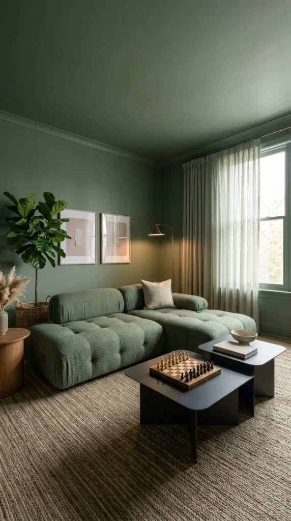
Paint the walls, trim, and ceiling the exact same sage shade, in the same finish, before adding any furniture. Color drenching a room removes the visual break where wall meets ceiling, and that missing seam is what makes a saturated color feel enveloping instead of overwhelming.
The psychology behind this is counterintuitive at first: painting a ceiling darker usually makes people worry the room will feel smaller. In practice, a fully drenched room does the opposite in the right conditions, because the eye has no white ceiling line to register as a boundary or a stopping point. Without that visual edge, the room reads as one continuous volume, not a box with a lid — which tends to make a small or medium room feel deeper, not more cramped.
This only works with adequate light. A drenched room with a single north-facing window and no supplemental lighting will read dark, not cozy. The rooms where color drenching succeeds almost always pair the saturated paint with at least one strong secondary light source — a floor lamp, a sculptural table lamp, or layered sheer curtains that keep daylight moving through the space and never let it stop at the glass.
⚠️ Warning Drenching a room in a flat or matte finish on the ceiling specifically can make the room read heavier than intended—aintended—a soft eggshell finish on the ceiling reflects just enough light to keep the color from going flat overhead.
Recommended Materials
- Boucle upholstery
- Blackened steel or matte black metal (side tables)
- Jute rug
- Wood side table
- Linen throw pillow
Main Colors
- Deep Sage / Moss Green
- Charcoal Black
- Cream
- Blush (accent art)
Best Lighting
- An arc or tripod floor lamp as a secondary light source
- Sheer curtains to keep daylight moving through the room and not stopping at the window
- Warm 2700K bulbs exclusively—cool-whiteexclusively—cool-white bulbs will fight a drenched, moody palette
Maintenance
- Water the floor plant weekly and rotate it toward the light source every two weeks
- Dust pampas grass or dried florals monthly with a soft brush, not water
Group Wall Objects in Odd Numbers Before Hanging a Single Frame
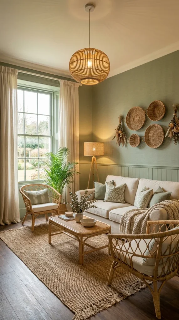
Plan your wall grouping on the floor first — mixing framed botanical prints with one or two woven baskets in an odd-numbered cluster — before a single nail goes into the wall. A gallery wall that mixes flat frames with dimensional objects reads as curated, not matched, but only if the spacing and grouping are planned as one composition and not hung piece by piece.
The reason woven baskets work specifically well against a sage wall is dimensional contrast: flat framed prints sit close to the wall plane, while a shallow woven basket casts a small shadow and breaks that plane slightly. That shadow is what keeps a wall of mostly flatmostly flat objects from reading as one solid rectangle of frames. Professional gallery-wall stylists lay every piece out on the floor in its intended arrangement first for exactly this reason — it’s far easier to judge whether the shadow-casting objects are distributed evenly from above than after the first nail is already in the wall.
Odd-numbered groupings—three,groupings—three, five, seven pieces—readpieces—read as intentional far more reliably than even numbers, which tend to visually pair off into a grid. A rattan pendant light overhead, sharing the same woven material as the baskets on the wall, ties the ceiling and the wall grouping into one material story, not two unrelated decisions happening in the same room.
Recreating This Look: Budget Tiers
💚 Affordable: thrifted frames with printable botanical art, one woven basket from a craft store 💛 Mid-Range: a matched set of wood-frame prints plus two or three woven wall baskets.baskets. 💎 Investment: custom-framed original botanical prints paired with hand-woven baskets sourced from a specialty maker.maker.
Recommended Materials
- Rattan (pendant, wall baskets)
- Boucle upholstery
- Live-edge wood (coffee table)
- Woven wall baskets
- Wool-blend rug
Main Colors
- Sage Green
- Terracotta
- Cream / Ivory
- Natural Rattan
Best Lighting
- A large rattan globe pendant as the room’s main fixture
- Floor-to-ceiling sliding glass doors for daylight
- Warm ambient bulbs in the pendant to avoid a flat, even wash across the gallery wall
Maintenance
- Dust woven baskets every few weeks with a soft brush to prevent buildup in the weave
- Water floor plants weekly, rotating monthly toward the strongest light source
Related Guides
- Grey Couch, Endless Style: 10 Living Room Looks to Try—forTry—for more living room furniture pairings beyond sage
- The Biophilic Living Room Guide—aGuide—a deeper dive into plant-forward living room styling
- 10 Shades of Green That Change How a Dining Room Feels—ifFeels—if you’re deciding between sage and other green tones
- Top 10 Sectional Sofa Designs for Comfort, Style & Small Spaces—includingSpaces—including a sage-toned sectional worth comparing
- Rattan and Light: 10 Boho Sunroom Looks Worth Copying—forCopying—for more ways to work rattan into a bright room room A gallery wall reads as designed when it’s planned on the floor first, not hung piece by piece on the wall. Lay out your full grouping—framesgrouping—frames and baskets together—ontogether—on the floor tonight, photograph it from above, and only start hanging once that photo looks balanced.
Add Molding Before You Add a Single Piece of Furniture
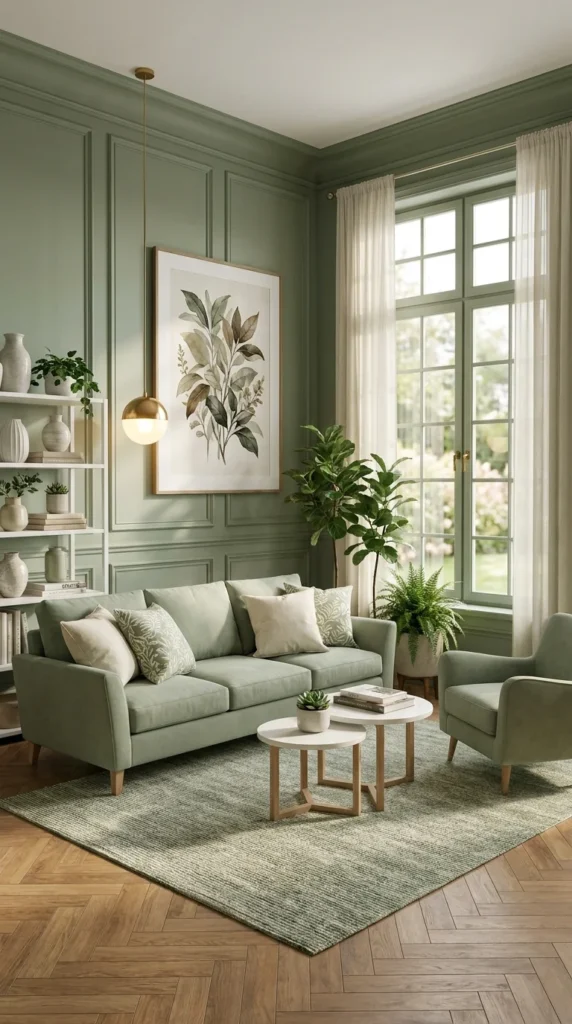
If the budget allows, install picture-frame wall paneling before choosing any furniture for the room. Molding painted the same color as the wall adds shadow-based dimension that flat paint alone cannot create, and it changes the proportions the rest of your furniture needs to answer to.
The mechanism is entirely about shadow, not color. Painting simple rectangular molding the same sage tone as the wall around it means the color itself stays completely uniform — but the raised edges catch and lose light differently throughout the day, creating a grid of subtle shadow lines. That’s a level of architectural detail flat paint can never produce, and it’s one of the few upgrades that reads as expensive because it genuinely requires more labor and material, not because of a design trick.
Once that paneling grid is in place, it also sets a rhythm the rest of the room should respect. Furniture and art placed against a paneled wall reads best when it aligns loosely with the panel lines and doesn’t fight them — a sofa centered under one panel, artwork sized to sit inside a panel’s proportions and not spanning across two.
What a Paneled Wall Typically Solves
❌ Before: A plain painted wall this size usually reads as a flat backdrop, with all of the room’s visual interest pushed onto the furniture and accessories in front of it. ✅ After: Adding picture-frame molding gives the wall its own architectural presence, so the room reads as designed even before a single piece of furniture is placed against it.
Recommended Materials
- Linen and velvet upholstery
- Painted wood wall paneling
- Terrazzo flooring
- Wool area rug
- Ceramic vases
Main Colors
- Sage Green
- Terracotta
- Cream
- Warm Rust
Best Lighting
- Lead with natural light here—ahere—a large multi-pane window is the room’s dominant light source
- Avoid a single centered overhead fixture, which would flatten the paneling’s shadow lines
- Add one warm floor or table lamp for evening depth
Mix Three Natural Materials, Never More, in One Sightline
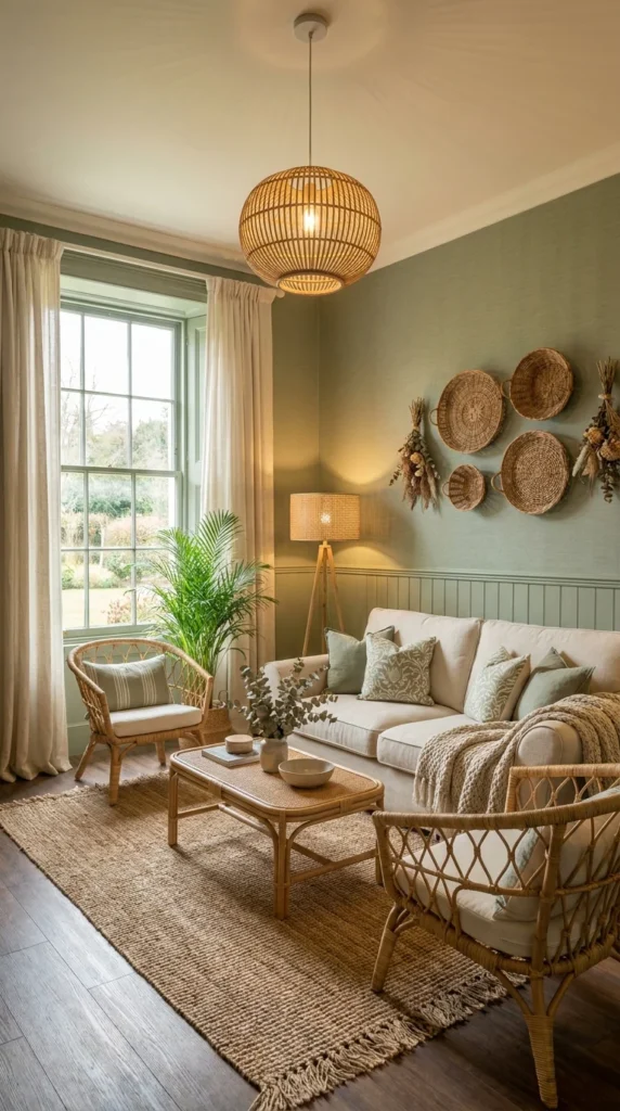
Choose exactly three natural materials for the room — commonly rattan, jute, and linen — and repeat only those three throughout, resisting the urge to add a fourth. A cottage-leaning sage room depends on natural materials to feel warm and not sterile, but three materials repeated is what reads as cohesive; four or five different natural materials in one room startstart to look accidental, not curated.
This is a discipline problem more than a shopping problem. Rattan chairs, a jute rug, linen upholstery, wicker wall baskets, and dried florals can all individually look great — but stacked together in one room, each material starts competing for the same “natural, textured” visual space and not reinforcing it. Choosing three and repeating them in at least two places each (rattan in both the chairs and the pendant; jute in both the rug and a basket) creates a sense of a deliberate palette, not an accumulation of “boho” purchases.
Wainscoting painted the same sage as the upper wall plays a supporting role here too — it gives the natural materials above and around it a calm, single-color backdrop to sit against, over competing for attention with a second wall treatment.
📌 Important Note This three-material discipline applies specifically to natural textures — solid metal or glass accessories (a lamp base, a mirror frame) don’t count against the limit, since they read as a different visual category entirely and can actually help ground a room with too much natural texture.
Recommended Materials
- Rattan (chairs, pendant)
- Wicker (wall baskets)
- Jute (rug)
- Linen (upholstery)
- Painted wood (wainscoting)
Main Colors
- Sage Green
- Cream / Ivory
- Natural Rattan Tan
Best Lighting
- A rattan pendant paired with a rattan-shaded floor lamp for layered warm light
- Tall sash window as the primary daylight source
- Warm 2700K bulbs throughout to keep the natural materials from reading cool or gray
Maintenance
- Vacuum jute rugs monthly with low suction, since jute fibers can fray under a beater-bar attachment
- Dust-wovenDust-woven wicker baskets every few weeks
- Check dried florals seasonally and replace any that have become brittle or faded
💡 Pro Tip Buy a small swatch of each of your three chosen materials and photograph them together in your room’s actual lighting before ordering furniture — natural fiber tones shift more than fabric swatches under warm versus cool bulbs.
Where a Natural-Material Room Loses Its Cohesion
- Adding a fourth or fifth natural material because each one looked good individually in the store
- Choosing wicker and rattan pieces in noticeably different tones, so they read as mismatched, not layered
- Skipping any smooth or metal accessory, leaving every surface in the room textured
- Painting the wainscoting a different white or cream in place of matching the wall above it
Set a Warm Material Against Sage to Stop It From Reading Cold
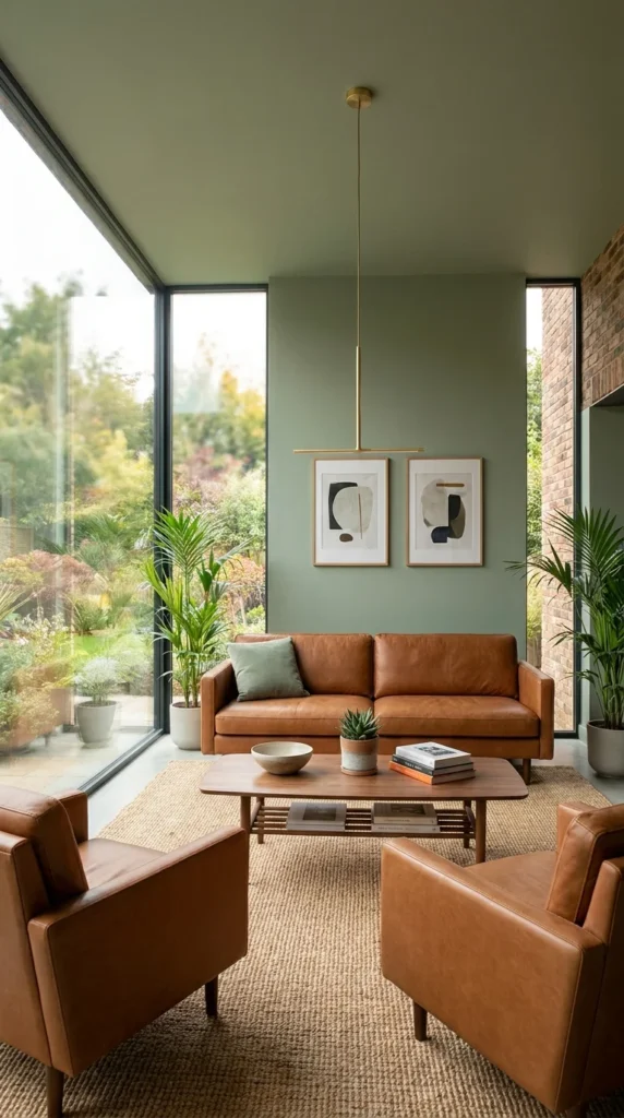
Anchor the seating around one warm-toned material—cognacmaterial—cognac leather is the most reliable choice—ratherchoice—rather than continuing the sage palette into the furniture itself. Sage is a cool-leaning, muted color, and a room that pairs it only with more cool or neutral tones risks feeling flat no matter how much natural light it gets.
The professional reasoning is about contrast doing the work that a second accent color would otherwise have to do. Cognac leather sits at almost the opposite end of the color wheel from sage in terms of temperature, and that contrast alone creates visual energy without needing a third loud color introduced into the room. It’s a lower-risk move than pattern or bold accent color, because leather’s warmth reads as sophisticated in place of decorative — it doesn’t date the way a trend-driven accent fabric might.
Floor-to-ceiling glazing amplifies this effect specifically in a sage room, because the volume of daylight coming through large windows makes both the cool wall color and the warm leather read at full saturation, with neither one muted. In a room with smaller windows, the same leather-and-sage pairing would likely need a warmer bulb temperature to achieve a similar balance.
⚠️ Warning Pairing sage with cool-toned gray leather over a true warm cognac or tan tone defeats the entire purpose of this pairing — always check a leather sample against the wall paint in daylight before ordering, since leather listed as “brown” online can lean surprisingly cool in person.
Recommended Materials
- Leather upholstery (cognac or tan)
- Jute rug
- Wood coffee table
- Brass or gold metal fixtures
- Exposed brick (if present)
Main Colors
- Sage Green
- Cognac / Tan Leather Brown
- Brass Gold
- Charcoal (accent art)
Best Lighting
- A linear brass pendant for a warm, focused light source
- Expansive corner glazing as the dominant daylight source
- Warm bulbs throughout, since large windows already introduce plenty of cool daylight balance
Maintenance
- Condition leather upholstery every three to six months to prevent cracking near sun-exposed seams
- Water a small succulent or low-maintenance plant weekly, keeping it away from intense afternoon glare through the glazing
Worth the Investment?
Floor-to-ceiling glazing and genuine leather seating are both expensive relative to the rest of this room’s material list, and both earn their cost here. The glazing does something paint and furniture can’t—itcan’t—it changes how much daylight the sage color receives throughout the day, which affects every other decision in the room. Leather, meanwhile, ages into a warmer patina over years and doesand does not wearwear out the way a fabric sofa would. For a rental or a room with limited natural light, both are skippable; for a room built around this much window, they’re arguably the two purchases worth prioritizing over everything else on this list.
Match Every New Piece’s Scale to the Room Before Its Color
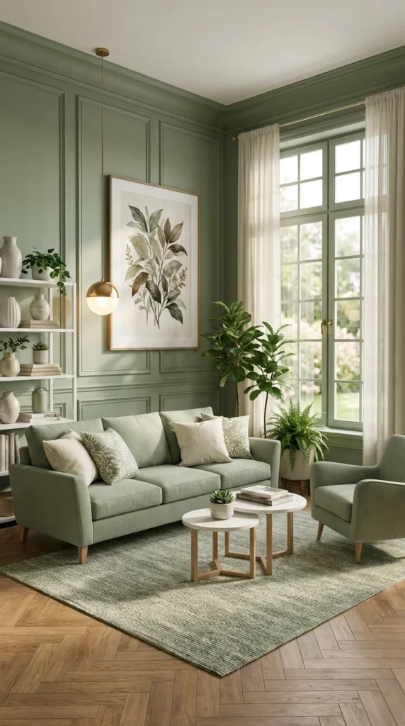
Measure the room’s proportions before choosing furniture scale — a nested pair of round coffee tables works in a room with open floor space around the seating, while a single larger table suits a tighter layout. Scale mistakes are far more visible in a sage room than a neutral one, because the wall color already commits to a strong visual identity; furniture that’s the wrong size for the room draws attention to itself and stops supporting the palette.
The underlying principle is proportion relative to negative space, not room size alone. A nested pair of round tables at two heights creates a small, layered focal point that works precisely because there’s enough open floor around the seating group to let that layering read clearly. In a smaller or more furniture-dense room, the same nested pair would simply look like clutter—a single correctly sized table would read as more intentional.
Symmetry plays a supporting role here too. A sofa and armchair placed with roughly equal visual weight on either side of a central shelving unit reads as balanced without needing to be perfectly matched — one anchors one side, the other balances it, and the open shelving between them becomes the room’s visual center, not either seat competing for that role.
What to Confirm Before Furniture Shopping
☐ Measure the open floor space around your intended seating area, not just the seating area itself. ☐ Decide on one nested table pair or one single larger table—never both. ☐ Confirm at least 30 inches of walking clearance around any coffee table ☐ Check that no single piece of furniture is taller than the window sill it sits nearest to. ☐ Balance visual weight on either side of any central shelving or focal point, without requiring exact symmetry.
📌 Important Note This scale principle applies most strongly in rooms with herringbone or patterned flooring — a busy floor pattern makes oversized furniture look even larger than it measures, so err toward the smaller option when the flooring itself already carries visual weight.
Recommended Materials
- Velvet or chenille upholstery
- Painted wood wall paneling
- Herringbone wood flooring
- Brass or gold metal fixtures
- Ceramic accessories
Main Colors
- Sage Green
- Cream / Ivory
- Brass Gold
- Warm Oak
Best Lighting
- A brass globe pendant as the room’s central fixture
- Tall window for daytime brightness
- Warm ambient bulbs for evening use
Maintenance
- Water ferns and other humidity-loving plants twice weekly, more often in dry winter months
- Wipe herringbone flooring with a dry or barely damp mop to protect the wood’s finish
Furniture Layout Tips for a Sage Green Living Room
- Keep a minimum of 30–36 inches of walking clearance around any coffee table so the room stays functional, not just photogenic
- Angle seating slightly toward the room’s main window over only toward the TV, so natural light stays part of the daily experience
- Float larger sectionals a few inches off the wall and never push them flush, which preserves the shadow line that makes upholstered texture read clearly
- Leave one wall or corner deliberately open, not fully filled—negative space is what keeps a textured, plant-heavy room from tipping into visual clutter
Who Should Choose This Style?
- Best for living rooms with strong natural light, where sage’s muted tone can read calm, not dim
- Best for renters and first-time owners who want warmth and personality without committing to a bold, trend-driven color
- Best for households that already lean toward natural materials — wood, rattan, linen — since sage pairs more easily with organic textures than with high-gloss, modern finishes
- Not ideal for north-facing rooms with minimal window area, where the muted green can skew flat without supplemental warm lighting
- Not ideal for households that want a bright, high-energy color scheme—sage is fundamentally a calm, quiet backdrop, not a statement color on its own
Budget Summary
| Budget | Expectation |
|---|---|
| Low | Sage paint, a jute rug, thrifted ceramic pots, and one large faux plant |
| Medium | A boucle or velvet sofa, brass pendant lighting, and a mix of real and faux plants |
| Premium | Custom wall paneling, genuine leather seating, floor-to-ceiling glazing, and hand-woven natural fiber accessories |
FAQ
Does sage green make a living room feel dark? Not on its own—sage is a muted, mid-tone green, closer to gray-green than a deep forest shade. Rooms feel dark when a muted color is paired with too little natural or warm artificial light, not because of the color itself. Pairing sage with a warm bulb temperature and at least one reflective metal accent (brass or gold) keeps it from reading heavy even in rooms with moderate light.
What colors pair best with sage green in a living room? Blush pink, terracotta, cream, and brass gold are the most reliable pairings, because each introduces warmth that balances sage’s cool undertone. Cognac leather works especially well as a furniture-level warm accent, not a decorative one. Avoid pairing sage with a second cool tone, like gray or slate blue, without a strong warm element somewhere in the room.
Will sage green work in a small living room? Yes, particularly in a pale or mid-tone sage and not a deep, saturated one. Keeping trim and ceiling the same tone as the walls (color drenching) can actually make a small room feel larger by removing the visual stopping point where wall meets ceiling — though this depends on the room having enough light to support a darker overall palette.
What furniture style suits a sage green living room best? Curved or rolled-arm silhouettes tend to soften a saturated sage wall better than boxy, hard-edged furniture. Boucle, velvet, and leather all pair well with sage; the material matters more than the specific furniture shape, since sage is muted enough to sit comfortably behind a wide range of upholstery textures.
How many plants does a sage green living room actually need? Fewer than most Pinterest photos suggest. Two or three plants at staggered heights, repeated in one or two pot materials, read as more intentional than five or six scattered plants of similar size. The height variation and material repetition matter more than the total plant count.
Author Box
Aesthetic Life Editorial writes about approachable, real-budget home design for aestheticlifes.com, testing color, texture, and material pairings before recommending them to readers.
Explore More
You may also enjoy:
- 10 Maximalist Living Room Ideas to Steal for a Room Full of Personality
- Small Space, Big Impact: Floating TV Units for Modern Living Rooms
- 10 Boho Bedroom Looks That Feel Curated, Not Cluttered
Tags
sage green living room, biophilic living room decor, boucle sectional sofa, rattan pendant lighting, colour-drenched living room, sage green paint pairing, boho living room ideas, warm leather and sage decor
Results will vary depending on your room’s light, budget, and personal taste — for structural changes like panellingpaneling or built-ins, it’s always worth bringing in a professional to confirm the details before committing.

