

Most people scrolling through fireplace inspiration end up with the same problem: the photos look incredible, but nothing about their own living room comes close. The mantel is either bare and awkward or so overloaded with frames and candles that the fireplace itself disappears. Somewhere between minimalism and decoration, a lot of homes get stuck.
That gap is exactly what this list is about. These ten fireplace feature walls were chosen because they solve that tension in different ways — some through texture, some through negative space, and a few through a single bold material choice that does all the work on its own. None of them rely on clutter or expensive built-ins to feel finished.
What ties them together is restraint. Each wall proves that a fireplace does not need ten accessories competing for attention to feel like the focal point of a room. Sometimes it just needs one honest decision, made with confidence, and left alone.
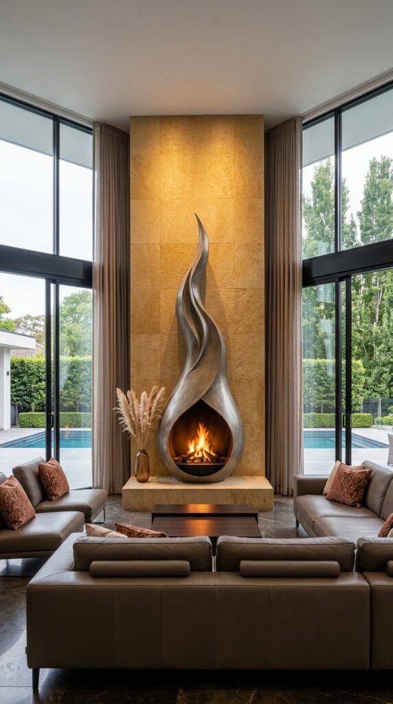
1. The Flame That Doesn’t Need a Fire to Make Its Point
The sculptural steel form here does something most fireplace surrounds never attempt — it borrows the shape of fire itself, twisting upward before the flame even reaches it. That single gesture becomes the entire design statement, and the honey-toned limestone slab behind it does nothing to compete. It just holds space, lit from a hidden source above, letting the metal do the talking. The pampas grass in the corner is a smart, quiet choice too — soft where everything else is hard-edged and reflective. What’s easy to miss is how much the floor-to-ceiling glass on both sides is doing here; without that light pouring in from two directions, the polished steel would read as heavy instead of fluid. Scale matters most in a room like this. A smaller sculpture would have looked like an ornament instead of an architectural moment.
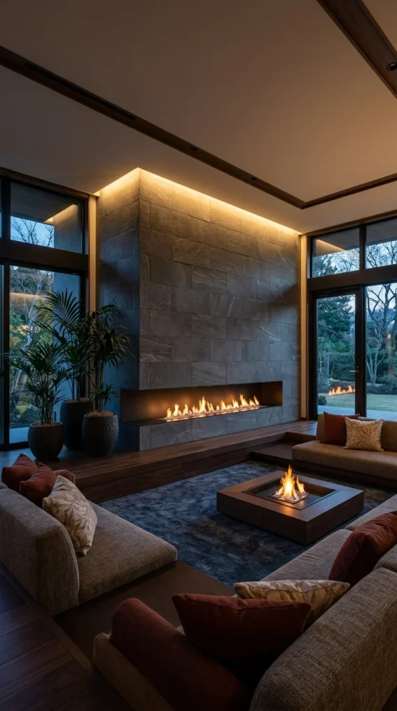
2. Two Fires, One Room, Zero Competition
This is a room built around fire as a layout decision, not just a design accent. The linear gas feature stretches nearly the full width of the stone wall, while a second, smaller flame sits low in a sunken coffee table at the centre of the seating. Most homes would treat that as overkill. Here it works because the two fires are doing different jobs — the wall feature is architectural and constant, while the table flame is social, low, and meant to be gathered around. The sunken floor level is the real quiet decision in this space. Dropping the seating below the main floor line makes both fire sources sit closer to eye level, which is why the room reads as intimate instead of cavernous, even with ceilings this high. The hidden LED strip above the stone does the rest, washing light upward so nothing feels like a spotlight.
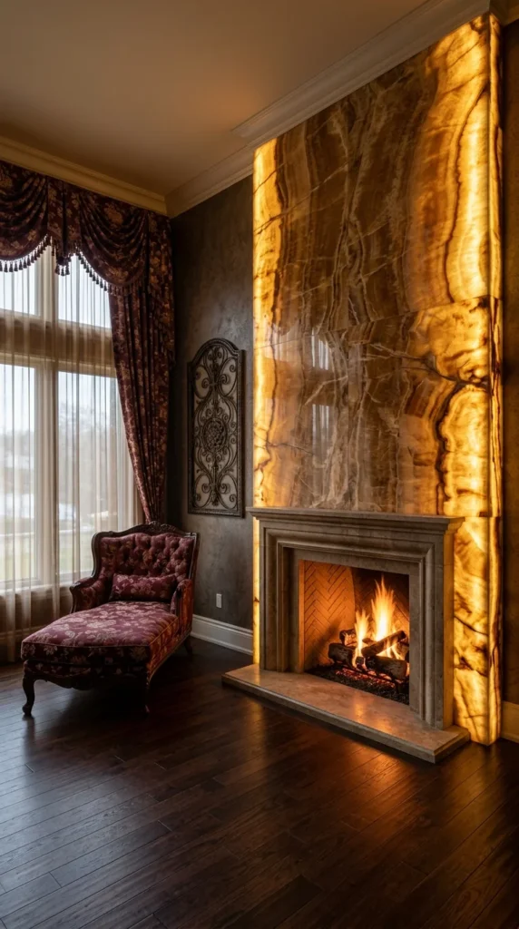
3. When One Material Is Allowed to Be Loud
Honestly, backlit onyx is not a subtle material, and it does not pretend to be. The veining across this slab looks almost molten once light passes through it from behind, turning a solid stone wall into something closer to stained glass. It is the one wall on this list that pushes against the “less is more” idea directly — and it still earns its place, because everything else in the room is deliberately restrained. The traditional stone mantel below is carved but plain; the herringbone firebrick stays quiet, and the room’s other patterns, the drapery and the tufted chaise, sit far enough away not to fight with the wall for attention. That is the tradeoff worth naming here: a feature this dramatic only works when it is the single loud voice in the room, not one of several.
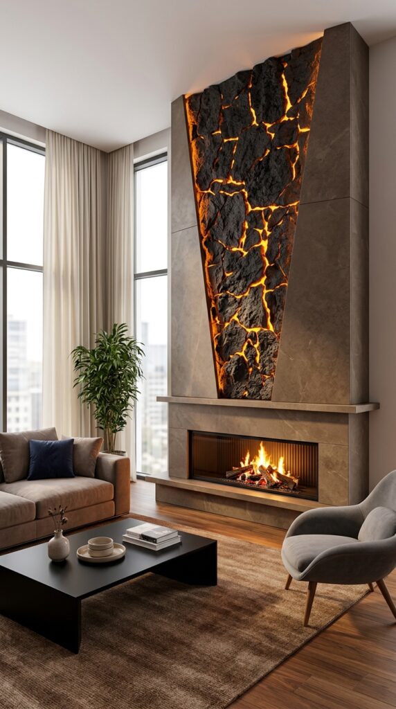
4. The Wall That Looks Like It’s Cracking Open
There is no hidden reading required for this one. The molten-rock inset is the obvious focal point, cut into the stone cladding like a fault line running from ceiling to mantel, and it is meant to be looked at directly rather than discovered. The triangular shape is doing more work than it first appears — a straight rectangular panel in this same material would have read as a television insert, but the tapered edges make it unmistakably decorative instead. Below it, the actual fireplace opening stays almost plain by comparison, a simple linear firebox with vertical fluting that lets the wall above stay the star. The rest of the room follows the same logic: a low black table, one plant, and minimal pattern. Nothing here is asking to be noticed except the one thing that was always meant to be.
Pro Tip: When a feature wall is this visually loud, keep furniture silhouettes low and simple — height competes with the wall, but low-profile pieces let it stand alone.
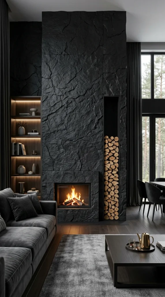
5. The Wall Dark Enough to Make Firewood the Decoration
Charcoal-black stone cladding is a commitment, and it comes with a real tradeoff worth saying upfront — a wall this dark absorbs light rather than bouncing it, so the room depends entirely on other sources to avoid feeling closed in. That is exactly what happens here. Warm shelf lighting on the left and the tall windows on the right do the job the wall itself refuses to do. The cleverest move, though, is the narrow firewood niche cut into the stone beside the firebox. Stacked logs are not usually treated as a design element, but lined up vertically against black rock, the pale wood grain becomes its own texture study. It is a practical storage solution that never once looks like one. That is the kind of detail worth noticing: function dressed as intention, not the other way around.
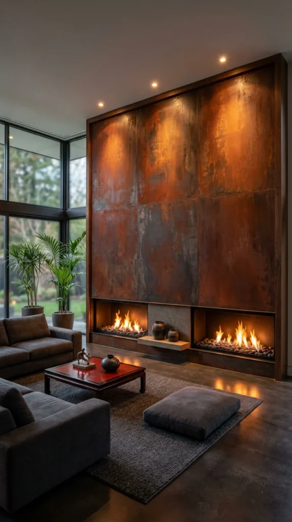
6. Split Fire, Same Wall, Different Personalities
Weathered steel panels cover this entire wall in a patchwork of rust-orange and gunmetal grey; no two panels are shaded quite the same. I find this material choice interesting because it looks intentional and accidental at once – the kind of surface that reads as industrial reclamation even though every tone was almost certainly engineered. Two separate fireboxes sit low along the base, split apart by a small stone shelf holding a pair of ceramic vessels. That gap matters more than it looks. Instead of one wide fire commanding the whole wall, the room gets two smaller, calmer flames bracketing a quiet pause point between them, which softens the scale of a wall this tall and this warm in colour. Recessed ceiling lights pick up the same copper undertones in the metal, so the glow above almost matches the fire below without a single visible flame doing it.
Pro Tip: Splitting one large fireplace into two smaller openings can make an oversized wall feel more approachable without shrinking the overall design.
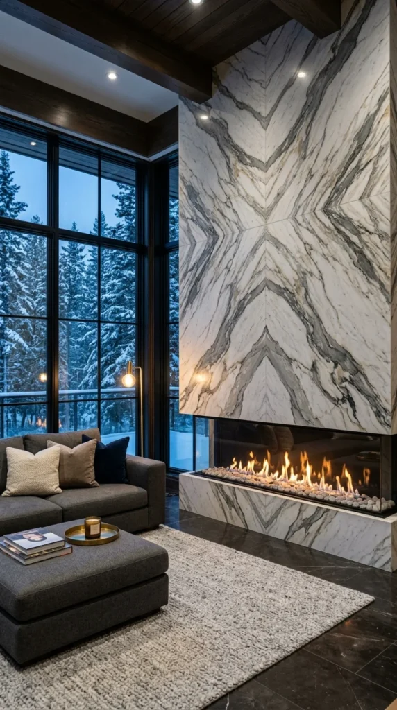
7. The Marble That Was Cut to Meet Itself
This is a book-matched slab, which means the veining on the right panel is a mirror of the veining on the left, cut from the same block and flipped to meet in the centre. That is the whole design principle at work here, and it produces the dramatic diamond pattern climbing straight up the wall. Most homes never see this technique because it requires buying two matched pieces from the same stone, which is not the budget-friendly route. A more affordable version of the same idea exists in large-format porcelain tile printed with a mirrored vein pattern – it will not have the same depth under direct light, but from across a room, the symmetry reads almost identically. The snow visible through the corner windows adds something the wall alone could not: cool light bouncing off marble that is already cool-toned, while the fire below stays the only warm note in the entire composition.
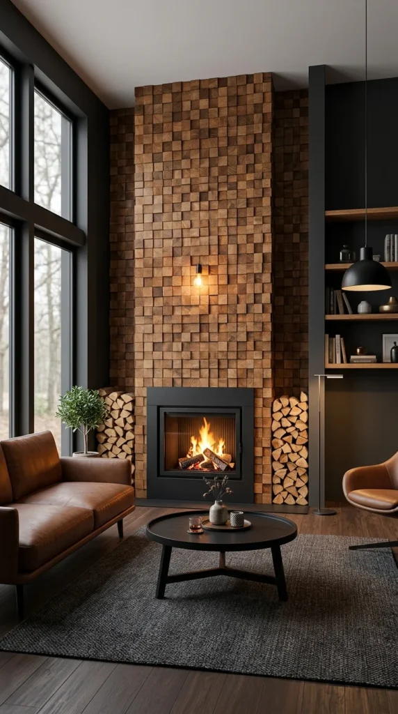
8. A Wall Made of Six Hundred Small Decisions
End-grain wood blocks cover this entire chimney breast, each square cut so the growth rings face outward instead of running lengthwise like a normal plank. It is a labour-intensive way to build a wall, and that is worth saying plainly rather than dressing it up. Every block had to be cut, sanded, and set individually, which is part of why this look rarely shows up in budget renovations — a peel-and-stick veneer can mimic the colour, but never the depth those hundreds of individual end-cuts create under angled light. What softens all that texture is the single pendant bulb mounted low on the wall, doing almost nothing functionally and everything visually, since its warm glow pools against the wood grain instead of lighting the room. The stacked firewood flanking the firebox was clearly chosen to echo the wall’s own material, which is a small continuity most people would build by accident rather than plan for.
Pro Tip: Echoing one material – like matching firewood tone to a wood-clad wall – creates cohesion without adding a single extra decorative object.
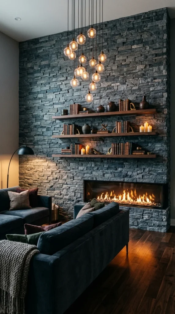
9. The Shelves Are Actually the Story, Not the Lights
Personally, I would hesitate before hanging a bulb cluster this dense over a fireplace — sculptural lighting like this and a fire below can compete for the same visual attention, and in a smaller room it likely would. Here it works only because the stacked stone wall gives both elements enough surface area to breathe. What actually holds the composition together, though, are the three floating shelves layered with books, ceramics, and candles at varying heights. That staggered arrangement creates the kind of visual rhythm a single mantel display never manages since the eye has three separate stopping points instead of one crowded row. The linear firebox stays narrow and low by comparison, almost secondary to everything happening above it. That is the tradeoff of a wall this busy: the fire stops being the obvious focal point and becomes just one texture among several.
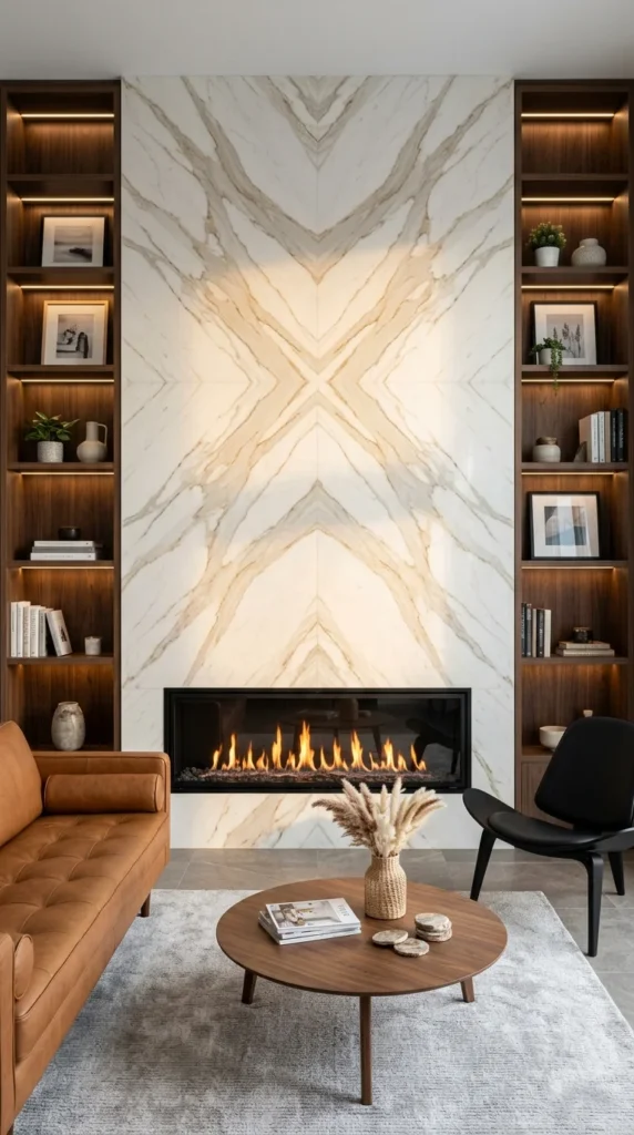
10. Bookended by Shelving, Framed by Symmetry
Where the marble wall earlier in this list stood alone against dark stone and snow, this one gets a different kind of support – built-in walnut shelving on both sides, lit from within and stacked with framed photography and books. That is it. That is the whole idea. The same book-matched veining technique creates another mirrored pattern here, though this one reads softer, more golden than grey, and the symmetry stretches downward into an X rather than climbing straight up. What nobody puts in the caption is how much the cognac leather sofa and black lounge chair are doing to keep this room from feeling like a showroom. Warm leather against cool marble is the kind of pairing that looks accidental but rarely is. It is a fitting note to end on: a wall built from restraint, finished by everything chosen to sit near it.
Conclusion
Looking back across these ten walls, the thing that connects them is not a shared material or a single style — it is restraint used as a design tool rather than a limitation. The onyx wall was allowed to be loud because nothing near it competed. The blackened stone leaned on firewood instead of being a decoration. The book-matched marble did all its work through symmetry alone. Even the busiest wall on this list, with its bulb cluster and layered shelving, still gave the fire enough open space to remain visible rather than buried.
That is the real insight worth taking from this list: a fireplace wall does not need more elements to feel finished; it needs the right ones left alone. Most rooms overcorrect in one direction or the other — too bare or too crowded — and both miss the same lesson. One material, one gesture, one honest decision, given room to be seen. That is usually enough.
FAQs
1. Do I need real stone or marble to get this look, or are there budget-friendly alternatives? Natural stone and book-matched marble carry a premium cost, but large-format porcelain tile now replicates veining patterns convincingly enough to read the same from normal viewing distance. Peel-and-stick stone veneer and engineered wood block panels are also reasonable stand-ins for renters or tighter budgets, though they tend to lack the depth that comes through under direct or angled lighting.
2. Are these fireplace wall styles renter-friendly, or do they require permanent renovation? Most of the dramatic effects here — slab stone, backlit onyx, end-grain wood — involve permanent installation and are best suited to homeowners. Renters can borrow the underlying ideas at a smaller scale: a freestanding electric fireplace against a textured accent panel or layered floating shelves and warm lighting around an existing fireplace, without touching the structure itself.
3. How do I choose between a bold feature wall and a more minimal one for my own space? It generally comes down to what else is happening in the room. A wall with strong veining, texture, or colour works best when the surrounding furniture and finishes stay quiet, letting the wall be the singular statement. If the room already has a pattern, colour, or a lot of furniture, a plainer stone or simple linear firebox tends to hold up better over time without competing for attention.


2 Responses