
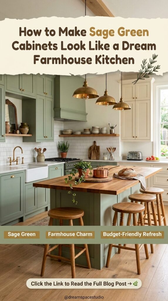
Sage green cabinets are everywhere right now, but most kitchens that copy the color end up flat — the paint reads more like a trend than a finished room. The green alone was never the whole look; it’s the metals, the wood tones, and the lighting layered around it that turn a green cabinet into an actual farmhouse kitchen.
The goal isn’t to paint your cabinets and call it done — it’s to build a small, deliberate palette around that sage base so the room feels collected over time rather than picked from one paint chip. This guide breaks that process into ten specific, repeatable decisions, using ten real kitchens as proof each one works.
By the end, you’ll know how to choose a metal finish and repeat it on purpose, pair sage with the right wood and stone tones, layer lighting instead of relying on one fixture, and avoid the mistakes that make a farmhouse kitchen look staged instead of lived-in. This guide is for anyone repainting cabinets, planning a renovation, or simply trying to make an existing sage kitchen feel more finished — whether you’re working with a full kitchen or one wall.
Quick answer: sage green cabinets work best paired with one warm metal finish (brass or copper, repeated throughout), a natural wood countertop or island top, and layered lighting — pendant clusters plus under-cabinet or window light — rather than a single overhead fixture.
Let’s start building.
Quick Overview
| Style | Farmhouse / Cottage Kitchen |
|---|---|
| Best For | Kitchens with existing wood floors, farmhouse or cottage-style homes |
| Budget | Medium–High (cabinetry is the main cost driver) |
| Difficulty | Moderate — paint is DIY-friendly, hardware and lighting less so |
| Maintenance Level | Low–Medium |
Group Your Pendant Lights Instead of Spacing Them Evenly
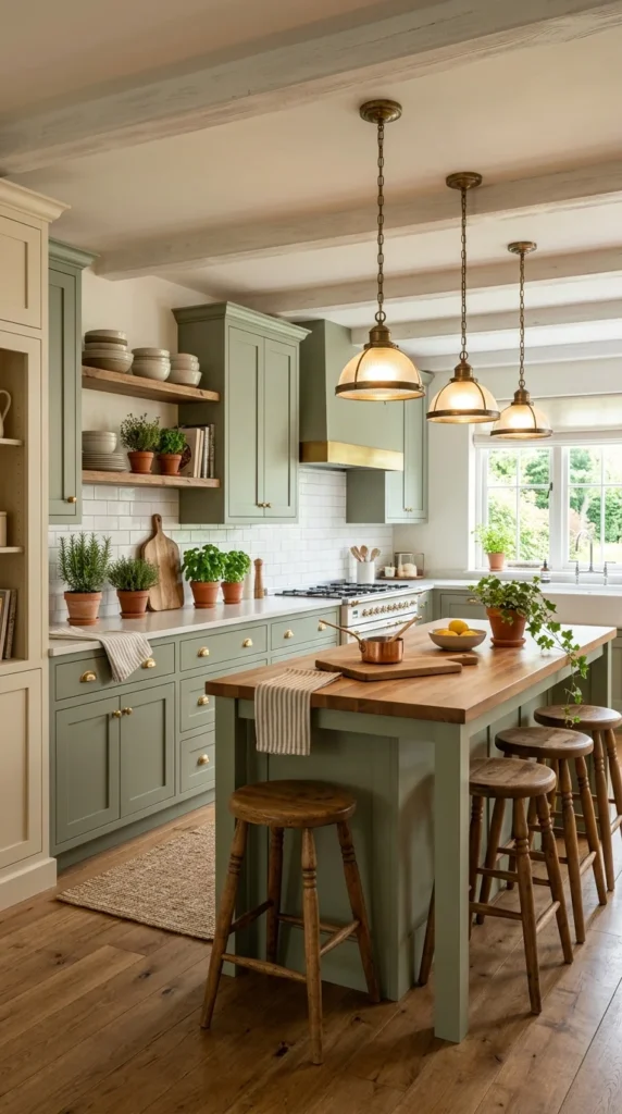
Cluster three matching pendant lights close together over an island rather than spacing them evenly across its full length. A tight grouping reads as one deliberate lighting moment; evenly spaced fixtures read as a functional requirement someone checked off a list.
This works because grouped light sources concentrate visual weight in one place, which gives the eye a clear anchor point above the island the same way a chandelier would in a dining room. Spread three pendants the full width of a long island and each one ends up doing a third of the job alone — clustered together, they read as a single, more substantial fixture with real presence.
Professionals lean on this trick specifically in longer kitchens, where evenly spaced lighting can accidentally make an island look like a hallway rather than a gathering spot. Grouping the pendants toward the section of the island people actually sit or gather at reinforces that this is a social space, not just a prep counter.
💡 Pro Tip Hang the pendants at slightly different chain lengths — a few inches apart — rather than perfectly level. The small variation in height reads as intentional and handmade, which suits a farmhouse kitchen far more than a perfectly uniform row.
Why the Brass Repeats From the Pendants to the Pot Handles
One reason this kitchen’s lighting doesn’t feel like an afterthought is that the same warm brass shows up again on the cabinet hardware and the cookware handles resting nearby. Repeating a metal finish across fixtures and small objects tends to make a room read as considered, even when those objects were bought at completely different times. Swap the pendants for a cooler chrome finish and the brass hardware would likely start to look mismatched rather than intentional.
Recommended Materials
- Painted wood shaker cabinetry
- Antique brass pendant lighting and hardware
- Butcher block wood island top
- Terracotta pots for herbs
- Woven jute rug
Main Colors
- Sage Green
- Warm Honey Oak
- Antique Brass
- Cream White
- Terracotta
Best Lighting
- Clustered brass dome pendants above the island
- Large adjacent window for daytime work light
- Warm 2700K bulbs throughout to complement the brass
Maintenance
- Water potted herbs every two to three days, more often in summer heat
- Trim herbs regularly to keep them full rather than leggy
- Wipe brass fixtures with a soft cloth monthly to maintain their warm patina
Where This Look Falls Apart
- Spacing pendant lights evenly across a long island instead of clustering them
- Mixing brass fixtures with chrome or nickel hardware elsewhere in the same room
- Choosing cool white bulbs, which fight the warmth of both the wood and the brass
- Overcrowding the island counter so the pendant cluster has nothing clear to highlight
Grouped light reads as a design decision; spaced-out light reads as a requirement. Before installing new pendants, mock up the spacing with painter’s tape on the ceiling to see how close is too close.
Pair a Warm Wood Countertop With One Cool Marble Surface
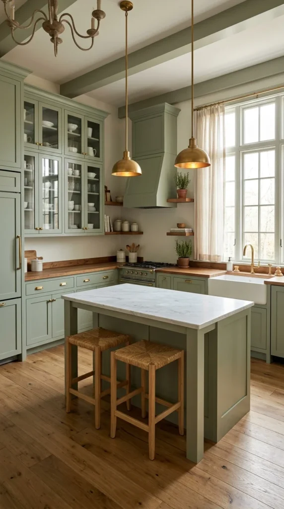
Choose one warm material — a wood countertop or open shelf — and one cool material, like white marble, and let those two textures do the room’s real contrast work instead of relying on the cabinet color alone. Sage green sits between warm and cool, which is exactly why it pairs well with both at once.
This works because a kitchen built entirely from warm materials can start to feel heavy, while one built entirely from cool stone can feel sterile — sage green is flexible enough to bridge both without clashing with either. A walnut countertop along the perimeter paired with a white marble island top creates a visual rhythm: warm, cool, warm, cool, as the eye moves around the room, rather than one flat, uniform surface everywhere.
Professionals treat this pairing as a ratio, not a 50/50 split — usually two-thirds warm wood to one-third cool stone works best, so the room still reads as warm and inviting overall, with the marble acting as a highlight rather than the dominant surface.
💎 Worth the Investment? A marble island top is one of the more expensive single choices in a kitchen like this, and it’s worth it specifically because it’s doing double duty — it’s the room’s main prep surface and its main visual highlight. Where I’d pull back, if budget is tight: skip marble on the full perimeter counters and reserve it for the island alone, keeping the surrounding countertops in more affordable, durable butcher block. The contrast reads just as strong with less material, and the wood perimeter counters age more forgivingly under daily kitchen use than marble would.
Recommended Materials
- Glass-front shaker cabinetry
- Walnut butcher block perimeter counters
- Carrara-style white marble island top
- Antique brass fixtures
- Rush or rattan-seated counter stools
Main Colors
- Sage Green
- Warm Walnut Brown
- Carrara White
- Antique Brass
- Soft Cream
Best Lighting
- Rope-and-wood chandelier as a secondary ambient fixture
- Single brass pendant over the island
- Large window with sheer curtain for filtered daylight
Getting This Balance Right at Home
Identify which surfaces in your kitchen are non-negotiable to replace (usually the island, since it’s the visual centerpiece) and prioritize your material budget there first, keeping the surrounding perimeter counters in a more affordable warm wood or laminate that mimics wood grain. This keeps the two-thirds warm, one-third cool ratio intact even on a tighter budget.
Where This Combination Goes Wrong
- Using marble on every surface, which tips the room too cool and loses the farmhouse warmth
- Choosing a wood counter with a very orange or yellow undertone that clashes with grey-veined marble
- Skipping a sealant on butcher block counters near the sink, leading to water damage over time
- Pairing warm wood and cool marble but keeping all the metal finishes cold, which undercuts the balance
Two-thirds warm material to one-third cool material is the ratio that keeps a sage kitchen feeling farmhouse, not showroom. Decide which single surface in your kitchen deserves the marble upgrade before pricing out the whole room.
Turn the Windowsill Into a Working Herb Garden
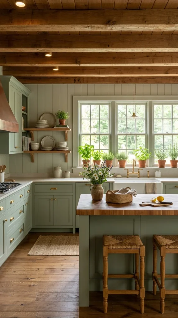
Line a run of potted herbs directly along a kitchen windowsill or triple window rather than treating that space as empty ledge. A working herb garden does more for a farmhouse kitchen’s authenticity than almost any decorative object could, because it’s genuinely functional, not just styled to look that way.
This works because a windowsill full of live plants introduces natural, unrepeatable variation — no two basil plants look identical — which is exactly the kind of imperfection a farmhouse kitchen depends on to avoid feeling manufactured. It also solves a real problem: herbs need bright, consistent light, and a kitchen windowsill above the sink is usually the best-lit spot in the entire room for exactly that reason.
Professionals treat a herb windowsill as a lighting decision as much as a decor one — the plants only work visually if the window behind them is large enough to backlight the leaves, so the greenery reads as vibrant rather than shadowed.
☐ Windowsill Herb Checklist ☐ Choose pots that fit the sill depth without overhanging the edge ☐ Group at least five to six pots for a full, established look ☐ Mix leaf shapes and heights (basil, thyme, rosemary) rather than one repeated herb ☐ Confirm the window gets at least four hours of direct light daily ☐ Leave the faucet area clear so the sink stays fully functional
Why This Corner Draws the Eye First
One reason the eye lands on the windowsill before anything else in this kitchen is that it’s the brightest, most backlit part of the entire room — light draws attention before color or shape does. Placing the greenest, most textured element directly in that brightest spot means the plants do the visual heavy lifting the rest of the kitchen doesn’t have to. Move the same herb collection to a dimmer corner and they’d likely read as an afterthought instead of a feature.
Recommended Materials
- Vertical shiplap wall paneling
- Copper range hood
- Solid wood open shelving
- Terracotta herb pots
- Rush-seated counter stools
Main Colors
- Sage Green
- Copper
- Warm Oak
- Terracotta
- Soft Cream
Best Lighting
- Triple window as the primary daylight source
- Single pendant light for evening ambient light
- Avoid heavy window treatments that would shade the herb garden
Maintenance
- Water herbs every two to three days, checking soil moisture before each watering
- Rotate pots weekly so all sides get even light exposure
- Trim herbs regularly to encourage bushier, fuller growth
- Wipe copper range hood monthly to maintain its warm tone
Easy Ways to Get This Wrong
- Choosing a windowsill too shallow for the pots, risking them tipping or overhanging the sink
- Using only one type of herb, which reads as sparse rather than a full garden
- Blocking the window with a heavy curtain that starves the plants of light
- Letting herbs go leggy and unkempt instead of harvesting and trimming regularly
A working herb garden earns its visual space by actually being useful, not just decorative. Measure your own windowsill this week and see how many pots it can realistically hold.
Mirror the Layout on Both Sides of a Narrow Kitchen
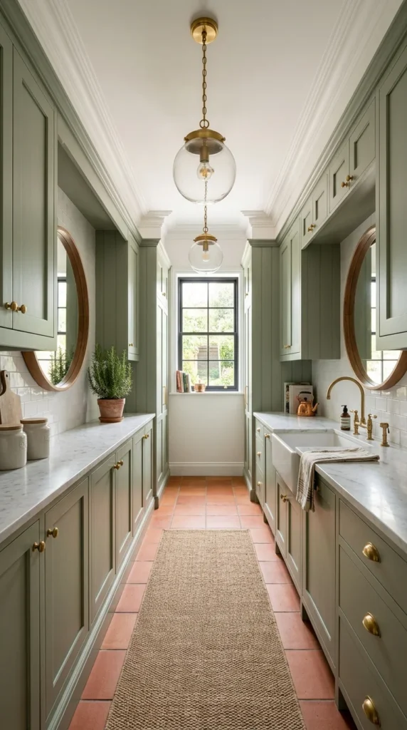
Design a narrow galley kitchen or butler’s pantry with matching cabinetry, counters, and even mirrors on both sides of the walkway, rather than treating one wall as primary storage and the other as an afterthought. Symmetry is what makes a narrow space feel intentional instead of cramped.
This works because a mirrored layout gives a long, narrow room a sense of rhythm — the eye moves down the space evenly instead of getting pulled toward whichever side happens to have more going on. Round mirrors placed at matching points on each wall reinforce that symmetry further, and they bounce additional light down a corridor-shaped room that would otherwise feel dim at the far end.
Professionals use this approach specifically in transitional spaces — butler’s pantries, galley kitchens, mudroom-adjacent prep areas — where the room’s shape is already decided and the only real design lever left is how evenly the two sides balance each other.
📌 Important Note Full symmetry only works if both sides of the room serve genuinely similar functions — storage facing storage, prep facing prep. If one side needs to be a working sink wall and the other pure storage, aim for balanced visual weight instead of literal mirrored objects.
Getting This Layout Right at Home
Sketch your narrow kitchen or pantry from a bird’s-eye view and note which elements are fixed (plumbing, appliances) before deciding what can be mirrored. Where you can’t match function exactly, match visual weight instead — a run of glass-front cabinets on one side can balance a run of solid cabinets on the other if both use the same cabinet height and hardware.
Recommended Materials
- Sage shaker cabinetry
- White marble countertops
- Antique brass fixtures and hardware
- Terracotta floor tile
- Jute runner rug
Main Colors
- Sage Green
- Carrara White
- Antique Brass
- Terracotta
- Charcoal (window framing)
Best Lighting
- Paired brass globe pendants running down the center
- Narrow black-framed window at the far end for daylight
- Warm-toned bulbs to keep the terracotta floor from reading cold
Where Symmetry Falls Apart
- Mismatching cabinet heights on either side, which breaks the mirrored effect immediately
- Choosing different hardware finishes for each wall
- Skipping the runner rug, which is what ties the long, narrow floor plan together visually
- Hanging mirrors at different heights instead of matching points on each wall
A narrow kitchen gains presence when both walls carry equal visual weight, not when one side does more work than the other. Sketch your own narrow space and mark where true symmetry is possible before renovating.
Stack Potted Herbs Above the Cabinets, Not Just Below
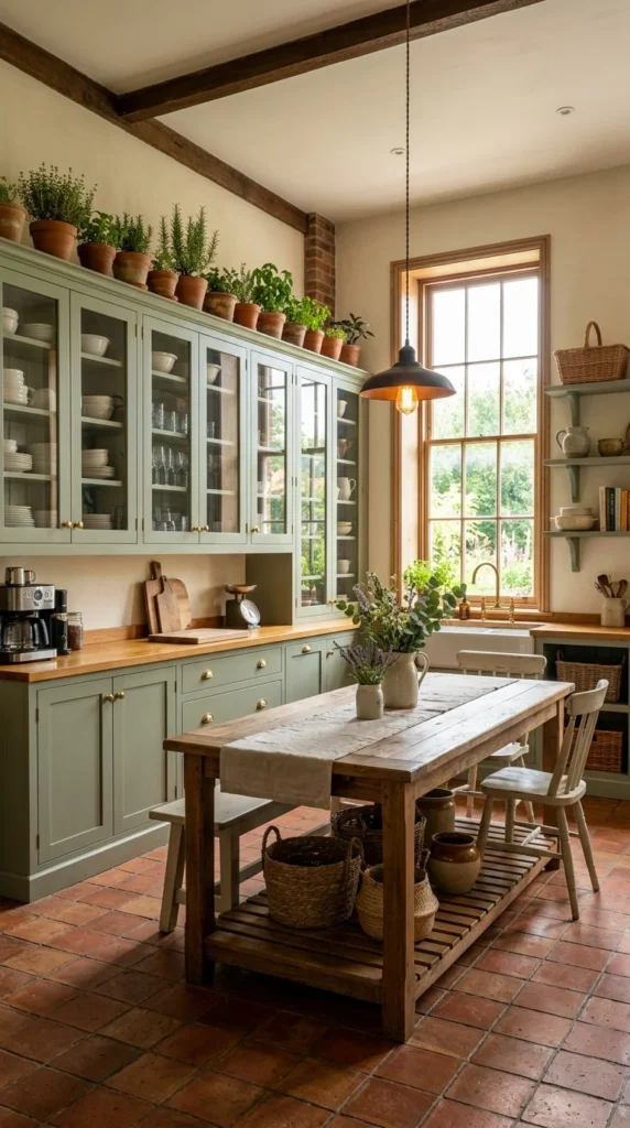
Line a row of potted plants along the top of your upper cabinets, using the dead space between cabinet crown and ceiling as a second greenery layer instead of leaving it empty. This is one of the simplest, lowest-cost ways to add warmth to a kitchen that already has good bones.
This works because most kitchens only use greenery at counter height, leaving the upper third of the room visually bare. Adding a second, higher layer of plants pulls the eye upward and makes a room with tall cabinetry feel more finished, the same way crown molding finishes off a ceiling line. It also softens the hard edges of cabinet tops, which otherwise read as a flat, unstyled shelf.
Professionals treat cabinet-top greenery as a low-risk way to add life to a kitchen without touching the cabinetry itself — it’s fully reversible, inexpensive, and works in almost any kitchen with cabinets that don’t already reach the ceiling.
Recommended Materials
- Glass-front sage cabinetry
- Solid wood countertops
- Terracotta floor tile
- Woven wicker baskets
- Wrought iron pendant light
Main Colors
- Sage Green
- Warm Oak
- Terracotta
- Matte Black
- Soft Cream
Best Lighting
- Black wrought iron pendant with an exposed warm bulb
- Side window for natural daylight
- Avoid placing plants directly under a heat-emitting fixture
Maintenance
- Water cabinet-top herbs every two to three days, checking that pots have drainage
- Trim plants regularly so they don’t outgrow the cabinet-top space
- Dust glass cabinet fronts weekly to keep the display visible
Where to Start If You’re Copying This Room
Measure the gap between your cabinet tops and the ceiling — anything over six inches can comfortably hold a small terracotta pot. Use plants with a trailing or compact habit rather than tall, top-heavy varieties that could tip from the cabinet edge, and stick to one plant type repeated across the row for a calmer, more intentional look than a mix of different species.
What Trips People Up Copying This Room
- Choosing pots too tall for the cabinet-to-ceiling gap, so they look cramped
- Using a different plant variety in every pot instead of repeating one for rhythm
- Skipping regular watering because the plants are out of easy daily reach
- Overcrowding the row so individual pots lose their shape and definition
Plants above the cabinets solve a real, common problem: bare, unstyled space near the ceiling. Measure your own cabinet-to-ceiling gap this week to see if this trick works in your kitchen.
Commit to One Metal Finish and Repeat It Everywhere
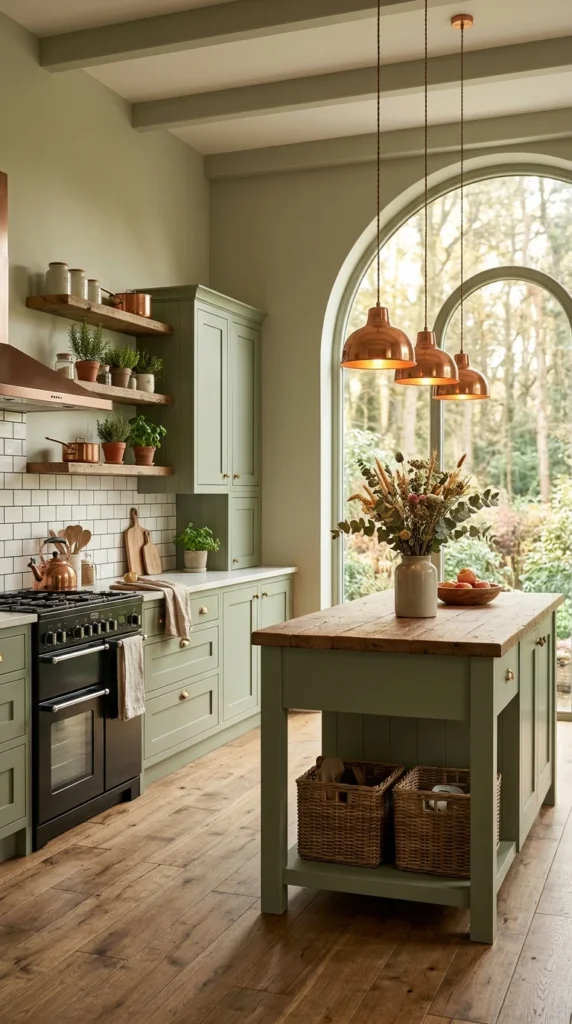
Choose a single metal — brass, copper, or blackened iron — and use it for every fixture in the room: pendant lights, the range hood, cabinet hardware, and any small accessories. Mixing metals can work in some rooms, but a farmhouse kitchen built around sage green reads more cohesive with one consistent finish.
This works because copper and brass both carry a warm undertone that pairs naturally with sage’s own slightly warm-green cast, and repeating that same warm metal across every touchpoint in the room reinforces the connection instead of introducing competing tones. A copper range hood next to copper pendant lights doesn’t just match — it makes the whole room feel like it was planned as one cohesive scheme rather than assembled fixture by fixture.
Professionals commit to one metal early in a renovation specifically because it’s expensive and disruptive to change later — cabinet hardware is easy to swap, but a range hood or pendant cluster is not, so the metal decision should happen before either is purchased.
Copper vs. Brass Comparison
| Factor | Copper | Brass |
|---|---|---|
| Undertone | Warmer, slightly pink-orange | Warmer, slightly yellow-gold |
| Patina Over Time | Darkens and can develop a natural patina | Stays more consistent, especially if lacquered |
| Best Paired With | Terracotta, warm wood, white subway tile | Cream, marble, sage green cabinetry |
| Maintenance | Occasional polishing if a bright finish is wanted | Wipe with a soft cloth to maintain shine |
| Cost | Generally higher, especially for hoods | Wide range depending on fixture quality |
💡 Pro Tip If you already have mixed metals in an existing kitchen, start the transition with the largest, most visible fixture — usually the range hood or pendant lights — rather than swapping small hardware first. The big fixture sets the tone the smaller pieces should follow.
Why the Copper Hood Doesn’t Compete With the Tile
One reason the copper range hood reads as a warm accent rather than an overwhelming one is that its undertone actually deepens over time, developing a natural patina that softens rather than brightens with age. A brand-new, highly polished copper surface would likely feel too shiny against the matte white subway tile behind it — the material’s natural aging process is part of what makes this pairing work.
Recommended Materials
- Copper range hood and pendant lights
- White subway tile backsplash
- Solid wood open shelving
- Woven wicker storage baskets
- Sage shaker cabinetry
Main Colors
- Sage Green
- Copper
- Cream White
- Warm Oak
Best Lighting
- Copper pendant cluster as the main light source
- Large arched window for daytime brightness
- Warm bulbs throughout to complement the copper’s undertone
Maintenance
- Wipe copper fixtures with a soft, dry cloth monthly
- Water shelf herbs every two to three days
- Clean subway tile grout lines quarterly to prevent discoloration
Where This Look Falls Apart
- Mixing brass hardware with a copper hood, which reads as inconsistent rather than layered
- Choosing a highly polished copper finish that clashes with a matte, farmhouse-style room
- Skipping regular polishing if a bright copper look is the goal, letting it darken unevenly
- Pairing warm copper with cool-toned grey stone, which fights the metal’s undertone
One consistent metal finish does more for cohesion than any other single decision in a kitchen this size. Decide on your metal before ordering a single fixture, since it’s the hardest choice to reverse later.
Frame the Backsplash With an Archway Instead of a Wall
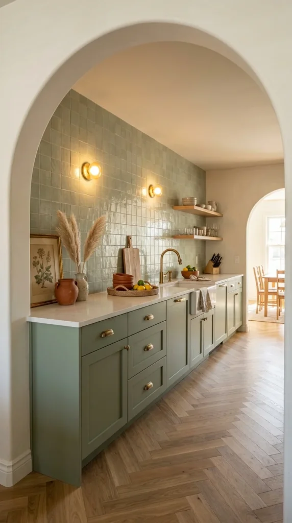
Position a textured, patterned backsplash inside an arched opening rather than on a flat wall, letting the architecture itself frame the material like a piece of art. An archway does more to elevate a backsplash than almost any tile choice on its own.
This works because an arch naturally draws the eye toward whatever sits inside it, the same way a picture frame directs attention to the art within. A textured green tile backsplash framed by a plaster archway reads as a considered focal point rather than just “the wall behind the sink” — the architecture is doing curatorial work the tile alone couldn’t do.
Professionals use archways this way specifically when a kitchen opens into another room, since the arch also functions as a soft transition point rather than a hard wall break — it lets the eye understand the two spaces are connected without losing the kitchen’s own sense of definition.
Getting This Look Right at Home
If you already have an archway or opening near your kitchen’s prep area, treat the wall inside it as a dedicated feature zone — a different tile, a bolder color, or added texture than the rest of the kitchen. If you don’t have an existing archway, even a shallow niche or a change in wall depth can create a similar framing effect on a smaller scale.
⚠️ Warning A heavily textured or patterned tile like this works because it’s contained within the archway’s edges. Extending the same tile onto the flat walls outside the arch removes the framing effect entirely and can make the whole kitchen feel visually busy instead of intentional.
Why the Tile Reads as a Feature, Not Just a Backsplash
One reason this textured tile doesn’t overwhelm the room is that the archway itself creates a hard visual stop — the eye knows exactly where the “feature” begins and ends. Without that architectural boundary, the same bold tile would likely need to compete for attention with everything else in the kitchen instead of being clearly set apart from it.
Recommended Materials
- Zellige-style ceramic tile
- Brass wall sconces
- Herringbone wood flooring
- Terracotta pottery accents
- Sage shaker cabinetry
Main Colors
- Sage Green (tile and cabinetry)
- Antique Brass
- Terracotta
- Cream White
Best Lighting
- Paired brass wall sconces flanking the tile feature
- Ambient light borrowed from the adjoining dining room
- Warm bulbs to bring out the tile’s texture and depth
Where This Look Falls Apart
- Extending the feature tile beyond the archway onto flat surrounding walls
- Choosing flat, unglazed tile that doesn’t catch light the way a textured or glazed finish does
- Skipping sconces or dedicated lighting, leaving the archway’s feature wall underlit
- Painting the archway itself a contrasting color, which competes with the tile instead of framing it
Architecture can do the framing work that a wall alone can’t. Look for any existing archway, niche, or wall break in your own kitchen before choosing where to put a bold material.
Take the Cabinetry All the Way to the Ceiling
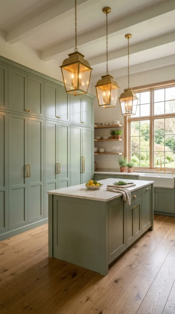
Extend cabinetry to the full ceiling height rather than stopping short and leaving an open gap above. Floor-to-ceiling cabinetry reads as intentional, built-in storage; a gap above standard-height cabinets reads as unused space that collects dust.
This works because a kitchen with tall ceilings and standard-height cabinets creates an awkward proportion — too much empty wall above, not enough storage below. Extending cabinetry the full height solves both problems simultaneously: it adds genuinely useful storage and corrects the room’s proportions so the cabinetry feels sized to the space rather than lost in it.
Professionals treat ceiling height as one of the first measurements taken in any kitchen renovation specifically because it dictates whether standard cabinet heights will look intentional or undersized — a nine- or ten-foot ceiling almost always calls for full-height cabinetry rather than a gap.
☐ Floor-to-Ceiling Cabinetry Checklist ☐ Measure your ceiling height before finalizing cabinet plans ☐ Reserve top shelves for less-frequently-used items ☐ Add a step stool or small ladder if top shelves exceed comfortable reach ☐ Match crown detailing to the room’s existing trim style ☐ Keep hardware consistent from top row to bottom row
Why the Lantern Pendants Balance a Wall This Tall
One reason the lantern-style pendant lights don’t get visually lost against a full wall of tall cabinetry is that their scale is deliberately generous — smaller pendants would have disappeared against that much cabinet surface. Matching fixture scale to the size of the wall behind it is what keeps a tall room from feeling top-heavy or under-lit.
Recommended Materials
- Floor-to-ceiling sage shaker cabinetry
- Antique brass lantern pendant lights
- White marble island top
- Solid wood open shelving
- Wide-plank wood flooring
Main Colors
- Sage Green
- Antique Brass
- Carrara White
- Warm Oak
Best Lighting
- Brass lantern pendant trio as the room’s main light source
- Large window for daytime brightness
- Warm bulbs to soften the height of the cabinetry
Maintenance
- Water small potted herbs on open shelving every two to three days
- Dust upper cabinet surfaces every few months, since they’re used less frequently
- Wipe brass lantern fixtures monthly to maintain their finish
What Trips People Up Copying This Room
- Stopping cabinetry short of the ceiling, leaving a dust-collecting gap
- Choosing pendant lights too small in scale for a full-height cabinet wall
- Skipping a step stool, making top cabinets purely decorative rather than usable
- Mismatching crown molding detail between the cabinetry and the room’s existing trim
Full-height cabinetry corrects a tall room’s proportions and adds real storage at the same time. Measure your own ceiling height this week before deciding how far your next cabinet run should go.
Let the Kitchen’s Color Spill Into the Living Room
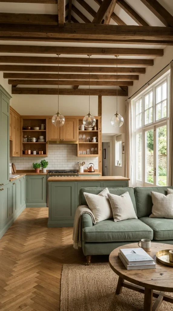
Carry the sage green from your cabinetry into the adjoining living space through a sofa, an accent chair, or a single piece of upholstery, rather than stopping the color hard at the kitchen’s edge. In an open-concept layout, color continuity is what makes two rooms feel like one considered space instead of two separately decorated zones.
This works because open-concept rooms share sightlines constantly — you can see the living room from the kitchen and the kitchen from the living room — so any hard color break between them becomes obvious the moment you’re standing in either space. Repeating the cabinet’s sage tone in a sofa or chair on the other side of the room closes that gap and makes the transition feel deliberate rather than accidental.
Professionals treat open-concept kitchens and living rooms as one design zone from the start, choosing the kitchen’s cabinet color first and then selecting upholstery, rugs, or drapery in the adjoining space to echo it — usually in a softer, more muted version of the same green rather than an exact match.
⚠️ Warning Matching the exact same sage green in both the cabinetry and a large upholstered piece like a sofa can occasionally read as too matchy if nothing else varies. Choose a slightly different tone, texture, or fabric finish for the upholstery so the color feels echoed rather than duplicated.
Why the Wood Beams Also Do Continuity Work
One reason this open floor plan doesn’t feel like two competing rooms is that the exposed wood beams run uninterrupted from the kitchen ceiling into the living space, giving both areas a shared architectural line in addition to the shared color. Color repetition alone can feel superficial without a second, structural element reinforcing it — the beams are doing quiet work that the green alone couldn’t manage.
Recommended Materials
- Two-tone cabinetry (painted sage lower, natural wood upper)
- Exposed wood ceiling beams
- Copper hood and accents
- Linen sofa upholstery
- Herringbone wood flooring
Main Colors
- Sage Green
- Natural Oak
- Copper
- Cream Linen
- Warm Charcoal (beams)
Best Lighting
- Glass globe pendant trio over the kitchen island
- Floor-to-ceiling windows for daylight across both spaces
- Warm bulbs throughout to unify the two rooms
Maintenance
- Water small counter and shelf plants every two to three days
- Dust exposed wood beams every few months
- Spot-clean linen upholstery as needed to keep the sofa looking fresh
Where This Look Falls Apart
- Stopping the sage color hard at the kitchen’s edge with nothing echoing it beyond
- Choosing an exact-match fabric that makes the upholstery feel duplicated rather than complementary
- Using a completely different wood tone in the living room furniture than the kitchen’s cabinetry
- Ignoring the ceiling line, missing a second easy opportunity for visual continuity
In an open floor plan, color should travel between rooms, not stop at a doorway. Look at your own open-concept space and identify one piece of furniture that could echo your kitchen’s color.
Choose Stools With Turned Legs Over Plain Metal Ones
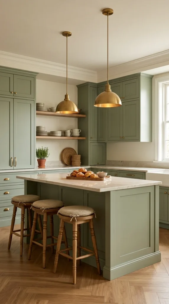
Select counter stools with turned wood legs and tied cushion seats instead of straight metal or acrylic bases, especially in a kitchen already built around soft, farmhouse materials. Furniture-style detailing on a small piece like a stool does more for a room’s character than its size would suggest.
This works because turned wood legs carry the same handcrafted, slightly imperfect quality that defines farmhouse style elsewhere in the room — the same logic that makes a live-edge table or a hand-thrown pottery piece feel right at home. A sleek metal stool base, by contrast, introduces an industrial note that can undercut an otherwise soft, collected kitchen even if every other material is correct.
Professionals treat seating as one of the last decisions in a kitchen specifically because it’s one of the easiest to get wrong — a beautiful cabinetry and lighting scheme can be undermined by stools that read as an entirely different style pulled in at the last minute.
Recommended Materials
- Turned solid wood stool legs
- Woven tie-on seat cushions
- White marble island top
- Antique brass dome pendants
- Sage shaker cabinetry to the ceiling
Main Colors
- Sage Green
- Antique Brass
- Carrara White
- Warm Oak
- Oatmeal (cushion fabric)
Best Lighting
- Paired brass dome pendants over the island
- Natural window light for daytime brightness
- Warm bulbs to complement the wood stool legs
Getting This Detail Right at Home
Before choosing counter stools, look at every other piece of furniture and hardware already in the room and ask whether it has soft, rounded, or hand-finished detailing — if it does, match that quality in the stools rather than introducing a harder, more industrial shape. Turned legs, woven seats, and tied cushions are all small signals that reinforce a farmhouse kitchen’s overall handmade feel.
Maintenance
- Water any small potted plants on open shelving every two to three days
- Spot-clean woven seat cushions as needed with a damp cloth
- Wipe wood stool legs occasionally with a dry cloth to prevent dust buildup in the turned details
Where This Detail Falls Apart
- Choosing sleek metal or acrylic stool bases that clash with a farmhouse kitchen’s softer materials
- Selecting a cushion fabric or color that doesn’t relate to anything else in the room’s palette
- Picking stools too tall or short for the island’s counter height, creating an awkward seating gap
- Overlooking the legs entirely and choosing stools based on seat comfort alone
Small furniture details carry as much style weight as the big decisions like cabinetry and lighting. Look at your current stools with fresh eyes and ask whether their legs match the rest of your kitchen’s character.
Cooking Workflow Tips
- Keep the stove-to-sink-to-refrigerator triangle clear of tall decor like potted plants or baskets that could interrupt daily movement
- Store frequently used cookware and utensils within reach of the stove, even if it means keeping one open shelf slightly less styled than the rest
- Position herb pots near — but not directly above — the stove, since rising heat can dry soil out faster than expected
- Choose a range hood with real ventilation power, not just visual appeal, especially in a kitchen that will see regular home cooking
Who Should Choose This Style?
- Best for homeowners with existing wood floors or wood architectural details to build the warm side of the palette around
- Best for anyone who cooks regularly and wants a kitchen that feels both functional and collected, not sterile
- Best for readers comfortable committing to one metal finish and repeating it, rather than mixing several
- Not ideal for very small kitchens with limited natural light, where deeper sage tones can read as heavy rather than cozy
- Not ideal for anyone planning to resell soon in a market that favors neutral, all-white kitchens
Budget Summary
| Budget | Expectation |
|---|---|
| Low | Painted existing cabinets, brass cabinet hardware swap, potted herbs, jute rug |
| Medium | New shaker cabinetry, butcher block counters, brass pendant lighting |
| Premium | Custom floor-to-ceiling cabinetry, marble island top, copper range hood and fixtures |
A quick honesty note: results will always vary depending on your kitchen’s existing layout, your budget, and your own taste — for anything structural or costly, like moving plumbing, extending cabinetry to the ceiling, or installing a range hood, it’s worth pairing your own ideas with a contractor or designer’s eye before committing.
FAQ
What color hardware goes best with sage green cabinets?
Warm metals — antique brass or copper — tend to work best with sage green because both share a slightly warm undertone. Cooler finishes like chrome or brushed nickel can work in a more modern take on the style, but they read less farmhouse and more contemporary.
Do sage green cabinets go with wood or white countertops?
Both, depending on the balance you want. A wood countertop leans the kitchen warmer and more rustic; a white or marble countertop leans it brighter and slightly more polished. Many of the most successful sage kitchens use a mix of both across different surfaces rather than choosing just one.
Will sage green cabinets go out of style?
Sage green has stayed in steady rotation as a muted, earthy neutral rather than a saturated trend color, which gives it more staying power than brighter greens. Pairing it with timeless materials like wood, brass, and marble — rather than trend-driven tile or hardware — helps the whole kitchen age well.
How do I make a small kitchen with sage cabinets feel bright, not heavy?
Prioritize a lighter shade of sage over a deep, saturated one, maximize natural light with sheer or minimal window treatments, and balance the green with plenty of white or cream on the counters, walls, and backsplash.
What lighting works best in a sage green farmhouse kitchen?
Layered lighting works best — a grouped pendant fixture over the island, under-cabinet task lighting for prep areas, and as much natural window light as the room allows. Avoid relying on a single central overhead fixture, which tends to flatten the room’s warmth.
If you’re planning a full kitchen renovation and the decisions feel overwhelming, that’s completely normal — tackle one material or fixture decision at a time rather than trying to finalize the whole room at once.
Aria writes about approachable, real-budget home design for Aesthetic Lifes. She focuses on breaking down design trends into steps homeowners can actually execute room by room, without needing a full renovation budget.
Related Guides
- 10 Pink Kitchen Ideas That Feel Bold, Not Overdone — for comparing how a different bold cabinet color handles the same material pairings
- 10 Scandinavian Kitchens That Show What Minimalism Really Looks Like — a cooler, more pared-back take on kitchen material choices
- Retro Never Left: 10 Vintage 1950s Kitchen Ideas — if you’re drawn to more nostalgic, character-driven kitchen styling
- What Makes a Pantry Actually Functional? 10 Examples — for extending this kitchen’s storage logic into an adjoining pantry
- Small Space, Big Coffee Bar: 10 Design Ideas That Fit — a smaller-scale project using the same warm materials
Conclusion
Design Blueprint: the kitchen you now know how to build pairs sage green cabinetry with one consistent warm metal finish, a mix of warm wood and cool stone surfaces, and layered lighting that reinforces the room’s farmhouse character instead of flattening it.
Quick Recap: across these ten kitchens, the decisions that mattered most were grouping light fixtures instead of spacing them evenly, committing to a single repeated metal finish, balancing warm and cool materials deliberately, and letting real, living details — herbs, mirrored layouts, furniture-style stools — carry as much weight as the paint color itself.
Reader Checklist
☐ Choose one metal finish and repeat it across every fixture and piece of hardware ☐ Balance warm wood surfaces with one cooler stone element, roughly two-thirds to one-third ☐ Add a working herb garden somewhere with strong, consistent natural light ☐ Group pendant lighting rather than spacing it evenly across an island ☐ Extend your color or material choices into any adjoining open-concept space
Next Steps: start with your metal finish decision before anything else — it’s the hardest and most expensive choice to reverse once fixtures are installed.
Explore More
You may also enjoy:
- 10 Laundry Room Ideas
- Stylish Shoe Racks That Double as Entryway Decor
- 10 Rug Styles That Make Any Bedroom Feel Cozier
Tags: sage green kitchen cabinets, farmhouse kitchen ideas, brass kitchen lighting, copper range hood, marble kitchen island, butcher block countertop, cottage kitchen decor, open concept kitchen, farmhouse cabinet hardware, cozy kitchen design


One Response