
You’ve moved the sofa twice, bought a plant that’s already tired, and the room still doesn’t feel finished. That’s usually not a furniture problem — it’s a connection problem, between the room and whatever daylight or greenery is sitting just outside the window, unused.
Designers call this biophilic design: pulling natural light, organic materials, and living plants back into rooms that quietly lost them over the years. It isn’t about gutting an apartment. Sometimes it’s one jute rug, one shelf in raw wood, or simply not blocking a window with a bookcase. These nine living rooms show how that plays out in real spaces, upkeep included.
Quick Overview
| Style | Biophilic |
| Best For | Renters, homeowners, plant lovers |
| Budget | Low to high, scales easily |
| Difficulty | Easy to intermediate |
| Maintenance Level | Depends on how much greenery you add |
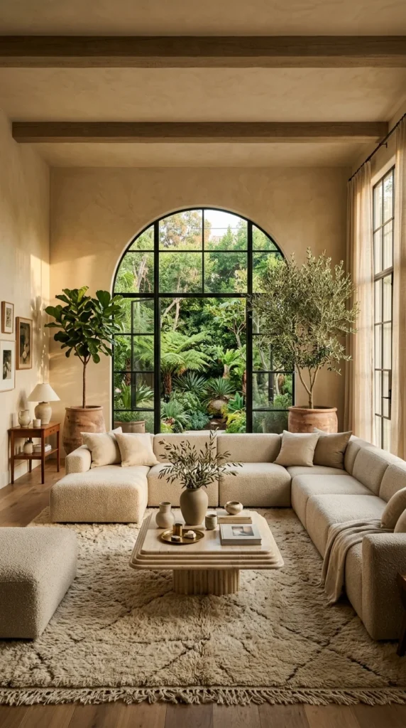
1. Letting the Arch Outrank the Sofa
The arched window does more visual work here than the sectional in front of it, which is really the decision this room settles: does architecture lead, or furniture? The fiddle-leaf fig and areca palm are placed so they read as part of the window’s shape, filling in where its curve would otherwise leave empty air.
This suits anyone with one strong architectural feature — an arch, a bay window, a fireplace — and not much interest in styling everything else around it. It needs very little added decor to feel resolved, but it depends entirely on that one feature; take it away and the same furniture reads as unfinished instead of intentional. To recreate it, pick furniture that echoes the window’s shape. The boucle sectional’s curve repeats the arch above it, and a round live-edge coffee table grounds the soft layout. On a tighter budget, one curved chair and two well-placed plants do the same job.
Materials: boucle, live-edge wood, sheer linen, rattan planters, natural-fiber rug · Colors: warm cream, soft sage, natural oak · Lighting: let the arch’s own daylight lead; add one warm floor lamp for evenings
Where This One Trips People Up
- A boxy, straight-armed sofa that fights the arch instead of echoing it
- Plants placed off to one side instead of framing the window evenly
- Skipping coasters on live-edge wood, which shows water rings within weeks
- Overfilling the room with small decor that competes with the architecture
2. Treating the Garden as the Room’s Real Artwork
Easy to miss at first: the height order of the two potted trees, tallest by the window, shortest near the seating, like a small staircase for the eye. That’s the real question here — should a garden view sit in the background, or get treated as the room’s actual artwork? The terracotta olive tree and fiddle-leaf fig step down toward the sofa, and the black-framed arch treats the garden outside as more deliberate than anything hung on a wall.
This needs a real view — a garden, mature trees, even a tidy neighboring yard. The reward is a room that feels expensive without much spent on decor. The tradeoff is the deep plaster texture, beautiful in shifting light but quicker to show scuffs than flat paint. On a smaller budget, two plants of different heights on either side of one window rebuild the same stepped framing — height difference matters more than which plants you pick.
Materials: warm plaster, exposed timber, travertine, boucle · Colors: terracotta, sandy beige, deep olive · Maintenance: both trees need a steady watering routine and occasional rotation toward the light; dust textured plaster rather than scrubbing it, or the texture flattens
A Small Risk That Pays Off Here
Bordering a real window with a dark, heavy frame is a gamble — done wrong, it shrinks the opening. It works here because the frame is thin relative to the glass, so it reads as a picture frame rather than a barrier. A thicker frame in the same spot would likely close in a view meant to feel open.
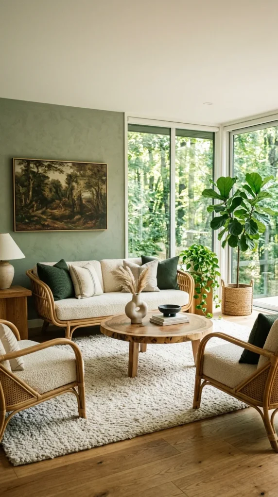
3. Choosing a Wall Color the View Already Picked
We’d probably have gone with white here, which is exactly why the choice made works better than the safe one would have. The sage-green accent is pulled straight from the forest visible through the corner windows, so the wall reads less like a paint decision and more like an extension of what’s outside. That’s the question this section answers: pick a wall color in isolation, or let the view pick it for you.
This suits rooms with a genuinely green outlook more than city-facing units. For a deeper look at how far to push a color pulled from a window view, see the sage green living room principles. It fits homeowners comfortable committing to a wall color — renters may prefer something removable. The advantage is a color story that never feels arbitrary. The compromise is that it depends almost entirely on natural light; the same green on a north-facing wall with no real greenery outside reads flat instead of alive. A single framed piece of art in a matching tone carries the same link without repainting a whole wall.
Materials: matte plaster paint, framed canvas, ceramic planters · Colors: sage green, forest shadow, warm white · Lighting: this room leans on daylight from the corner windows; place the statement plant at the brightest corner, since it needs the light more than a decorative spot
Where This Look Falls Apart
- A bold, saturated paint that competes with the view instead of extending it
- An accent color with no real relationship to what’s outside the window
- Art in a neutral frame instead of one that echoes the wall’s undertone
- Placing the statement plant somewhere decorative rather than somewhere genuinely bright
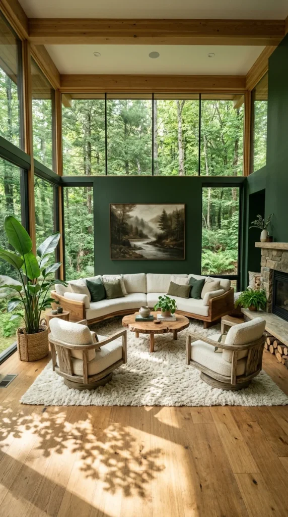
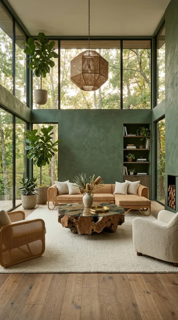
4. When the Wall Is Mostly Window
The tradeoff in a room this glass-heavy shows up in the afternoon, not the morning. Floor-to-ceiling windows on two walls turn the surrounding trees into the room’s real backdrop, and the forest-green wall continues that view rather than competing with it. The honest question: how much of a “wall” should actually be window, and can the room handle the glare that comes with the answer?
This setup needs genuine tree cover or a private outlook — without it, that much glass exposes rather than frames. The advantage is a space that feels far larger than its square footage. The compromise is specific: anyone in the swivel chairs closest to the glass should expect glare once the sun shifts.
Worth the Investment?
Full-height glass isn’t cheap and isn’t reversible the way paint is — the one call here worth thinking twice about. It earns its keep with real tree cover and a view worth having every season. It earns nothing facing a parking lot or a fence eight feet away. If the view is genuinely there, this is one of the few upgrades that lives up to its own photo. If not, one dark accent wall paired with a single nature-toned painting gets most of the feeling for a fraction of the cost.
Materials: warm oak flooring, exposed timber, boucle, shag wool · Colors: forest green, warm oak, cream · Lighting: natural light dominates through both glass walls; add sheer or solar shades near the swivel chairs specifically
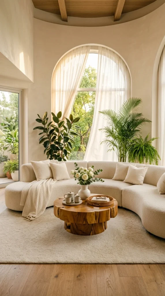
5. Letting Plants Carry the Only Color in the Room
Billowing sheer curtains soften direct sun into something diffused, while the rubber plant and areca palm still read clearly against the glass. The decision here is restraint: how much color to add once the plants are already doing the visual work. The seating area commits to one narrow tonal range — cream boucle, pale wood floor, ivory rug — which leaves the greenery by the window as the only real color statement in the room.
This suits minimalists more than busy family spaces, where mess shows fast on pale upholstery. The advantage is that it’s close to foolproof — a neutral palette rarely clashes with itself. The compromise: everything depends on the plants staying full; a sparse plant here has nowhere to hide. The rubber plant and areca palm reach partway up the arch’s curve without blocking it — a few inches shorter and the window loses its anchor entirely.
Materials: boucle, pale oak flooring, wool rug, sheer linen · Colors: ivory, cream, pale oak, deep green from the plants alone · Lighting: sheer curtains cut strong sun into soft, even light, which keeps a rubber plant’s leaves from scorching
Easy Ways to Get This Look Wrong
- Letting plants thin out without pruning or replacing them, since there’s no other color to fall back on
- Undersizing plants relative to the window, leaving the arch’s curve without an anchor
- Adding a second bold color elsewhere, which competes with the greenery instead of framing it
- Skipping fabric protection on pale upholstery in a household with kids or pets
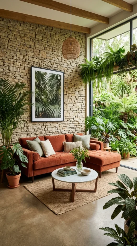
6. Treating Upkeep as Part of the Design, Not an Afterthought
This much live foliage comes with real, ongoing upkeep — watering schedules, humidity needs, occasional pruning — worth knowing before falling for the photo alone. The stacked stone wall does the actual textural work, rough and warm-toned, grounding the room before a single plant gets added. The honest question: are you willing to treat plant care as part of the design plan, or is it an afterthought you’ll resent later?
This suits people who already enjoy plant care as a hobby — the maintenance load here runs genuinely higher than most rooms in this guide. The advantage is real depth that photographs differently as plants grow. The compromise is the maintenance itself, plus a real risk of the room feeling crowded. Concrete flooring and a plain white marble coffee table act as visual rest stops between the green zones, which is what keeps this much foliage from tipping into clutter.
Materials: stacked stone, burnt-orange velvet, white marble, rattan pendant lighting · Colors: burnt orange, warm stone, concrete grey · Maintenance: expect a real watering rotation, humidity monitoring for tropical varieties, and periodic pruning — budget time for this the way you’d budget money for furniture
What Trips People Up Recreating This
- Letting humidity-loving plants dry out near strong, direct afternoon sun
- Underestimating the ongoing time commitment before adding this much live greenery
- Skipping neutral “rest stop” surfaces, which turns layered planting into clutter
- Choosing glossy or patterned flooring instead of a plain surface that absorbs the visual noise
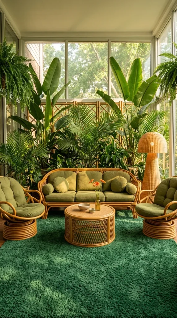
7. Going All In on Green Instead of Borrowing It Carefully
This is more green than most people would choose for their own living room, and that’s the point. Where the sage-green wall earlier in this guide borrows its color carefully, this space goes maximalist: an emerald shag rug and a dense wall of banana leaf and monstera foliage lean into color instead of restraint. The decision here is commitment — go all in on one dominant tone, or keep mixing neutrals with occasional green accents.
None of this survives without the vaulted ceiling’s skylights and floor-to-ceiling windows flooding the room from multiple angles; this density of planting needs real, consistent daylight, not just good styling. The advantage is visual drama a careful palette can’t match. The compromise is scale-dependent — the oversized banana leaf plant on the left only works because the ceiling height matches it; in a standard eight-foot room, the same plant would overwhelm the space. Readers drawn to this fuller direction generally will find the same commit-don’t-borrow logic in the maximalist living room approach, applied beyond just plants.
Materials: rattan furniture, emerald wool shag, banana leaf and monstera foliage, warm brass · Colors: emerald green, olive, warm gold · Maintenance: high — large tropical plants at this density need frequent watering, humidity awareness, and regular pruning
Easy Ways to Get This Look Wrong
- Ignoring the ongoing maintenance load a room this green actually requires
- Attempting this density of planting without matching skylights or glass
- Undersizing the statement plant relative to ceiling height, which reads as cramped
- Skipping a warm interruption color, which leaves the palette one-note
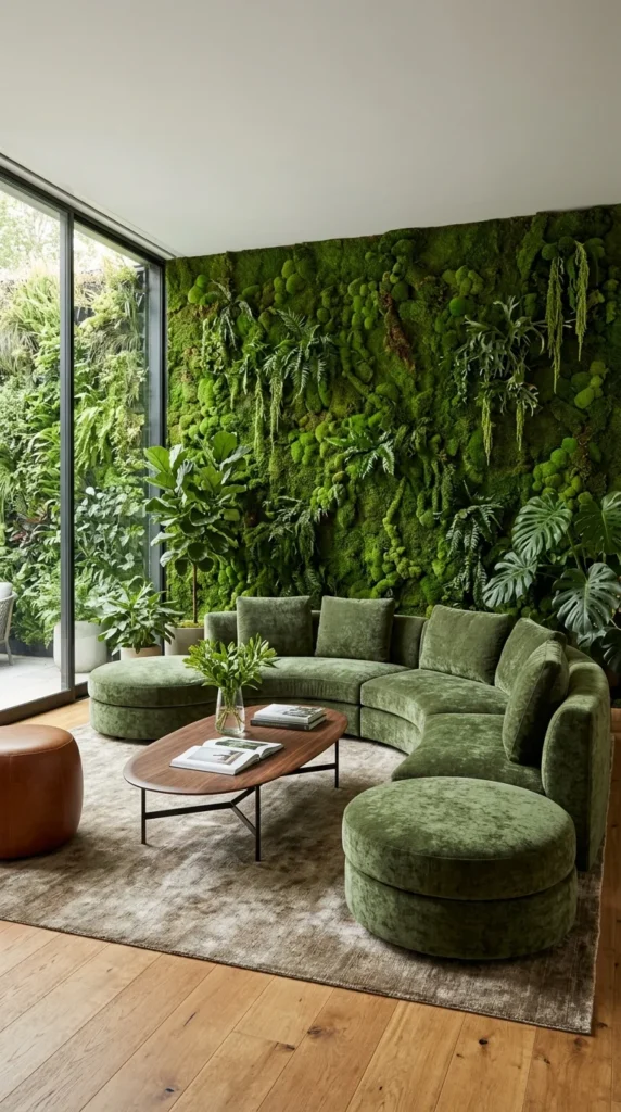
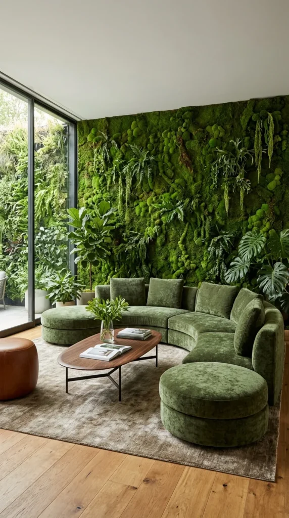
8. Letting a Sofa Disappear Into the Wall Behind It
Easy to miss on a first look: how closely the sofa’s color was matched to the wall behind it. The moss-green velvet blurs into the living moss wall so precisely that furniture and architecture start reading as one continuous surface. The decision here is whether furniture should stand apart from a bold wall treatment or vanish into it — this room chooses to vanish, on purpose.
Because the sofa and wall share nearly the same tone, the eye doesn’t stop at the furniture’s edge the way it would in a higher-contrast room — it keeps moving to the glass door and the garden beyond, which is what keeps a dense, saturated wall feeling spacious instead of heavy. This suits restrained decorators more than anyone drawn to contrast, and it needs a genuine sightline to the outdoors to work at all. The advantage is a room that feels expansive despite a dense wall treatment. The compromise is upkeep — a living moss wall at this scale needs humidity control and real, ongoing maintenance, not a weekend install.
Materials: preserved or living moss, moss-green velvet, raw walnut, leather · Colors: moss green, cognac brown, warm walnut · Maintenance: periodic misting or professional upkeep depending on the moss type, a genuine ongoing commitment
Where This Look Falls Apart
- Underestimating moss wall maintenance as a one-time install rather than an ongoing job
- Matching sofa and wall tone without also securing a real sightline outdoors
- Choosing preserved moss without checking its humidity needs against your climate
- Adding a patterned or high-contrast sofa, which breaks the tonal blur the room depends on
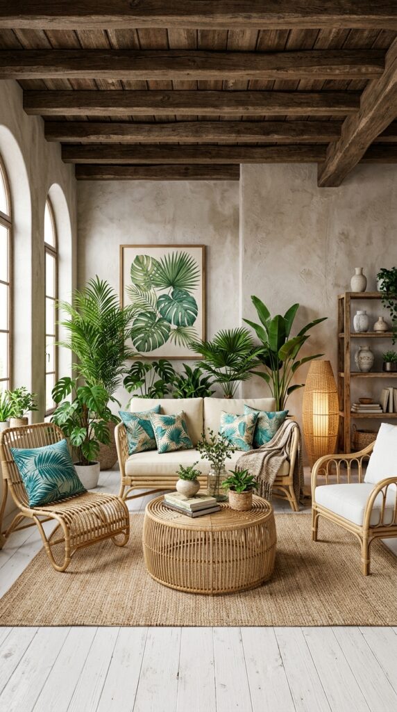
9. Using One Repeated Print to Unify Furniture That Doesn’t Match
Easy to miss at first: how much work the teal palm-leaf pillows are quietly doing. Repeated across nearly every seat, they’re the one thread tying otherwise mismatched furniture into a single arrangement. This last room answers a common, practical question — what to do when your furniture doesn’t match and you’re not ready to replace it all at once.
This suits anyone furnishing gradually, mixing hand-me-downs with newer pieces, or renting and unable to commit to a full set. The advantage: one of the cheapest, lowest-commitment ways to make a room feel intentional. The compromise is that it only masks mismatched furniture — it doesn’t fix clashing wood tones underneath. Dark, heavy ceiling beams could overwhelm a room this size, but the whitewashed floor acts as a counterweight. If this layered, lived-in mix appeals to you, boho jungle living rooms build on the same relaxed logic.
Materials: rattan seating, jute or sisal rug, whitewashed wood flooring, botanical-print cotton · Colors: teal, whitewash, warm stucco · Maintenance: rattan holds up well over years of normal use but can dry out and crack in very low-humidity climates, so occasional conditioning oil is worth budgeting for
Where This Look Falls Apart
- Pillows or throws in slightly different shades instead of one truly consistent accent
- Pairing heavy dark beams with an equally dark floor, which removes the counterweight the room depends on
- Skipping humidity care for rattan in dry climates, leading to cracking over time
- Assuming the unifying textile fixes proportion problems it was never meant to solve
Arranging Furniture Around the Plants, Not the TV
- Leave a few inches of clearance between seating and any textured accent wall — plaster, stone, or moss — to prevent scuffing from daily use
- Place your tallest plant near your brightest window first, then arrange seating around it, not the other way around
- Keep walkways clear of trailing or floor-level plants; a biophilic room loses its calm fast if greenery turns into a tripping hazard
- Group plants in odd numbers of varying heights near windows instead of lining them up evenly along a wall
Who Should Choose This Style?
- Best for renters and homeowners who want a room to feel calmer without a full renovation
- Best for households near a genuine view — trees, a garden, even a tidy courtyard — since several of these ideas depend on it
- Not ideal for households unwilling to commit to a real plant-care routine, since most of the effect here relies on healthy, maintained greenery rather than styling alone
Budget Summary
| Budget | Expectation |
|---|---|
| Low | One or two floor plants, a jute or sisal rug, matching accent pillows |
| Medium | A textured accent wall, rattan furniture pieces, a live-edge coffee table |
| Premium | A stacked stone or living moss wall, custom plaster finishes, mature statement trees |
FAQ
Do I need bright light for this to work? Most rooms here lean on strong daylight, but pothos, snake plants, and ZZ plants tolerate dimmer corners while still adding to the same layered, natural feel.
What’s the cheapest way to start? One large floor plant near your brightest window, paired with a natural-fiber rug, gets you most of the way there without touching a wall or buying furniture.
Will this work in a small apartment? Yes. Two plants of different heights near one window, or matching accent pillows across mismatched chairs, recreates the idea without the larger rooms shown here.
Do I need a green thumb? Not really. Pothos, snake plants, and ZZ plants tolerate a missed watering or two, which makes the look achievable even if you’ve killed a plant before.
Conclusion
None of these nine rooms agree on how much greenery is “enough,” and that’s the real takeaway. One arched window with two well-placed plants does nearly as much emotional work as an entire moss wall — what changes is scale and budget, not the logic. What separates a livable biophilic room from a styled fantasy isn’t the plant count. It’s honesty about what that greenery costs in upkeep.
Start by noticing where the light actually falls in your own room, what texture is missing, and which single plant would do more work than five scattered around for effect. The same logic that shapes a custom sunroom works just as well in a rented studio with one window and one healthy pothos.
Aesthetic Life Team covers living room design, natural materials, and small-space styling for readers furnishing on real budgets, not showroom ones.
Explore More
You may also enjoy:


3 Responses