
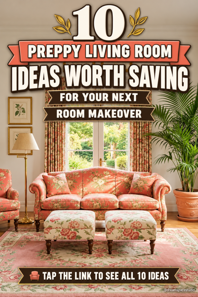
Preppy design has a reputation for being loud, but the best rooms in this style are actually built on discipline. Navy, coral, and green show up again and again because they’re a controlled palette, not a free-for-all — and the gallery walls, chintz, and brass hardware that define the look only read as “polished” when they’re arranged with real intention. If you’ve been saving preppy living rooms without knowing which direction actually fits your own space, the ten rooms below break the style into distinct, recreate-able directions, from grounded equestrian classics to bold maximalist color-blocking, so you can figure out which one is actually yours.
A Navy Sofa Anchored by an Equestrian Gallery Wall
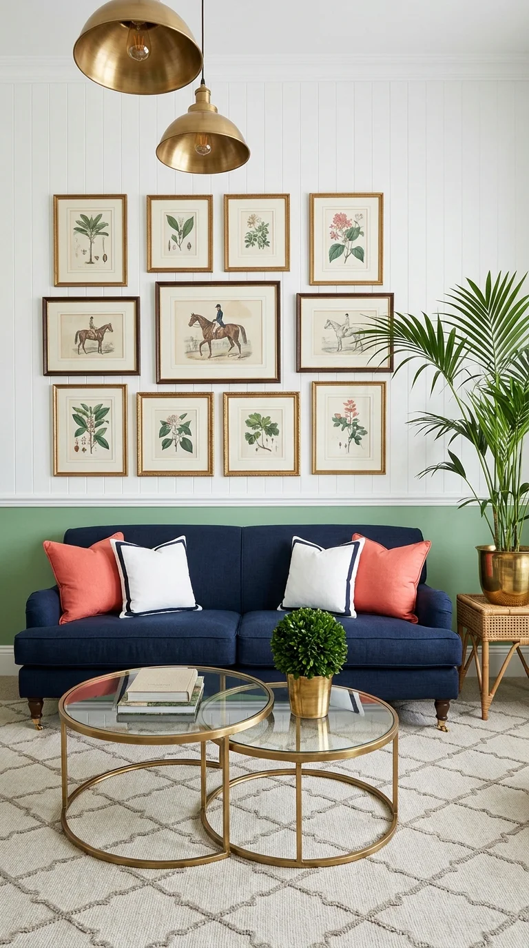
This room’s defining move is the twelve-piece gallery wall — a mix of botanical prints and equestrian sporting scenes, all in matching gold frames, hung over white board-and-batten paneling with a green lower wall. That two-tone wall does more work than it gets credit for: it gives the gallery a clean stopping point and keeps twelve separate frames from feeling scattered.
This direction suits someone who wants the “old money” version of preppy — traditional, a little formal, but still comfortable enough for daily life. It works especially well in a formal living room or a front sitting room that guests see first, rather than a casual family space. The navy linen sofa with white-piped coral and cream pillows keeps the palette from tipping too country-club, and the brass dome pendants overhead add warmth without competing with the artwork.
The advantage here is longevity — this look doesn’t chase a trend, so it won’t feel dated in five years. The real compromise is commitment: a gallery wall this dense takes real planning, and a half-finished version reads as clutter rather than curation. To recreate it on a budget, buy one large botanical print set instead of twelve individual frames, and use uniform frames from a single retailer rather than mixing finishes. Explore our full living room design ideas hub for more gallery wall layouts if this is the direction you’re leaning toward.
The most common mistake with this look is hanging the gallery wall too high, which breaks the visual connection to the sofa below it — the bottom row should sit roughly 6 to 8 inches above the sofa back, not the ceiling.
A Coastal-Preppy Living Room Built Around Block Print and Rattan
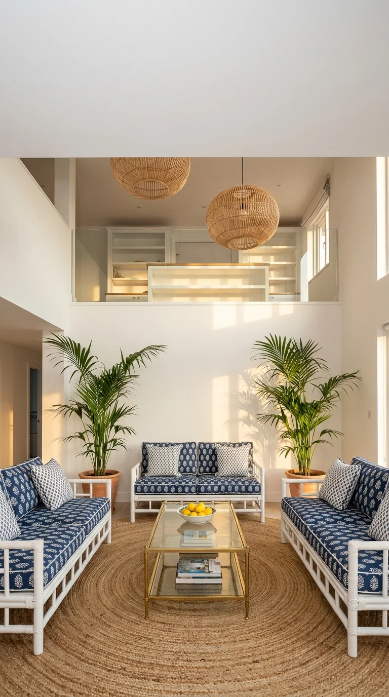
Swap the gilt frames for white rattan furniture and this becomes a completely different reading of preppy — lighter, more relaxed, closer to a beach house than a study. The navy block-print cushions do the pattern work here instead of artwork, and the double-height ceiling with woven pendant lights keeps the whole room feeling airy rather than heavy.
This is the version for anyone whose lifestyle leans casual — a family that wants the preppy color story without the formality, or a vacation home where durability matters as much as looks. It’s a strong match for sunrooms, three-season rooms, or any living room with real natural light, since the white rattan reflects it well. If your own space leans more toward lush greenery and texture than crisp navy, our boho jungle living room guide covers a related but distinct direction worth comparing against this one.
The genuine trade-off with rattan furniture is maintenance — it needs to stay out of direct damp and gets brittle if it dries out completely, so it suits a climate-controlled room better than an uninsulated porch. A smaller-budget version can keep just the sofas in rattan and swap the pendant lights for simpler woven versions, since the lighting is the most expensive element to source. The mistake to avoid is pairing rattan with a busy patterned rug — this look needs one calm, textural rug (like the jute one shown) so the block-print cushions stay the star.
A Traditional Chintz Living Room for a Softer, Vintage-Leaning Preppy
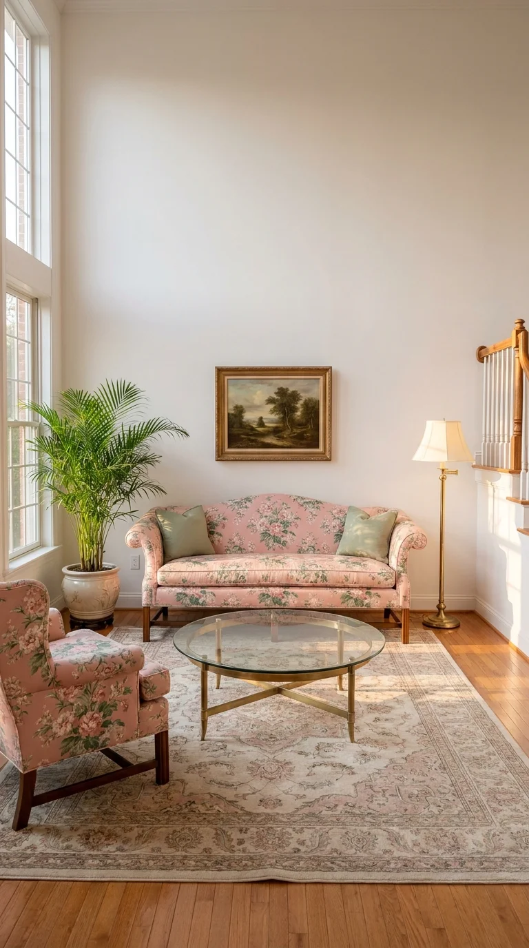
This is preppy’s most traditional, least trend-driven expression — a pink floral chintz sofa and matching wingback chair, a brass-and-glass coffee table, and an antique-style rug in soft rose and cream. The high ceilings and single landscape painting keep the busy upholstery from overwhelming the room.
This direction genuinely suits an older home with real architectural presence — high ceilings, original moldings, natural wood floors — where the furniture can hold its own against the scale of the room. It’s not the right fit for a small apartment living room, where this much pattern in a tight footprint tends to feel heavier than intended. If you’re weighing how much floral pattern your own space can handle, our guide to floral-printed furniture that still feels sophisticated is worth reading before committing to a full chintz sofa.
The advantage is genuine timelessness — chintz has cycled in and out of fashion for decades and always comes back, so it ages better than most patterned upholstery. The compromise is resale and flexibility: matching sofa-and-chair sets in a strong print are harder to reposition or reupholster individually later. A budget-friendly version keeps the neutral floor and wall treatment shown here and adds the floral pattern only through pillows and a slipcover, rather than committing to fully upholstered chintz furniture. A common misstep is adding more than one bold pattern into a room like this — the floral upholstery should be the only loud element in the space.
Mixing Gingham, Leopard, and Stripes Without It Looking Chaotic
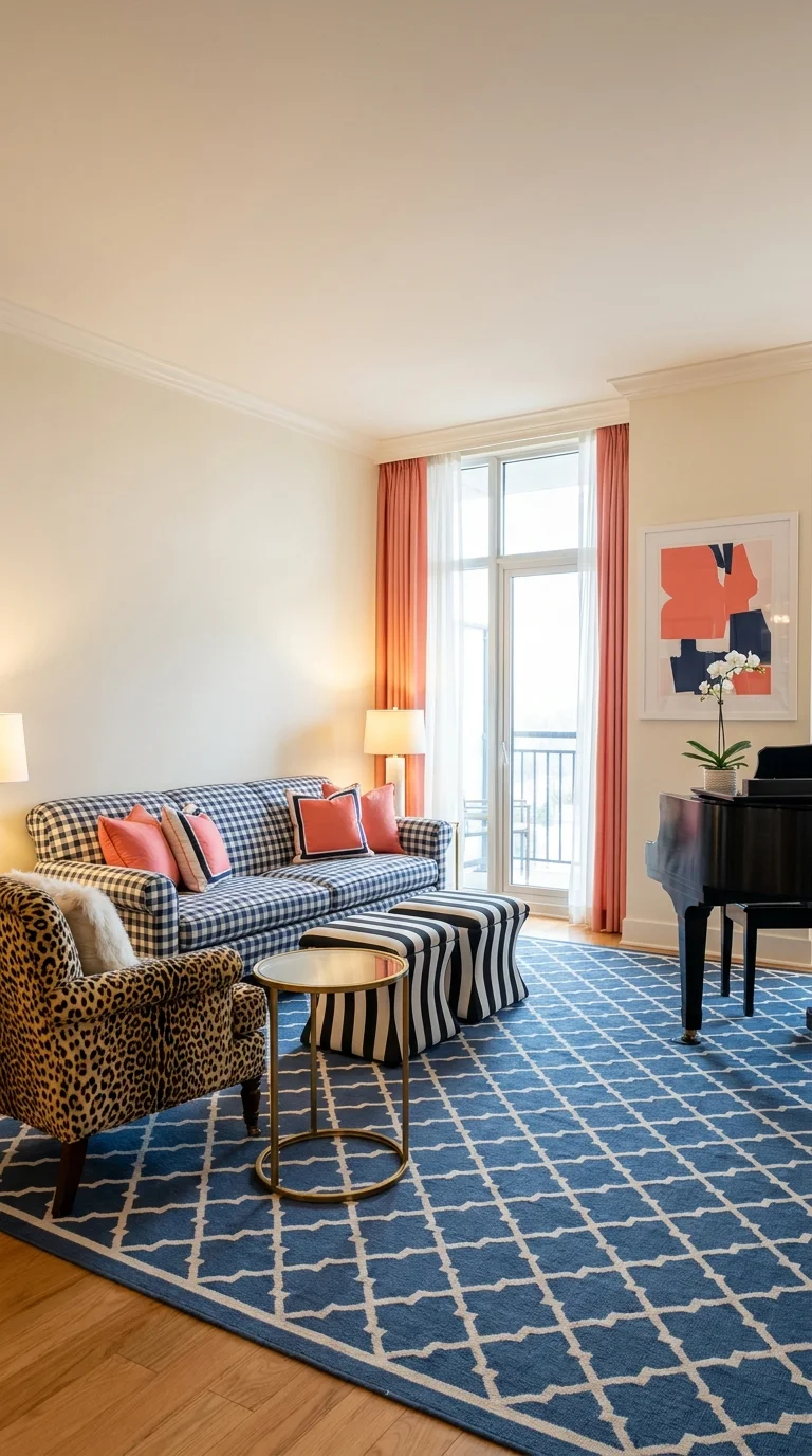
This room proves preppy can also be maximalist and pattern-heavy without losing its polish. Gingham check, leopard print, and bold stripe upholstery all sit in the same space, unified by a single repeating color story of navy, coral, and cream carried through the curtains, rug, and abstract art.
This look is for someone genuinely confident mixing pattern and unafraid of a room with personality — not a starter attempt at preppy, but an advanced one. It works best in a larger living room with enough negative space (plain walls, a simple rug border) to let three competing patterns breathe rather than compete for attention. Anyone drawn to this kind of layered, unmatched pattern mixing should read our case for maximalist living room ideas that actually work, since the same discipline that makes maximalism work applies directly here.
The strongest advantage is that this room will never feel boring or interchangeable with a neighbor’s living room. The real compromise is that mixing this many patterns leaves very little room for error — one more patterned element and the balance tips into visual noise. On a tighter budget, start with just two patterns (gingham and stripe, for example) and add the third, like leopard, only once you’re confident with the pairing. The most common mistake is matching patterns in scale — gingham, leopard, and stripe work here specifically because they’re different scales; three patterns at the same visual size read as chaotic rather than curated.
A Classic Blue-and-Coral Nantucket-Style Living Room
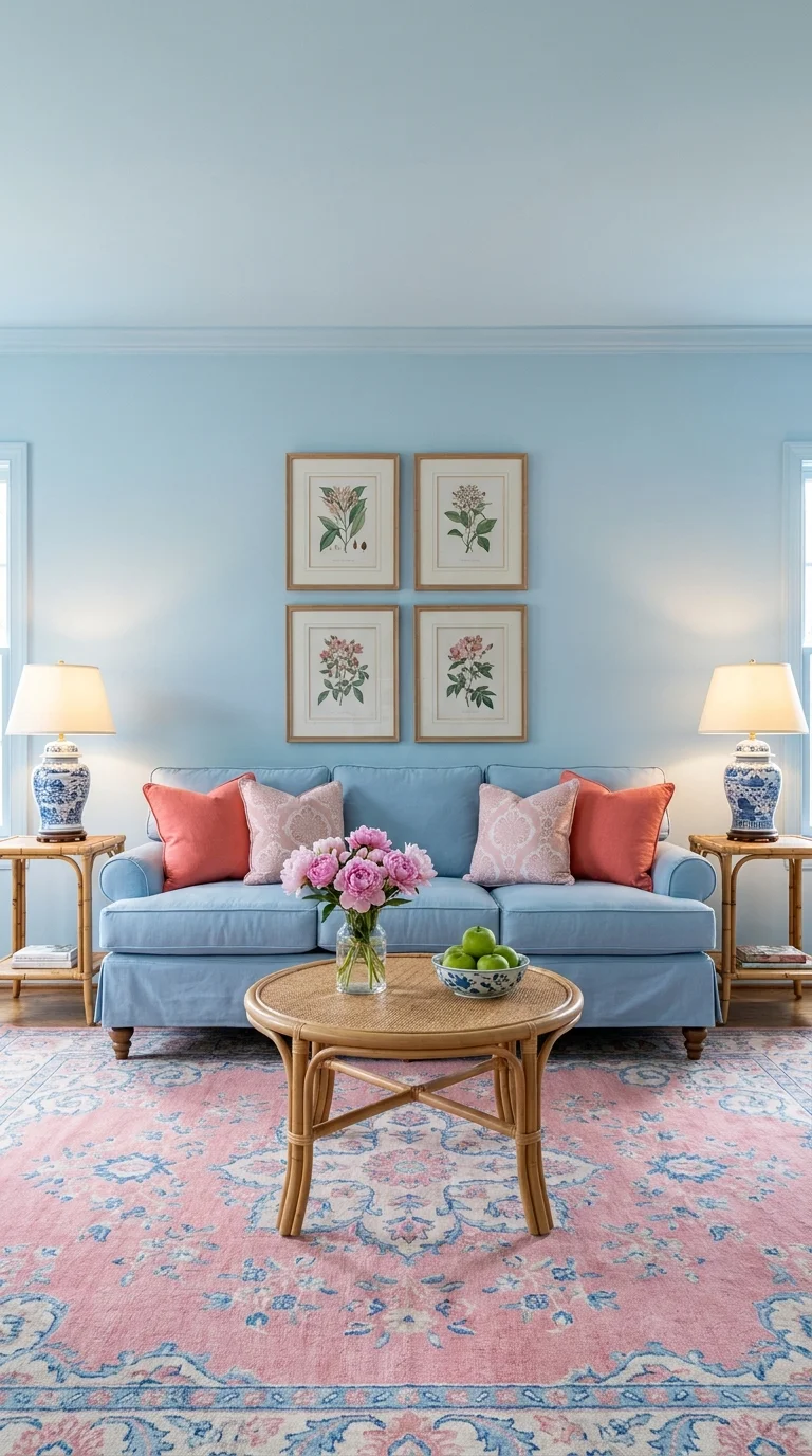
If one image defines “classic preppy,” it’s this one — a sky blue sofa, coral and blush pillows, blue-and-white ginger jar lamps, and a symmetrical set of botanical prints centered on the wall. The palette repeats in three places (walls, sofa, pillows), which is exactly why the room reads as resolved rather than randomly decorated.
This is the safest, most universally approachable version of the style — a strong choice for a first attempt at preppy or for anyone nervous about commitment, since blue and coral read as fresh rather than dated. It suits family living rooms and formal sitting rooms about equally well, which is rare for this style. The symmetry of the two matching side tables and lamps is worth studying if you’re planning your own layout, since it’s the single easiest technique for making a preppy room feel intentional rather than assembled.
The advantage is flexibility — this palette pairs easily with wood tones, brass, and rattan, so it’s forgiving to build around over time. The compromise is that the strict symmetry shown here requires a fairly formal, centered room layout; it doesn’t translate as cleanly into an irregular or open-plan space. A lower-cost version keeps the wall color and rug as the main investment and finds the ginger jar lamps secondhand, since they’re a common vintage find. The mistake worth flagging is choosing a coral that leans too orange — the coral in a room like this needs a pink undertone to stay in the same family as the blue, or the two colors fight instead of complementing each other.
A Fully Coordinated English Country Living Room
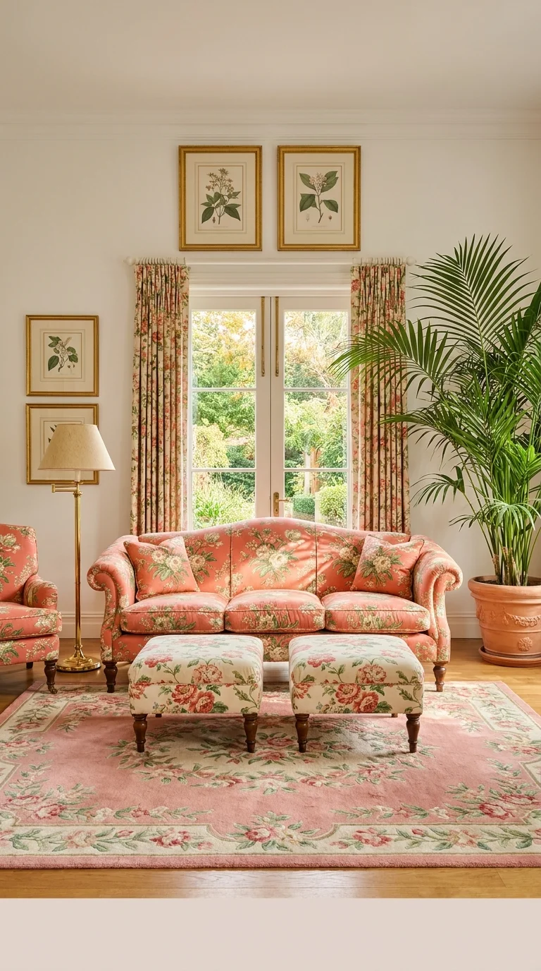
Here the same coral floral chintz covers the sofa, the ottomans, and the curtains — full coordination rather than accent pattern. It’s the most maximalist-traditional room in this set, and it works because the wall color stays neutral and the wood floor is left completely bare of any competing pattern.
This suits someone who genuinely loves English country style and wants a room that commits fully to it, rather than a lighter, more editorial take on preppy. It reads best in a room with real garden or window views, since the floral coordinates naturally with greenery outside, as shown by the French doors here. Anyone building a similarly warm, fully-committed room should also look at our country living room ideas, which cover the same cozy, layered philosophy from a slightly different angle.
The advantage of full coordination is cohesion — there’s no guesswork about whether elements match, because they’re literally the same fabric. The compromise is cost and flexibility: matching drapery, sofa, and ottoman fabric in a single print is a significant investment, and it’s difficult to update just one element later without buying new fabric for all of them. A simplified version uses the floral fabric only on the ottomans and pillows, keeping the sofa itself in a solid coral. A frequent error here is choosing curtains in a different scale of floral than the upholstery — for full coordination to actually look coordinated, the print scale needs to match, not just the color family.
A Soft Grandmillennial Library Corner in Blush and Sage
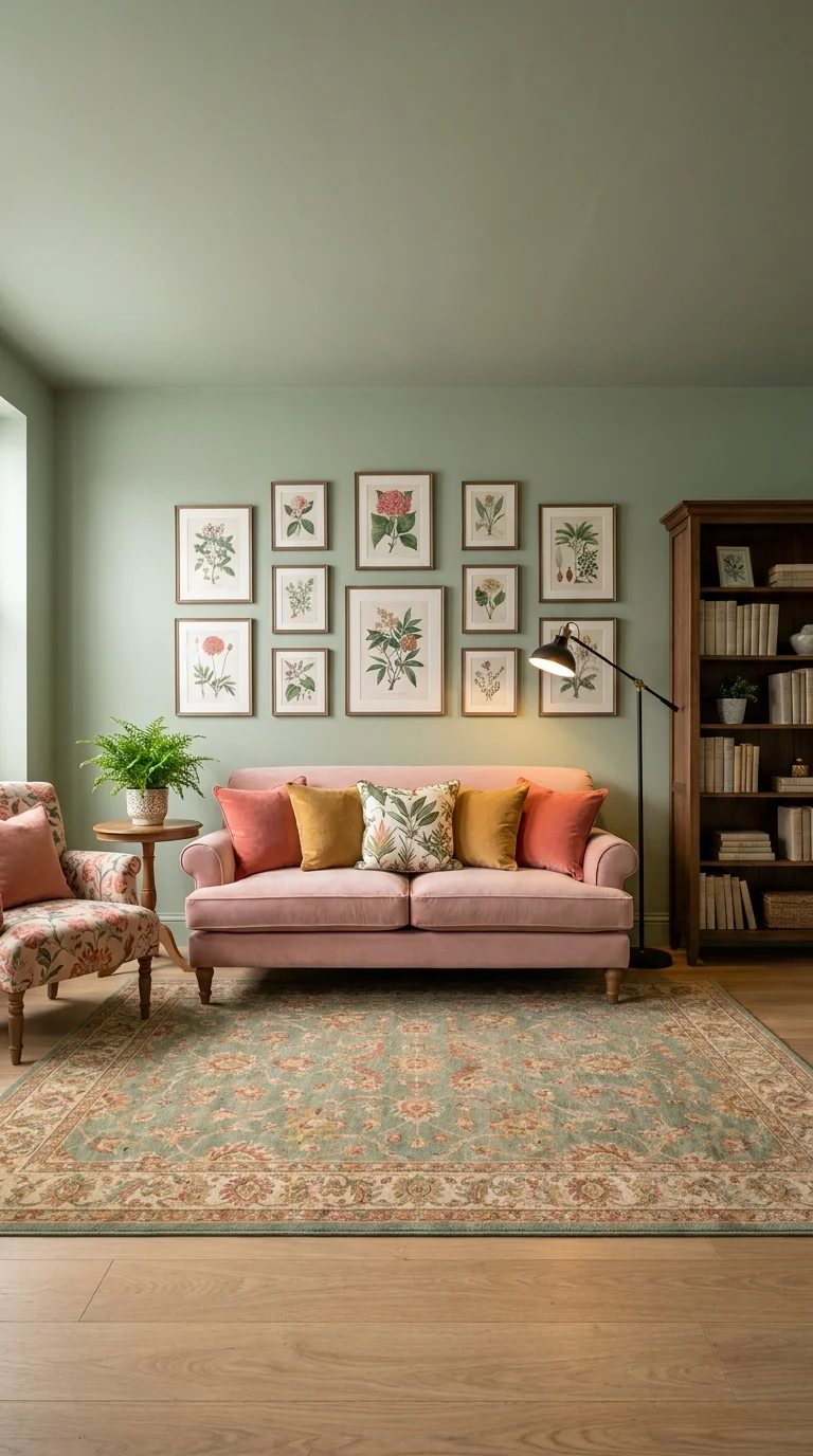
This room takes the gallery-wall idea from the first image and reworks it in a completely different palette — sage green walls, a blush pink velvet sofa, and a floral wingback chair, with an eleven-piece botanical gallery wall balanced against a wooden bookcase on the opposite side. The floor lamp positioned between them is what keeps the two halves of the room from feeling like separate zones.
This direction suits a den, library, or reading-focused living room rather than a main entertaining space — the intimate scale and bookcase both point to a room meant for one or two people at a time, not a crowd. It’s a strong match for anyone who wants preppy’s traditional bones without navy or coral, since sage and blush prove the style isn’t locked into one color story. If sage green is genuinely the direction you want to explore further, our dedicated guide on designing a sage green living room walks through the palette in far more depth than one room here can cover.
The advantage is a genuinely calming, restful atmosphere that most bolder preppy rooms don’t achieve. The compromise is scale — a gallery wall this large needs a correspondingly large, uninterrupted wall, so it doesn’t downsize well into a small den. For a smaller budget, reduce the gallery wall to six or seven prints in a tighter grid rather than the full eleven shown, and keep the bookcase as the main textural anchor instead. The most common mistake in a room like this is choosing a floor lamp that’s too tall or too bright — the warm, low lighting shown here is part of what makes the space feel like a library rather than an office.
A Bold Maximalist Preppy Room in Kelly Green and Coral
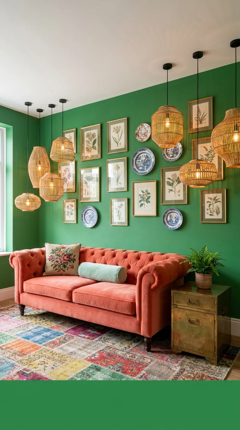
This is the boldest room in the set — kelly green walls, a tufted coral chesterfield, and a dense eclectic gallery wall that mixes botanical prints with blue-and-white chinoiserie plates, all lit by a cluster of woven rattan lanterns. The patchwork rug in the foreground pulls in nearly every color already on the wall, which is a deliberate, advanced move rather than an accident.
This room is for someone who wants preppy pushed to its most maximalist edge — genuinely bold color-blocking rather than the softer pastel versions elsewhere in this list. It suits a dedicated sitting room or den where the household has already decided the space is allowed to be dramatic, rather than a main family living room that needs to stay neutral for resale. Readers who want more rooms built on this same confident, saturated approach should look at our maximalist living room ideas roundup for further direction.
The genuine advantage is that a room this specific and personal is nearly impossible to replicate by accident, which is rare in decorating. The real compromise is resale value and longevity — a fully saturated green wall with this much pattern is a harder sell to a future buyer, and repainting later is a bigger job than swapping pillows. A toned-down version keeps the green wall but simplifies the gallery to prints only, skipping the mixed-media plates, and uses two pendant lanterns instead of five. A mistake to watch for is spacing the plates and frames unevenly — an eclectic gallery wall still needs consistent spacing between pieces, even when the frame styles themselves are intentionally mismatched.
Worth the Investment?
Between the eleven-piece gallery wall and the cluster of rattan lanterns in this room, the lanterns are the one worth spending more on. A gallery wall can be built gradually over months as you find pieces, but mismatched pendant lighting is much harder to fix later without an electrician revisiting the ceiling — buying the full lighting set at once, even at a higher upfront cost, avoids a redo that ends up costing more in the long run.
An English Cottage Living Room With a Floral Wallpaper Feature Wall
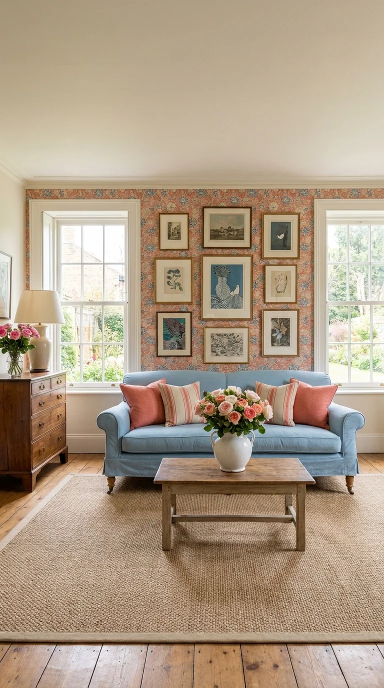
This room’s defining choice is using floral wallpaper as the gallery wall’s backdrop, rather than a solid painted wall — the nine framed pieces sit directly on the pattern instead of beside it, which is a noticeably different technique from the gallery walls elsewhere in this set. The powder blue slipcovered sofa and coral-striped pillows keep the room from reading as too busy despite the wallpaper.
This suits a cottage, farmhouse, or older home with real windows and natural light flanking the seating area, since the wallpaper and gallery both benefit from daylight rather than artificial lighting alone. It’s a good fit for someone who already loves pattern but wants a more lived-in, less formal version of the fully-coordinated English country look shown earlier in this list. The antique wooden chest and fresh flowers reinforce that this is a room meant to feel collected over time, not bought in one trip.
The advantage is genuine warmth and personality that a plain painted wall behind a gallery can’t quite match. The compromise is permanence — wallpaper is a bigger commitment than paint, both in cost and in the difficulty of changing course later if the pattern stops working for you. A lower-commitment version limits the wallpaper to a single small accent wall rather than the full width shown here, or uses a removable wallpaper option for renters. The most common mistake with wallpaper behind a gallery wall is choosing frames that are too thin or too pale — they need enough visual weight to stand out against a patterned background, not just a plain one.
A Modern-Preppy Living Room Built Around a Curved Emerald Sofa
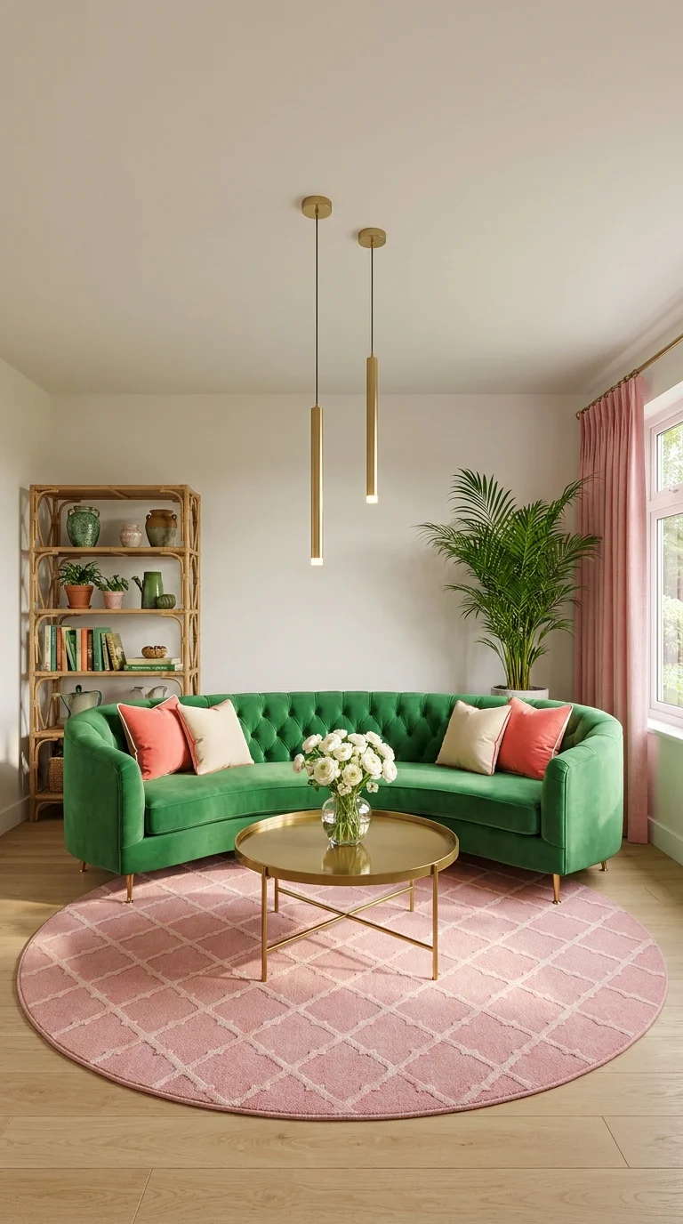
The last room in this set is the most contemporary — a curved, channel-tufted emerald green sofa paired with a round blush pink rug, slim brass pendant lights, and a rattan bookshelf. There’s no gallery wall here at all; instead, the sofa’s silhouette itself is the room’s main statement.
This direction suits someone drawn to preppy’s colors and materials but not its more traditional, symmetrical layouts — the curved furniture and round rug are a deliberately softer, more current shape language. It works well in a smaller or more awkwardly-shaped room, since a curved sofa can follow a corner or an odd angle that a straight sectional can’t. For more on how curved silhouettes are showing up across living rooms generally, our piece on the retro living room trend bringing back warm tones and curved furniture covers the shape in more depth.
The advantage is that this room updates preppy for someone who finds the traditional version too formal, without abandoning the palette entirely. The compromise is that a curved sofa this specific is a genuine investment piece — it’s harder to find secondhand or in a budget range than a standard straight sofa. A more accessible version keeps the emerald and blush color pairing but uses a standard sofa silhouette, saving the curved piece for a smaller accent chair instead. The mistake to avoid is centering a rectangular coffee table in front of a curved sofa — a round or oval table, like the one shown, follows the sofa’s line instead of fighting it.
Preppy Living Room FAQ
What colors define a preppy living room? Navy, coral or pink, and green (either sage or kelly) are the core palette, almost always paired with white or cream and warmed up with brass hardware. Most successful preppy rooms repeat the same two or three colors at least twice in the space — on the sofa, the pillows, and the artwork, for example — rather than introducing a new color for every element.
Is preppy decorating too trend-driven to still be timeless? The strongest preppy rooms lean on classic references — chintz, gallery walls, ginger jars, brass — that have cycled in and out of style for decades rather than a single current trend. A room built around these longer-standing elements, like several of the ones above, tends to age better than one built around a passing color moment.
Can I do a preppy living room on a smaller budget? Yes — the gallery wall and coordinated fabric looks in this list are the most expensive to fully recreate, but each has a simplified version: a smaller gallery instead of a dense one, pattern limited to pillows instead of full upholstery, or secondhand brass and rattan pieces instead of new ones.
How do I mix patterns in a preppy room without it looking cluttered? Vary the scale of the patterns you combine, the way the gingham-leopard-stripe room above does, and keep at least one element in the room — the walls, the floor, or the ceiling — completely plain so the eye has somewhere to rest.
Bringing It All Together
What separates these ten rooms isn’t really the color palette — most of them share navy, coral, or green in some combination. It’s how each one handles repetition and restraint: which elements get echoed across the room, and which single loud choice is allowed to stand alone. Once you can name that pattern in a room you love, you’re no longer picking a “preppy living room” off Pinterest — you’re picking the specific version of it that actually fits how you live.
Explore More
You may also enjoy:
- Grey Couch, Endless Style: 10 Living Room Looks to Try
- Top 10 Sectional Sofa Designs for Comfort, Style, and Small Spaces
- 10 Fireplace Feature Walls That Prove Less Is More
Written by the Aesthetic Life Team, covering living room design, color palettes, and practical styling advice for real homes.

