
Maximalism gets accused of being chaos with good lighting. The rooms below make the opposite argument—that enough color, pattern, and texture can coexist in one space without any of it canceling the rest out, as long as something in the room is doing the organizing. Ten living rooms, ten different ways of proving that more isn’t the risk people assume it is.
Dried Florals Stacked High Enough to Read as Crown Molding
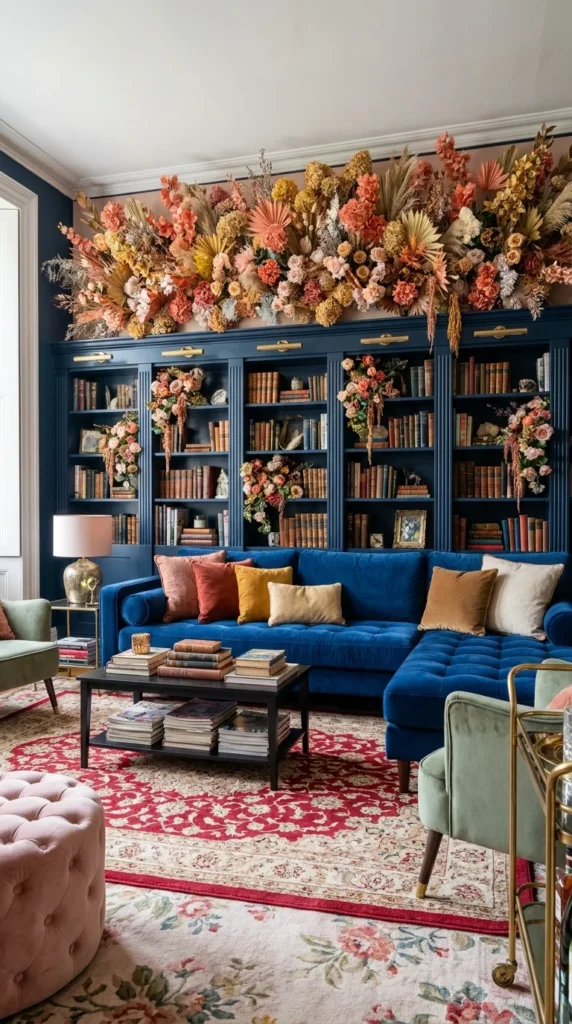
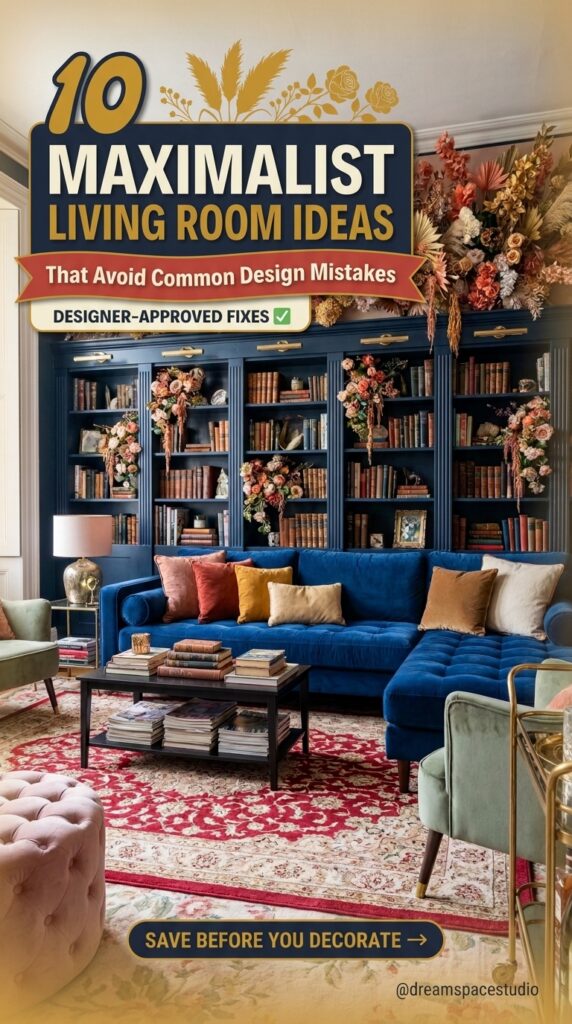
A wide band of dried and preserved florals runs across the top of a navy built-in bookcase, filling the gap between cabinetry and ceiling the way a cornice or molding usually would. The colors—rust, mustard, blush, and cream—pick up almost every tone already present in the pillows below, so the arrangement functions as connective tissue rather than a separate decorative gesture. Below it, a cobalt velvet sectional sits on a red-and-cream floral rug, with a blush ottoman and sage chairs pulling in just enough cool and muted tones to keep the warmth from tipping into overload. The scale is the real trick here: a small dried arrangement over built-ins would look like an afterthought, but one this wide and this dense earns its place as a structural element.
💡 Pro Tip: When using dried or preserved florals as a top-of-cabinet accent, treat the width of the arrangement as a design decision, not a filler task. A narrow strip reads as clutter; a band that spans the full run of cabinetry reads as intentional trim.
Sunset Mural Meets a Room Full of Competing Patterns
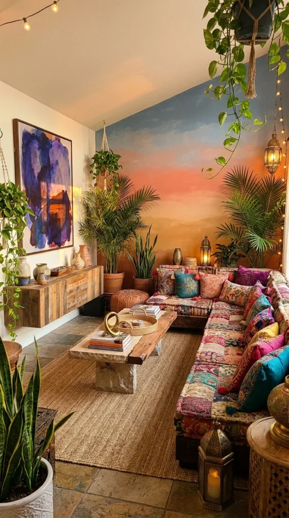
A hand-painted gradient—deep blue fading into orange and rose—covers an angled wall from floor to ceiling, doing the work most rooms leave to a single accent wall of paint. Everything in front of it argues against restraint: a patchwork sectional stitched from a dozen unrelated textiles, string lights threaded through hanging plants, brass lanterns, and a large abstract painting in cobalt and violet. What keeps the room from feeling overstuffed is the consistency of material—wood, woven textiles, and plants repeat often enough that the eye has somewhere familiar to land between the louder moments.
✅ Checklist — Layering Bohemian Maximalism Without Losing Structure
- Anchor with one large-scale painted or printed backdrop
- Repeat a single material (wood, rattan, or brass) at least three times
- Let plants fill vertical gaps instead of adding more furniture
- Keep floor coverings in one tonal family even if patterned
Pattern Density Becomes the Organizing Principle
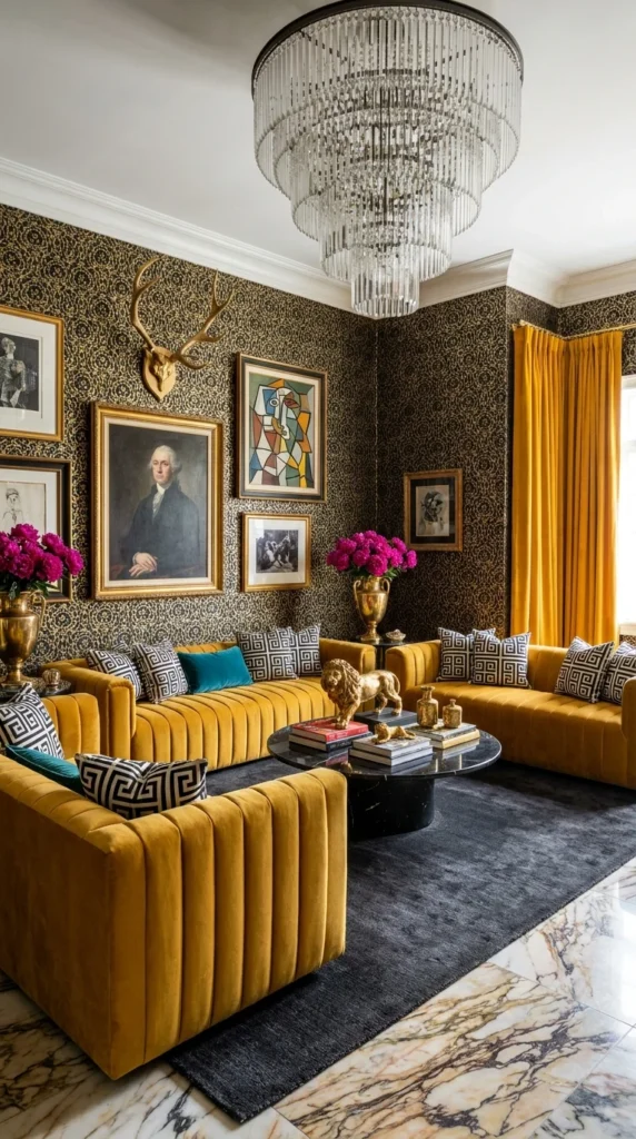
Black-and-gold leopard-print wallpaper covers every wall in this room, and rather than fighting it, the furniture and art commit fully to the same density. Mustard velvet channel-back sofas, a gold trophy vase, a mounted set of antlers, and a gallery wall mixing classical portraiture with modern abstraction all sit against the print without any single piece trying to quiet the room down. A tiered crystal chandelier adds another layer of ornamentation overhead, and the marble floor underneath introduces the only surface in the room without a repeating pattern — which is precisely what keeps the space from tipping into visual noise.
📝 Note: Rooms built on a strong wallpaper pattern tend to need at least one unpatterned, high-shine surface—marble, glass, or lacquer—to give the eye a place to rest between busier elements.
Why Does a Charcoal Room Feel Brighter Than a White One?
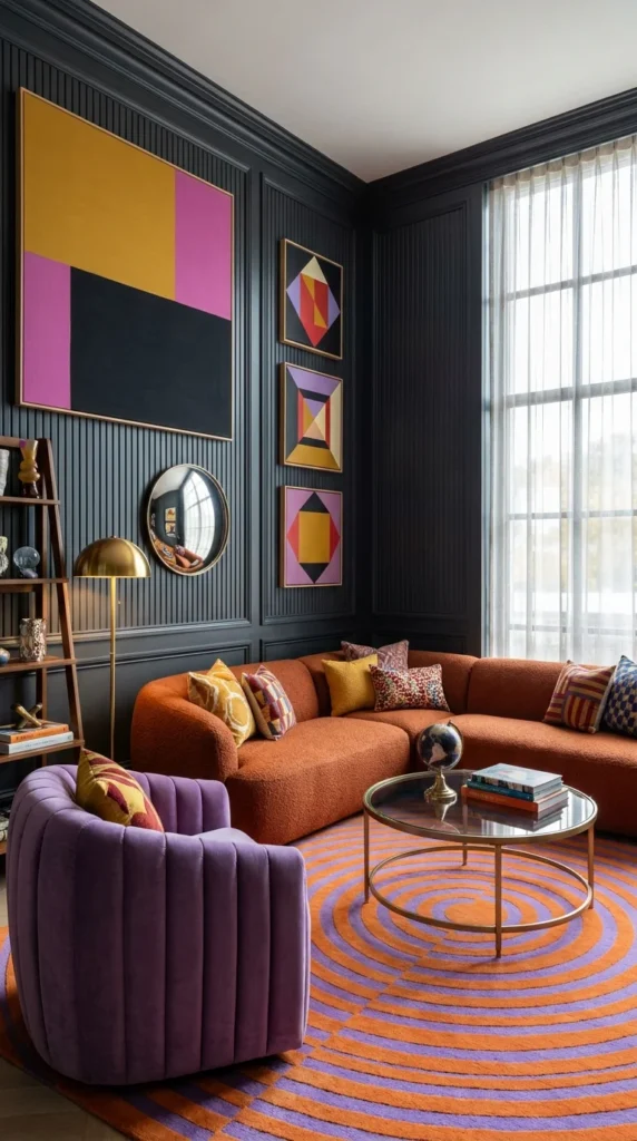
Because color, not wall shade, is what a room reads apattern—whichvy. Here, deep charcoal paneling covers the walls floor to ceiling, and it should, by most conventional logic, shrink the room and dampen the light. Instead, a rust boucle sectional, a violet velvet swivel chair, and a wall of pink-and-yellow geometric art push so much saturated color into the space that the dark backdrop starts to function like a gallery wall — a neutral field that lets the furniture and art hold all the visual weight. Sheer curtains at the tall window let enough daylight through to keep the charcoal from going flat.
📊 At-a-Glance: Color Load in This Room
- Wall color: Charcoal (neutral base)
- Accent colors: Rust, violet, mustard, pink
- Pattern sources: Geometric art, circular rug, mirror
- Metal finish: Brass, used sparingly
Gold Trim Turns Painted Walls Into Architecture
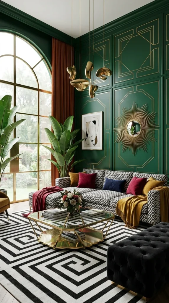
Deep emerald paint covers the walls of this room, but the paint isn’t what makes the space feel finished—the gold trim applied in interlocking geometric panels is doing that. The pattern turns flat drywall into something closer to millwork, and it’s reinforced by a sunburst mirror, a sculptural gold pendant fixture, and a brass-framed coffee table, all speaking the same metallic language. A black-and-white geometric rug and a rust velvet curtain are the only elements that don’t include gold, which keeps the room from becoming a single-note metallic showcase.
💰 Budget Box: Gold trim applied in a repeating geometric pattern can approximate the look of custom millwork at a fraction of the cost — painter’s tape, a metallic paint pen or trim paint, and a level are the only tools required, though the layout should be measured and marked before any paint goes on the wall.
Gallery Walls Dense Enough to Replace Every Other Decoration
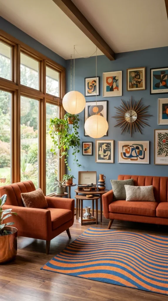
A tightly packed gallery wall of mid-century-style abstract prints covers most of the vertical space above a rust-colored sofa and chair, with a sunburst clock inserted into the grid as if it were simply another frame. Paper lantern pendants hang at two different heights in front of the windows, and a wavy blue-and-orange striped rug covers the floor—enough movement in three different directions that the room never settles into a single focal point. Wood-toned window frames and a stack of nesting tables in matching wood tie the cooler wall color back to the warmer furniture.
🔄 Alternative Approach: For a lower-commitment version of this density, a modular picture-ledge system lets frames overlap salon-style without requiring dozens of nail holes—useful for renters who want the same visual effect without the wall damage.
Dark Ceilings Paired With Saturated Cabinetry, Working Against Expectation
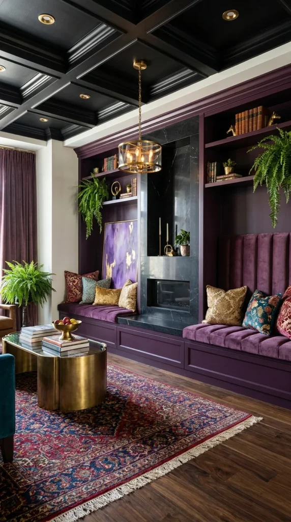
A black coffered ceiling sits directly above deep- plum built-in cabinetry and a matching velvet bench seat, and the combination should, on paper, make the room feel low and enclosed. It doesn’t, largely because of contrast management: brass pendant fixtures and recessed lighting keep the ceiling from going completely flat and dark, while a black marble fireplace surround gives the eye a second dark surface to connect the ceiling back down to the floor level. A jewel-toned Persian rug and mixed metallic and floral pillows keep the seating area from reading as a monochrome box.
⚠️ Warning: A dark ceiling this saturated needs deliberate lighting planning before installation—without enough fixtures at varying heights, the same combination can flatten into a room that feels smaller rather than more dramatic.
Quilted Wall Panels Do What Paint Cannot
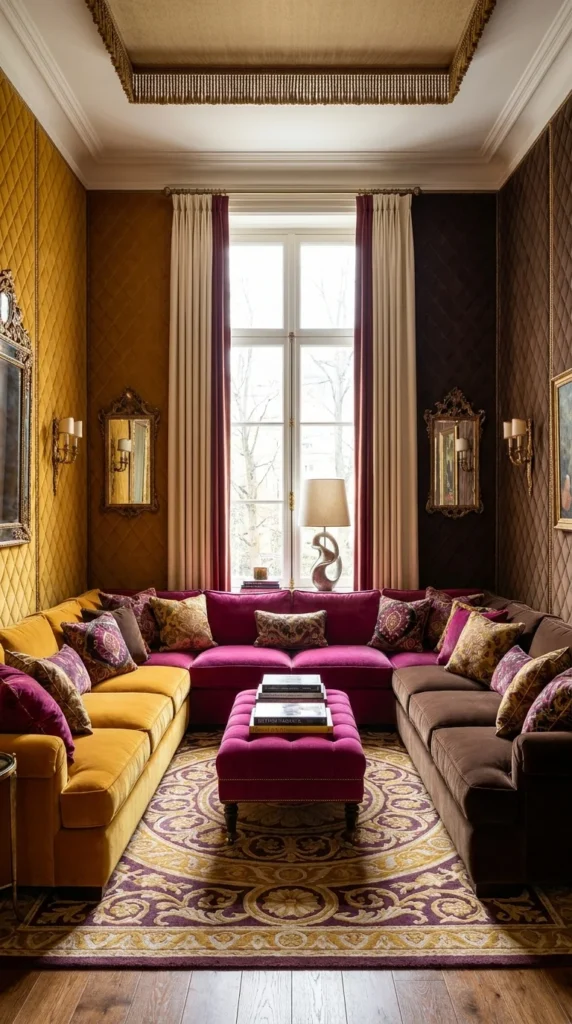
Mustard and deep brown quilted fabric panels cover opposite walls in this narrow room, adding a tactile, upholstered quality that paint or wallpaper can’t replicate. A magenta velvet sectional runs down the center, styled with pillows in gold, burgundy, and patterned silk, while ornate gilt mirrors on either wall bounce light back into a space that has no windows on two of its four sides. The result treats the walls themselves as furniture — soft, dimensional, and warm to the touch — rather than as a backdrop for it.
⏱️ Time & Cost: Upholstered or quilted wall panels typically run higher than paint or wallpaper and require professional installation for a clean, gap-free finish; budget for measuring, foam backing, and fabric yardage well before the installation date.
Four Floral Prints, One Continuous Sectional
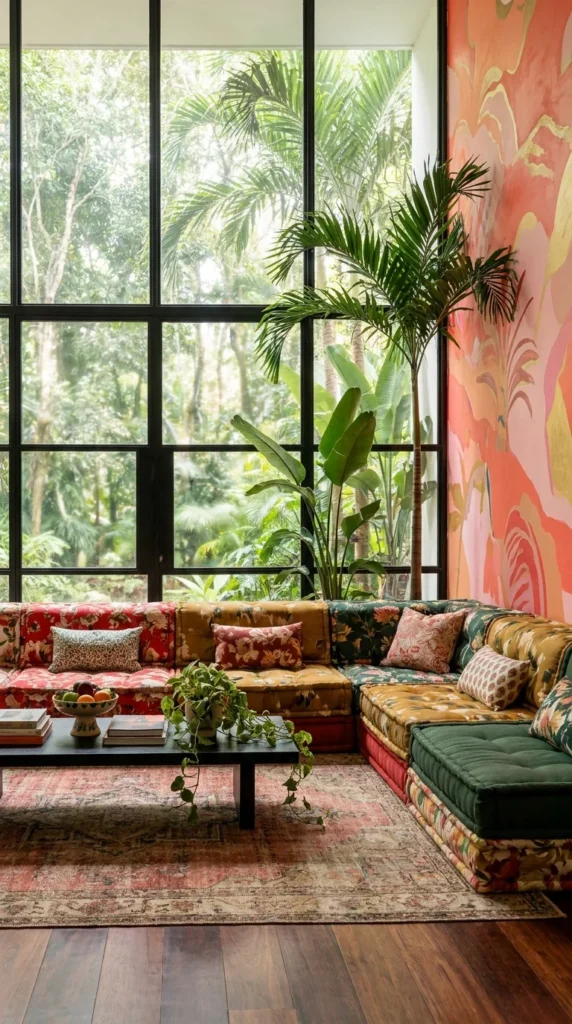
Afurniture—soft, sofa is upholstered in four dtouch—rather fabrics—a red-and-white pattern, a mustard vintage print, a green botanical, and a coral floral—stitched together into one continuous piece rather than styled as separate mismatched cushions. Floor-to-ceiling black-framed windows behind it open onto dense tropical foliage, and a coral-and-gold abstract mural on the adjacent wall picks up the warmest tones in the upholstery. The effect works because every fabric shares a similar saturation level; none of the four prints is muted or pastel enough to look like it wandered in from a different room.
💡 Pro Tip: When mixing multiple florals on one piece of furniture, matching saturation and scale across the prints matters more than matching color—a soft pastel print next to a saturated jewel-tone print will look accidental rather than intentional.
Colorful Glass Pendants Anchor a Room Built on Contrast
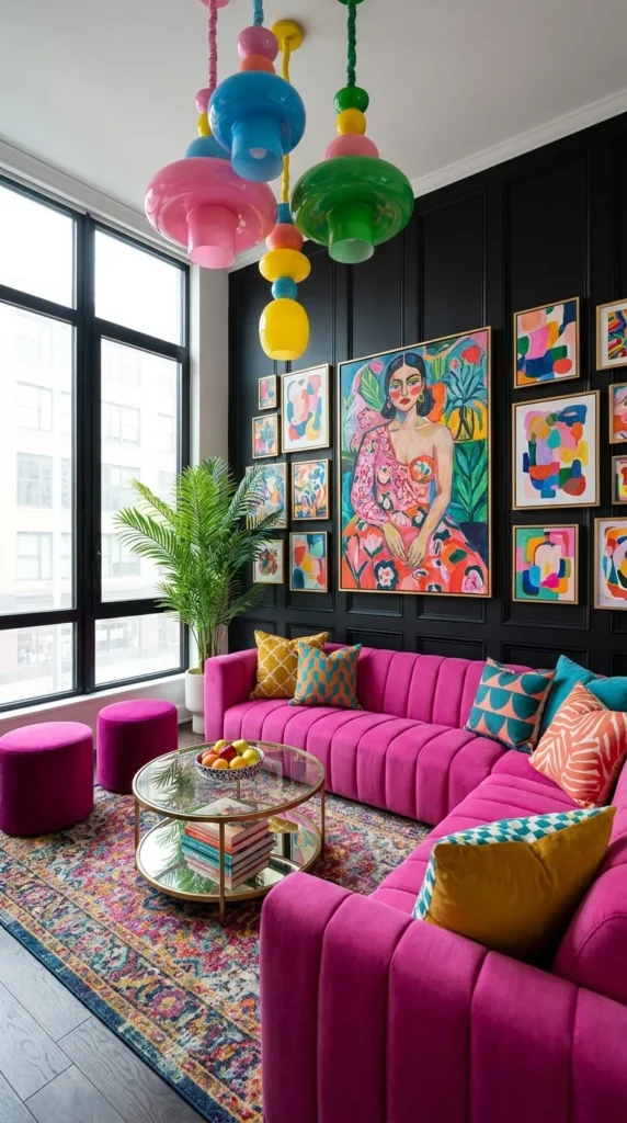
A cluster of glass pendant lights in pink, blue, green, and yellow hangs at staggered heights above a magenta velvet sectional, set against a fully black paneled wall. The dark backdrop does the same job here that it does in a room with charcoal walls elsewhere in this style: it holds a gallery wall of vivid portrait and abstract art, plus a mix of teal, mustard, and coral pillows, without letting any single piece disappear. Floor-to-ceiling windows on the opposite side bring in enough daylight to keep the black paneling from feeling like a void rather than a frame.
❓ Reader Question: Can a fully black wall work in a room without much natural light? It can, but it needs at least one strong artificial light source — a sculptural pendant, a floor lamp, or accent lighting — positioned to hit tsource—afurniture directly rather than the wall itself.
Frequently Asked Questions
Is maximalist design more expensive than minimalist design?
Not necessarily. Cost depends on materials and finishes chosen, not the amount of pattern or color in a room — a maximaliroom—abuilt around a bold rug, thrifted art, and paint can cost less than a minimalist room built around a single designer sofa.
How do I keep a maximalist room from feeling cluttered?
Repetition is the key tool: repeating one or two materials, metals, or colors throughout the space gives the eye consistent anchors, even when the individual pieces vary widely in pattern and texture.
What’s the easiest way to start moving toward maximalism in a rental?
Rugs, pillows, art, and lighting can introduce most of the color and pattern maximalism relies on without requiring any wall changes, making them the lowest-risk starting point for renters.
Do all the colors in a maximalist room need to match?
They need to relate, not match exactly. Rooms in this style tend to work when colors share a similar depth or saturation level, even if the hues themselves are quite different.
Is dark paint a mistake in a small living room?
Not automatically. Several rooms above use near-black or deep jewel-toned walls in modestly sized spaces, relying on layered lighting and saturated furniture to keep the room from feeling closed in.
Conclusion
None of these ten rooms are restrained, and none of them are accidental. What holds each one together is a consistent internal logic—a repeated material, a controlled palette, and a dark backdrop doing quiet organizational work behind louder furniture and art. Maximalism isn’t the absence of editing; it’s editing applied to volume instead of quantity. For anyone hesitant to commit to a bold rug, a saturated wall color, or a mismatched gallery wall, the throughline across these spaces is a useful reminder: more works when something in the room is holding it together, not when everything in the room is competing for attention.


3 Responses