

Your living room does not have to whisper. For years, design advice has pushed the same message: keep it neutral, keep it simple, keep it safe. But maximalist living rooms are proving that a space can be bold, layered, and unapologetically full of personality without turning into visual chaos.
If you’ve ever scrolled past a room packed with rich colors, mixed patterns, and collected objects and felt an instant pull toward it, you already understand the appeal. Maximalism is not about clutter. It is about curated abundance — every piece earning its place, even when there are a lot of pieces.
The real challenge is doing it well. Add one wrong element and a room stops feeling intentional and starts feeling messy. That is exactly where most people get stuck.
These 10 maximalist living room ideas are built to solve that problem. Each one shows a different way to layer color, texture, and personality—while staying realistic for actual homes, not just styled photoshoots. Whether you’re working with a small rental or a spacious open-plan living room, there’s an approach here you can genuinely make your own.

1. Deep green paneled walls with a Curved Velvet Sofa
What struck me first here was the wall color, not the furniture. Panelled walls painted in a dark, almost forest green change how every other color in the room reads—the rust and terracotta pillows suddenly look richer, warmer, and more deliberate than they would against plain white. The curved velvet sofa softens what could otherwise feel like a heavy, formal space, and the rattan pendant light adds texture without competing for attention. A tufted round ottoman in the same green keeps the palette from fragmenting.
This is not a color scheme for renters chasing a security deposit back, admittedly. But the idea translates easily: even one deep green accent wall, paired with warm metallics and a patterned rug, borrows this same moody, layered feeling without repainting an entire room.
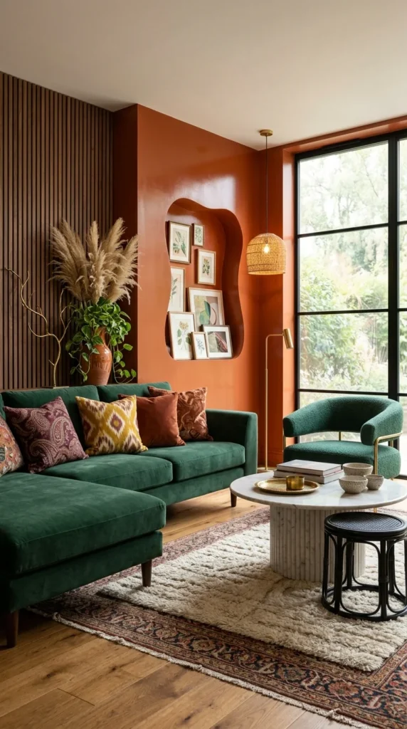
2. A Burnt Orange Accent Wall with a Sculptural Gallery Niche
Where the first room built its mood with dark paneling, this one gets there with color-blocking. The burnt orange wall is not a small accent — it wraps the corner and swallows a good portion of the room, which is exactly why it works instead of feeling like a mistake. Paint one wall this shade in isolation, and it can look unfinished. Commit to the full corner, as this room does, and it reads as a decision.
The carved-out niche holding a cluster of small framed prints is the detail worth copying regardless of budget. It turns what would be flat wall space into a built-in gallery, and it does not require the orange paint or a custom cutout to work—a shallow shelf or a recessed nook painted a contrasting color gets you most of the way there.
The green sofa and armchair repeat the color from the previous room, but here it plays a supporting role instead of the lead. That is the kind of restraint maximalism actually depends on—one bold move per space, not five competing for the same attention.
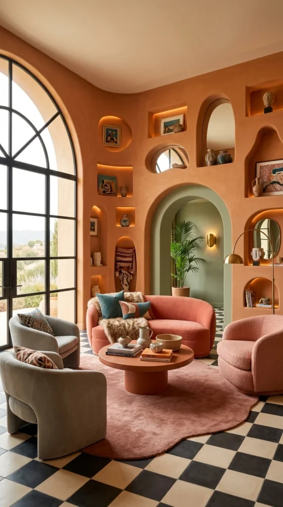
3. Sculpted Terracotta Walls with Built-In Display Niches
Why does this room feel like a gallery and a living room at the same time? The answer is in the walls themselves. Instead of hanging art on top of a flat surface, the terracotta plaster is carved into a series of arched and circular niches, each one lit from within and holding a single object—a vase, a small painting, a bust. Nothing competes, because nothing shares a shelf.
This is the most ambitious idea in this list, and it is fair to say most renters will not be recreating carved plaster walls anytime soon. But the underlying principle is completely portable: dedicate one object per display spot instead of clustering several together, and even a plain floating shelf starts to feel curated rather than crowded.
The black-and-white checkerboard floor and dusty rose sofa keep the room from tipping into one-note orange. It is a reminder that a bold wall color needs at least one high-contrast element to ground it—otherwise the whole space starts to blur into a single warm haze.
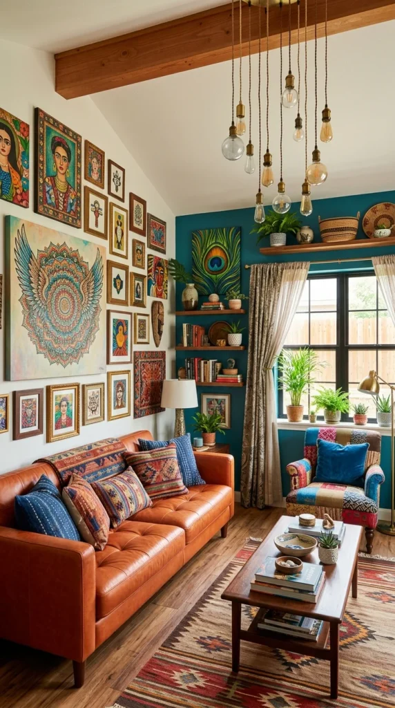
4. A Salon-Style Gallery Wall Against a Two-Tone Room
Dozens of frames. Almost no matching. And somehow the wall still holds together. That is the trick of a proper salon-style gallery wall—it does not rely on consistency of frame color or subject matter; it relies on density. Portraits, mandalas, small landscapes, and folk art are packed edge to edge, and the sheer volume is what reads as intentional rather than random.
This is one of the more approachable ideas here, honestly. Frames can be collected slowly, secondhand, or mismatched on purpose. The real skill is in the hanging, not the shopping—keeping edges roughly aligned even as styles vary, so the eye reads “collection” instead of “leftover frames.”
The room splits itself in two: a warm white wall for the gallery and a deep teal wall for the seating nook with open shelving and layered plants. That division matters. Trying to gallery-wall a teal wall this saturated would have buried half the art. Save your busiest wall treatment for the wall with the least competition.
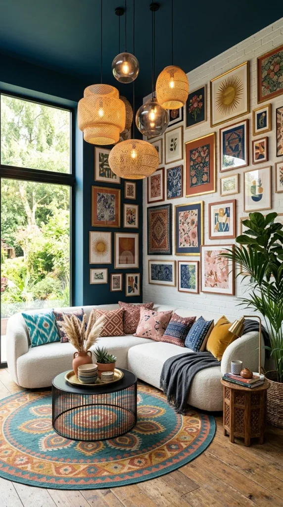
5. A Massive Framed Gallery Wall Paired with a Cluster of Pendant Lights
Most people who copy this room reach for the frames first. That is the wrong starting point. What actually makes this space feel cohesive is the neutral white sofa and warm wood floor underneath it all — a calm base that lets the wall carry almost all the visual weight without the room tipping into overwhelm.
The gallery wall itself covers nearly floor to ceiling, mixing floral prints, abstract shapes, and patterned textiles in gold and dark wood frames. It is dense, but it stays organized because most of the frames share warm, similar tones—rust, mustard, and deep blue. That color discipline is doing more work than the framing choices.
Above it, a cluster of woven and glass pendant lights hangs at different heights, which is a small detail worth pointing out on its own: staggering light fixture heights add dimension the way varied artwork does, just at a different level of the room. Combined with a round patterned rug echoing the same warm palette, the whole space feels planned rather than accumulated—even though it is doing an enormous amount visually.
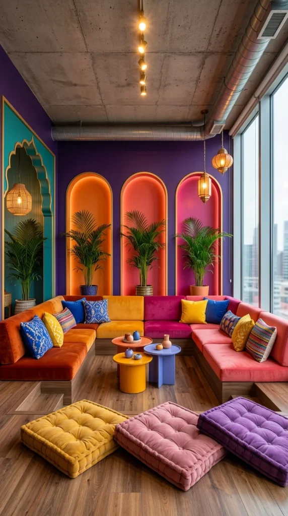
6. Rainbow Velvet Seating Against an Industrial Concrete Ceiling
This is not a combination I would have reached for, but the contrast here is genuinely impressive. Exposed concrete ceiling, visible ductwork, floor-to-ceiling city-view windows — every structural cue says “industrial loft.” Then the room fills that shell with rust, mustard, magenta, and coral velvet sectionals, three glowing arched niches, and a stack of tufted floor cushions in yellow, pink, and purple. It should clash. It does not.
The reason is proportion, not color theory. The saturated colors stay confined to soft furnishings and the arched wall niches—the ceiling, floor, and window wall stay untouched and neutral. That contrast between hard industrial bones and soft maximalist color is exactly what keeps a room this bright from feeling like a children’s playroom instead of an adult living space.
Worth naming honestly: this look depends on a fairly large, open floor plan. Squeeze this palette into a small boxy room, and the color blocks lose the breathing room that makes them read as intentional rather than loud.
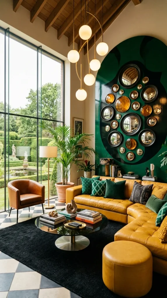
7. A Cluster of Convex Mirrors on a Glossy Green Oval
A dozen small circular mirrors. Different sizes, different frames — some black, some brass, one amber-tinted. Mounted together on a glossy dark green oval painted directly onto the wall, like an oversized frame of its own. It is the single most eye-catching idea in this entire list, and it costs far less than it looks like it should.
That is the thing about a mirror cluster: individually, small convex mirrors are inexpensive and easy to find secondhand. The visual impact comes almost entirely from grouping them densely against one bold shape, not from any single expensive piece. It is one of the few maximalist statements here that a renter could genuinely execute with removable adhesive hooks and zero wall damage.
The mustard leather sectional grounds the room in warmth, while black-and-white checkerboard flooring and a cluster of brass-and-glass pendant lights add just enough contrast to keep the green wall from reading as the only decision in the room. Floor-to-ceiling garden views help too, though that part, admittedly, is not something you can shop for.
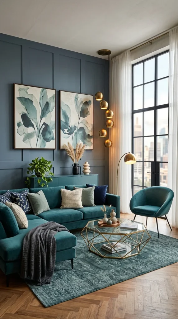
8. Tonal Blue-Green Layering Instead of Competing Colors
Not every maximalist room needs five different colors fighting for space. This one proves the point using almost one palette. Slate-blue paneled walls, a deep teal sofa, botanical prints in matching sage and cream tones, a teal accent chair, and a rug that pulls the same blue-green family together underfoot. The maximalism here comes from layering—velvet, watercolor art, patterned pillows, wood, and brass—not from color contrast.
A cascading brass pendant light drips down the corner in a loose, organic line, adding just enough warmth and sparkle to stop the tonal palette from feeling flat or cold. It is doing quietly what the bolder color-block rooms elsewhere on this list do more loudly.
The takeaway for smaller or rented spaces is a genuinely useful one: staying within one color family while still layering textures and patterns is often the safer entry point into maximalism, especially if bright multicolor rooms feel intimidating. Same density of decision-making, lower risk of it looking wrong.
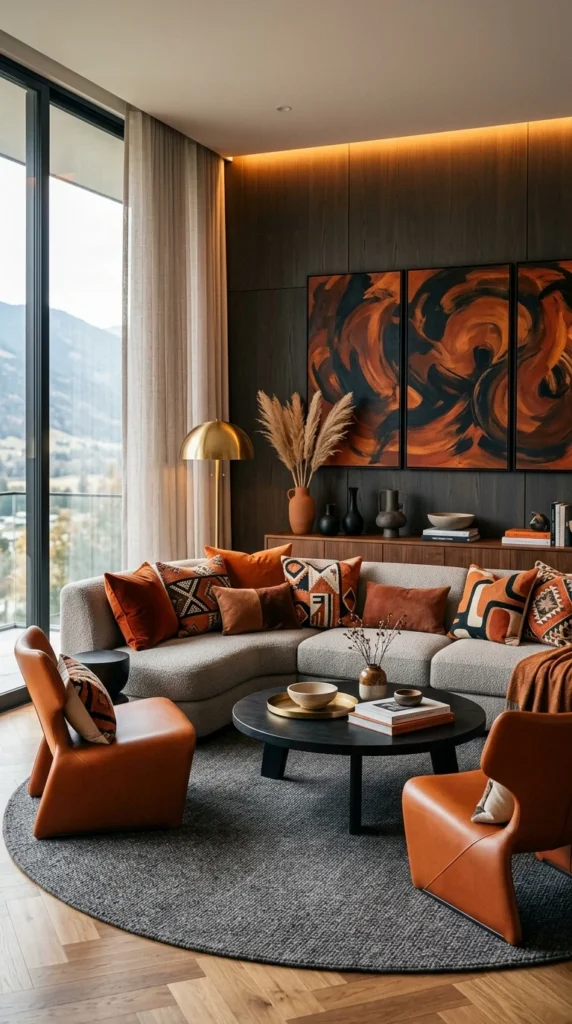
9. A Triptych Statement Painting Anchoring a Neutral Room
This is one of the more restrained rooms on this list, and that restraint is exactly why it earns a spot. The sofa is a soft neutral boucle. The rug is plain charcoal grey. The walls are dark wood paneling with hidden warm lighting along the top edge. On paper, none of that sounds maximalist at all.
The three-panel abstract painting in burnt orange, rust, and black is doing all the heavy lifting, and it does not need help. A single large-scale, high-impact art piece can carry an entire room’s personality on its own, which means the furniture and textiles around it are free to stay quiet rather than compete.
Sculptural orange leather chairs and a scattering of terracotta pillows echo the painting’s palette without repeating it exactly, which is what keeps the room from feeling like a matched set. For anyone nervous about maximalism, this is the easiest entry point on the whole list: pick one bold art piece, pull two or three colors from it into smaller accents, and leave the big furniture pieces neutral.
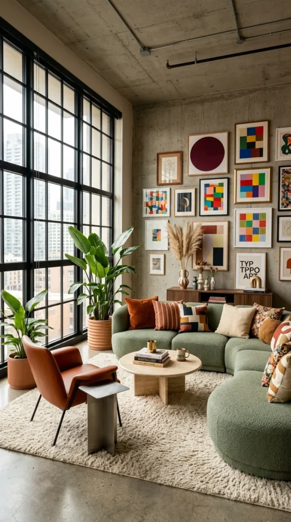
10. A Modern Art Grid Against Raw Concrete, Softened by Boucle and Greenery
Concrete ceiling. Exposed pipes. Floor-to-ceiling industrial windows. It is the same cool, hard-edged shell as the Rainbow Velvet Room earlier in this list—proof that this style of architecture can go in genuinely opposite directions depending on what fills it.
pieces—hung Here, instead of saturated color blocks, the room leans on a tight grid of small modern art prints — geometric color studies, a single dark circle, and typographic pieces — hung with almost gallery-level precision above a low wooden console. Sage green boucle seating and a thick cream rug soften every hard surface in the room, while oversized bird of paradise plants add the one element no gallery wall or concrete ceiling can fake: real texture that changes with the light.
It sounds simple. It rarely is, actually, getting a grid of mismatched small art to look aligned rather than accidental. But it closes out this list on the right note—proof that maximalism is not one look. It is a decision to layer, commit, and let a room say something, whether that something is loud or quiet.
Final Thoughts
Ten rooms, ten different ways in—and no two of them got there the same way. Some leaned on color, some on collected objects, and some on a single oversized art piece doing all the work. What ties them together is not a formula. It is confidence: choosing something specific and following through on it instead of playing it safe with beige and hoping the room feels finished.
If none of this feels immediately doable, that is fine. Start small. Pick one idea from this list — a gallery wall, a cluster of mirrors, one bold painting — and build outward from there. Maximalism does not ask you to redo an entire room in a weekend. It asks you to stop editing your personality out of the space you actually live in.
FAQs About Maximalist Living Room Design
1. Is maximalist decor still in style in 2026?
Yes—if anything, it has grown stronger as a reaction to years of all-neutral, minimalist interiors. The current version of maximalism is more curated than the “more is more” trend of the past, though. Rooms like the ones above work because they layer color and pattern with intention, not because they pile on random objects.
2. Will a maximalist living room make a small space feel cramped?
Not necessarily — it depends on execution more than square footage. Tonal color layering (like the blue-green room in this list) tends to work better in smaller spaces than high-contrast color blocking, since it avoids visual competition. Keeping the floor and ceiling relatively calm, even when the walls and furniture are bold, also helps a small room breathe.
3. What is the easiest way to start with maximalism without overwhelming a room?
Pick one anchor — a single bold painting, a gallery wall, or one saturated accent wall — and build outward from there with two or three supporting colors pulled from it. Trying to introduce five ideas at once (a bold wall, a busy rug, a gallery wall, and clashing furniture) is usually what makes a room feel chaotic instead of intentional.


5 Responses