
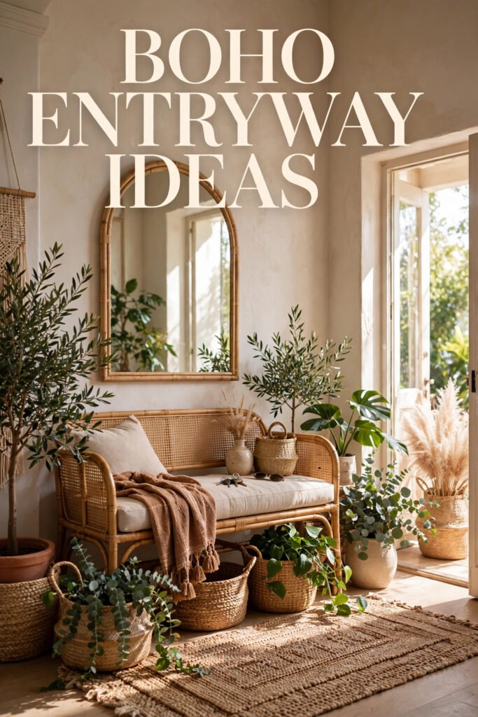
Walk into ten different boho entryways, and you’ll notice something right away: none of them look the same. One leans into whitewashed Mediterranean plaster, another goes almost black and moody, another is built entirely around a quilted textile instead of the usual macrame. Boho isn’t one look — it’s a set of decisions about texture, pattern, and warmth that you get to make for your own front door.
This guide breaks down ten real entryway directions, what makes each one distinct, who it actually suits, and how to recreate it without turning your hallway into a Pinterest board nobody can walk through. By the end, you should know exactly which one is yours.
Quick Overview
| Style | Global / Layered Boho |
|---|---|
| Best For | Entryways, hallways, mudrooms |
| Budget | Low–Medium |
| Difficulty | Easy, mostly DIY-friendly |
| Maintenance Level | Low–Medium (higher if live plants are involved) |
Where a Slatted Wood Wall Earns Its Keep
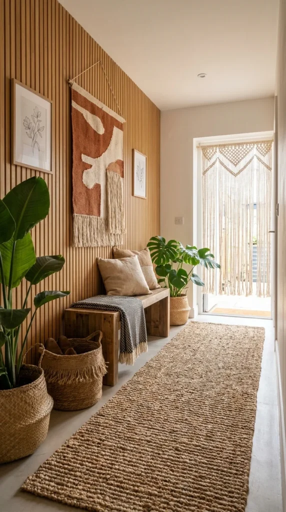
A vertical slat wall changes how an entryway reads before you’ve added a single accessory. Here, warm oak battens run floor to ceiling, giving the hallway a rhythm that plain drywall never could, and that rhythm is exactly what lets the rest of the space stay loose. A rust-and-cream woven wall hanging sits directly on top of the slats, and the fringe at its base picks up the same vertical lines the wood is already making — that’s not an accident; it’s why the piece reads as placed rather than hung.
The oversized bird of paradise and monstera on the left do more than fill a corner; their broad leaves are the only curved shapes in a room built almost entirely from straight lines, and that contrast is what keeps the slats from feeling like a woodshop. A jute runner carries the same warm tone down the hallway toward a macrame door curtain, so the eye has a clear path from the front door to the light outside.
This look suits anyone renovating a builder-grade hallway that currently has nothing going on — the slats give a flat wall instant depth without touching the layout. It’s a strong fit for narrow entryways specifically, since vertical lines make a tight hallway feel taller rather than more cramped. Homeowners planning to stay put for a while get the most out of it, since slat walls are a real installation, not a rental-friendly swap.
The advantage is durability: wood paneling doesn’t fade, sag, or need replacing the way textiles do. The compromise is commitment — once it’s up, changing the wall color or texture means redoing carpentry, not repainting. To recreate it on a smaller budget, pre-cut slat panels or peel-and-stick wood strips get most of the visual effect without hiring a carpenter. The most common mistake is running the slats only partway up the wall; stopping short kills the vertical effect that makes the whole thing work.
Where the Oak Is Doing the Most Work
Repetition is the quiet engine here — the vertical lines in the slats, the runner’s woven ridges, and the fringe on the wall hanging all move in the same direction, which is one reason this hallway feels resolved rather than decorated piece by piece.
Where This Look Falls Apart
– Painting the slats a cool gray instead of leaving the wood tone warm, which fights the plants and jute
– Hanging art with straight, boxy frames that compete with the slats instead of contrasting with them
– Skipping a runner and leaving the floor bare, which breaks the warm-tone continuity
– Choosing plastic planters instead of woven baskets, which reads as an afterthought against this much natural material
Recommended Materials: white oak slats, jute, macrame cotton cord, seagrass basket weave, reclaimed wood bench
Main Colors: Warm Oak, Rust, Natural Jute, Cream
Best Lighting: This hallway leans on the light spilling in from the open door at the far end — if your entry doesn’t have that, a single warm-toned pendant near the bench keeps the wood tones from looking flat.
Maintenance: The monstera and bird of paradise need bright, indirect light and a wipe-down of their leaves every few weeks to keep dust from dulling the green.
Should You Go Full Mediterranean Plaster?
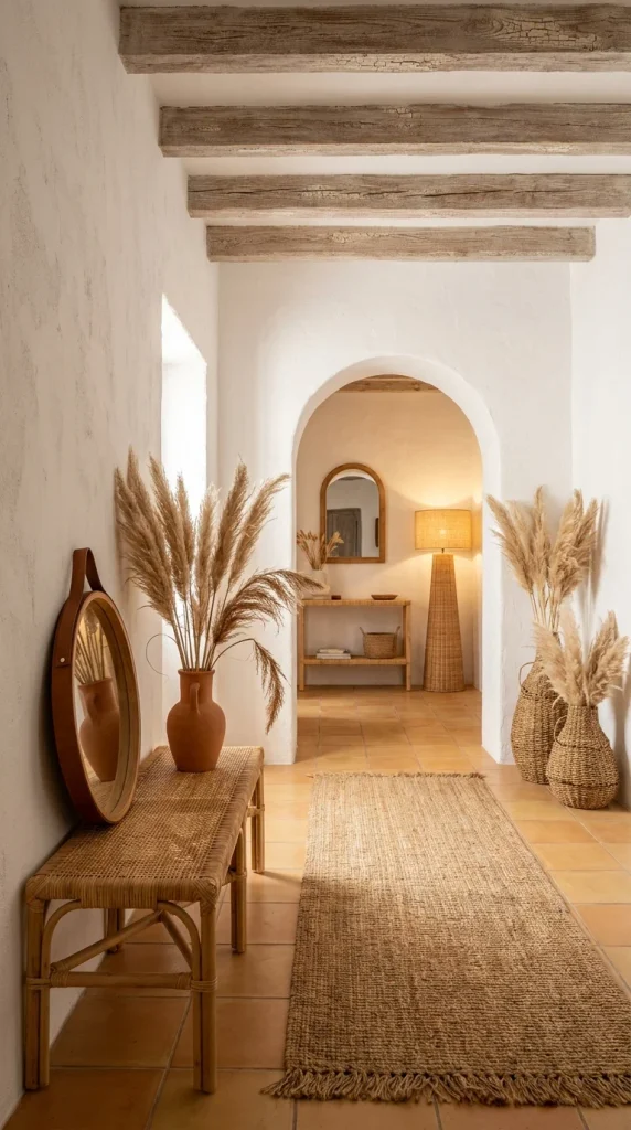
This hallway isn’t styled boho on top of a neutral box — the architecture itself is doing the work. Rough white plaster walls, an arched doorway, and exposed wood ceiling beams set a rustic, sun-baked tone before a single accessory gets added, and that’s the real lesson: in a space like this, boho styling is closer to editing than decorating.
Scale matters more than usual here. The pampas grass on both sides of the archway is tall enough to nearly reach the beams, and that height is what keeps the arrangement from disappearing against such a large, plain wall — a shorter bouquet would have looked stranded. A round leather-strap mirror leans casually against the wall rather than hanging perfectly centered, which is a small, deliberate risk: it reads as lived-in rather than staged, but only because everything else in the hallway is tidy enough to support that looseness.
This direction suits anyone with genuine architectural bones to work with — real arches, real beams, terracotta or tile flooring — rather than a flat rental hallway trying to fake it. It’s best for households who want warmth without clutter, since the whole look depends on negative space between pieces. Climate matters too: this palette was built for homes that get strong, warm natural light, where white plaster glows instead of looking cold.
The advantage is that it photographs and lives beautifully with almost no ongoing styling effort — the architecture carries the room. The compromise is that it’s the hardest of the ten to fake convincingly if your entryway is a standard drywall box; you’re either plastering and adding beams, or accepting a paler version of the effect. For smaller budgets, a lime-wash paint finish on existing walls gets close to the texture without structural work. The most common mistake is over-filling a space like this — adding a gallery wall or extra furniture pieces erases the calm that makes it work in the first place.
A Palette Built Around Restraint
The entire hallway runs on one temperature of light — warm terracotta tile, honey-toned rattan, and sun-bleached plaster — and keeping every material in that same warm register is one reason the arched doorway beyond doesn’t feel like a separate room.
Easy Ways to Get This Wrong
– Adding cool-gray or black accents, which breaks the warm, sun-washed consistency
– Choosing a mirror frame in polished chrome instead of natural rattan or leather
– Over-accessorizing the console table so the mirror loses its breathing room
– Using a synthetic rug instead of a natural jute weave, which looks noticeably out of place against real plaster
Recommended Materials: lime-washed plaster, terracotta tile, rattan, leather strapping, reclaimed wood beams
Main Colors: Warm White, Terracotta, Honey Rattan, Weathered Wood
Best Lighting: Natural light leads here — the archway pulls daylight through from the room beyond, with a woven rattan pendant filling in warmth once the sun drops.
Maintenance: Lime-washed or textured plaster shouldn’t be scrubbed hard; a soft dry cloth for dust is usually enough, and any scuffs are touched up with a matching plaster patch rather than paint.
A Terracotta Nook Built for Sitting Still
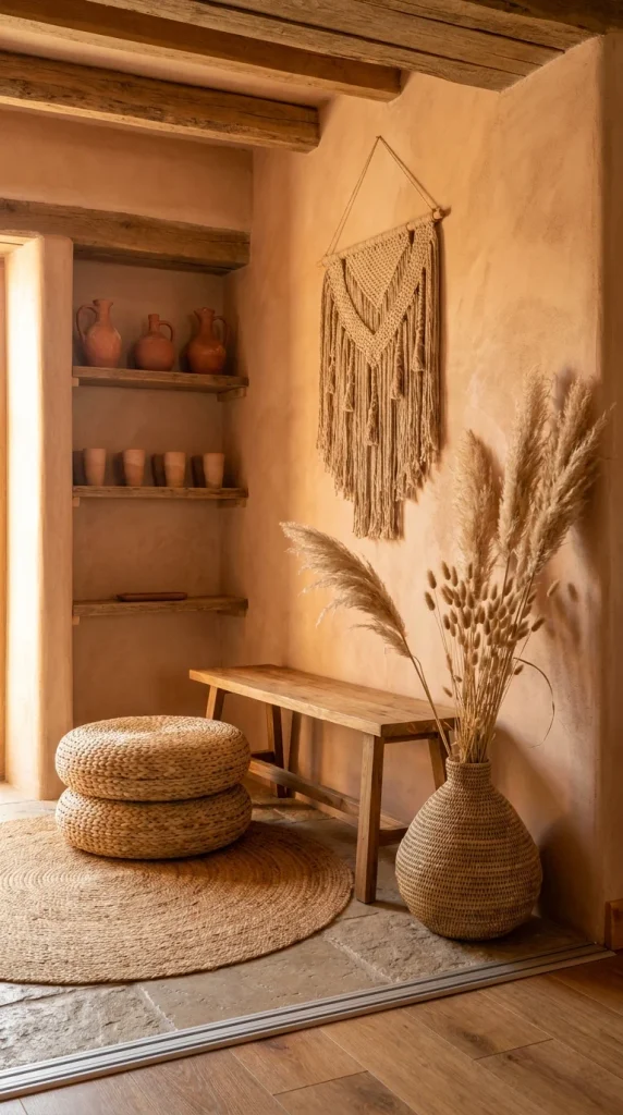
Where the last hallway used white plaster, this small nook goes the opposite direction and paints the walls the same warm terracotta as the clay pottery on the shelves — and that single decision is what makes the whole corner feel like one composed idea instead of a wall plus some furniture. The color doesn’t stop at the wall; it continues into the pitchers, the vase, and even the light hitting the wood beams above.
The two stacked jute poufs next to a low bench are a scale choice worth noticing: rather than one large ottoman, two smaller rounded shapes create a stepped, sculptural silhouette that a single piece couldn’t. It’s a small risk, since stacking furniture can look accidental, but the matching weave ties them together as one intentional object rather than two mismatched ones. A tall bundle of dried pampas and bunny-tail grass in a bulbous woven vase adds the only vertical line in an otherwise low, horizontal grouping, which is what keeps the eye moving upward instead of settling flat.
This nook suits anyone with an awkward leftover corner — beside a door, under a window, at the end of a hallway — rather than a full formal entry. It’s a strong option for renters too, since almost everything here (pouf, vase, bench) is freestanding and moves out with you. It fits households drawn to a single-color-family approach rather than high-contrast palettes, since the entire look depends on staying in one warm tonal range.
The advantage is that a monochromatic warm palette is genuinely hard to get wrong once you commit to it — most terracotta, rust, and clay tones sit together naturally. The compromise is that painted plaster walls in a strong color are a bigger commitment than a gallery wall, and repainting later means covering saturated color, which usually takes more coats. To simplify on a budget, a terracotta accent wall behind just the shelving unit gets most of the effect without painting the whole nook. The most common mistake is introducing a cool-toned accessory — a gray throw, a black frame — that immediately breaks the warmth the whole corner is built on.
Why the Wall Color Is Doing More Than the Furniture
The clay pitchers on the open shelves repeat the same reddish-orange as the wall behind them, and that repetition is a big part of why this corner reads as composed — swap those pitchers for a mixed set in different tones and the cohesion would likely loosen.
Where People Trip Up Recreating This
– Choosing a cool white or gray for the walls instead of a true warm terracotta, which undercuts the whole concept
– Leaving the open shelving mismatched instead of grouping pottery by tone
– Skipping the height element (the pampas grass) and leaving the grouping too low and flat
– Using a square or rectangular rug instead of a round one, which fights the round pouf shapes
Recommended Materials: tinted lime plaster, terracotta pottery, jute weave, reclaimed wood, dried pampas grass
Main Colors: Terracotta, Clay, Warm Sand, Aged Wood
Best Lighting: Warm, low-angle light (late afternoon works especially well) makes the plaster texture and pottery glaze glow — a single warm bulb overhead keeps that same tone after dark.
Maintenance: Dried pampas grass sheds fine fibers over the first few weeks; a light spray of hairspray or clear sealant slows the shedding, and pottery just needs an occasional dusting.
The Bright, Renter-Friendly Version of Boho
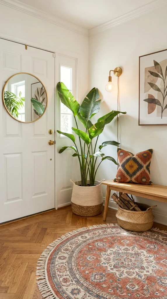
Not every boho entryway needs earthy walls or exposed beams — this one proves the look works just as well in a plain white apartment hallway with herringbone floors, which is exactly why it’s the most renter-friendly of the ten. Nothing here is structural. A round brass mirror leans against the wall, a potted bird of paradise fills the corner, and a kilim pillow adds pattern on an otherwise plain wood bench — every piece could be packed into a box on move-out day.
The scale of that bird of paradise plant relative to the entry is the biggest decision in the room: it’s tall enough to reach nearly to the wall sconce above it, filling vertical space a small potted plant never could in a hallway this narrow. That size is a deliberate risk in a tight space, but it pays off because nothing else in the room competes with it for height. The round vintage-style rug underneath softens the sharp herringbone lines of the floor, giving the eye a place to land before it reaches the pattern-heavy kilim pillow.
This entryway suits apartment dwellers and renters specifically, since it proves boho warmth doesn’t require painted walls or built-in storage. It’s also a strong fit for smaller entries in general, since round shapes (the mirror, the rug) and a single oversized plant read as intentional rather than cluttered in a way that many small objects wouldn’t. Anyone nervous about “committing” to a full design direction can start here and add more texture over time.
The advantage is flexibility — swap the pillow, rotate the plant, change the rug, and the whole mood shifts without touching a wall. The compromise is that without any architectural texture to lean on, the look depends more heavily on getting proportions right; a too-small plant or too-plain mirror leaves the corner feeling unfinished rather than minimal. To recreate this on a tight budget, a faux bird of paradise in a two-tone basket gets most of the visual impact without live-plant maintenance. The most common mistake is choosing a plant that’s too short for the ceiling height, which is the single biggest thing separating this look from a generic apartment corner.
Scale as the Only Real Decoration
The plant is essentially doing the job three or four smaller accessories usually do in a boho entry — its height and leaf shape become the room’s visual anchor, and in this case the round mirror and round rug are simply echoing that same soft shape rather than competing for attention.
Where This Style Trips People Up
– Choosing a plant too small for the ceiling height, leaving the corner feeling empty above waist level
– Skipping a rug entirely on wood floors, which leaves the herringbone doing all the visual work alone
– Adding too many patterns at once instead of letting one pillow carry the boho pattern
– Hanging the mirror instead of leaning it, which loses the casual, collected feel the room is going for
Recommended Materials: brass, herringbone wood flooring, woven basket planter, kilim wool, cotton bench cushion
Main Colors: Warm White, Brass, Terracotta Kilim, Green
Best Lighting: A single brass wall sconce beside the door does the evening work here; during the day, the window beside the front door is doing most of the lighting.
Maintenance: Bird of paradise needs bright indirect light and benefits from rotating the pot every few weeks so it grows evenly instead of leaning toward the window.
Should You Go Dark in a Boho Entryway?
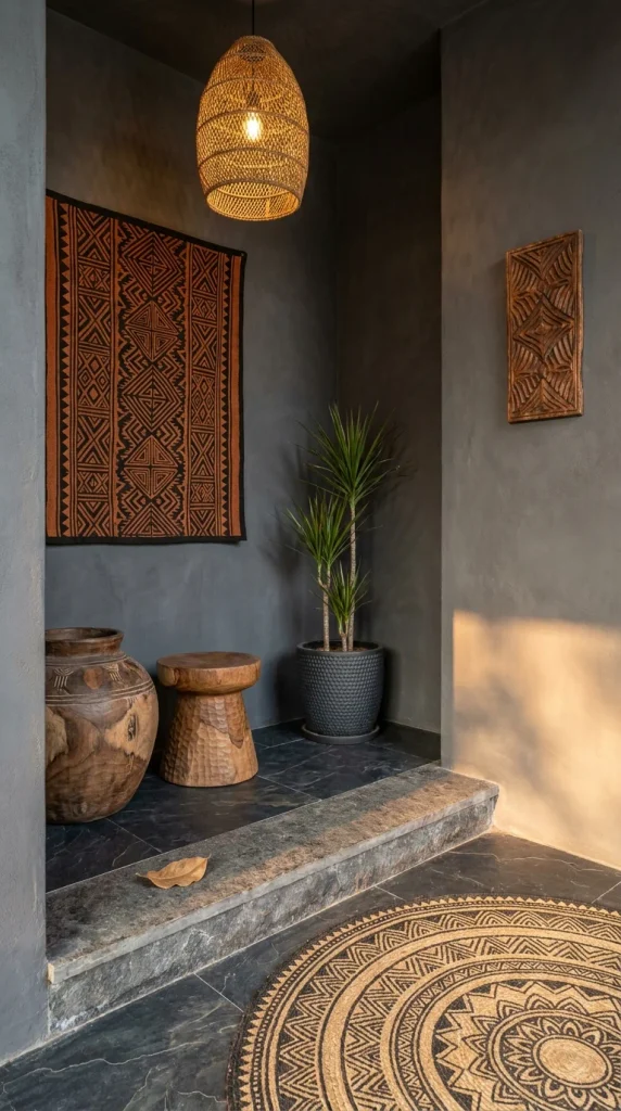
Almost every boho entryway leans light and airy — this one deliberately doesn’t, and that’s what makes it worth including. Charcoal-plastered walls and black slate flooring set a moody backdrop, and a mudcloth-style tapestry in rust and black is the one piece of color allowed to stand out against it. Rather than fighting the darkness with bright accents everywhere, this room commits to it and lets a single textile and a warm wicker pendant do the visual lifting.
That pendant light is worth pausing on: its woven texture and warm glow are the brightest thing in the entire frame, which means the eye is drawn there first even though it’s a small object in a mostly dark room — a clear example of light doing more compositional work than color or size. Below it, a large carved wood vessel and a chunky wood stool sit directly on the slate step, their rough, hand-hewn surfaces reading as sculpture rather than furniture in this dim, gallery-like setting.
This direction suits homeowners who already gravitate toward moody, dramatic interiors elsewhere in the house and want their entryway to match rather than jar against it stylistically. It works especially well for entries that get limited natural light anyway, since dark walls stop fighting a losing battle against dim daylight and instead lean into it. It’s a poor fit for small, naturally dark hallways with no supplemental lighting — without a warm fixture like the pendant here, the same palette would just read as gloomy rather than intentional.
The advantage is drama that’s genuinely hard to achieve with a light palette — this look reads as considered and confident rather than default. The compromise, and the honest one, is upkeep and light: dark, matte-finish walls show dust, fingerprints, and scuffs more visibly than pale plaster, and the whole effect depends on having a warm light source, not overhead white light. Anyone without existing warm fixtures should budget for at least one pendant before committing to dark walls. The most common mistake is pairing dark walls with cool white lighting, which turns dramatic into simply dim.
Who Should Skip This Style?
Charcoal walls are worth a genuinely mixed verdict here. If your entryway already struggles for natural light and you’re not planning to add a warm fixture, this palette will likely make the space feel smaller and dimmer rather than dramatic — the effect depends entirely on that wicker pendant doing real work, not just decoration. It’s also a tougher sell in a home you’re planning to sell within a few years, since dark, textured plaster is a more involved repaint than a neutral wall. Where it does pay off is in homes with strong natural light elsewhere and owners who want their entry to feel like a considered transition rather than a bright, generic hello — in that context, it’s arguably the boldest and most memorable option on this list.
Common Traps With This Look
– Using cool white bulbs instead of warm-toned lighting, which kills the intended mood
– Choosing a glossy black finish instead of a matte, textured one, which reads as sleek-modern instead of earthy-boho
– Skipping a textile or tapestry and leaving the dark walls completely bare
– Placing a small, delicate plant here instead of a substantial, sculptural one that can hold its own against the dark backdrop
Recommended Materials: tinted charcoal plaster, honed slate, rattan/wicker, carved solid wood, mudcloth-style cotton.
Main Colors: Charcoal, Rust, Black, Warm Wood
Best Lighting: Warm-toned pendant lighting is non-negotiable here — without it, dark walls this saturated will read flat rather than moody.
Maintenance: Dracaena plants tolerate lower light better than most boho staples, making them one of the few good plant choices for a genuinely dim entry like this one.
Related Guides
Since global boho texture, plant-heavy styling, and natural rugs come up across the whole house, these guides are worth a look if you’re extending the look beyond the entryway:
– Stylish Shoe Racks That Double as Entryway Decor — practical entryway storage that still leans boho
– 10 Boho Bedroom Looks That Feel Curated, Not Cluttered — the same texture-layering approach applied to a bedroom
– Rattan and Light: 10 Boho Sunroom Looks Worth Copying — more rattan and plant pairing ideas for sunlit rooms
– The Biophilic Living Room Guide — for plant-styling guidance beyond the entryway
– 10 Wall Mirror Ideas That Make Small Rooms Look Twice as Big — useful if your entry is on the smaller side
Can Ikat Patterns Work Under a Staircase?
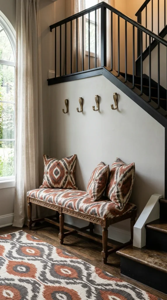
This entryway isn’t boho in the woven-and-earthy sense the earlier ones lean on — it’s boho-traditional, built around a heavily patterned ikat bench tucked beneath a dark staircase. The bench cushion and its two matching pillows share the same diamond ikat print as the rug underneath, and that three-piece repetition is the whole reason the corner feels finished instead of like leftover furniture stuffed under the stairs.
The proportion worth noticing is how much pattern is allowed in such a small footprint. A bench this heavily patterned, paired with an equally patterned rug, is a real visual risk — pattern-on-pattern this dense usually reads as busy. It works here because the walls, staircase, and curtains around it are kept completely plain, giving the ikat textiles room to be the only loud element in the frame. Brass coat hooks lined up above the bench add a second material and a bit of shine without adding a second competing pattern.
This corner suits anyone dealing with dead space under a staircase — a notoriously awkward area to furnish — rather than a full entry hall. It’s a strong option for households drawn to traditional or English-country interiors who still want a boho note of pattern and texture, since ikat sits comfortably between both worlds. It’s less suited to strict minimalists, since the entire concept depends on being comfortable with a busy, layered textile moment.
The advantage is that under-stair space this awkward rarely gets used well, and a bench like this solves function (a place to sit and put on shoes) and decoration in one move. The compromise is that a heavily patterned, custom-upholstered bench like this is a genuine investment — reupholstering furniture costs more than most boho accessories on this list. To simplify for a smaller budget, a plain bench with two ikat pillows gets a lighter version of the same effect. The most common mistake is adding more pattern elsewhere in the same sightline — a patterned lampshade or curtain nearby would overload what’s already a bold, busy corner.
What This Under-Stair Corner Solves
An awkward triangular space under a staircase is usually wasted or cluttered with junk; here, a bench sized specifically to the available depth turns dead space into a genuine seat-to-put-your-shoes-on moment, which is a functional win most entryways this size don’t get.
Where People Get This Wrong
– Adding a second bold pattern nearby, which overwhelms a space that only has room for one
– Choosing a bench too deep for the under-stair footprint, which blocks the natural walking path
– Skipping the coat hooks and leaving nowhere for daily outerwear, wasting the functional opportunity
– Using a busy, ornate mirror above the bench instead of keeping the wall clear so the textile stays the focal point
Recommended Materials: ikat-woven cotton, carved hardwood bench legs, wool rug, brass hardware
Main Colors: Terracotta, Charcoal, Cream, Brass
Best Lighting: A tall arched window beside the bench brings in most of the daylight; no overhead fixture is needed if the window gets direct morning or afternoon sun.
When the Furniture Itself Is the Statement Piece
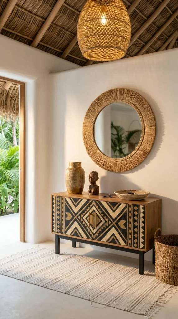
Every other entry on this list layers texture through rugs, plants, and textiles. This one does it almost entirely through one object: a hand-painted sideboard covered edge to edge in a bold black-and-tan tribal geometric pattern, set beneath a round mirror woven from rope. The thatched palm roof overhead and open sightline to greenery outside confirm this is a warm-climate, resort-style space — but the sideboard is doing more design work than the architecture around it.
The proportion choice here is confident: a piece this visually loud is usually kept small in a room, but the sideboard spans nearly the full width of the console area, refusing to be a quiet accent. It gets away with that because the wall behind it and the rug beneath it are both left plain and pale, giving the pattern nowhere to compete. A carved wood vase and small wood figure on top add height and craft without adding a second pattern, which is exactly the restraint that keeps the piece from tipping into visual overload.
This look suits anyone building a vacation home, coastal property, or a room they want to feel like a permanent getaway rather than an everyday hallway. It’s a strong fit for larger entries that can give a piece this bold enough negative space to breathe — in a tight hallway, this sideboard would likely feel cramped rather than confident. It’s not a look for anyone hoping to blend the entryway seamlessly with a more neutral rest-of-house style, since this piece is built to be the obvious focal point.
The advantage is that one well-chosen statement piece like this can replace the need for several smaller decorative moves — it’s simultaneously storage, art, and focal point. The compromise is cost and rarity: hand-painted tribal-pattern furniture at this scale is a specialty purchase, not something picked up at a big-box store, and it can be genuinely hard to find a second piece that complements rather than competes with it. For a smaller budget, a single tribal-print textile draped over a plain console gets a lighter version of the same effect. The most common mistake is adding more patterned furniture nearby, which turns one confident statement into visual competition.
Where the Eye Lands First
Between the woven mirror, the palm ceiling, and the carved objects on top, the sideboard’s graphic black-and-tan pattern is what the eye is drawn to first — it’s the only element in the room with hard geometric lines, which makes it read as the anchor even though the mirror above it is technically larger.
Common Mistakes to Avoid Here
– Pairing this sideboard with an equally bold rug, which competes instead of supports
– Overloading the top of the piece with too many small objects, which clutters what should read as a display
– Choosing a plain modern mirror instead of a textured, woven one, which loses the tactile balance
– Placing it in a room with limited natural light, where the intricate pattern gets lost in shadow
Recommended Materials: hand-painted mango wood, woven rope, teak legs, carved wood accessories
Main Colors: Black, Warm Tan, Natural Wood, Cream
Best Lighting: Bright, direct natural light is doing the heavy lifting here — this piece was clearly chosen for a space that gets strong daylight, since its pattern needs light to read clearly rather than fade into shadow.
Maintenance: Hand-painted wood furniture should be dusted rather than wiped with harsh cleaners, since strong chemicals can dull painted detail over time.
What a Bold Wall Color Does for Boho Pieces
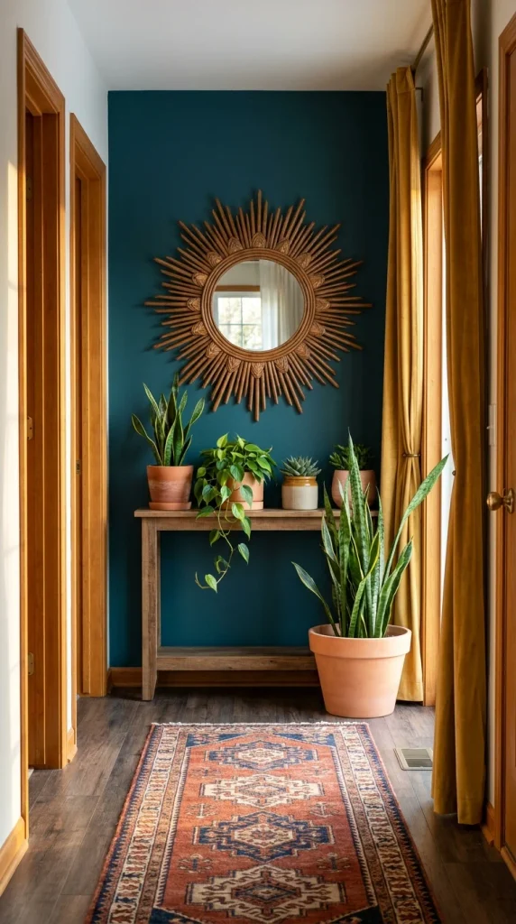
Most boho entryways lean on natural, muted tones — this hallway proves the aesthetic works just as well against a saturated deep teal wall, as long as the furniture and accessories stay in their usual warm, earthy lane. The teal isn’t competing with the boho pieces; it’s making them pop harder than they would against white. A sunburst rattan mirror, made from dozens of individual radiating rods, becomes the clear focal point specifically because of the contrast between its warm wood tone and the cool wall behind it.
The furniture below stays intentionally simple — a plain wood console holding a mixed grouping of potted plants (snake plant, pothos, a small succulent) in varied heights and leaf shapes. That variety is the point: instead of one oversized statement plant like some of the other entries on this list, this hallway builds its greenery from several smaller, different plants, creating a layered, collected-over-time look rather than one dramatic gesture. Mustard velvet curtains at the far end pick up warmth from the wood tones and keep the teal from feeling like the only color decision in the space.
This direction suits anyone with a plain hallway who’s more comfortable committing to paint than to structural changes, since color is the single boldest move here and everything else stays relatively restrained. It’s a great fit for plant collectors specifically — this look rewards having several different plants rather than one large one. It’s a poor match for anyone who repaints often or dislikes strong color, since a saturated wall like this is the whole foundation of the look.
The advantage is that a bold wall color this well-chosen makes wood tones, rattan, and greenery look noticeably richer than they would against plain white — it’s one of the cheapest ways to make existing boho pieces look more intentional. The compromise is commitment to color in a high-traffic, easily scuffed hallway, which shows wear differently than a light neutral. To simplify for a smaller budget, painting just the lower half or a single accent panel gets a taste of the effect without a full wall commitment. The most common mistake is choosing plants that are all roughly the same size, which flattens the layered look this hallway depends on.
How Teal and Rattan Split the Room
The wall color and the mirror’s warm wood tone sit almost directly opposite each other, and that kind of high-contrast pairing tends to make both elements read as more intentional — swap the teal for a beige and the sunburst mirror would likely recede rather than anchor the hallway the way it does here.
Easy Ways This Goes Wrong
– Choosing plants that are all the same height, which removes the layered effect that makes the grouping interesting
– Pairing a cool wall color with cool-toned furniture instead of warm wood, losing the contrast that makes it work
– Skipping a rug and leaving hardwood floors bare in a high-traffic hallway
– Adding too many accessories to the console table, cluttering what should be a clean plant display
Recommended Materials: rattan, reclaimed wood, terracotta pots, cotton velvet, wool-blend rug
Main Colors: Deep Teal, Mustard, Warm Rattan, Green
Best Lighting: Natural light from the far window carries most of the room; against a dark wall like this, avoid cool white bulbs, which can make the teal look flat rather than rich.
Maintenance: A mixed plant grouping like this needs different watering schedules per plant — snake plants and succulents want to dry out fully between waterings, while pothos prefers more consistent moisture.
Farmhouse Boho, Told Through Textile Art
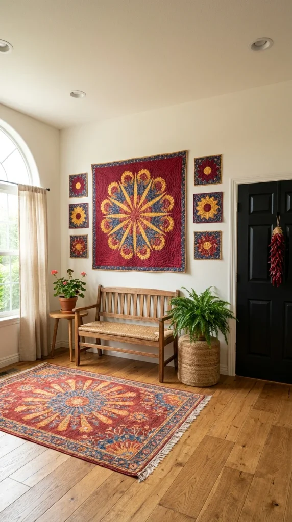
This entryway swaps the expected macrame or woven wall hanging for something less common in boho spaces: a large quilted sunburst textile, flanked by six smaller matching sunflower-pattern quilt squares. It’s a genuinely different way to bring pattern and craft to a boho wall, and it immediately shifts the whole room toward Americana-farmhouse territory rather than global-boho.
The symmetry here is deliberate and worth noticing, since most boho styling leans asymmetrical and collected-looking. Three quilt squares sit on each side of the central piece in a tight, even grid — a formal arrangement that would look stiff in most boho rooms but works here because the quilting itself is loose, handmade, and imperfect. That tension between a formal layout and an informal craft material is the specific thing that keeps this from reading as either too fussy or too casual. A wicker bench with a rush seat continues the natural-fiber theme below, while a black front door with a dried chili ristra hanging on it adds a second craft-textile moment without competing with the quilt wall.
This look suits anyone drawn to farmhouse style who wants a boho note without losing that country identity — think exposed wood floors, arched windows, gingham or floral leanings elsewhere in the home. It’s a strong fit for households with a genuine textile collection (quilts, vintage linens) looking for a way to display them as art rather than storing them in a closet. It’s a less natural fit for modern or minimalist homes, where this much pattern and this formal a grid would likely feel out of place against clean lines.
The advantage is originality — quilted wall art like this is genuinely uncommon in boho entryways, so it stands out without requiring an unusual budget. The compromise is that this arrangement depends on either owning or finding quilted pieces in a coordinated pattern, which takes more hunting than buying a single macrame piece off the shelf. For a smaller budget, one framed vintage quilt square alone still reads as intentional textile art without needing the full symmetrical grid. The most common mistake is mixing unrelated quilt patterns instead of choosing pieces from the same color family, which turns a curated wall into a mismatched one.
Two Panels, One Message
Repetition across seven separate textile pieces — the burgundy, gold, and blue running through the center quilt and every smaller square around it — is what lets this wall read as one cohesive artwork instead of seven unrelated pieces of fabric loosely grouped together.
What Trips People Up Recreating This
– Mixing quilt patterns from different color families instead of keeping them coordinated
– Hanging the smaller squares unevenly instead of in a tight, deliberate grid
– Choosing a glossy modern frame instead of letting the quilting itself be the visual texture
– Pairing this wall with a sleek, contemporary bench that clashes with the handmade textile feel
Recommended Materials: cotton quilting, wicker, rush seating, reclaimed wood flooring
Main Colors: Burgundy, Gold, Navy, Cream
Best Lighting: A tall arched window beside the wall floods it with soft daylight — quilted textiles like this look their richest in natural light rather than under a single overhead fixture.
Maintenance: Quilted textiles fade with prolonged direct sun exposure, so positioning this wall away from harsh afternoon light helps the colors stay vivid longer.
Should You Add Floor Cushions Instead of Just a Bench?
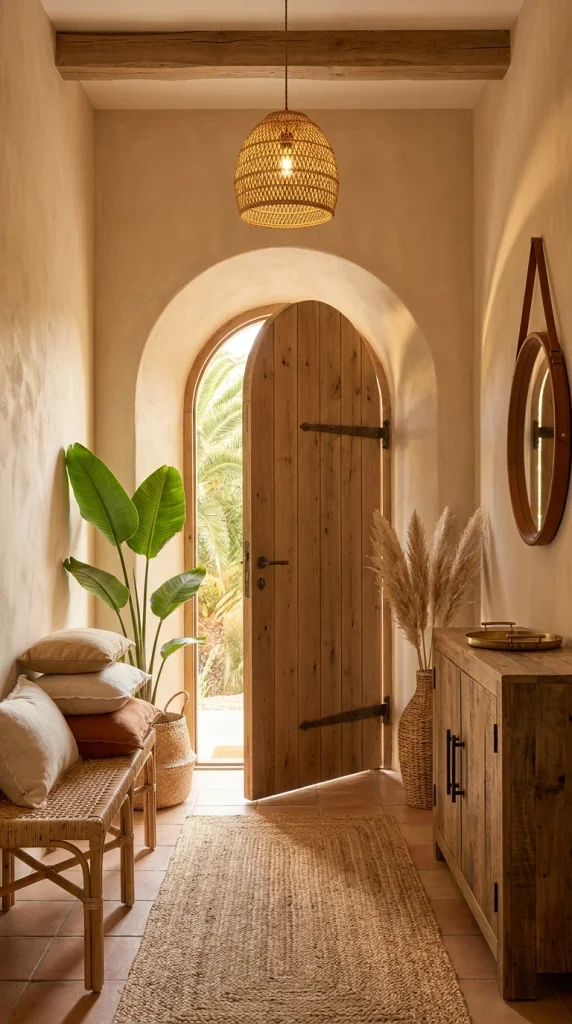
This entryway closes out the list with a return to warm Mediterranean plaster, but with one meaningful addition the earlier version didn’t have: a stack of loose floor pillows piled directly on a rattan bench, instead of a single tidy cushion. That change turns a spot to sit briefly into a spot that invites you to actually linger, which is a small but real functional shift.
The arched wood door at the center of the frame is doing significant proportional work — its height and rounded top pull the eye upward and outward toward the palm trees visible through the opening, making a fairly narrow hallway feel more expansive than its actual footprint. A reclaimed wood cabinet on the opposite wall, with a round leather-strap mirror hung above it, mirrors the bench-and-pillow grouping across the hall, giving the space a loose, balanced symmetry without feeling rigid about it.
This entry suits homeowners who want their entryway to double as a genuine waiting or sitting spot — for putting on shoes, for a moment before heading out — rather than a pure pass-through. It’s a strong fit for anyone with a similar Mediterranean or Spanish-influenced architectural style already in place, since this look depends on that arched doorway and tile flooring to feel authentic rather than applied. It’s a poor match for very high-traffic entries (large families, frequent guests), where a pile of loose pillows would likely end up on the floor within a day.
The advantage is comfort and warmth that a bare bench alone doesn’t offer — piled pillows make an entryway feel like part of the home rather than a functional afterthought. The compromise is upkeep: loose pillows shift, fall, and need regular restacking in a way a single fixed cushion doesn’t. To simplify for a smaller budget or lower-traffic entry, two or three coordinating pillows instead of five or six get a similar layered look with less daily tidying. The most common mistake is choosing pillow covers in mismatched fabrics instead of a coordinated but not-identical palette, which is what keeps a pile like this looking curated instead of chaotic.
Is the Pillow Pile Worth It?
A stacked cushion arrangement like this photographs beautifully, but it’s genuinely more upkeep than most people expect — in a household with kids, pets, or frequent guests, these pillows won’t stay stacked for long, and someone will be restacking them daily. Where it earns its place is in a lower-traffic entry that functions more like a quiet transition space than a busy family thoroughfare; there, the extra comfort and warmth are worth the small bit of tidying. If your entryway sees constant use, a single fixed bench cushion gets most of the coziness without the maintenance.
Where This Setup Falls Apart
– Using pillow covers in clashing patterns instead of a coordinated color family
– Piling pillows too high, making the bench impractical to actually sit on
– Skipping a rug at the base of the arch, leaving the tile floor feeling incomplete
– Placing this arrangement in a high-traffic entry where pillows constantly end up on the floor
Recommended Materials: rattan, linen and cotton pillow covers, terracotta tile, reclaimed wood, leather strapping
Main Colors: Warm White, Terracotta, Rust, Natural Wood
Best Lighting: The open door itself is the main light source during the day; a woven rattan pendant overhead keeps the warm tone consistent once evening light fades.
Maintenance: Linen and cotton pillow covers should be spot-cleaned rather than machine-washed often, since frequent washing can flatten the natural texture that gives them their casual, lived-in look.
Keeping a Boho Entryway Working for Daily Traffic
An entryway isn’t a display room — it takes muddy shoes, wet umbrellas, and dropped keys every single day, so a few practical calls matter more here than almost anywhere else in the house.
- Choose flatweave or low-pile natural rugs (jute, sisal) over plush ones in the direct walking path — they hide dirt better and don’t hold moisture from wet shoes.
- Keep at least one flat surface—a bench seat or console top—genuinely clear for keys, mail, and bags, even if the rest of the space is layered with texture.
- Position delicate natural-fiber baskets and floor pillows slightly out of the main foot-traffic line, since they wear and shift faster than furniture directly in the path
- Add a coat hook or hook row near the door at multiple heights if kids use the entry too, so outerwear doesn’t end up on the bench or floor.r
Who Should Choose This Style?
- Best for homeowners with some architectural character already (arches, beams, tile) who want to lean into it rather than fight it
- Best for renters and apartment dwellers wanting texture and warmth through freestanding, portable pieces like rugs, plants, and mirrors
- Best for households comfortable layering patterns and natural textures rather than sticking to one dominant material
- Not ideal for households with young kids or pets in very high-traffic entries, where natural-fiber rugs and loose floor pillows wear out fast
- Not ideal for strict minimalists who prefer a single clean surface over layered texture and pattern
Budget Summary
| Budget | Expectation |
|---|---|
| Low | Jute runner rug, faux pampas grass, thrifted woven baskets, peel-and-stick wood slat panel.ls |
| Medium | Rattan pendant light, potted live plants, woven bench cushion, a single kilim or ikat pillow |
| Premium | Custom wood slat paneling, hand-loomed wool rugs, hand-painted tribal furniture, vintage textile wall art |
Frequently Asked Questions
What’s the easiest way to start a boho entryway on a budget?
Start with a natural-fiber rug and one substantial plant—those two elements alone carry most of the warmth this style depends on, and both are easy to swap or upgrade later.
Do I need real plants for a boho entryway to work?
No. Several of the directions above use real greenery, but a well-chosen faux bird of paradise or dried pampas grass in a woven basket gets most of the visual effect without any watering schedule.
How do I keep a jute rug from fraying at a front door?
Trim loose fibers as they appear rather than pulling them, keep the rug off any spot that gets standing water, and consider a low-pile flatweave instead of a thick jute weave in the highest-traffic entries.
Can a small entryway pull off a full boho look?
Yes—several of the styles above (the bright renter-friendly hallway and the terracotta nook, in particular) were built for tight footprints. Round shapes and one well-scaled statement piece tend to work better than several small accessories in a narrow space.
What wall colors work best behind boho furniture?
Warm whites and earthy plaster tones are the safest starting point, but as the teal and charcoal entries above show, saturated colors can make rattan and wood tones look even richer when the rest of the palette stays warm and consistent.
About the Author
Aesthetic Life Team
The Aesthetic Life Team is a group of home decor writers and design enthusiasts who research, curate, and write practical, real-world styling guides for every room in the house. The team draws on interior design principles, current home trends, and hands-on decorating experience to help readers make confident, informed choices for their own spaces. This article, like all Aesthetic Life content, is intended for general inspiration and educational purposes and reflects editorial opinions on interior design trends.
Conclusion
Boho isn’t a single formula—it’s a set of decisions about texture, color, and how much pattern you’re comfortable living with. Whether that means a slatted wood wall, a full terracotta-plastered nook, or something as unexpected as quilted textile art, the ten directions above cover a genuinely wide range of budgets, architectural starting points, and daily traffic levels. Pick the one that matches how your entryway actually gets used, not just the one that photographs best, and it’ll hold up long after the first week.
Explore More
You may also enjoy:
– 10 Dreamy Boho Patios to Inspire Your Next Backyard Refresh
– 10 Slatted Wood Wall Designs That Turn Plain Rooms Into Japandi Retreats
– 10 Rug Styles That Make Any Bedroom Feel Cozier

4 Responses