Small rooms have a way of making even your favorite furniture feel like it’s fighting for space. You’ve probably scrolled past dozens of Pinterest photos where a room looks airy and open, then looked around your own 10×10 bedroom or cramped studio apartment and wondered what you’re doing wrong. Here’s the honest answer: it’s rarely about the furniture. It’s about light—and how little of it actually moves through the room.
This is where mirrors quietly do more work than almost any other design element. A well-placed mirror doesn’t just reflect a room—it bounces natural light, creates a sense of depth, and tricks the eye into reading the space as larger than it actually is. No demolition, no expensive renovation, no permission from your landlord required.
Whether you’re renting, working with a tight budget, or just tired of a room that feels smaller than its square footage suggests, these 10 wall mirror ideas are built for real homes — not showrooms. Let’s get into what actually works.
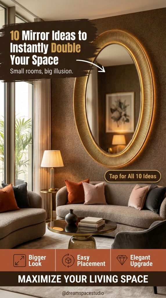
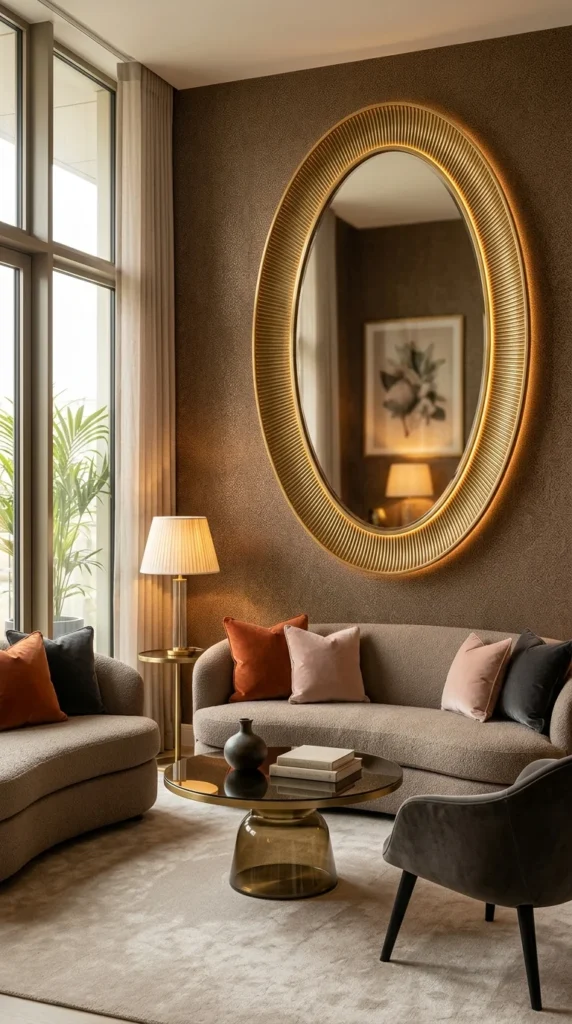
What struck me first about this room wasn’t the mirror itself—it was the wall behind it. That deep, textured brown would swallow light in most homes, and yet this space still feels warm instead of cave-like. The oval mirror is doing quiet, deliberate work here: its ribbed brass frame catches and scatters the lamp light unevenly, which reads as glow rather than glare. That subtlety matters more than the mirror’s size.
Vertical orientation is the real lesson to steal. In a room with tall windows and a low curved sofa, a round or square frame would have fought the ceiling height. This oval elongates the eye upward instead, making the whole wall feel taller. (And yes, that distinction actually matters more than it sounds.) A backlit or brass-rimmed mirror like this runs $150–$400 depending on size—not cheap, but far less than repainting an entire accent wall to fix the same problem.
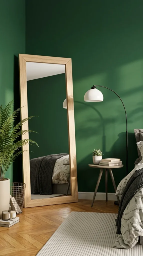
2. The Leaning Oak Mirror — Doubling the Room Without Touching It
This one is simpler to explain, and honestly, that’s the appeal. A tall, leaning mirror like this doesn’t need a mounting bracket, a stud finder, or a single nail in the wall—which makes it one of the few genuinely renter-safe options on this list. Lean it against a corner, angle it slightly, and it reflects almost the entire bedroom back into itself.
The oak frame is doing more than adding warmth. Against that deep green wall, a black or metal frame would have created hard contrast and made the corner feel smaller, not bigger. Wood softens the transition instead. The tradeoff worth knowing before you buy: leaning mirrors this size need floor space to spare, so they work best in a bedroom with a clear wall run, not a tight studio corner already crowded with furniture. Budget-wise, expect $80 on the low end and $300+ for solid oak.
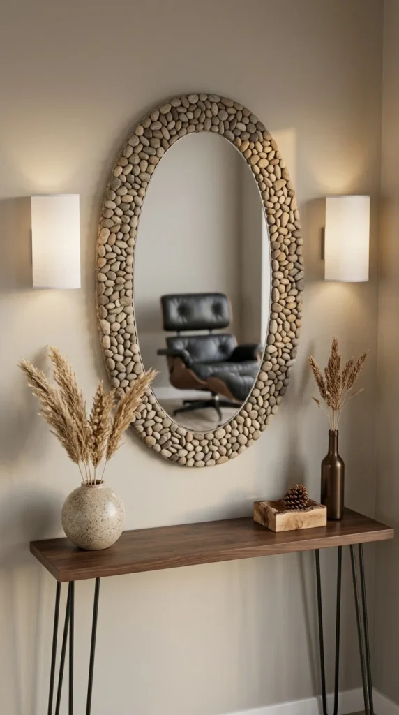
3. The Pebble-Frame Mirror — Texture as the Whole Point
Symmetry does a lot of quiet lifting in this entryway. Two matching sconces, a centered mirror, a console table with even weight on both sides — nothing here is accidental. That kind of balance is part of why the space feels larger than a narrow hallway usually does.
This is not a combination I would have reached for myself—river stone framing can tip into “spa lobby” territory fast—but the restraint elsewhere in the room keeps it from feeling themed. The stones stay in one warm tonal family, the wall is a plain neutral, and nothing else in the vignette competes for texture.
Pro tip: Textured frames like pebble, rope, or rattan reflect light less directly than polished metal, so pair them with actual light sources—sconces or a lamp—rather than relying on the mirror alone to brighten a dim hallway.
For renters, a lighter resin-pebble version (not real stone) runs closer to $60–$120 and hangs on a standard picture hook.
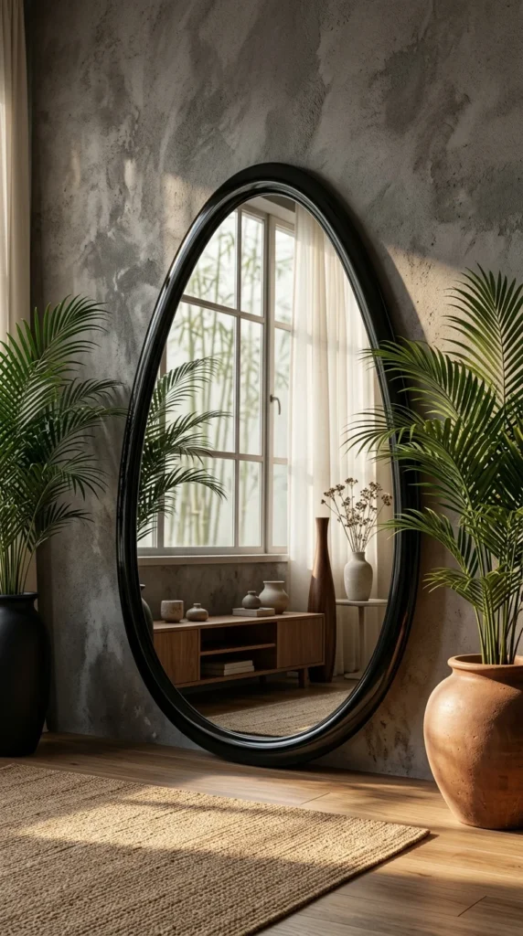
4. The Egg-Shaped Black Mirror — Reflecting a Window That Isn’t There
Three plants. One irregular mirror. And somehow the corner reads as a garden nook instead of a cluttered plant shelf. Here’s why: the mirror isn’t reflecting the room you’re standing in—it’s angled to capture the window across from it, which means it’s essentially manufacturing a second light source in a spot that would otherwise just be wall.
That’s the real technique to borrow, and it’s the one most people skip. A mirror placed opposite or near a window doesn’t just brighten the room in general — it pulls that specific light source into a part of the room that never gets any. If your small space has one good window and three dark corners, this is worth trying before you buy a single extra lamp.
The organic egg shape also softens the textured concrete wall behind it, which a rigid rectangle would have fought against.
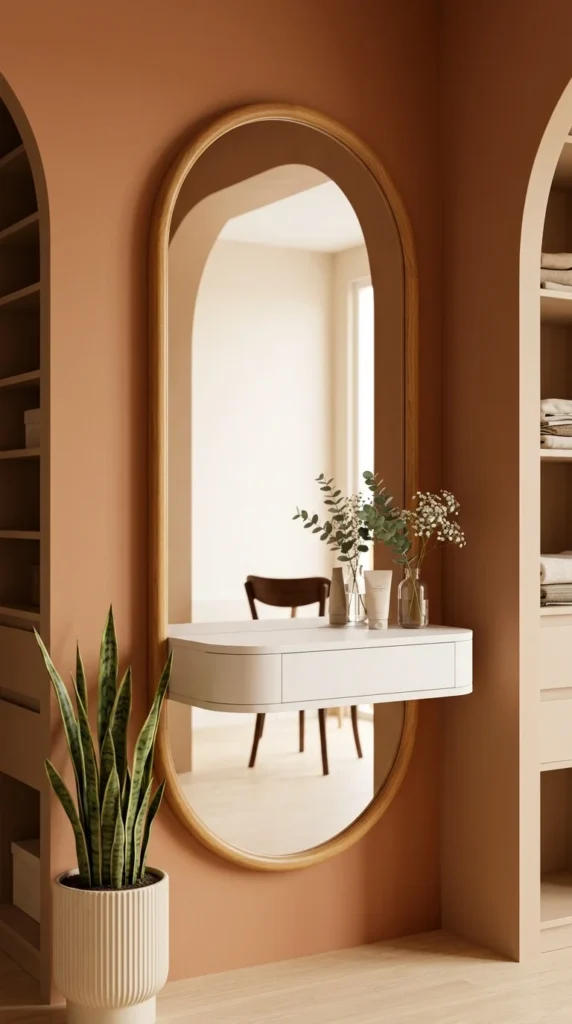
5. The Pill-Shaped Vanity Mirror — Where Function Decides the Shape
Not every mirror on this list needs a design theory behind it. Sometimes the shape is just practical: this floating vanity needed a mirror tall enough to catch a full torso and wide enough to sit flush against the wall behind it, and a capsule shape does exactly that without wasting inches on rounded corners a rectangle would need to clear.
The terracotta wall is the more interesting move here. Warm wall colors are usually the enemy of “making a room feel bigger” advice—most guides push you toward white or pale neutrals instead. But paired with a light oak frame and a mirror this size, the warmth actually reads as inviting rather than closing in, because the reflected space behind it stays pale and open.
Pro tip: If you’re building a small vanity nook, match the mirror width to the desk below it, not the wall—an oversized mirror on a narrow surface looks unbalanced no matter how good the frame is.
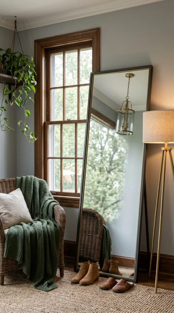
6. The Floor-Leaning Mirror That Doubles as a Second Window
This is the kind of setup that looks effortless in photos and takes a little trial and error to place correctly in real life. The mirror is leaning at a slight angle, tall enough to catch the full window beside it, and the payoff is that the room now reads as if it has two windows instead of one—the same amount of actual daylight, twice the visual openness.
The thin brass edge inside the black frame is a small detail, but it matters more than it looks. A plain black frame against this cool gray wall would have felt heavy and closed the space down slightly. That sliver of brass keeps the frame from reading as a dark rectangle and lets it blend into the window light instead of competing with it.
One tradeoff worth naming: a mirror this tall needs a stable lean—either an anti-tip strap or a heavy base—especially in a room with kids, pets, or a chair positioned this close beside it.
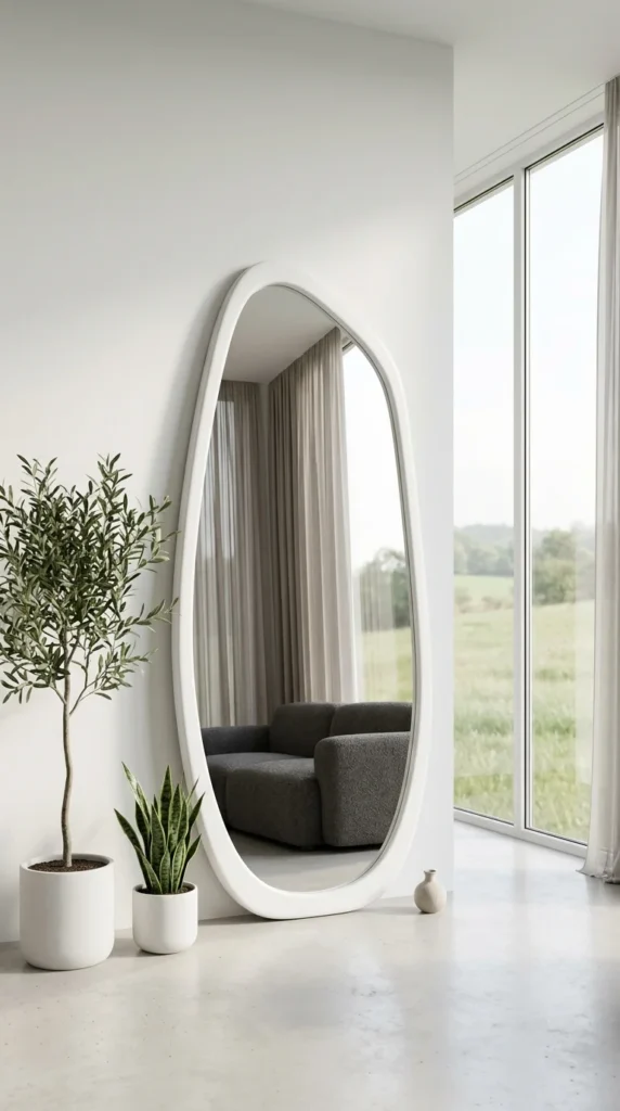
7. The White Organic Mirror — Disappearing Into the Wall on Purpose
This mirror works by trying not to be noticed. The frame is painted the exact white of the wall behind it, so instead of reading as a separate object hung in the room, it almost reads as a soft-edged opening cut into the wall itself. That’s a different strategy from the black or brass frames earlier on this list—where the frame draws the eye, here the frame steps back entirely.
That is it. That is the whole idea.
It’s also worth noticing what the mirror is reflecting: a dark sofa and heavy curtains, doubled and folded into a bright white room. The contrast is what makes the space feel expansive rather than empty. A monochrome white mirror in an already white room only works if there’s something with real weight for it to reflect.
Fear worth naming: an all-white, oversized mirror can feel risky to commit to. If that’s holding you back, a smaller version in the same shape gives the same softening effect for under $150.
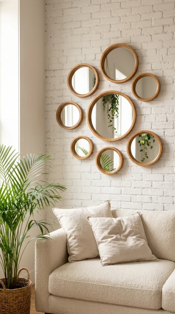
8. The Circle Mirror Cluster — More Reflections, More Forgiveness
Where a single oversized mirror needs the right wall, the right height, and near-perfect placement to work, a cluster like this is more forgiving. Nine wood-framed circles of varying sizes are grouped tightly on white-painted brick—the arrangement itself does the visual work of a “big statement piece” without requiring one large, expensive mirror or a precise center-of-wall measurement.
I keep coming back to why this reads as intentional instead of chaotic, and I think it’s the frame consistency. Every ring is the same warm wood tone, just in different diameters. Mixed frame finishes here—a black one, a gold one—would have collapsed the whole effect into clutter.
Practically, this is one of the more forgiving projects on this list. You don’t need to get spacing perfect on the first try; small circle mirrors are light enough to reposition with removable adhesive hooks, which makes this a genuinely low-risk weekend project for a rental.
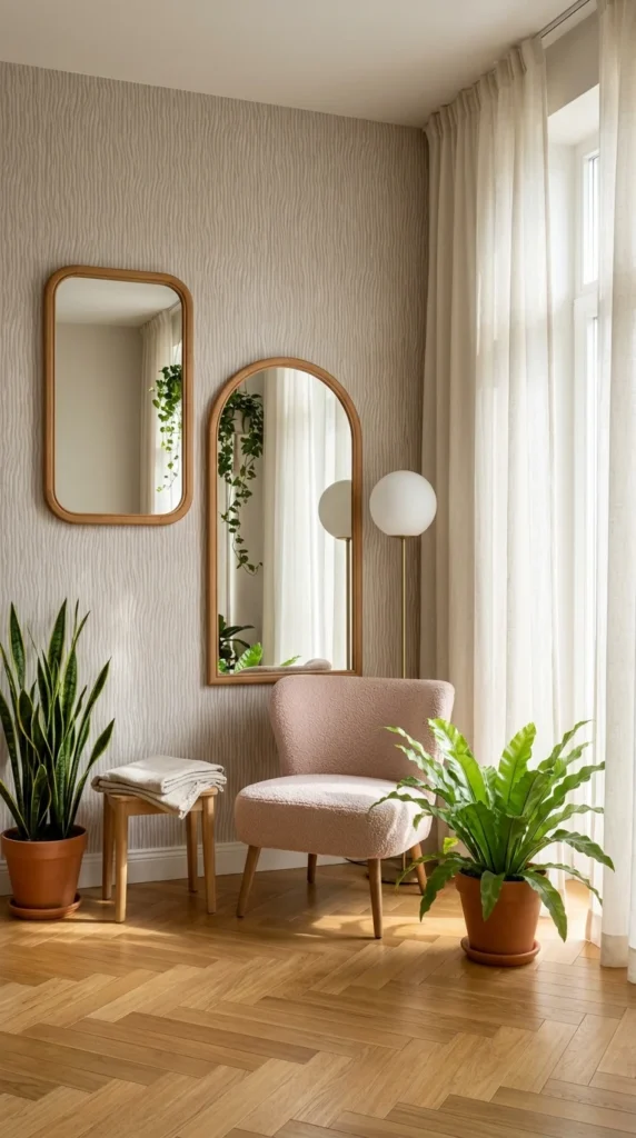
9. Two Mirrors, Two Jobs — Not a Matching Set
Where the circle cluster earlier relied on repetition, this corner does the opposite: a smaller rectangular mirror and a taller arched one, different heights, different shapes, hung with no attempt to match. That’s a harder trick to pull off well, and it works here because each mirror is doing a distinct job—the rectangle sits at eye level for quick checks near the door, while the arched one is scaled to the reading chair below it, reflecting the plant and window light back into the seating nook.
Personally, I’d hesitate to copy this exact pairing without a plan—mismatched mirrors can look unfinished if the shapes are too similar or the frames don’t share at least one material. Here, both frames are the same light oak, which is the detail holding the whole grouping together. Change one frame to black metal and the pairing likely falls apart visually. Match the wood tone first; everything else about the pairing is more flexible than it looks.
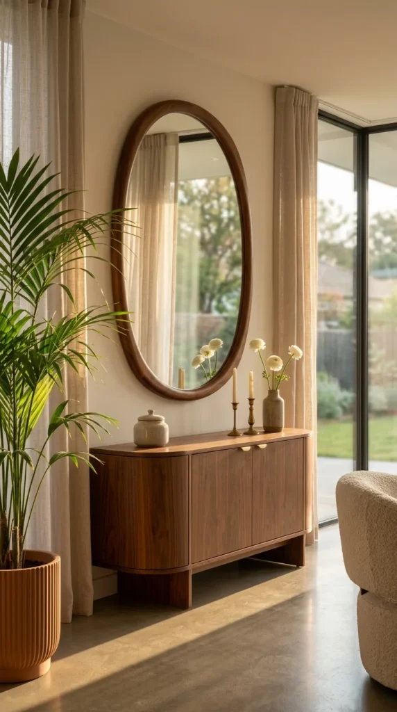
10. The Walnut Oval — Reflecting the Outside In
Why does this room feel bigger than the floor plan probably allows? It’s not just the mirror—it’s what the mirror is angled to catch. Positioned across from the sliding glass door, it pulls the backyard, the fence line, and even the tree outside straight into the wall above the credenza. The room borrows scenery it doesn’t technically contain.
The walnut frame matters more here than in some of the other picks on this list. Match it to the credenza below, like this room does, and the mirror reads as part of one furniture story instead of a separate decor decision bolted on afterward. That’s the small win worth taking from this room even if you can’t recreate the sliding door: pick a mirror frame in the same wood tone as your nearest furniture piece, and it’ll look intentional even on a modest budget.
Pro tip: Oval and round mirrors soften a room full of straight-edged furniture—credenzas, window frames, and door trim—without needing a single curved chair to balance it.
Conclusion
Ten rooms, ten completely different mirrors—and if there’s one thread running through all of them, it’s this: the mirror was never really the point. Light was. Every choice on this list, whether it was a $60 resin-pebble frame or a $400 backlit brass oval, worked because someone thought about what the mirror was reflecting, not just how it looked on the wall.
That’s the part most small-space advice skips. It’s easy to tell someone “add a mirror.” It’s more useful to say, “Stand where the mirror will hang, look at what’s across from it—a window, a plant, a hallway—and ask if that’s actually worth doubling.”
You don’t need all ten of these ideas. You need one, placed with intention, in the spot your room is already fighting hardest to open up. Start there, and the rest of the room tends to follow.
FAQs
1. Do bigger mirrors always make a small room look bigger? Not automatically. Size helps, but placement matters more — a large mirror facing a blank wall does far less than a smaller one angled toward a window or an open sightline.
2. Where’s the best place to hang a mirror in a small room? Directly across from or adjacent to your main light source, usually a window. This bounces natural light deeper into the room instead of just reflecting another wall.
3. Is a leaning floor mirror safe for renters and small spaces? Yes, with one caveat—anchor it with an anti-tip strap or wall strap if you have kids, pets, or a tight walking path nearby, since it isn’t mounted to the wall.



One Response