
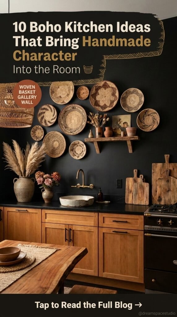
Boho kitchens rarely start with an expensive renovation. They start with texture — a woven pendant, a patchwork tile, an oiled wood stool — layered until the room feels collected rather than purchased all at once. That’s the tension worth understanding before you commit to this style: it looks effortless, but every version below is built from a handful of deliberate decisions about material, repetition, and restraint.
The ten kitchens here don’t represent one “boho look.” They represent ten different answers to the same underlying questions — how much pattern, how much wood, how much color, how much plant life. Use them to figure out which answers actually match how you live, not just which photo you’d pin.
Quick Overview
| Style | Artisanal Global Boho |
|---|---|
| Best For | Open-plan kitchens, plant lovers, texture-driven homes |
| Budget | Low–High (highly scalable) |
| Difficulty | Beginner–Advanced, depending on the idea |
| Maintenance Level | Medium |
A Carved Wood Panel That Works Like a Piece of Art
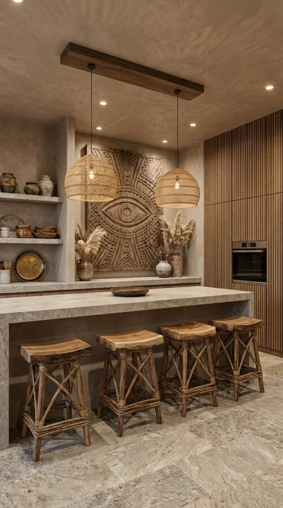
This kitchen answers a question a lot of boho homeowners eventually ask: what do I put on the wall instead of a backsplash? Here, the answer is a hand-carved wood panel with a bold eye motif, treated less like decor and more like a piece of gallery art the whole room is arranged around.
The honed stone island and plastered ceiling stay quiet on purpose — pale, textural, unpatterned — so the carved panel has room to read as the room’s one loud statement. Two oversized woven pendant lights hang low over the island, echoing the same warm wood tone as the panel without competing with it, which is what keeps the ceiling from feeling busy despite two large fixtures. The open shelving stacked with stone-glazed pottery does real double duty: it’s storage, but it’s also the supporting cast that makes the carved panel feel curated rather than random.
This idea suits homeowners who want one serious design moment rather than a dozen small ones, and it works particularly well in kitchens with a single blank wall crying out for scale — the kind of wall that a row of small framed prints would only make look emptier. It’s a strong match if your existing finishes (stone counters, wood-slat cabinetry) are already neutral enough to support a bold focal piece; if your kitchen already has a busy tile floor or a strong cabinet color, this panel will fight for attention instead of anchoring it.
Where the Eye Lands First
The carved panel sits at eye level directly behind the island’s main seating run, which means it’s the first thing a seated guest actually looks at — not the range, not the cabinets. That placement is deliberate: repeating the same warm wood tone in the panel, the pendant weave, and the stools creates one continuous visual thread across three different objects, which is one reason the room reads as composed rather than assembled from separate purchases. In this case, swapping the panel for something in a colder material would likely break that thread and make the pendants feel disconnected from the wall behind them.
Recommended Materials: carved solid wood, honed limestone, rattan weave, glazed stoneware, unlacquered brass Main Colors: Warm Walnut, Stone Grey, Aged Terracotta, Soft Plaster Best Lighting: Two low-hung pendants over the island plus recessed ceiling lights aimed to wash the carved panel, which brings out its relief detail after dark.
💡 Quick Tip: If a full carved panel is out of budget, a single large reclaimed-wood relief piece from a local artisan market achieves a similar focal effect for a fraction of the cost.
Common Ways This Idea Gets Recreated Wrong
- Hanging the carved panel off-center instead of aligned with the seating below it
- Pairing it with a busy patterned backsplash elsewhere in the same sightline
- Choosing a panel with cool-toned or painted wood instead of a warm natural finish
- Skipping the accent lighting, which leaves the carving’s texture flat and hard to appreciate at night
A Patchwork Tile Wall That Does the Job of a Dozen Accessories
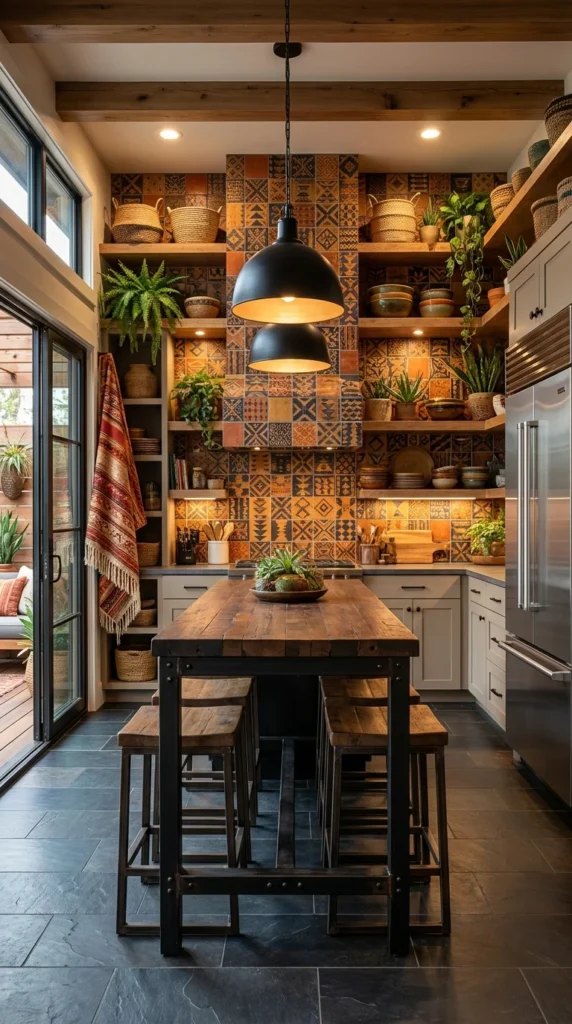
If the first idea proved restraint can carry a room, this one proves the opposite: maximalist pattern, confidently deployed, can be just as resolved. The full-height patchwork tile wall mixes geometric motifs in rust, ochre, and indigo, and it’s doing the job that a dozen framed prints, throw pillows, and knickknacks would otherwise have to do separately.
What keeps this from tipping into chaos is the charcoal slate flooring and matte black pendants and table legs — a firm, dark, unpatterned frame around the loudest element in the room. That’s a useful principle if you’re nervous about pattern: the busier your feature wall, the plainer everything else needs to be. Open wood shelving stacked with woven baskets softens the industrial black hardware, and the layered plants and hanging textile on the left keep the whole space from feeling like a showroom.
This direction suits people who actually enjoy curating collections — the shelves here are doing visual work, not just storage — and it’s a strong fit for narrow galley kitchens, where a bold tiled wall gives an otherwise plain corridor a genuine reason to linger. It’s a harder sell in small, low-light kitchens, where that much saturated pattern and dark flooring together can start to feel closing-in rather than cozy; the natural light coming through the sliding doors here is doing a lot of the balancing.
Recommended Materials: patchwork ceramic tile, matte black steel, reclaimed wood, natural fiber baskets, slate flooring Main Colors: Rust Orange, Deep Indigo, Charcoal, Warm Ochre Best Lighting: Two black dome pendants positioned close together over the table, supplemented by the natural light from the adjacent glass doors — without that daylight, this palette would read considerably darker.
Recreating It Without the Full Tile Wall
- Start with a peel-and-stick patchwork tile panel behind open shelves instead of tiling floor to ceiling
- Keep the floor and countertops solid and dark to anchor the pattern
- Add one textile — a rug, throw, or hanging blanket — to soften the black metal
- Limit the palette to three tile colors max so it reads intentional, not random
Getting This Look Wrong
- Using warm white or light oak flooring, which flattens the contrast this look depends on
- Choosing tile patterns from more than one design “family” (e.g., mixing Talavera with Art Deco geometrics)
- Overcrowding the open shelves until the baskets and pattern compete instead of pairing
- Leaving the space under-lit, since patchwork tile loses its impact in flat daylight-only rooms
Tropical Wallpaper as the Only Boho Move You Need
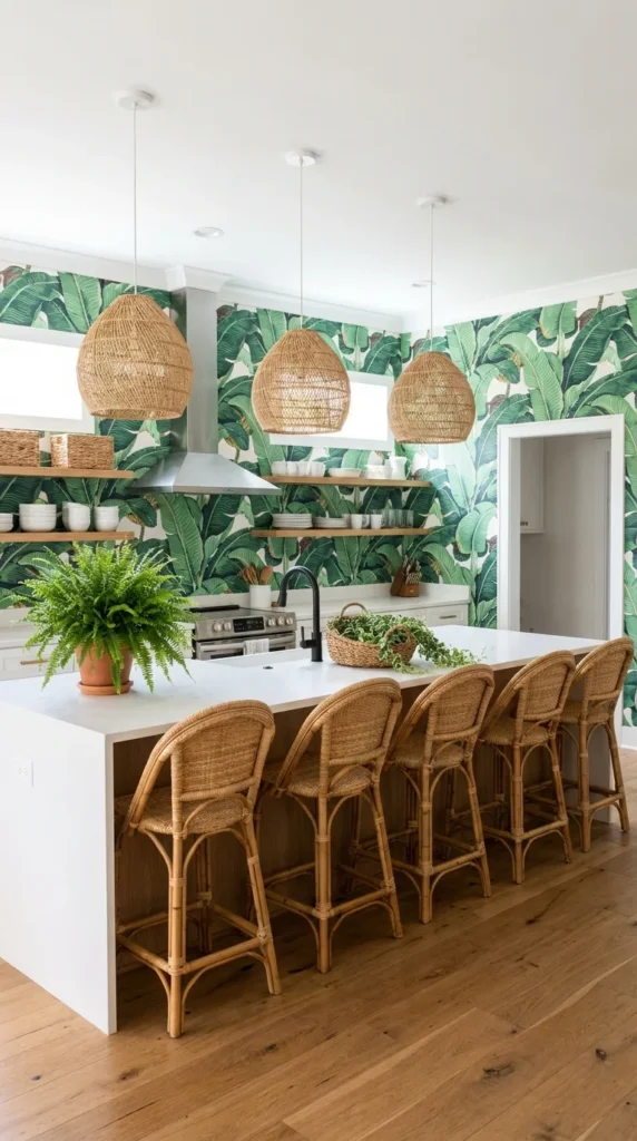
This kitchen makes a case for doing one thing boldly instead of layering ten small boho touches. The oversized banana-leaf wallpaper is the entire personality of the room — everything else, from the white waterfall island to the plain wood floor, is intentionally left alone.
That restraint is the actual lesson here, not the wallpaper itself. White cabinetry, a white island, and open wood shelving give the pattern nowhere to compete, which is why a print this large doesn’t overwhelm the room the way it might against busier finishes. The rattan bistro-style counter stools are the one other boho element allowed in, and they were chosen specifically because their woven texture pulls a natural material into the room without adding a second competing pattern.
This is a strong option for homeowners who love the idea of a maximalist statement but don’t want to commit to boho everywhere — a rental-friendly, removable wallpaper application can achieve this exact look without permanent changes, which makes it one of the more approachable ideas here. It suits bright kitchens with genuine daylight, since the wallpaper’s white background needs light to keep it feeling airy rather than dense. In north-facing or naturally dim kitchens, that same wallpaper can start to feel heavy rather than tropical.
A Palette Built Around One Loud Decision
Every other material in this kitchen is neutral by design — the white quartz island top, the pale oak floor, the unadorned wood shelving. That restraint isn’t a lack of confidence; it’s what makes the wallpaper readable as a single, deliberate statement instead of one pattern fighting for space among several. A room this committed to a single move tends to feel more sophisticated than one where five smaller boho gestures are all competing for the same attention, largely because the eye always knows where to land first.
Recommended Materials: removable botanical wallpaper, quartz countertop, natural rattan, white oak flooring Main Colors: Banana Leaf Green, Crisp White, Natural Rattan Tan Best Lighting: Simple pendant lights kept understated on purpose, letting daylight from nearby windows do most of the work of keeping the wallpaper feeling fresh rather than dark.
💡 Quick Tip: Test a wallpaper sample against your kitchen’s actual light at both midday and evening before committing — large-scale botanical prints shift mood dramatically under warm bulb light versus daylight.
Common Mistakes With Bold Wallpaper Kitchens
- Adding a second patterned element (a rug, tile, or fabric) that competes with the wallpaper
- Choosing dark cabinetry that muddies the crisp white/green contrast this look depends on
- Installing permanent wallpaper in a rental without checking lease terms first
- Under-lighting the space, which makes a large tropical print feel dense rather than lush
Copper Fixtures and Patchwork Tile, Layered for Old-World Warmth
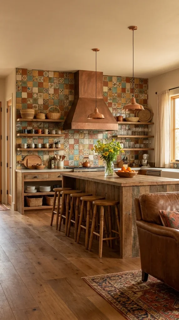
Where the previous kitchen proved one bold move is enough, this one shows how several warm elements can layer together without ever feeling matchy. The hammered copper range hood and matching pendant lights are the room’s clearest signature, but they only work because of what surrounds them: a mosaic tile wall mixing teal, rust, and cream, a reclaimed wood island, and a genuinely worn Persian-style rug.
None of these materials were chosen to match each other exactly — they were chosen to sit in the same warm, aged color family. That’s the real design principle at work: copper, terracotta tile, honey-toned wood, and a faded vintage rug all read as “old and well-loved” even though most of them are new, which is what gives this kitchen its lived-in feeling rather than a showroom one.
This direction suits homeowners drawn to vintage and antique-adjacent styling — the leather sofa and turned wood stools both look like pieces that could have been inherited rather than bought new. It’s a good fit for kitchens that open directly into a living space, since the leather seating here suggests the kitchen island doubles as a casual gathering spot. It’s a tougher fit for anyone who wants a bright, high-contrast kitchen; every material here sits in the same mid-to-warm tonal range, so the room reads cozy rather than crisp, and that’s a deliberate trade-off, not an accident.
How Copper Actually Ages in a Working Kitchen
Unlacquered copper — like the hood and pendants here — will darken and develop a natural patina with heat and handling over the first year or two. That’s generally treated as a feature in this style rather than a flaw worth polishing away, since the deepening color is part of what makes copper read as “vintage” rather than “new hardware store fixture.” Homeowners who want the copper look to stay bright and polished should budget for a lacquered finish or regular maintenance instead, since raw copper won’t hold its factory shine on its own.
Recommended Materials: hammered copper, patchwork mosaic tile, reclaimed wood, leather upholstery, vintage wool rug Main Colors: Aged Copper, Terracotta, Deep Teal, Honey Wood Best Lighting: Two copper pendants hung at slightly different heights over the island, plus the window’s natural light — the metal’s warm glow does most of the evening ambiance on its own. Maintenance: The vintage-style rug and unsealed reclaimed wood island top will both need occasional cleaning and refinishing attention; unlacquered copper needs no maintenance at all if you want the patina to develop naturally.
Where This Copper-and-Tile Look Falls Apart
- Choosing lacquered, mirror-bright copper and expecting the same worn-in effect
- Selecting a rug in cool tones (blues, greys) that clashes with the warm tile and copper
- Skipping the reclaimed or distressed wood in favor of new, uniform lumber
- Overcrowding the tile wall with too many open shelves, losing the pattern’s impact
A Skylight-Lit Kitchen Built Around Living Plants
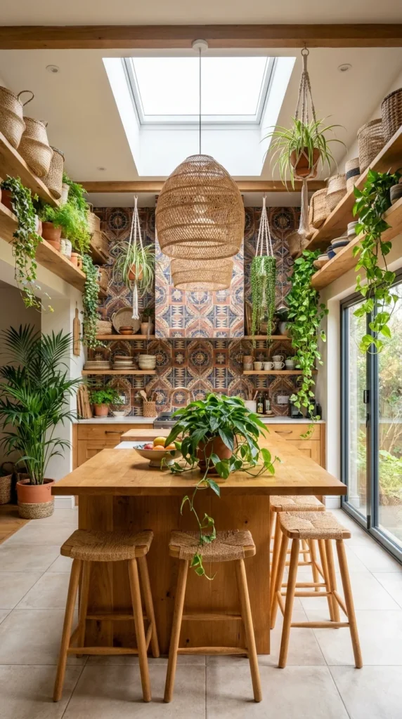
Some boho kitchens use plants as an accessory. This one uses them as the primary design material — trailing pothos, hanging ferns, and potted palms fill nearly every open surface, hung from macrame slings and lined along double-tier open shelving, until the greenery is doing as much visual work as the cabinetry.
None of this works without the skylight. Direct overhead daylight is what makes a plant density this high actually livable rather than a maintenance trap, and it’s the single structural feature separating this kitchen from a similar room without one. The oak island and open shelving stay simple and pale specifically so the plants read as the star rather than competing with a busier cabinet finish, and the patterned tile wall behind the stove is the only other pattern allowed into the room.
This is the clearest option here for genuine plant enthusiasts and anyone renovating a kitchen with real overhead or south-facing light to spare — a rattan or wicker pendant repeated at multiple heights, as seen above the island and near the window, is the connective thread that ties the greenery back to the room’s other boho materials. It’s a poor match for kitchens with limited natural light or for households who travel often, since a collection this size needs consistent watering and light to avoid becoming the opposite of inviting.
Recommended Materials
Solid oak, natural jute and macrame, hand-glazed patterned tile, woven rattan, terracotta planters
Main Colors: Oak Blonde, Leaf Green, Warm Terracotta Tile Best Lighting: A skylight is doing the heavy lifting here — without one, this level of plant density would need supplemental full-spectrum grow lighting to stay healthy through darker months. Maintenance: This is the highest-upkeep idea in the group. Regular watering, occasional repotting, and periodic pruning are required to keep this many plants looking intentional rather than overgrown.
Easy Ways to Get This One Wrong
- Attempting this density of plants in a kitchen with only one small window
- Choosing plastic or synthetic hanging planters instead of natural jute or macrame
- Letting trailing vines grow into work zones near the stove or sink
- Forgetting a watering routine, which turns “lush” into “neglected” within weeks
For anyone weighing how much greenery a kitchen can realistically support, it’s worth comparing this density against a lower-maintenance version — the plant styling shown in these boho entryway ideas uses a fraction of the density with a similar effect, which is a gentler starting point for anyone renovating a kitchen with less direct light.
Matte Black Walls With a Sculptural Basket Gallery
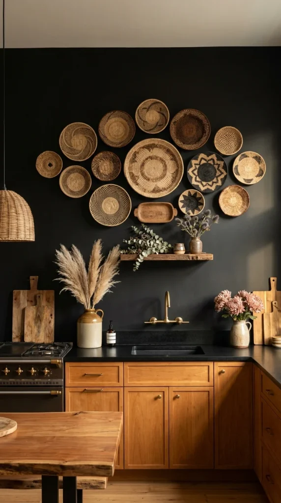
Every other kitchen so far leans light or warm. This one proves boho can hold its own in a dark, dramatic palette — matte black walls and a black stone countertop, offset by an oversized gallery arrangement of woven baskets in a full range of sizes and weave patterns.
The basket wall is the reason this works instead of just reading as a dark, moody kitchen with no personality. Arranged in a loose, asymmetrical cluster rather than a rigid grid, the baskets bring texture and warmth into a palette that would otherwise feel cold and formal. Brass fixtures and warm wood lower cabinetry do the same job at a smaller scale, catching light against the matte black backdrop instead of disappearing into it.
Against that dark wall, the eye goes straight to the basket cluster before it registers anything else in the room — the size gradation, largest baskets toward the center-left, is what gives an intentionally asymmetrical arrangement a clear visual center instead of looking scattered. This idea suits confident, design-forward homeowners who want a kitchen that photographs like a statement piece, and it’s an especially good fit for kitchens that get plenty of natural or supplemental light elsewhere in the room, since dark walls need that contrast to avoid feeling like a cave. It’s a difficult match for small, window-poor kitchens, where black walls this saturated can make an already tight room feel smaller rather than moodier.
Recommended Materials: matte black paint, black honed stone, natural woven baskets, warm cherry wood cabinetry, brass hardware Main Colors: Matte Black, Warm Cherry Wood, Aged Brass, Natural Basket Tan Best Lighting: A single woven pendant plus under-shelf lighting aimed at the basket wall — dark walls absorb light quickly, so this idea needs more fixtures than a lighter kitchen of the same size.
Where This Look Trips People Up
- Choosing a basket arrangement that’s too uniform in size, losing the sculptural effect
- Pairing black walls with cool-toned cabinetry instead of warm wood, which reads sterile rather than moody
- Under-lighting the room, since matte black paint absorbs far more light than it reflects
- Skipping the brass or warm metal accents that keep the palette from feeling flat
Hand-Etched Celestial Cabinetry as the Whole Kitchen’s Identity
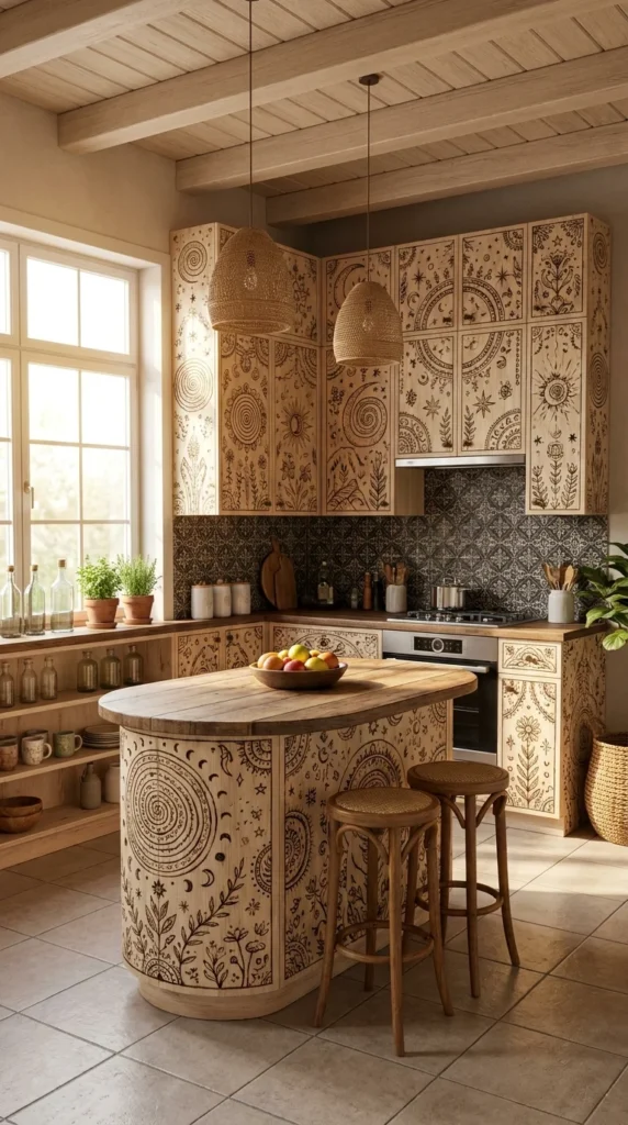
Nothing else in this article looks quite like this kitchen, and that’s the point of including it. Every cabinet face here is covered in hand-burned pyrography artwork — suns, moons, spirals, and botanical line work — turning what’s normally the most utilitarian surface in a kitchen into the room’s entire design statement.
This only works at this scale because the rest of the room gets out of the way. The black-and-white patterned tile backsplash is graphic but small-scale, so it doesn’t visually compete with the cabinet artwork nearby, and the pale, unfinished wood tone of the cabinets themselves is what lets the burned linework actually stand out instead of disappearing into a darker stain.
The curved island here is genuinely oversized relative to the room’s footprint, and that’s a real proportion risk rather than an accident — a curved shape this large works specifically because it echoes the circular sun and spiral motifs already covering the cabinets, tying the room’s boldest structural choice back to its boldest surface choice. In a kitchen without that repeating circular language, an island this scale would likely feel disproportionate rather than intentional. This idea is realistically limited to homeowners commissioning custom or semi-custom cabinetry, or confident DIYers willing to attempt wood-burning their own doors; it’s not an idea to half-execute; a partial or uneven wood-burn job will look unfinished rather than intentional.
Is Custom-Etched Cabinetry Worth It?
This is genuinely one of the more expensive and labor-intensive ideas in this article, and it isn’t the right call for most kitchens. It’s worth pursuing if you already plan to invest in fully custom cabinetry and want a genuinely one-of-a-kind result that mass-market boho decor simply can’t replicate — no pendant or rug purchase gets you this level of individuality. It’s not worth it if you’re planning to sell within a few years, since such a specific, personal design choice narrows your buyer pool considerably, or if your budget is better spent elsewhere; a few well-chosen rattan and wood accents deliver most of the same warmth for a fraction of the cost and commitment.
Recommended Materials: unfinished or lightly sealed solid wood, hand-pyrography detailing, patterned ceramic tile, woven rattan pendants, wood beam ceiling Main Colors: Natural Blonde Wood, Charcoal & Cream (tile), Warm Amber Best Lighting: Two rattan pendants over the island plus large windows along one wall — the etched detail needs strong, even light to actually read clearly rather than disappearing into wood grain.
Where This Idea Genuinely Falls Apart
- Attempting a DIY wood-burn without practicing the technique on scrap wood first
- Mixing the pyrography cabinets with an already-busy backsplash pattern
- Choosing a dark wood stain that hides the burned linework instead of framing it
- Under-scaling the island, losing the circular-motif echo that ties the room together
A Monochrome Bleached-Wood Kitchen That Reads as Wabi-Sabi Boho
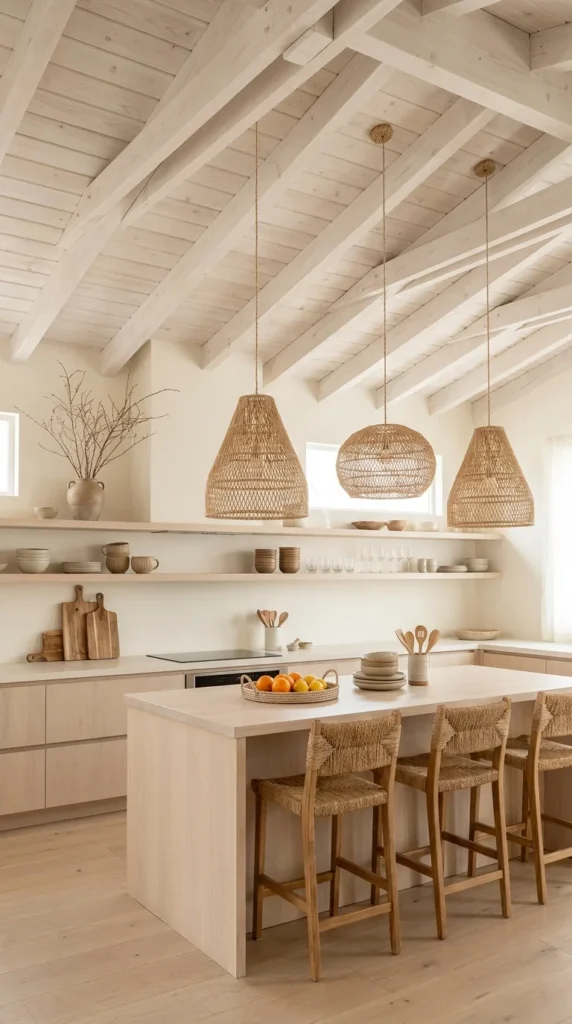
This kitchen strips boho down to almost nothing but wood and light. Every surface — the vaulted beam ceiling, the cabinetry, the flooring, the open shelving — sits in the same pale, whitewashed wood tone, with three oversized rattan pendants as the only real texture break in the entire room.
That level of restraint is a genuine design risk: a single monochrome material palette this consistent can tip into feeling unfinished or sterile if it’s not handled carefully. What saves it here is scale and light. The dramatic vaulted ceiling gives the eye somewhere to travel upward, and the three rattan pendants — cone, drum, and dome shaped, deliberately not matching — introduce just enough handmade irregularity to keep the room from feeling like a showroom display.
This idea suits minimalists who still want warmth, and it’s a genuinely strong match for kitchens with existing wood-beam architecture, since the whole effect depends on having that structural detail to bleach and highlight rather than hide. It’s a poor fit for kitchens without any existing wood ceiling or beam detail, since replicating this look from a flat drywall ceiling would require a full structural addition rather than a simple finish change — a much bigger project than most of the other ideas here.
How Bleached Wood Actually Ages
Whitewashed and bleached wood finishes will continue to lighten slightly with UV exposure over time, particularly near windows, which generally deepens this look’s washed-out character rather than damaging it. The one real risk is uneven fading — a large piece of furniture or rug left in place for years can leave a visible tone difference once moved, so it’s worth rotating rugs and floor items occasionally in a kitchen this sun-exposed.
Recommended Materials: whitewashed solid wood, natural rattan, unlacquered wood beams, light oak flooring Main Colors: Bleached Oak, Warm White, Natural Rattan Best Lighting: Three varied rattan pendants plus abundant window light — this palette depends entirely on brightness, since the same materials in a dim room would read flat rather than airy.
💡 Quick Tip: If your ceiling doesn’t have exposed beams, a single row of stained wood battens can approximate the texture and shadow lines this look relies on without a full structural rebuild.
Common Mistakes in Monochrome Wood Kitchens
- Matching all three pendant shapes exactly, which removes the handmade irregularity that keeps the room from feeling flat
- Introducing a second wood tone (like a darker walnut accent) that breaks the monochrome effect
- Skipping window treatments entirely, leading to uneven fading over just a few years
- Attempting this look in a low-light kitchen, where the palette reads washed-out rather than bright
A Blush Island as the One Boho Color Statement
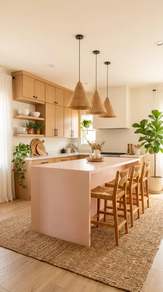
Most of the kitchens so far build warmth through wood and texture. This one adds something different: color. A soft blush-pink waterfall island sits against warm light-oak cabinetry, proving that a single painted or lacquered colored surface can carry an entire room’s personality without tipping into a full “pink kitchen.”
The restraint elsewhere is what makes the color work. Everything besides the island — cabinets, floor, pendant fixtures — stays in a neutral wood-and-black palette, so the blush reads as one confident decision rather than a color scheme spread thin across too many surfaces. The jute rug underfoot and rush-seat stools tie the color choice back into the room’s boho materials, keeping the pink from feeling like it belongs in a different, more modern kitchen entirely.
This idea suits homeowners who want a boho kitchen with a distinct personal signature rather than an entirely neutral palette, and it’s especially well suited to open-concept homes where the island is visible from adjoining living spaces and can act as a soft focal point. It’s a weaker choice for anyone planning to sell soon or renting, since a painted or lacquered colored island is a far more personal, harder-to-neutralize commitment than a wood or white one — repainting an island is a real project, not a weekend fix.
A Palette Built Around One Confident Surface
The jute rug’s woven texture and the rush-seat stools both repeat the same natural, nubby texture, which is a quieter kind of repetition than color but does the same job — it links the blush island back to the room’s warmer, more organic materials instead of letting it read as a purely modern design choice dropped into a boho room. That connective texture is arguably doing more work than the color itself in keeping the room feeling cohesive.
Recommended Materials: painted or lacquered wood island, light oak cabinetry, natural jute weave, woven rush seating Main Colors: Soft Blush Pink, Light Oak, Matte Black (pendants) Best Lighting: Three black cone pendants in a row, chosen deliberately in a dark neutral so they don’t compete with the island’s color — plus generous window and sheer-curtain daylight.
Getting a Colored Island Wrong
- Choosing a color with a cool undertone, which clashes with the warm oak surrounding it
- Adding a second colored surface (a colored backsplash or cabinet run) that competes with the island
- Skipping the jute or natural-fiber texture that ties the color back to the room’s other materials
- Picking pendant fixtures in a competing color instead of a neutral tone
One Oversized Pendant as the Only Boho Statement in a Classic Kitchen
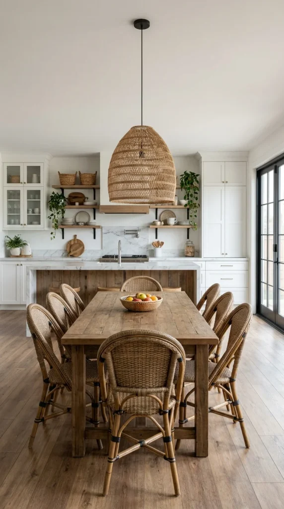
The last kitchen in this set makes the most conservative case for boho of any of them: a fully classic white kitchen — marble backsplash, glass-front cabinetry, black French doors — with exactly one boho element allowed in: a single, oversized woven rattan pendant hung dead-center over a long reclaimed wood dining table.
That single pendant is doing an enormous amount of work relative to its size. In a room this classic and symmetrical, the eye is naturally drawn to the one object that breaks the pattern, and here that’s the pendant’s organic, hand-woven texture against an otherwise crisp white kitchen. Woven rattan dining chairs at the table repeat that same texture at a smaller scale, which is enough repetition to make the pendant feel intentional rather than like a stray decorating decision.
This is the lowest-risk entry point into boho style for anyone with an existing white or classic kitchen they’re not ready to renovate, and it’s a genuinely good fit for open-plan homes where the kitchen and dining area share one continuous sightline, since a single oversized fixture can visually anchor both zones at once. It’s a less satisfying choice for anyone who actually wants a fuller boho identity throughout the room — this approach keeps the kitchen itself almost entirely traditional, and it’s worth being honest that one pendant and a set of chairs is a boho accent, not a boho kitchen.
Recommended Materials: natural rattan weave, reclaimed solid wood, white marble, painted cabinetry, black-framed glass doors Main Colors: Crisp White, Warm Reclaimed Wood, Natural Rattan Best Lighting: One dramatic oversized pendant supplemented by abundant daylight through the black French doors — this idea depends on the pendant reading as a genuine statement, which needs a fairly high ceiling to pull off.
Where a Single-Statement Approach Falls Apart
- Choosing a pendant that’s too small to actually register as a focal point
- Adding a second boho element (a rug, wallpaper, or accent wall) that dilutes the intentional restraint
- Hanging the pendant off-center from the table it’s meant to anchor
- Pairing it with cool-white rattan chairs instead of a warm, natural weave that matches the pendant
If you’re weighing whether a single large fixture is enough boho character for your space, it’s worth looking at how a reclaimed-wood table alone can shift a room’s feel — the styling in these rattan bed frame designs uses a similarly restrained, one-material approach to bring warmth into an otherwise neutral room.
Cooking Workflow Tips for a Boho Kitchen
- Keep open shelving styled with everyday dishware within arm’s reach of the stove, not just decorative pottery, so the boho display doesn’t slow down actual cooking
- Choose a range hood finish (copper, black steel, or wood-clad) that can handle daily grease and heat exposure, since decorative metals need more frequent wiping in an active kitchen
- Position trailing or hanging plants well clear of the stovetop and prep zones to avoid singed leaves and workflow obstructions
- If your countertop is natural stone or reclaimed wood, seal it appropriately for food prep — the raw, aged look many of these kitchens rely on still needs a food-safe sealed surface underneath
Who Should Choose This Style?
- Best for homeowners who want a kitchen with genuine warmth and personality without a full structural renovation
- Best for plant lovers, pattern lovers, and anyone drawn to layered, collected-over-time spaces
- Best for open-concept homes with strong natural light, since several of these ideas depend on daylight to avoid feeling heavy
- Not ideal for households who prefer a strictly minimalist, low-clutter kitchen or who need every surface to be effortlessly low-maintenance
Budget Summary
| Budget | Expectation |
|---|---|
| Low | Rattan pendant lights, woven baskets, a jute rug, dried pampas grass, peel-and-stick patterned tile |
| Medium | Solid wood bar stools, open wood shelving, a reclaimed wood dining table, patterned ceramic tile |
| Premium | Custom hand-etched or carved cabinetry, a copper range hood, a natural stone island, fully reclaimed wood structural elements |
Frequently Asked Questions
Is a boho kitchen hard to maintain? It depends entirely on which version you choose. A kitchen built around live plants and unsealed natural materials, like the skylight-lit design above, needs real ongoing care. A kitchen that leans on one statement pendant or a patterned tile wall needs no more upkeep than a standard kitchen.
Can boho style work in a small kitchen? Yes, and often more successfully than a maximalist version. The single-pendant approach or a bold wallpaper against otherwise plain white cabinetry both scale down well, since they rely on one confident move rather than dense layering that needs room to breathe.
Does boho style work with white cabinets? It works especially well. Several of the kitchens above use white or pale cabinetry specifically to let one boho element — a wallpaper, a tile wall, a pendant — stand out clearly, which is often easier to pull off than layering boho textures onto already-dark cabinetry.
What’s the easiest boho element to add first? A woven rattan pendant light is generally the lowest-commitment entry point. It requires no structural changes, works with almost any existing cabinet color, and can be swapped out later if your taste shifts.
Is boho kitchen style a passing trend? The specific materials — rattan, reclaimed wood, natural stone, woven textiles — have been used in kitchen design for decades under different style names, which suggests the underlying materials are more durable than any single “boho” label. Choosing quality natural materials over trend-driven synthetic versions is the more reliable way to keep the look feeling current for years rather than seasons.
If you’re weighing a full renovation rather than a styling refresh, it’s worth reading through this kitchen countertop buying guide before choosing a surface material, since several of the ideas above depend heavily on the countertop finish underneath them.
About the Author
Aesthetic Life Team covers home décor and design inspiration with a focus on real, buildable ideas — from full renovations down to single-piece styling swaps. The team researches materials, finishes, and layout decisions across real interiors to help readers choose what actually fits their own home, not just what photographs well.
Explore More
You may also enjoy:

