
When a Room Looks “Fine” But Never Feels Finished
The walls are painted. The furniture is placed correctly. Yet the room still feels flat — something is missing, and it’s hard to name. In most cases, that missing element is texture, not colour or clutter.
The Hidden Problem
- A blank wall quietly drains the warmth out of an otherwise well-planned room
- Most people only notice this once they see the alternative sitting next to it
The Fix: Slatted Wood Walls
- A core element of Japandi design — the overlap between Japanese restraint and Scandinavian warmth
- Vertical slats introduce rhythm, shadow, and material depth without demanding attention
What This Roundup Covers
- How vertical slats shift the way light and shadow move through a space
- Where slatted walls tend to work best — bedrooms, entryways, media walls, and beyond
- Budget-friendly versus investment-level approaches to the same look
- Small adjustments that let the idea work in rented or imperfect spaces
Each design carries its own lesson — not just a different photograph.
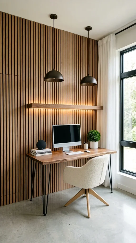
🪵 The Slatted Wall That Doubles as a Light Trick
- The vertical oak slats run floor-to-ceiling, and that single decision does most of the visual work — it makes a fairly narrow nook feel taller than it actually is
- 💡 Hidden detail most people miss: the floating shelf isn’t just storage — the warm LED strip tucked underneath it grazes the slats, creating shadow lines that repeat all the way up the wall
- Design principle at work: rhythm — evenly spaced slats create a visual beat that calms the eye instead of overwhelming it
- 🌓 Light and shadow: the grooves between slats catch daylight from the window differently through the day, so the wall literally changes mood from morning to evening
- 🪑 Practical reality check: live-edge desks look effortless in photos, but that natural edge means no two are identical — expect slight gaps if you ever swap furniture nearby
- 🧵 Texture contrast: the boucle chair against hard oak slats and concrete flooring is doing a lot of quiet work – soft against rigid, warm against cool
- 💰 Budget translation: full slat-wall paneling is an investment-level project, but slat panels or peel-and-stick strips can mimic the rhythm affordably in a rental
One-line takeaway: This wall isn’t decoration — it’s functioning as both a light diffuser and a spatial illusion.
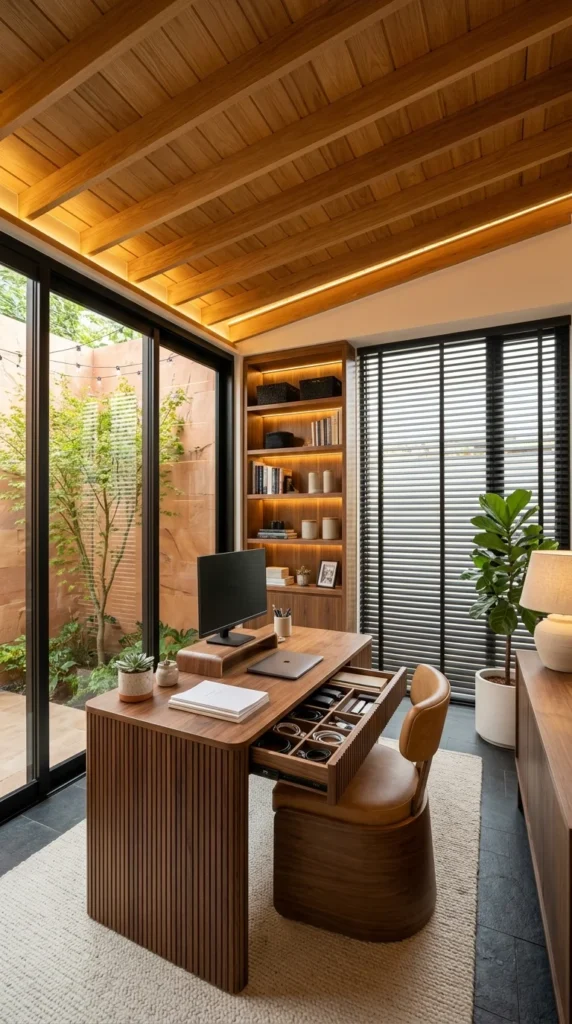
🗄️ The Desk That Hides More Than It Shows
- The slatted desk panel isn’t just a style match for the ceiling beams — it’s disguising a fully functional storage drawer, organized into small compartments for watches, cables, and everyday clutter
- 📦 Hidden detail most people miss: the drawer only reveals itself when opened — from the front, the desk reads as a single solid slab, which keeps the whole room visually quiet
- Design principle at work: repetition — the same vertical-line language repeats across the desk, ceiling beams, and bookshelf trim, tying three separate furniture pieces into one system
- 🌤️ Light and shadow: warm LED strips under the shelves and along the ceiling beams echo each other, so the eye keeps moving upward and back down in a loop
- 🪟 Space compression check: the floor-to-ceiling glass wall on the left visually cancels out the compact footprint — without it, this corner would likely feel tight
- 🧺 Practical reality check: open shelving with warm lighting looks styled, but it also means everything on display needs to stay tidy — there’s no closed-door option here
- 🌿 Sensory dimension: the fiddle-leaf fig and the outdoor greenery through the glass add a cooling, organic contrast against all the warm wood tones
- 💰 Budget translation: a fully slatted desk is a premium custom piece, but a slat-front cabinet insert can bring the same look to a standard desk at a fraction of the cost
One-line takeaway: The real design win here isn’t the wood — it’s how much storage disappears without breaking the room’s visual rhythm.
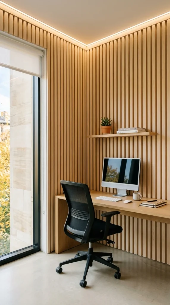
📐 The Corner That Shouldn’t Work — But Does
- The light oak slats wrap around the internal corner without a single break in rhythm, which is the actual trick making this narrow nook feel like an intentional room instead of a leftover space
- 🔲 Hidden detail most people miss: the ceiling-line LED strip follows the exact angle of the corner, drawing a bright frame that pulls attention up and away from how tight the footprint really is
- Design principle at work: unity — matching the desk, floating shelf, and wall paneling in the same tone removes visual breaks, so three different objects read as one continuous structure
- 🪑 Practical reality check: the mesh ergonomic chair is the one deliberately “unstyled” object in the frame — a quiet reminder that comfort during actual work hours outranks matching aesthetics
- 🌤️ Light and shadow: natural daylight from the floor-to-ceiling window hits the slats at a low angle, casting subtle shadow stripes that shift position as the day moves on
- 🌱 Visual weight balance: the small potted succulent and stacked books on the shelf are the only “loose” objects in an otherwise rigid, linear space — they keep it from feeling sterile
- 💰 Budget translation: wraparound slat paneling like this is a premium build, but a single accent wall using pre-cut slat panels can borrow the same corner-anchoring effect for far less
- ⚠️ One-regret prevention: floating desks like this look sleek, but they typically need hidden wall bracing – worth checking before assuming it’s a simple DIY mount
One-line takeaway: the corner isn’t hidden here; it’s celebrated — and that’s what makes the whole nook feel designed rather than squeezed in.
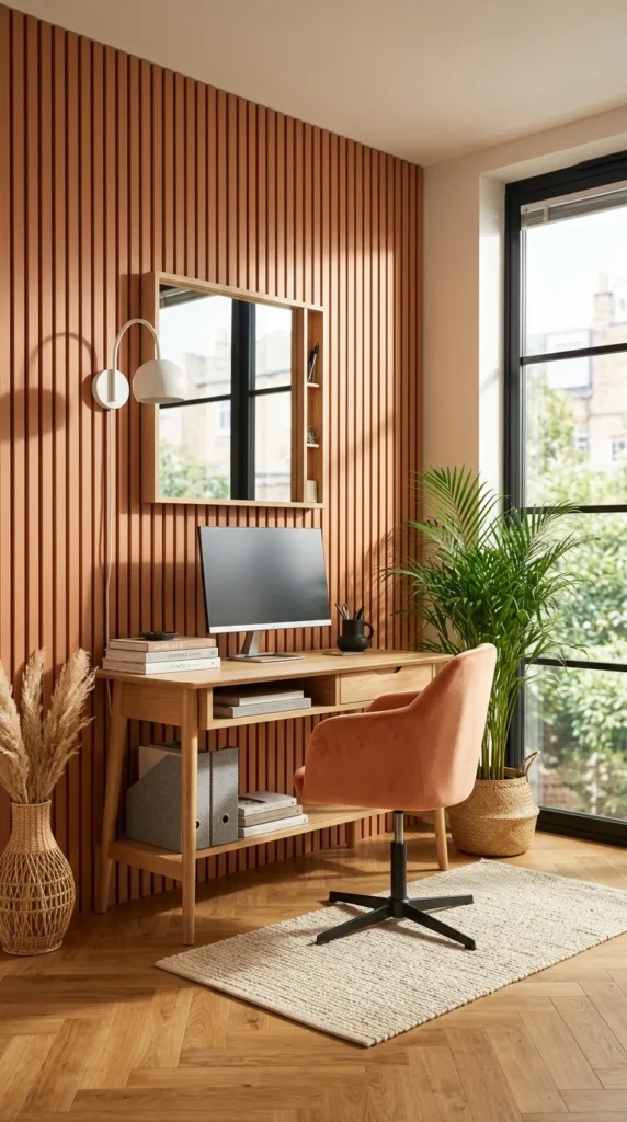
🪞 The One Object Doing Double Duty
- The wall-mounted mirror above the desk isn’t just decorative — it’s positioned to bounce daylight from the window across the terracotta slats, brightening a wall color that could otherwise feel heavy in a small footprint
- 🧡 Hidden detail most people miss: the mirror’s built-in side shelf quietly adds vertical storage without needing an extra shelf bracket — a small space-saving decision most viewers scan right past
- Design principle at work: color temperature — the warm terracotta slats, honey-toned wood, and blush chair all sit in the same tonal family, which is why the room feels cohesive despite mixing several materials
- 🌤️ Light and shadow: the wall sconce’s exposed cord and dome shade cast a soft arc of shadow onto the slats by afternoon, adding a second layer of texture beyond the wood grain itself
- 🪑 Practical reality check: the velvet swivel chair looks soft and inviting, but velvet in a sunlit spot like this will show wear and fading faster than a more neutral fabric would
- 🌿 Temperature perception: the palm plant and woven basket introduce a cooler, looser texture that keeps the warm palette from feeling flat or one-note
- 💰 Budget translation: a full terracotta slat wall is an investment-level statement, but the same warmth can come from painting a plain accent wall in a similar tone before adding slat trim later
- ⚠️ One-regret prevention: open shelving under the desk looks tidy styled for photos, but binders and books left exposed daily need real organizing discipline to keep the look intact
One-line takeaway: the colour is what gets noticed first, but it’s the mirror’s placement that’s actually doing the structural work of making the corner feel bigger and brighter.
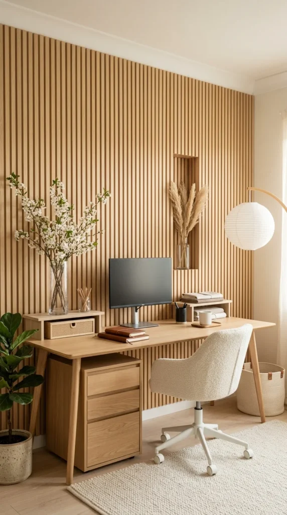
🕳️ The Cutout That Isn’t Just Decoration
- The recessed niche built into the slats holding the dried pampas grass isn’t a random styling choice — it’s a deliberate break in the wood rhythm that gives the eye a resting point before it reaches the desk
- 🌾 Hidden detail most people miss: that niche is the same depth as the slats themselves, so the display sits flush rather than sticking out — a small detail that keeps the wall feeling seamless
- Design principle at work: scale — the tall, narrow slats visually stretch the wall upward, while the horizontal desk and low chair pull the eye back down, keeping the room from feeling top-heavy
- 💡 Light and shadow: the paper globe floor lamp diffuses light softly across the slats instead of casting hard shadows, which is why this version of the wall reads calmer than the others
- 🪑 Practical reality check: the boucle chair and rattan basket add tactile softness, but boucle fabric traps dust more than smoother weaves – worth a regular light brushing to keep it looking fresh
- 🌸 Sensory dimension: the fresh cherry blossom stems bring a seasonal, temporary softness that photographs beautifully but needs replacing — a detail easy to miss when copying the look
- 💰 Budget translation: a built-in slat niche requires custom carpentry, but a simple floating shelf inside a slat-paneled wall can mimic the same display effect for less
- ⚠️ One-regret prevention: the three-drawer wood cabinet looks minimal here, but real daily use — pens, chargers, files — can quickly outgrow drawers this shallow
One-line takeaway: the niche proves that a slatted wall doesn’t need to be uniform to feel calm — one intentional gap can do more than perfect repetition.
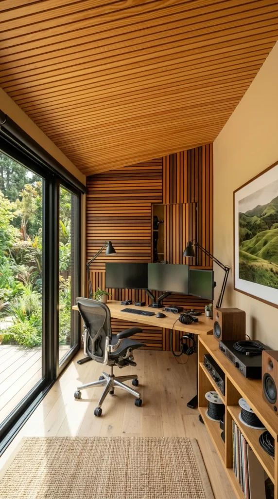
🎛️ When the Wall Pattern Changes the Whole Feel
- Unlike the previous rooms, this wall uses horizontal slats mixed with a herringbone-angled panel, and that shift instantly changes the room’s energy from calm to focused – a small pattern change carries real psychological weight
- 🎚️ Hidden detail most people miss: the ceiling slats run in the same horizontal direction as the wall, extending the line unbroken from wall to ceiling — this is what stretches a narrow room and makes it feel longer than it is
- Design principle at work: energy distribution — the triple-monitor setup and cable management sit in a tight, active zone, while the vinyl shelving and framed art on the right create a calmer, resting zone in the same room
- 🌤️ Light and shadow: the horizontal grooves catch light differently than vertical slats do — shadows fall in long lines instead of tall ones, giving the wall a more grounded, stretched-out feel
- 🎧 Practical reality check: exposed cable runs and multiple monitor arms look intentional here, but they require real cable management discipline — without it, this setup slides into visual clutter fast
- 🖼️ Object relationship rule: the landscape print on the right wall isn’t random — its green tones echo the garden visible through the glass door, connecting the interior back to the outdoor view
- 💰 Budget translation: the angled accent panel is a custom carpentry detail, but pre-made herringbone wood tiles can recreate a similar break in pattern for far less
- ⚠️ One-regret prevention: floor-to-ceiling glass looks striking against dark wood tones, but it also means zero privacy buffer — worth considering before committing to a setup this open
One-line takeaway: this room proves slats aren’t a single formula — changing the direction of the lines can shift a space from serene to studio-focused without changing a single piece of furniture.
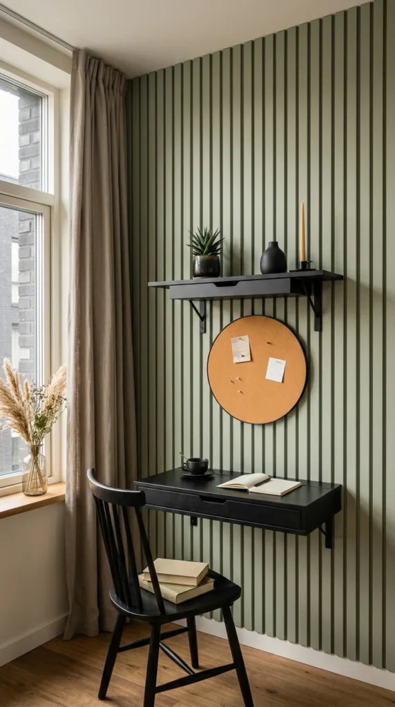
🟤 The Round Shape Breaking a Wall Full of Lines
- Against a wall of unbroken sage-green vertical slats, the circular corkboard is the only curved object in the entire frame — and that single contrast is what stops the eye instead of letting it slide past
- 🎯 Hidden detail most people miss: the corkboard sits at the exact midpoint between the floating shelf and the fold-down desk, visually anchoring two separate furniture pieces into one connected column
- Design principle at work: contrast — round against straight, matte cork against painted wood, black hardware against soft green — every pairing here is intentional, not accidental
- 🪑 Practical reality check: a fold-down desk this size works for a laptop and journal, but it’s not built for a full workstation — this is a writing nook, not a home office replacement
- 🕯️ Visual weight balance: the single taper candle and dark vase on the shelf are deliberately sparse — removing even one of them would leave the shelf feeling unfinished rather than minimal
- 🌾 Object relationship rule: the dried pampas grass by the window echoes the same muted, earthy palette as the wall, linking the seating area back to the desk without repeating a single object
- 💰 Budget translation: painted slat paneling like this sage tone is far more affordable than stained wood slats, since it’s the color and line pattern doing the visual work, not the material itself
- ⚠️ One-regret prevention: black wall-mounted furniture looks sharp against light walls, but every scuff and dust mark shows more visibly on matte black than it would on natural wood tones
One-line takeaway: this nook proves a slatted wall doesn’t need size to make an impact — colour, one curved object, and restraint do more here than a full office setup would.
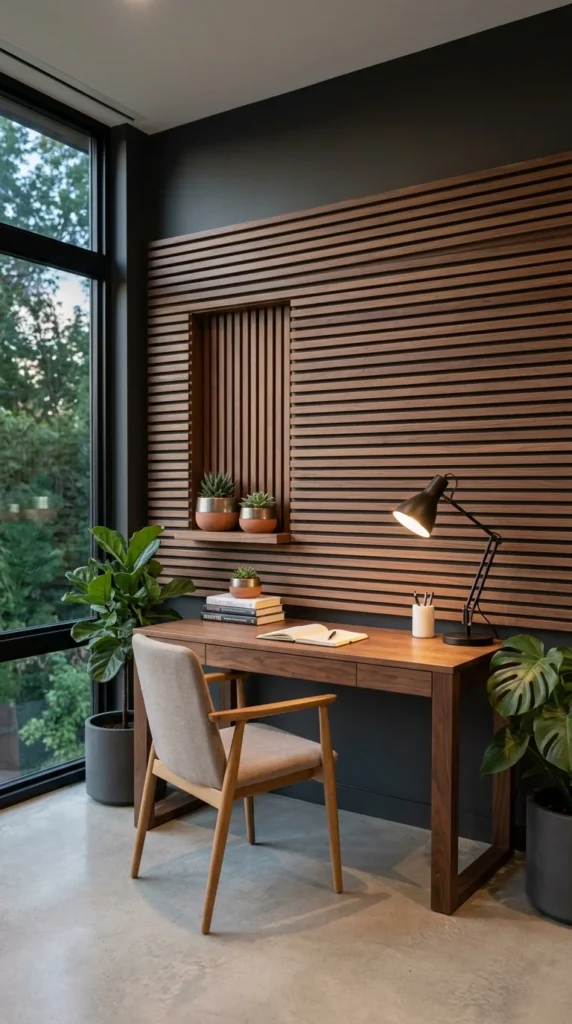
🌑 The Dark Wall That Makes Wood Look Richer
- Unlike every wall before it, this one uses horizontal walnut slats set against charcoal paint, and that dark backdrop is what pushes the wood grain forward — the same slats on a white wall would read much flatter
- 🖤 Hidden detail most people miss: the recessed niche breaks from horizontal to vertical slats mid-wall, a subtle shift that’s easy to scan past but is the only thing stopping the wall from feeling like one long, uninterrupted stripe
- Design principle at work: emphasis — the niche is deliberately styled with just two small potted succulents, giving the eye one clear focal point instead of competing with the busier desk below
- 💡 Light and shadow: the articulating desk lamp casts a warm, angled pool of light directly onto the slats beside it, and that contrast between lit and unlit wood is what gives the wall its sense of depth
- 🪑 Practical reality check: the woven-seat wood armchair is comfortable for short writing sessions, but lacks the back support needed for full workdays — a detail styling photos rarely account for
- 🌿 Temperature perception: the fiddle-leaf fig and monstera on either side of the desk soften the room’s otherwise cool, moody palette without competing with the wood tones
- 💰 Budget translation: dark accent paint behind a slat wall is one of the most affordable ways to add this level of contrast — no extra wood or carpentry needed, just a color change
- ⚠️ One-regret prevention: dark walls photograph beautifully in daylight, but the same room can feel noticeably heavier and smaller once evening light disappears
One-line takeaway: it’s not the wood that’s doing the heavy lifting here — it’s the dark wall behind it, making every grain line and shadow read twice as deep.
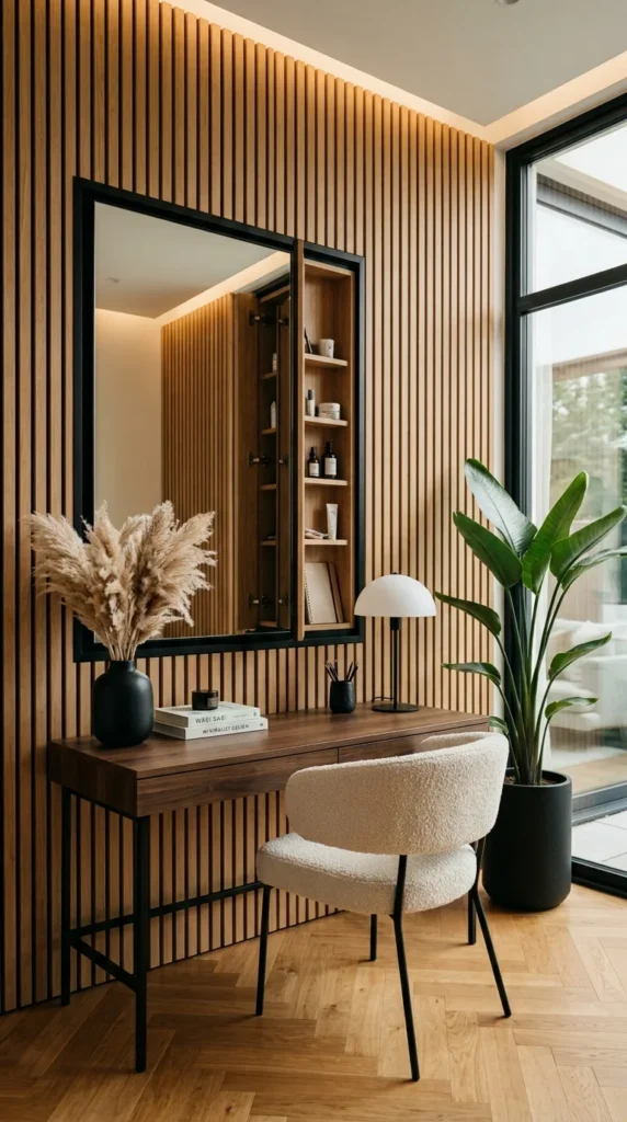
🪟 The Mirror That’s Actually a Cabinet in Disguise
- The framed mirror above the desk isn’t fixed to the wall — it swings open on a hinge to reveal a fully shelved storage cabinet, which means the wall is hiding real function behind what looks like a simple styling piece
- 🗄️ Hidden detail most people miss: the interior shelving is lit separately from the room, so opening the mirror reveals its own soft glow — a small detail that turns a practical cabinet into something that still feels considered
- Design principle at work: proportion — the black-framed mirror is sized to match the width of the desk almost exactly, which is why the whole arrangement reads as one balanced unit instead of two separate pieces
- 💡 Light and shadow: the mushroom-shaped table lamp sits low and soft, casting light across the walnut desktop without competing with the warm LED strip glowing along the ceiling line above the slats
- 🪴 Space compression check: the bird-of-paradise plant is tall enough to reach close to the window height, which keeps the eye moving vertically and stops the corner from feeling cut off from the rest of the room
- 🧵 Texture contrast: the boucle chair, dark walnut desktop, and honey-toned oak slats each bring a different material weight — soft, dense, and light — into the same small footprint
- 💰 Budget translation: a hinged mirror-cabinet is a mid-to-premium hardware investment, but a standard mirror paired with a slim floating shelf beside it can offer similar hidden storage for less
- ⚠️ One-regret prevention: a mirror this reflective doubles as a light bouncer, but it also means clutter on the desk gets visually doubled too — worth keeping the surface fairly minimal
One-line takeaway: The real function of this wall isn’t visible until someone opens the mirror — proof that the most useful design choices aren’t always the ones on display.
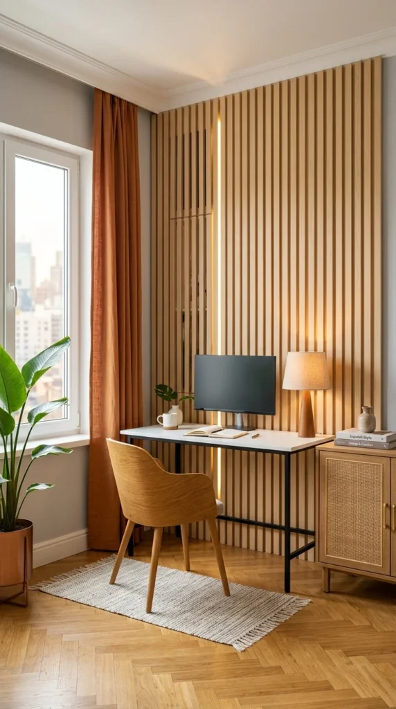
✨ The Single Line of Light That Splits the Wall in Two
- Every other wall in this roundup relies on even, repeated slats — this one breaks that rule with a single vertical LED strip running through the paneling, splitting the wall into two uneven sections instead of one continuous pattern
- 💫 Hidden detail most people miss: the mirrored panel beside the light strip reflects it back, doubling the glow without adding a second fixture — a lighting trick that reads as more elaborate than it actually is
- Design principle at work: visual tension — deliberately breaking symmetry here is what makes the wall feel modern rather than purely traditional Japandi, proving the style can flex without losing its calm core
- 🏙️ Light and shadow: daylight from the floor-to-ceiling window competes with the warm LED strip, so the wall shifts character completely between daytime and evening – two different moods from one fixed design
- 🪑 Practical reality check: the white desktop paired with a black metal frame is a clean look, but light-colored surfaces show scuffs and cup rings faster than wood tones do — worth a coaster habit
- 🧡 Temperature perception: the rust-toned curtain is the only warm-colored textile in the room, and it’s doing more to soften the space than any of the furniture pieces are
- 💰 Budget translation: a single embedded LED strip is one of the most affordable ways to add drama to a slat wall — no extra carpentry, just one continuous light channel
- ⚠️ One-regret prevention: rattan cabinet fronts look textural and light, but they’re harder to wipe clean than solid wood doors — a detail worth knowing before choosing one for a high-traffic room
One-line takeaway: This wall closes the roundup on the right note—proof that even inside a “rules-based” style like Japandi, one deliberate break in the pattern can be the most memorable design choice of all.
🌾 The Quiet Thread Running Through Every Room
- Across all 10 spaces, one thing never changed: the slats never tried to be the star — they worked quietly in the background, shaping light, sound, and rhythm while the furniture and plants got the visual credit
- 🔑 The insight worth remembering: a slatted wall’s real value isn’t the pattern itself — it’s how differently that same pattern behaves depending on color, direction, and light source pointed at it
- From terracotta to charcoal, vertical to horizontal, every version proved this is less a single “look” and more a flexible design language that adapts to almost any room’s mood
- Whether the goal is a calmer home office or a warmer reading nook, the smallest version of this idea — one accent panel, one lit niche — can carry the same effect as a full wall
- The takeaway: good design here isn’t about copying a photo exactly — it’s about borrowing the logic behind it and letting it fit a real, imperfect room
❓ Frequently Asked Questions
🪵 Are slatted wood walls hard to maintain? Not typically. Most slat walls only need occasional dusting, and wood tones tend to hide minor scuffs better than flat painted walls. Higher-traffic areas may show wear faster, especially near desks or seating.
🏠 Can renters use this look without permanent installation? Yes, in many cases. Peel-and-stick slat panels or lightweight slat cladding can recreate the visual rhythm without drilling into walls, though coverage and durability vary by product.
💡 Does a slatted wall work in a room with little natural light? It can, though the effect often depends on added lighting. Several designs in this roundup used LED strips behind shelves or along ceiling lines to keep the texture visible even after daylight fades.

One Response