
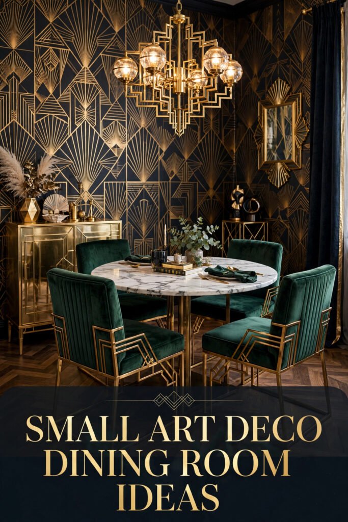
Art Deco doesn’t need a mansion to work. The style was built on bold geometry, lacquered surfaces, and a handful of confident materials — brass, velvet, marble, and glass — and every one of those reads just as strongly in a compact dining nook as it does in a grand hall. The real skill isn’t fitting more in; it’s knowing which two or three Deco signatures to lean on so a small room feels intentional instead of crowded.
This guide walks through ten real dining rooms, each built around a different Deco idea — from sunburst brass to fluted cabinetry to a single oversized floral panel — and breaks down who each one actually suits, what it costs to recreate, and how to scale it down without losing the drama that makes Deco, Deco.
Quick Overview
| Style | Art Deco |
| Best For | Compact dining rooms, apartment nooks, statement-hungry renovators |
| Budget | Medium–High |
| Difficulty | Moderate (works best with 1–2 hired trades for millwork or electrical) |
| Maintenance Level | Medium |
A Sunburst Wall That Does the Room’s Entire Job
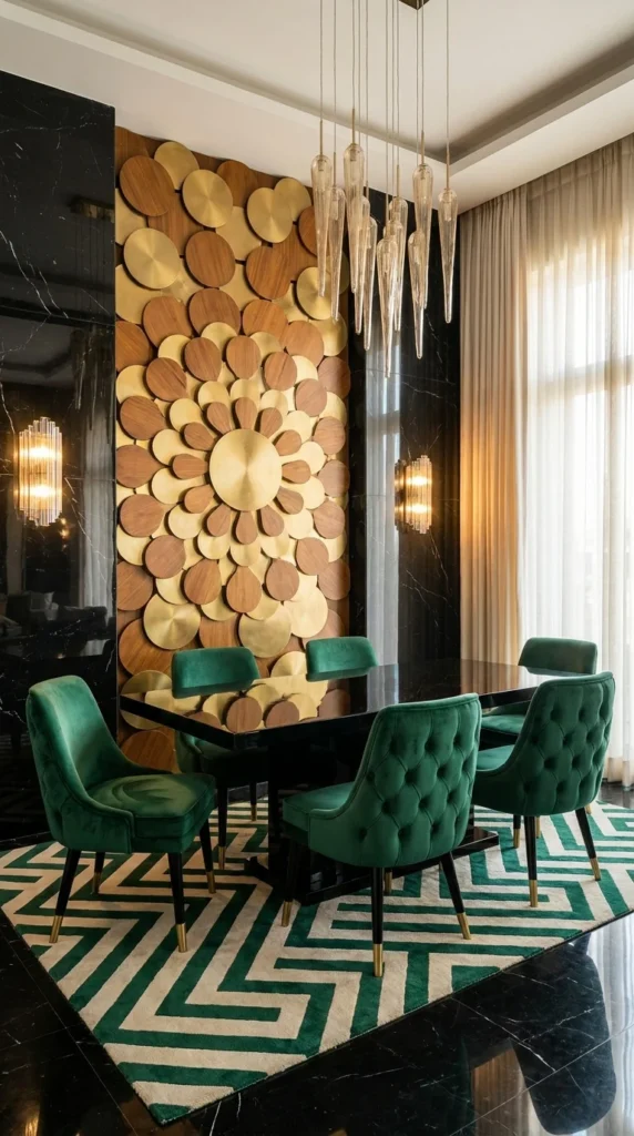
Walk into this dining room and the wood-and-brass sunburst panel behind the table is the only thing that needs to happen. The circular composition mimics the shape of a formal Deco medallion, but built from dozens of small wood and brass discs rather than one carved piece, which is what keeps it from feeling like a museum reproduction. Everything else in the room — black lacquered surfaces, a slim brass-and-glass icicle chandelier, emerald velvet chairs — exists to support that one wall, not compete with it.
The repetition of the disc shape, echoed faintly in the round chandelier drops above, is what makes the room read as composed rather than assembled. Swap the sunburst for a flat painting and the room would lose its architectural anchor immediately — this piece is doing structural, not decorative, work.
For smaller rooms, this idea scales down beautifully: a 4-foot version of the same disc pattern, sized to a narrow accent wall, delivers the same visual weight without needing the double-height ceiling shown here. Renters can approximate it with a large round mirror flanked by two smaller brass sconces instead of the full installation.
Small Space Tip: A sunburst feature works hardest on the wall directly behind the table, where every seated guest faces it — don’t waste it on a side wall no one looks at.
Recommended Materials: Walnut veneer discs, brushed brass, black lacquered wood, emerald velvet, glass icicle pendants
Main Colors: Warm Walnut, Brushed Brass, Emerald Green, Black Lacquer
Best Lighting: Multiple slim pendant drops at varying heights rather than one central fixture — this keeps light low and warm without blocking the sightline to the sunburst wall
Where the Repetition Almost Falls Apart
- Using a single large medallion instead of the layered disc pattern — it reads as a clock, not a Deco motif
- Pairing the black lacquer table with cool-toned chairs instead of warm velvet, which fights the wood tones in the wall
- Skipping the geometric rug and leaving the black floor bare, which makes the room feel unfinished from the waist down
- Hanging art on the sunburst wall’s flanking sections — it needs breathing room on both sides to read as a focal point, not clutter
An Airy, Neutral Take on the Style
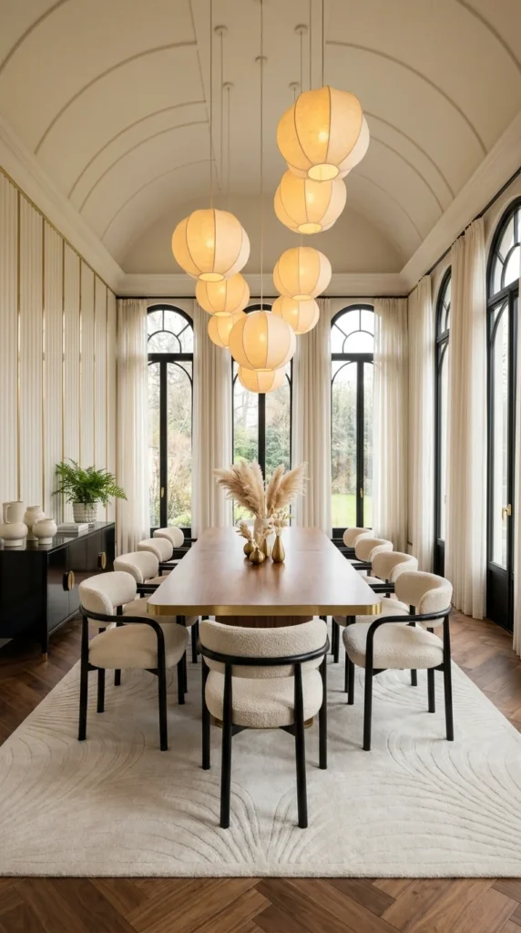
Not every Deco room needs to feel dense. This dining space proves the style works in soft, light-filled architecture too — a barrel-vaulted ceiling and arched steel windows give it Deco-era bones, while the cluster of cocoon-shaped paper lanterns and boucle-upholstered chairs keep the palette almost entirely neutral. It’s the quietest room in this list, and that restraint is the point.
The cluster of lanterns hung at staggered heights creates a soft visual rhythm overhead that echoes the arched windows below without literally repeating their shape — a subtler version of the repetition principle than a bolder room would use. Because there’s so little color contrast, every material has to earn its place: the walnut table’s brass inlay edge is the only hard-edged, metallic note in an otherwise soft room, and it’s doing a lot of work to keep the space from feeling like generic neutral décor.
This is the easiest room on this list to adapt for a small apartment, since it relies on architecture and texture rather than saturated color or heavy furniture. A single pendant cluster over a narrow table, paired with two or three boucle chairs, gets most of the effect in a fraction of the square footage — for a broader sense of how this kind of soft, texture-first room reads across an entire apartment, these mid-century apartment ideas take a similarly casual approach to vintage-inspired styling.
Recommended Materials: Walnut wood, brushed brass, boucle upholstery, blackened steel window frames, linen curtains
Main Colors: Cream, Warm Walnut, Soft Brass, Black (window trim only)
Best Lighting: Natural light through arched windows is doing the heavy lifting here — the lantern cluster supplements rather than replaces it, so orient a similar table toward the largest window available
Maintenance: Boucle upholstery needs occasional brushing to keep its texture from flattening or trapping dust — vacuum with an upholstery attachment monthly rather than wiping it down
A Quiet Room That’s Easy to Get Wrong
- Adding too much pattern to the rug or curtains, which flattens the soft, architectural calm this room depends on
- Choosing a glossy black table instead of warm wood, which pulls the whole palette toward the coldness this room deliberately avoids
- Hanging the lantern cluster too high, losing the intimate, low-slung lighting that makes the vaulted ceiling feel cozy rather than cavernous
- Skipping the brass inlay or trim detail entirely, leaving the room with no metallic accent to tie it to the Deco era at all
Fluted Cabinetry as the Real Statement Piece
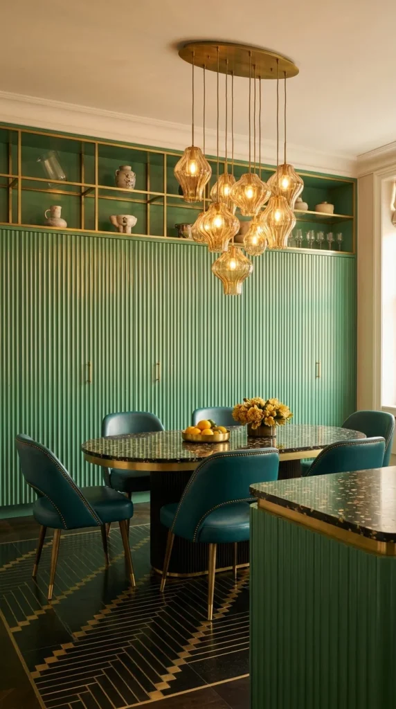
This room makes the case that cabinetry, not artwork, can be the Deco statement. Floor-to-ceiling fluted green paneling wraps the back wall, topped by an open brass-trimmed display shelf holding ceramics and glassware — a detail that turns storage into styling. The round terrazzo-look table and teal nailhead chairs sit almost secondary to that wall, which is unusual for a dining room and exactly why this idea stands out from the others in this list.
The vertical fluting repeats at a tight, consistent interval, and that consistency is what keeps a wall this large from feeling heavy — an irregular groove spacing would read as cheap paneling instead of custom millwork. The amber glass pendant cluster overhead picks up the warmth of the open shelving without competing with the cool green tone, which is a proportion choice worth noticing: the pendants are small individually but numerous, balancing the visual weight of one large wall with many small points of light.
Full floor-to-ceiling fluted millwork is a real investment, but the effect scales down surprisingly well — a single fluted panel behind a sideboard, or fluted MDF applied to just one accent wall, captures most of the texture at a fraction of the cost and without a full custom build. If cabinetry-as-statement appeals to you here, these Art Deco kitchen ideas show the same fluted-and-brass language applied to a working kitchen.
Recommended Materials: Fluted painted wood, brushed brass trim, amber glass, ceramic and glassware for open shelving, terrazzo-effect stone
Main Colors: Sage-Forest Green, Brushed Brass, Amber Glass, Teal
Best Lighting: A pendant cluster over the table, kept low, plus under-shelf lighting on the open display shelving to make the ceramics read as intentional styling rather than storage clutter
Where This Wall Loses Its Polish
- Uneven flute spacing or depth, which reads as a budget panel rather than custom millwork
- Overfilling the open shelving with mismatched clutter instead of a curated, color-coordinated set of objects
- Choosing cool white lighting over warm amber tones, which clashes badly with green cabinetry
- Pairing the fluted wall with a glass or chrome table, which undercuts the organic, tactile quality the fluting is meant to introduce
When the Ceiling Becomes Part of the Design
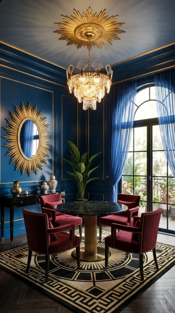
Most dining rooms treat the ceiling as blank space above the real design. This one doesn’t — a gilded sunburst medallion mounted directly on the ceiling sits paired with a crystal-and-brass chandelier below it, so the eye travels up before it even reaches the table. It’s a genuinely bold move, and one that only works because the deep navy walls and gold trim give the room enough visual weight to support looking upward.
That ceiling medallion and the sunburst mirror on the side wall use the same radiating-line motif, just at two different scales and orientations — this is Deco’s repetition principle taken almost architecturally literal, and it’s what stops the room from feeling like two unrelated luxury pieces were placed in the same box. The burgundy velvet chairs and brass pedestal table stay comparatively restrained, which is the right call: with this much happening overhead, the seating needs to recede.
This is the highest-commitment idea in this article — a ceiling medallion isn’t a weekend project — but a smaller room can still borrow the principle. A single round mirror with a sunburst frame, hung as the only wall decoration, gives a taste of the same idea without touching the ceiling at all.
Recommended Materials: Gilded plaster or composite medallion, crystal glass, brushed and polished brass, burgundy velvet, marble tabletop
Main Colors: Navy Blue, Gold, Burgundy, Crystal Clear
Best Lighting: A tiered crystal chandelier centered under the medallion is non-negotiable here — anything asymmetrical undercuts the symmetry the ceiling design is built around
Common Mistakes With a Room This Bold
- Centering the chandelier off the true middle of the medallion, which breaks the symmetry the whole ceiling depends on
- Choosing wall art that competes with the sunburst mirror instead of leaving that wall alone
- Under-lighting the room so the gold trim and medallion detail disappear into shadow at night
- Using matte black or chrome hardware instead of brass, which clashes with the room’s warm-metal theme
Where Checkerboard Marble Sets the Whole Mood
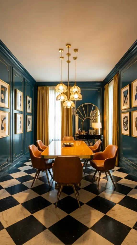
This room bets everything on its floor. A black-and-cream checkerboard marble pattern stretches wall to wall, and every other choice in the room — dark teal lacquered walls, mustard curtains, cognac leather swivel chairs — is calibrated to sit comfortably on top of that graphic base without fighting it for attention. It’s the most masculine, clubhouse-leaning room in this list, and the floor is the reason why.
Notice how the scalloped brass pendant cluster and the arched brass bar mirror behind it echo each other’s curved edges — both are rounded shapes in an otherwise rectilinear room, which is a deliberate proportion choice that keeps the space from feeling too rigid. The leather chairs, with their swivel bases, are a subtle nod to mid-century practicality inside an otherwise formal Deco shell, which is exactly the kind of small deviation that keeps a period style from feeling like a costume.
Checkerboard flooring at this scale is a real renovation, but a smaller version — a checkerboard runner rug under the table instead of full marble — captures the graphic energy for a fraction of the cost and works in a rental.
Recommended Materials: Black and cream marble, dark lacquered wood paneling, cognac leather, brushed brass, mustard velvet drapery
Main Colors: Deep Teal, Cognac Brown, Mustard Gold, Checkerboard Black-and-Cream
Best Lighting: Warm-toned brass fixtures throughout — cool white bulbs here would make the marble floor read as clinical rather than glamorous
Easy Ways to Get This Wrong
- Using grey-toned marble instead of true black-and-cream, which loses the graphic punch the pattern depends on
- Pairing the checkerboard floor with a patterned rug, creating visual competition on the ground plane
- Choosing light or bright upholstery instead of cognac or dark leather, which breaks the room’s grounded, clubhouse tone
- Skipping curtains entirely, leaving hard surfaces (marble, lacquer, leather) with nothing soft to balance the acoustics
Live-Edge Wood Meets Fluted Brass Pilasters
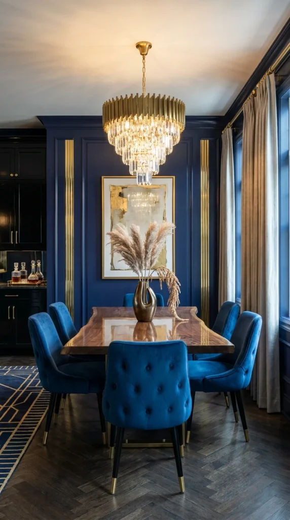
Most of the rooms in this article lean fully into lacquer and polish. This one deliberately doesn’t — a live-edge walnut table with a raw, organic silhouette sits inside a room otherwise built from fluted brass pilasters and navy paneling, and that contrast between the wild wood grain and the disciplined architecture is the entire idea. It’s Deco glamour with one intentionally rustic interruption.
The fluted brass pilasters flanking the artwork repeat the vertical line motif found throughout classic Deco millwork, but here they’re paired with a table shape that has no straight edges at all — a genuine proportion risk that pays off because the chandelier above splits the difference, offering the crystal formality of Deco lighting over a table that refuses to be formal. It’s a good lesson in how one deliberately organic element can loosen an otherwise rigid room without breaking its identity.
Because the table is the expensive, hard-to-replace piece here, smaller budgets should start with a standard rectangular walnut table and add the fluted-pilaster wall detail instead — the architectural moment reads almost as strongly without the live-edge investment. That same pairing of warm organic wood against a more disciplined room shows up again in this retro living room trend, if you want to carry the idea into the room next door.
Recommended Materials: Live-edge walnut, brushed and fluted brass, navy lacquered wood paneling, blue velvet, herringbone dark wood flooring
Main Colors: Navy Blue, Brushed Brass, Walnut Brown, Gold Leaf
Best Lighting: A tiered crystal-and-brass chandelier centered over the table, sized generously enough to hold visual weight against the room’s dark walls
What Trips People Up Recreating This
- Choosing a perfectly rectangular table, which erases the organic contrast the whole room is built around
- Under-scaling the chandelier for a dark-walled room, where a too-small fixture disappears instead of glowing
- Mixing too many different brass finishes (polished, brushed, antiqued) in the same sightline, which reads as mismatched rather than intentional
- Leaving the live-edge table unsealed, which invites staining and warping over time in a room used daily
Blush and Brass, Without Losing the Drama
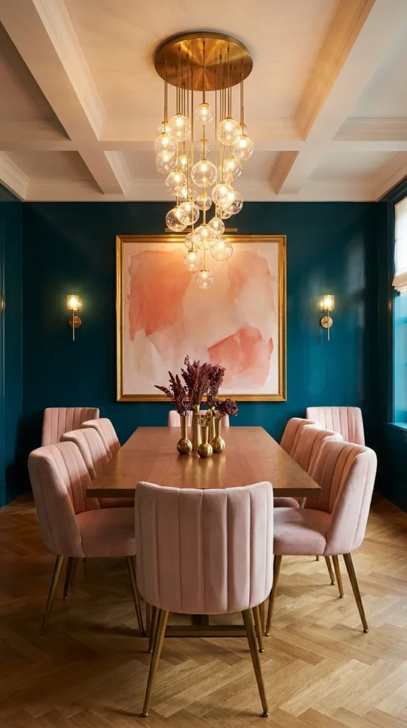
Deco doesn’t have to skew masculine or moody — this room proves it can be soft and still hold real presence. Blush pink channel-tufted chairs surround a warm wood table under a cluster of brass-stemmed glass globe pendants, all set against deep teal walls that keep the pastel palette from tipping into anything twee. The teal is doing the heavy lifting here: without it, the blush and brass would feel like a nursery, not a dining room.
The globe pendant cluster, staggered at different heights and stem lengths, is a lighting choice that mimics the shape of the framed abstract artwork below it — both are soft, rounded forms floating against a hard-edged teal backdrop, and that repeated softness is what makes the room feel cohesive rather than like two separate design ideas stacked together. The channel-tufting on the chairs adds a third layer of vertical line work that quietly echoes the room’s overall geometry without anyone consciously noticing it.
This palette is genuinely renter-friendly: teal walls can be approximated with a large framed textile or paint (if allowed), and the blush chairs plus brass pendant cluster do most of the stylistic work even in a plain white rental dining nook.
Recommended Materials: Channel-tufted velvet, brushed brass, blown glass globes, wood tabletop, herringbone oak flooring
Main Colors: Deep Teal, Blush Pink, Brushed Brass, Warm Oak
Best Lighting: A cluster of small glass globes at varied heights rather than one large fixture — this is what keeps a soft palette from reading as flat under a single bright source
Where This Palette Falls Apart
- Choosing a cool, icy pink instead of a warm blush, which clashes with the brass and teal rather than complementing them
- Skipping the teal backdrop entirely for an all-neutral wall, which lets the pastel chairs drift into overly sweet territory
- Hanging the pendant cluster too tightly bunched, losing the airy, floating quality that makes the globes feel intentional
- Using matte black hardware anywhere in the room, which fights the warm brass tone this palette depends on
Is a Room This Formal Worth the Investment?
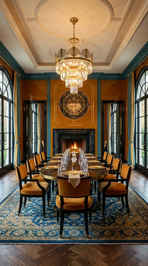
This is the grandest room in this list — an ornate plaster ceiling medallion, a fan-tiered crystal chandelier, amber lacquered walls with teal trim, and a black marble fireplace anchoring one end of a long dining table. It’s also the room where the “small dining room” reader most needs a straight answer: is this worth attempting at any scale below the original?
Honestly, the full ceiling medallion and matching geometric mirror piece over the fireplace are the two elements doing the most expensive, least negotiable work here — the plaster detailing alone requires a skilled tradesperson, and a poorly executed version looks worse than no medallion at all. If the budget doesn’t stretch to real plasterwork, this is a room to admire rather than fully replicate; a simpler crystal chandelier and a warm lacquered wall color get you 60% of the mood without the ceiling investment. What’s genuinely worth borrowing at any budget is the pairing of a black marble surface against a warm mustard-amber wall — that specific contrast is what gives the room its glow, and it works in a room a tenth of this size.
The long Persian-style rug grounding the table also deserves a mention: it’s patterned, warm, and traditional in a way that keeps a room full of hard, reflective surfaces (marble, crystal, brass, lacquer) from feeling cold underfoot.
Recommended Materials: Gilded plaster, black marble, crystal glass, brushed and polished brass, tan leather, wool rug
Main Colors: Amber-Mustard, Deep Teal Trim, Black Marble, Gold
Best Lighting: A large tiered crystal chandelier is essential at this scale — a smaller fixture would be visually swallowed by the ceiling height and medallion detail
Where This Room Gets Expensive Fast
- Attempting DIY plaster medallion work, which rarely holds up next to a professionally installed ceiling feature
- Choosing faux marble laminate for the fireplace surround, which reads as artificial against real crystal and brass
- Under-scaling the rug so bare floor shows around the table, which breaks the room’s sense of formality
- Skipping the teal trim detail on the amber walls, losing the color contrast that keeps the room from feeling flat and monochromatic
Red, Black, and a Very Confident Stripe
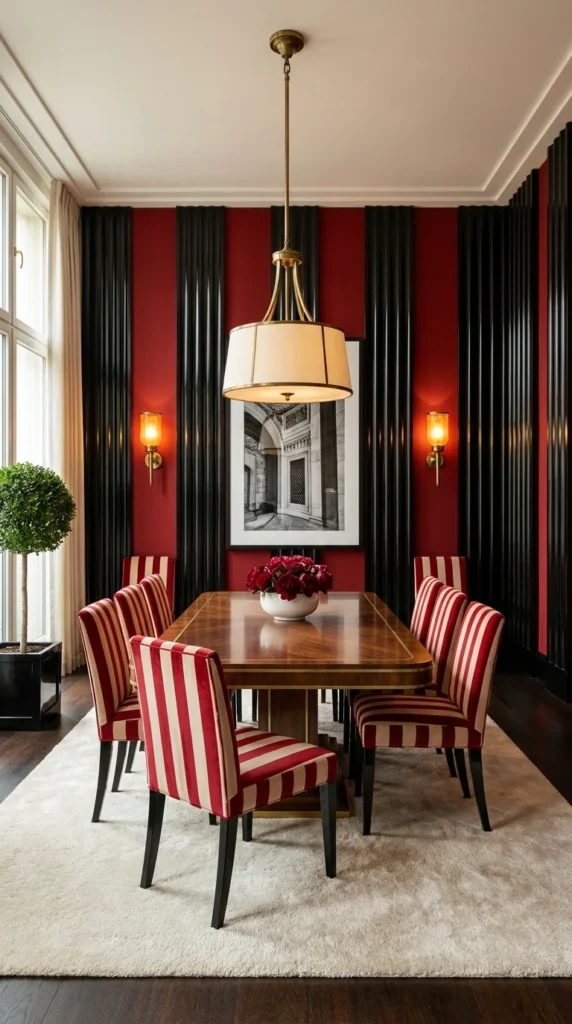
This room isn’t trying to be subtle, and that’s exactly its appeal. Red-and-cream striped chairs sit against alternating fluted black and matte red wall panels, with a single black-and-white architectural photograph as the only non-color element in the room. It’s the most graphically bold room in this list, built almost entirely on the strength of one repeating pattern used at two different scales.
The stripe on the chair upholstery and the vertical fluted panels on the wall are two different expressions of the same linear motif, just rotated and scaled differently — the chairs read as horizontal-adjacent stripes at seat height, while the wall reads as tall verticals behind them. That’s a genuinely sophisticated repetition choice: most rooms would just repeat one pattern, but this one uses the same underlying idea (parallel lines) in two orientations, which keeps it from feeling like a themed party room instead of a designed one.
The black-and-white photograph earns its spot precisely because it’s the one element that isn’t red — a room this saturated needs at least one visual rest point, and a monochrome image does that job without introducing a third competing color. Anyone drawn to working this confidently with red should also look at these red kitchen ideas, which tackle the same bold-color-plus-black-accent balance in a different room.
Recommended Materials: Striped velvet, fluted lacquered wood panels, brushed brass, framed photography, wool area rug
Main Colors: Deep Red, Black, Cream, Brushed Brass
Best Lighting: A single drum pendant with a soft white shade, kept simple, so the fixture doesn’t compete with the wall’s graphic pattern
Where This Bold Palette Loses Control
- Adding a second patterned textile (a printed rug or patterned curtain) on top of the striped chairs, overloading the room with competing lines
- Choosing warm-toned photography or colored art instead of black-and-white, removing the room’s one visual rest point
- Mixing red undertones — a cool blue-red stripe against a warm orange-red panel reads as a mistake, not a choice
- Using a glass or chrome table instead of warm wood, which makes the room feel colder than the stripe pattern intends
One Oversized Floral Panel, Doing the Work of an Entire Wall
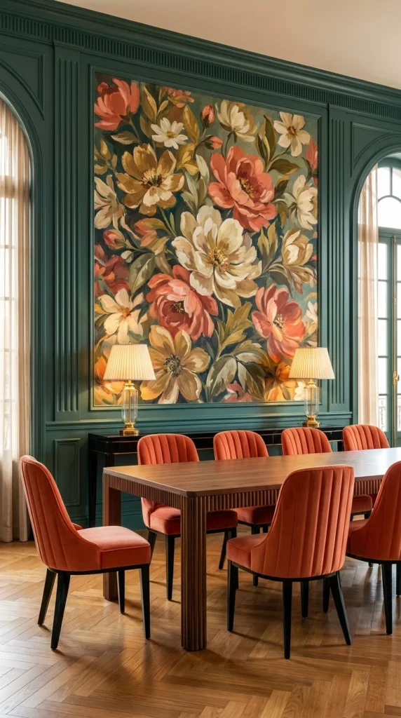
The final room in this list takes the opposite approach from the sunburst wall that opened it: instead of geometry, it uses one large, richly painted floral panel as the entire visual anchor, set into deep green fluted paneling. Coral and terracotta channel-back velvet chairs pick up the warm tones from the painting’s blooms, which is what ties a very traditional-feeling artwork back into a Deco room rather than letting it feel like a mismatched addition. Green shows up as a dominant tone in several rooms across this list, and these shades of green for a dining room go deeper into picking the right one.
This is a good example of scale used deliberately as decoration — the painting is oversized enough that it functions almost like wallpaper rather than a piece of framed art, filling the space the way a Deco mural would have in an original 1920s dining room. The twin table lamps flanking the credenza below repeat the painting’s symmetry, anchoring the composition and keeping the eye from drifting to one side.
For a smaller room, a single, oversized botanical print — even a large-format reproduction rather than an original painting — captures most of this idea’s warmth, and pairing it with two or three chairs in a matching warm tone does the rest.
Recommended Materials: Fluted painted wood, oil or acrylic floral artwork, velvet channel-back upholstery, brushed brass lamp bases, herringbone oak flooring
Main Colors: Forest Green, Coral-Terracotta, Cream, Brushed Brass
Best Lighting: Symmetrical table lamps flanking the artwork below, plus overhead ambient light — avoid a single spotlight on the painting alone, which flattens the room’s warmth
Common Mistakes With an Oversized Art Piece
- Choosing a painting with cool undertones against warm green paneling, which creates an unintentional clash instead of harmony
- Hanging the piece too small for the wall, losing the mural-like impact that makes this idea work
- Skipping the chair color coordination, leaving the artwork’s warm palette isolated instead of echoed in the room
- Cluttering the console below the painting with too many objects, competing with the art instead of supporting it
Keeping a Small Art Deco Dining Room Practical to Use
- Choose a table finish that survives daily wear — lacquered or sealed wood handles spills and heat better than unsealed live-edge surfaces in a small room used often
- Anchor the room with one metal finish, not three, so a compact space doesn’t read as visually busy the moment guests sit down
- Pick chairs with washable or performance velvet if the dining room doubles as a workspace or family table — true silk velvet stains easily
- Leave at least 36 inches of clearance behind every chair for a small room to still feel comfortable to move through during a dinner party
Who Should Choose This Style?
- Best for homeowners who want a dining room to feel like an event, not just a functional eating space
- Best for apartment dwellers with one strong architectural feature (an arch, a fireplace, a good window) to build a Deco moment around
- Best for anyone drawn to jewel tones, brass, and pattern who wants a style with historical grounding rather than a passing trend
- Not ideal for households that need an easy-clean, low-fuss dining space — velvet upholstery and lacquered surfaces both require more upkeep than performance fabric and laminate
Budget Summary
| Budget | Expectation |
|---|---|
| Low | Brass-finish pendant light, striped or velvet chair covers, a large framed print in place of custom art |
| Medium | Velvet dining chairs, a lacquered or brass-trimmed table, one fluted or paneled accent wall |
| Premium | Custom fluted millwork, a plaster ceiling medallion, a crystal chandelier, real marble flooring or surrounds |
FAQ
Does Art Deco work in a small dining room, or does it need a large space? It works in small rooms, but the approach has to change — instead of using several Deco signatures at once (a medallion, a chandelier, a checkerboard floor), a small room should commit to one strong feature, like a fluted accent wall or a single sunburst mirror, and keep everything else simple around it.
What’s the easiest, lowest-cost way to start an Art Deco dining room? A brass pendant light and a set of velvet dining chairs, paired with any warm wood or lacquered table, gets the core of the look without any structural changes to the room.
Is Art Deco dining furniture comfortable for everyday use, or is it mostly for show? Well-made velvet chairs and a solid wood table are entirely practical for daily use — the style’s reputation for formality comes more from lighting and wall treatments than from the furniture itself, which tends to have clean, ergonomic lines.
What colors pair best with brass in a small Art Deco dining room? Deep, saturated colors — emerald, navy, teal, and burgundy — read as most authentically Deco against brass, though softer palettes like blush and cream also work when balanced with at least one deep accent tone.
About the Author
Aesthetic Life Team curates and researches interior design ideas across every major style, from Art Deco to Japandi, with a focus on practical, real-world recreation over pure inspiration. The team draws on established design principles, materials knowledge, and current home trends to help readers make confident, informed decisions about their own spaces. Aesthetic Life does not sell products or accept paid placements within its editorial content.
In the End: Pick One Signature, Not All Ten
A small Art Deco dining room works best when it borrows one clear idea from this list — a sunburst wall, a fluted cabinet, a checkerboard floor — rather than trying to combine several. The rooms in this guide that feel the most resolved are the ones built around a single confident decision, with everything else in the space quietly supporting it. Start there, and the glamour takes care of itself.
Explore More
You may also enjoy:
- Retro Never Left: 10 Vintage 1950s Kitchen Ideas — for more warm, era-inspired color and material pairings
- The Case for More Maximalist Living Room Ideas That Actually Work — bold pattern and color layering ideas for adjacent rooms
- 10 Fireplace Feature Walls That Prove Less Is More — focal-wall design principles that apply well beyond the fireplace
Tags: art deco dining room, small dining room ideas, brass pendant lighting, fluted wood paneling, velvet dining chairs, sunburst wall decor, jewel tone interiors, vintage glam dining room

2 Responses