
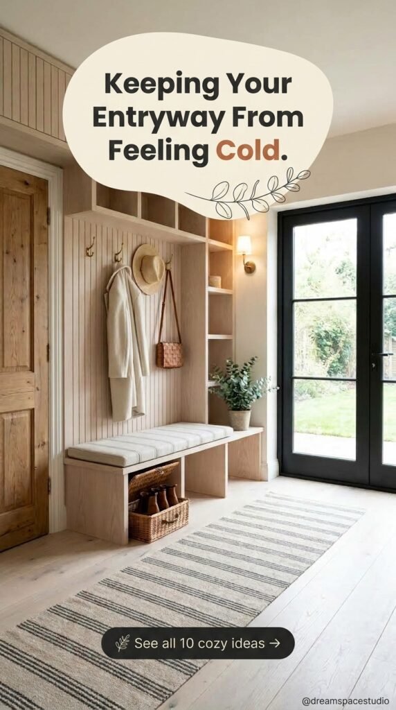
Scandinavian entryways aren’t styled to look empty — they’re edited to work hard. Every piece earns its spot: a bench that hides shoes, a mirror that opens up a tight hallway, hooks that catch a coat before it lands on the floor. The look reads calm because the function is solved, not because the space is bare.
If you’ve saved a dozen “Scandi entryway” photos and can’t tell which one actually fits your home, that’s the problem this guide solves. Below are ten entryways that all share the same restrained, natural-material DNA — but each one answers a different practical question: built-in versus freestanding, open shelving versus closed cabinets, a bench you can sit on versus a console you can’t. By the end, you’ll know which approach matches your space, your storage needs, and how much of a project you’re willing to take on.
Quick Overview
| Style | Scandinavian / Japandi-Adjacent |
|---|---|
| Best For | Small to mid-size entryways, renters and homeowners alike |
| Budget | Low–Medium |
| Difficulty | Easy DIY-friendly (built-ins require a carpenter) |
| Maintenance Level | Low |
1. The Boucle Bench Nook That Makes a Tight Corner Work Harder
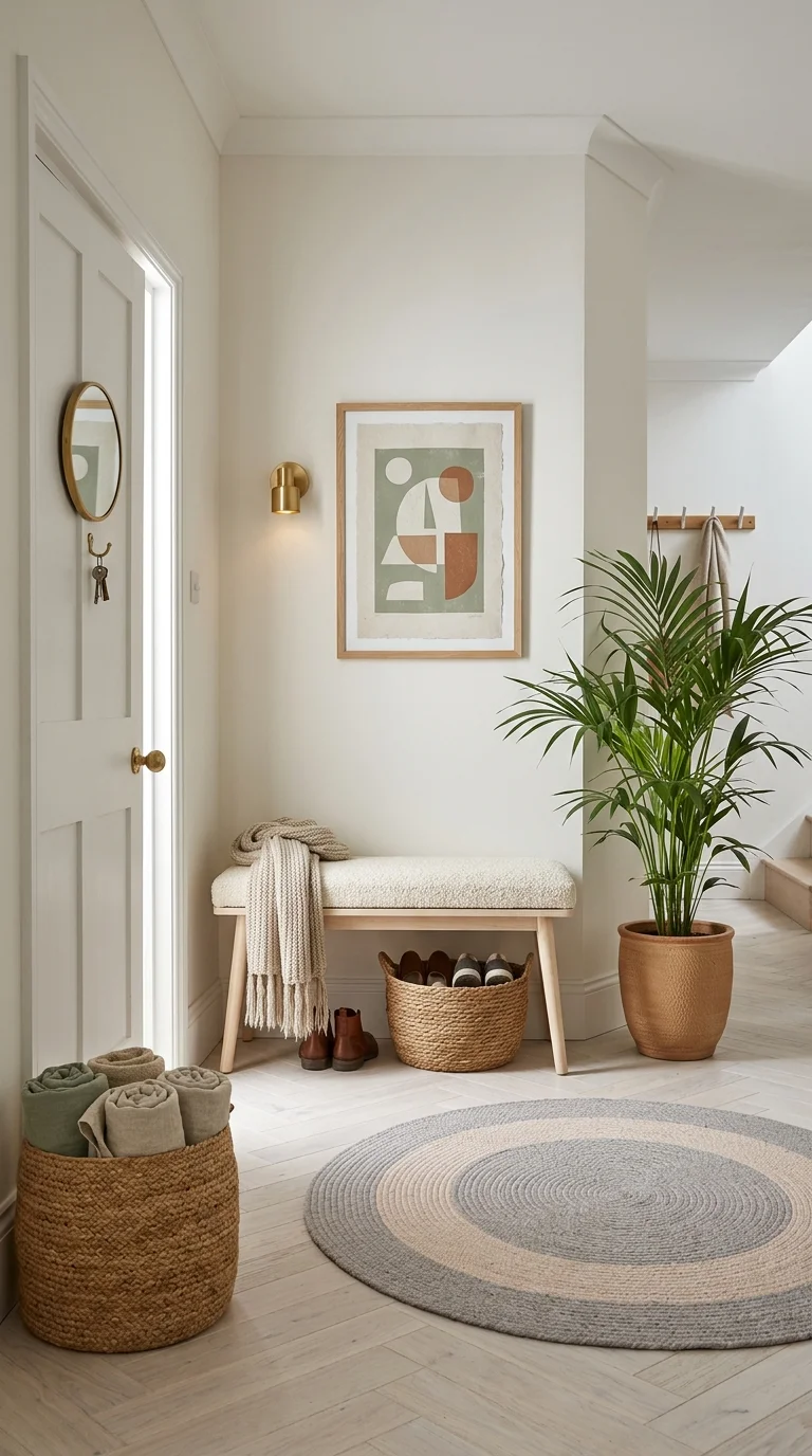
If your entryway is really just a leftover sliver of hallway, this is the layout to study. A slim boucle-topped bench sits under an abstract geometric print, with a brass sconce doing the job a window can’t. Open shoe space underneath and a woven basket for throws keep everything visible and grabbable, while a round mirror on the door itself — not the wall — solves a spatial problem most people don’t think to solve there.
What makes this idea distinct from a typical bench setup is the repetition of curves: the round mirror, the rounded bench legs, and the arcs in the artwork all echo each other, which is why the corner feels resolved instead of just “furnished.” A Kentia palm in a textured terracotta pot adds the one organic, imperfect element the geometry needs.
This suits renters and small-hallway homes where a built-in isn’t possible or worth the investment. It’s not ideal for households with more than two or three pairs of daily shoes, since the open basket storage fills up fast. The lifestyle it supports is grab-and-go: coat on, shoes on, one glance in the mirror, out the door.
Why the Curves Keep Pulling Your Eye Back
The mirror’s round frame, the bench’s rounded legs, and the soft shapes in the print all repeat the same visual language. That kind of repetition tends to be what makes a small vignette read as composed rather than just an assembled piece by piece — swap the round mirror for a square one and the corner likely loses some of that cohesion.
Recommended Materials: boucle upholstery · light oak or ash wood · brass hardware · jute/braided rug · terracotta
Main Colors: Warm White · Sage Green · Terracotta · Natural Oak
Best Lighting: A single wall sconce placed at eye level does the real work here since there’s no window — warm (not cool white) bulbs matter more in a windowless corner than almost anywhere else in the home.
Maintenance: The Kentia palm needs occasional dusting of its leaves and a spot with indirect light nearby; the boucle bench top should be brushed, not scrubbed, if it picks up dust from shoes.
Where This Layout Usually Goes Wrong
Skipping the sconce and relying only on overhead light, which leaves the mirror and art looking flat
Choosing a bench too deep for the space, which blocks the door swing
Overfilling the basket so it becomes a dumping ground instead of a throw-blanket spot.
Hanging the mirror at a height that only works for one person’s reflection
Caption: A slim bench and warm brass lighting turn a tight corner into a functional daily-use nook.
2. The Built-In Millwork Wall for Households That Need Real Storage
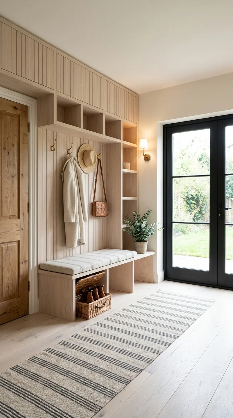
This is the answer for anyone whose entryway problem is genuinely “too much stuff, not enough furniture.” A full run of light oak millwork — cubbies up top, a padded bench seat, hooks in between — turns one wall into a complete drop zone, with black-framed French doors bringing in enough light that the wood paneling doesn’t feel heavy.
The defining characteristic here is verticality used on purpose: storage stacks from floor to ceiling instead of spreading sideways, which is exactly what makes this idea different from the console-table entries elsewhere in this list. A rattan basket tucked under the bench catches shoes that don’t fit the open cubbies above.
This is the strongest fit for families or anyone entering through a mudroom-style door daily — it’s a mudroom in function even if it’s technically a front hall. It’s a poor fit for anyone who can’t commit to custom carpentry or a landlord who won’t allow it. The tradeoff for all this storage is upfront cost and a build timeline measured in weeks, not a weekend.
Why the Wood Grain Direction Actually Matters
The vertical tongue-and-groove paneling above the bench runs the same direction as the cubby dividers, which helps the whole wall read as one built piece rather than several stacked components. Running the grain horizontally instead would likely have made the wall feel shorter and more broken up.
Recommended Materials: light oak millwork · woven rattan · linen bench cushion · brass hooks · black-framed glazing
Main Colors: Light Oak · Warm White · Matte Black · Sage
Best Lighting: The sconce beside the cubby wall supplements the natural light pouring through the French doors — in a space this reliant on daylight, evening light matters as much as daytime light.
Maintenance: Oak paneling should be wiped, not soaked, and rattan baskets benefit from an occasional shake-out rather than washing.
Where This Layout Usually Goes Wrong
Sizing cubbies for shoes but forgetting bag or helmet storage
Choosing an unfinished cushion fabric that stains from wet coats
Placing hooks too high for kids to reach on their own
Skipping a closed-storage option entirely, leaving nowhere to hide seasonal clutter.
Caption: Floor-to-ceiling millwork keeps coats, bags, and shoes contained without a single freestanding piece.
3. The Console Table Vignette for Homes That Want a Design Moment
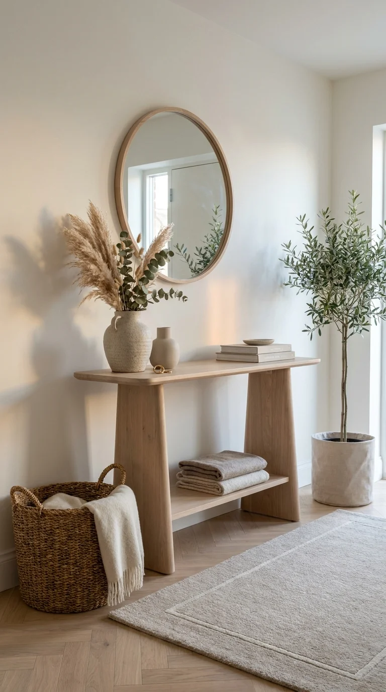
Not every entryway needs storage above all else — some just need to feel finished the second someone walks in. A trestle-leg console table under a round wood-framed mirror, styled with pampas grass, a stack of books, and a potted olive tree, is built entirely around that goal. A lower shelf holds folded towels, and a woven basket with a throw sits on the floor for the one thing the table’s clean surface won’t.
What separates this from the storage-first builds elsewhere in the guide is that the console is treated as a styling surface first, functional catch-all second — the vases and books are permanent, not swapped out daily. That’s a deliberate tradeoff: it looks considered, but it doesn’t solve where daily mail or keys actually go.
This suits homeowners who have another spot nearby for shoes and coats and want the entry itself to make a first impression — an open-plan home where the entry is visible from the living room is the ideal candidate. It’s the wrong choice for a household without a secondary drop zone, since there’s genuinely nowhere here for daily clutter to land.
The One Ratio That Keeps This From Feeling Top-Heavy
The mirror is roughly the same width as the console beneath it, and both sit with enough wall space around them to breathe. A mirror much wider than the table below it tends to make the whole grouping feel unbalanced, even if each piece is attractive on its own.
Recommended Materials: solid oak or ash · dried pampas grass · ceramic vessels · wool rug · linen throw
Main Colors: Natural Oak · Cream · Sage Green · Terracotta
Best Lighting: Relies almost entirely on the large window just out of frame — this idea only works as-is in an entry that gets genuine daylight; without it, add a wall sconce above the mirror.
Maintenance: Dried pampas grass sheds slightly over time and should be shaken out or replaced every season or two; the olive tree needs bright, indirect light and infrequent watering.
Where This Layout Usually Goes Wrong
Overcrowding the console top so it stops functioning as a landing spot at all.
Choosing a mirror frame that competes with the table’s wood tone instead of matching it
Forgetting a real storage solution exists somewhere else in the home.
Letting dried florals go dusty and faded without seasonal refreshing.
Caption: A single console does double duty as a catch-all surface and the room’s main styling moment.
4. The Locker-Style Wall for Hiding Everything Behind Closed Doors
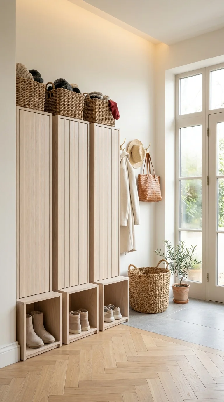
Three tall, narrow oak cabinets — each with its own shoe cubby underneath — turn this entry into something closer to a locker room than a decorative vignette, and that’s the entire point. Woven baskets on top hold seasonal items like hats and scarves, while hooks beside the lockers catch coats and bags for daily use.
The idea this section is built around is closed storage as the default, open storage as the exception — almost everything here disappears behind a door, which is the opposite approach from the open-shelf builds elsewhere in this guide. That makes it the most visually calm option on this list, since clutter is never actually visible.
This fits households that value a tidy-looking entry over quick visual access — if you’d rather open a door than dig through an open cubby, this is your model. It’s a poor match for young kids who need to grab their own shoes independently, since the cabinet doors add a step that open cubbies skip. Tall glass French doors nearby keep the narrow footprint from feeling closed-in despite all the solid millwork.
Why Three Repeated Units Read as One Piece
Each locker is identical in width, height, and hardware placement, and that exact repetition is what keeps three separate cabinets from looking like three separate purchases. Varying the widths even slightly would likely have broken that sense of a single built unit.
Recommended Materials: light oak veneer or solid wood · woven seagrass baskets · straw · leather bag straps · natural fiber flooring
Main Colors: Light Oak · Cream · Warm White
Best Lighting: Tall glass doors supply most of the daylight; no supplemental fixture is visible, which works only because the doors face a bright exterior.
Maintenance: Wicker baskets on top should be checked for dust buildup periodically, and cabinet hinges benefit from an occasional check if doors see daily use.
Where This Layout Usually Goes Wrong
Sizing the shoe cubbies too shallow for boots or larger shoe sizes
Skipping ventilation inside closed cabinets, which traps moisture from wet shoes.
Placing baskets on top out of reach for anyone who actually needs seasonal items often
Choosing hardware-free doors that are hard to open one-handed while holding bags
Caption: Closed lockers hide daily clutter behind doors while open shoe cubbies stay grab-and-go.
5. The Stairwell Console With a Gallery Wall Doing the Heavy Lifting
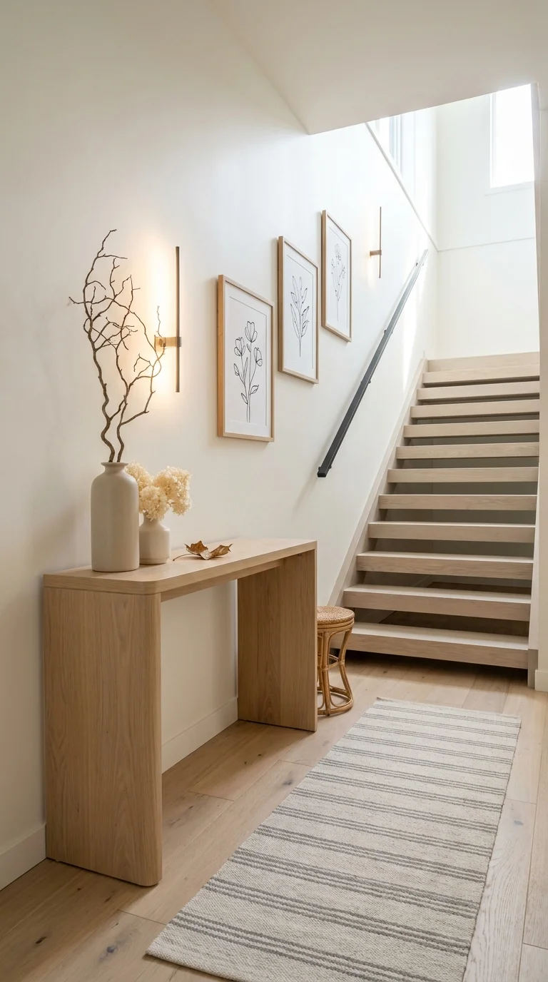
When the entry and the staircase are essentially the same space, this is a workable template. A simple oak console sits against the wall beneath a run of matching botanical line-art prints, flanked by slim vertical sconces, with a striped runner leading the eye toward the stairs instead of fighting the sightline.
The defining decision in this section is letting the art carry the visual interest instead of the furniture — the console itself is almost minimal, just a flat surface and two vase groupings, while four matching frames do the actual styling work. That’s a different bet than the console-vignette entry earlier in this guide, which loaded the table itself with objects.
This works well for stairwell entries and open-plan homes where the entry has to share visual space with a sightline to the second floor. It’s not the right fit for a home without decent wall length beside the stairs, since the gallery wall needs room to breathe rather than being cramped beside the railing.
Why the Eye Goes to the Art First, Not the Table
The frames are hung at a consistent height and evenly spaced, which draws the eye along the wall in a clean line before it drops to the console. If the frames were mismatched in size or spacing, the eye would likely bounce around instead of following that intended path toward the stairs.
Recommended Materials: solid oak · linen-matted frames · ceramic vases · dried branches · wool-blend runner
Main Colors: Natural Oak · Warm White · Charcoal (stair rail)
Best Lighting: Two slim wall sconces flank the gallery wall and do more work than a single overhead fixture would in a stairwell this tall.
Maintenance: Framed prints need only occasional dusting; dried branch arrangements should be checked yearly for dust and brittleness.
Where This Layout Usually Goes Wrong
Hanging the gallery wall at a height that only looks right from the bottom of the stairs, not the top
Choosing frames in mismatched finishes that compete with the wood console
Placing the runner too narrow for the hallway width, leaving exposed floor on both sides
Ignoring stair-light spillover, which can wash out artwork closest to the steps
Caption: A run of matching frames turns a stairwell landing into the entry’s visual anchor.
6. The Arched Niche Bench Where Architecture Does the Styling
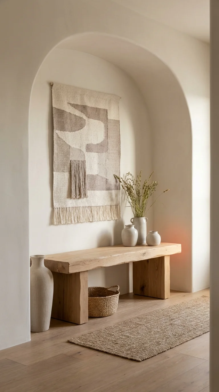
This entry works because the room’s shape was designed to help, not because of what’s sitting inside it. A rough-hewn, live-edge wood bench sits inside a plastered archway, under a fringed woven wall hanging, with a trio of ceramic vessels doing all the additional styling the space needs.
What makes this section stand apart is the deliberate architectural niche — few homeowners have an arch to work with, but for those who do, this shows how little else the space actually needs. The bench itself is almost unfinished-looking on purpose, letting the raw wood contrast with the smooth plaster instead of trying to match it.
Worth the Investment? — This is the one section in the guide worth calling out directly. If you already have (or can build) an arched niche, a plain live-edge bench, and one textile is genuinely all you need — spending more on decor here would likely compete with the architecture rather than complement it. If you don’t have the niche, recreating this exact look elsewhere means building the arch first, which is a real renovation, not a decor purchase.
This suits homes with existing architectural character — older builds, Mediterranean-influenced layouts, or anyone doing a fuller renovation. It’s not a realistic model for a standard rectangular hallway without construction.
Why the Bench Stays Deliberately Rough
The live-edge top keeps its natural, uneven grain instead of being sanded smooth, and that texture is what keeps the vignette from feeling too polished against the soft plaster curve. A sleeker, more finished bench would likely read as generic furniture rather than a piece that belongs specifically in this niche.
Recommended Materials: live-edge solid wood · lime-washed plaster · wool/cotton-blend woven textile · stoneware ceramics · jute rug
Main Colors: Warm White · Natural Oak · Taupe
Best Lighting: Soft, diffused daylight from an adjacent opening does the work; the plaster’s texture is what catches and holds that light.
Maintenance: Plaster walls should avoid harsh scrubbing; the live-edge bench may need occasional oiling to prevent the exposed grain from drying out.
Where This Layout Usually Goes Wrong
Adding too many extra objects and burying the architecture that’s doing the real work
Choosing a bench that’s stained or lacquered instead of left raw, losing the intended contrast
Skipping the rug, which leaves the stone or tile floor feeling unfinished
Attempting the arch as a faux paint effect instead of real dimension, which reads flat
Caption: The arch alone does most of the styling work, so the bench stays purposefully plain.
7. The Cushioned Alcove Bench Built for Actually Sitting Down
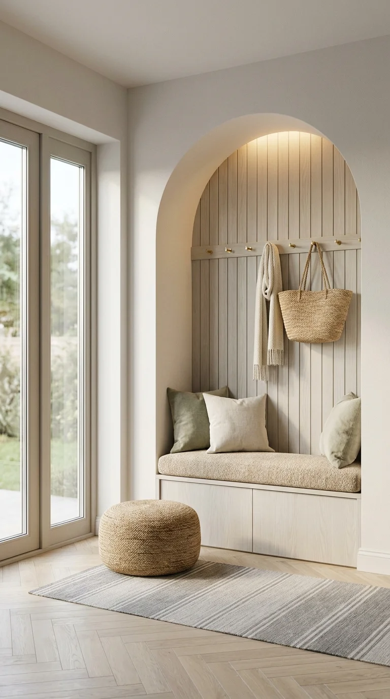
Most entryway benches are landing spots for bags, not places anyone sits. This one is different: a carved-out arch holds a genuinely cushioned bench with three pillows, hooks with brass knobs overhead, and a woven jute pouf pulled up in front — an actual seat for putting shoes on, not just a shelf shaped like a bench.
The idea this section teaches is comfort as a design requirement, not an afterthought — the cushion depth and pillow count are chosen for sitting, which is a genuinely different brief than the slim boucle bench earlier in this guide that prioritized a tight footprint over lounging comfort.
This fits households with kids, elderly family members, or anyone who needs to sit while putting on shoes rather than balancing on one foot. It’s a lower priority for a fast-traffic, single-person household where nobody actually stops to sit. Floor-to-ceiling glass beside the nook keeps the space from feeling closed off despite the enclosed arch.
Why the Pouf Matters More Than It Looks Like It Should
The jute pouf sits at a height close to a footstool, giving a second, lower seat option beside the bench itself. That small addition changes the space from “somewhere to perch” into “somewhere two people can actually sit at once” — pulling it away would likely make the bench feel like a single-person spot again.
Recommended Materials: linen or cotton cushion covers · painted wood paneling · brass hardware · braided jute · wool-blend runner
Main Colors: Sage Green · Warm White · Natural Jute
Best Lighting: Recessed lighting inside the arch itself adds a soft glow that a standard overhead fixture wouldn’t achieve in a niche this deep.
Maintenance: Cushion covers should be removable and washable given daily shoe-changing traffic; the jute pouf needs occasional vacuuming to prevent dust buildup in the weave.
Where This Layout Usually Goes Wrong
Choosing decorative-only cushions that aren’t rated for daily seating wear
Under-lighting the niche so it becomes a shadowed dead zone at night
Skipping a second seat, forcing one person to wait while another puts on shoes
Hanging pegs too close together, so hung items overlap and tangle.
Caption: A cushioned bench inside a carved-out arch gives the entry an actual place to sit down.
8. The Shiplap L-Bench for Corner Entries With Awkward Angles
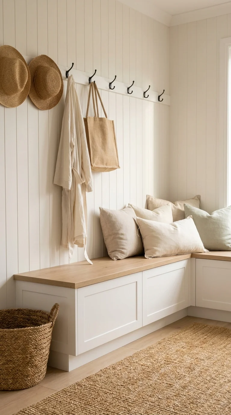
When an entry wraps around a corner instead of running along one flat wall, an L-shaped bench solves the layout problem a straight bench can’t. White shaker-style cabinetry runs the full length under a wood-topped bench seat, with shiplap paneling above and a wall of hooks holding hats, a robe, and a tote bag.
The distinguishing choice here is built-in cabinetry replacing open baskets entirely — everything below the bench top is closed storage, which is a more coastal-farmhouse take than the light-oak Scandi builds elsewhere in this guide, even though the bones (natural materials, restrained palette, functional hooks) are the same.
This is the strongest option for corner entries and mudrooms that double as a family drop zone, since the L-shape maximizes usable bench length without eating into walking space. It’s a mismatch for a narrow straight hallway, where an L-shape simply won’t fit.
Why White Cabinetry Doesn’t Read as Cold Here
The white cabinet fronts are paired with a natural wood benchtop and warm-toned pillows, so the white acts as a neutral base rather than the dominant note. Pairing that same white with a cooler-toned countertop instead of warm wood would likely have pushed the whole space toward feeling clinical.
Recommended Materials: painted shaker cabinetry · solid wood bench top · shiplap paneling · linen pillow covers · braided jute rug
Main Colors: Warm White · Light Oak · Sage Green (accent pillow)
Best Lighting: Relies on an adjacent window for daylight; a row of small sconces or picture lights above the hooks would extend usability into evening.
Maintenance: Painted shaker fronts show scuffs more visibly than wood and may need occasional touch-up paint near the bench height where bags brush against them.
Where This Layout Usually Goes Wrong
Skipping cabinet pulls, making the drawers hard to open with full hands.
Overloading the hook wall so hats and bags overlap and fall
Choosing pillow fabric that isn’t washable near a high-traffic shoe zone
Forgetting a doormat transition, tracking outdoor debris onto the wood bench top
Caption: Cabinetry underneath the bench swaps open cubbies for closed, kid-proof storage.
9. The Sage Green Built-In That Proves Color Belongs in a Calm Entry
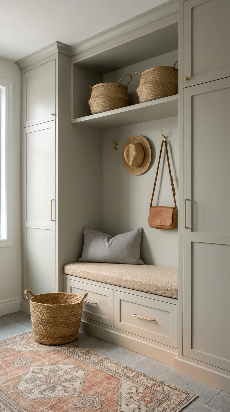
Most of this guide leans on wood tones and white, but this entry shows that a muted color still fits the Scandinavian brief when it’s handled with restraint. Full-height sage green cabinetry frames a cushioned bench nook, with an open shelf above holding woven baskets and brass-handled drawers below for closed storage.
The idea driving this section is that one confident color, kept flat and matte, can replace a wood tone as the entry’s anchor without breaking the calm mood the rest of this guide is built around — a vintage-patterned rug in warm terracotta and cream adds pattern without adding visual noise.
This suits homeowners who want the entry to feel distinct from the rest of a neutral, wood-toned home — a sage or muted-green entry can act as a gentle transition color. It’s a riskier choice for anyone planning to sell soon or unsure about committing to a non-neutral built-in, since repainting cabinetry later is a real project, not a quick fix.
Why the Rug Gets to Be the Loud Element
With the cabinetry, walls, and bench all in muted, related tones, the patterned vintage rug is the only element allowed to carry real visual complexity. Adding a second patterned textile — say, patterned pillows too — would likely compete with the rug instead of letting it stand out as the room’s one bold note.
Recommended Materials: painted shaker cabinetry · brass hardware · boucle cushion · woven seagrass baskets · vintage-style wool rug
Main Colors: Sage Green · Terracotta · Warm White · Brass
Best Lighting: Depends on a window just out of frame; in a windowless version of this layout, warm-toned recessed lighting would be essential to keep the green from reading cool.
Maintenance: Matte cabinet paint marks more easily than gloss and may need gentle spot-cleaning; a vintage-style rug should be rotated occasionally to even out wear near the door.
Where This Layout Usually Goes Wrong
Pairing the green with cool-white trim instead of warm white, flattening the palette.
Choosing brass hardware that’s too shiny, which can clash with a deliberately matte cabinet finish
Adding a second bold pattern that competes with the rug
Underestimating how much a saturated cabinet color affects a small space’s perceived size
Caption: Painted cabinetry in a muted sage gives this entry color without breaking the calm mood.
10. The Narrow Hallway Fix Built Around One Oval Mirror
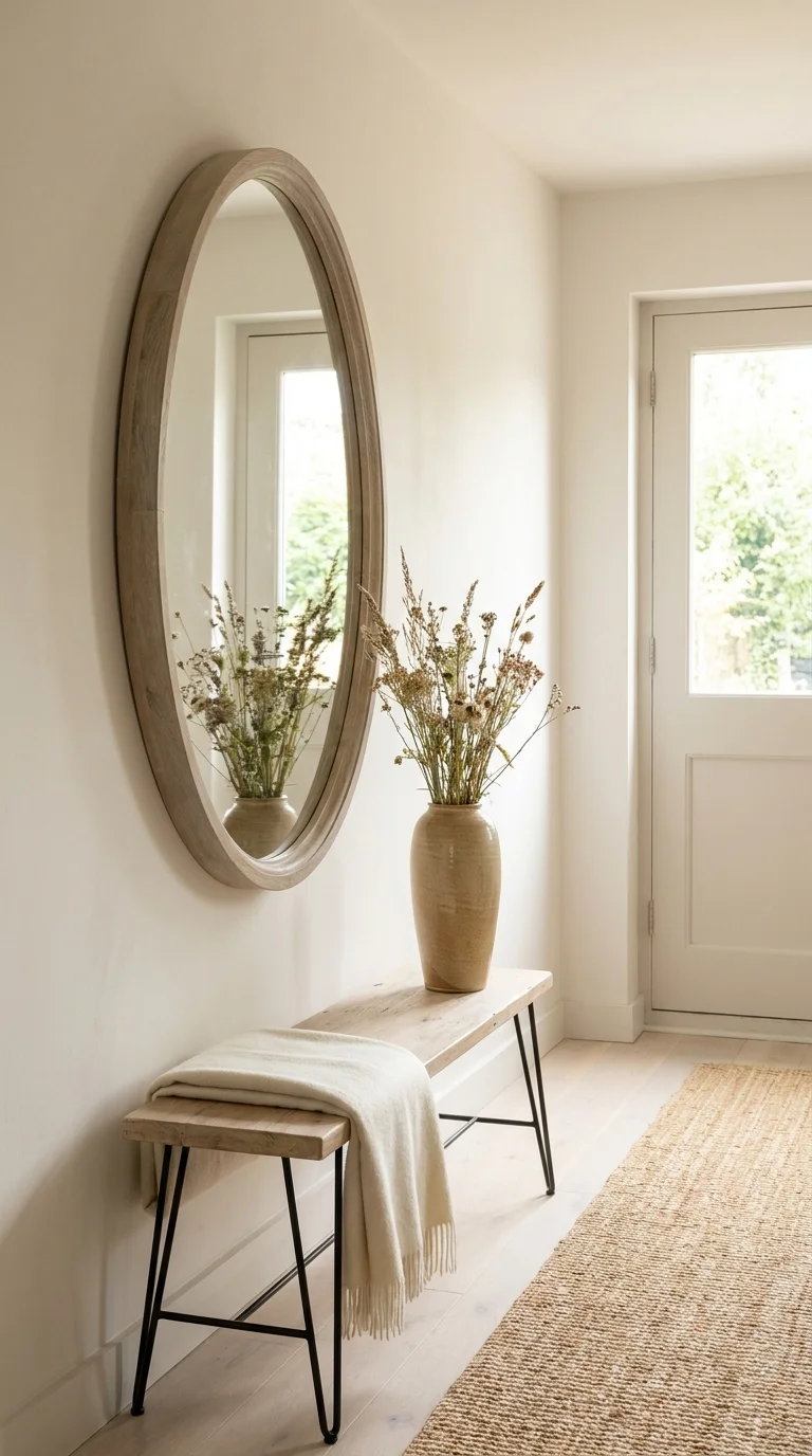
Some entries aren’t rooms at all — they’re just the first stretch of hallway past the front door, with barely enough width for furniture at all. This layout solves that with the smallest possible footprint: a slim rustic bench on hairpin legs, a tall oval mirror above it, and a single ceramic vase of dried flowers, all pushed against one wall to keep the walkway clear.
The one defining decision in this section is choosing an oval mirror over a round or rectangular one specifically to stretch the hallway’s height — a shape choice that solves a spatial problem the other, wider mirrors in this guide don’t need to solve. Hairpin legs keep the bench visually light so it doesn’t crowd a hallway this narrow.
This is the right model for genuinely narrow entry hallways — apartments, older homes with tight footprints, or any entry under about three feet wide. It’s unnecessary in a wider entry, where a bulkier bench and a differently shaped mirror have more room to work.
Why an Oval Beats a Round Mirror in a Narrow Space
The mirror’s elongated vertical shape draws the eye up and down the hallway rather than out to the sides, which tends to make a narrow space feel taller rather than emphasizing how little width it actually has. A wide round mirror in this same spot would likely have drawn attention to the hallway’s narrowness instead of past it.
Recommended Materials: reclaimed or weathered wood · black metal hairpin legs · ceramic vase · jute runner · glazed door panel
Main Colors: Weathered Oak · Warm White · Matte Black
Best Lighting: Borrowed daylight from the glass-paned door at the end of the hall is the main light source; a slim wall sconce beside the mirror would help on darker days.
Maintenance: A reclaimed wood bench may need occasional wax or oil to maintain its finish; dried florals should be dusted or refreshed seasonally.
Where This Layout Usually Goes Wrong
Choosing a bench too deep for the hallway width, narrowing the walkway further
Hanging the mirror too high to actually be useful for a quick check before leaving
Skipping a runner, which leaves a narrow hallway floor feeling unfinished
Overcrowding the single console surface, defeating the point of the minimal footprint
Caption: An oval mirror stretches a narrow hallway visually without adding any extra furniture depth.
Who Should Choose This Style?
Best for renters and homeowners who want a calm, low-clutter first impression without a maximalist look
Best for households juggling daily shoes, coats, and bags who need real function, not just decor
Best for homes with natural light, since the palette leans on warm wood and soft neutrals that flatten out in dim rooms
Not ideal for anyone who wants a bold, high-color statement entry — this style stays deliberately muted.
Daily Traffic Flow Tips for Entryways
Separate zones by frequency: Put daily items (shoes, keys, everyday coats) within arm’s reach and seasonal items (boots, umbrellas) higher up or behind closed doors.
Give every household member their own hook or cubby so items don’t pile onto one shared surface.
Keep a clear path to the door — benches and consoles should sit flush against a wall, not jut into the walking lane.
Add a boot tray or mat near the entry point before the rug, so moisture and debris never reach the natural-fiber flooring shown throughout this guide.
Budget Summary
| Budget | Expectation |
|---|---|
| Low | A slim bench, a mirror, and a jute rug from a big-box retailer |
| Medium | A solid-wood console or bench, a framed mirror, woven baskets, and a wool-blend rug |
| Premium | Custom built-in millwork, painted shaker cabinetry, brass hardware, and a live-edge or reclaimed-wood bench |
Bringing Rattan and Texture Into a Scandi-Boho Entry
If the woven baskets and jute textures across several of these entries appealed to you more than the cleaner, all-wood builds, it’s worth looking at how a fuller boho entryway leans further into rattan and greenery while keeping the same functional bones.
Solving Shoe Storage Without Losing the Look
For entries where shoes are the real bottleneck rather than coats or bags, a closer look at stylish shoe racks built for daily use shows a few more ways to keep footwear contained without resorting to a plain plastic rack by the door.
Frequently Asked Questions
Do Scandinavian entryways need a bench to work? No — several of the entries above, like the console-table vignette, skip a bench entirely and rely on a table surface instead. A bench matters most if you regularly sit down to change shoes; otherwise, a console or wall-mounted shelf covers the same visual style.
What’s the cheapest way to get this look in a rental? A jute or wool-blend runner, a wood-framed mirror, and a set of woven baskets go a long way without any permanent changes. Peel-and-stick hooks can stand in for built-in pegs, and a freestanding bench avoids any wall-mounted commitment.
How do I keep a light wood entry from showing every scuff? Choose a matte or low-sheen wood finish rather than high-gloss, since gloss tends to show scratches more visibly, and place a boot tray or mat at the door to catch debris before it reaches the floor or bench.
Can I mix in color, or does everything have to be neutral? The sage green built-in in this guide shows that one confident, muted color works fine as long as it stays flat and matte rather than saturated or glossy — the goal is restraint, not an all-neutral rule.
Is a rug necessary in a Scandinavian entryway? Not strictly, but nearly every example above uses one — a jute, wool-blend, or braided rug adds warmth and sound absorption to what’s otherwise a hard-floored, high-traffic space, and it’s one of the lowest-cost ways to finish the look.
Conclusion
The ten entries in this guide all share the same restrained materials — light oak, jute, brass, sage, warm white — but they solve ten genuinely different problems: a tight corner, a full mudroom’s worth of gear, a narrow hallway, an architectural arch. The right one for your home isn’t the prettiest photo you saved; it’s the layout that matches the traffic, the storage, and the footprint you’re actually working with. Pick the section above that matched your own entry’s constraints, and you already have a materials list, a layout, and a common-mistakes checklist to start from.
Written by the StartechLife Team — a group of interior design writers and stylists focused on practical, buildable home inspiration. Every idea in this guide is based on real, existing interiors, not AI-generated concepts, and is meant to help you plan changes you can actually make in your own space.


One Response