
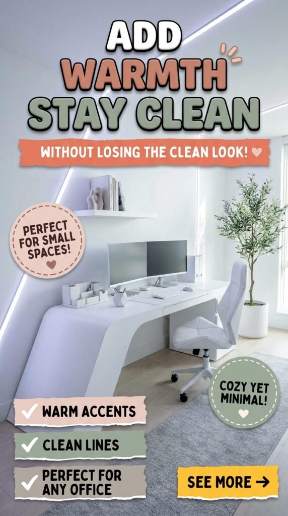
A truly white home office can go two very different directions. Done
well, it feels bright, calm, and easy to focus in. Done carelessly, it
feels sterile and cold the moment the excitement of a fresh coat of
paint wears off. The ten workspaces below take that same bright,
light-driven foundation and build ten genuinely different rooms on top
of it — from a fully custom sculptural desk to a $30 string-light
corner. Each one solves a different problem and suits a different kind
of worker, space, and budget. By the end, the goal isn’t to admire all
ten. It’s to know exactly which one is yours.
Quick Overview
| Style | Clean, Light-Driven Minimalism |
|---|---|
| Best For | Small offices, renters, plant lovers, shared spaces |
| Budget | Low to Premium (spans the full range) |
| Difficulty | Easy DIY to fully custom fabrication |
| Maintenance Level | Low to Medium, depending on plants and finishes |
The Curved Pod Office That Wraps Around the Desk
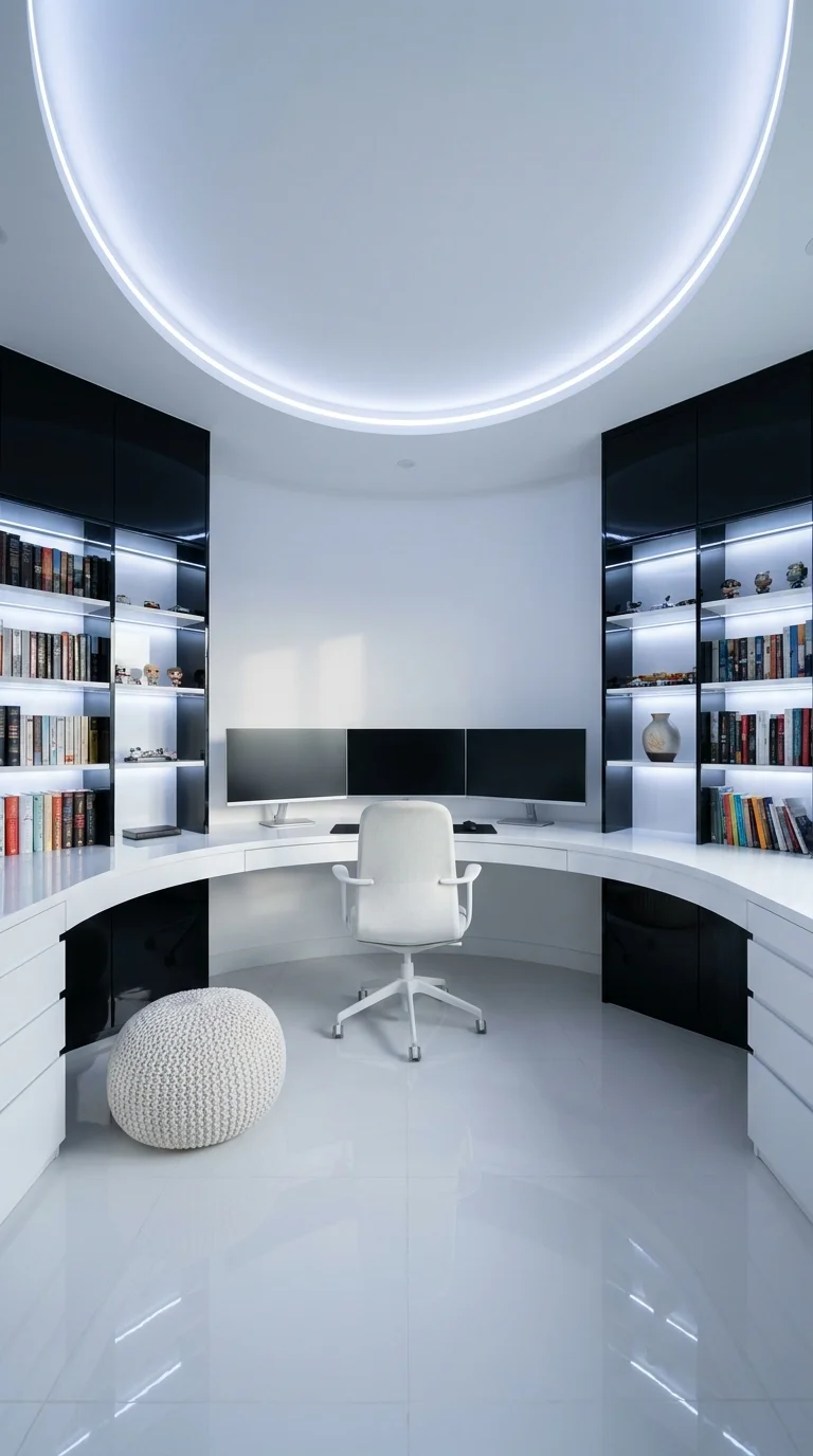
This room skips corners entirely. The cabinetry, the ceiling detail, and
the desk all follow the same continuous radius, so the architecture
itself — not the furniture — is the actual design idea here. It
stands apart from every other room in this list because nothing in it is
rectangular; the curve is doing the work that walls and shelving usually
do elsewhere.
That kind of enclosed, no-corner layout suits someone who wants their
desk to feel like a personal pod rather than a corner of a shared room — collectors who display figures, streamers, or anyone doing long,
solo, multi-monitor sessions where visual distraction is the enemy. It
works best in a dedicated home office setup or an awkward windowless space that
would otherwise be hard to use well, since the curve gives an otherwise
dead room a clear identity.
The advantage is genuine: a room with no hard corners reads as calmer
and more contained, which helps with focus during long stretches at the
desk. The tradeoff is real too — this level of curved millwork is a
custom carpentry project, not a furniture purchase, and it’s difficult
to change your mind about later. A scaled-down version can get close
with fanned floating shelves and an LED strip glued along the shelf edge
instead of a full ceiling ring, which keeps the spirit of the idea
without the built-in cost.
The one habit worth avoiding here is mixing warm and cool white light
sources, which breaks the illusion of one continuous glow faster than
almost anything else in the room.
Where the Ring of Light Sends Your Eye
The halo ceiling detail is doing more compositional work than the
furniture — a repeating radius pulls the eye downward and centers it
directly on the desk, which is one reason the room reads calm despite
the glossy black accents. This kind of circular framing tends to work
best in rooms without competing architectural lines nearby. In this
case, the effect would likely soften if the ring were interrupted by a
door or window sitting on its axis.
Recommended Materials
High-gloss black lacquer cabinetry
Matte white composite millwork
LED cove lighting
Polished porcelain tile flooring
Brushed-metal chair base
Tempered glass desktop
Main Colors
Warm White
Glossy Black
Cool White LED Glow
Best Lighting
A continuous LED ring supplies even ambient light with almost no visible
shadow, though the room has no separate task lamp in frame — adding a
small warm desk light would ease eye strain over longer sessions.
Maintenance
Glossy lacquer surfaces show fingerprints and dust quickly, so a
microfiber wipe-down a few times a week keeps the reflective finish
looking sharp rather than smudged.
Where a Curved Room Can Go Wrong
Mixing warm and cool white bulbs, which breaks the illusion of one
continuous light ring.
Adding a rectangular rug that fights the room’s circular logic
underfoot.
Leaving the display shelves visually cluttered without matching bins
or risers, so the curve stops feeling designed.
Choosing a chair with a busy print or bold color that becomes the
loudest thing in an otherwise quiet room.
The Symmetrical Panel Wall Office With a Drink Fridge Built In
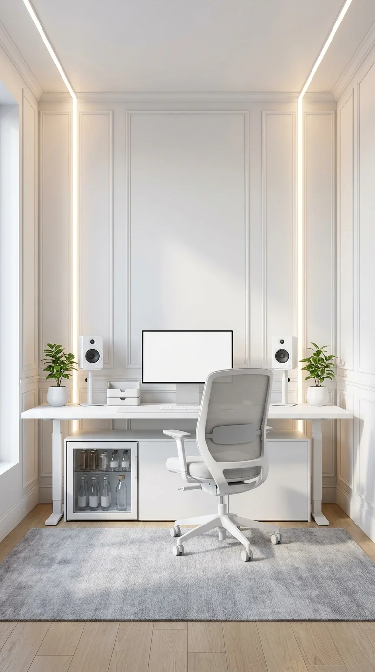
Every element in this room is mirrored — the paneled molding, the LED
strips tucked into the grooves, the matching plant-and-speaker pairing
on each side. That deliberate, near-perfect symmetry is the defining
move, and the small glass-front fridge built in below the desk is the
practical payoff: refreshments within arm’s reach without leaving the
room.
A layout this formal suits people whose workday runs through video
calls, since a mirrored backdrop reads as polished and intentional on
camera in a way an asymmetric desk rarely does. It fits naturally into a
room that already has panel molding, or a formal home office that’s
being upgraded from a plain guest room. It’s a good match for
long-hours remote executives who want their setup to double as a small
at-desk break station.
The camera-ready symmetry is the clear win, but it comes with a strict
cost: applied panel molding is a genuine carpentry investment, and a
fridge tucked under the desk can crowd leg room for some chair styles. A
close approximation is achievable with peel-and-stick wainscoting panels
and an LED strip run along the trim, paired with any small under-desk
fridge, which captures most of the look without full custom millwork.
One detail worth watching: the blank monitor sitting dead-center of a
symmetric room becomes the first thing anyone notices, so keeping the
screen filled with actual content matters more here than in a less
formal layout.
The Panels, the Plants, and the Speakers Are All Saying the Same Thing
This room repeats its vertical panel lines at least three times — in
the wall molding, the LED strips, and the identical plant-and-speaker
pairing on either side — and that consistent repetition is one reason
a strictly symmetrical layout still feels calm instead of stiff.
Symmetry this exact is a deliberate risk: a single mismatched object,
like a crooked frame or an odd-colored mug, tends to draw attention
immediately. Swapping in a different-model speaker on just one side
would likely be more noticeable here than in a looser layout.
Recommended Materials
Painted wood panel molding
Brushed aluminum bookshelf speakers
Matte white desk laminate
Glass-front mini refrigerator
Ceramic planters
Main Colors
Soft White
Warm Cream (trim glow)
Sage Green (plants)
Best Lighting
Warm LED strips recessed into the panel grooves read closer to ambient
sconces than direct task lighting — a good general glow for video
calls, though a desk lamp is still worth adding for close paperwork.
Maintenance
Two potted plants flank the desk, so a weekly watering check and an
occasional wipe of the fridge’s glass front keep the symmetry looking
as tidy as it reads in a photo.
Easy Ways to Throw Off a Symmetrical Room
Buying two different plant pots instead of a matching pair is the
fastest way to break the illusion.
Running fridge or speaker cables visibly across the panel face,
cutting straight through the clean lines.
Skipping a rug, leaving the hard floor and the fridge’s cord
underfoot looking unfinished.
Hanging one piece of wall art off-center to ‘add interest,’ which
undercuts the entire point of the layout.
The Corner Setup Built for Three Monitors and a Wall-Mounted TV
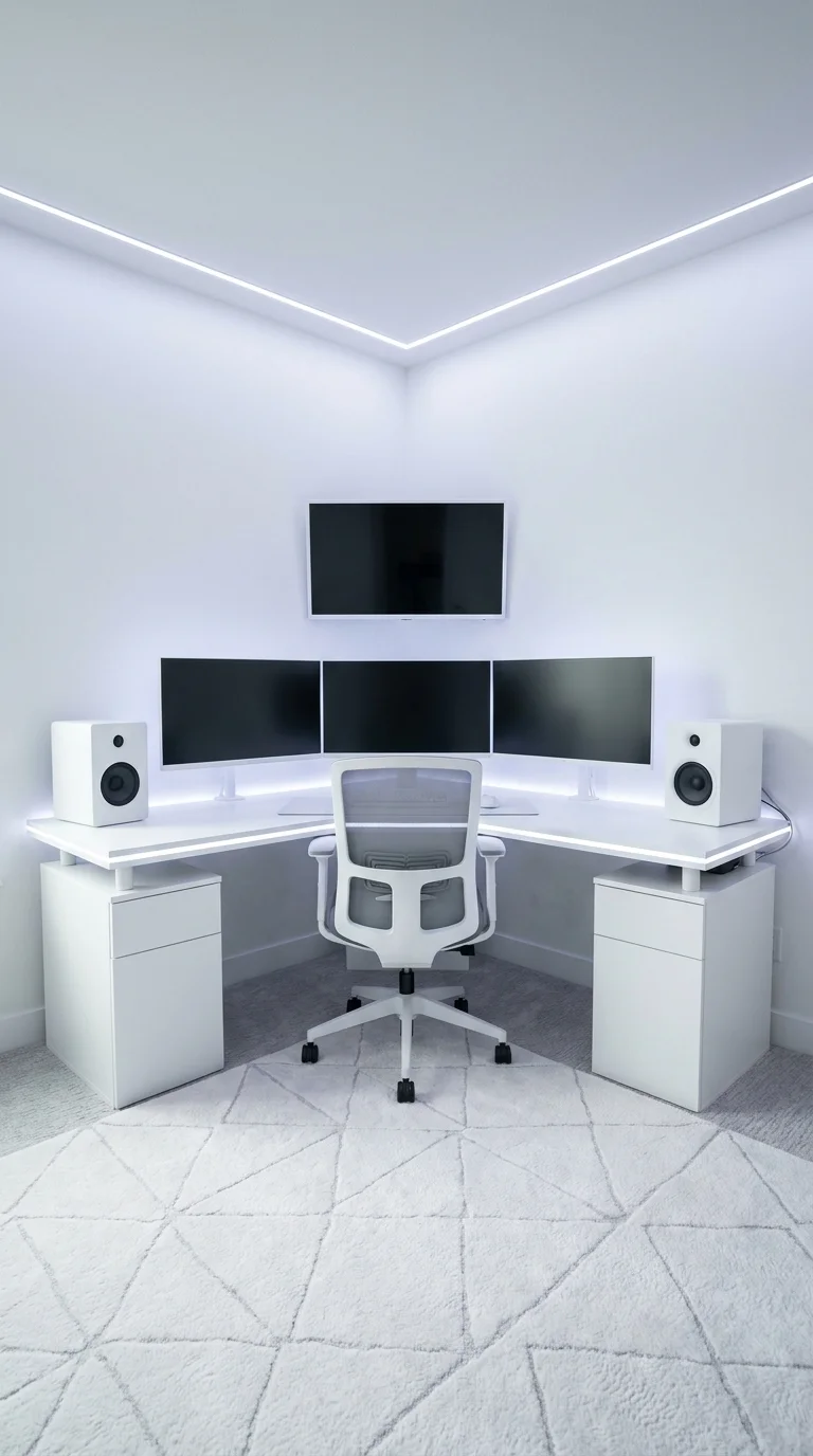
This corner leans all the way into a multi-screen command center: three
curved monitors, a wall-mounted TV above them, and matching filing
pedestals anchoring both sides of the desk. The ceiling’s triangular
LED outline echoes the desk’s own L-shape, so the architecture and the
furniture are working off the same geometry rather than fighting it.
It’s built for people who genuinely need several live views at once — traders, streamers, data-heavy roles, or competitive gamers who benefit
from a dashboard-style multi-monitor setup instead of turning between windows. A
squarish room with an accessible, uncluttered corner is the easiest
place to attempt this, since the whole idea depends on having a true
right angle to build into.
The strongest advantage is efficiency: everything stays within one sweep
of the eyes instead of requiring a physical turn. The tradeoff is just
as real — three monitors plus a wall TV means genuine cable
management, glare control, and equipment cost well above a single-screen
setup. A pared-back version keeps the corner-outline LED strip, which is
the cheapest part of the look, while dropping to two monitors and
skipping the wall-mounted TV.
Matched filing pedestals matter more than they might seem; buying them
separately in two different finishes is the single fastest way to
undercut an otherwise carefully built corner.
Three Monitors Only Works Because the Desk Is Big Enough to Carry Them
The screens read as one continuous instrument panel rather than clutter
mostly because the corner desk is deep enough that the monitors’ visual
weight doesn’t overwhelm the surface underneath — a ratio that’s
easy to get wrong on a shallower desk. Adding the wall-mounted TV above
raises the stakes further, and the layout only stays balanced because
the twin filing pedestals anchor the bottom corners with matching mass.
Shrinking the desk without shrinking the monitor count would likely tip
that balance quickly.
Recommended Materials
Matte white laminate corner desk
Powder-coated metal monitor arms
Upholstered mesh task chair
Wool-blend geometric-pattern rug
MDF filing pedestals
Main Colors
Bright White
Cool LED Blue-White
Charcoal Grey (bezels)
Best Lighting
The triangular LED outline supplies shadow-free ambient light, which is
exactly what a multi-monitor setup needs to avoid glare on three screens
at once — task lighting is deliberately left out for that reason.
What Breaks a Multi-Monitor Corner Like This
Mounting the monitors too high, forcing a constant upward neck tilt
across three screens instead of one.
Buying filing pedestals in two different finishes because they were
sourced separately.
Running a warm-white desk lamp that clashes with the cool LED corner
strip, creating two competing light temperatures.
Choosing a shallow desk that can’t physically fit three monitor
bases side by side without touching.
The Blush Pink Desk Built on Repurposed Cube Storage
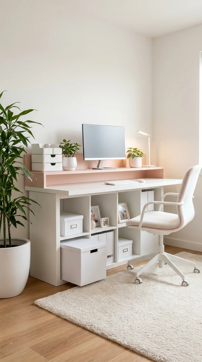
Here the desk surface sits directly on modular cube storage instead of a
dedicated set of legs, so the furniture is doing double duty as both
work surface and storage from the start. It’s the most budget-forward
build in this entire list, using off-the-shelf shelving rather than any
custom desk.
That approach suits renters and small-space dwellers, students, and anyone in a first apartment
or shared room who needs storage as much as a work surface, and it’s
easy to fit into a bedroom corner or small apartment where a full desk
footprint isn’t realistic. It’s a genuinely modular system too — cube storage can expand or rearrange as needs change, at a fraction of
the cost of any built-in setup shown elsewhere in this list.
The compromise is desk depth, which runs shallower than the built-in
options, and open-front bins that show clutter fast if they aren’t kept
tidy. A raised riser shelf over the monitor adds extra storage without
adding desk footprint, and a simpler unfinished wood shelf can stand in
for the blush laminate riser on a tighter budget.
Unlabeled, mismatched bins are the fastest way this exact setup starts
to look more thrown-together than curated, so keeping storage containers
matched in color and material carries more weight here than in a pricier
build.
What That Blush Laminate Will Look Like in a Year
Laminate finishes like the blush desktop and riser here hold color well
but tend to show scratches and edge-chipping sooner than solid wood or
painted MDF, especially at a corner used daily for pens and mugs.
Pairing a light laminate with a slightly darker edge band is a common
way to disguise those inevitable nicks over time. The soft blush tone
also helps hide dust better than a bright white surface would in a busy,
multi-use desk like this one.
Recommended Materials
White cube shelving (laminate)
Blush-toned laminate desktop and riser
Canvas storage bins
Ceramic planters
Painted MDF chair frame
Main Colors
Soft White
Blush Pink
Warm Oak (flooring)
Best Lighting
A small white desk lamp supplies focused task light, which this corner
clearly needs since there’s no visible ambient ceiling fixture in the
frame — a good example of a task lamp compensating for a room without
built-in overhead glow.
Maintenance
Small potted plants sit on the desk itself, so a weekly water check and
an occasional rotation toward the window keep them healthy without extra
effort.
Where a Cube-Storage Desk Falls Apart
Leaving bins unlabeled and mismatched, the single fastest way this
setup starts to look cluttered instead of curated.
Overloading the open cubes so items spill past the shelf edge and
interrupt the clean desk line above.
Skipping a cord management box, letting charger cables pool visibly
on an otherwise tidy surface.
Choosing a rug so busy it competes with the desk’s soft palette
instead of grounding it.
The Sculptural White Desk That Grows Out of the Wall
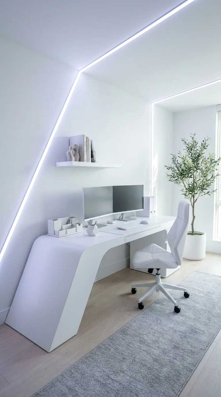
The desk here isn’t a separate object at all — it reads as one
continuous sculptural form flowing from the angled wall down into a low
platform base. A diagonal LED strip tracks the ceiling’s actual slope
rather than running level, reinforcing that the whole room was designed
around one architectural gesture rather than a piece of furniture.
This suits a design-forward homeowner who wants a true architectural
centerpiece rather than a purchasable desk, and it’s a smart way to
turn an awkward angled-ceiling room — an attic conversion, for
instance — into the room’s best feature instead of a problem to hide.
It rewards someone who wants a signature, non-replicable room over
swappable furniture that could be updated later.
The tradeoff is significant: this is genuinely custom fabrication with
real cost and lead time, and it can’t be resized or relocated once
built. A scaled-down version using a modular waterfall-edge desk from an
off-the-shelf furniture line captures a meaningful part of the
sculptural feel without the fully custom base, following the same
diagonal light line up the wall.
Keeping the floating shelf above sparingly styled — a few books, one
vase — matters more here than almost anywhere else in this list, since
the desk’s sculptural line is meant to be the room’s one clear focal
point.
How Much Wall the Desk Is Allowed to Take Up
The desk base is scaled to occupy nearly the full angled wall, and that
only works because everything else in the room — the shelf, the chair,
the single tree — stays deliberately small in comparison. Reducing the
desk’s footprint while keeping the same visual weight would likely make
the sculptural base read like an afterthought rather than the room’s
central idea. The ratio here clearly favors the architecture, with the
furniture accepting a supporting role.
Recommended Materials
Solid-surface composite desk base
Painted drywall
Engineered wood flooring
Powder-coated metal chair frame
Glass vase
Main Colors
Warm White
Soft Grey (shadow tones)
Olive Green (tree)
Best Lighting
The diagonal LED strip tracks the ceiling’s real angle instead of
running level, reinforcing the sculptural line rather than simply
lighting the room, and it’s paired with genuine daylight from the
adjacent window.
Maintenance
A live olive tree sits beside the desk, so rotating it toward the window
every couple of weeks and wiping dust from the broad leaves occasionally
keeps it healthy and photogenic.
Is a Sculptural Desk Base Actually Worth Building?
A fully custom desk base like this one is one of the few upgrades in a
home office that photographs as architecture rather than furniture, and
that alone can justify the cost for someone working from this room daily
who wants it to feel unlike anything bought off a shelf. That said,
it’s hard to recommend for anyone who moves often or expects to redo
their layout within a few years, since a form this specific doesn’t
adapt to a new floor plan. For a forever home, or a genuinely
design-obsessed owner, it’s worth it; for most other households, a
waterfall-edge desk from a modular line gets close to the same visual
impact for a fraction of the commitment.
Where a Sculptural Desk Build Goes Wrong
Cluttering the floating shelf with too many objects, turning a quiet
architectural line into a junk shelf.
Choosing a desk chair with a busy pattern or bold color that
competes with the sculptural base for attention.
Running a straight ceiling light strip instead of following the
room’s actual angle, fighting the architecture rather than
tracing it.Underestimating cable routing — a base this sculptural has nowhere
obvious to hide cords unless it’s planned before fabrication.
The Office That’s Really Just a Corner of the Living Room
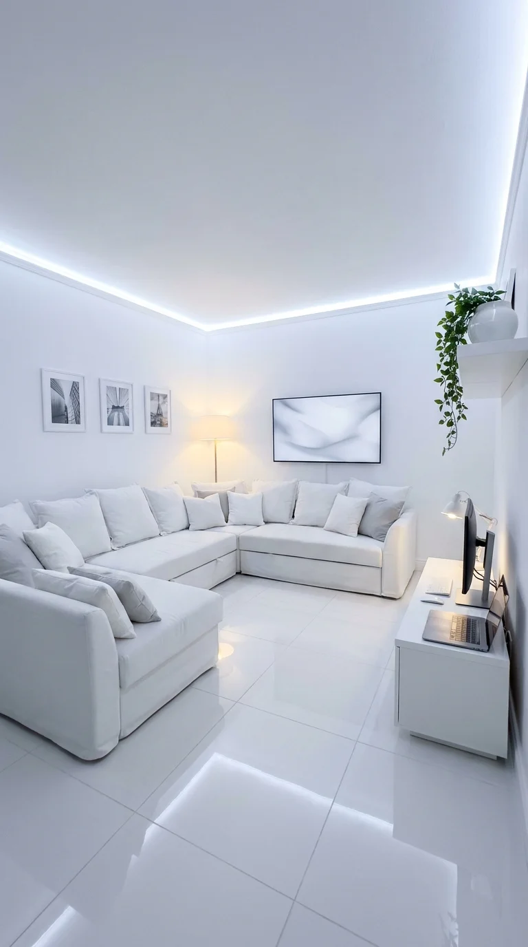
There’s no dedicated office here at all — a slim white console desk
with a monitor and laptop is tucked into a far corner of what’s
otherwise a full living room, sectional and all. It’s the clearest
proof in this list that a functioning workspace doesn’t need its own
room, or even a full-size desk, just a deliberately claimed corner.
This fits people without a spare room to convert, small apartment
dwellers, and hybrid workers who only need a desk for a few hours a day
rather than a full workday. It suits a social household too, since the
setup can visually disappear into the living space when the workday ends
rather than dominating the room.
The advantage is space efficiency — nothing gets sacrificed to build a
separate office, and square footage keeps doing double duty. The real
compromise is focus: there’s no visual or acoustic separation from a TV
and open seating just a few feet away, which matters for anyone doing
sustained deep work rather than light tasks.
Matching the desk’s finish to the room’s existing console or media
furniture is what keeps this from reading as two mismatched rooms
stacked on top of each other, and it’s worth prioritizing over a desk
that stands out.
The Eye Lands on the Sofa First, Which Is the Point
The desk is deliberately the smallest object in the frame here — the
sectional and the wall art claim the visual hierarchy, and the desk
reads almost like an afterthought tucked into the corner. That’s likely
intentional: a home office folded into a living room tends to work best
when it doesn’t announce itself the moment you walk in. A larger or
more visually loud desk would probably compete with, rather than quietly
support, the room’s main living-room function.
Recommended Materials
Glossy porcelain tile flooring
Upholstered slipcover sectional
Matte white console desk
Brushed metal floor lamp
Framed prints
Main Colors
Bright White
Soft Grey (pillows and tile veining)
Green (trailing plant)
Best Lighting
A single warm floor lamp beside the desk supplies most of the task light
in this corner, since the room’s main lighting is designed around the
seating area rather than the workspace.
Maintenance
A hanging plant sits near the desk, so a weekly soil check and an
occasional trim of trailing vines keep it from drifting into the TV
sightline.
Where a Living-Room Office Corner Falls Apart
Buying a desk chair that doesn’t match the room’s other seating,
making the corner look bolted-on rather than designed in.
Leaving cords and a laptop charger visible across the side table,
dragging the eye toward the ‘work’ zone.
Skipping any privacy or acoustic buffer, which makes video calls
awkward with open seating a few feet away.
Oversizing the desk so it competes with the sectional instead of
quietly supporting the room.
The String-Light Corner Built More Like a Bedroom Nook Than an Office
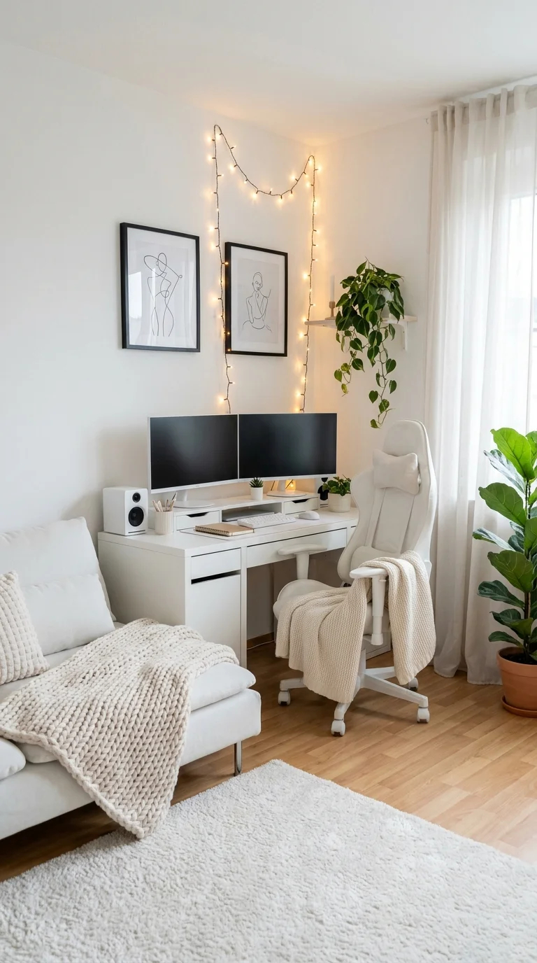
This is the most purely decor-driven idea in the group. There’s no
architecture and no built-in cabinetry — just a pair of matching
line-art prints, a loose loop of warm string lights, and a knit throw
layered over a chair, all doing the work that construction does in the
other sections.
It suits renters, students, and creatives who want a personal, cozy
corner rather than a polished, professional-looking setup, and it fits
naturally into a bedroom corner or shared apartment where permanent
changes aren’t an option. It’s better matched to creative or freelance
work with an evening rhythm than a strict nine-to-five, since the
ambient glow flatters mood more than it supports bright daytime focus.
Its biggest strength is portability — string lights, prints, and
throws can all move out with a renter using nothing more than a few
small hooks. The real limitation is brightness: this soft, ambient glow
isn’t strong enough on its own for focused daytime screen work without
an added desk lamp.
Keeping the string lights confined to one defined shape, rather than
scattering them randomly across the wall, is what keeps this
budget-friendly corner reading as intentional instead of thrown
together.
Two Frames, One Rhythm of Light
The pair of matching line-art prints repeats the same loose, sketch-like
linework, and the string lights above echo that same relaxed rhythm
rather than a rigid grid — a small repetition that helps a genuinely
low-cost setup still feel curated. Swapping in one larger print instead
of the matched pair would likely lose some of that rhythm. The
houseplants add a second, looser layer of repetition that softens the
corner even further.
Recommended Materials
Matte black picture frames
Warm-white string lights
Sheer linen curtains
Knit cotton throw
Engineered wood flooring
Main Colors
Bright White
Warm Amber (string lights)
Sage Green (plants)
Best Lighting
String lights supply a soft ambient glow well suited to evening work,
but this setup would benefit from an added desk lamp to handle daytime
screen glare and close reading.
Maintenance
Several houseplants sit around the desk, so rotating pots toward the
window periodically and wiping dust from the leaves monthly keeps the
greenery looking as fresh as the rest of the corner.
Where a String-Light Corner Loses Its Charm
Draping the lights so loosely they sag into the monitor’s sightline
instead of framing the wall above it.
Mixing warm-white and cool-white bulbs on the same string, which
breaks the cozy effect immediately.
Skipping task lighting entirely, leaving daytime sessions squinting
through screen glare.
Overcrowding the wall with too many prints, turning a curated
gallery moment into visual noise.
The Nearly Empty Desk That Lets One Purple Glow Do All the Talking
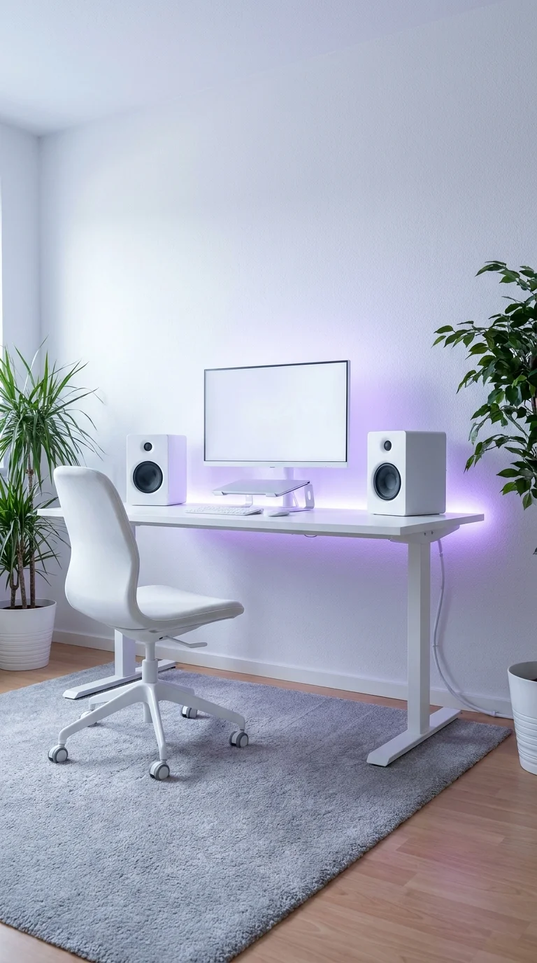
Strip away the color, and this room is almost bare: a simple standing
desk, one monitor, matching speakers, and two potted plants against an
otherwise blank wall. The entire personality comes from a single wash of
purple LED light — no shelving, no art, no additional decor competing
for attention.
It’s the fastest, cheapest way in this whole list to add real mood to a
plain room, and it stands in sharp contrast to the custom-carpentry
sections earlier on. It works for renters who can’t modify walls,
minimalists who want a mood switch without permanent decor, and anyone
who wants ambient color without RGB cluttering the desk itself.
The advantage is near-zero commitment: a single color-changing LED bar
achieves the whole look, at a fraction of the cost of anything built-in.
The real compromise shows up the moment the light turns off — without
the glow, the room reads unfinished rather than intentionally minimal.
Because nothing else in the frame is doing visual work, the wall wash
should stay the room’s one deliberate decision; adding extra decor on
top of it tends to dilute rather than enhance the effect.
What Happens to a Plain Wall Once the Light Turns Off
A matte painted wall like this one shows an LED wash beautifully but
also shows every scuff and shadow clearly once the light is off, since
there’s no texture, art, or shelving to distract from the bare surface.
A satin or eggshell finish tends to hide those marks slightly better
than the flat matte shown here. This setup depends more on the wall’s
paint condition than almost anything else in this list, since nothing
else in the room competes for attention.
Recommended Materials
Matte white wall paint
Engineered wood flooring
Powder-coated steel desk frame
Laminate desktop
Ceramic planters
Main Colors
Bright White
Vivid Purple (LED glow)
Soft Grey (rug)
Best Lighting
This section is essentially a lighting case study — one color-changing
LED strip supplies the room’s entire personality, with no visible task
lamp, so a small clip-on light is worth adding for actual close work.
Maintenance
Two potted plants flank the desk, so a light weekly watering schedule
and occasional dusting keep them as the only organic material breaking
up an otherwise hard-surfaced room.
Where a One-Light-Feature Room Falls Flat
Choosing a wall paint sheen that shows scuffs badly once the accent
light is switched off.
Positioning the LED strip too high, washing the ceiling instead of
the wall and losing the intended glow.
Adding desk clutter that competes with the room’s one intentional
design move.
Picking a rug pattern or color that clashes with whatever LED tone
gets used most often.
The Desk Buried Under Two Fully Planted Floating Shelves
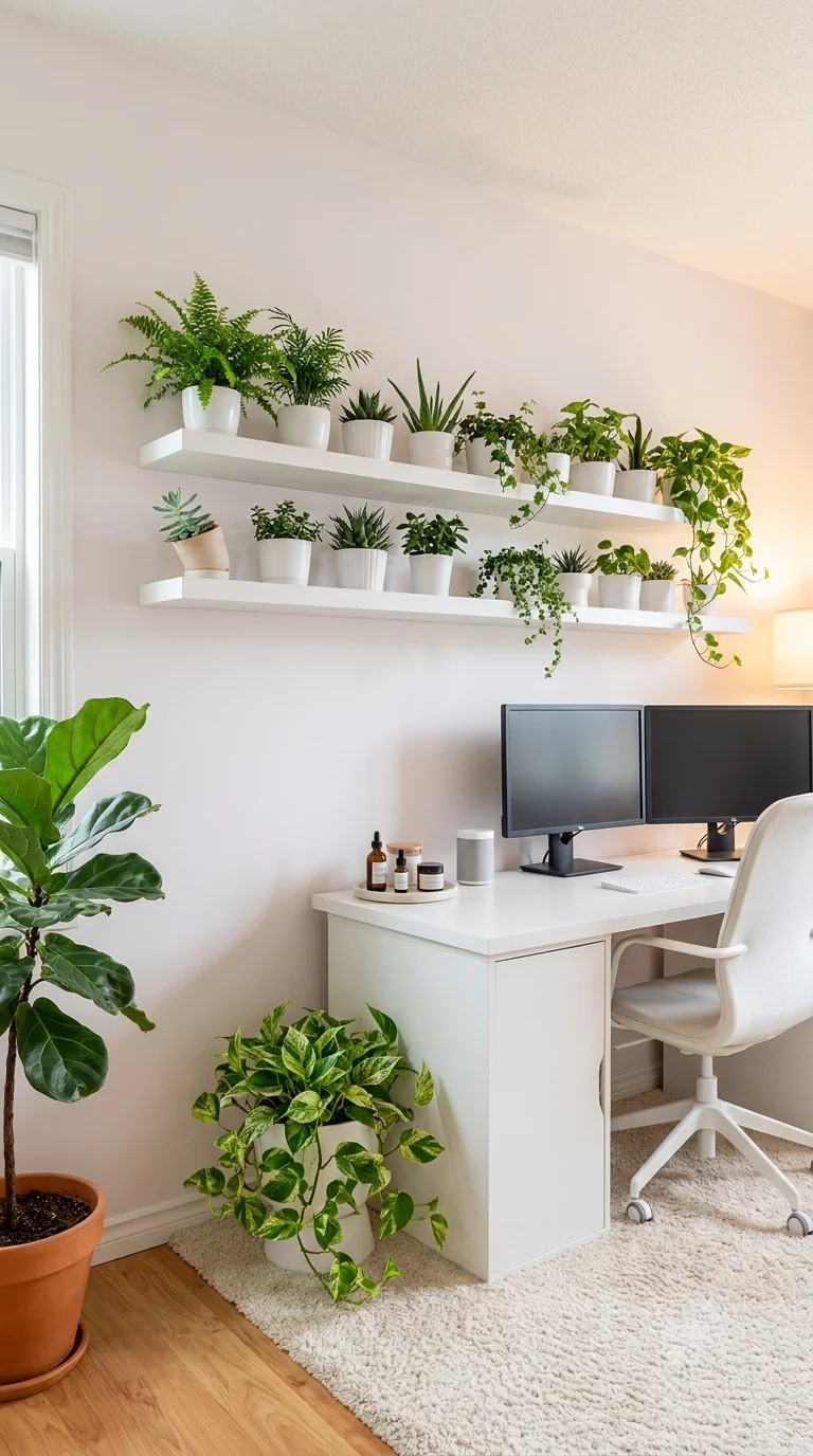
Two floating shelves packed with a dense mix of potted plants sit
directly above a simple dual-monitor desk, with a floor-level
fiddle-leaf fig anchoring the corner below. It’s the most biophilic
setup in the entire list — the wall storage here is entirely
plant-based rather than books or decor objects.
It suits genuine plant lovers and anyone who finds greenery calming
enough to be worth the upkeep, and it depends on a room with decent
natural light nearby, since these wide varieties won’t hold up on
ambient room light alone. It rewards someone willing to do regular
watering and rotation in exchange for a workspace that feels noticeably
alive.
The advantage is real: this much greenery softens an otherwise
hard-surfaced desk setup and can be built up gradually rather than
purchased all at once. The compromise is equally real — dozens of
small pots mean dozens of individual watering schedules, and the look
turns overgrown fast without regular attention.
Starting smaller, with five or six easy-care varieties like pothos,
snake plant, and succulents, captures the spirit of this idea without
the full-density commitment shown here, with more plants added gradually
over time.
Small Pots, Repeated Enough Times to Read as One Wall
No single plant here is doing the visual work — it’s the sheer
repetition of small pots at a similar scale across both shelves that
reads as an intentional green wall rather than a cluttered collection.
Breaking that rhythm with one oversized planter would likely pull focus
away from the overall effect. The floor-level fiddle-leaf fig acts as a
single larger anchor point that keeps the dense shelf display from
feeling untethered from the rest of the room.
Recommended Materials
White floating wood shelves
Ceramic and terra cotta plant pots
Cream wool-blend rug
Matte white desk laminate
Natural wood flooring
Main Colors
Bright White
Multiple Greens (foliage)
Warm Terra Cotta (some pots)
Best Lighting
The desk sits directly beneath a window, and that natural light does
double duty here, supporting the dense plant wall while reducing the
need for daytime task lighting.
Maintenance
This section is essentially built around upkeep — expect to water on a
rotating schedule based on each plant’s individual needs, rotate pots
occasionally for even growth, and trim trailing vines before they reach
the desk surface.
Where a Plant-Wall Desk Setup Gets Overwhelming
Choosing plants with wildly different watering needs and grouping
them together, guaranteeing some get over- or under-watered.
Skipping saucers or trays, which leads to water stains on the shelf
finish over time.
Letting trailing vines grow unchecked until they hang directly over
the keyboard and monitor.
Placing the densest greenery on a wall with no real window nearby,
where most varieties will struggle regardless of styling.
The Warm Wood Nook That Skips White for a Softer, Timeless Feel
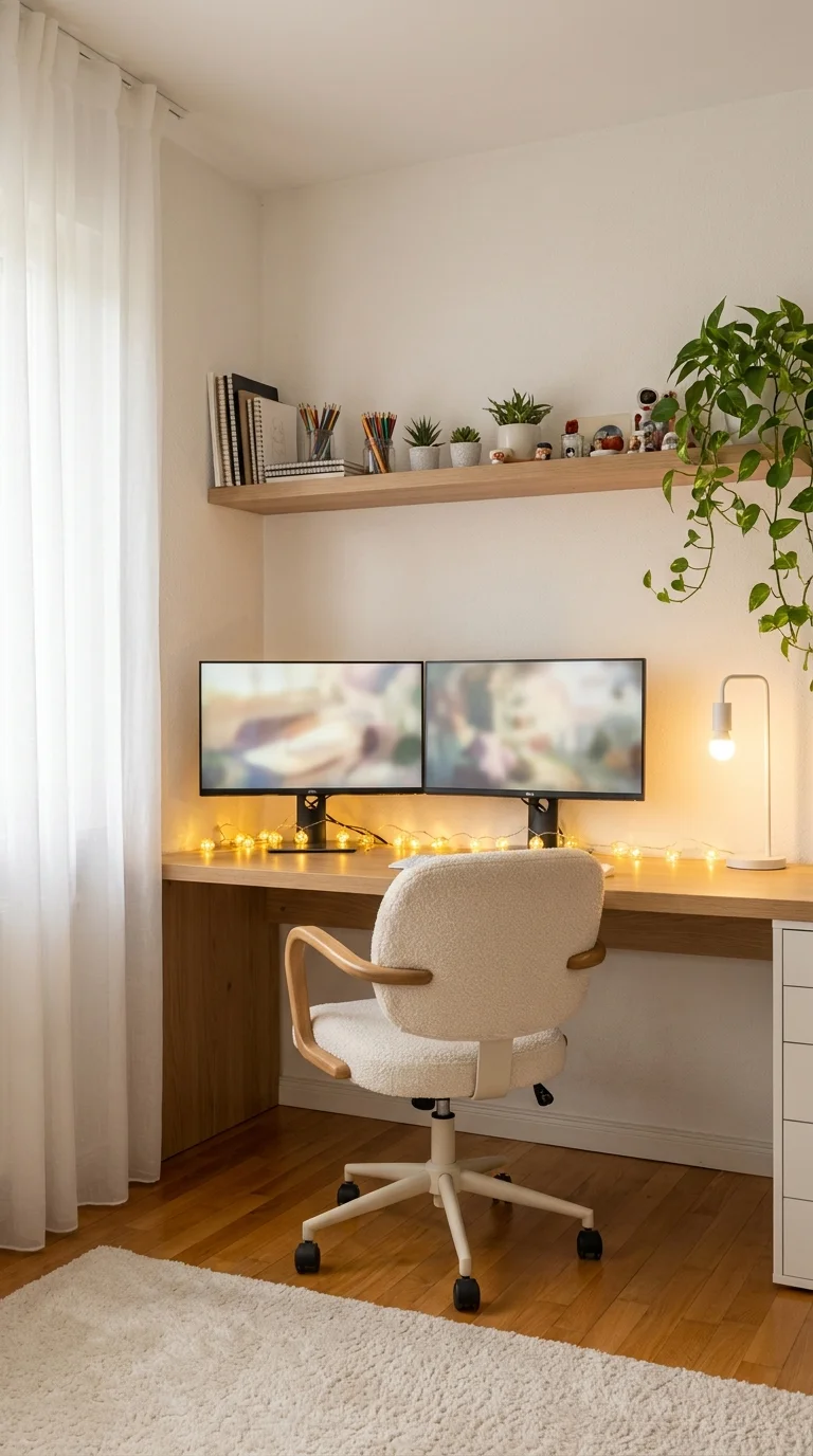
This is the only section in the entire list built around warm wood tones for a home office
instead of white surfaces, and it proves the ‘clean, bright’ brief
doesn’t require an all-white palette. A floating wood desk fills a
genuine room corner, paired with a boucle-upholstered chair, soft string
lights, and a matching wood shelf overhead.
It suits readers who want a bright, calm workspace without the stark,
clinical feel some all-white rooms can carry, and it works especially
well in a room with existing wood flooring or trim to tie into. It
rewards someone who spends long hours at the desk and wants a tactile,
textured environment rather than a hard-surfaced one.
Wood and boucle both age visually well, hiding daily fingerprints and
dust better than glossy white surfaces do — a genuine practical
advantage over several other ideas in this list. The tradeoff is light
absorption: warm wood tones soak up more light than white surfaces, so
this look depends more heavily on a genuinely bright window to avoid
feeling dim.
Sheer, rather than blackout, curtains matter specifically here, since
this palette needs the extra daylight bounce that heavier curtains would
otherwise block.
The Eye Travels From Window to Shelf to Screen, in That Order
The sheer curtain, the floating wood shelf, and the monitors sit almost
in a single sightline running in from the window, which likely helps
this corner feel bright even though wood tones generally read darker
than white surfaces. That sequencing is a small but deliberate choice — placing the desk anywhere else in the room would probably lose some
of that daylight-to-workspace flow. The trailing pothos softens the
transition between the shelf and the window rather than blocking it.
Recommended Materials
Warm oak-toned wood shelving and desk
Boucle upholstery
Powder-coated metal chair legs
Sheer linen curtains
Natural wood flooring
Main Colors
Warm Oak
Soft Cream (boucle)
Sage Green (pothos)
Best Lighting
A small clip or gooseneck desk lamp adds warm task light close to the
keyboard, working alongside the sheer curtains that let daylight carry
most of the room’s overall brightness.
Maintenance
A hanging pothos sits above the desk, so watering every one to two weeks
and trimming trailing growth before it reaches the monitors keeps it
tidy, alongside periodic dusting of the open wood shelf.
Where a Warm Wood Nook Loses Its Brightness
Hanging heavy blackout curtains instead of sheer ones, cutting the
natural light this palette depends on.
Choosing a dark wood stain that reads heavy rather than warm,
especially in a corner with limited daylight.
Skipping task lighting entirely and relying only on string lights,
which aren’t bright enough for close work.
Overloading the open wood shelf with too many books and objects,
making a cozy corner feel cluttered instead of warm.
Staying Focused and Comfortable at a Desk Like This All Day
Position the monitor (or monitors) so the top of the screen sits at
or just below eye level, regardless of how striking the desk
itself looks — several of the setups above favor style over
screen height, and a simple riser fixes that fast.Add at least one warm task light near the keyboard even in rooms
with strong ambient or LED lighting, since ceiling glow rarely
lights the actual work surface well enough for long sessions.Keep cords and chargers routed under or behind the desk in every
layout above — visible cables are the fastest way any of these
clean setups start to look unfinished.Choose a chair for lumbar support first and finish second; several
of the whitest, most photogenic chairs shown here work best paired
with a small lumbar cushion for genuine all-day comfort.
Who Should Choose This Style?
Best for renters and small-space dwellers who want a bright,
low-clutter workspace without major renovation.
Best for households without a spare room, since several of these
ideas fold a full workspace into a living room or bedroom corner.
Best for plant lovers and anyone who wants their workspace to double
as a calming, green retreat.
Not ideal for households that need a fully closed-off, soundproofed
office — most of these layouts are open corners or shared rooms
rather than separate rooms with doors.Not ideal for anyone drawn to bold color or maximalist decor, since
the palette across this style stays deliberately restrained.
Budget Summary
| Budget | Expectation |
|---|---|
| Low | Cube-storage desk, string lights with framed prints, a few easy-care potted plants, one LED accent light bar |
| Medium | Floating wood shelf desk, boucle task chair, modular corner desk with monitor arms, peel-and-stick panel molding |
| Premium | Custom curved millwork with LED coving, built-in under-desk fridge, fully custom sculptural desk base, dense multi-shelf plant wall |
Frequently Asked Questions
Does an all-white home office feel cold or sterile?
Not if warmth comes through material and lighting rather than color.
Warm-white LED strips, wood tones, boucle or knit textures, and live
plants all soften a white palette without breaking it, as several of the
setups above show.
How do you keep a white desk setup looking clean day to day?
Favor satin or matte finishes over high gloss where possible, keep cords
tucked out of sight, and do a quick wipe-down of visible surfaces a few
times a week — glossy white surfaces show fingerprints and dust faster
than textured or wood finishes.
What’s the best lighting for a small or windowless white office?
Continuous LED coving or strip lighting tends to outperform a single
overhead bulb, since it lights the whole room evenly and avoids harsh
shadows on monitors. Pair it with a small warm task lamp for close work.
Can a white home office include plants without ruining the clean
look?
Yes — several ideas above lean on plants for exactly that reason.
Grouping pots by similar watering needs and choosing simple white or
terra cotta containers keeps greenery looking curated rather than
cluttered.
Do I need a full room for a home office, or can it fit into a shared
space?
A full room helps with focus but isn’t required. Several layouts here
fold a genuine workspace into a living room or bedroom corner using a
slim desk, making a dedicated office optional rather than essential.
About the Author
Written and reviewed by the Aesthetic Life Team — a group of home and
interior design editors who study real workspace layouts, from
architect-built rooms to simple weekend refreshes, to help readers
choose ideas that genuinely fit their space and budget.
Conclusion
Ten white-leaning offices, and not one of them solves the same problem.
Some of these ideas cost less than a weekend project — a cube-storage
desk, a loop of string lights, a single LED wall wash. Others are
genuinely custom builds meant for a forever home. What they share is a
bright, light-driven foundation that never has to feel sterile once
warmth is added through material, lighting, or greenery. The point of
reading through all ten isn’t to admire the photography. It’s to walk
away knowing which layout actually matches your space, your budget, and
the way you work — and, at this point, that answer should already be
clear.
Explore More
You may also enjoy:

