

You’ve seen it a hundred times on Pinterest: a blank, boring wall that somehow becomes the whole personality of a room the second someone adds a mural. And then you look at your own wall — the same beige rental-safe paint, the same forgettable nothing — and wonder why every “easy DIY mural” tutorial still ends with a room that looks like a failed art project.
Here’s the truth nobody tells you upfront: a mural isn’t just decoration. It’s a design decision — one that changes how a room feels, how light moves through it, and whether guests notice your taste or your TV. The best murals aren’t the loudest ones. They’re the ones that look like they were planned, not slapped on over a weekend.
In this list, we’re breaking down 10 wall murals that don’t just look good in photos — they hold up in real homes, on real budgets, whether you own the walls or you’re renting every square inch of them. No fantasy. No filters. Just murals worth actually hiring — or faking — a designer for.
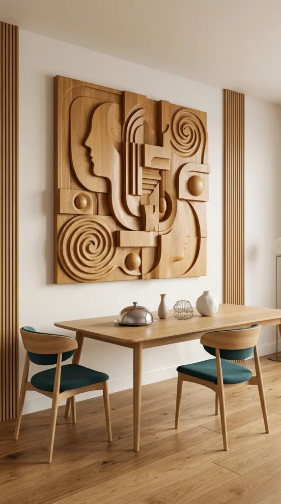
1. The Sculptural Cubist Face Mural
This isn’t wallpaper, and it isn’t paint – it’s a sculptural wood mural, carved in abstract cubist faces that shift depending on where you stand in the room. That’s the whole point of it. Move a few steps left, and the profile disappears into pure geometry; step back, and the face reappears.
The fluted wood panels flanking it aren’t decoration either — they’re doing a framing job, visually containing the mural so it reads as one deliberate piece instead of something randomly hung on a blank wall. That’s a detail worth copying even without the carved panel itself.
The real tradeoff here is cost and permanence. A piece like this is a custom investment, not a weekend project, and it only works if your dining table stays roughly where it is — because the mural was clearly designed to be viewed from exactly this angle.
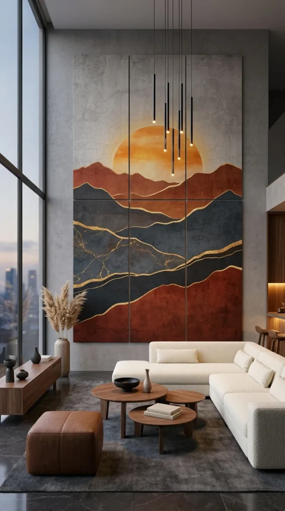
2. The Six-Panel Sunset Mountain Mural
Six panels. One sunset. That’s genuinely all this mural needs to say – and it works because it commits fully to scale, running nearly floor-to-ceiling across a wall most rooms simply don’t have.
The gold crackle lines running through the mountains do more than look expensive. They catch the pendant lighting hung directly in front, so the artwork actually changes appearance depending on the time of day and which bulbs are lit. That’s a genuinely clever pairing, not a coincidence.
Here’s the honest limitation: this only works with double-height ceilings and floor-to-ceiling windows like the ones here. Hang this exact piece in a standard 8-foot room, and instead of feeling dramatic, it will feel like it’s pressing down on the space.
💡 Pro Tip: When a mural relies on scale for impact, measure your ceiling height before falling in love with the design. What reads as dramatic at 12 feet can feel oppressive at 8.
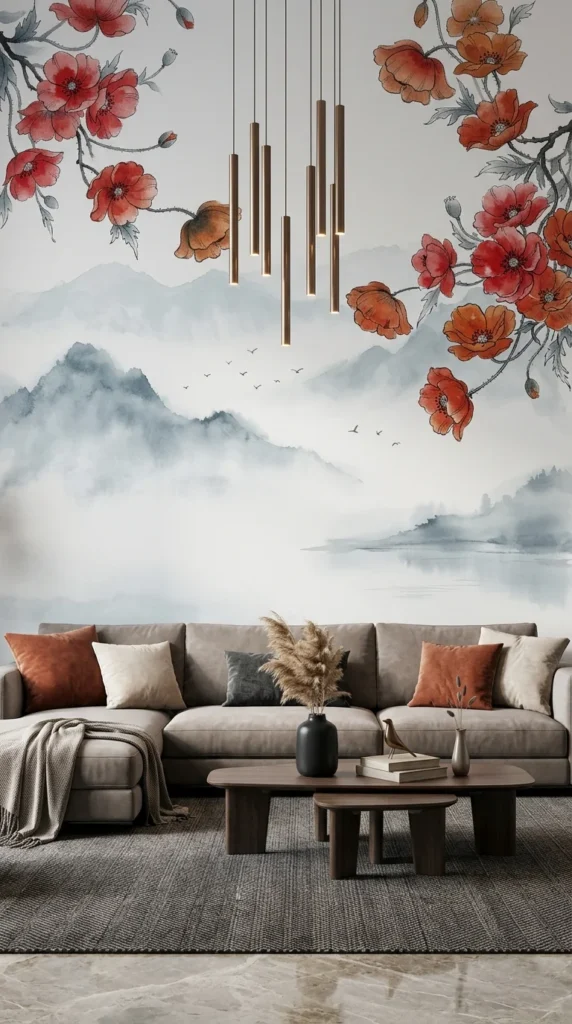
3. The Misty Mountain & Poppy Branch Mural
Unlike the bold sunset panels before it, this mural works in fog and restraint. The misty ink-wash mountains stay almost monochrome, which is exactly what lets the red poppy branches in the corners do all the emotional work – that’s a classic use of visual weight balance, where one small area of colour outweighs an entire wall of neutral tone.
What struck me first here was the flock of birds painted mid-flight over the water. It’s a tiny detail, easy to miss on a quick scroll, but it gives the whole mural a sense of motion that a static mountain scene alone wouldn’t have.
Practically speaking, this mural pairs well with muted, warm-toned furniture like the taupe sofa here. Put it behind anything glossy or brightly coloured, and the calm effect this whole wall is built on disappears instantly.
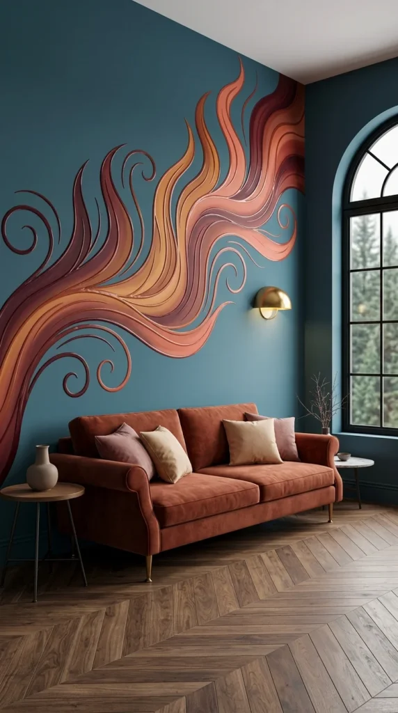
4. The Corner-Wrapping Flame Mural
Not going to pretend I love this one immediately. It’s loud, it’s asymmetrical, and it takes up an entire corner of the room instead of politely staying on one flat wall.
But the more I look at it, the more it makes sense. The swirling flame shapes climb from floor to ceiling and actually wrap around the architectural corner, which is a much harder trick to pull off than a flat mural – most people don’t even attempt it because measuring and aligning a design across an angle are genuinely difficult.
The rust-orange sofa underneath isn’t a coincidence either. It pulls the warmest tone directly out of the mural, while the deep teal walls stay dark enough to keep the whole design from tipping into chaos. This is a bold room formula: one dominant colour anchoring the furniture and one dark neutral holding everything else back.
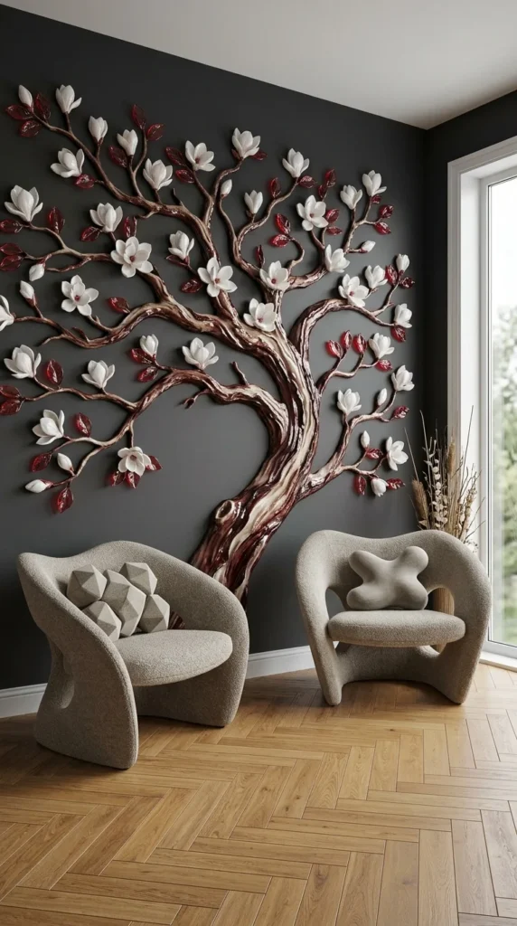
5. The Sculptural Magnolia Tree Mural
This is a sculptural magnolia tree, built out in raised, dimensional branches with individually shaped white blossoms and deep red leaves. It’s not painted on — it’s mounted, which gives it actual shadow and depth that shifts slightly as the light in the room changes throughout the day.
The charcoal-grey wall behind it does a lot of quiet work here. Against a lighter background, this same tree would read as pretty but flat. Against dark grey, every petal and leaf gets a visible edge, and the whole piece looks almost lit from within.
The boucle chairs in front keep things simple on purpose — no pattern, no competing texture, just soft neutral shapes that let the tree stay the obvious focal point of the room.
💡 Pro Tip: Dark background walls (charcoal, navy, and deep green) make textured or dimensional murals pop far more than white ever will — the contrast does the work paint alone can’t.
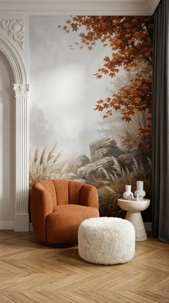
6. The Autumn Forest Mural Beside a Classical Archway
The tension in this room is real: a classical archway with carved moulding sitting right next to a moody autumn forest mural, and it shouldn’t work as well as it does. Mixing an ornate, traditional architectural detail with a soft, atmospheric landscape is the kind of pairing most guides would tell you to avoid.
It works here because of restraint elsewhere. The mural itself stays mostly fog and muted rock, with the rust-coloured maple leaves doing the only real colour work in the top corner – a small, contained area against a large, quiet field.
And honestly, that rust tone doesn’t stop at the wall. It reappears in the burnt-orange boucle chair, tying the whole corner together. Skip that connection, and this same mural next to plain white furniture would feel like two separate design decisions instead of one room.
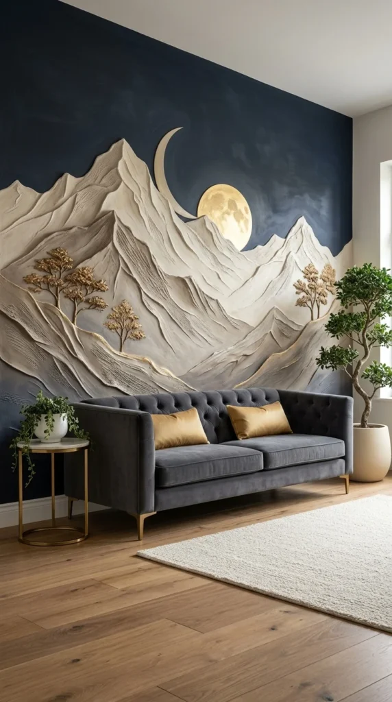
7. The Textured Moonlit Mountain Mural
The first time I looked at this wall, I focused on the textured mountain range — the plaster-like ridges and the raised peaks that actually cast shadows. It took a second look to notice the gold-leafed trees scattered along the slopes, small enough that they read as an afterthought at first glance and a deliberate detail on the second.
That gold isn’t isolated to the mural, either. It shows up again in the brass side table legs and the sofa’s mustard velvet pillows, tying a textured, almost sculptural wall into a room full of soft velvet and warm wood. That’s one named principle doing the heavy lifting: object relationship, where separate pieces feel connected because they share a single accent colour.
Personally, I’d hesitate to try this in a small room — the navy background is dramatic, but it also absorbs light fast, and without the wood floors and cream rug balancing it out, this could easily feel like a cave instead of a statement.
💡 Pro Tip: If your mural includes a metallic accent (gold, brass, or copper), repeat that exact tone once elsewhere in the room — a lamp, table leg, or frame. One repetition is enough to feel intentional.
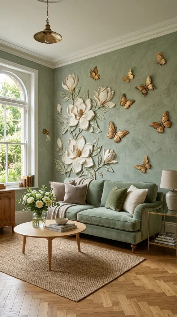
8. The Butterfly & Magnolia Textured Mural
The butterflies scattered across this wall aren’t painted flat — they’re raised, individually shaped pieces, catching light differently depending on where the pendant lamp falls in the room. Paired with the oversized magnolia blooms below them, the whole composition reads less like wallpaper and more like a piece of art that happens to cover an entire corner.
Here’s something worth knowing before copying this: raised, textured mural pieces like these collect dust differently than flat paint or standard wallpaper. The edges and petals need occasional wiping down, especially in a room with a window this close — something that rarely comes up in the photos people save for inspiration.
The sage-green wall colour matters just as much as the mural itself. It’s soft enough to let the white flowers stand out without turning the room stark, and it’s flexible enough to work with the mixed wood tones already in this space.
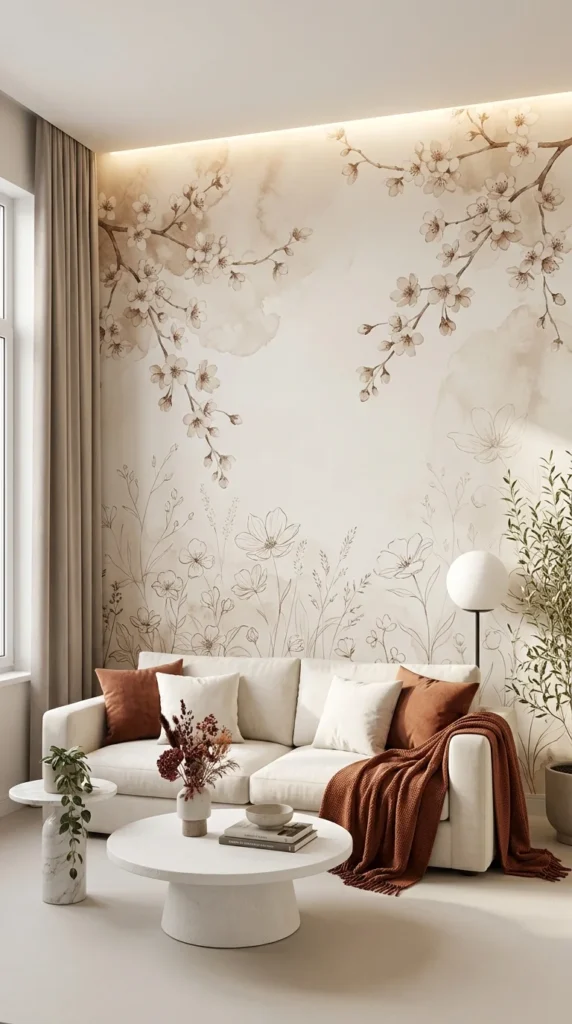
9. The Soft Cherry Blossom & Wildflower Mural
Most bedroom or living room murals reach for bold colour. This one does the opposite, and that’s exactly why it works. The cherry blossoms drift down from the ceiling line, fading into the blank wall by the time they reach eye level, while loose wildflower sketches grow up from the floor to meet them halfway.
That empty middle section isn’t a missed opportunity — it’s the whole design. A visual silence moment like this gives the eye somewhere to land before the sofa even enters the picture, which is harder to pull off than filling every inch of wall with pattern.
This is the kind of mural that looks effortless in photos and takes real restraint to actually live with. Add one more patterned pillow, one more busy throw, and the quiet balance this wall depends on falls apart fast.
💡 Pro Tip: Match your textiles to your mural’s ink colour, not just its dominant colour — a warm brown throw against a warm brown branch reads intentional; a cool-toned one clashes even if the colours seem “close”.
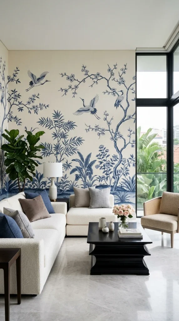
10. The Chinoiserie Crane & Blossom Mural
Where the earlier bedroom mural whispered in soft ink tones, this one speaks in full sentences. The indigo cranes and blossoming branches cover almost the entire wall, floor to ceiling, and it holds up precisely because the room gives it room to breathe – floor-to-ceiling windows, pale marble floors, and furniture kept deliberately neutral.
That’s the real lesson here: a mural this saturated and detailed only works when everything else in the room stays quiet. The moment you add a patterned rug or a colourful accent chair, the wall stops being the focal point and starts competing with itself.
Most people who love this style go too big too soon. In a smaller room without this much natural light, the same mural can feel heavy instead of elegant — proof that scale and daylight matter as much as the design itself.
Conclusion
None of these ten rooms rely on loud furniture or expensive built-ins to feel finished. The mural is doing that work – quietly in the blossom-covered bedroom, dramatically in the six-panel sunset, and structurally in the carved-wood dining wall. That’s really the throughline across this entire list: a mural isn’t an accessory you add at the end. It’s a decision you build the room around.
The honest takeaway is that scale, lighting, and restraint matter more than the design itself. The same mural that looks stunning under a double-height ceiling can feel heavy in a standard room, and the boldest wall in this list only works because everything else around it stayed quiet.
You don’t need a mansion or a design degree to borrow from any of these. You need one wall, a clear sense of what mood you’re chasing, and the discipline to stop decorating once the mural has already said enough.
FAQs
1. Are wall murals renter-friendly, or do I need to own my home? Plenty of options exist for renters now, including peel-and-stick murals that remove cleanly without damaging paint or drywall. Traditional pasted murals or hand-painted designs (like the carved wood piece or plaster-textured mountains above) are more permanent and better suited to homeowners.
2. How do I choose furniture that won’t compete with a bold mural? Keep upholstery and rugs in solid, neutral tones, and let one colour from the mural repeat in a pillow, throw, or accent piece. Busy patterns on furniture next to a busy mural almost always overwhelm a room.
3. Do wall murals make a small room feel more cramped? Not necessarily — light, misty, or monochrome murals (like the ink-wash mountain scene) can actually open up a small space, while dense, dark, or oversized murals tend to work best in larger rooms with high ceilings and strong natural light.


One Response