
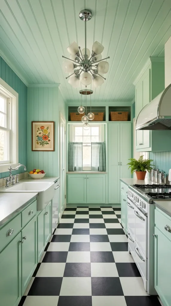
You keep seeing 1950s kitchens all over your feed—the checkerboard floors, the pastel appliances, the chrome trim—and something about them looks more finished than anything you’ve managed with a full renovation budget. That’s not nostalgia doing the work. It’s design logic.
1950s kitchens weren’t built around a color trend; they were built around real daily use, where every material had a job to do. Pastel tones, chrome accents, and checkerboard flooring worked together because they were balanced against each other, not layered on for effect.
This guide looks at ten real kitchens shaped by that era—not to romanticize the past, but to figure out what actually still works in a home lived in today, whether you rent or own. Each room gets one honest look, including the parts that wouldn’t survive daily use without some upkeep.
Quick Overview
| Style | Retro / Vintage 1950s |
| Best For | Renters and owners who want committed color, not full remodels |
| Budget | Low–High (scalable) |
| Difficulty | Easy to advanced depending on the element |
| Maintenance Level | Low–high depending on material |
1. When One Countertop Sets the Room’s Whole Rhythm
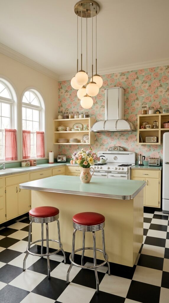
The mint-green laminate countertop on this island is the room’s quiet anchor, even though pendant lights and floral wallpaper pull attention first. The decision this room makes is where to put the “anchor” color—not on the walls, but repeated across every counter surface, perimeter included. That single repeated tone is what keeps the space feeling composed instead of busy, even with floral wallpaper, red stools, and gingham curtains all competing for attention at once.
This approach suits kitchens with several loud, independent patterns already in play—it’s a fix for visual competition, not a starting point for a blank room. It fits busy, lived-in family kitchens more than minimalist ones and supports a household that wants personality without chaos. The advantage is real: one repeated surface color can hold together almost any number of clashing patterns above it. The tradeoff is that it only works if the color repeats consistently—inconsistent counter colors across zones would undo the whole effect.
To recreate it on a budget, laminate is one of the more affordable countertop materials available, which makes this a realistic weekend project rather than a full renovation. Chrome trim on the island edge, the stool legs, and the range hood quietly ties three separate color stories into one, and the floral pattern on the island is the only soft, irregular shape in a room built almost entirely from straight lines and curves—a small contrast that keeps the whole thing from feeling staged.
Pro Tip: If your kitchen already has several bold patterns competing for attention, repeat one countertop or trim color consistently across every zone before adding anything new—it does more unifying work than a fresh accent ever would.
One Reason This Feels Resolved, Not Decorated
The mint tone doesn’t just sit on the island—it repeats exactly across the perimeter counters, creating a visual thread that guides the eye around the room before it settles on the checkerboard floor. That kind of exact repetition, rather than a “close enough” match, tends to be what separates a coordinated kitchen from one that merely shares a color family.
Recommended Materials: Laminate countertop, chrome trim, cotton gingham, glossy floral wallpaper
Main Colors: Mint Green, Chrome Silver, Cherry Red, Black-and-White Checker
Best Lighting: Pendant lighting over the island does double duty here, lighting the workspace while echoing the room’s chrome accents; keep it warm-toned to balance the cool mint.
Maintenance: Laminate is low-maintenance and wipes clean easily, though it can chip at seams over decades of use; chrome trim needs occasional polishing to avoid water spotting.
Easy Ways to Get This Look Wrong
Using a matte finish where the original’s glossy laminate and chrome depend on shine to read as cohesive
Choosing a slightly different green for the island versus the perimeter counters instead of one exact match
Skipping a metal trim element, which leaves the competing patterns with nothing tying them together
Over-matching every pattern in the room instead of allowing one soft, irregular shape to break the geometry
2. Committing One Color to Every Surface, Floor to Ceiling
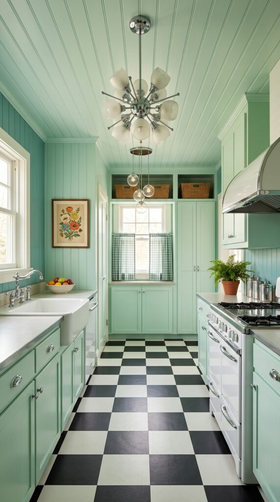
What’s easy to miss at first is that only two things in this kitchen carry any pattern at all—the gingham curtains and one framed floral print. Everything else relies purely on color and form to hold interest. The decision here is total commitment: mint-green beadboard covers walls and ceiling alike, one tone carried floor-to-ceiling instead of broken up by contrast.
This suits narrow or galley-style kitchens more than open, wide ones—the effect depends on a contained space where one color can genuinely wrap the room. It fits people comfortable with a bold, semi-permanent choice (beadboard isn’t a weekend swap) and supports a calm, cohesive daily routine over a constantly changing one. Its advantage is a small kitchen that reads as intentional rather than cramped. Its real compromise is spatial: that kind of full-color commitment compresses the vertical space slightly, though a narrow galley layout and a tall window keep it from feeling closed in here specifically.
To recreate the effect without full beadboard, painting walls and the ceiling the same bold tone gets most of the way there for a fraction of the cost and effort. The checkerboard floor returns in this room too, but its job shifts—instead of anchoring the room the way it did in Section 1, it becomes the one high-contrast element allowed to break the monochrome. Woven basket storage above the tall cabinets answers a real limitation worth borrowing regardless of color scheme: a narrow kitchen with nowhere else to put bulk items.
Where the Eye Actually Rests
Chrome fixtures on the faucet, chandelier, and range hood read as the only cool material against an otherwise soft, matte palette, which is part of why the room doesn’t feel flat despite using essentially one color everywhere. Swap that chrome for brushed brass, and the room would likely lose its one temperature contrast—a small material choice carrying more weight than it first appears to.
Recommended Materials: Beadboard paneling, chrome fixtures, woven basket storage, checkerboard vinyl or tile
Main Colors: Mint Green (full room), Black-and-White Checker, Chrome Silver
Best Lighting: A tall window is doing real work here—in a fully mint room, natural light keeps the beadboard from reading flat; supplement with a chrome chandelier for evening use.
Maintenance: Painted or beadboard walls in a kitchen need periodic wipe-downs near the cooking zone specifically, since grease builds up faster on walls than most people expect.
What Trips People Up Recreating This
Underestimating how much a fully painted or paneled room shows grease near the stove specifically
Attempting this in a wide, open kitchen where the “wrap” effect never fully reads
Skipping the one high-contrast floor or accent, which leaves an all-mint room feeling flat instead of bold
Choosing brass or gold fixtures instead of a cool metal, losing the temperature contrast the room depends on
3. Letting One Material Carry the Whole Room’s Drama
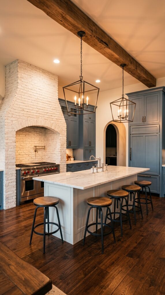
That much exposed brick above a working range comes with a real cost: grease and heat exposure will show wear on its rough surface faster than painted drywall ever would. The decision this room makes honestly is whether to accept that maintenance tradeoff in exchange for a genuinely dramatic focal point. The whitewashed brick hood is the clear anchor here, its arched shape and rough texture set deliberately against the smooth marble island below it.
This works best for kitchens with a strong existing architectural opportunity—a chimney breast, a structural arch—rather than a flat wall with nothing to build from. It suits people drawn to visible texture and a slightly worn, lived-in look over a flawless, uniform finish and fits a kitchen used for real, regular cooking rather than one kept mostly for show. The advantage is a genuinely one-of-a-kind focal point that can’t be replicated with paint or tile. The compromise is upkeep specifically at the range—that surface will need cleaning attention no smooth material would require.
To recreate the effect at lower cost or commitment, brick-look tile or a textured plaster finish can approximate the look without structural brick work, though the specific patina will differ. Slate-blue cabinetry gives the brick the visual weight it needs—without a similarly weighted color nearby, the brick would dominate the room instead of anchoring it, which is worth testing with paint swatches before committing to any brick treatment. Industrial-style stools, with black metal frames and worn wood seats, echo the beam’s raw texture rather than matching the polished marble, a small but deliberate tension worth carrying into any room built around one dramatic material.
Recommended Materials: Whitewashed brick, honed marble, exposed wood beam, blackened metal, worn wood seating
Main Colors: Slate Blue, Whitewash, Warm Marble White, Black Metal
Best Lighting: Lantern-style pendants over the island cast warm, directional light that catches the brick’s texture without washing it flat under a broad overhead source.
Maintenance: Whitewashed brick near a range needs regular grease cleaning to avoid staining into the porous surface; marble should be sealed periodically to resist etching from acidic spills.
Where This Look Falls Apart
Pairing rustic stools with a fully polished, contemporary island, breaking the deliberate tension the room relies on
Placing a smooth, glossy material near the brick instead of one weighted enough to balance it
Skipping regular grease cleaning near the range, which shortens how long the whitewash stays looking fresh
Choosing brick without an existing architectural reason for it, which can read as applied rather than structural
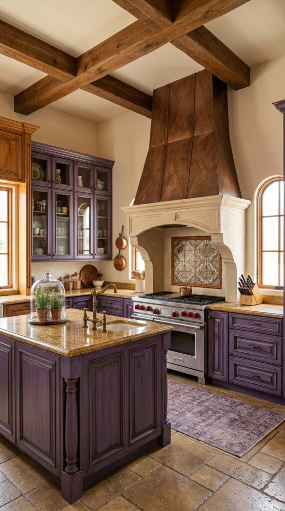
4. Choosing Craft and Texture Over a Bold Color Story
The hammered copper hood is this room’s clear centerpiece, its geometric paneling catching light differently at every angle—a texture-driven focal point rather than a color-driven one. The decision here is a genuine either/or: build the room’s drama from color, the way Sections 1 and 2 do, or build it from craftsmanship and material texture instead.
This suits people who’d rather invest in one exceptional handmade or hand-finished piece than in a full color scheme, and it fits kitchens with warm, earthy surrounding tones rather than cool or pastel palettes. It supports a household that values a kitchen looking different depending on the light—morning versus evening—over one that reads the same at all hours. The advantage is a focal point with real depth that photographs differently every time. The compromise is that texture-driven design depends heavily on light quality; a room with poor natural light won’t showcase a hammered surface the way this one does.
To recreate it without the cost of a full copper hood, a hand-finished or hammered-look backsplash panel can introduce the same light-catching texture at a fraction of the investment. A hand-painted tile backsplash does quiet supporting work below the hood, echoing the copper’s warm tones while adding the only patterned surface in a room built mostly from solid materials, and deep plum cabinetry carries real visual weight, grounding both the island and the perimeter storage so the eye doesn’t drift too far toward the hood alone.
A Material Behavior Worth Knowing
The copper’s texture only fully reads under direct light, which means this room likely looks and feels different in the morning than it does by evening—something a still photo genuinely can’t capture. A surface this large also needs regular polishing to avoid dulling over time; skip that upkeep and the light-catching effect this whole room is built around fades within a year or two.
Recommended Materials: Hammered copper, hand-painted tile, deep plum cabinetry, exposed wood beams, stone archway
Main Colors: Copper, Deep Plum, Warm Stone, Hand-Painted Blue-and-White
Best Lighting: Direct, warm-toned light is essential here—copper’s texture disappears under flat, diffuse lighting, so a focused fixture over the range matters more than ambient brightness.
Maintenance: Copper needs regular polishing to prevent dulling and patina buildup; hand-painted tile should be sealed to protect the pattern from daily splashes near the range.
Easy Ways to Get This Look Wrong
Choosing a smooth, machine-finished copper look instead of genuinely hammered texture, losing the light-catching effect
Lighting the hood with flat, diffuse light instead of a focused fixture that lets the texture actually read
Skipping regular copper polishing, which lets the surface dull faster than expected
Pairing the hood with a busy, patterned cabinet color instead of one grounding solid tone
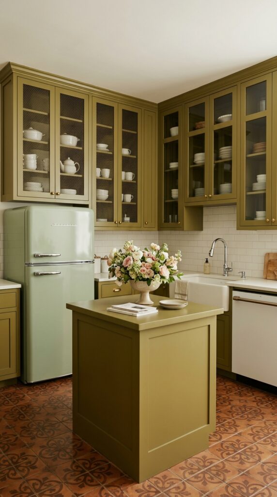
5. Turning Storage Into the Room’s Display
Wire-mesh cabinets like these only really work with dishware chosen on purpose—mismatched everyday plates would clutter the effect rather than complete it, and that’s the tradeoff worth naming before copying this look. The decision this room makes is whether storage should hide contents or display them, and it commits fully to display.
This fits kitchens where the owner already has a cohesive set of dishware worth showing off, rather than a mixed, practical everyday collection. It suits smaller kitchens with limited wall space for open shelving, since mesh-front cabinets still offer full enclosure and dust protection. It supports a slower, more curated approach to buying dishware over time, rather than replacing pieces casually. The advantage is real storage that doubles as decoration without an open shelf’s dust exposure. The compromise is that it demands more intentionality about what goes inside than a solid-door cabinet ever would.
To recreate it on a budget, swapping just a few upper cabinet door panels for wire mesh or glass inserts achieves the same display effect without replacing the whole run. A sage-green retro refrigerator stands as the room’s one saturated color break, its rounded, glossy form set against the matte, angular olive-green cabinetry around it, while a patterned terracotta floor carries the only bold visual noise in the space — and it works precisely because everything above waist height stays calm and single-toned. Brass hardware, rather than chrome, quietly warms a palette that could otherwise read cold given how much olive and white dominate the room.
Recommended Materials: Wire-mesh cabinet fronts, brass hardware, terracotta tile, retro enamel appliances
Main Colors: Sage Green, Olive, Brass, Terracotta
Best Lighting: Interior cabinet lighting behind the mesh fronts makes the display effect work after dark—without it, the collection disappears once natural light fades.
Maintenance: Wire-mesh fronts collect dust differently than solid doors and need more frequent wiping; retro enamel appliances should be cleaned with non-abrasive products to protect the glossy finish.
What Trips People Up Recreating This
Choosing a bold floor pattern in a room that also has busy upper cabinetry, doubling up on visual noise
Filling mesh cabinets with mismatched, everyday dishware instead of a curated, cohesive set
Skipping interior cabinet lighting, which leaves the display effect invisible in the evening
Pairing brass hardware with a cool-toned palette instead of a warm one is meant to balance
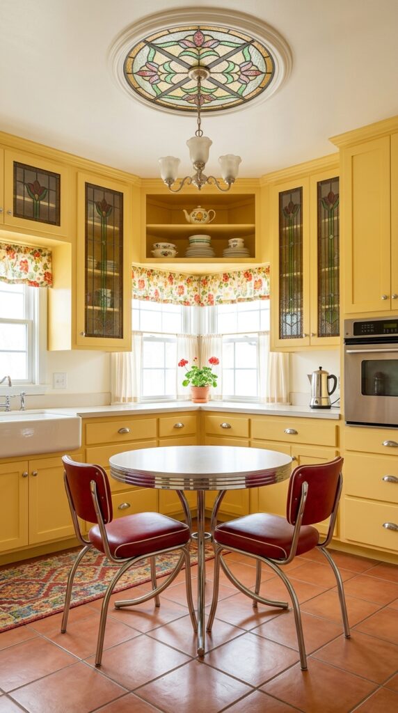
6. Letting the Ceiling Carry the Room’s Boldest Idea
The detail most people miss on a first pass is how awkward the actual footprint of this corner banquette is—two people passing each other at that table would genuinely struggle, whatever the charm of the room suggests. The decision this room makes is unusual: treat the ceiling, not the walls or floor, as the primary design statement. The stained-glass ceiling medallion above the banquette, with its floral pattern and painted lead lines, is the single most unexpected element in the kitchen—the kind of decorative gesture usually reserved for an entryway rather than a breakfast nook.
This fits homeowners specifically, since stained glass of this kind is a genuine architectural investment rather than a swappable decor piece—renters should look at reproduction alternatives instead. It suits a dedicated breakfast nook or banquette corner more than a full working kitchen ceiling and supports a household that treats the kitchen as a gathering space worth architectural investment, not just a functional room. The advantage is a genuinely unforgettable focal point; nothing else on this list attempts it. The compromise is real and specific: stained glass this ornate is costly to repair if damaged, closer to an architectural investment than a styling choice.
To recreate the spirit of it without full stained glass, a single circular pendant fixture with leaded or textured glass can nod to the same idea at a fraction of the cost and risk. Its circular form echoes directly below in a chrome-edged bistro table, a top-to-bottom visual rhyme most people would feel before consciously noticing it, while leaded-glass cabinet inserts on either side repeat the same tulip motif from the medallion, tying the room’s boldest feature into ordinary storage doors.
Worth the Investment?
Stained glass at this scale isn’t a small decision, and it’s worth being honest about that before falling for the photo. It’s not a project to take on for resale value or trend appeal—the cost of fabrication and eventual repair only makes sense if the room genuinely means something to daily life, like a breakfast nook used every morning. For most kitchens, a single leaded-glass pendant or a reproduction medallion decal captures a meaningful part of the effect for a fraction of the commitment, and that’s the more realistic starting point for most budgets.
Recommended Materials: Stained glass, leaded glass, chrome trim, vinyl seating, floral valance fabric
Main Colors: Buttery Yellow, Deep Red, Stained-Glass Multicolor, Chrome Silver
Best Lighting: Natural daylight through the medallion is what makes this design work—position the banquette near a window specifically so the glass catches light through the day, not just under artificial fixtures.
Maintenance: Stained glass requires specialist repair if cracked or leaded lines loosen; deep red vinyl seating should be wiped promptly after spills to avoid staining.
Where This Look Falls Apart
Cramming a banquette into a footprint too narrow for two people to pass, prioritizing charm over daily use
Installing stained glass without direct daylight access, which mutes the entire effect it depends on
Choosing this for a full working kitchen ceiling instead of a contained banquette nook
Underestimating repair costs and treating it as a swappable decor choice rather than an investment
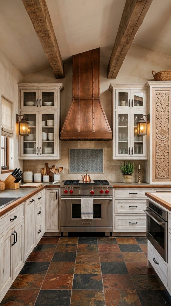
7. Choosing Handmade Texture Over Polished Shine
I find myself drawn more to this hood than any of the smoother copper surfaces on this list—the visible seams and hammered rivets read as functional metalwork rather than polished decoration. The decision here echoes Section 4’s copper choice but takes it further: raw, riveted texture instead of smooth, high-shine metal.
This suits kitchens aiming for a rustic or farmhouse-adjacent feel rather than a polished, formal one, and it fits homeowners drawn to visible craftsmanship marks over a flawless factory finish. It supports a household that values character and imperfection over uniformity in their daily-use spaces. The advantage is a hood that feels genuinely handmade rather than manufactured. The compromise is upkeep of a different kind than Section 4’s—that much slate flooring nearby is porous and typically needs periodic sealing to resist staining.
To recreate the look on a smaller budget, a riveted-look copper or metal backsplash panel behind the range gets close to the same handmade read without the cost of a full custom hood. Whitewashed cabinetry surrounding it stays deliberately understated, letting the hood and the exposed ceiling beams carry the room’s visual weight without competition, while a multi-toned slate floor introduces the room’s only real color complexity, its warm rust and charcoal tones pulling directly from the copper above and tying the space together vertically.
A Small Detail That Earns Its Place
A single carved wood panel beside the cabinetry stands out as the one ornamental flourish in the room, and it works precisely because everything nearby stays plain. Add a second ornamental element, and that contrast would likely disappear—restraint elsewhere is what lets this one detail actually register.
Recommended Materials: Riveted copper, whitewashed wood, multi-toned slate, carved wood accent
Main Colors: Copper, Whitewash, Slate Grey, Rust
Best Lighting: Lantern-style sconces flanking the hood cast warm, uneven light rather than even illumination—a choice that likely makes this kitchen feel noticeably different at night than under daylight.
Maintenance: Slate flooring needs periodic sealing to resist staining, especially near a working range; riveted copper develops patina naturally and needs less frequent polishing than a smooth, high-shine finish.
Easy Ways to Get This Look Wrong
Pairing riveted copper with otherwise glossy, formal finishes, undercutting the handmade feel
Adding a second decorative flourish beyond the one carved panel, which crowds out the room’s intentional restraint
Skipping slate sealing, leading to staining that’s difficult to reverse once set in
Choosing even, diffuse overhead lighting instead of directional sconces that let the texture read at night
8. Layering Pattern on Pattern and Making It Hold
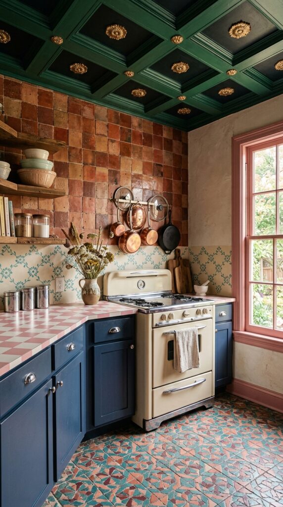
Something worth noticing only on a second look: the pink-trimmed window is the sole place pink appears outside the countertop, a quiet callback most readers would feel before consciously placing it. The decision this room makes is the riskiest on this list—layering multiple bold patterns in one space rather than picking just one to commit to.
This suits confident decorators comfortable with visual risk, and it fits a kitchen where the owner wants a genuinely unique, personality-forward space over a safe, resale-friendly one. It supports a household that enjoys a busier, more collected-over-time aesthetic rather than a controlled, minimal one. The advantage is a room with more personality than almost anything else on this list. The compromise is real: this many patterns only work because each individual pattern stays small in scale—scale up any one of them and the balance breaks.
To recreate the approach without the full risk, start with one solid grounding color—as this room does with navy cabinetry—before adding a second pattern, and stop there until the first pairing feels resolved. The coffered ceiling above, painted deep green with gilded rosettes at each intersection, does something almost no other kitchen on this list attempts, treating the ceiling itself as a primary design statement the way Section 6 did with its medallion. Directly below, a terracotta tile backsplash introduces an entirely different texture and color story, and the two coexist because both commit fully rather than compromising toward neutral.
Pro Tip: Multiple bold patterns can share a room successfully when one solid, grounding color—like navy cabinetry—repeats consistently throughout every zone.
Recommended Materials: Coffered wood ceiling, terracotta tile, navy cabinetry, gilded trim, copper cookware
Main Colors: Navy, Deep Green, Terracotta, Gilded Gold
Best Lighting: Layer lighting deliberately here—a single overhead source would flatten the coffered ceiling’s dimension; use directional fixtures to catch the gilded rosettes individually.
Maintenance: Gilded trim needs gentle, non-abrasive cleaning to avoid wearing away the finish; terracotta tile should be sealed to resist staining from daily cooking splashes.
Where This Look Falls Apart
Attempting this combination without genuinely committing to each pattern fully, landing in a compromised middle ground instead
Scaling up any one pattern past a small, contained size, which breaks the balance the whole room depends on
Skipping a solid grounding color like navy, leaving competing patterns with nothing to unify them
Using harsh cleaning products on gilded trim, which wears the finish faster than expected
9. Saving the Boldest Color for the Room’s Natural End Point
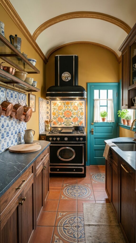
By this point, a pattern starts to feel obvious: the boldest room usually saves its boldest color for last, not first. Here, that’s a teal Dutch door sitting at the room’s natural end point, the one place the eye lands after moving through mustard walls, black, and copper. The decision this room makes is about sequencing color, not just choosing it—placing the most saturated tone exactly where the eye naturally finishes its path through the space.
This suits kitchens with a clear architectural end point—a door, a window, an alcove—that can hold a bold color without competing with everything along the way. It fits households who want one unmistakable “wow” moment rather than color spread evenly throughout and supports a kitchen used often enough that the door itself becomes a daily, appreciated detail. The advantage is a strong visual payoff that doesn’t overwhelm the rest of the room. The compromise is that this only works with a genuine architectural anchor at the end of the sightline—without one, there’s nowhere for that final bold color to land.
To recreate it, identify whichever fixed point in your kitchen naturally draws the eye last — often a door or a window — and reserve your boldest color choice for exactly that spot rather than spreading it around. The barrel-vaulted ceiling above, trimmed in carved wood molding, curves the entire room’s geometry into a soft arch that shapes how every other element below gets read, while a matte black range with an oversized chrome porthole window stands as the primary object, its cool, industrial tone a deliberate departure from the warm mustard surrounding it.
Recommended Materials: Painted wood door, carved wood molding, matte black range, hand-painted tile
Main Colors: Teal, Mustard Yellow, Matte Black, Warm Copper
Best Lighting: A window or glass panel near the Dutch door helps the teal catch natural light through the day; supplement with warm artificial light in the evening so the color doesn’t read flat after dark.
Maintenance: Painted doors in a high-traffic kitchen spot need periodic touch-ups where hands and hardware make contact most; matte black finishes show fingerprints more visibly than gloss.
What Trips People Up Recreating This
Overcrowding the sightline with additional bold elements before the eye reaches the intended end point
Spreading the boldest color evenly through the room instead of reserving it for one clear end point
Choosing a matte black finish without accepting the more visible fingerprint upkeep it requires
Attempting this sequencing logic in a room with no genuine architectural anchor to land the color on
10. A Kitc 10. Committing to One Warm Color Across Every Surface It Touches
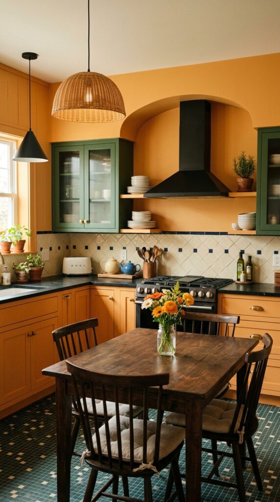
Honestly, an all-orange wall this saturated would make most people hesitate before committing to it—it’s a color choice that would be genuinely difficult to soften or partially undo later without repainting the whole room. The decision this final room makes is a full warm-color commitment, tempered by exactly one cool material chosen to keep it from tipping into overwhelming.
This suits kitchens with strong natural light, since saturated warm colors need real daylight to avoid feeling heavy, and it fits households drawn to a cheerful, high-energy cooking space over a calm, neutral one. It supports a home where the kitchen doubles as a social gathering spot, since a color this bold tends to become a conversation starter. The advantage is a room with genuine warmth and personality that neutral kitchens can’t match. The compromise is real commitment risk—undoing a fully saturated wall color later means repainting the entire room, not just touching up an accent.
To recreate it with less risk, start with the wall color in a smaller, contained area—one alcove or a lower cabinet run—before committing to the full room. An arched alcove painted in the same marigold as the walls frames a matte black range hood without breaking the room’s color continuity, the arch’s shape doing more visual work than any contrast could, while sage-green cabinetry provides the one cool note in an otherwise warm room, its glass-front doors letting the eye pass through to soft white dishware rather than stopping at a solid surface.
Pro Tip: A single cool-toned material—like a green cabinet or a blue-tiled floor—can balance an otherwise fully warm-toned room without needing to compromise on the wall color’s saturation.
Recommended Materials: Painted plaster or drywall, glass-front cabinetry, diamond-patterned tile, mosaic tile flooring
Main Colors: Marigold Orange, Sage Green, Matte Black, Navy Accent
Best Lighting: Strong, consistent natural light is essential to keep saturated orange from reading heavy; if daylight is limited, warm artificial lighting is a closer substitute than cool-toned bulbs.
Maintenance: Saturated wall paint shows scuffs more visibly than a mid-tone color, so touch-up paint on hand is worth keeping stocked near high-traffic zones.
Easy Ways to Get This Look Wrong
- Committing to full-room saturation without testing the color in a smaller area first
- Skipping the one cool-toned material, leaving an all-warm room with nothing to balance it
- Attempting this in a room with limited natural light, where the saturation reads heavy rather than cheerful
- Choosing a solid-door cabinet instead of a glass-front, losing the visual relief the room depends on
Related Guides
A few other guides on the site build on ideas from this one:
- Maximalist Funky Kitchens to Steal for Your Next Renovation—for readers drawn to the pattern-layering approach in Section 8
- 10 Pink Kitchen Ideas That Feel Bold, Not Overdone—more on the single-color-commitment logic behind Sections 2 and 10
- Dark Academia Kitchen Layouts for Old Homes and New Builds—for more on architectural focal points like Section 3’s exposed brick hood
- Retro Bathroom Trends Making a Stylish Comeback—if this era’s aesthetic appeals to you beyond the kitchen
- What Makes a Pantry Actually functional?—for the storage-as-display idea explored in Section 5
Cooking Workflow Tips for a Retro Kitchen
- Keep the working triangle (stove, sink, fridge) clear of decorative storage pieces like open wire-mesh cabinets, which are better suited to less-trafficked zones
- Choose a durable, easy-clean material near the range specifically — brick, stained glass, and gilded trim all need extra care in that zone
- If committing to a bold wall or cabinet color, test it in the actual kitchen lighting at different times of day before finalizing
- Reserve your most delicate or high-upkeep material (stained glass, hand-hammered copper, gilded trim) for a lower-traffic accent rather than a daily-use surface
Who Should Choose This Style?
- Best for renters and owners who want committed, personality-forward color without a full structural remodel
- Best for households drawn to visible material texture and craftsmanship over a flawless, uniform finish
- Not ideal for anyone hesitant about maintenance—several of these signature materials (stained glass, brick, hammered copper, and slate) genuinely require more upkeep than a standard modern finish
Budget Summary
| Budget | Expectation |
|---|---|
| Low | Laminate countertops, checkerboard vinyl flooring, chrome or brass hardware swaps |
| Medium | Beadboard paneling, retro enamel appliances, patterned tile backsplash |
| Premium | Custom hammered copper hoods, whitewashed structural brick, stained-glass ceiling features |
FAQs
Is a full 1950s kitchen renovation realistic on a mid-range budget? Not always as a full overhaul, but individual elements—checkerboard flooring, chrome hardware, one bold accent color—can be added gradually without a complete remodel; budget-friendly vinyl checkerboard tile or peel-and-stick options work well for renters who can’t make permanent changes.
Which 1950s design element works best in a small or narrow kitchen? A single committed wall-to-ceiling color, paired with one contrasting floor pattern, tends to work better than layering several bold elements into a tight space—it keeps the room feeling intentional rather than visually crowded.
Do bold, saturated colors from this era actually age well, or do they feel dated quickly? Colors themselves rarely date a room—inconsistent execution does. When a bold tone repeats consistently across cabinetry, trim, or accents, it tends to read as a deliberate choice rather than a passing trend.
Conclusion
What’s interesting across all ten of these kitchens isn’t that they share a color palette — they don’t. What they share is a refusal to hedge. Each room commits fully to one loud idea, whether that’s a ceiling, a hood, or a single accent color, and then keeps everything else around it quiet enough to let that one choice actually read. That’s a different lesson than simply adding checkerboard flooring and chrome trim, though those do keep showing up for a reason: they solved real problems around light, flow, and storage in kitchens with far less square footage than most new builds today.
The takeaway isn’t to copy any single room here exactly. It’s to notice which grounding choice—a repeated tone, a textured hood, or a single bold door—might already fit a kitchen someone’s living in right now. Good design rarely announces itself loudly. More often, it’s the one quiet decision doing work nobody consciously registers, which is probably why these kitchens still hold up decades later.
Explore More
You may also enjoy:


One Response