
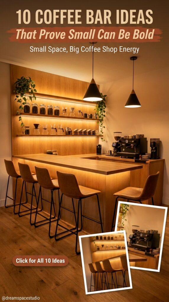
A coffee bar sounds like a luxury reserved for kitchens with extra counter space to spare. Most homes don’t have that. What they do have is a corner, a narrow shelf, and part of a countertop already crowded with everything else—and somehow, people are still making it work.
The ten spaces here prove that a coffee station doesn’t need square footage. It needs a decision about where things go and what gets left out. Some use vertical space instead of horizontal. Some borrow a spot nobody else wanted—the end of a cabinet run, a gap beside a window. None of them required knocking down a wall.
What follows isn’t a single formula stretched ten times. Each setup solves the same basic problem—where does the coffee stuff live—in a completely different way.
1. A Coffee Bar Built Into a Window Wall Instead of a Kitchen Corner
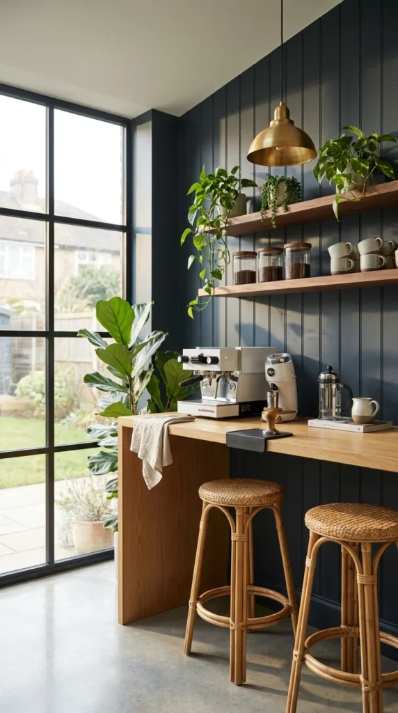
This setup skips the usual spot entirely. Instead of tucking the coffee station between the fridge and a cabinet, it runs along a full wall of glass—a narrow wood counter fixed at bar height, facing the garden instead of the kitchen. The espresso machine and grinder sit at the center, flanked by a French press and a small pitcher, with everything else lifted off the counter and onto two floating shelves above.
The dark, vertically paneled wall behind it does more than set a mood. It gives the wood counter, brass pendant light, and glass jars of coffee beans something to contrast against—without that backdrop, the same objects would read as clutter on a plain white wall. The paneling also hides the transition where the counter meets the window frame, so the whole thing looks built-in rather than added on.
Height is the real space-saver here. By running the counter at standing-bar level with tall rattan stools, the design avoids competing with any existing kitchen counter or island. It’s a coffee bar that exists in the leftover strip of space beside a window—a zone most kitchens waste entirely.
💡 Pro Tip: If your kitchen has an underused stretch of wall near a window, a fixed shelf or narrow counter at 40–42 inches (bar height) works better than trying to match standard counter height — it visually separates the coffee zone from food prep without needing a wall.
2. A Coffee Nook Carved Into a Full Wall of Cabinetry
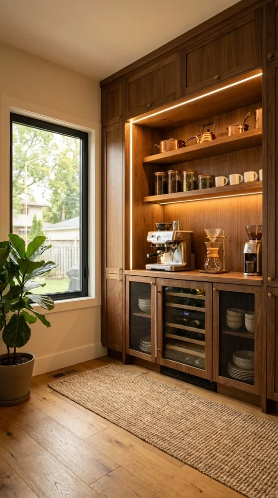
This one doesn’t add a coffee station to the kitchen — it converts a single bay of built-in cabinetry into one. The walnut cabinets run floor to ceiling on either side, but the center section has its doors removed entirely, replaced with open shelving and a strip of warm LED lighting tucked under each shelf edge.
That lighting detail matters more than it looks like it should. Recessed shelving without a light source tends to sit in shadow, especially inside a deep cabinet run like this — coffee mugs and glass canisters would read as dark silhouettes instead of objects worth displaying. The LED strip solves that by lighting the shelf contents from above, which is also what makes the copper cookware on the top shelf actually catch the eye instead of blending into the wood tone behind it.
Below the open shelving, the closed cabinets keep their doors—one section swapped for a built-in wine fridge, the others for mesh-front storage holding bowls and plates. That contrast is deliberate: the coffee equipment stays visible and easy to reach, while everything else gets put away behind a door. It’s a way to feature one specific ritual inside a wall that otherwise looks like ordinary storage.
📌 Important Note: Under-shelf lighting like this only reads as intentional when the shelf material and cabinet finish match exactly — a mismatched wood tone between the open nook and the surrounding cabinetry will make the lit section look like an unfinished renovation rather than a designed feature.
3. An L-Shaped Counter That Turns a Coffee Station Into a Real Gathering Spot
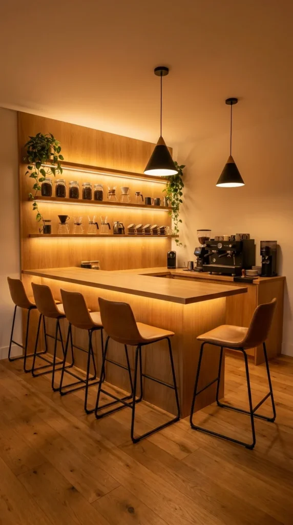
Most coffee setups solve for one or two people standing at a counter. This one solves for a small crowd. The counter bends into an L shape, wrapping around the corner so the seating side stretches long enough for five stools while the work side—where the espresso machine, grinder, and pour-over gear sit—stays completely separate from where people sit.
That separation is what keeps the layout from feeling like a kitchen island doing double duty. The equipment lives on its own run of counter, backed by open shelving stocked with glass canisters and pour-over drippers, while the seating side is left clear of anything but the wood itself. Nobody sitting at the bar has to navigate around a grinder or a milk pitcher to set down a cup.
Warm LED strips under both shelf edges and two black pendant lights over the seating do the rest of the work. The lighting is intentionally lower and warmer than daylight — closer to a bar or café than a kitchen — which is really what signals this is a space meant for lingering, not a quick stop for a to-go cup.
🪑 Quick Checklist: What Makes an L-Shaped Layout Work
☐ Keep equipment and seating on separate counter runs, not the same surface
☐ Use warm, low-hung pendant lighting rather than bright overheads
☐ Add under-shelf lighting to the storage side to keep it from disappearing in dim light
☐ Leave the seating-side counter empty—no appliances, no clutter
☐ Match stool height to counter height (typically 40–42 inches) for comfortable long-term sitting
4. An Arched Niche That Makes a Concrete Counter Feel Sculptural
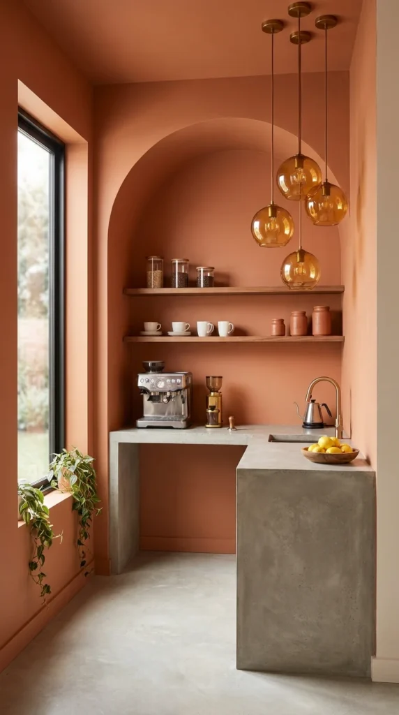
Terracotta paint and a rounded archway do something a rectangular nook never could—they soften a small, functional counter into something closer to architecture. The wall curves overhead instead of squaring off, and the color runs uninterrupted from floor to ceiling, so the whole alcove reads as one continuous shape rather than a counter pushed against a flat wall.
The concrete surfaces are the quiet counterpoint here. Raw, matte, and slightly imperfect in texture, they keep the warm terracotta from tipping into something overly soft or decorative. A polished stone or glossy tile would have fought with the wall color; the concrete instead sits back and lets the orange do the talking, while still giving the espresso machine a solid, cool surface to sit on.
Three amber glass pendants, hung at staggered heights, fill the vertical space the archway creates. Without them, that tall curved ceiling above the counter would feel empty. The pendants give the eye something to land on partway up, tying the lower counter to the height of the room instead of leaving it feeling disconnected from the ceiling above.
💚 Recreating This Look: Budget Tiers
💚 Affordable: A can of terracotta or warm clay-toned paint and a single pendant light can bring the same warmth to a flat wall — no arch required.
💛 Mid-Range: A poured concrete-look countertop overlay or concrete-effect laminate gets the textural contrast without a full renovation.
💎 Investment: An actual curved archway cut into drywall, paired with cast concrete counters, delivers the full architectural effect shown here.
5. A Mustard Wall That Turns a Narrow Landing Into a Sunroom Coffee Bar
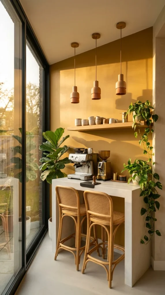
This is a coffee station squeezed into what looks like a stairwell landing or a slice of sunroom—a spot most homes would leave empty or treat as pass-through space. A single white counter, barely wider than the espresso machine sitting on it, runs perpendicular to a full wall of glass, catching direct afternoon light that most kitchen coffee stations never get.
The mustard-yellow wall is doing more than adding color. In a space this narrow, a pale or white wall would let the bright window light wash everything out, flattening the whole nook. The saturated yellow instead holds its own against the light, and in late-day sun it turns almost gold—the kind of effect that photographs well but also just makes the corner feel warmer to sit in at any hour.
Three small wood-and-copper pendants, clustered rather than evenly spaced, fill the tall-pitched ceiling above the counter. Cane-back stools and trailing houseplants soften what is otherwise a very compact, hard-edged setup—proof that a coffee bar can work in a leftover architectural sliver as long as the wall color and lighting are doing enough visual work to make it feel like a destination rather than a gap.
⚠️ Warning: A narrow counter facing direct sunlight for hours a day can fade wood tones and dull metal finishes faster than expected—a UV-protective finish on wood surfaces, or simply positioning the espresso machine slightly back from the glass, helps prevent premature wear in a spot this exposed.
6. A Shiplap-Front Counter That Makes a Farmhouse Kitchen Feel Custom-Built
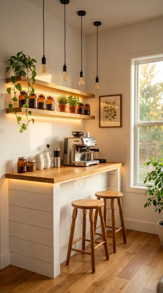
Set into the corner of what reads as a farmhouse or cottage-style kitchen, this coffee bar uses the same white shiplap paneling as the rest of the room on its counter base—a small detail that keeps the whole thing from looking like a separate piece of furniture parked against the wall. The butcher-block countertop on top is the only material break, and it’s enough to signal “this is where coffee happens” without needing a different wall color or a change in flooring.
Four bare Edison bulbs, hung at slightly different lengths, replace what would usually be a single overhead fixture. That staggered height does real work in a corner this tight — instead of one light source casting a flat pool of light, the bulbs create layered shadows across the shelf below, which is part of why the amber glass jars and terracotta pots catch as much visual interest as they do.
Under-shelf lighting along both floating shelves and the counter edge means the space still looks warm and finished after dark, when window light disappears entirely. Combined with a framed botanical print and simple turned-leg stools, the whole corner reads less like a coffee station bolted onto a kitchen and more like a room that was designed around this one function from the start.
📌 Important Note: Bare bulb pendants at staggered heights only work well when hung above head clearance for anyone standing at the counter—in a corner setup like this, keep the lowest bulb at least 6–7 feet from the floor to avoid it becoming a hazard near the seating area.
7. Handmade Teal Zellige Tile Turns a Coffee Counter Into a Café Moment
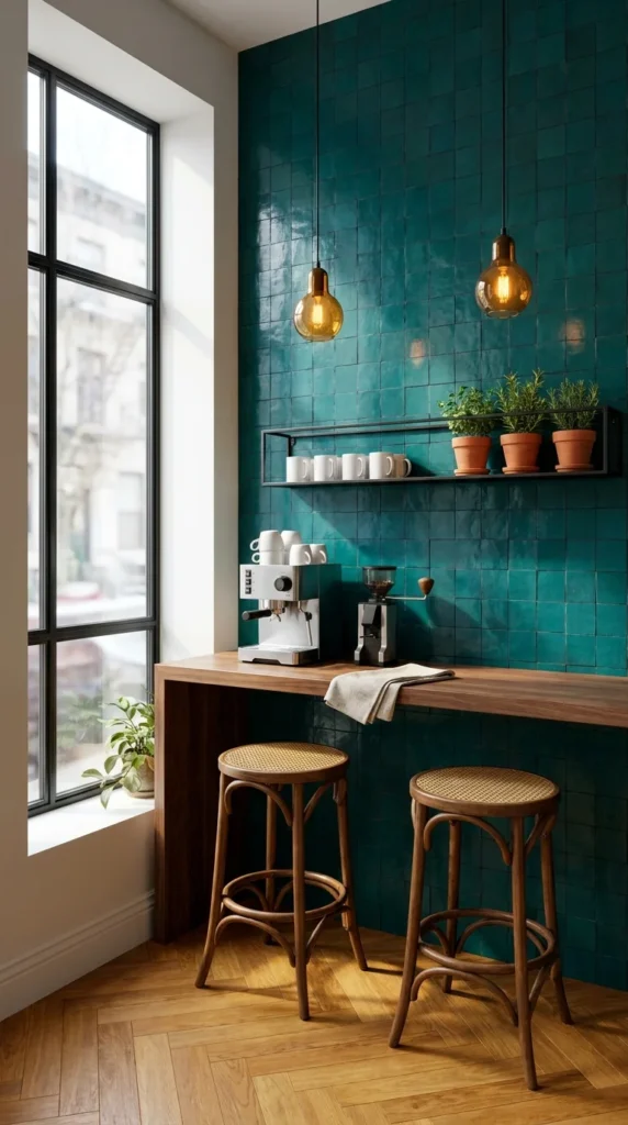
Full-height glazed tile in a deep teal, with the slightly irregular, handmade look of Moroccan zellige, covers the entire wall behind this counter—floor-to-ceiling coverage that a standard backsplash never attempts. The unevenness in each tile catches light differently depending on the angle, so the wall shifts between deep green and near-black across its surface instead of sitting as one flat color.
A black metal shelf, holding white mugs and a row of terracotta herb pots, is mounted directly onto the tile rather than built into it—a detail that matters practically, since drilling into glazed tile requires different anchors than drywall, and a shelf this size needs to be secured into a stud or tile-rated hardware to hold weight safely. Two amber pendant bulbs hang at uneven heights nearby, their warm glass tone doing the work of softening what could otherwise feel like a cold, hard-surfaced corner.
Herringbone wood flooring and a walnut counter bring the palette back down to warm tones, keeping the teal from overwhelming the space the way it might against white oak or pale flooring. Rattan-seated stools finish the look with the kind of texture that a glossy tile wall alone can’t provide—this is a counter built to feel like a neighborhood café counter, not a kitchen appliance corner.
🌿 Recreating This Look: Budget Tiers
💚 Affordable: Peel-and-stick tile in a similar teal glaze finish gets close to the color depth without the labor cost of real zellige.
💛 Mid-Range: A partial accent wall in genuine glazed ceramic tile, paired with a butcher-block counter, captures most of the effect at lower material cost.
💎 Investment: Full-height handmade zellige tile, professionally installed with tile-rated wall anchors for shelving, delivers the exact look shown here.
8. A Patterned Tile Counter Front Turns Two Woven Pendants Into a Focal Point Instead of an Accessory
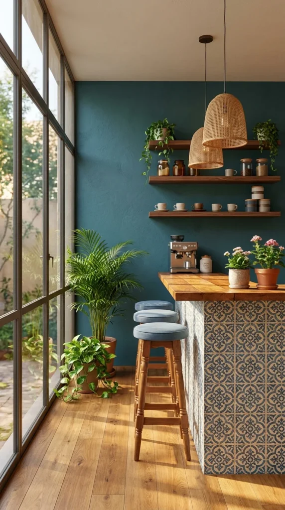
This counter faces its patterned side outward on purpose. Blue-and-white ornamental tile wraps the entire base of the island, floor to countertop, turning what’s normally the least-noticed part of a counter — the front panel — into the most detailed surface in the room. A plain wood or painted base would have let the deep teal wall behind absorb all the visual weight; the tile gives the eye a second place to land at a completely different height.
Two woven rattan pendant shades, hung at staggered lengths above the counter, pick up the same warm wood tone as the tiled countertop and the open shelves behind it. Their texture reads as soft and handmade next to the hard geometry of the tile pattern below — a pairing that works because the two textures sit at opposite ends of the room’s visual weight instead of competing on the same surface.
Dusty blue upholstered stools with turned wood legs echo the tile’s blue tone without matching it exactly, which keeps the seating from looking like it was chosen straight off a matching furniture set. Floor-to-ceiling glass on the opposite wall floods the whole space with enough natural light that the teal wall, tile pattern, and warm wood counter all stay readable instead of receding into shadow by afternoon.
🌸 Recreating This Look: Budget Tiers
💚 Affordable: Peel-and-stick patterned tile decals applied to a plain counter base bring the same visual pop at a fraction of the cost.
💛 Mid-Range: Ceramic tile in a similar ornamental pattern, installed on just the counter’s front face rather than the full room, keeps materials and labor contained.
💎 Investment: Custom-cut patterned tile with mitered edges and professional installation across the full counter base delivers the seamless look shown here.
9. A Freestanding Island Lets the Espresso Machine Face an Open Field Instead of a Wall
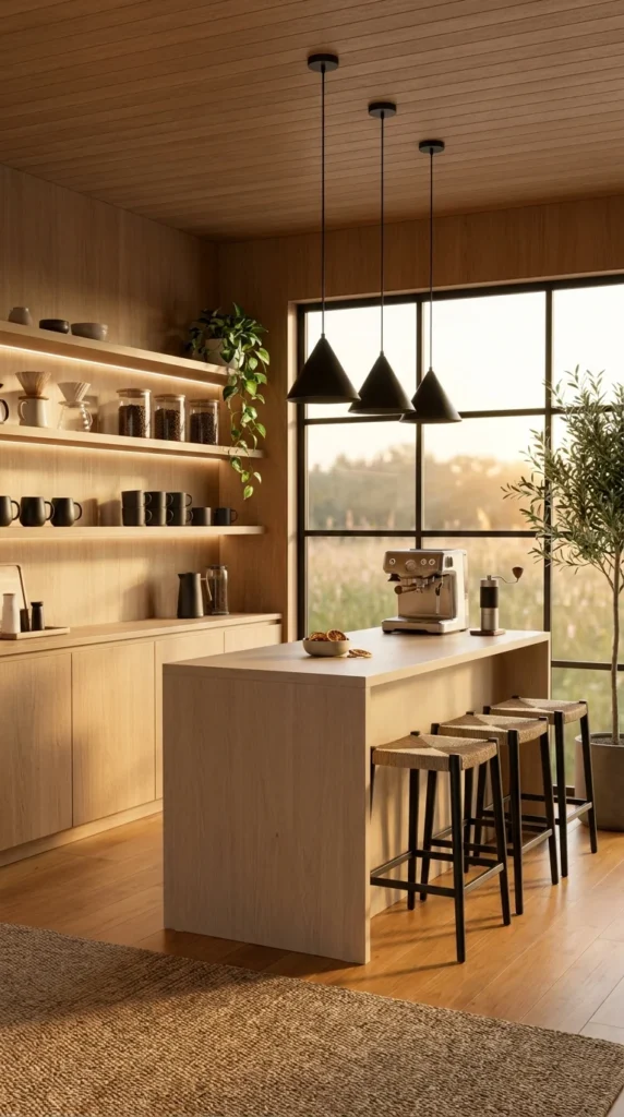
Rather than pushing the coffee equipment against a wall, this setup floats a slim wood island in the middle of the room, positioned so the espresso machine faces a full window wall overlooking open grassland. It’s an unusual choice—most kitchen coffee stations are designed around storage and backsplash, not a view—but placing the machine here means whoever uses it does so looking outward instead of at cabinetry.
Storage still happens, just off to the side. A full wall of pale wood cabinetry and open shelving runs perpendicular to the island, holding mugs, pour-over drippers, and glass jars of beans under the same warm under-shelf lighting seen in setups with less natural light. Here, though, that lighting is more atmosphere than necessity—the wall of windows already floods the room with late-day sun, so the shelf lighting mainly adds warmth rather than visibility.
Three black cone pendants, clustered tightly over one end of the island, mark the coffee station’s exact location without needing a wall or backsplash to define the zone. Rush-seated stools and a jute rug ground the otherwise minimal wood tones in something textured, while a single olive tree in the corner echoes the greenery visible through the glass.
💡 Pro Tip: When a coffee station sits on a freestanding island rather than against a wall, cluster pendant lights tightly over just the equipment zone — spacing them evenly across the whole island length dilutes the sense of a defined “station” and makes the island read as generic prep space instead.
10. A Recessed Charcoal Niche Uses a Staircase Landing as Its Only Real Backdrop
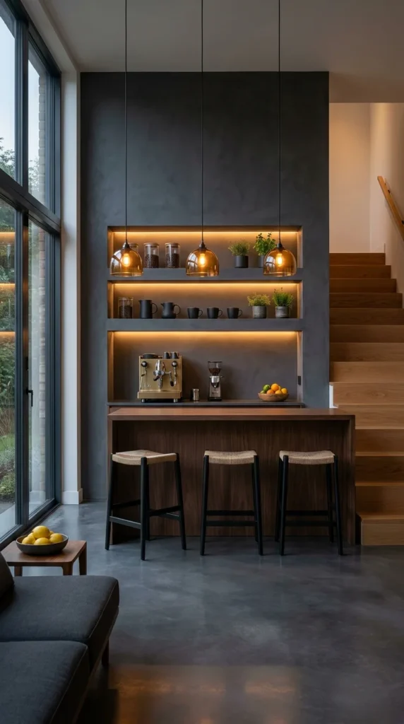
Set beside an open staircase rather than inside a kitchen, this coffee bar occupies a full-height wall finished in dark plaster or microcement—a material choice that makes the recessed shelving above the counter look carved out of solid stone rather than built from wood and drywall. The niche steps back from the wall in three shallow tiers, each one lit from below so the shelf contents glow against the dark surface instead of disappearing into it.
That lighting choice isn’t decorative alone — in a room with this much dark, matte material, unlit shelving would read as a black void, especially with polished concrete floors absorbing rather than bouncing light. The warm under-shelf glow is what keeps the espresso machine, mugs, and glass jars visible and gives the wall a sense of depth instead of flattening into a single dark plane.
Three amber glass pendants, hung close together at the same height, repeat the warm tone of the shelf lighting and mark the counter’s exact center. Below, a walnut counter with black-legged stools introduces the only warm, textured material in an otherwise cool, monochrome space—and because the staircase sits directly beside it, the whole setup reads less like an isolated kitchen feature and more like a fixture built into the architecture of the room itself.
📌 Important Note: Dark, matte wall finishes like plaster or microcement absorb far more light than they reflect — any recessed shelving on a wall like this needs its own dedicated lighting, since ambient room light alone won’t be enough to keep the contents visible after dark.
Conclusion
None of these ten setups depended on a bigger kitchen. What they had in common was a clear decision about where the coffee station lives and what gets left out of it—a window wall, a staircase landing, a leftover sliver beside a sunroom door. Some leaned on bold wall color to do the visual work; others let tile, lighting, or a single well-placed pendant carry the whole space.
The through-line is that a coffee bar doesn’t need to compete with the rest of the kitchen for square footage. It just needs a defined edge—a wall, a color, a lighting change, a counter height—that tells the eye this spot serves a different purpose than the counter next to it. Whether that’s a full accent wall or just a strip of LED lighting under one shelf, the smallest homes on this list found room for a coffee bar by making one clear choice and building everything else around it.
Frequently Asked Questions
How much space do I actually need for a home coffee bar?
A functional coffee station can fit in as little as 24–30 inches of counter width—enough for an espresso machine or

