

Industrial lighting has a reputation problem. Most people picture one thing — a single black cage bulb over a kitchen island — and stop there. But the fixtures actually doing the work in the best industrial-leaning homes are far more varied: ring pendants stacked in threes, wire mesh globes clustered like a chandelier, drum shades with a warm copper interior. The style isn’t about picking “an industrial light.” It’s about picking the right industrial light for the room, the ceiling height, and the mood you’re actually going for.
This guide walks through ten real rooms, each built around a different fixture decision, so you can figure out which approach actually fits your space before you buy anything.
Quick Overview
| Best For | Open-plan homes, converted lofts, tall or vaulted ceilings, exposed materials |
|---|---|
| Budget | Medium |
| Difficulty | Moderate (hardwiring may need an electrician) |
| Maintenance Level | Low–Medium |
Ring Pendant Trio Over a Shared Reclaimed-Wood Partner Desk
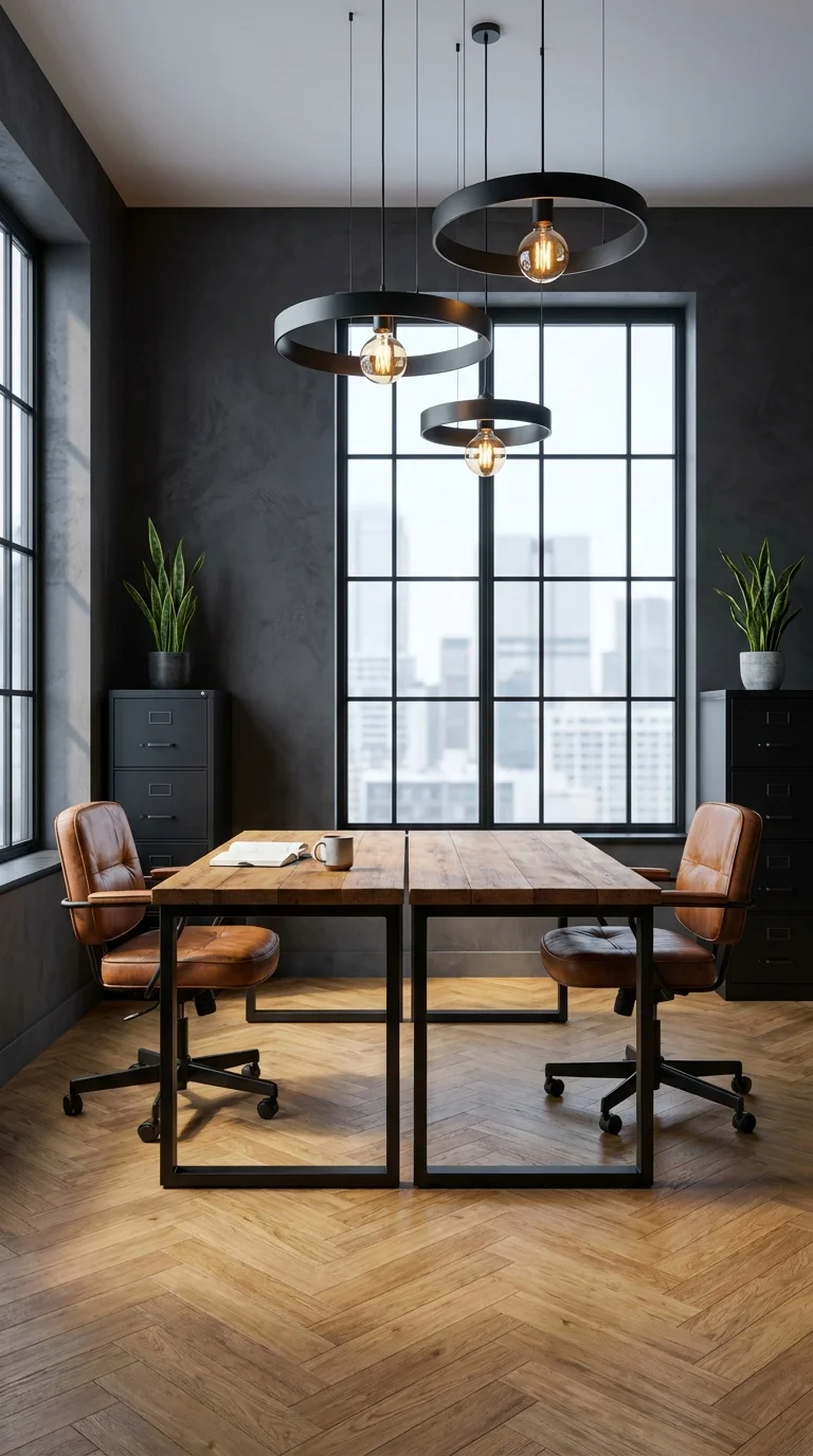
Graduated ring pendants let two desks share one light source without doubling up fixtures.
Three black ring pendants, each hung at a slightly different height, drop from a single ceiling point above a two-person partner desk built from thick reclaimed planks. The rings themselves are almost sculptural — open circles with a single Edison bulb suspended in the center, more like hanging art than task lighting. Behind them, a floor-to-ceiling steel-framed window pulls in a city skyline, and the walls are painted a flat, near-black charcoal that lets the warm bulb glow read as the room’s only real color note.
This is a shared workspace, and the lighting decision reflects that directly: instead of two separate desk lamps competing for space on a narrow tabletop, one overhead cluster lights both work zones evenly. The ring shape does something a solid shade can’t — it lets light spill in every direction rather than pooling straight down, so neither side of the desk falls into shadow while the other stays bright. That’s a real consideration for anyone setting up a home office two people will actually use at once, an idea covered in more depth in this rustic home office design guide.
The charcoal walls are doing quiet work too — a lighter wall would compete with the pendant glow instead of framing it. Leather task chairs and open filing cabinets in matte black keep the palette tight, so the eye has nowhere to land except the desk and the light above it.
Where the Rings Actually Earn Their Keep
One reason this setup reads as intentional rather than accessorized is repetition: the circular pendant shape echoes nowhere else obviously, but the staggered heights create their own rhythm, so the cluster feels composed even without a matching motif elsewhere in the room. Swapping in three identical drop lengths would likely flatten that effect — the height variation is doing real visual work here, not just decoration.
Recommended Materials: Matte black steel, reclaimed oak planks, leather upholstery, painted plaster, glass Edison bulbs
Main Colors: Charcoal Black, Warm Oak, Cognac Leather, Brass-Toned Filament Glow
Best Lighting: The pendant cluster is the primary light source; pair it with a small brass desk lamp for close reading work since the rings alone won’t fully flood the tabletop.
Where This Setup Falls Apart
Hanging all three rings at the exact same height, which kills the layered effect that makes the cluster feel deliberate
Choosing a wall color light enough to wash out the bulb glow instead of framing it
Skipping a dimmer, which leaves video calls either too dark or uncomfortably bright with no middle ground
Centering the cluster over only one half of a shared desk, leaving the second seat under-lit
Amber Glass Globes Paired With a Backlit Concrete Shelf
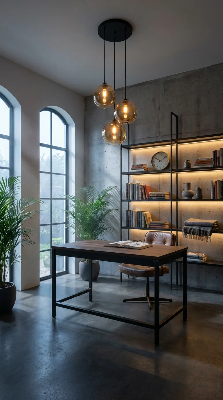
A three-globe cluster keeps the desk lit while the shelf lighting handles the room’s ambiance.
Three amber-tinted glass globes hang at staggered heights above a simple wood desk set against a raw concrete wall. To the right, an open steel shelving unit holds books, vases, and a clock, all backlit with a continuous warm LED strip tucked behind each shelf edge. Arched windows on the opposite wall bring in soft daylight, and two potted palms soften what would otherwise be a fairly hard, industrial material palette.
This section carries two light sources doing two different jobs, and that split is the actual lesson here. The globe pendants are task lighting — close, warm, and focused directly over the desk surface where reading and writing happen. The shelf lighting is ambient — it exists to make the concrete wall feel warm after dark rather than cold, and it does that without adding a single visible fixture. Anyone nervous about pairing exposed concrete with a cozy reading nook should look at how the amber glass tint alone shifts the tone of the whole wall.
A Palette Built Around One Warm Note
The amber glass isn’t just a style choice — it’s doing color-temperature work that a clear glass globe wouldn’t. Clear glass would let the bulb’s natural white-yellow light through unfiltered; the amber tint pushes everything toward a deeper honey tone, which is likely the single biggest reason this concrete-and-steel room reads as inviting instead of stark.
Recommended Materials: Amber glass, poured concrete, blackened steel shelving frame, unfinished oak desk, woven leather chair
Main Colors: Concrete Grey, Amber Glass Glow, Warm Oak, Deep Green (from the palms)
Best Lighting: Layer the amber pendants for task light with the LED shelf strip for ambient warmth — running only one of the two leaves the room either too dim to work in or too flat after dark.
Maintenance: Wipe glass globes with a dry microfiber cloth to avoid streaking; the potted palms need bright, indirect light and a weekly check for dry soil since the concrete floor won’t hold humidity the way a rug would.
Easy Ways to Get This Wrong
Choosing clear glass globes instead of amber and losing the warm color-temperature effect entirely
Running the LED shelf strip on daylight-white instead of a warm color temperature, which clashes with the pendant glow
Overcrowding open steel shelving until it looks cluttered instead of curated
Placing the desk too far from the window and relying on the pendants alone during the day
A Layered Copper Drum Pendant Anchoring a Round Breakfast Table
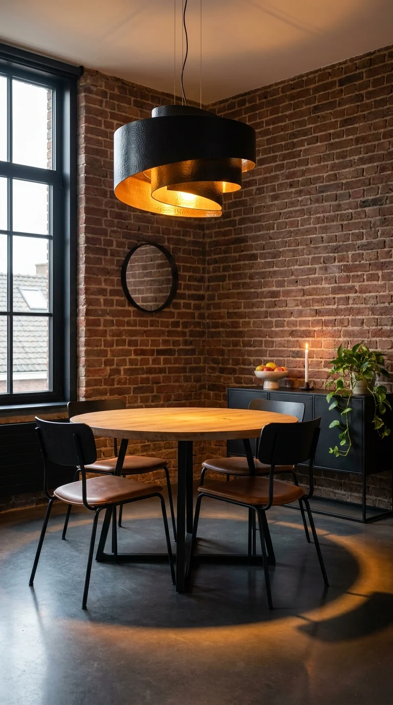
One statement fixture is doing all the lighting work this small dining corner needs.
A three-tier drum pendant — black on the outside, hammered copper on the inside — hangs low over a round oak table tucked into a brick corner. The copper lining catches and throws the bulb’s light downward and outward at the same time, casting a soft amber circle across the concrete floor that’s visible even in daylight. Four black metal chairs with leather seats surround the table, and a low black console with a fruit bowl and a single taper candle sits against the brick wall behind it.
This is a small dining nook, not a full dining room, and the fixture choice reflects that scale directly. One large, layered pendant does more for a compact space than several smaller lights would — it gives the room a focal point without needing extra fixtures competing for attention in a footprint this tight. The tiered copper interior is the detail that keeps a single black drum from reading as plain: each layer catches light differently, so the shade itself has visual depth even when unlit.
Why the Copper Interior Is Doing the Real Work
Where the ring pendants in the first room stayed evenly lit throughout, this fixture behaves differently — the copper lining concentrates light downward into a defined pool rather than spreading it evenly, which is why the floor shadow under the table reads so clearly circular. That concentrated glow is part of what makes a small brick corner feel intimate rather than cramped, an idea that shows up again in this small art deco dining room roundup, where scale and fixture size get the same close attention.
Recommended Materials: Hammered copper, matte black steel, exposed brick, solid oak tabletop, leather seat pads
Main Colors: Brick Red, Copper Glow, Matte Black, Warm Oak
Best Lighting: The drum pendant should hang low enough — roughly 30–34 inches above the tabletop — that the copper interior is visible from a seated position; hung too high, the metallic lining disappears from view entirely.
What Trips People Up Recreating This
Hanging the pendant too high, which hides the copper interior that makes the fixture worth choosing in the first place
Pairing it with cool-white bulbs instead of warm ones, which fights the copper’s natural amber cast
Adding a second overhead fixture nearby, which crowds a nook this size instead of letting one piece anchor it
Choosing a shade with no visible interior lining, losing the layered depth entirely
Oversized Wire-Mesh Domes Over a Matte-Black Kitchen-Dining Run
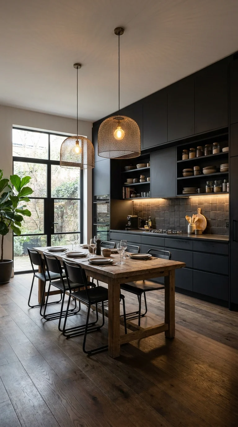
Mismatched pendant sizes stop a long black kitchen run from reading as one flat block.
Two woven wire mesh dome pendants — one noticeably larger than the other — hang over a long reclaimed-wood dining table set against a wall of fully matte-black cabinetry. Warm LED strips run under the open shelving and along the toe-kick, catching the edges of stacked ceramics and glass jars. A steel-framed garden door lets daylight spill across the wide-plank floor, and a large potted fig tree softens the run of black cabinets on the far side.
The mismatched pendant sizes are the entire design decision here, and it’s worth understanding why that works instead of reading as a mistake. A kitchen this dark, with cabinetry running floor to ceiling on one full wall, risks feeling like a single flat block of black. Two pendants of the same size, hung evenly, would only reinforce that flatness. Making one dome noticeably larger breaks the symmetry just enough that the eye has somewhere to travel across the room instead of sliding straight past — a technique this dark academia kitchen collection leans on too, using scale contrast to keep dark cabinetry from feeling monotonous.
What the Layout Solves in Daily Use
Mesh pendants let light escape through the woven pattern in every direction rather than just downward, which matters in a kitchen where the table doubles as a prep surface and a dinner spot. The under-cabinet LED strips pick up the slack for actual cooking tasks, so the pendants are free to focus on ambiance and the dinner table specifically rather than trying to do both jobs badly.
Recommended Materials: Woven black wire mesh, matte black cabinetry, reclaimed wood tabletop, tiled backsplash, black steel chair frames
Main Colors: Matte Black, Warm Oak, Brass Bulb Glow, Deep Green (fig leaves)
Best Lighting: Combine the mesh pendants over the table with continuous under-cabinet LEDs for prep zones; relying on the pendants alone leaves the counters too dim for actual cooking.
Maintenance: Wire mesh shades collect dust in the weave over time — a soft brush attachment on a vacuum clears it faster than wiping; the fig tree needs bright indirect light and rotating every few weeks to grow evenly.
Where This Look Falls Apart
Hanging two identically sized pendants, which loses the scale contrast that keeps the room from feeling flat
Skipping under-cabinet lighting and expecting the pendants to handle prep-surface visibility
Choosing a solid shade instead of an open mesh one, which blocks the ambient spill the room depends on
Letting an all-black kitchen go without a single warm wood or plant element to soften it
Hidden Amber Lighting Warming a Corten-Steel Wet Room
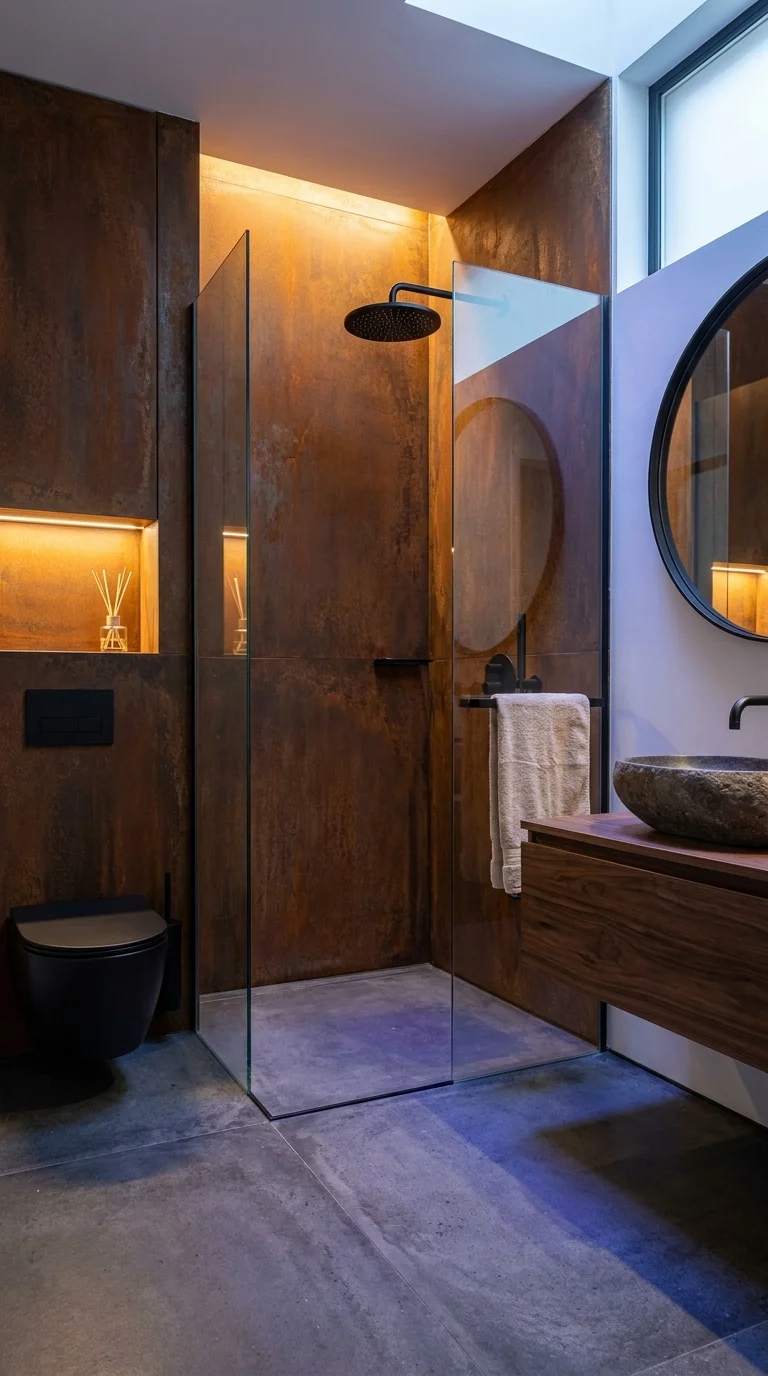
Recessed light niches do more to warm this room than the shower fixture itself.
Rust-toned corten steel panels cover the walls of this bathroom, their weathered texture catching light unevenly in a way smooth tile never could. A frameless glass shower divider separates the wet zone from the rest of the room, and a recessed niche built directly into the steel glows with warm hidden lighting — the room’s real light source, more than the visible black rainfall showerhead or the round wall mirror beside it. A stone vessel sink sits on a floating walnut vanity, and a skylight overhead adds a cool daylight contrast to the warm glow below.
This is a room built around one core decision: hide the lighting, not the fixture. There’s no visible pendant or flush-mount here — the light lives inside a carved-out niche in the steel wall, which means the corten texture itself becomes the thing catching and diffusing the glow. That’s a very different approach from a bathroom that relies on a single vanity light or overhead can, and it’s worth understanding before committing to it, since it depends entirely on planning the electrical work before the steel panels go up.
A Room Designed Around Rust, Not Around a Fixture
Corten steel is chosen specifically because it keeps changing — it develops a deeper, more varied rust patina over years of humidity exposure, and that shifting surface texture is what makes hidden light so effective here: a flat tile wall would reflect the glow evenly, but the pitted, uneven Corten surface scatters it, creating soft shadow variation across the whole panel. For homeowners weighing where to place fixtures in a small wet room, this guide to sconce placement in bathrooms covers the more common visible-fixture approach as a useful comparison point.
Recommended Materials: Corten steel paneling, frameless tempered glass, natural stone vessel sink, walnut vanity, matte black fixtures
Main Colors: Rust Orange, Charcoal Grey, Walnut Brown, Warm Amber Glow
Best Lighting: Recessed, warm-temperature hidden lighting works better here than any visible fixture — a bare bulb or exposed pendant would fight the Corten’s texture instead of highlighting it.
Maintenance: Corten steel in a bathroom needs a damp-location-rated sealant behind the scenes to prevent rust bleed onto the floor over time; the stone sink should be resealed periodically since porous stone in a constantly humid room stains faster than in a dry one.
Easy Ways to Get This Wrong
Installing standard, non-damp-rated lighting inside a niche this close to shower spray
Choosing smooth tile instead of a textured material, losing the shadow variation that makes hidden lighting worth doing
Skipping ventilation planning, since a warm, glowing niche in a humid room needs real airflow behind the wall assembly
Adding a second visible fixture that competes with the niche instead of leaving it as the room’s one light source
A Sputnik Chandelier Filling a Vaulted, Beam-Ceiling Living Room
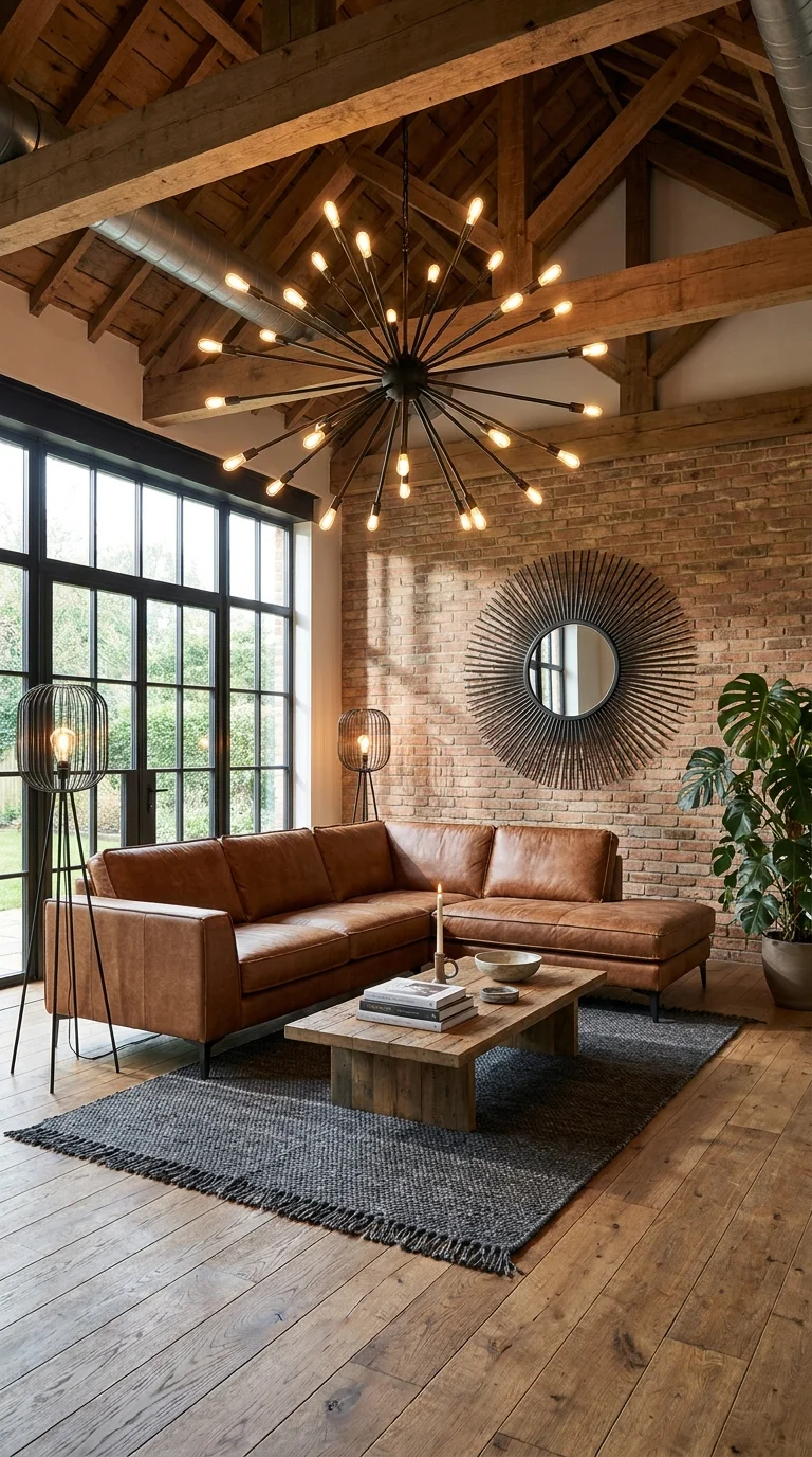
A ceiling this tall is the only thing that makes a fixture this large feel proportional.
A starburst-style chandelier — dozens of exposed bulbs radiating out from a central black sphere — fills the peak of a vaulted, timber-beamed ceiling above a cognac leather sectional. A round sunburst mirror echoes the chandelier’s radiating shape on the brick accent wall below, and two black wire-cage floor lamps flank the sofa, doing quieter supporting work. Full-height steel-framed doors open onto a garden, and a low wood coffee table with a woven grey rug grounds the seating area.
Scale is the entire argument for this room. A Sputnik chandelier this large would overwhelm a standard eight-foot ceiling instantly — but here, the exposed timber beams and vaulted peak give it enough vertical room to actually breathe. This is the clearest example in the whole set of a fixture that only works because of what’s above it, which is worth knowing before shopping for a statement chandelier in a room with a flat, standard-height ceiling.
Worth the Investment?
A fixture this size, with this many bulbs and this much visible metalwork, is a genuine investment — both in cost and in the structural ceiling support it needs. It’s worth it in a room like this one, where the vaulted ceiling would otherwise sit visually empty, and the chandelier becomes the thing that makes the whole vertical space feel intentional rather than wasted. In a standard-height room, that same budget would likely go further split between a few well-placed floor lamps and a simpler flush-mount — the chandelier’s value here is inseparable from the architecture it’s filling.
Homeowners drawn to this kind of sculptural, radiating fixture but working with a flatter ceiling might find more workable inspiration in this mid-century apartment style guide, which covers scaled-down statement lighting for more standard room heights.
Recommended Materials: Blackened steel, exposed timber beams, cognac leather, reclaimed brick, woven wool rug
Main Colors: Cognac Leather, Warm Oak, Brick Red, Charcoal Black
Best Lighting: The chandelier alone can leave the seating area under-lit for reading; the two wire-cage floor lamps exist specifically to fill that gap at a lower, more usable height.
What Trips People Up Recreating This
Installing a chandelier this scale under a standard flat ceiling instead of a vaulted or double-height one
Skipping floor or table lamps entirely and expecting one overhead fixture to handle every lighting need in the room
Choosing a chandelier with too few bulbs for the ceiling height, leaving it looking sparse instead of full
Ignoring the structural weight the ceiling needs to support before installation
Bare-Bulb Pendants Doing the Job of a Nightstand Lamp
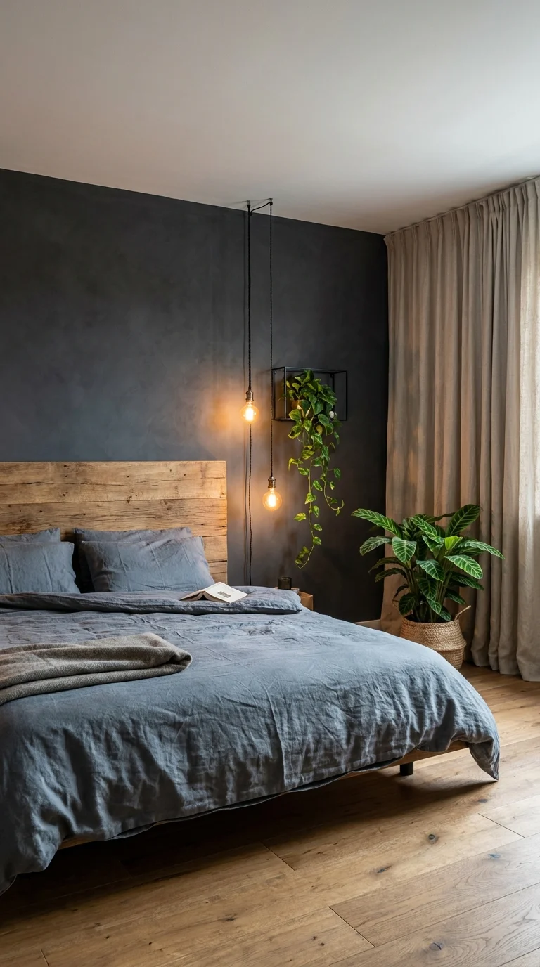
Two staggered bulbs replace a lamp and free up the entire nightstand surface.
Two bare Edison bulbs hang from thin black cords at staggered heights beside a bed with a rough-sawn wood headboard, dropping from a shared ceiling canopy rather than individual junction boxes. A wall-mounted wire planter box holds a trailing pothos plant between the two pendants, its vines threading down past the lower bulb. The wall behind the bed is painted a deep charcoal-blue, and heavy linen curtains in a warm taupe soften the room’s otherwise hard edges.
This is a bedroom with no nightstand lamp at all, and that absence is the actual design decision worth noticing. Bare pendant bulbs at staggered heights do the reading-light job a lamp normally handles, but without taking up any surface space — which matters more than it sounds like in a room where the nightstand is doing double duty as a place for books, a glass of water, and whatever else lands there before bed. Anyone drawing up an industrial-style bedroom from scratch should weigh this trade-off early, since it changes furniture shopping too — a nightstand without a lamp can be smaller, or skipped in favor of a simple wall shelf, as covered in this industrial bedroom design roundup.
A Small Scale Risk That Pays Off
Bare bulbs this close to a headboard carry a real risk of feeling stark or unfinished if the surrounding materials don’t warm them up. Here, the reclaimed wood headboard and the trailing plant do that softening work — without them, two exposed bulbs on cords would likely read as an unfinished electrical fixture rather than a considered choice.
Recommended Materials: Rough-sawn wood, blackened steel cord canopy, linen bedding and curtains, woven wire planter, glass Edison bulbs
Main Colors: Charcoal Blue, Warm Oak, Taupe Linen, Deep Green
Best Lighting: Stagger the bulb heights so one sits at reading height and one sits higher for ambient glow — hanging both at the same length loses that dual function entirely.
Maintenance: The trailing pothos needs indirect light and a weekly watering check; bare bulbs generate more visible heat than a shaded fixture, so keep trailing vines and curtain fabric a safe distance from direct contact.
Where This Look Falls Apart
Hanging bulbs directly against dark walls with no warm material nearby to soften the effect
Skipping a dimmer switch, which leaves bare bulbs uncomfortably bright for a bedroom at night
Placing bulbs too close to flammable curtain fabric or trailing plant vines
Choosing a cool-white bulb temperature instead of warm, which turns a cozy detail harsh
Staggered Cylinder Pendants Lighting a Curved Plaster Alcove
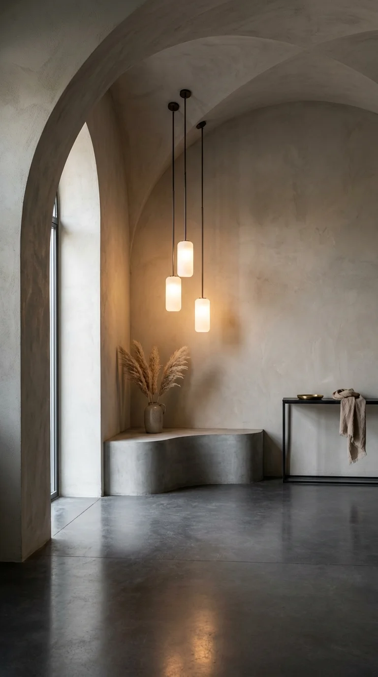
Uneven drop heights are what keep three matching pendants from reading as a single block.
Three frosted glass cylinder pendants drop from a shared ceiling plate at three different heights, lighting a sculpted, curved plaster bench tucked into a vaulted archway. The walls and vaulted ceiling are finished in the same warm, textured lime plaster throughout, blurring the line between wall and ceiling entirely. A tall arched window brings in soft daylight, and a stoneware vase filled with dried pampas grass sits on the bench, echoing the room’s soft, sandy palette.
The staggered heights are doing the same job here that they did in the very first room in this guide, but for a completely different reason. In the home office, uneven drops kept a workspace evenly lit for two people. Here, in a purely architectural alcove with no obvious function, the staggered heights exist to highlight the curve of the bench and the depth of the archway itself — the lighting is there to sculpt the space, not to illuminate a task.
What the Eye Finds First
In a room this monochromatic, the lowest-hanging pendant becomes the natural focal point simply because it sits closest to eye level and closest to the curved bench below it. The other two cylinders, hung progressively higher, fade slightly into the plaster backdrop — which is likely intentional, since it keeps the alcove feeling layered rather than symmetrical and static.
Recommended Materials: Frosted glass, lime plaster, blackened steel cord fittings, dried pampas grass, stoneware vessel
Main Colors: Warm Sand, Plaster Grey, Frosted Glass White, Bronze Metal Fittings
Best Lighting: Warm-temperature bulbs inside the frosted glass keep the plaster from reading cold; the same fixture with a cool-white bulb would flatten this room’s entire warm, sandy palette.
A Common Mistake Worth Avoiding
Hanging all three cylinders at the exact same length, losing the sculptural staggering effect
Choosing clear glass instead of frosted, which would show the bulb filament and break the soft, diffused glow
Skipping the curved bench detail and using a straight one, which fights the room’s rounded architectural language
Overfilling the alcove with decor when the lighting and architecture are meant to be the whole feature
A Wire-Cage Wall Sconce Standing In for a Reading Lamp
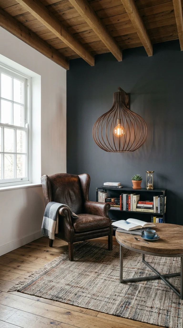
A single sconce frees up the side table for books instead of a lamp base.
A single onion-shaped wire cage sconce mounts directly onto a dark charcoal accent wall above a low black bookshelf, its exposed bulb glowing warm against the exposed wood-beam ceiling. A worn brown leather wingback chair with a plaid throw sits beside it, paired with a round wood coffee table where an open book, a mug, and an hourglass are arranged. The rest of the room stays white and simple, letting the dark wall and the sconce’s sculptural shape carry all the visual weight.
This section makes a direct case for choosing a wall sconce over a table or floor lamp in a reading corner, and it’s worth being explicit about why that trade works here. A floor lamp would need its own footprint on already-limited floor space beside a wingback chair; a table lamp would take up room on a low bookshelf better used for actual books. The wall-mounted sconce solves both problems by putting the light source entirely off the furniture and directly onto the wall instead.
Why the Repetition Works Here
The wire cage shape echoes the woven texture of the throw rug beneath the chair, a small, easy-to-miss repetition that ties the sconce back into the room’s material language instead of it feeling like an isolated fixture bolted onto an otherwise unrelated wall. That kind of quiet echo is often what separates a sconce that feels chosen from one that feels leftover from a hardware store aisle.
Recommended Materials: Wire cage metal, leather upholstery, exposed timber beams, painted plaster, woven wool rug
Main Colors: Charcoal Black, Cognac Leather, Warm Oak, Cream White
Best Lighting: Mount the sconce at roughly shoulder height when seated — too high, and it lights the ceiling instead of the page; too low, and it glares directly at eye level.
Maintenance: Leather chairs like this benefit from conditioning every six months to prevent cracking, especially near a heat-generating light fixture; dust the wire cage shade regularly since the open weave shows buildup faster than a solid shade would.
What Trips People Up Recreating This
Mounting the sconce too high on the wall, which lights the room generally but fails at actual reading tasks
Choosing a solid shade instead of an open cage, losing the sculptural silhouette on the wall itself
Skipping a plug-in or dimmable option, leaving the room stuck at one fixed brightness after dark
Ignoring the chair’s proximity to the fixture, risking heat exposure to leather or fabric over time
For homeowners planning out a full reading nook rather than just the lighting, this reading nook design guide covers seating and layout choices that pair naturally with a wall-mounted fixture like this one.
A Nine-Bulb Mesh Cluster Turning a Drafting Table Into the Room’s Focal Point
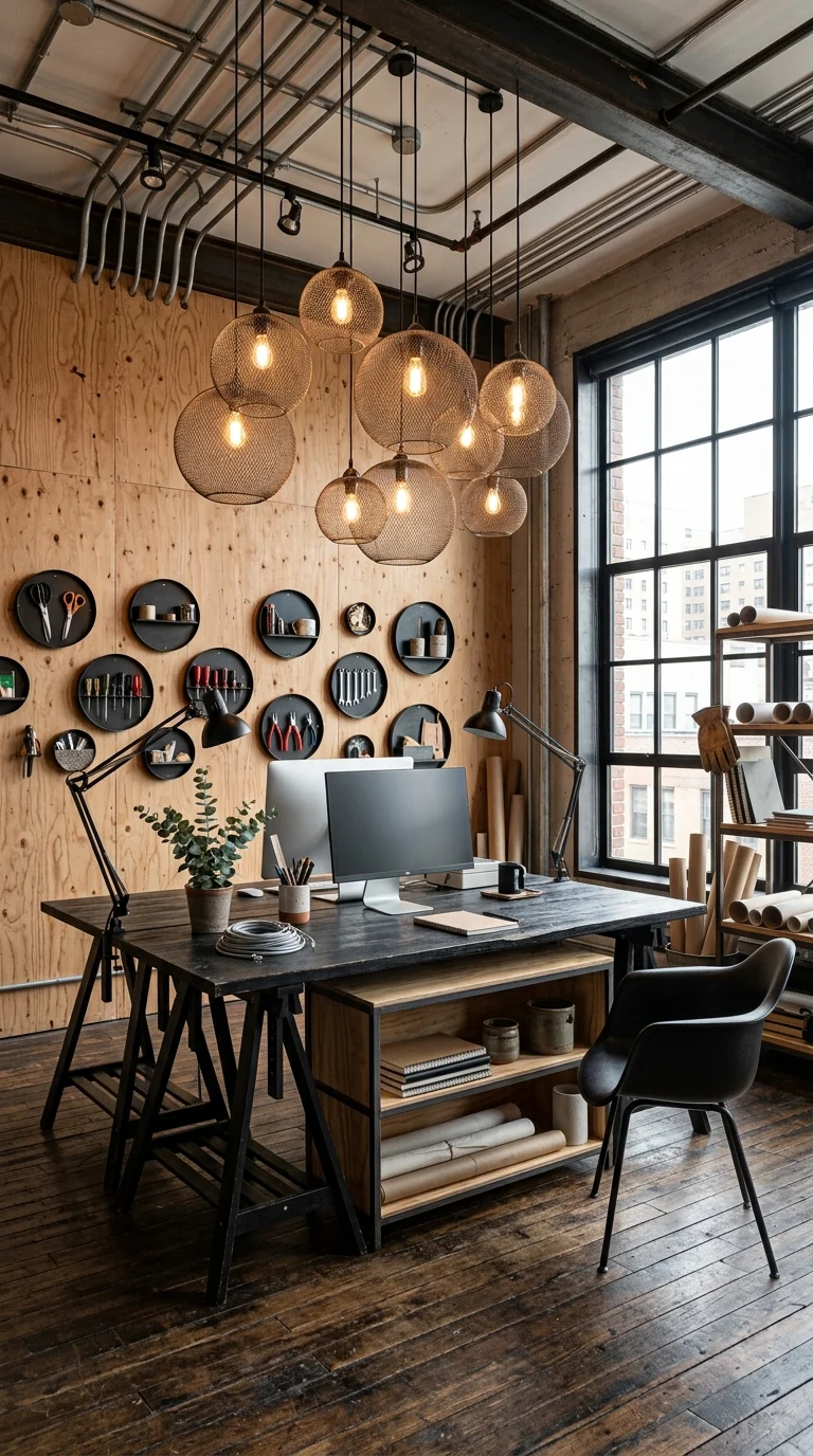
Nine bulbs at uneven heights do the work a single flush-mount fixture never could.
Nine woven wire mesh globe pendants, in three different sizes, cluster together at staggered heights above a black steel-and-plywood drafting table. Exposed ceiling pipework and steel beams run overhead, and a plywood accent wall behind the desk holds a grid of small circular tool-storage discs — scissors, pliers, wrenches, all visibly organized rather than tucked away. A tall steel-framed window brings in daylight from the side, and the desk itself doubles as both a workstation and open shelving underneath.
This is the boldest lighting decision in the entire guide, and it works because the room around it can handle the visual weight. Exposed pipes, open tool storage, and a plywood wall all read as intentionally unfinished — a design language where a cluster of nine visible bulbs doesn’t feel excessive; it feels consistent. Drop this same fixture into a fully finished, drywalled room, and it would likely read as too busy; here, it’s the natural conclusion of everything else already on display.
Where the Mesh Globes Are Doing the Most Work
Because the pendants vary in both size and drop height, the cluster reads as organic rather than mechanically arranged, even though every element in the room otherwise leans hard into precision and order — the tool wall is a grid, the desk is a rectangle, the pipes run in straight parallel lines. The lighting is the one deliberately imperfect element, and that contrast is likely what keeps the whole room from feeling too rigid.
Recommended Materials: Woven wire mesh, blackened steel piping, plywood paneling, reclaimed hardwood flooring, powder-coated steel desk frame
Main Colors: Warm Oak, Charcoal Black, Plywood Tan, Brass Bulb Glow
Best Lighting: A cluster this size needs a dimmer more than any other fixture in this guide — nine uncovered bulbs at full brightness is workable for detailed tasks but overwhelming for anything else happening in the room.
Easy Ways to Get This Wrong
Installing a cluster this size in a smaller or more finished room where it overwhelms rather than complements
Skipping a dimmer switch on a fixture with this many exposed bulbs
Hanging every globe at the same height, losing the organic, staggered quality that balances the room’s rigid grid layout
Choosing warm-white bulbs inconsistently across the cluster, which creates visible color-temperature mismatches bulb to bulb
Lighting Placement & Safety Tips
Match the fixture to the wiring, not the other way around. Statement pendants and clusters like the ones in this guide often need a dedicated junction box moved or added — plan the electrical work before falling in love with a specific fixture.
Keep anything near water damp-location rated. Bathroom fixtures, even hidden ones like the corten steel niche, need a rating that accounts for humidity and occasional splash exposure.
Use a dimmer wherever a room serves more than one purpose. A home office, reading nook, or open kitchen-dining space needs different brightness levels for different times of day — a fixed-brightness fixture limits how the room can actually be used.
Check ceiling support before hanging anything oversized. A Sputnik chandelier or a nine-bulb cluster carries real weight; confirm the ceiling structure can support it before installation, not after.
Who Should Choose This Style?
Best for homeowners with taller ceilings, exposed beams, or brick and concrete already part of the room’s structure
Best for open-plan homes where one fixture needs to visually anchor a large, multi-use space
Not ideal for renters or standard-height rooms without the vertical space to let larger fixtures breathe
Budget Summary
| Low | Bare Edison bulb pendants, a single wire cage sconce, warm-white LED bulbs |
|---|---|
| Medium | Wire mesh dome pendants, a layered drum shade, under-cabinet LED strips |
| Premium | A sculptural sputnik chandelier, corten steel wall paneling, custom hidden lighting niches |
FAQ
Does industrial lighting work in a small room, or does it need a big, open space? Smaller fixtures — a single wire cage sconce, a bare bulb pendant, or one small drum shade — scale down fine. It’s the largest statement pieces, like a Sputnik chandelier or a nine-bulb cluster, that genuinely need vertical or horizontal room to avoid feeling crowded.
Do I need an electrician to install these fixtures, or can I do it myself? Swapping a like-for-like fixture on an existing junction box is often DIY-friendly. Moving a junction box, adding a dedicated dimmer circuit, or wiring a hidden lighting niche behind steel paneling is electrical work best left to a licensed electrician.
Why do so many of these rooms use warm bulbs instead of bright white ones? Industrial materials — black steel, brick, concrete, corten — read cold on their own. Warm-temperature bulbs are one of the simplest, cheapest ways to counteract that and keep a room feeling lived-in rather than clinical.
Can I mix different industrial fixture styles in the same home? Yes, as long as there’s a consistent thread — the same metal finish, a repeated bulb style, or a shared color temperature — tying the rooms together. Mixing wildly different finishes (polished chrome in one room, matte black in the next) tends to feel disjointed room to room.
About StartechLife Team
StartechLife Team is a home décor and interior design publication built around real, achievable rooms rather than aspirational ones that never quite translate to an actual house. For this guide, the team focused specifically on lighting decisions that hold up in homes with genuine structural bones — beams, brick, concrete — since industrial style depends so heavily on what a room already has to work with. Every recommendation here is chosen for being something a homeowner could realistically source and install, not just something that photographs well.
Conclusion
The rooms in this guide all make one thing clear: industrial lighting isn’t a single fixture type; it’s a set of decisions about scale, warmth, and how much visual weight a ceiling can actually hold. A staggered bare-bulb pair works in a bedroom precisely because it’s restrained; a nine-bulb mesh cluster works in a workshop precisely because it isn’t. The right choice depends less on the style label and more on being honest about your ceiling height, your room’s existing materials, and how much of a statement you actually want the light fixture to make. Match the fixture to the room’s own bones, and the “cold industrial” reputation the style still carries tends to disappear entirely.


3 Responses