
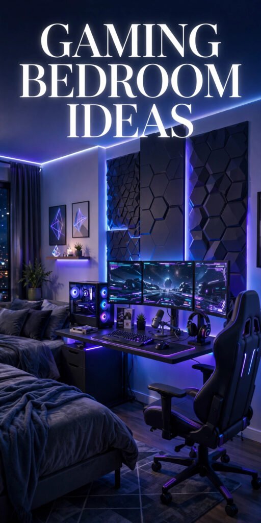
Most “gaming room” inspiration online is really just a photo of RGB strips slapped onto a normal bedroom. The ten rooms below are doing something more specific — each one solves a different problem: where the light comes from, how a desk fits into a sleeping space, what happens to a small room when a screen becomes the main light source. If you’re trying to figure out which direction actually fits your room, your budget, and how you sleep, this is built to help you land on one answer instead of ten favorites.
Quick Overview
| Style | Modern Gamer / Tech-Forward Loft |
|---|---|
| Best For | Gamers, streamers, WFH bedrooms |
| Budget | Low–High |
| Difficulty | Easy–Moderate, DIY-friendly |
| Maintenance Level | Low–Medium |
A Ceiling Built Entirely Out of Light
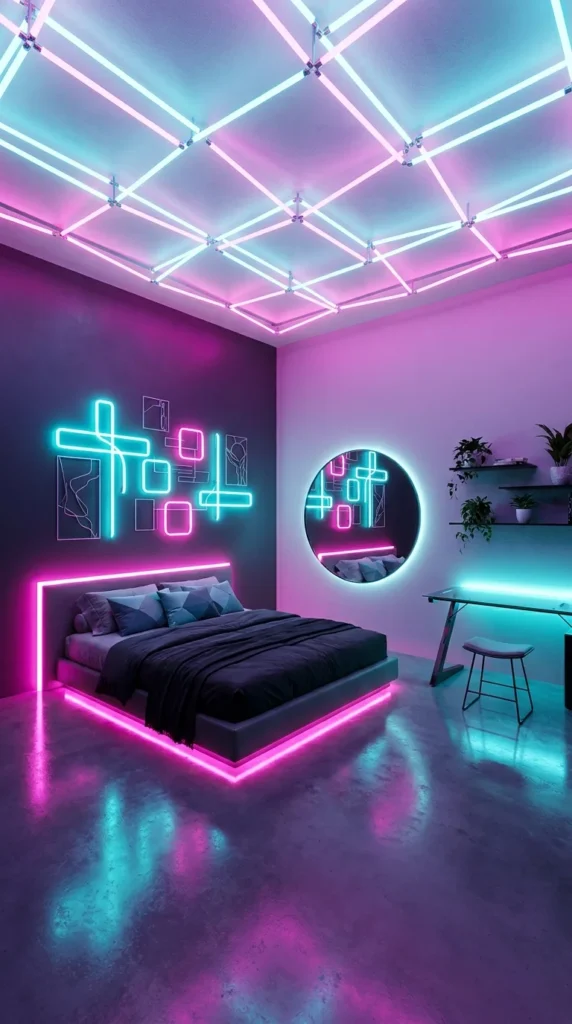
Most bedrooms treat the ceiling as the one surface nobody decorates. This one turns it into the entire design. A grid of exposed LED tubing crosses the ceiling in a diamond lattice, alternating pink and cyan, and it’s not a border or an accent strip — it’s the primary architectural feature of the room, more prominent than the bed itself.
That’s a proportion decision most rooms wouldn’t survive. A lighting grid this large, covering nearly the full ceiling plane, would normally overwhelm a bedroom sized for one person. It works here because everything below it — the charcoal platform bed, the plain grey walls, the unadorned concrete-look floor — stays deliberately quiet. The ceiling gets to be loud because nothing else in the room is competing for that attention. Swap the flooring for something patterned or add a busy headboard, and the whole hierarchy would likely collapse.
The rest of the room reinforces the same restraint: a neon-outlined wall graphic echoes the ceiling’s geometric line work, a circular mirror repeats the cyan-and-pink combination at a smaller scale, and pink LED strips trace the base of the bed frame so the color story touches the floor as well as the ceiling. That’s three separate touchpoints of the same two colors, which is what keeps a maximalist lighting choice from reading as chaotic — it reads as a system.
Reflective flooring does a lot of quiet work too. The glossy concrete throws the ceiling’s colors back upward, effectively doubling the light without adding a single extra fixture — a trick worth remembering if a full ceiling grid is out of budget but the polished-floor bounce isn’t.
One reason this room feels considered rather than random is that the grid pattern itself is symmetrical and evenly spaced — an irregular or clustered layout would read as clutter instead of architecture.
Where This Look Falls Apart
- Mixing more than two neon colors, which turns a system into visual noise
- Skipping the reflective flooring, which cuts the light output roughly in half
- Adding patterned bedding that competes with the ceiling for attention
- Running the grid at uneven spacing instead of a true, repeating lattice
Recommended Materials: Flexible LED neon tubing, powder-coated aluminum mounting channel, polished concrete-effect flooring, tempered glass desk surface, backlit acrylic wall panel, matte charcoal upholstery.
Main Colors: Aqua Cyan, Hot Pink Neon, Charcoal Grey, Cool White.
Best Lighting: This room is its own lighting plan — the ceiling grid supplies ambient light, so a secondary lamp is really only needed as a warm-toned backup for reading or winding down before sleep.
When a City Skyline Becomes the Headboard
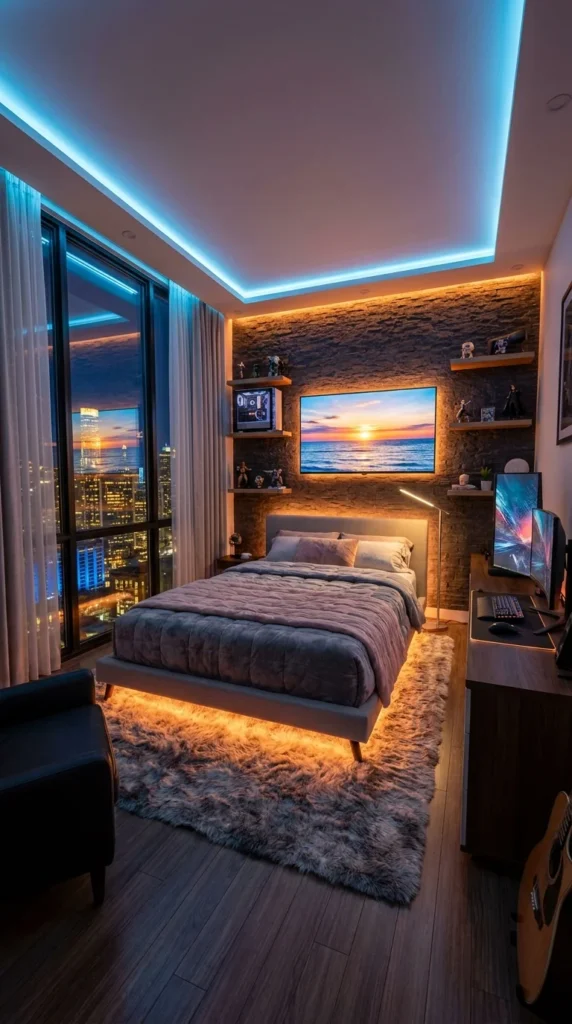
This room makes a decision most gaming setups avoid: it puts the window, not the desk, at the center of the composition. Floor-to-ceiling glass frames an entire skyline, and everything else — the bed, the dual-monitor desk, even the guitar propped in the corner — is arranged to keep that view uninterrupted.
The eye goes to the window first, and that’s not an accident of the photo. Sheer curtains soften the glass without blocking it, the ceiling cove lighting runs in a cool blue that echoes the evening sky outside, and the furniture stays low enough that nothing crosses the sightline. That’s a sightline decision as much as a lighting one — block that view with a tall dresser or a loud headboard and the room loses its whole reason for being arranged this way.
What makes the lighting genuinely interesting is the contrast: cool blue traces the ceiling perimeter while warm amber light glows underneath the bed frame and washes the stone-textured accent wall. Two temperatures, used deliberately, split the room into a “cool, alert” zone near the window and desk and a “warm, wind-down” zone around the bed — which matters more than it sounds like it should if this room is doing double duty as a place to play late and still fall asleep afterward. If you’re weighing a full accent-wall build against something simpler, this stylish TV wall guide breaks down lower-effort ways to get a similar anchored, screen-forward wall.
The acoustic guitar sitting in the corner is a small but telling detail — it signals this room isn’t purely a gaming cave, which is a useful reminder that a tech-forward bedroom doesn’t have to be single-purpose to still feel intentional.
Easy Ways to Get This Wrong
- Hanging heavy blackout drapes that erase the skyline view entirely
- Using only cool-toned lighting, which leaves the sleeping zone feeling clinical
- Positioning the desk so monitor glare competes directly with the window light
- Choosing a rug too thin to visually anchor the amber under-bed glow
Recommended Materials: Sheer voile curtains, dark walnut-look plank flooring, natural stone-texture accent panel, faux fur area rug, brushed metal floor lamp.
Main Colors: Warm Amber, Midnight Blue, Charcoal Grey, Soft Blush.
Best Lighting: Natural light from the full-height window should lead during the day; in the evening, lean on the warm under-bed glow rather than the cool ceiling cove once it’s close to bedtime.
The Built-In Bench That Doubles as a Bed
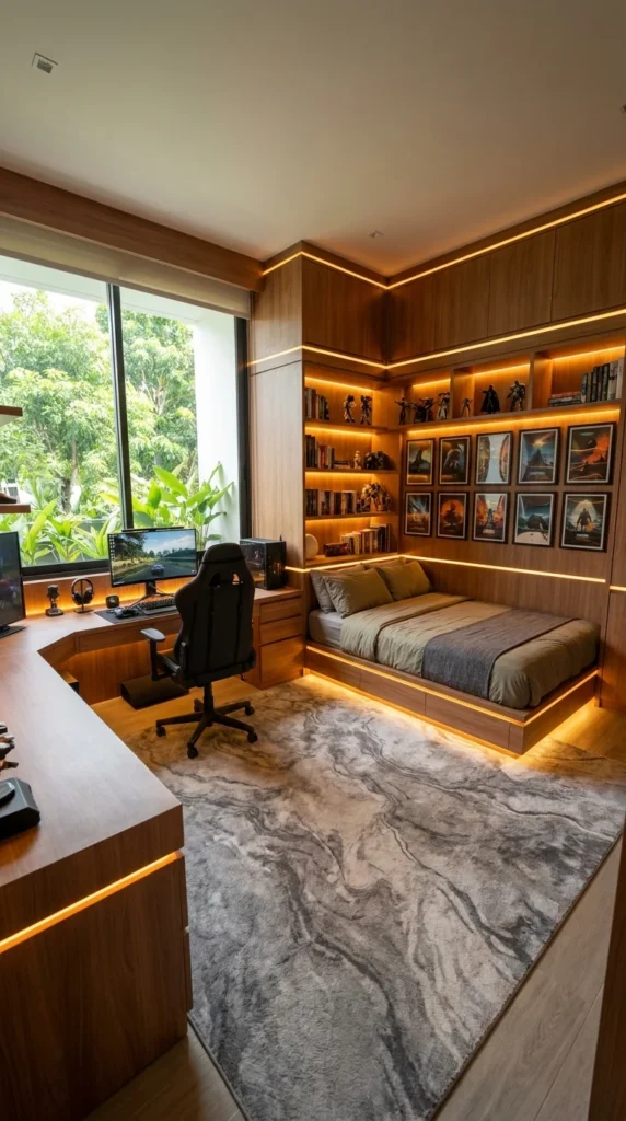
Instead of a freestanding bed frame, this room builds the sleeping surface directly into a wood platform that wraps the corner like a window seat. It’s a space-planning decision first and a style decision second — a built-in daybed frees up floor area that a standalone frame never could, which matters enormously in a room this size that also needs to fit a full L-shaped desk.
The warm honey-toned wood paneling runs continuously from the shelving into the bed platform, which is what keeps the built-in from reading as an afterthought bolted onto the wall. Backlighting tucked under every shelf edge means the wood grain catches light instead of sitting in shadow, and that’s a material behavior worth knowing: wood veneer under warm LED strip lighting tends to look richer and more saturated over time as the warm cast interacts with the natural tone, whereas the same veneer under cool white light can start to look flat and grey.
A tightly curated gallery of framed movie posters fills the shelving niches — not scattered across the wall, but boxed into the same modular grid as the books and collectible figures beside them. That containment is a big part of why a genuinely large collection of personal items doesn’t tip the room into clutter. Anyone weighing a similar corner-desk-and-storage combo might find useful cross-reference in this gaming setup breakdown, which compares several desk configurations for exactly this kind of dual-purpose room.
The large window and marbled grey rug keep the material palette from feeling like an all-wood box — the rug’s cool veining is really the only thing in the room breaking from the warm wood-and-amber scheme, and it does it just enough to keep things from feeling monotone.
What Trips People Up Recreating This
- Building shelving in a different wood tone than the platform bed, breaking the continuity.
- Leaving the poster/collectible display ungridded, which reads as clutter fast
- Skipping under-shelf lighting, which flattens the wood grain entirely
- Choosing a desk chair that doesn’t match the room’s warm-neutral palette
Recommended Materials: Engineered wood veneer paneling, warm-white LED strip, marbled wool-blend area rug, tempered glass desk top, framed archival prints.
Main Colors: Honey Oak, Warm Amber, Soft Taupe, Charcoal Accent.
Best Lighting: Lead with the large window during the day; the under-shelf LED strip should stay on a warm color temperature to keep the wood from looking washed out at night.
A Room That Uses Yellow Like an Architect’s Highlighter
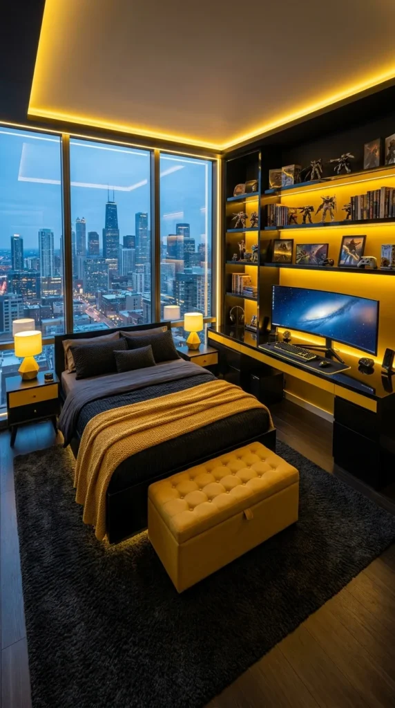
Here, a single accent color is used the way an architect uses a highlighter — to trace the exact geometry of the room rather than to decorate randomly. The yellow LED cove doesn’t just line the ceiling perimeter; it follows every step and角 corner of the ceiling’s actual shape, which means the light fixture is essentially a floor plan drawn in glowing color.
One reason this room feels resolved instead of themed is that the yellow shows up at least three separate times at three different scales: the full ceiling cove, the pair of geometric table lamps flanking the bed, and the tufted ottoman at the foot of the bed. Repetition at varying scales — large, medium, small — is what makes a bold accent color feel like a considered choice rather than a single loud gesture surrounded by silence.
Black furniture does the heavy lifting underneath that yellow. The lacquered nightstands, the low bed frame, and the built-in media shelving are all a deep matte or gloss black, which means the yellow reads as genuinely bright rather than washed out — pairing a saturated accent with a mid-tone neutral tends to dull both colors, so the black-and-yellow pairing here is doing more work than it looks like at first glance.
Worth the Investment? A Custom Cove vs. a Stick-On Strip
Building yellow light into an actual ceiling cove, the way this room does, costs more thanan adhesive LED strip and usually means hiring an electrician or a finish carpenter. It’s worth it if the light needs to look like part of the architecture rather than an add-on — the shadow gap a cove creates is what makes the light source disappear and just leave a glow. For a rental or a lower budget, a stick-on strip mounted along existing crown molding gets close to the same effect without the construction, though the light will look slightly more like a strip and less like a built-in feature.
Where This Trips People Up
- Pairing yellow with warm wood tones instead of black or charcoal, which mutes the contrast
- Using only one yellow element instead of repeating it at multiple scales
- Choosing a cool-white monitor bias light that clashes with the warm yellow cast
- Under-lighting the collectible shelf, leaving it dark against the glowing ceiling
Recommended Materials: Black lacquered wood casegoods, mustard velvet upholstery, curved ultrawide monitor, faux fur area rug, walnut display shelving.
Main Colors: Golden Mustard Yellow, Jet Black, Warm Walnut Brown.
Best Lighting: The ceiling cove should be the dominant light source after dark; keep any secondary lamps in the same yellow-warm family rather than introducing a cooler white.
An Attic Ceiling That Refuses to Be a Problem
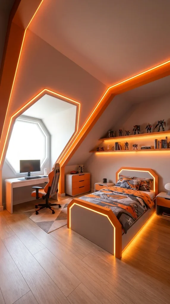
Sloped ceilings usually get treated as a limitation to work around. This room treats the slope as the entire design opportunity: a continuous line of orange LED trim follows every angle of the roofline exactly, which means the lighting is essentially tracing the architecture instead of ignoring it.
The proportion logic here is specific to attic spaces. The angular, hexagon-topped headboard mirrors the pitch of the ceiling almost exactly — the bed’s shape is a smaller echo of the room’s shape, which is a scale relationship that only makes sense in a room with this particular roofline. In a standard rectangular bedroom, an angular headboard like this would look arbitrary; here, it looks load-bearing, like it belongs to the architecture rather than sitting inside it.
That same logic extends to the window: an octagonal shape set into the sloped wall, outlined in the same orange trim, repeats the geometric language a third time. Anyone dealing with a similarly awkward roofline might find this attic bedroom slope guide useful for other ways to turn the angle into a feature instead of a compromise.
Orange is a demanding color to commit to at this scale, and it works here specifically because the walls and floor stay a soft neutral — light oak flooring and off-white paneling give the orange trim nothing to compete with. Drop in a patterned rug or a second bold color and the geometric clarity that makes this room work would likely start to blur.
Common Mistakes to Avoid
- Running LED trim along only some of the ceiling angles instead of the full roofline
- Choosing a rectangular headboard that ignores the room’s actual geometry
- Adding a second saturated accent color that competes with the orange
- Skipping trim at the window, which breaks the repeated geometric pattern
Recommended Materials: Light oak laminate flooring, painted MDF ceiling paneling, flexible orange LED channel, angled glazing unit, matte-finish gaming chair.
Main Colors: Tangerine Orange, Warm Oak, Soft Grey-White.
Best Lighting: Daylight through the octagonal window should be primary during the day; the orange trim carries the room after dark and works best kept as the only accent light source in the space.
A Painted Map Standing In for a Headboard
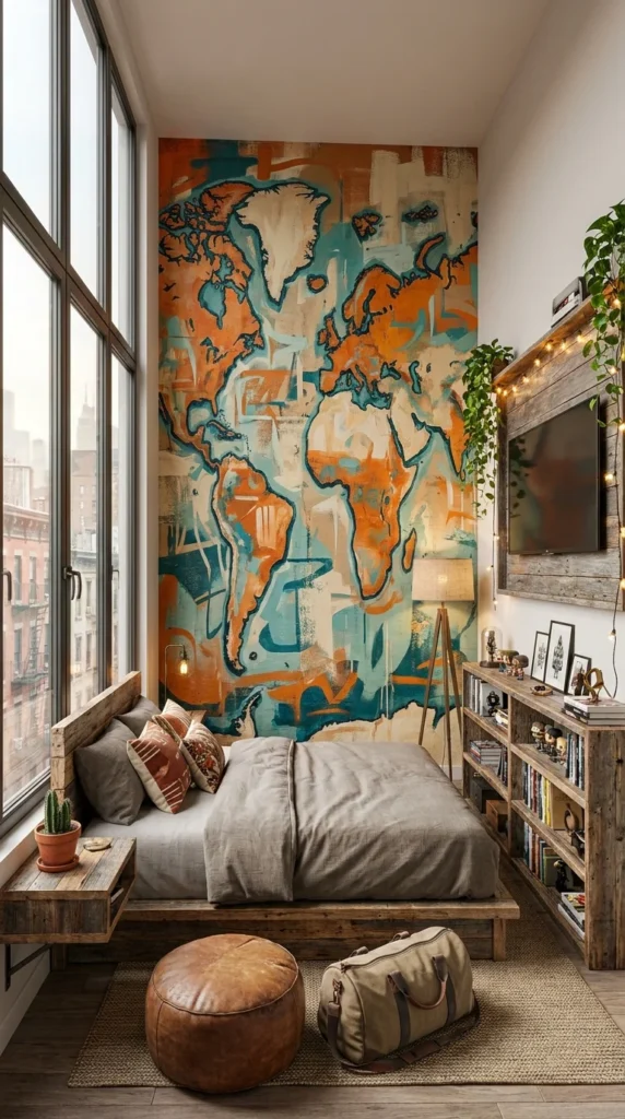
There’s no traditional headboard in this room at all — instead, a floor-to-ceiling world map mural does that job, anchoring the bed visually without a single piece of furniture behind it. That’s a genuinely different way to solve the “what goes behind the bed” question, and it changes where your eye lands the instant you walk in: straight to the mural, well before the bed itself registers.
The mural’s rust-orange and dusty-teal palette is doing double duty as both art and color scheme. Instead of picking bedding, rugs, and furniture to match a paint color, this room picked them to match specific colors already present in the artwork — the warm grey bedding pulls from the map’s cream base, and the leather pouf and woven rug echo its rust tones. Building a palette backward from a piece of art, rather than choosing art to match a palette, tends to make the whole room feel more cohesive because every color choice traces back to one source.
Reclaimed, visibly weathered wood shows up in the low platform bed, the floating nightstand, and the open bookshelf — a texture that would look incomplete without the travel-themed props scattered through the room, from the canvas duffel bag to the leather pouf. For more ways to build an entire wall around a single striking graphic instead of hanging several smaller pieces, this mural roundup covers several other approaches worth comparing side by side.
A small potted cactus sits at bedside — low-maintenance by nature, but worth noting if you’re planning a similar windowside plant shelf: succulents in this kind of bright, direct window light need infrequent watering but do need the drainage checked so the wood surfaces underneath don’t take on moisture damage over time.
Common Mistakes
- Choosing bedding in a color that doesn’t actually appear in the mural
- Hanging the mural off-center relative to the bed, breaking the anchor effect
- Mixing reclaimed wood tones that clash rather than complement each other
- Overcrowding the mural wall with additional art, which competes with the focal point
Recommended Materials: Large-format canvas or vinyl mural print, reclaimed barnwood furniture, jute-blend area rug, leather pouf, canvas travel duffel.
Main Colors: Rust Orange, Dusty Teal, Warm Cream, Weathered Walnut.
Best Lighting: String lights and the large window should stay the primary sources — anything brighter or cooler risks washing out the mural’s intentionally muted, weathered palette.
One Poster Doing the Work of an Accent Wall
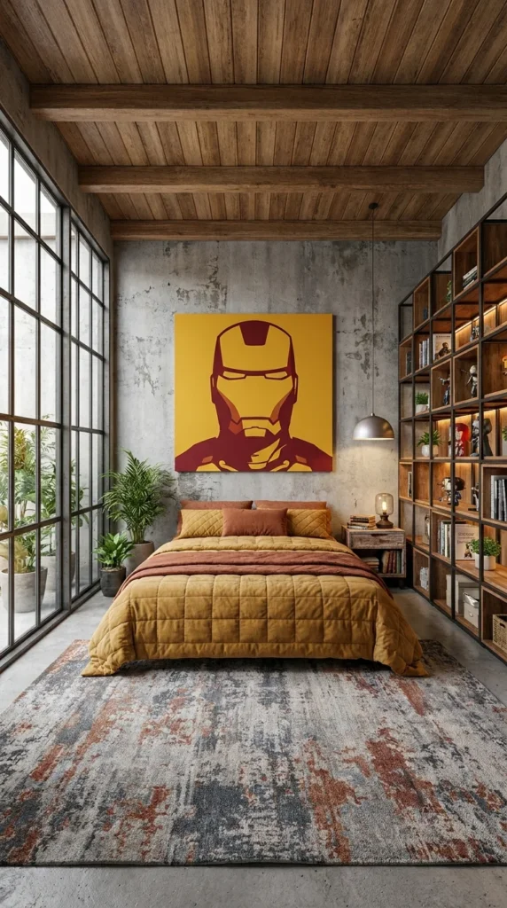
A single oversized graphic portrait, rendered in flat mustard and rust, hangs against raw polished concrete — and it’s doing the job an entire accent wall usually does, on its own. That’s a scale decision worth studying: the print is large enough relative to the wall that it doesn’t read as “art hung on a wall” ;it reads as the wall’s actual feature, the same way a fireplace or a window would be.
Concrete is an unforgiving material to build a bedroom around, and it behaves differently over time than most bedroom finishes — it stays cool to the touch, picks up ambient humidity more than drywall, and shows its aggregate texture more visibly under warm, low-angle light like the pendant fixture here. That behavior is exactly why the room leans warm everywhere else: mustard-and-rust bedding, honey-toned wood shelving, and a rust-and-grey rug all push back against the concrete’s inherent coolness so the room doesn’t end up feeling like an unfinished basement.
Black iron shelving, left open rather than boxed in, holds books and collectible figures against the concrete without adding another dominant material to the mix — open shelving reads as lighter visually than closed cabinetry, which matters when the walls themselves are this heavy and textural. If you’re drawn to the idea of a single large graphic doing the work of a whole feature wall, this above-bed art guide walks through several scale and placement approaches that apply directly here.
Floor-to-ceiling steel-framed windows and a run of potted plants along the glass mean this room does need a maintenance conversation: plants at this scale, especially against south- or west-facing glass, need a real watering schedule, and unsealed or lightly sealed concrete floors benefit from an occasional sealant refresh to resist staining.
Where This Look Falls Apart
- Choosing a print too small to function as the wall’s real focal point
- Pairing concrete with cool-toned textiles instead of warm ones, doubling down on coolness
- Boxing the shelving in solid panels instead of leaving it open against the concrete
- Neglecting plant care near the steel windows, leading to leggy or dying greenery
Recommended Materials: Polished concrete wall finish, exposed wood ceiling beams, mustard velvet quilted bedding, black iron open shelving, blown-glass pendant light.
Main Colors: Mustard Gold, Rust Red, Concrete Grey, Walnut Brown.
Best Lighting: The single pendant should stay warm-toned to counteract the concrete’s coolness; rely on the steel-framed windows for daytime light rather than adding competing fixtures.
A Room Split Into Two Glowing Zones
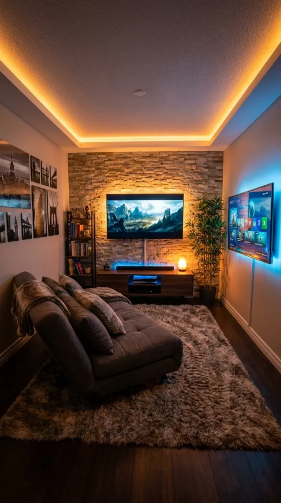
This isn’t a bedroom in the traditional sense — it’s a media lounge, but it earns its place here because it solves a problem plenty of gaming bedrooms run into: what happens when you want a movie-watching zone and a gaming zone in the same footprint without one canceling the other out. The answer, in this room, is two separate lighting temperatures marking two separate purposes.
A warm amber cove traces the ceiling above the stone-textured media wall, where a large screen plays ambient scenery, while a second, cooler blue backlight glows behind a mounted gaming display on the opposite wall. The eye can tell which zone is “on” simply from the color of light spilling off each wall, which is a genuinely useful bit of sightline logic if a room needs to function as two different spaces depending on the hour.
What keeps the two zones from feeling disconnected is a shared warm-neutral base running underneath both: the plush charcoal sectional, the deep faux fur rug, and the natural stone veneer all repeat across the room regardless of which accent light is active. One reason this dual-zone approach reads as one room and not two mismatched ones is that shared neutral base — strip it out and each zone would likely start to feel like it belongs to a different apartment entirely.
A small gallery wall of black-and-white city photography sits opposite the stone feature wall, adding a quieter, non-glowing element that gives the eye somewhere to rest between the two brighter zones.
Common Mistakes
- Using the same light color for both zones, erasing the “which mode is this” cue
- Skipping a shared neutral material, making the two zones feel unrelated
- Placing seating that only faces one screen, undermining the dual-purpose layout
- Choosing a rug too small to visually unify both halves of the room
Recommended Materials: Natural stone veneer panel, warm and cool LED cove channels, faux fur area rug, velvet sectional upholstery, dark walnut-look flooring.
Main Colors: Warm Amber, Cool Blue, Stone Beige, Charcoal Grey.
Best Lighting: Alternate between the two coves depending on activity — amber for movies and wind-down, blue for active gaming sessions — rather than running both simultaneously.
A Shelving Wall Built to Glow, Not Just Store
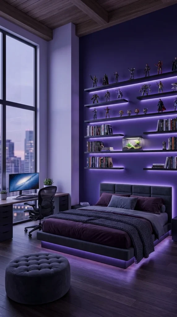
Most collectible displays are lit as an afterthought — a single spotlight, maybe, aimed at a shelf. This wall flips that priority entirely: the shelving itself is the room’s primary light source, with a deep purple LED backlight running behind every tier so the entire wall glows rather than just the objects sitting on it.
That’s a scale and proportion call worth breaking down. The shelving runs floor-to-ceiling and nearly wall-to-wall, which is a genuinely large amount of visual weight to put opposite a bed — in a smaller room, or with less consistent styling, a wall this dominant could easily overwhelm the sleeping area. It works here because the bed’s own headboard is upholstered in a deep, saturated plum that’s close in tone to the purple backlight, so the two large elements in the room are working from the same color family instead of competing for dominance.
The collection itself is arranged with real intention — figures grouped roughly by scale on the upper shelves, books and a small planted terrarium taking the lower ones — which keeps a genuinely large number of individual objects from reading as clutter. Anyone drawn to this saturated purple mood lighting might want to compare it against this purple bedroom roundup, which shows the same color family used in several very different lighting setups.
The small planted terrarium and aquarium-style tank tucked into the shelving do come with a maintenance commitment most display walls don’t: aquatic and terrarium ecosystems need a real cleaning and feeding schedule, and it’s worth deciding whether that upkeep is realistic before building an entire shelving system around one.
What Trips People Up Recreating This
- Backlighting only some shelves instead of the full run, breaking the “glowing wall” effect
- Choosing bedding or headboard fabric in a clashing rather than complementary purple tone
- Overcrowding shelves without grouping by scale or type, undercutting the display
- Adding a terrarium or aquarium without committing to its actual maintenance schedule
Recommended Materials: Black powder-coated steel shelving, purple LED backlight strip, channel-tufted velvet headboard, planted terrarium, walnut writing desk.
Main Colors: Deep Plum, Amethyst Purple, Charcoal Black, Warm Walnut.
Best Lighting: The purple backlight should stay the dominant source in the evening; daylight from the adjacent window is the only other input this room needs.
A Wall of Light Standing in for a Window
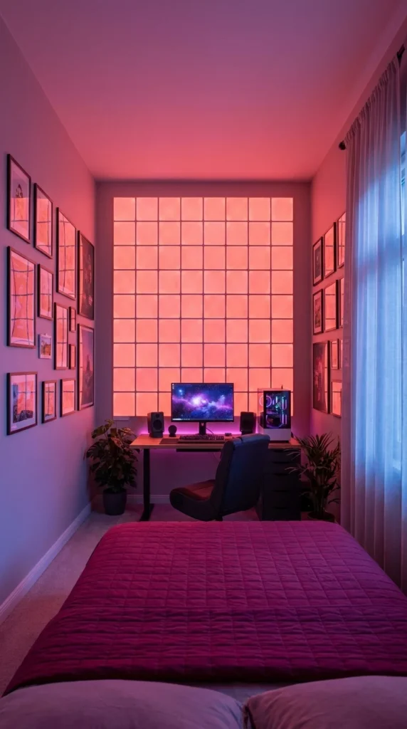
In a genuinely small footprint, this room skips the usual accent-wall options entirely and installs a grid of backlit panels instead — dozens of individually glowing coral-pink squares that function less like decor and more like a second light source built into the wall itself.
The sightline math here is simple but effective: in a room this compact, there’s nowhere else for the eye to go. The panel wall sits directly behind the desk, at the exact spot a window would normally be, and its scale — floor to well above head height — means it reads as an architectural feature rather than a lit-up poster. A grid this large is really the only thing capable of holding visual weight in a room this size without a second competing focal point.
Small-space design usually means editing hard, and this room does: the desk is minimal, the bed is positioned to leave the panel wall unobstructed, and the framed photography on the side walls is hung in tight, symmetrical clusters rather than scattered loosely. That restraint elsewhere is what allows the glowing wall to stay the single loudest element in the room. For more strategies built specifically around tight bedroom footprints, this minimalist bedroom guide covers several other small-space approaches worth weighing against a full lighting-panel wall.
Magenta quilted bedding picks up the panel wall’s coral-pink undertone without matching it exactly, which keeps the bedding from looking like it’s trying to blend into the wall — a near-match here would likely flatten the contrast that makes the panel wall pop in the first place.
Common Mistakes
- Installing panel lighting in a small room without editing surrounding clutter first
- Choosing bedding that matches the panel color too closely, flattening contrast
- Hanging gallery photos in loose, uneven spacing that competes with the grid’s precision
- Underestimating the desk footprint needed once the panel wall is the fixed anchor
Recommended Materials: Modular backlit LED panel wall, quilted velvet-blend bedding, compact desk unit, framed photo prints, sheer window curtain.
Main Colors: Coral Pink, Magenta, Soft Blush, Charcoal Accent.
Best Lighting: The panel wall is the primary light source by design; keep any secondary lamp warm and low so it doesn’t compete with the wall’s saturated glow.
Sleeping Well in a Room Built for Screens
A gaming bedroom lives a double life — a workstation by evening, a bedroom by night — and that split needs a plan, not an afterthought.
- Put ceiling coves, cove lights, and monitor bias lighting on separate smart dimmers or timers, so the room can shift from “gaming” to “sleeping” brightness without manually flipping several switches.
- Keep the sleeping zone at least a few feet from the desk’s electronics and cabling, since bedside clutter and cord tangles are one of the fastest ways these rooms stop looking intentional.
- Choose blackout-capable curtains even in rooms with statement window views, so daylight can be controlled independently of the accent lighting.
- Favor warm-toned LED (2700K–3000K) for any light that stays on within an hour of bedtime, and save cooler blues and whites for active gaming hours.
Who Should Choose This Style?
- Best for gamers and streamers who want their setup to double as a genuinely finished-looking bedroom, not a desk shoved into a corner
- Best for renters and small-space dwellers, since LED strip lighting and panel walls are largely removable and scale down to smaller footprints.
- Best for anyone spending long stretches of time working or playing from bed, since several of these rooms are built around that dual use
- Not ideal for households with shared walls or light-sensitive sleepers, since several of these looks rely on always-visible ambient lighting that needs deliberate dimming at night
Budget Summary
| Budget | Expectation |
|---|---|
| Low | Adhesive LED strip lighting, framed poster prints, a patterned area rug, blackout curtain panels |
| Medium | Painted or wallpapered accent wall, floating shelves with built-in lighting, an upgraded ergonomic desk and chair |
| Premium | Custom-built ceiling coves or ceiling-grid lighting, floor-to-ceiling backlit panel walls, built-in platform bed and shelving carpentry |
Frequently Asked Questions
Does RGB or neon lighting make it harder to fall asleep? It can, depending on the color and timing. Cooler blue and white tones are more likely to interfere with winding down close to bedtime, while warm amber or dim red tones tend to be gentler. The Sleep Foundation’s overview of blue light is a useful starting point if screen and lighting exposure before bed is a genuine concern.
What’s the cheapest way to start a gaming bedroom makeover? Adhesive LED strip lighting along one wall or the ceiling perimeter, plus a large framed print, typically delivers the biggest visual change for the smallest cost — both are covered in the Low tier of the budget table above.
Can renters recreate any of these looks without damaging walls? Yes, several of the rooms above rely almost entirely on adhesive lighting, removable wallpaper or mural panels, freestanding shelving, and rugs — none of which require permanent alteration to the space.
How much desk space does a bedroom gaming setup actually need? It depends more on monitor count than room size — a single-monitor setup fits comfortably into a corner nook, while dual- or ultrawide-monitor setups, like the ones shown above, generally need at least a full wall segment to avoid feeling cramped.
What’s the easiest way to keep a gaming bedroom from looking cluttered? Grouping cables, controllers, and collectibles into defined zones — a shelf, a drawer, a cable tray under the desk — does more for a tidy look than any single piece of furniture, based on how consistently the more organized rooms above use contained storage.
About the Author
Aesthetic Life Team covers real interior design directions across bedrooms, living spaces, and small-footprint rooms, with a focus on ideas readers can actually adapt to their own homes and budgets.
Conclusion
The rooms above aren’t ten versions of the same neon bedroom — they’re ten different answers to the same question of how light, color, and furniture can turn a bedroom into a space built around screens without it feeling like an afterthought. Some lean on architecture, like the sloped attic ceiling or the full lighting grid; others lean on a single bold gesture, like the world map mural or the oversized poster. Picking one comes down to how much of your room’s existing structure you’re willing to work with, and how much light you actually want glowing in a space you also need to sleep in.
Explore More
You may also enjoy:

