
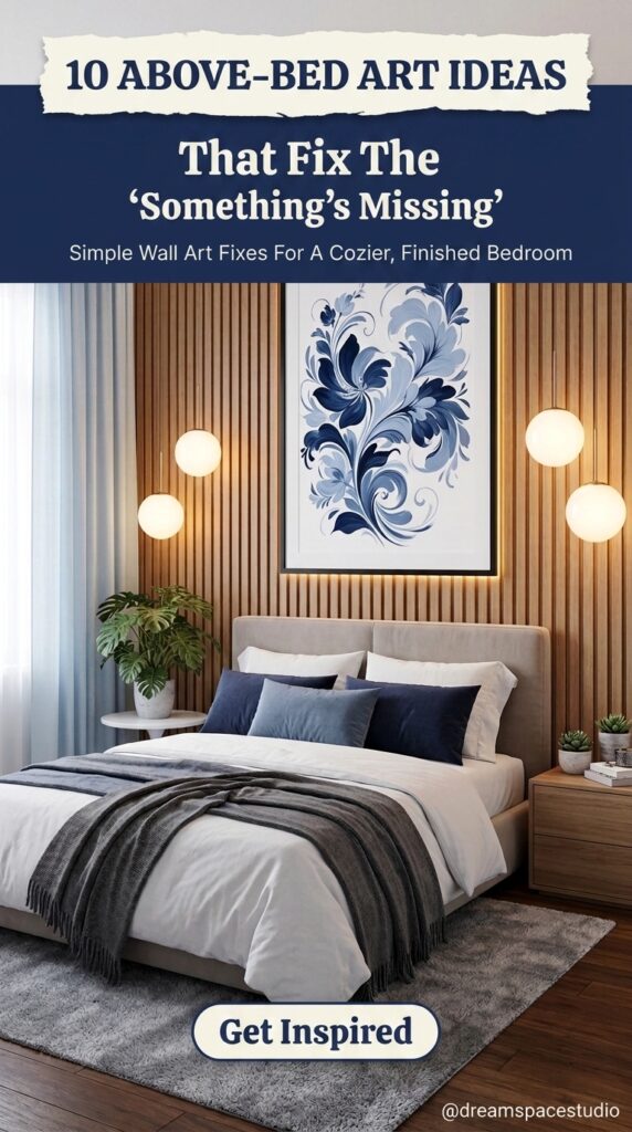
You painted the walls. You picked out the perfect duvet. You even found a rug that ties the whole room together. And yet, standing at the doorway, something still feels unfinished — and nine times out of ten, that something is the blank wall staring back from above the headboard.
This is one of the most common frustrations in bedroom design, and it rarely gets talked about directly. A bed can be styled perfectly and still feel like a hotel room rather than a home, simply because the wall above it was treated as an afterthought. The space above a headboard carries more visual weight than most people realize — it’s usually the first thing your eye catches when you walk in.
The ten setups below aren’t about copying a Pinterest board. They’re about understanding why certain choices above a bed actually work — scale, spacing, contrast, and a few honest tradeoffs most design content skips entirely.
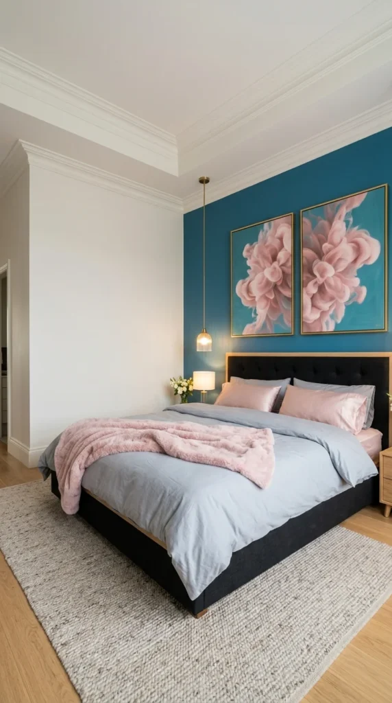
1. Two Panels, One Message: Why This Pairing Works Harder Than a Single Print
This bedroom leans on a diptych – two matching pink floral panels split across a deep teal accent wall. That’s the design choice worth noticing first: a single large canvas would have flattened against all that saturated colour, but splitting the artwork into two frames creates a seam down the middle that gives the eye somewhere to rest. The teal wall isn’t just a backdrop here. It’s doing the actual work of making the soft pink blooms feel intentional rather than decorative filler.
The gold frame edges pick up the brass pendant light hanging beside the bed, which ties the metal tones together without anyone having to say so out loud. Scale matters too — the artwork stretches almost the full width of the headboard, so it never looks like it’s floating alone on a wall that size. That is the whole idea.
Pro Tip: When a wall colour is this bold, matching metal tones between the frame and nearby fixtures does more visual work than adding a third pattern.
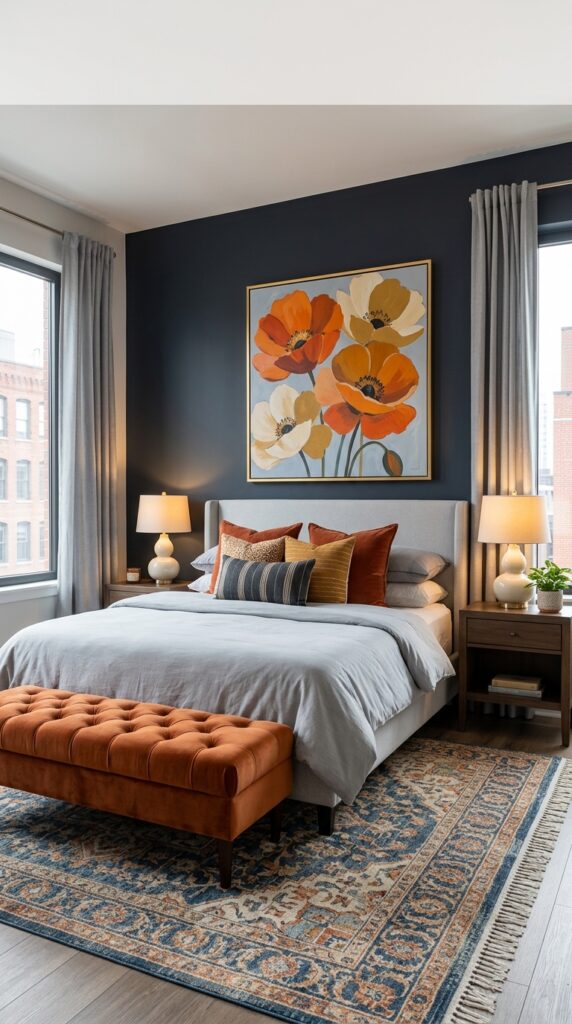
2. A Bold Wall Like This Doesn’t Leave Much Room for Error
Pick the wrong artwork against a charcoal-navy wall this saturated, and it either disappears into the darkness or fights with everything else in the room. This poppy print manages neither, mostly because it repeats colours already sitting elsewhere on the bed — the rust velvet pillows, the mustard stripe, even the terracotta bench at the foot of the frame. Colour echo is the principle doing the heavy lifting here: the artwork isn’t introducing a new palette; it’s confirming one that already exists.
What’s easy to overlook is the gold frame edge, which is barely a shade different from the lamp bases flanking the headboard. Skip that detail and the whole wall reads as flatter than it actually is. The frame earns its size, too — smaller artwork here would have got swallowed by the dark backdrop entirely.
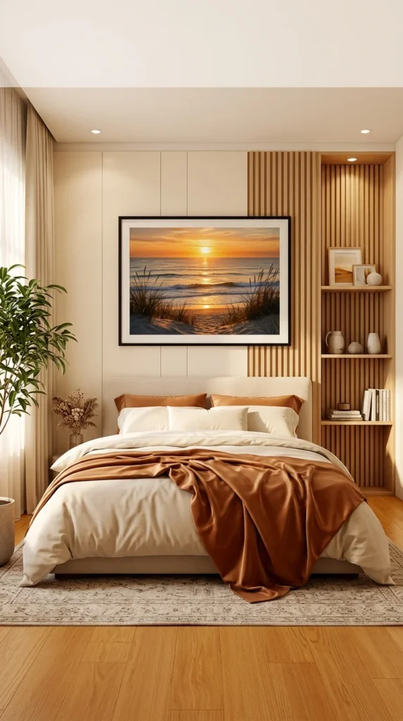
3. When a Photograph Has to Compete With This Much Wood Texture
A black frame is a risky call in a room built almost entirely on warm tones – the fluted wood panelling, the honey-toned floor, the caramel throw pulled across the bed. Black can read cold or out of place against that much amber. Here it doesn’t, mostly because the sunset photograph inside the frame carries the exact same orange-gold range as everything surrounding it, so the frame’s edge becomes a quiet border rather than a clash.
The negative space built into this wall is doing more than people usually notice. The artwork sits on its own flat panel section, separate from the vertical wood slats beside it, which stops the whole wall from turning into visual noise. Move that same photograph six inches to the right, onto the fluted texture, and it would fight the wood grain instead of resting against it. Placement here isn’t decorative. It’s the reason the piece works at all.
Pro Tip: A busy accent wall (wood slats, brick, panelling) often needs a flat, uninterrupted section set aside specifically for artwork — otherwise the two textures cancel each other out.
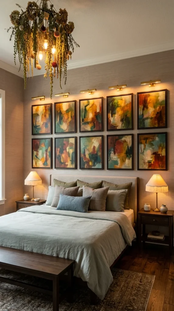
4. Ten Frames, One Grid: This Setup Is Not for the Faint of Heart
Honestly, a ten-panel gallery grid like this is not something I’d recommend to someone who wants a quick above-bed fix. Getting ten frames level, evenly spaced, and lit individually takes real planning — this is a commitment, not a weekend project. But when it’s pulled off correctly, as it is here, the payoff is a wall that feels curated rather than decorated.
Each frame gets its own dedicated picture light, mounted directly above the row, and that’s the detail actually holding this composition together. Without those individual lights, the wall would flatten into one large, undefined block of colour once the room dims. With them, each panel stays legible on its own even at night. The abstract paintings themselves share a warm rust-and-ochre palette, which is what allows ten separate pieces to read as one intentional wall instead of ten random purchases.
Pro Tip: A grid layout only holds together visually if the spacing between every frame is identical — inconsistent gaps are usually the first thing a guest notices, even if they can’t say why.
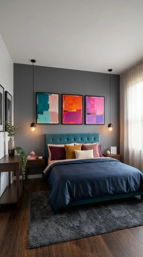
5. Three Panels of Color Blocking Against a Wall That Knows to Stay Quiet
This one is simpler to explain than the others. Three abstract paintings, each built from flat blocks of colour – teal and blush, orange and magenta, pink and purple – hung side by side above a teal velvet headboard. That’s the whole setup. The charcoal-grey wall behind them isn’t neutral by accident; a lighter wall would have pulled attention away from the artwork instead of framing it.
What makes this work is restraint elsewhere. The pillows pick up burgundy, mustard, and blush from the paintings, but nothing on the bed tries to outshine the wall art itself. Two bare-bulb pendant lights hang on either side of the trio, low enough to sit almost level with the frames, which keeps the eye moving horizontally instead of getting stuck in one spot.
And honestly, that is the right call — three panels, one consistent frame colour, done.
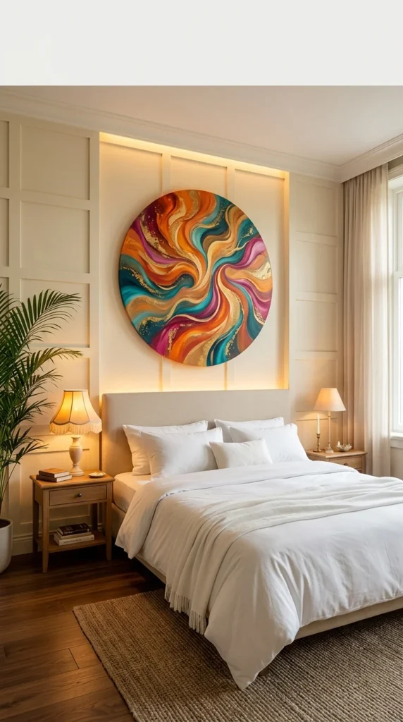
6. A Circular Canvas Surrounded by Built-In Light Is a Bigger Project Than It Looks
Before anything else, a fair warning: that soft glow outlining the wall panel isn’t a lamp trick or a filter — it’s LED cove lighting recessed into custom millwork, and it’s not something you’re adding to a rental wall over a weekend. This is the kind of detail that looks effortless in photos and actually involves an electrician and a carpenter in real life.
That said, the payoff is real. The circular canvas breaks the rectangular monotony every bedroom on this list has leant on so far, and its swirling teal-orange-magenta palette gets a second life from the backlighting bouncing off the cream millwork around it. A round shape against all these straight panel lines also does something subtle: it softens a room that would otherwise feel fairly rigid and architectural.
Pro Tip: If built-in backlighting isn’t realistic for your space, a simple LED picture light mounted above a round canvas gets you 70% of this effect for a fraction of the effort.
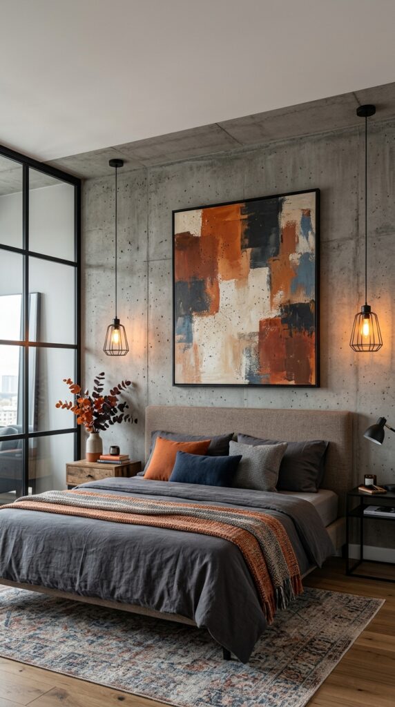
7. Raw Concrete Doesn’t Ask for Delicate Art, and This Painting Understands That
Unlike the backlit millwork in the previous room, this wall does the opposite — it leans fully into an unfinished, industrial surface, exposed concrete with visible speckling and texture left completely raw. A soft watercolour or pastel piece would have looked out of place here. Instead, the artwork is a blocky abstract composition in rust, charcoal, and cream, painted with the same rough, unpolished energy as the wall behind it.
The temperature contrast matters more than it seems. Concrete alone reads cold, almost unfinished on purpose, but the burnt orange and terracotta tones inside the painting warm the whole corner without needing a single soft textile to do it. Two black wire-cage pendants flank the frame at matching heights, echoing the black window mullions across the room – a small connection, but one that keeps the industrial materials feeling coordinated rather than accidental.
Pro Tip: Warm-toned artwork is one of the most effective ways to soften a concrete or exposed-brick wall without covering up the texture that made you want it in the first place.

8. Circles Within Circles: A Celestial Print That Plays It Safe (In a Good Way)
Overlapping black and gold spheres, styled like planets or nebulas caught mid-orbit, sit inside a plain black frame against cream-panelled walls. It’s a quieter choice than the industrial concrete piece or the swirling resin circle seen earlier in this list—there’s no texture play, no built-in lighting, just a graphic print doing one job well.
That job is tying the room’s metallic accents together. The gold tones inside the artwork match the brass wall sconce beside the bed almost exactly, which is the kind of coordination that reads as deliberate even though it’s easy to miss on a first glance. The channel-tufted black headboard grounds the whole wall below it, giving the pale artwork something solid to sit above instead of floating against more cream panelling.
One regret prevention: Circular or planetary motifs like this tend to read as trendy rather than timeless — worth considering if you want artwork that still feels right in five years.
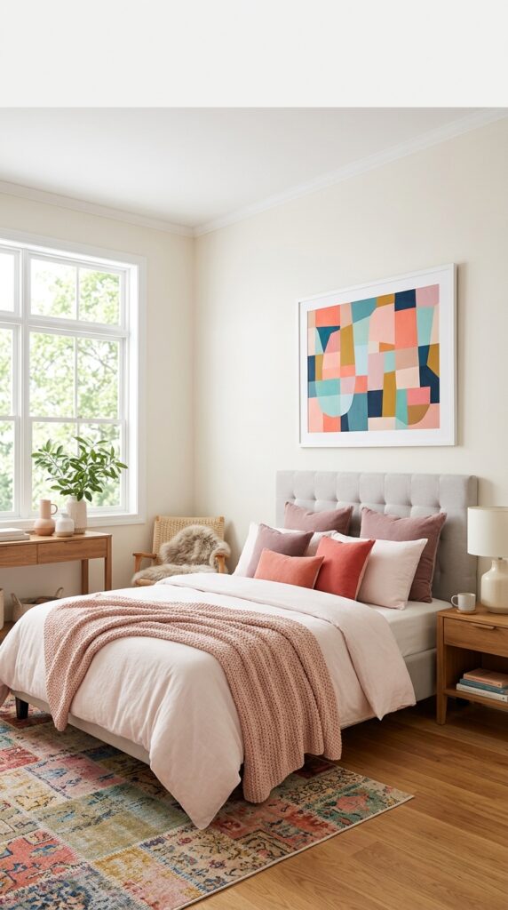
9. This Artwork Isn’t Actually Centered Over the Bed — and That’s Worth Talking About
Look closely, and the geometric print here sits noticeably off-centre from the headboard, shifted toward the window rather than dead-centre above the pillows. That’s a deliberate call, not a styling accident, and it’s the kind of choice most above-bed guides never mention. The room’s window and wall proportions pulled the balance point away from the bed itself, so the artwork was hung to centre on the wall, not the furniture beneath it.
It’s a small tension, honestly, and not every eye will catch it immediately. But once you notice it, it’s hard to unsee. The white frame keeps things simple, letting the abstract colour-blocked shapes — dusty rose, teal, mustard, and navy — do the talking, and those same tones repeat almost exactly in the layered throw pillows below. Where the earlier concrete-wall room solved warmth with texture, this one gets there entirely through colour repetition.
Pro Tip: When a wall isn’t symmetrical to the bed, centre your art on the wall’s visual balance point instead of forcing it directly above the headboard — it often looks more intentional.
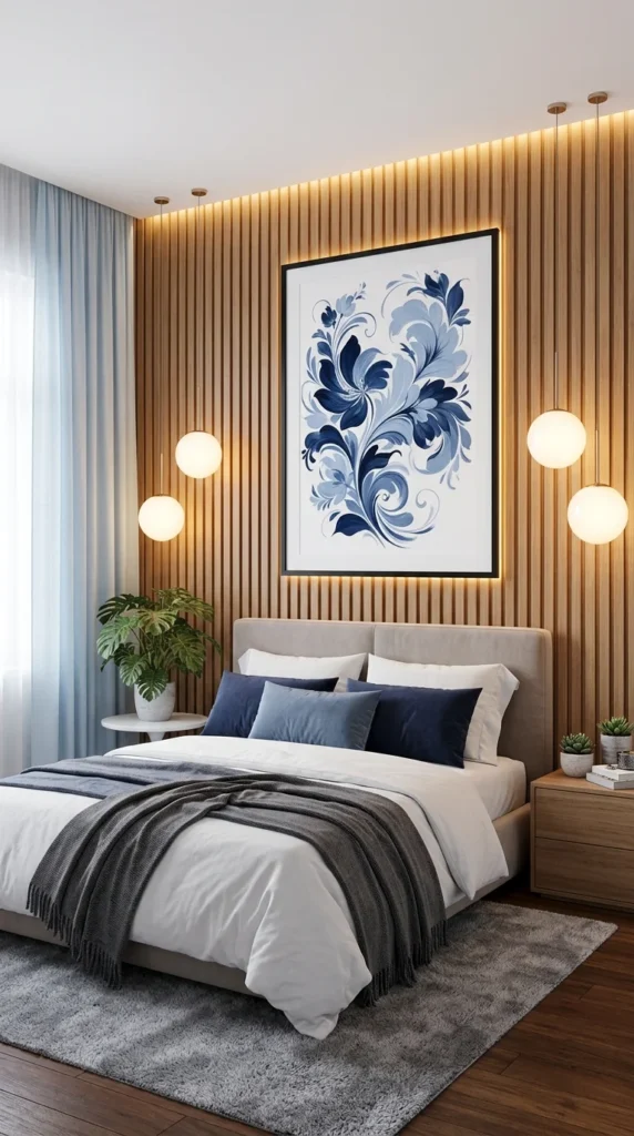
10. Backlit Wood Slats Again — But This Time the Artwork Earns a Softer Reaction
Personally, I’d call this the calmest room on the whole list, and after nine bedrooms of bold colour and heavy texture, that restraint feels earned rather than boring. The wall treatment echoes the fluted panelling from earlier in this series, but here it wraps the print in a thin backlit edge instead of separating it onto its own flat panel — a different solution to a similar problem.
The artwork itself is a navy-and-powder-blue floral illustration, ornate and symmetrical, hung inside a plain black frame that keeps the busy pattern from tipping into fussy. Four glass globe pendants flank the piece in a loose diamond formation, and that’s the detail worth noticing: the lights aren’t decorative extras; they’re doing the job a picture light would normally do, just spread wider and softer.
Editorial signature: The artwork’s blue tones don’t match the bedding by accident — they match the pendant light’s warm-white glow just enough to keep the whole wall from feeling cool.
Final Thoughts: There’s No Single “Right” Way to Fill This Wall
Looking back across all ten rooms, the one thing that never changes is intention. Whether the wall above the bed holds a single sunset photograph or a ten-panel gallery grid, the pieces that worked were the ones that responded to something already in the room — a colour already on the pillows, a texture already on the wall, or a light fixture already hanging nearby. None of them were chosen in isolation.
What’s worth remembering is that scale and placement usually matter more than the artwork itself. A beautiful print hung too small, too high, or dead centre on an asymmetrical wall will always look slightly off, no matter how much it cost. And a modest, affordable piece – sized correctly and lit thoughtfully – will consistently outperform an expensive one that ignores the room around it.
If there’s one habit worth borrowing from every example here, it’s this: before buying anything, stand at the doorway and look at the wall the way a guest would. That single vantage point tends to reveal more than any style guide ever could.


2 Responses