
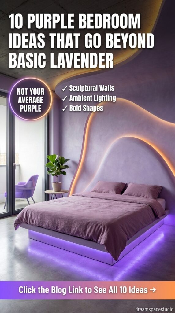
Purple has a reputation problem—too teenage, too try-hard, and too easy to get wrong. These ten bedrooms argue the opposite. From a deep aubergine wall dressed in gold-trimmed millwork to a single sculptural bed frame that looks molded rather than built, purple turns out to be one of the most versatile colors in a bedroom, provided you know which version of it you’re actually going for. Here’s what separates a purple bedroom that reads as sophisticated from one that reads as a phase.
Quick Overview
| Style | Purple / Jewel-Tone Bedroom |
|---|---|
| Best For | Primary bedrooms, statement guest rooms, city apartments |
| Budget | Low–High (scalable from paint to full custom millwork) |
| Difficulty | Easy to advanced, depending on the direction |
| Maintenance Level | Low–Medium (mostly paint and fabric care) |
Velvet, Crystal, and a Wall That Doesn’t Hold Back
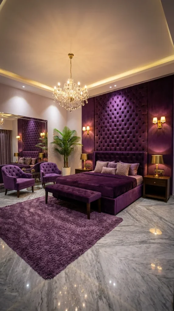
A floor-to-ceiling tufted velvet wall in deep eggplant purple, lit by a full crystal chandelier and doubled by a mirrored wall across the room, is about as maximalist as a purple bedroom gets—and it commits to that fully rather than softening any part of it.
This is purple played as pure old-world glamour. The tufted wall isn’t a headboard accent—it’s the room’s entire architectural backdrop, running the full height and width behind the bed. Pairing that kind of upholstered wall with a crystal chandelier and polished marble flooring pushes the whole room toward hotel-suite opulence rather than a typical bedroom’s usual restraint.
It suits primary bedrooms with real ceiling height and floor space to support this much visual weight, since a chandelier and a fully upholstered wall both need room to be seen properly rather than feeling cramped. It’s the wrong fit for anyone who wants their bedroom to feel calm and understated—this is a room built to make an impression.
The lifestyle fit is someone who wants their bedroom to feel like a genuine retreat, closer to a boutique hotel than an everyday sleeping space. Its strongest advantage is how much drama it delivers from essentially two materials—tufted velvet and crystal—which keeps the room feeling luxurious without needing a dozen competing design elements.
The compromise is real upkeep: a tufted velvet wall this large is a genuine upholstery investment, and velvet in a bedroom will show dust and require occasional professional cleaning to stay looking crisp. To simplify for a smaller budget, apply the tufted velvet treatment to just the headboard section rather than the full wall, and swap the crystal chandelier for a simpler pendant with a similar warm glow.
The most common mistake is choosing a chandelier too small for the room’s actual scale—a modest fixture gets visually lost against a wall this bold, so proportion matters more here than in a quieter room.
One practical recommendation: if the full tufted wall is the splurge, keep the rest of the room’s furniture relatively simple—this look works because the wall has room to be the obvious star, not because every surface is equally dressed up.
Why the Mirror Wall Isn’t Just Decoration
The mirrored wall opposite the bed does real functional work here, doubling the chandelier’s light and making the tufted purple wall visible from multiple angles in the room—a genuinely useful trick in any richly colored, dramatic bedroom where you want the statement wall to register no matter where you’re standing. The purple shag rug underfoot repeats the wall’s exact tone, which is what keeps the room feeling like one cohesive color story instead of a purple wall dropped into a neutral room.
💡 Small Space Tip: No room for a full crystal chandelier? A smaller crystal pendant, hung slightly lower, borrows the same glamorous sparkle in a fraction of the visual footprint.
Recommended Materials: Tufted velvet (wall upholstery) · Crystal (chandelier) · Polished marble (flooring) · Velvet (armchairs, bench) · Shag wool (area rug)
Main Colors: Deep Eggplant Purple · Warm Gold · Cream
Best Lighting: A full crystal chandelier is the room’s centerpiece light source, supplemented by warm brass wall sconces at headboard height—both should use warm-white bulbs to keep the purple velvet reading rich rather than cool.
Maintenance Note: Large upholstered velvet walls benefit from a periodic professional fabric clean and a light vacuum with a brush attachment between cleanings to keep dust from settling into the tufting.
Readers drawn to this moody, glamorous direction may also enjoy our guide to dark feminine bedrooms that prove moody can still be soft, which explores a closely related rich, romantic palette.
Where This Look Falls Apart
- Choosing a chandelier too small for the room’s actual scale
- Skipping regular fabric maintenance on a large tufted velvet wall
- Overcrowding the room with additional furniture that competes with the wall’s drama
- Pairing warm purple velvet with cool-white lighting, which flattens the color’s richness
When the Wall Itself Becomes Sculpture
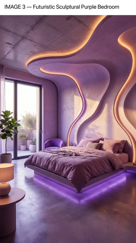
Concrete plaster flows across the wall and ceiling in soft, organic curves, traced entirely in embedded LED lighting—this isn’t a bedroom with purple accents; it’s a room where the architecture itself has been sculpted into a single flowing form.
This is the most architecturally ambitious room in this entire guide. Rather than applying color or pattern to an existing flat wall, this space treats the wall-ceiling junction as one continuous sculptural surface, with light embedded directly into its curves rather than added afterward as a fixture.
It suits readers planning a genuine architectural renovation, not a decorating refresh—this look depends on custom plasterwork and integrated lighting design from the start, not furniture or paint choices layered onto a standard room. It’s a strong fit for a modern, minimalist home where this kind of sculptural gesture reads as intentional rather than out of place.
The lifestyle fit is someone drawn to spaces that feel closer to installation art than traditional interior design—a bedroom meant to be genuinely futuristic, not just trend-forward. Its strongest advantage is total originality; nothing about this room reads as a template applied to a space, because the space itself was built around one continuous idea.
The compromise is significant: this level of custom plasterwork and integrated LED lighting is a serious construction and design commission, generally requiring specialized contractors rather than a standard renovation crew. To simplify for a smaller budget, recreate a smaller version of the effect with a single curved accent wall behind the headboard, using LED strip lighting along its edge rather than embedding it into full structural plasterwork.
The most common mistake is treating the LED lighting as an afterthought rather than planning it into the wall’s construction from day one—retrofitted strip lighting rarely achieves the same seamless, glowing-from-within effect as lighting integrated during the plaster application itself.
One practical recommendation: work with a lighting designer alongside your contractor from the earliest planning stages if pursuing this look—the lighting and the sculptural form need to be designed together, not sequenced as separate steps.
Is a Fully Sculptural Wall Like This Worth the Investment?
Here’s an honest take: this is one of the most expensive and technically demanding ideas in this entire guide, and it’s genuinely not necessary to achieve a striking purple bedroom. But for a home already committed to a modern, architecturally distinctive identity, a sculptural wall like this delivers something no amount of furniture or paint ever could—a room that feels custom-built around one singular idea rather than decorated after the fact. If the scope gives you pause, that’s a reasonable signal to start smaller: a single curved LED-edged accent panel behind the bed captures a meaningful share of the same futuristic feeling without committing to a full structural renovation.
The Floating Bed Frame’s Quiet Purple Glow
The bed platform itself appears to float, with a strip of purple LED light glowing from underneath it—a smaller-scale echo of the same embedded-lighting idea used on the wall above. Keeping the bedding itself in soft, muted mauve and taupe tones (rather than matching the wall’s bold purple) was a smart restraint—it lets the architecture carry the room’s boldest color statement while the bed stays a calmer resting point.
Recommended Materials: Sculpted plaster (wall and ceiling) · Integrated LED strip lighting · Poured concrete (flooring) · Velvet (accent chair) · Linen (bedding)
Main Colors: Soft Lavender-Grey · Warm Amber (LED glow) · Deep Violet (under-bed lighting)
Best Lighting: Warm-toned LED strips embedded along the wall’s curves provide the room’s primary ambient light—the under-bed purple glow adds a second, cooler-toned light layer for evening use.
Common Ways This Gets Misread
- Attempting to retrofit LED lighting after plasterwork is already complete, losing the seamless glow effect
- Underestimating the specialized contractor expertise this level of sculptural plasterwork requires
- Choosing bold, saturated bedding that competes with the wall rather than letting it lead
- Skipping a lighting designer, resulting in uneven or poorly integrated illumination
A Portrait Mural as the Room’s Real Focal Point
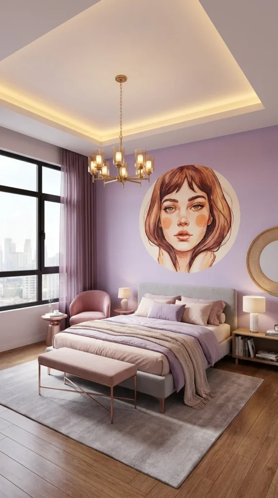
A large circular illustrated portrait, painted directly onto a soft lavender wall, replaces the usual headboard art or mirror with something far more personal and editorial—this bedroom treats the wall the way a gallery treats a single, deliberately oversized piece of art.
The defining idea here is using fine-art illustration, not pattern or texture, as the room’s main design statement. Where most bedrooms in this guide lean on velvet, tile, or architecture to make their case, this one does it with a single striking image—proof that a purple bedroom’s “wow” moment doesn’t have to come from the color or the furniture at all.
It suits readers who want a bedroom with genuine personality and are comfortable with a bold, figurative art choice rather than something more abstract or neutral. It’s a strong fit for a smaller city apartment bedroom, since the mural does so much visual work that the rest of the room can stay relatively simple.
The lifestyle fit is someone who thinks of their bedroom as a space for genuine self-expression, not just rest. Its strongest advantage is that it’s entirely achievable without any structural renovation—this is fundamentally still a paint-and-decor bedroom, just with one exceptional, oversized art choice at its center.
The compromise is that commissioning or painting a mural at this scale and quality is a real skill investment, and a poorly executed version can look amateur rather than intentional. To simplify for a smaller budget, commission a large circular canvas print of similar artwork rather than a hand-painted mural—it achieves a very similar effect without needing a muralist on site.
The most common mistake is choosing artwork at a scale too small for the wall, which loses the confident, gallery-like impact this idea depends on.
One practical recommendation: if commissioning original artwork, work with the artist to make sure the piece’s color palette pulls from tones already in your bedding and furniture—that’s what makes a bold mural feel integrated rather than randomly placed.
A Softer Palette Doing the Supporting Work
Everything besides the mural itself—the dusty rose accent chair, the pale purple bedding, the brass chandelier—stays soft and muted, which is exactly what lets the portrait read as the room’s obvious focal point rather than one bold element among several. The rattan-framed mirror beside the mural adds warmth and texture without competing with the illustration’s own detail.
Recommended Materials: Painted or printed mural (wall art) · Velvet (accent chair) · Brass (chandelier, side table) · Engineered wood flooring · Wool-blend area rug
Main Colors: Soft Lavender · Dusty Rose · Brass · Cream
Best Lighting: A brass drum chandelier with warm-white bulbs lights the room evenly without casting harsh shadows across the mural—even, diffused light matters more here than in a room built around texture rather than imagery.
For more ways to make the wall above the bed the room’s real statement, our guide to above-bed art ideas covers several other approaches to this same idea.
Easy Ways to Get a Mural Bedroom Wrong
- Choosing artwork at too small a scale for the wall it’s meant to anchor
- Selecting a mural color palette unrelated to the room’s existing bedding and furniture
- Overcrowding the wall with additional frames or shelving that compete with the mural
- Attempting a hand-painted mural without sufficient artistic skill, risking an amateur result
Deep Plum Meets an Unexpected Green
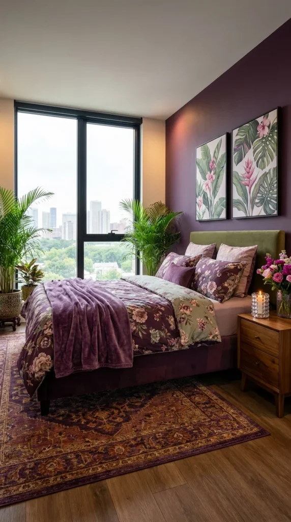
An eggplant-toned accent wall, paired with a green velvet headboard and layered floral-and-solid bedding, proves purple doesn’t have to stay in its own color family to feel cohesive—sometimes the more interesting choice is the contrast.
This is purple at its most maximalist and eclectic, closer to a well-traveled, gathered-over-time bedroom than a single-palette showroom look. Tropical botanical prints, a jewel-toned rug in warm gold and burgundy, and a deep plum wall all coexist because they share a similar richness and saturation, even though they’re not literally the same color family.
It suits readers who love pattern and color mixing and aren’t looking for a strictly monochromatic purple room. It’s a strong fit for an eclectic, well-traveled home where florals, botanical prints, and jewel tones already coexist comfortably elsewhere.
The lifestyle fit is someone who wants their bedroom to feel personal and layered, built from pieces that each have their own story rather than a single coordinated set. Its strongest advantage is flexibility—because the palette isn’t strictly monochromatic, it’s easier to introduce individual pieces over time without needing an exact color match.
The compromise is that this level of pattern and color mixing takes a genuinely trained eye to avoid feeling chaotic—the difference between “curated eclectic” and “mismatched” is often more subtle than it looks. To simplify for a smaller budget, start with the deep plum wall and one botanical print, adding the green headboard and patterned rug gradually once you’ve confirmed the base palette works in your space.
The most common mistake is introducing a third or fourth unrelated color into a room already balancing purple, green, and gold—this palette works because it stays disciplined at three main tones, and each additional color increases the risk of visual chaos.
One practical recommendation: if mixing this many patterns feels risky, anchor the room with one dominant solid (the plum wall) and let only two other elements—here, the headboard and the bedding—carry pattern or a second color.
The Botanical Prints Are Doing More Than Decorating
The tropical leaf prints above the nightstand don’t just add greenery visually—they directly bridge the gap between the purple wall and the green headboard, giving the eye a logical path between two colors that wouldn’t otherwise feel related. Live plants placed near the window reinforce that same botanical thread, extending the artwork’s colors into a three-dimensional element.
Recommended Materials: Painted plaster (accent wall) · Velvet (headboard) · Cotton-linen blend (floral bedding) · Wool-blend vintage-style rug · Engineered wood flooring
Main Colors: Deep Plum · Sage Green · Blush Pink · Warm Gold
Best Lighting: Warm ambient lighting from a bedside lamp suits this richly patterned room better than a single overhead fixture, since softer, layered light keeps the multiple patterns from feeling visually harsh.
This kind of confident color-and-pattern mixing pairs well with our guide to boho bedroom looks that feel curated, not cluttered, which explores a similar layered, collected approach.
Common Mistakes With This Kind of Color Mixing
- Introducing a fourth or fifth unrelated color, pushing the room from curated into chaotic
- Choosing botanical or floral prints in colors that don’t bridge the room’s two main wall and furniture tones
- Skipping a dominant solid anchor color, leaving the whole room feeling pattern-heavy with no resting point
- Over-matching patterns too literally instead of letting them relate through color rather than exact print repetition
Built-In Storage Doing Double Duty as Design
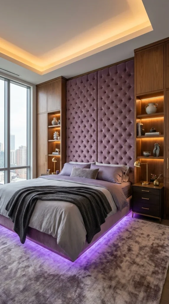
Mauve tufted panels anchor the headboard wall, but it’s the wood built-in shelving flanking the bed—complete with integrated under-shelf lighting—that makes this room feel as functional as it does glamorous.
This is a genuinely practical take on a purple bedroom, proving the color works just as well in a storage-forward, real-life room as it does in a purely decorative showpiece. The built-in shelving isn’t hidden away or minimized—it’s lit and displayed like a design feature in its own right, holding books, vases, and small sculptural objects as intentionally as any styled shelf in a living room.
It suits primary bedrooms where storage is a genuine priority, not just an afterthought squeezed in around the bed. It’s a particularly strong fit for a city apartment bedroom without a separate dressing room or large closet, where built-in shelving needs to pull real weight.
The lifestyle fit is someone who wants their bedroom to look considered and glamorous without sacrificing everyday function—a genuinely liveable version of a luxe purple room rather than one styled purely for photographs. Its strongest advantage is that it solves a real problem (where does everything actually go?) while still contributing meaningfully to the room’s overall design impact.
The compromise is that built-in millwork at this scale, especially with integrated lighting, is a bigger carpentry and electrical investment than simply buying freestanding nightstands and shelving. To simplify for a smaller budget, use freestanding open shelving units on either side of the bed instead of full built-ins, and add battery-powered puck lights rather than hardwired under-shelf lighting.
The most common mistake is overfilling built-in shelving with too many small objects, which turns a considered display into visual clutter—the shelving here works because each shelf has breathing room around what’s displayed on it.
One practical recommendation: plan the electrical wiring for shelf lighting before the built-ins are constructed, not after—retrofitting hardwired lighting into finished millwork is far more difficult and costly than including it in the original build.
Why the Purple Under-Bed Glow Doesn’t Feel Gimmicky
The purple LED strip under the bed frame echoes the warm amber tone of the shelf lighting just enough to feel connected, rather than like two unrelated lighting systems competing in the same room. Both lighting elements stay low and ambient—neither one is bright enough to function as a reading light, which keeps them firmly in the “mood lighting” category rather than competing with the room’s actual task lighting from the bedside lamps.
Recommended Materials: Tufted velvet (headboard panels) · Walnut wood (built-in shelving) · Integrated LED strip lighting · Wool-blend area rug · Brass (lamp fixtures)
Main Colors: Dusty Mauve · Walnut Brown · Warm Amber · Soft Violet (LED accent)
Best Lighting: Warm-white under-shelf LED strips provide ambient light for the built-ins, while brass bedside lamps handle actual reading light—a good template for layering ambient and task lighting separately rather than relying on one fixture for both.
Maintenance Note: Built-in shelving with integrated lighting should have an accessible electrical panel or easily reachable driver, since LED strip drivers occasionally need replacement over the shelving’s lifespan.
Where People Get This Setup Wrong
- Over-filling built-in shelves with too many small objects, losing the considered, curated display effect
- Planning shelf lighting wiring after construction rather than before, adding unnecessary cost
- Choosing under-bed LED lighting bright enough to disrupt sleep rather than staying subtly ambient
- Skipping proper task lighting at the bedside, relying only on ambient shelf and under-bed glow
A Grand Estate Treatment for a Bedroom Wall
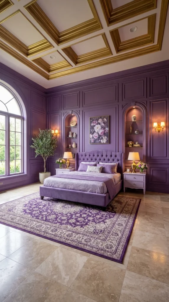
Full wall paneling in rich purple, trimmed edge to edge in gold, rises to meet an elaborate coffered ceiling also detailed in gold—this bedroom is dressed the way a formal drawing room would be, not a typical place to sleep.
The defining move is applying genuine architectural millwork—paneling, coffered ceiling detail, arched display niches—to a bedroom at a scale usually reserved for formal reception rooms. This is purple filtered through old-world estate glamour, closer to a European manor house than a contemporary bedroom.
It suits larger bedrooms with the ceiling height and architectural budget to support genuine millwork, since the coffered ceiling and full wall paneling both depend on real scale to read properly rather than feeling cramped. It’s the right direction for readers who want their bedroom to feel like the most formal, considered room in the house, not the most relaxed.
The lifestyle fit is someone drawn to traditional, old-world grandeur who wants their bedroom to feel like a genuine architectural statement. Its strongest advantage is total cohesion—wall, ceiling, and furniture all participate in one consistent, formal design language, which very few bedrooms achieve at this level.
The compromise is substantial cost: full-height paneling, a detailed coffered ceiling, and built-in arched display niches together represent a significant millwork investment, more akin to a formal living or dining room renovation than a typical bedroom update. To simplify for a smaller budget, apply the gold-trimmed paneling to just the headboard wall and skip the full coffered ceiling treatment, keeping the ceiling simple while the wall still carries the room’s architectural weight.
The most common mistake is adding this level of formal millwork to a room with insufficient ceiling height, which can make the coffered detailing feel oppressive rather than grand.
One practical recommendation: work with a millwork specialist to scale the coffer size and paneling proportions specifically to your room’s dimensions—a coffered pattern sized for a much larger room can feel visually overwhelming when compressed into a standard bedroom footprint.
Arched Niches That Turn Storage Into Display
The arched wall niches flanking the bed do the same job as open shelving, but their curved, recessed shape reads as architecturally intentional rather than simply functional—a detail that ties directly back to the room’s overall formal, old-world character. A vintage-style medallion rug on the floor echoes the same rich purple as the walls, keeping the floor from feeling like an afterthought against so much wall and ceiling detail.
Recommended Materials: Painted wood paneling with gold trim (walls) · Detailed coffered millwork (ceiling) · Tufted velvet (headboard) · Wool-blend vintage-style rug · Travertine tile (flooring)
Main Colors: Rich Purple · Antique Gold · Cream
Best Lighting: Warm brass wall sconces flanking the bed add symmetry and soft light without competing with the ceiling’s detailed gold trim—natural light from the arched window supplements during the day.
Readers drawn to this level of formal, traditional architectural detail may also enjoy our black bedroom inspiration guide, which explores a similarly dramatic, richly detailed direction in a different color story.
Where This Level of Formality Goes Wrong
- Attempting full coffered ceiling detail in a room with insufficient ceiling height
- Scaling the millwork pattern for a larger room rather than the bedroom’s actual dimensions
- Skipping a millwork specialist and attempting DIY paneling at this level of detail
- Pairing formal architectural paneling with overly casual furniture, breaking the room’s consistent language
Image 6 — Media Library Fields
Alt Text: Purple bedroom with gold-trimmed wall paneling and coffered ceiling millwork Caption: Arched display niches and gold trim treat this bedroom like a formal estate reception room. Title: Gold Trim Purple Paneled Bedroom
Paper Flowers as Soft, Romantic Wall Art
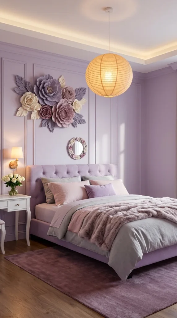
A cluster of oversized 3D paper flowers, mounted directly onto a soft lilac wall, brings a handcrafted, almost whimsical romance into a bedroom that otherwise keeps everything else quietly elegant.
The defining idea is treating paper craft as fine wall art rather than a temporary party decoration. Layered petals in blush, lilac, and cream catch light and shadow in a way flat printed art can’t, giving the wall genuine dimension without needing an expensive commissioned piece or architectural intervention.
It suits readers who want a soft, romantic bedroom with one distinctive handmade-feeling element, without committing to anything structurally permanent. It’s an especially good fit for a rental or any space where you want a bold decorative statement that can be removed without leaving a trace.
The lifestyle fit is someone drawn to a gentler, more traditionally feminine take on a purple bedroom—soft lilac walls, a paper lantern pendant, faux fur throws—rather than the deeper jewel tones seen elsewhere in this guide. Its strongest advantage is accessibility: paper flower wall art is one of the more affordable, DIY-achievable ideas in this entire list, with a visual impact well beyond its cost.
The compromise is durability—paper flowers, even well-made ones, are more fragile and dust-prone than painted or fabric wall art, and they’re not a great fit for a humid room or one that gets a lot of direct sun exposure, which can fade the paper’s color over time. To simplify further, a smaller cluster of just three or four flowers, rather than the full arrangement shown, still delivers meaningful visual impact at an even lower cost and time investment.
The most common mistake is placing paper flower art in a spot that gets strong direct sunlight, which fades the paper’s color noticeably faster than in a shadier part of the room.
One practical recommendation: if making these yourself, use moisture-resistant cardstock rather than standard paper—it holds its shape and color considerably longer in a bedroom’s normal humidity levels.
A Palette That Stays Gentle on Purpose
Every element in this room—the lilac walls, the blush-and-grey bedding, the soft round paper lantern pendant—sits in the same gentle, muted tonal range, which is what gives the paper flower cluster room to be the one slightly bolder, more textural moment. The small floral-framed mirror beside the flowers echoes their shape at a smaller scale, connecting the wall art to a functional piece rather than leaving it entirely isolated.
Recommended Materials: Cardstock or fabric (paper flower wall art) · Tufted velvet (headboard) · Paper or rattan (pendant shade) · Faux fur (throw blanket) · Painted wood (nightstand, vanity)
Main Colors: Soft Lilac · Blush Pink · Cream · Warm White
Best Lighting: A round paper lantern pendant diffuses light softly across the whole room, which flatters both the muted color palette and the paper flowers’ layered texture without casting harsh shadows.
Common Mistakes With Paper Flower Wall Art
- Placing the arrangement in direct sunlight, fading the paper’s color over time
- Using standard printer paper instead of a more durable, moisture-resistant cardstock
- Overcrowding the cluster until it loses its handcrafted, deliberate arrangement feel
- Skipping proper wall-mounting hardware, risking sagging or falling petals over time
A Bed Frame Shaped Like a Single Sculpted Object
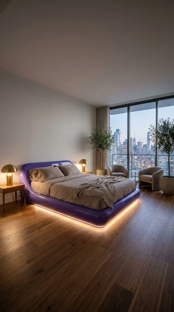
This bed frame isn’t built from separate pieces—it reads as one continuous molded form, its glossy purple surface curving up from the floor into the headboard without a single visible seam or joint.
This is the most purely design-object approach to a purple bedroom in this entire guide. Rather than using purple as a wall color, textile, or accent, this room makes the color and the furniture inseparable—the bed itself is the color, sculpted into a single confident shape rather than assembled from a frame, headboard, and base.
It suits minimalist, design-forward bedrooms where the goal is one exceptional piece rather than a fully layered, textural room. It’s a strong fit for a modern city apartment with clean architectural lines already in place, where a sculptural bed like this becomes the room’s obvious, singular focal point.
The lifestyle fit is someone who prefers restraint and negative space over maximalist layering—everything else in this room, from the neutral bedding to the simple boucle chairs, stays deliberately quiet so the bed itself can be the only bold statement. Its strongest advantage is how much visual impact it delivers from a single furniture piece, without needing bold wall color, pattern, or architectural intervention anywhere else in the room.
The compromise is that a genuinely seamless, sculptural bed frame like this is a specialty furniture piece, not something available from standard retailers—sourcing or commissioning one is a real furniture investment on its own. To simplify for a smaller budget, look for an upholstered platform bed with a similarly curved, low-profile silhouette in a glossy or lacquered purple finish, even if it isn’t a fully seamless molded piece.
The most common mistake is surrounding a sculptural piece like this with too much competing furniture or pattern, which undercuts the whole point of using one bold object as the room’s singular statement.
One practical recommendation: if this is the room’s one big splurge, keep every other purchase deliberately simple and neutral—the bed only reads as a design object if nothing else in the room is trying to compete with it.
Letting the City View Share the Spotlight
Positioning the bed to face the floor-to-ceiling window means the sculptural purple form and the skyline view are both visible at once, rather than competing for the room’s one moment of drama. Warm brass mushroom lamps on the flanking nightstands add just enough metallic warmth to keep the room from feeling entirely cool and minimal, without introducing any competing color.
Recommended Materials: Molded lacquer or high-gloss upholstery (bed frame) · Brass (lamp fixtures) · Boucle (accent chairs) · Engineered wood flooring · Linen (bedding)
Main Colors: Glossy Purple · Warm Taupe · Brass
Best Lighting: Integrated LED lighting beneath the bed frame adds a soft glow without overpowering the piece’s sculptural silhouette; brass table lamps handle the room’s actual task lighting.
For readers drawn to this restrained, design-object approach to a single statement piece, our Japandi bedroom design guide explores a closely related minimalist, considered philosophy.
Easy Ways to Get a Sculptural Bed Room Wrong
- Surrounding a bold sculptural piece with too much competing furniture or pattern
- Choosing busy, patterned bedding that fights the bed frame’s clean silhouette
- Skipping proper structural sourcing, ending up with a piece that looks molded in photos but assembled in person
- Adding bold wall color on top of an already-bold furniture piece, competing for the room’s one focal moment
Hand-Painted Cherry Blossoms on a Lavender Wall
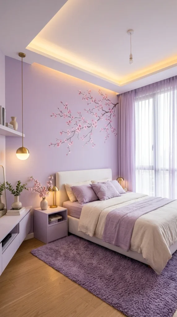
A single branch of hand-painted cherry blossoms stretches across a soft lavender wall, its delicate pink flowers and dark branch lines bringing a quiet, Japandi-inspired botanical touch to an otherwise simple, restrained bedroom.
The defining feature is the restraint of the artwork itself—one branch, painted with visible negative space around it, rather than a dense or busy mural. This is purple at its most understated and serene, drawing more from Japanese-influenced minimalism than from any of the more maximalist rooms elsewhere in this guide.
It suits readers who want a calm, meditative bedroom rather than a dramatic one. It’s a strong fit for a small apartment bedroom, since the artwork’s delicate scale and the room’s overall light palette both help a smaller space feel airy rather than cramped.
The lifestyle fit is someone who wants their bedroom to function as a genuine retreat for rest, with minimal visual stimulation beyond one carefully placed piece of art. Its strongest advantage is how effectively it uses negative space—the wall around the blossom branch is left intentionally empty, which is what gives the artwork its calm, breathing quality.
The compromise is that this look depends entirely on restraint, which can be harder to execute well than it looks—too much additional decor anywhere near the mural undercuts the whole effect. To simplify for a smaller budget, use a large-format wall decal of a similar cherry blossom branch design rather than commissioning hand-painted artwork—decals can achieve a very similar delicate linework effect at a fraction of the cost.
The most common mistake is adding too much additional wall decor near the mural, crowding out the negative space that makes this look feel calm rather than busy.
One practical recommendation: if using a decal rather than hand-painted art, choose one with a matte rather than glossy finish—it reads as more artisanal and less like a printed sticker under normal room lighting.
Where the Purple Actually Lives in This Room
Rather than painting the whole wall a bold purple, this room keeps the walls a very soft lavender and lets purple show up instead in the throw pillows and area rug—a much gentler way to bring the color in than a saturated accent wall. The white upholstered headboard and bedding provide a clean, neutral base, which is what keeps the soft purple accents and the cherry blossom mural from ever feeling overwhelming.
Recommended Materials: Painted plaster or decal (mural) · Upholstered linen (headboard) · Plush wool-blend rug · Brass (globe pendant) · Painted wood (nightstand)
Main Colors: Soft Lavender · White · Blush Pink · Brass
Best Lighting: A single warm brass globe pendant, hung low beside the bed, provides soft, focused light without competing with the mural’s delicate detail—sheer curtains filter daylight gently throughout the day.
Maintenance Note: Hand-painted or decal murals near a window benefit from UV-filtering sheer curtains, which slow color fading from direct sun exposure over time.
Where People Get This Restrained Look Wrong
- Adding too much additional wall decor near the mural, crowding out its negative space
- Choosing a saturated purple wall color instead of keeping the base tone soft and quiet
- Selecting a glossy decal finish that reads as printed rather than artisanal
- Skipping UV protection for artwork placed near strong, direct window light
A Canopy of Draped Fabric Over a Rustic Ceiling
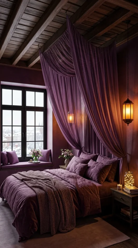
Deep plum velvet drapery cascades from the wood-beamed ceiling directly above the bed, gathered and swagged like a genuine four-poster canopy—paired with hanging lanterns and a snow-dusted window view, this room reads as a cozy, romantic retreat built for cold weather.
This is purple at its most rustic and romantic, closer to a mountain lodge or a countryside inn than any of the more modern or architecturally formal rooms elsewhere in this guide. The exposed wood beam ceiling and warm lantern lighting ground the deep purple drapery in something textural and cabin-like, rather than polished or glamorous.
It suits bedrooms with existing wood beam ceilings or rustic architectural bones, where the canopy drapery can feel like a natural extension of the room’s existing character rather than an artificial addition. It’s a strong fit for a colder climate or a mountain or countryside home, where the whole room’s mood leans toward cozy warmth against the cold visible just outside the window.
The lifestyle fit is someone who wants their bedroom to feel enveloping and warm, almost cave-like in the best sense—a retreat specifically built for cold nights and long mornings in bed. Its strongest advantage is how much atmosphere it creates through fabric and lighting alone, without needing any structural renovation beyond a mounting point for the drapery itself.
The compromise is that heavy velvet drapery collects dust more readily than a simple upholstered headboard, and it needs a genuinely secure mounting point given its weight, especially in a room with an already-exposed structural ceiling. To simplify for a smaller budget, mount a smaller canopy frame directly above the bed rather than draping fabric from ceiling beams, using lighter linen rather than heavy velvet.
The most common mistake is undersecuring the drapery’s mounting hardware to an exposed wood beam, risking sagging or, in the worst case, the fabric pulling loose over time.
One practical recommendation: have the drapery professionally steamed rather than machine-washed periodically—velvet at this scale holds its rich color and drape best with gentle, infrequent care rather than regular washing.
Why the Window Seat Matters as Much as the Bed
The cushioned window seat beneath the snow-view window gives this room a second cozy destination beyond the bed itself, which is part of what makes the whole space feel like a genuine retreat rather than just a place to sleep. A jar of string lights on the nightstand and a hanging lantern beside the bed both use warm, low-level light sources rather than a single overhead fixture, reinforcing the room’s intimate, candlelit atmosphere.
Recommended Materials: Heavy velvet (canopy drapery) · Exposed wood beams (ceiling) · Plush wool-blend throw · Painted wood (nightstand) · Wrought iron (hanging lanterns)
Main Colors: Deep Plum · Warm Amber · Weathered Wood Brown
Best Lighting: Hanging lanterns and a jar of warm string lights provide low, intimate ambient light—this room deliberately avoids bright overhead lighting in favor of a softer, candlelit feeling throughout.
For more cozy, textural bedroom ideas built around a similar warm, enveloping feeling, our guide to rug styles that make any bedroom feel cozier is a useful next stop.
Common Ways This Gets Misread
- Undersecuring heavy drapery to an exposed beam, risking sagging over time
- Choosing a lightweight fabric that doesn’t hold the same rich, gathered drape as true velvet
- Skipping regular dusting of heavy canopy fabric, which collects more dust than simpler headboard treatments
- Relying only on bright overhead lighting instead of the layered, low lanterns this look depends on
Living Comfortably With a Bold Purple Bedroom
- Test any deep or saturated purple paint color on the actual wall before committing—purple shifts noticeably under different light sources, and a color that looks rich in a paint chip can read as flat or muddy under the wrong bulb
- Vacuum velvet upholstery and rugs with a brush attachment regularly, and schedule a professional clean every year or two for large tufted walls or heavy drapery
- Protect any hand-painted or paper wall art from direct sunlight with UV-filtering curtains, since strong daylight fades both paint and paper noticeably faster than filtered light
- Polish gold or brass trim periodically with a metal-appropriate cleaner rather than an all-purpose spray, which can dull decorative gold leaf or plating over time
Who Should Choose This Style?
- Best for readers who want a bedroom with genuine visual impact, whether through color, texture, or architecture
- Best for larger primary bedrooms or statement guest rooms where a bold palette has room to breathe
- Not ideal for anyone who wants a strictly neutral, resale-ready bedroom, since deep purple is a genuinely personal, committed color choice
- Not ideal for a very small or low-light room without careful planning, since the deepest purple tones can feel heavy in the wrong conditions
Budget Summary
| Budget | Expectation |
|---|---|
| Low | A soft lavender paint color, purple bedding and throw pillows, and one piece of botanical or floral wall art |
| Medium | A tufted velvet headboard, a patterned area rug, brass lighting fixtures |
| Premium | A full tufted or paneled feature wall, custom millwork or sculptural plasterwork, a bespoke sculptural bed frame |
FAQ
Does purple make a bedroom feel too dark or small? It depends entirely on the shade and how much of the room it covers. A soft lavender or dusty mauve, especially paired with good natural light, feels airy rather than heavy. The deepest eggplant or aubergine tones work best in larger rooms with strong lighting or applied to just one accent wall rather than the entire room.
How do I keep a purple bedroom from feeling too young or trendy? The rooms in this guide that read as sophisticated rather than juvenile tend to pair purple with rich, grown-up materials—velvet, brass, marble, wood—rather than bright, saturated purple alone. Leaning toward muted, dusty, or deep purple tones over bright violet also tends to read as more mature.
What colors pair well with purple in a bedroom? Gold and brass are reliable, warm partners for almost any purple shade. Green, as seen in one of the rooms above, creates a bolder, more unexpected contrast. Cream, white, and warm wood tones all work as calmer, neutral supporting colors across nearly every purple palette.
Is a deep purple paint color hard to change later if I get tired of it? Deep, saturated colors typically need a stain-blocking primer before repainting to a lighter shade, which adds a step compared to repainting over a light neutral. It’s not a major obstacle, but it’s worth knowing upfront if you think you might want a lighter color again in a few years.
Conclusion
Ten bedrooms, ten different reasons purple works—a fully upholstered glam wall in one, a single sculpted bed frame in another, and a quiet cherry blossom branch left with room to breathe in a third. The common thread isn’t the shade of purple itself; it’s how deliberately each room commits to its chosen direction, whether that’s maximalist drama or genuine restraint. If one of these ten felt like it was speaking directly to your own bedroom, that’s usually the clearest sign of where to start.
Explore More
You may also enjoy:
- Dreamy Girls’ Bedroom Ideas You Can Actually Recreate—a softer, more playful take on color-forward bedroom design
- 10 Rug Styles That Make Any Bedroom Feel Cozier—practical guidance for grounding a bold bedroom palette underfoot
- How to Style an Attic Bedroom: 10 Design Ideas That Solve the Slope Problem—for readers working with a more architecturally challenging room
Tags
purple bedroom ideas, purple velvet bedroom, lavender bedroom design, jewel tone bedroom, purple accent wall, sculptural bed frame, glam bedroom decor, purple and gold bedroom, moody purple bedroom, purple bedroom color palette


3 Responses