Floral furniture has a reputation problem. Say the word “floral” and a lot of people picture a dated slipcover or a grandmother’s parlor chair nobody asked to inherit. The pieces below make the opposite case. Whether the flowers are hand-carved into walnut, stitched thread by thread into linen, painted in lacquer, or pressed and sealed under glass, a single floral piece — placed with restraint — can be the thing that makes an entire room feel considered rather than generic. This guide walks through nine distinct ways floral pattern shows up in real furniture, what each one asks of a room, and how to know which direction actually fits your own space.
Quick Overview
| Style | Floral Printed & Patterned Furniture |
|---|---|
| Best For | Entryways, living rooms, bedrooms wanting one strong focal piece |
| Budget | Low–High (technique-dependent) |
| Difficulty | Easy to place, harder to source authentically |
| Maintenance Level | Low–Medium |
A Carved Walnut Sideboard That Treats Flowers Like Sculpture
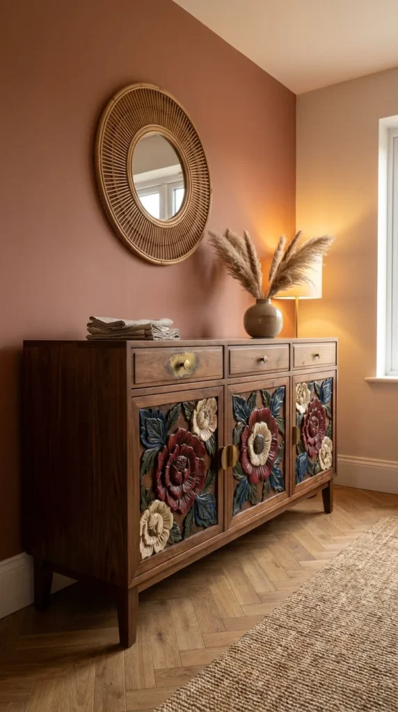
This entryway piece pairs a rattan sunburst mirror with a walnut sideboard whose three cabinet doors are carved and hand-painted with oversized peonies in burgundy, cream, and navy against deep-toned wood. The dusty terracotta wall behind it isn’t a coincidence — it’s doing half the work.
The single defining characteristic here is dimensionality: these flowers aren’t printed on a flat surface; they’re carved in relief, so the petals catch shadow differently depending on the time of day. That’s a different design problem than a printed floral fabric solves, because the pattern reads as sculpture first and color second. Repetition is the quiet engine of why this feels finished rather than busy — the same rose motif appears on all three door panels, the same brass hardware repeats across all three drawers, and the terracotta wall echoes the warmest tone inside the carved flowers. Nothing here is a one-off decision.
Anyone furnishing a hallway, dining room, or entry that gets seen constantly but used briefly should look closely at this one — a piece this detailed rewards a room people pass through slowly, like an entryway, more than a room people sit in for hours. It suits homes leaning mid-century or warm bohemian, where wood tone and pattern already share the stage. It’s a poor fit for anyone chasing an all-white minimalist scheme, since the carving needs a mid-to-dark backdrop to actually register.
The strongest advantage is that the pattern is permanent and colorfast in a way printed textiles never are — carved and painted wood doesn’t fade from UV exposure the way dye-printed fabric does. The real compromise is weight and cost: a hand-carved sideboard like this is heavy, expensive to ship, and nearly impossible to find at a low price point secondhand, because pieces this detailed were rarely mass-produced.
Where the Carving Actually Earns Its Keep
The rattan mirror above isn’t decorative filler — its circular, radiating lines give the eye a second pattern to rest on before it drops to the carved florals below, which is what keeps the vignette from feeling like one loud object in an otherwise plain hallway. A similar layering logic shows up in rattan bed frames that pair natural woven texture with more structured furniture nearby, where the same principle — one textural piece, one structured piece — keeps a room from tipping into visual competition.
Recommended Materials: solid walnut, hand-carved and painted detailing, brass hardware, woven rattan, jute rug Main Colors: Terracotta, Walnut Brown, Burgundy, Cream, Deep Navy Best Lighting: A warm-toned lamp positioned to the side (as shown) rather than overhead — raking light is what makes carved relief visible at all; flat overhead light flattens the whole effect Maintenance: Dust carved crevices with a soft brush rather than a cloth, which tends to skip over recessed detail and leave dust sitting in the grooves
Easy Ways to Get This Wrong
- Placing it against a pale, cool-toned wall, which drains the warmth the carving depends on
- Pairing it with a modern flush-mount mirror instead of something textural, which leaves the carving as the only pattern in the room and makes it read as ornate rather than intentional
- Overlighting it with a bright overhead fixture that flattens the carved shadow-play
- Skipping a rug underneath, which leaves the wood tones feeling unanchored against a bare floor
Embroidered Florals That Turn a Bench Into the Room’s Loudest Color Moment
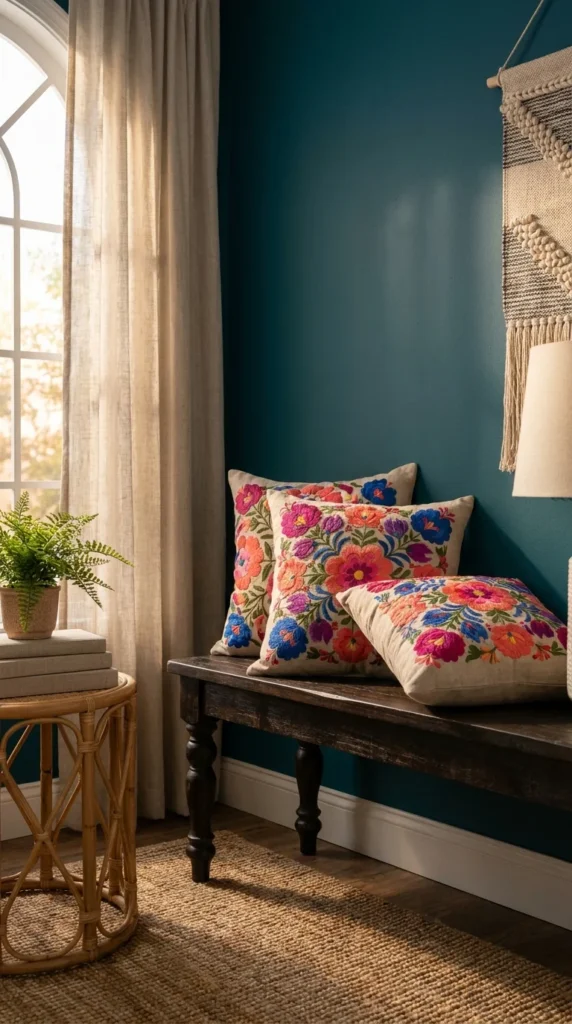
Three throw pillows, densely embroidered with hot pink, orange, and cobalt blooms on natural linen, sit stacked on a dark wooden bench against a saturated teal wall. Nothing else in the frame competes for attention, and that’s deliberate.
This is a different category of “floral furniture” from the carved sideboard above — here the flowers exist purely in thread, and the technique itself (dense satin-stitch embroidery) is what gives the color its saturation; printed fabric in these same hues would look flatter and less dimensional. The proportion logic worth noting: three pillows of nearly matching scale, clustered tightly rather than spread out, read as one unified color block instead of three separate accents — spacing them apart across a longer bench would have diluted the impact considerably.
This idea suits anyone who wants a floral pattern without committing to a large upholstered piece — pillows are reversible, low-cost to replace, and forgiving if a color trend shifts in a year or two. It’s the natural entry point for someone nervous about “too much pattern,” since the commitment is a $30–80 pillow rather than a reupholstered sofa. It’s a poor match for a room that already has a busy wallpaper or patterned rug, since the embroidery needs a solid, saturated backdrop like this teal wall to actually pop.
The advantage is flexibility — swap the pillow covers seasonally without touching the furniture underneath. The compromise is durability under daily use: hand-embroidered florals like these are typically dry-clean or spot-clean only, which makes them a better fit for a bench or accent chair than a heavily used family sofa.
A Palette Built Around One Bold Wall
The teal wall isn’t background — it’s the color-matching anchor for every embroidered thread on the pillows, and dropping this same pillow trio onto a neutral wall would have cut its visual punch by half. If bold wall color paired with pattern-heavy textiles is the direction you’re drawn to, the same principle shows up well in boho bedroom looks built around richly saturated, curated color choices rather than an anything-goes mix.
Recommended Materials: natural linen, cotton embroidery thread, reclaimed dark wood bench, woven jute rug. Main Colors: Teal, Hot Pink, Orange, Cobalt Blue, Natural Linen. Best Lighting: Warm, low side lighting like the lamp shown here — it keeps the teal from reading cold and lets the pillow colors glow rather than compete with daylight-blue undertones.
What Trips People Up Recreating This
- Choosing printed floral pillows instead of embroidered/textured ones, which loses the dimensional quality that makes this combination work
- Pairing with a cool white or gray wall instead of a saturated color, leaving the pillows looking isolated rather than intentional.
- Overcrowding the bench with too many additional objects, which competes with the pillows for attention
- Mixing more than two other patterns into the same sightline
A Navy Velvet Bench Wearing Its Florals Like Upholstery, Not an Accent
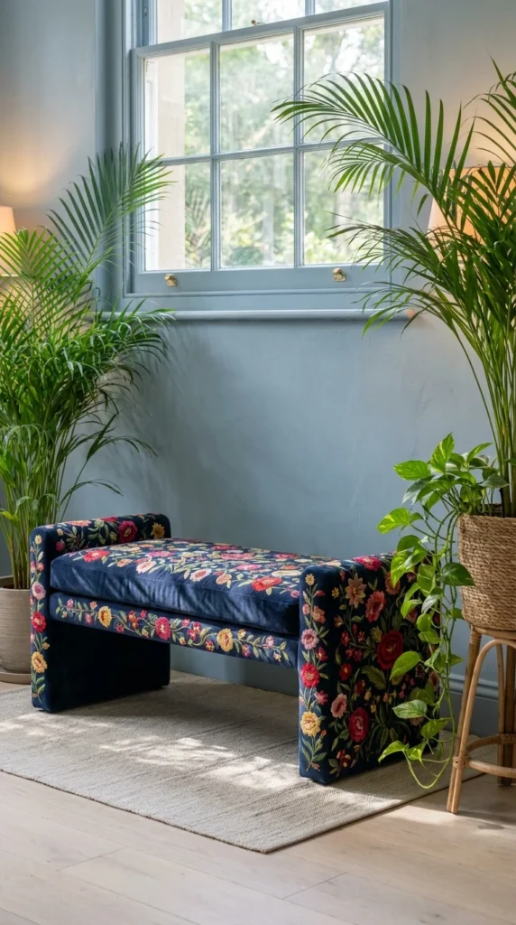
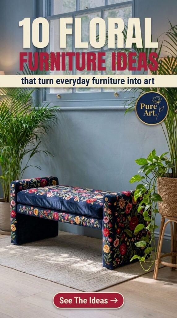
This backless bench is fully upholstered — seat, sides, and legs. — in a dense navy floral print packed with reds, yellows, and pinks, set against a pale dusty-blue wall and framed by two oversized palms.
Unlike the pillow-based approach above, this is a floral pattern as the primary upholstery, which is a bigger commitment but a very different visual result: the bench becomes a piece of art in its own right rather than an accent to a neutral base. Sightline logic matters here — the navy ground color is dark enough to hold its own next to the surrounding greenery, so the eye moves between “leaf green” and “floral navy” as two related but distinct visual anchors, rather than the plants swallowing a lighter-colored piece of furniture.
This works best for anyone furnishing a window seat, entry bench, or bedroom-end-of-bed spot that doesn’t need to seat a crowd — fully upholstered floral pieces like this are statement furniture, not workhorse furniture. It suits maximalist and English cottage leanings especially well, since the density of pattern here matches those aesthetics’ appetite for “more, but curated.” It’s a mismatch for anyone who needs furniture to disappear into a room; this piece is built to be looked at, not ignored.
The advantage is durability relative to the embroidered pillows above — a woven jacquard or printed velvet like this is typically more wear-resistant than hand-embroidery, since it’s engineered specifically for upholstery use. The compromise is reupholstering cost down the line: a heavily patterned custom fabric like this is expensive to replace if the bench ever needs new upholstery.
Why the Dark Ground Color Is Doing the Real Work
A floral print this dense would read as chaotic on a white or pale ground — the navy background is what lets red, yellow, and pink coexist without the whole bench looking like a garden explosion; a lighter base fabric would have needed a much more restrained flower count to stay legible. That’s the same restraint that makes purple bedroom schemes feel sophisticated rather than overwhelming when the deeper shade is used as the anchor color, not the accent — dark grounds carry saturated pattern better than pale ones almost every time.
Recommended Materials: velvet or jacquard floral upholstery, hardwood frame, woven wool-blend rug Main Colors: Navy, Red, Yellow, Blush Pink, Dusty Blue Best Lighting: Bright, indirect daylight from a nearby window, as shown — the navy ground needs strong natural light to keep the florals from reading almost black in shadow Maintenance: Rotate the cushion (if separate) periodically to even out sun fading, and keep large plants nearby watered on a schedule so leaf drop doesn’t stain the upholstery
Where This Look Falls Apart
- Choosing a pale or white-ground floral fabric instead of a dark one, which makes a dense pattern feel busy instead of grounded
- Placing it as the only seating in a small room, where its visual weight becomes overwhelming rather than a focal accent
- Skipping the surrounding greenery, which is part of what balances the density of the pattern
- Using it in a high-traffic mudroom-style entry, where velvet upholstery wears faster than woven options
A Beaded, Sculptural Wingback That Makes Florals Feel Like Jewelry
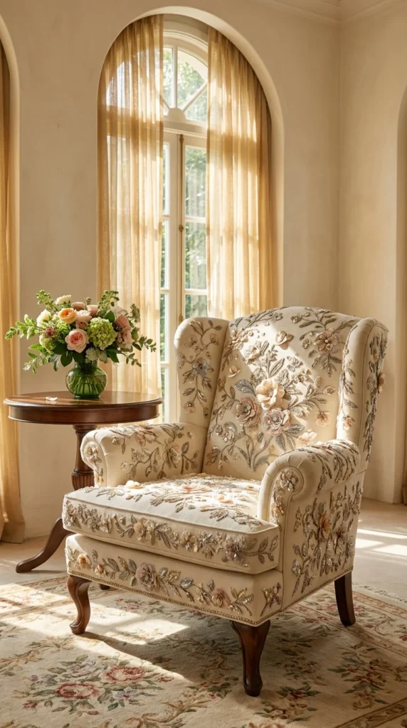
A cream wingback armchair is covered edge to edge in dimensional embroidery — appliquéd fabric flowers, beading, and metallic thread — set in a sun-filled room with arched windows and sheer gold curtains.
The defining trait here is that the florals aren’t flat pattern at all; they’re built up in layers, some petals raised and padded off the surface of the chair itself. That’s a material behavior distinction worth understanding before buying anything like it: dimensional appliqué like this catches and holds dust differently than a flat weave does, and it’s genuinely more fragile under regular contact than a printed or woven floral fabric would be.
This chair belongs in a formal sitting room, a bedroom reading corner that sees light use, or anywhere it functions more as a display piece than daily seating — it’s the wrong choice for a household with kids, pets, or anyone who’d actually flop into it after work. It suits traditional, French-country, or glam interiors that already lean toward embellishment; it would look like a costume piece dropped into a minimalist or industrial room.
The advantage is that nothing else in the mass market looks quite like it — this level of handwork is genuinely rare and reads as heirloom-quality the moment you see it. The obvious compromise is upkeep and fragility; raised beadwork and appliqué can’t be machine-washed, steam-cleaned casually, or exposed to direct pet claws without damage.
A Small Scale Risk That Pays Off Here
Covering an entire wingback — arms, back, seat, and cushion — in this much dimensional detail is a bigger visual risk than doing it on a smaller accent chair, since there’s nowhere for the eye to rest. It pays off specifically because the room around it is almost entirely neutral cream and gold, giving the chair the equivalent of a blank gallery wall to sit against.
Recommended Materials: appliquéd florals, glass beading, metallic embroidery thread, cream base fabric, carved wood legs Main Colors: Cream, Blush, Sage Green, Gold, Soft Pink Best Lighting: Diffused natural light through sheer curtains, exactly as shown — beading and metallic thread need soft, even light to sparkle without glaring; direct hard sun creates hot spots that flatten the texture in photos and in person
Easy Ways to Get This Wrong
- Placing it in a high-traffic hallway or family room where daily contact will flatten and snag the raised beadwork
- Pairing it with an equally busy patterned rug, which competes with the chair instead of framing it
- Choosing synthetic appliqué instead of real embroidery, which tends to look flat and craft-store rather than couture
- Setting it against a dark or saturated wall color, which removes the soft, airy context the piece depends on
A Hand-Painted Ceramic Vase Where the Furniture Is Barely the Point
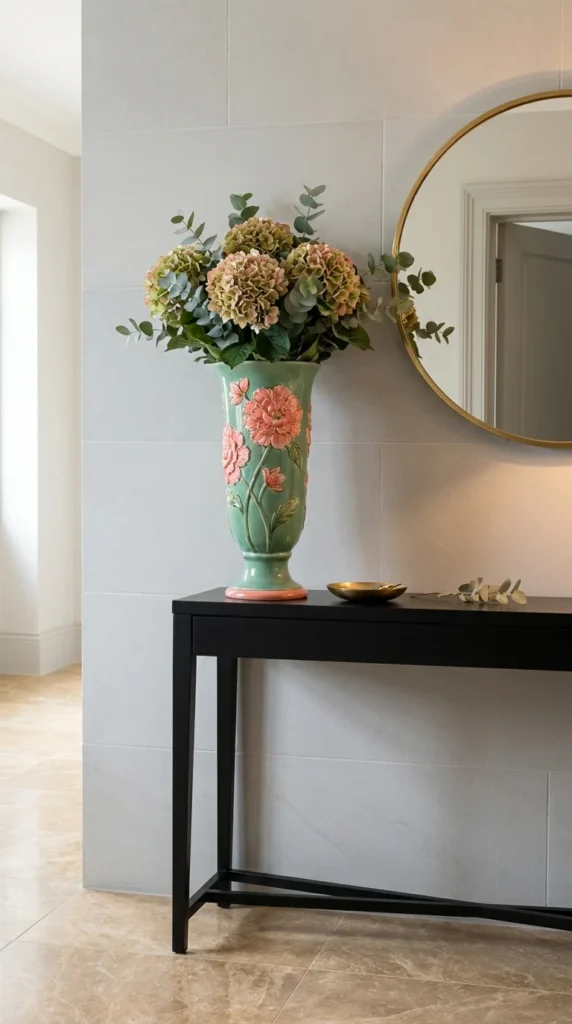
A tall green ceramic vase, hand-painted with pink peonies climbing its base, sits on a slim black console table beneath a round brass mirror, holding a bouquet of dried hydrangea and eucalyptus.
Technically the console is the furniture here, but the vase is what carries the floral story, and that’s worth calling out as its own category: sometimes “floral printed furniture” means the styling object on top of a piece, not the upholstery or woodwork of the piece itself. The visual focal point works because the vase’s painted florals are warm pink and green against the console’s cold matte black — that color-temperature contrast is what makes a fairly small object read as a statement piece in a large, pale-toned hallway.
This approach suits renters and anyone hesitant to commit to patterned upholstery — a painted vase is inexpensive, portable, and instantly changeable if your taste shifts. It’s ideal for entryways, console tables, and mantels where a single decorative object needs to do the visual work of an entire “floral moment.” It’s a weak choice if you’re trying to introduce pattern into seating or a large surface, since a vase alone won’t carry that scale of visual weight.
The advantage is total flexibility at low cost and low risk. The compromise is fragility and the fact that a single decorative object, however striking, can’t anchor a room’s overall pattern language the way upholstered floral furniture can — it needs a genuinely neutral backdrop to do its job.
Where the Light Actually Comes From
Marble-look flooring bounces ambient daylight upward here, which is part of why the vase’s glossy glaze looks so saturated rather than dull — matte flooring under the same vase would have muted the color noticeably. It’s a similar light-bouncing trick to what shows up in small powder rooms that lean on reflective surfaces to make a compact space read brighter and larger than its actual footprint.
Recommended Materials: glazed hand-painted ceramic, matte black steel console, brass-framed mirror, dried florals. Main Colors: Sage Green, Blush Pink, Matte Black, Brass, Cream Best Lighting: Bright, reflected ambient light off pale flooring. and a large mirror — direct sun isn’t necessary, but a light-colored floor beneath the vase makes a measurable difference in how saturated the glaze reads
What Trips People Up Recreating This
- Choosing a matte, unglazed vase instead of a glossy one, which mutes the exact color contrast that makes this vignette work
- Overcrowding the console with too many additional objects, leaving the vase without breathing room
- Using fresh flowers that clash in color with the painted design instead of complementary dried stems
- Skipping the mirror above, which is doing real work bouncing light back onto the glaze
A Coffee Table That Doesn’t Print Flowers — It Preserves Them
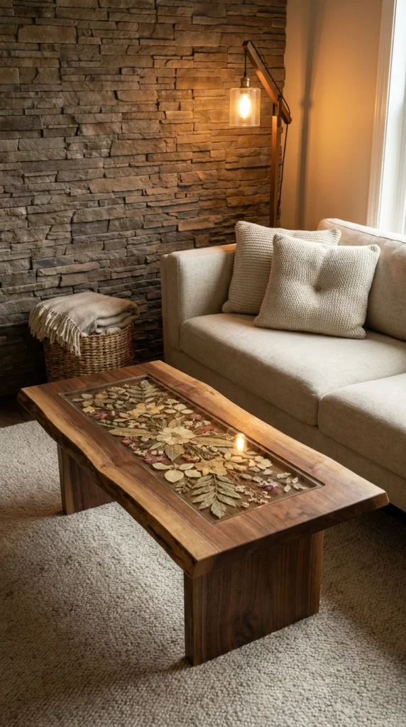
A live-edge walnut coffee table has a rectangular glass panel inset into its top, and beneath the glass sits an actual arrangement of pressed leaves and dried flowers, lit softly by a nearby floor lamp against a stacked-stone accent wall.
This is the most literal interpretation of “floral furniture” in this entire list, and it’s worth understanding why it’s structurally different from every other piece so far: nothing here is printed, carved, or stitched — actual dried botanicals are sealed permanently under glass, so the “pattern” is one-of-a-kind and will never be replicated by another manufacturer. That uniqueness is the entire selling point, and it also means image-based observation is doing real work in this description — the exact species pressed under this specific glass panel can’t be verified from a photo, only that pressed botanicals are visible.
This table suits nature-lovers, anyone doing a DIY furniture project, or a household that wants a genuinely one-of-a-kind piece rather than something replicable from a catalog. It’s an excellent fit for rustic, organic modern, or biophilic interiors, and pairs naturally with the kind of stacked-stone or reclaimed-wood backdrop shown here. It’s not the right choice for anyone who needs a coffee table to survive daily abuse from kids or pets — a glass inset like this scratches and requires more careful cleaning than a solid wood surface.
The advantage is genuine one-of-a-kind character; no two pressed-botanical tables will ever look identical. The compromise is the fragility of the glass inset and the fact that pressed florals can fade or discolor slightly over years of light exposure, since they’re organic material rather than dye or paint.
Why the Stone Wall Isn’t Competing With the Table
Stacked stone has its own strong texture, but it reads as neutral gray-brown rather than “patterned” the way the pressed florals do, which is why the two can share a room without fighting for attention — a busier patterned wallpaper behind this same table would have muddied the effect considerably. If earthy, textural backdrops like this appeal to you, the same restraint shows up in biophilic living rooms that lean on stone, wood, and greenery instead of printed pattern to create visual interest.
Recommended Materials: live-edge walnut, tempered glass inset, pressed dried florals and foliage, stacked stone (wall), woven jute rug Main Colors: Walnut Brown, Sage Green, Dusty Rose, Warm Gray Stone Best Lighting: A warm, angled floor lamp positioned close to the table, as shown — side lighting makes the pressed botanicals under the glass visible in relief instead of washing them out under flat overhead light Maintenance: Clean the glass inset with a dry or barely-damp microfiber cloth only — standard glass cleaner sprayed directly onto a sealed botanical inset can seep into seams and discolor the pressed material over time
Where This Look Falls Apart
- Using artificial or printed floral inserts instead of real pressed botanicals, which loses the entire one-of-a-kind appeal
- Placing it under strong direct sunlight for years, which will fade pressed florals faster than ambient or lamp lighting
- Cleaning the glass with harsh chemical sprays that can seep into the sealed edges
- Overloading the table’s surface with other objects, hiding the one detail the table is actually built to showcase
A Black Lacquer Cabinet Where Florals Are the Only Color in the Room
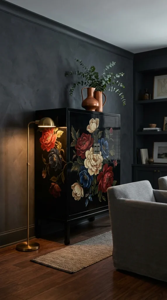
A glossy black lacquer cabinet, hand-painted with oversized red, cream, and blue peonies across both doors, sits in an almost entirely charcoal room — dark walls, dark floor, dark upholstery — lit by a single brass floor lamp and a copper vase of eucalyptus on top.
This is the boldest use of floral pattern on this list, and the proportion and scale logic is unusually high-stakes: in a room this monochromatic, the cabinet isn’t competing with other color, so every petal reads at full saturation with nothing to dilute it. That’s a completely different design calculation than the navy bench earlier — there, the florals shared the room with green plants and a blue wall; here, the florals are being asked to be the only color statement in the entire space.
Worth the Investment?
A piece this specific — glossy black lacquer with hand-painted florals this saturated — isn’t something you improvise with a furniture-paint kit and call it close enough. If the rest of a room is genuinely committed to a dark, moody palette, a cabinet like this earns its cost by being the one object doing all the color work; a cheaper faux-finish version would look like a decal next to walls this confidently dark. It’s not worth the investment in a room that already has color elsewhere — the effect only works because everything else stepped back.
This piece suits anyone building a dark academia, moody maximalist, or modern chinoiserie room, where a single lacquered statement cabinet is expected to anchor the entire palette. It’s the wrong move for a bright, airy room, where the contrast this cabinet depends on simply won’t exist. The advantage is undeniable visual impact — this is the piece guests will ask about. The compromise is that lacquer finishes show fingerprints and dust more visibly than a matte or wood-grain surface, and any chip in the glossy paint is hard to touch up seamlessly.
Is This Level of Contrast Worth the Upkeep?
Glossy lacquer needs more frequent, gentler dusting than a matte piece — every fingerprint and speck shows against that reflective black surface the way it never would on a satin finish. Anyone drawn to this level of drama should look at how dark, moody bedroom palettes balance saturated color against black or charcoal backdrops without tipping into feeling like a cave — the lighting logic is nearly identical to what’s happening in this room.
Recommended Materials: lacquered wood, hand-painted floral detailing, brass hardware and lighting, copper vessel, woven jute rug Main Colors: Charcoal Black, Crimson Red, Cream, Cobalt Blue, Copper Best Lighting: A single warm, directional lamp (as shown) rather than broad ambient light — this keeps the room’s darkness intact while still letting the floral colors glow under a focused beam Maintenance: Wipe the lacquered surface with a soft, dry microfiber cloth regularly; avoid ammonia-based cleaners, which can dull a lacquer finish over time
Easy Ways to Get This Wrong
- Attempting this look with faux or decal florals instead of genuinely hand-painted detailing, which reads as cheap next to a room this dramatic
- Adding other colorful accents nearby, which dilutes the single-f.o-hole room depends on
- Using bright overhead lighting instead of a focused lamp, which flattens the drama into ordinary
- Skipping the copper and brass accents, which are what keep the black-and-floral combination from feeling cold
A Painted Cottage Table Where the Flowers Match the Room’s Whole Mood
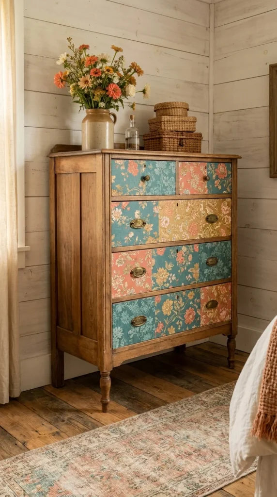
A cream-painted coffee table, its top and legs hand-decorated with small blue and coral folk-style florals, sits in a wood-paneled cabin living room with a plaid sofa and a worn vintage rug.
Unlike the bold, high-contrast lacquer cabinet above, this piece takes the opposite approach: the florals here are deliberately small-scale and softly colored, matching the informal, lived-in energy of a cabin rather than trying to be the loudest object in the room. This is a useful repetition principle case study — the same blue-and-coral color combination repeats in the vase of cornflowers sitting on top, tying styling and furniture together rather than treating them as separate decisions.
This table suits the same relaxed, warm, and timeless country living rooms where furniture is expected to feel collected and personal rather than showroom-new — folk-painted furniture like this often comes from flea markets, estate sales, or is hand-painted as a weekend project. It’s an easy DIY entry point for anyone who wants to try decorative painting themselves, since the scale and looseness of the florals is forgiving of imperfect brushwork. It’s a mismatch for a more formal contemporary room, where this level of rustic hand-painting would look out of place next to cleaner lines.
The advantage is accessibility — this is genuinely one of the more affordable ways to get floral pattern into a room, whether buying secondhand or painting a plain table yourself. The compromise is durability of the painted finish on a surface that gets daily contact; without a protective topcoat, hand-painted details on a coffee table wear down faster than furniture with less hands-on use.
What This Table Solves in Daily Use
A busy household needs a coffee table that can take a mug ring or a scuff without the whole piece looking ruined — the painted florals here are distributed across the whole surface rather than concentrated in one spot, so minor wear blends into the pattern instead of standing out as damage the way it would on a solid-color painted surface.
Recommended Materials: painted solid wood, ceramic vase, terracotta planter, vintage wool-blend rug Main Colors: Cream, Cornflower Blue, Coral, Sage Green, Warm Wood Best Lighting: Warm ambient lamp light against wood paneling, as shown — this palette depends on warm, low light to keep the cream base from reading stark white Maintenance: Apply a clear protective topcoat (matte polyurethane or wax) over hand-painted furniture that sees daily use, and reapply every couple of years depending on how much contact the surface gets
Where This Look Falls Apart
- Skipping a protective topcoat on a piece that will see daily coffee mugs and daily contact
- Using saturated, high-contrast paint colors instead of the softer, muted palette that matches a cabin’s relaxed mood
- Pairing it with sleek, contemporary furniture instead of other collected, textural pieces
- Choosing a glossy paint finish instead of matte, which reads too polished for this style
An Antique Marquetry Table Where the Flowers Are Made of Wood, Not Paint
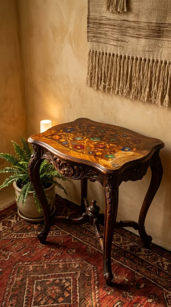
A dark wood side table with elaborately carved cabriole legs has a floral pattern built entirely from inlaid wood veneer — marquetry — in its tabletop, with different wood tones and colored inlays forming the petals and leaves, set against a richly patterned antique rug.
This is technically the most demanding floral technique in the entire list: marquetry involves cutting thin veneers of different wood species (and sometimes dyed wood or other materials) into shapes and inlaying them flush into the surface, meaning the floral pattern here is structural, not applied on top. The material behavior worth understanding is that genuine marquetry ages differently than paint or print — wood tones shift subtly over decades of light exposure, which is part of what gives an authentic antique piece its patina, rather than something to try to prevent.
This table suits anyone drawn to genuine antiques, estate pieces, or fine reproduction furniture — it’s a side table, occasional table, or lamp table rather than a piece meant for heavy daily use. It fits traditional, European antique, or eclectic-maximalist interiors that already lean into layered pattern, like the richly patterned rug shown beneath it. It’s the wrong choice for anyone furnishing a minimalist or strictly modern space, where this level of ornamentation would look historically out of place rather than intentional.
The advantage is craftsmanship that can’t be replicated cheaply — genuine marquetry is a dying trade skill, and pieces like this typically appreciate rather than depreciate in value if authentic and well-maintained. The compromise is fragility: inlaid veneer can lift, crack, or separate with humidity swings, and repair requires a specialist, not a general furniture restorer.
Is the Investment Worth It Here?
A well-preserved antique marquetry table is a genuinely different financial category than the painted cottage table or the lacquer cabinet earlier in this list — it’s closer to a piece of art than a functional purchase, and its value depends heavily on age, condition, and provenance rather than current furniture-market pricing.
Recommended Materials: inlaid wood veneer marquetry, hand-carved hardwood legs, antique wool rug Main Colors: Deep Walnut, Amber, Burgundy, Sage Green, Cobalt Blue Best Lighting: Warm, low, indirect lighting, as shown here with a single pillar candle nearby — direct sun is actually a risk for antique marquetry, since UV exposure accelerates the same wood-tone shifting that otherwise happens gradually and evenly with age Maintenance: Keep humidity in the room stable where possible; sudden swings are what cause inlaid veneer to lift or crack, more than any single cleaning product would
What Trips People Up Recreating This
- Placing a genuine antique marquetry piece in a room with fluctuating humidity, like near a radiator or an exterior door
- Cleaning with furniture polish containing silicone, which can seep into veneer seams over time
- Exposing it to direct sunlight for extended periods, accelerating uneven fading
- Assuming a “marquetry-style” printed or decal tabletop will read the same as genuine inlay — it won’t, up close
Placing Floral Furniture Room by Room
- Entryways and hallways: lean on carved, painted, or ceramic floral pieces (like the sideboard or vase above) since these spaces are passed through, not lived in — detail-heavy pieces get appreciated on the way by rather than worn down by daily use
- Living rooms: balance one floral statement piece against otherwise neutral seating; two heavily patterned pieces in the same sightline (a floral sofa and a floral cabinet) usually competes rather than complements
- Bedrooms: floral textiles and complementary pieces work well in a bed, but keep heavily upholstered floral furniture away from a room’s main walking path, since fabric-heavy florals show wear fastest in high-contact zones
- Dining and cozy nooks: hand-painted or pressed-botanical tabletops. (like the coffee table example above) Suits rooms where people linger and actually look down at the surface in front of them
Who Should Choose This Style?
- Best for homeowners who want one confident focal point rather than pattern spread evenly across a room
- Best for anyone drawn to craftsmanship — carving, embroidery, marquetry, and hand-painting all reward a closer look, not just a glance
- Best for renters or first-time pattern-users starting small with a painted vase or embroidered pillows before committing to upholstery
- Not ideal for households prioritizing low-maintenance, wipe-clean furniture, since several of these techniques (beading, lacquer, inlay) need gentler care than standard upholstery
Budget Summary
| Budget | Expectation |
|---|---|
| Low | Painted ceramic vase, embroidered floral pillow covers, a secondhand folk-painted side table |
| Medium | A reupholstered floral bench, a hand-painted lacquer-finish cabinet from a mid-range retailer |
| Premium | Genuine hand-carved sideboard, authentic antique marquetry table, custom pressed-botanical glass-top table |
FAQ
Does floral furniture only work in traditional or cottage-style homes? No — the pieces in this guide span mid-century, moody maximalist, boho, and rustic interiors. What matters more than the overall style label is scale and contrast: a large, saturated floral piece (like the black lacquer cabinet) can work in a modern room if the rest of the space is genuinely neutral enough to let it stand out.
How many floral pieces can one room actually hold? Most of the rooms shown here commit to exactly one floral furniture moment, sometimes echoed by a single supporting textile or vase in the same palette. Two or more competing floral pieces in the same sightline generally reads as cluttered rather than curated, unless they’re deliberately restrained in scale, like small embroidered pillows.
Is hand-painted or carved floral furniture harder to maintain than plain furniture? Somewhat, yes, though it varies by technique. Carved wood mainly needs careful dusting in the grooves; lacquer shows fingerprints more readily than matte finishes; beaded and appliquéd textiles need gentler cleaning than woven fabric; and antique marquetry is the most humidity-sensitive of all the techniques covered here.
Can floral furniture work with pets or young kids in the house? Some pieces are more forgiving than others. Painted or lacquered case furniture (cabinets, side tables) generally holds up better around pets than delicate embroidered or beaded upholstery, which can snag or flatten under regular contact.
Author Box
Aesthetic Life Team covers real-room interior design across every style and budget, from antique furniture and hand-crafted detailing to everyday, renter-friendly decorating ideas.
Conclusion
The nine pieces in this guide prove that “floral” isn’t one look — it’s a whole spectrum of technique, from a single painted vase to a museum-grade antique inlay, and each one asks something different of the room around it. The common thread isn’t the flowers themselves; it’s restraint. Every example here works because the rest of the room stepped back and let one confident piece do the talking. Start with a piece that matches your actual maintenance tolerance and budget, place it against a backdrop that lets its color or texture register, and resist the urge to add a second competing floral piece in the same sightline.
Explore More
You may also enjoy: