
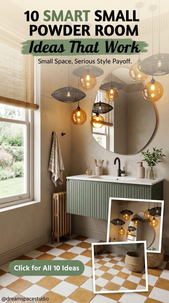
Design visuals created for illustrative purposes.
Most powder rooms get treated like an afterthought—a leftover closet with a toilet crammed in, painted whatever color was left over from the hallway. That’s usually because the room feels too small to justify real design effort. Thirty square feet doesn’t seem worth a statement wallpaper or a good light fixture, so it gets skipped entirely.
But the smallest room in the house is often where design choices show up the clearest. There’s no furniture to hide behind, no sprawling floor plan to distract from a weak wall color. Every material, every fixture, every inch of that tiny footprint is doing visible work — for better or worse.
These ten powder rooms make the case that limited square footage isn’t the obstacle people assume it is. Some lean into bold color. Others strip everything back to one strong material. What they share is intention — nothing in these spaces feels like it was left over from another room’s leftover paint can.
1. The Terracotta Wall That Makes Brass Glow
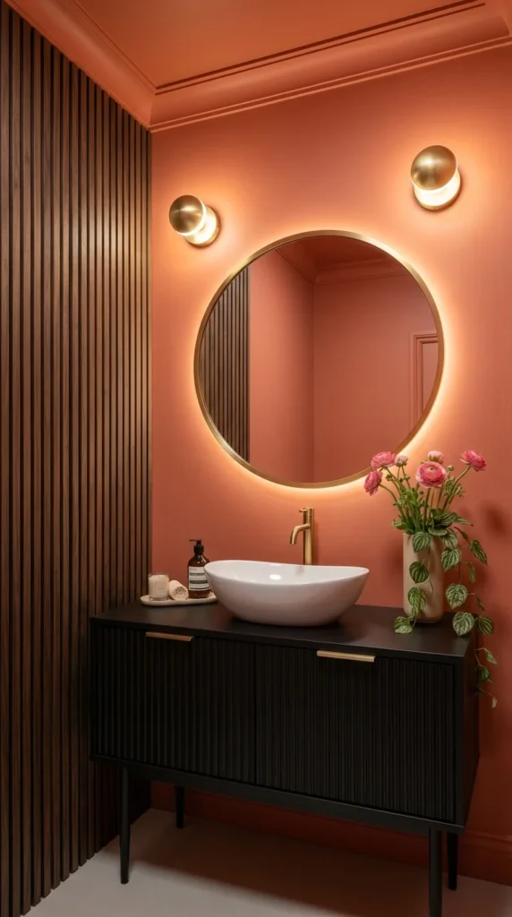
This bathroom commits to one bold color and lets everything else respond to it. The warm terracotta wall isn’t just a paint choice—it’s what makes the brass mirror frame, faucet, and sconces look distinctly gold instead of just metallic. Against a neutral wall, the same brass would look ordinary. Here, it glows.
The fluted wood panel on the left wall earns its place too. It breaks up what would otherwise be a flat expanse of color and adds textural contrast against the smooth painted surface. Paired with the black fluted vanity front, the ribbing detail repeats without feeling matched on purpose—it just feels considered.
The backlit round mirror pulls double duty here, working as both function and ambient lighting and softening a space that has no natural light source of its own.
💡 Pro Tip
If committing to a saturated wall color feels risky, test it on the ceiling first, as shown here. A colored ceiling comes across as a deliberate design choice rather than a full-room gamble, and it’s easier to repaint if you change your mind.
2. Pink Plinths Flank a Green Vanity in the Middle
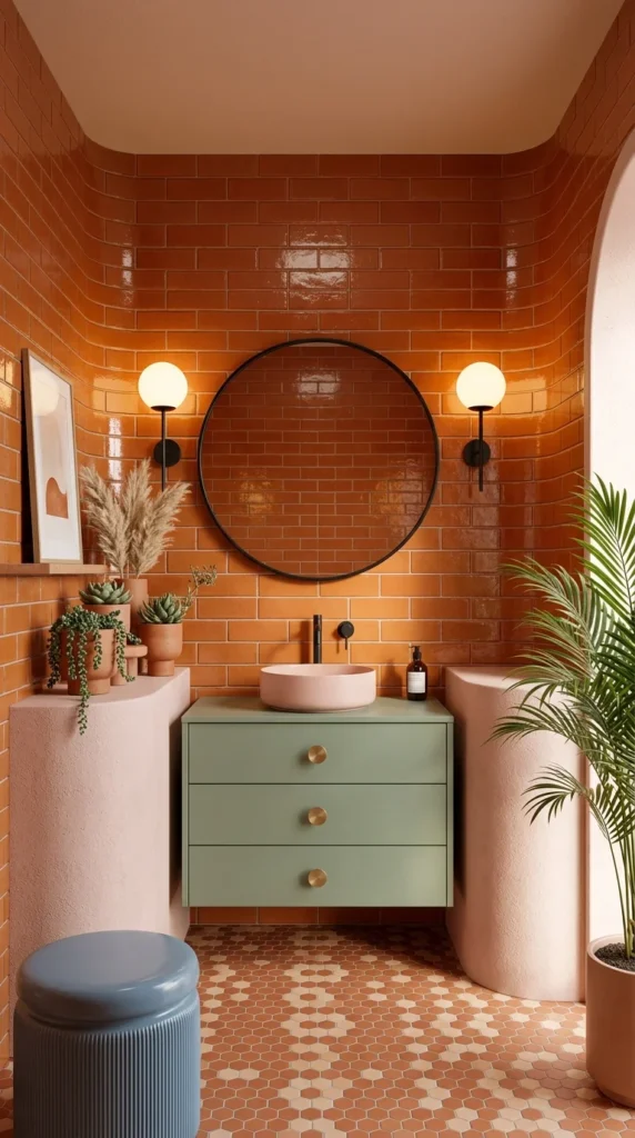
This layout treats the vanity as the centerpiece of a set, not a standalone piece. A sage green cabinet sits between two solid pink plinths—one holding plants, the other acting as a side column—and together the three pieces come across as one built-in unit rather than furniture pushed against a wall.
Warm orange brick tile covers every wall surface, and the round black mirror is the one shape and color that doesn’t match anything else in the room, which is exactly why it works as a focal point. Matching globe sconces on either side balance the mirror without competing with it.
The blush vessel sink continues the pink from the plinths onto the counter itself, tying the whole grouping together in one continuous color line from floor to faucet.
💡 Pro Tip
Don’t have built-in plinths? A pair of matching pedestal side tables in a solid color can recreate this framed-vanity effect without any construction work.
3. An Ornate Gold Frame Against Charcoal Walls
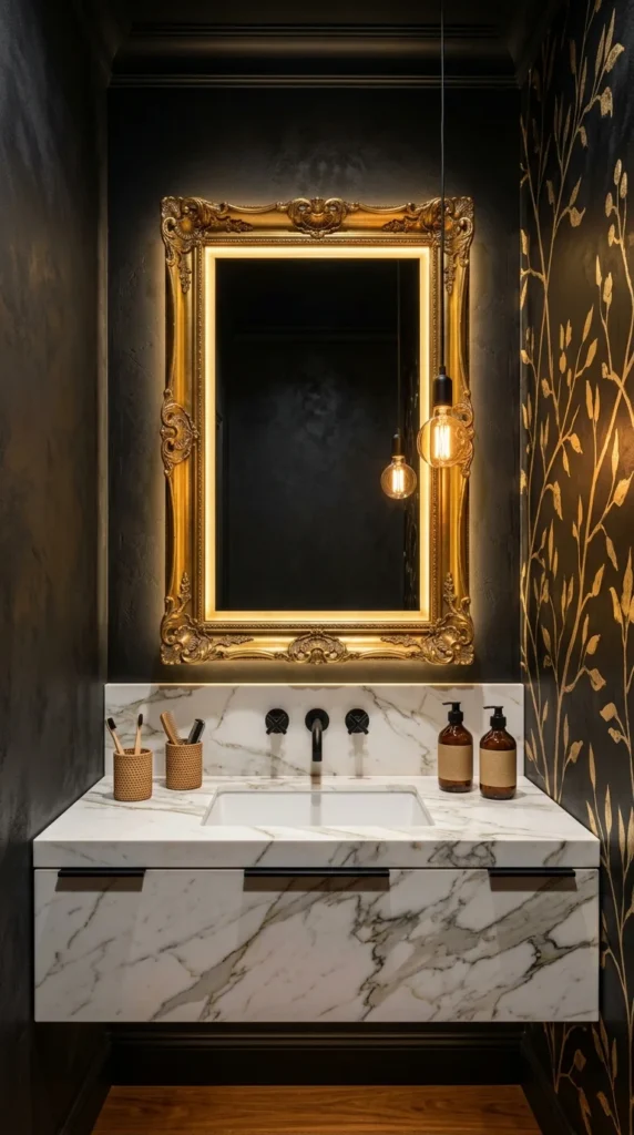
This bathroom pairs an antique-style backlit gold mirror with a fully modern floating marble vanity, and the contrast is what makes it feel expensive rather than mismatched. The mirror’s carved detailing would look fussy against a pale wall, but set on deep charcoal plaster, it stands out as the room’s one dramatic focal point.
Backlighting behind the frame carries most of the room’s ambiance in a space with no visible ceiling fixture. Combined with the single bare-bulb pendant hanging beside it, the lighting stays warm and low, which suits the moody wall color instead of fighting it.
The gold botanical wallpaper on the side wall picks up the mirror’s metal tone without repeating the same ornate pattern, so the two gold elements feel related rather than duplicated.
⚠️ Warning
Pairing an ornate vintage-style mirror with minimal modern fixtures only works if the finishes actually match in tone. A warm antique gold frame next to cool silver or chrome hardware will look like two different design eras collided by accident, not on purpose.
4. A Deep Red Vanity Anchors an All-Beige Room
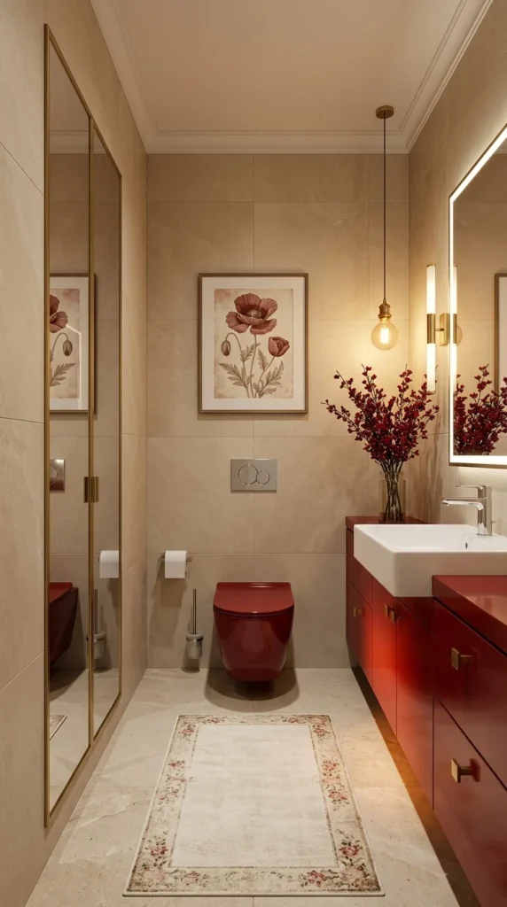
Every surface in this bathroom — walls, floor, even the full-length mirror frame — stays in the same warm beige stone tone. That restraint is what allows the red vanity and matching red toilet to define the entire room’s personality without a second color competing for attention.
The floor-to-ceiling mirror on the left wall does more than reflect light. It doubles the visual width of a narrow room, making the red furniture feel less overwhelming than it would against a shorter mirror.
A single pendant bulb hangs bare beside the backlit vanity mirror, keeping the lighting intentionally minimal so nothing distracts from the red-and-beige pairing itself.
📌 Important Note — The One Change That Made This Work
❌ Before: In most beige stone bathrooms, fixtures stay white or cream to avoid clashing with the neutral tile.
✅ After: Painting the toilet and vanity red turns two functional pieces into the room’s main design statement.
5. Woven Wall Objects Do the Job of Framed Art
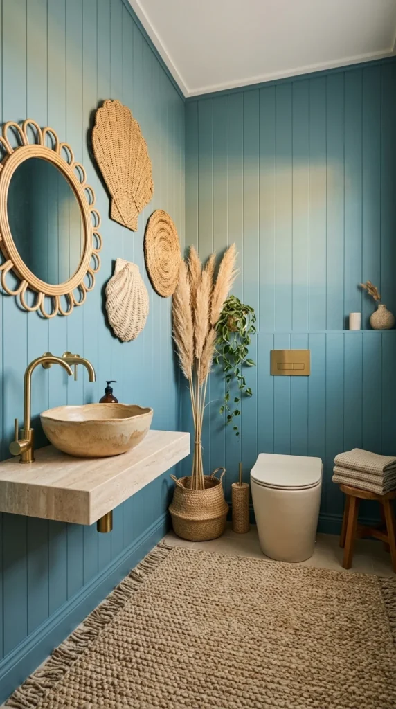
Instead of hanging art, this bathroom stacks woven shells and a rattan sun mirror straight onto the vertical shiplap wall. It’s an unconventional swap, but it works because the shapes echo each other—round mirror, round straw mat, and scalloped shell edges—so the grouping comes across as intentional rather than random.
The dusty blue tongue-and-groove paneling covers the entire wall rather than stopping at a standard half-height, giving the room a cabin-like coziness instead of the clinical feel a painted drywall bathroom often has. Brass fixtures against that muted blue pop without needing to be flashy.
A stone vessel sink and honed travertine counter bring in warmth that balances the coastal-blue backdrop, while pampas grass and a jute rug push the space toward relaxed, textural, beach-house territory.
📌 Important Note
This much wall texture and object layering only stays balanced because the color palette is limited to blue, tan, and brass. Add even one more competing color and the wall grouping starts to look cluttered instead of curated.
6. A Two-Tone Wall Split at Exactly the Right Height
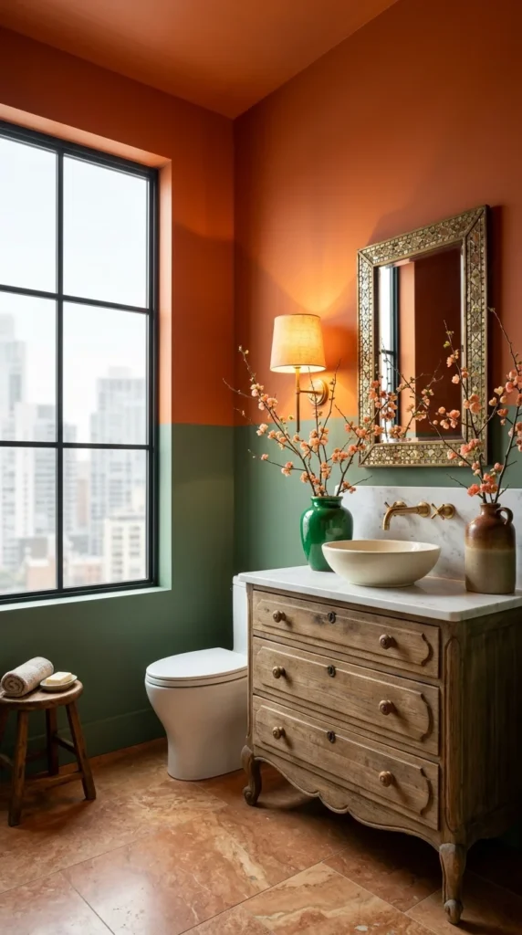
Instead of choosing one wall color, this room commits to two — burnt orange above, olive green below — split with a clean horizontal line. The trick is where that line falls: right at the height of the window’s midpoint, giving the colorblock the look of a planned architectural detail instead of an arbitrary paint decision.
An antique dresser stands in as the vanity, and it changes the entire feel of the room. Carved wood drawers and curved legs read as furniture, not fixtures—softening what would otherwise be a fairly graphic, high-contrast color scheme. The vessel sink sits on top rather than being built in, keeping that furniture-first illusion intact.
Warm terracotta floor tile ties back to the orange upper wall, while the green lower half and the antique wood find their own quieter connection.
Recreating This Look: Budget Tiers
💚 Affordable Version — Paint a standard vanity two colors to mimic the wall split, and use a budget vessel bowl instead of an antique piece.
💛 Mid-Range Version — Source a secondhand dresser and have it professionally converted into a vanity — most of the character comes from the piece itself.
💎 Investment Version — A custom-built vanity with hand-carved detailing and a Venetian-glass mirror frame, matched to the exact tones of the two-tone wall.
7. Five Pendant Lights Where One Fixture Belonged
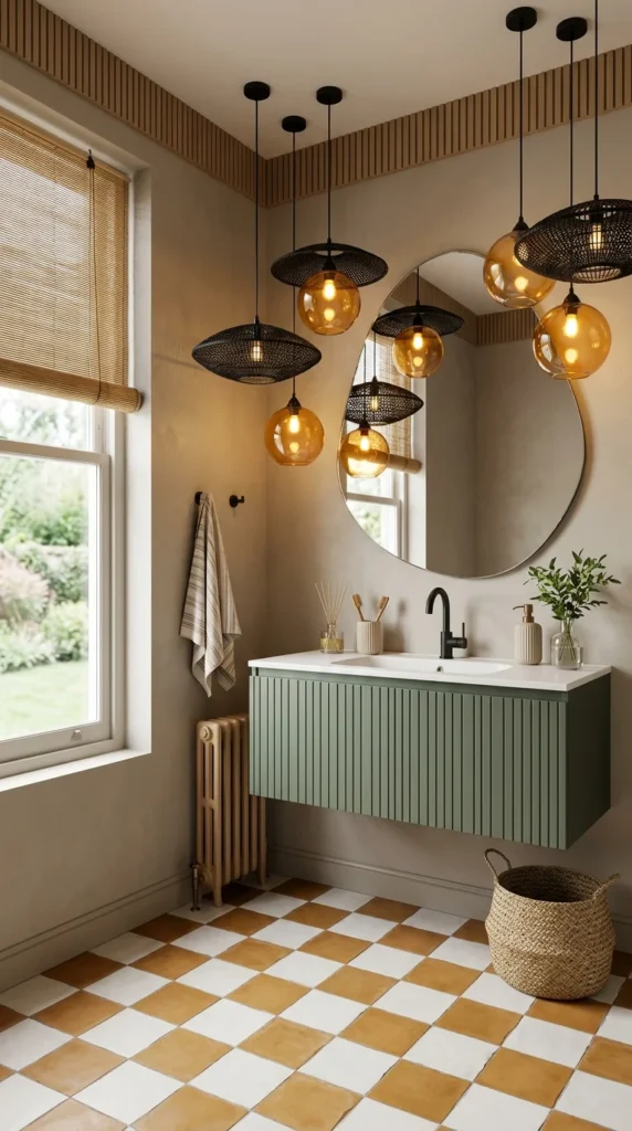
This vanity breaks the usual rule of one light fixture per sink. Five amber glass pendants, clustered at different heights, hang across the mirror instead of beside it—turning what’s normally a functional necessity into the room’s main visual event. It only works because the mirror is oversized enough to hold its own against that much hanging hardware.
The sage green fluted vanity keeps the room from tipping into visual overload. Its vertical grooves echo the wood slat detail running along the ceiling edge, giving the eye a calm surface to land on after taking in the pendant cluster and the checkerboard floor.
That amber-and-white checkerboard tile pulls the same warm tone from the pendant glass down to floor level, so the lighting and the flooring feel like part of the same decision.
⚠️ Warning
Clustering multiple pendants like this only works with a ceiling height that can handle the visual weight — usually 9 feet or more. In a standard 8-foot bathroom, this many fixtures at staggered heights will feel crowded rather than dramatic.
8. Patterned Terracotta Tile Sets a Vintage Tone
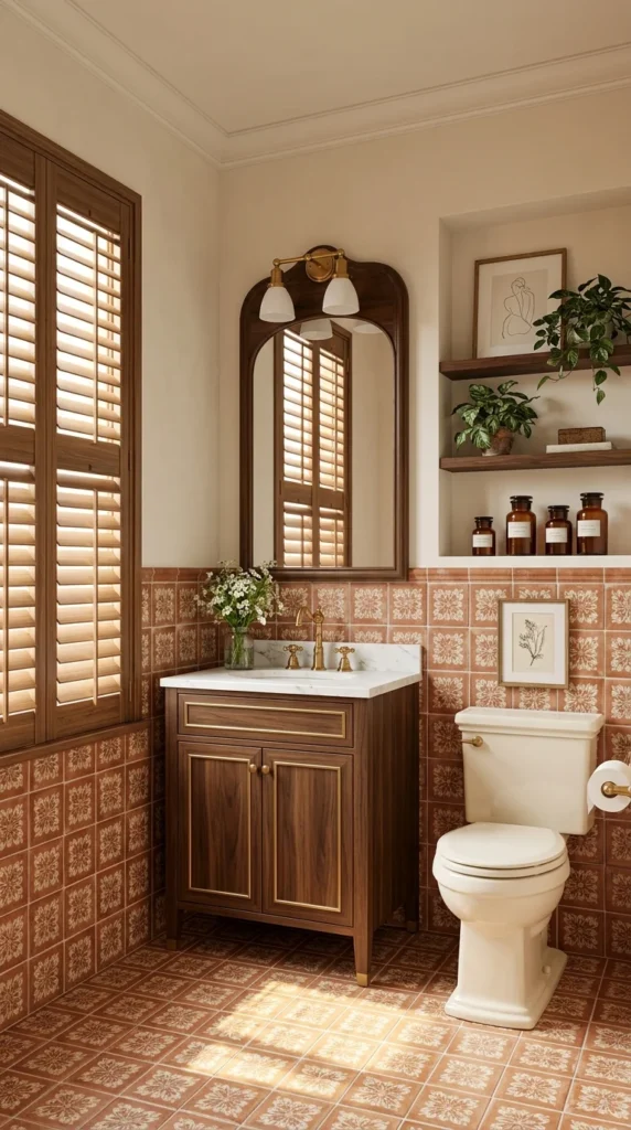
This room leans fully into pattern instead of avoiding it. The terracotta tile—repeated across both the floor and the half-wall—carries a Spanish-revival feel that a plain tile simply couldn’t deliver. Keeping the pattern consistent across two surfaces stops it from looking busy.
The plantation shutters do more than filter light. Their warm wood tone ties directly into the walnut vanity and arched mirror frame, so three separate elements end up telling one coordinated material story instead of feeling like three unrelated decisions.
The recessed shelf niche is the quiet win here—built into the wall instead of floating, it gives the plants and apothecary jars a defined space without adding visual clutter to an already pattern-heavy room.
Before You Recreate This Look
- A tile pattern with warm, muted tones (avoid high-contrast patterns in a small room)
- Wood-toned window treatment matching the vanity finish
- A recessed or built-in shelf, not a floating one
- Brass or gold hardware to tie the metals together
- A mirror frame that echoes the window shutter material
9. Dusty Pink Against Textured Blue Tile
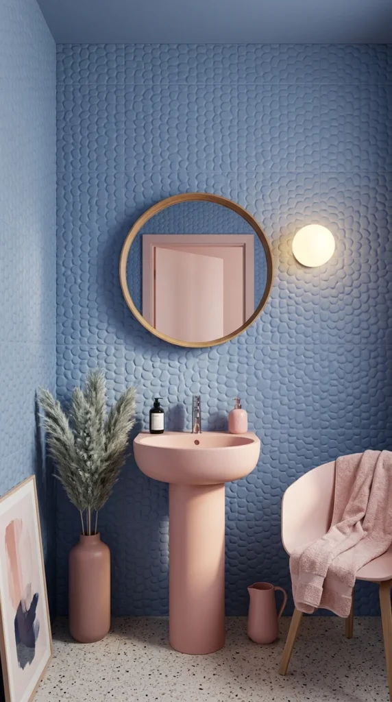
Color pairing is the main idea driving this entire space. The dusty pink pedestal sink and vase sit against a cool, pebble-textured blue tile—two tones that shouldn’t work together on paper but do because neither one is fully saturated. Muted pink and muted blue come across as a pair, not a clash.
The tile texture itself adds dimension without adding pattern. From a distance it looks like a flat solid color; up close, the raised pebble surface catches light differently across the wall, giving the room depth that a plain tile couldn’t offer in a space this size.
A pedestal sink was the right call here too — it keeps sightlines open in a narrow footprint, letting the terrazzo floor and the corner plant stay visible instead of being blocked by a bulky vanity.
📌 Important Note
Pedestal sinks look clean but offer zero storage. This layout only works if you have a linen closet or shelving elsewhere for toiletries — otherwise everything ends up cluttering the sink edge.
10. Green Subway Tile Meets a Wall of Warm Wood
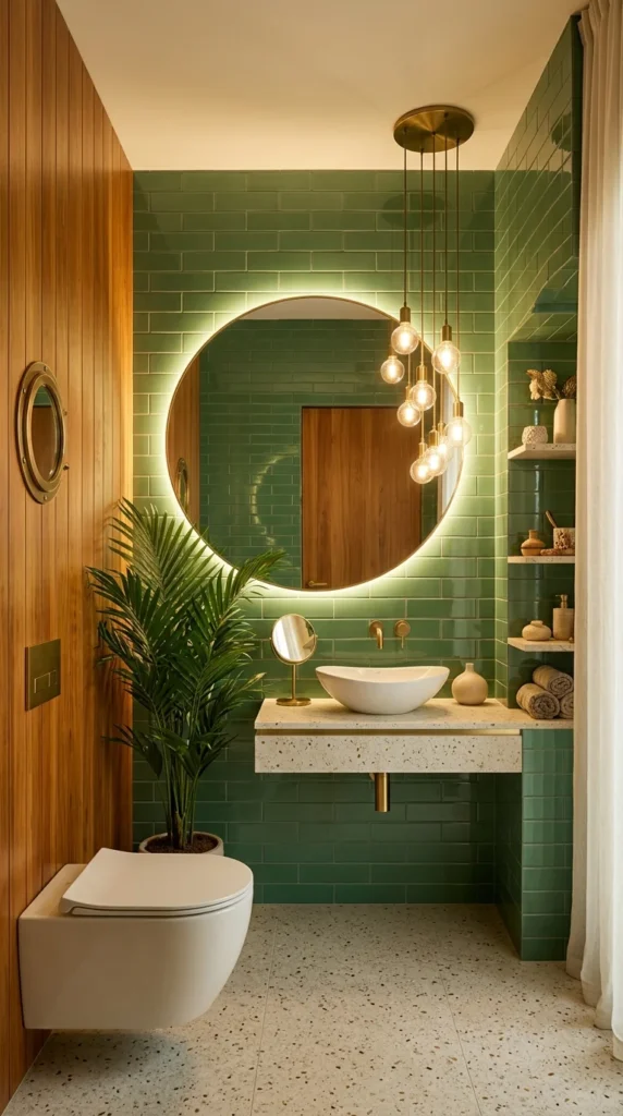
This room splits its wall treatment cleanly in two—glossy green subway tile on one side, vertical wood paneling on the other—and lets the wall-mounted toilet sit right at the seam between them. Wall-mounting the toilet keeps the floor visually uninterrupted, which matters more in a room already carrying two competing wall materials.
A cluster of bare bulbs hangs at staggered lengths beside the backlit round mirror, keeping the lighting layered instead of relying on a single overhead fixture. A small round vanity mirror sits independently near the sink for practical close-up use.
Terrazzo flooring ties the green tile and the wood tone together with flecks of both colors running through it.
Green Subway Tile vs Wood Paneling as the Main Wall Material
| Factor | Green Subway Tile | Wood Paneling |
|---|---|---|
| Moisture resistance | High | Needs sealing |
| Installation | Professional tiling | DIY-possible |
| Visual effect | Cool, reflective | Warm, textured |
| Best for | Wet zones near sink | Drier accent walls |
Conclusion
What ties these ten powder rooms together isn’t a shared style — it’s a shared refusal to treat a small room as a lesser one. Some lean on saturated color, others on pattern or texture, but every space here makes a clear decision and follows through on it instead of defaulting to safe, forgettable neutrals.
The other pattern worth noticing is restraint paired with commitment. A bold wall color works because the rest of the room stays quiet. A cluster of pendant lights works because the vanity underneath is simple. None of these rooms try to do everything at once—and that’s exactly what makes a small space feel finished rather than cramped.
If there’s one takeaway to borrow for your own powder room, it’s this: pick one strong material or color decision, and let every other choice support it instead of compete with it.
Frequently Asked Questions
How do you make a small powder room feel bigger?
Keep sightlines open with a pedestal or wall-mounted sink instead of a bulky vanity, use a large mirror to bounce light, and limit the wall to one or two colors rather than several competing tones.
Is it okay to use bold color in a small bathroom?
Yes — small rooms are often the best place for bold color since there’s less furniture to break it up. The key is committing fully rather than adding it in small accents, which can look accidental.
What’s the best sink type for a tiny powder room?
Pedestal and wall-mounted sinks work best for tight footprints since they keep the floor visible. The tradeoff is storage, so plan for a nearby closet or shelf for toiletries.
Do all the fixtures in a powder room need to match?
Not exactly — but the metal finishes (brass, black, chrome) should stay consistent throughout the room. Mixing warm and cool metals in the same small space tends to look unintentional.
How much does a powder room makeover typically cost?
It depends heavily on scope. Paint and hardware swaps are the most affordable route, while retiling, plumbing changes, or custom vanities push costs significantly higher. Budgeting by tier — cosmetic, mid-range, or full renovation — is the easiest way to plan.


One Response