
Mid-century style keeps coming back to apartments for one simple reason: it solves small-space problems without making the room feel cold or empty. Curved arms replace boxy corners, warm wood replaces heavy cabinetry, and every piece is scaled to be lived with, not just looked at. But “mid-century” covers a lot of ground—a moody green study wall and a sky-blue color-block living room are both technically correct, and technically very different apartments to live in.
This guide breaks down ten real mid-century apartment living rooms, each built around one clear design decision—a color, a material, or a layout choice—so you can see exactly which direction actually fits your space, your budget, and how you use your living room day to day.
Quick Overview
| Style | Mid-Century Modern |
|---|---|
| Best For | Apartments, rentals, small-to-mid living rooms |
| Budget | Medium |
| Difficulty | Easy–Moderate, DIY-friendly |
| Maintenance Level | Low–Medium |
1. The Glass-Box Living Room That Lets the Forest Do the Decorating
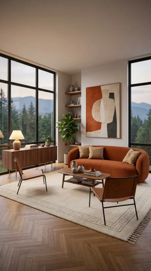
A burnt-orange boucle sofa curves gently around the corner of this room, but the real decision here isn’t the sofa—it’s the decision to let two full walls of black-framed windows outrank everything else in the space. Herringbone oak flooring, a walnut console, and a leather sling chair all sit slightly lower in visual weight than the view outside, and that hierarchy is deliberate.
This idea works because it treats the window as the artwork and the furniture as support. It suits apartments with a genuine view worth showing off—a tree line, a skyline, even a courtyard with mature planting—and it rewards people who’d rather buy fewer, better pieces than fill every wall. Families who like a busy, layered look will find this room too quiet; it’s built for people who want the outside to feel like part of the square footage.
The clearest advantage is how much bigger the apartment reads because of it—glass this size erases the sense of a boundary. The compromise is privacy and heat: uncovered floor-to-ceiling glass means visible interiors at night and real heat gain in summer, so sheer roller shades are doing quiet, necessary work even when you can’t see them in the photo.
To recreate it on a smaller budget, one wall of taller curtains hung close to the ceiling line, and a single warm-toned sofa will get most of the effect without new windows. Herringbone flooring and a matching console can wait—the light-to-furniture ratio matters more than any individual piece.
💡 Quick Tip: If your apartment doesn’t have this much natural light, keep every piece of furniture a shade lighter than you’d normally choose—it borrows brightness the windows can’t provide.
If you’re furnishing a living room from scratch, our breakdown of the grey couch living room looks is a useful companion read for comparing how a neutral sofa base changes everything else you can layer in.
Where the Glass Gets People Into Trouble
- Hanging curtains at window height instead of ceiling height, which shrinks the room visually
- Choosing a rug too small for the seating group, leaving furniture floating in front of all that glass
- Skipping window treatments entirely and dealing with glare on screens by mid-afternoon
- Matching every wood tone in the room instead of letting the console read slightly darker than the floor
Recommended Materials: Herringbone oak flooring, walnut veneer console, boucle upholstery, leather (sling chair), ceramic vase accents, wool-blend area rug
Main Colors: Burnt Terracotta, Warm Walnut, Soft Ivory, Sage Green (plant foliage)
Best Lighting: Lead with the natural light from the dual window walls; add one warm-toned table lamp on the console for evening ambiance rather than overhead fixtures, which would compete with the view.
Maintenance: The fiddle-leaf fig and potted greenery need bright, indirect light and weekly watering; boucle upholstery should be vacuumed with a soft brush attachment to avoid flattening the loop texture.
2. The Emerald Wall That Turns Three Mirrors Into a Focal Point
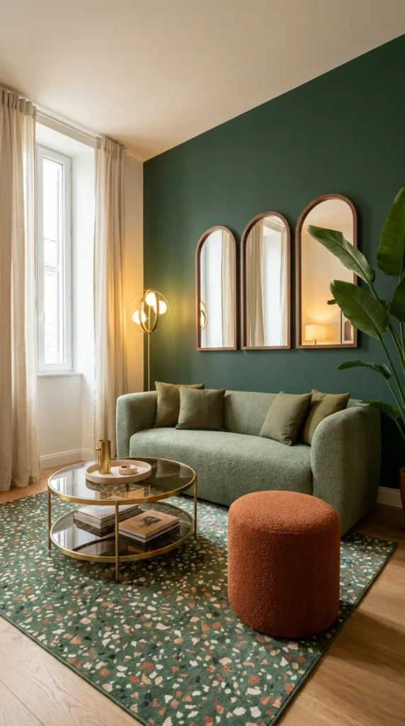
This room makes one bold move—a deep forest-green accent wall—and then repeats it with three arched mirrors that don’t just reflect light; they visually stack into an architectural feature of their own. The sage boucle sofa and terracotta pouf are almost neutral by comparison, which is exactly what lets the wall color carry the room.
The personality here reads sophisticated and slightly formal, but it avoids feeling stiff because the terrazzo rug reintroduces movement and imperfection underfoot. This works best in apartments with decent ceiling height, since a dark saturated wall in a low-ceilinged room can start to feel like it’s closing in rather than adding drama.
Anyone drawn to jewel tones but nervous about full-room color should look at this approach specifically—it isolates the boldness to a single wall, so the rest of the room can stay calm. It’s a strong fit for a formal-leaning apartment living room, less so for a room that also needs to function as a kids’ play space, since the styling reads adult and considered rather than durable.
One thing worth understanding: the three mirrors aren’t purely decorative. Arched shapes echo the window shape typically found in older apartment buildings, which is part of why this combination reads intentional instead of trend-chasing. To simplify for a smaller budget, a single large arched mirror does most of the same visual lifting as the trio, just with less repetition.
🪞 Quick Tip: Hang mirror groupings at a consistent baseline, not a consistent top edge—it reads more deliberate and less like a gap-fill.
A Wall Color This Bold Needs a Few Guardrails
- Painting the wall without sampling it under evening lamp light first, where dark green can shift almost black
- Skipping a rug with any pattern, which leaves nothing to soften the room’s formality
- Using cool-white bulbs against a green wall, which drains the warmth the palette depends on
- Hanging mirrors too high, breaking the sightline the arches are meant to create
Recommended Materials: Boucle upholstery, walnut mirror framing, brass table legs, terrazzo-pattern rug, glass tabletop
Main Colors: Forest Green, Sage, Terracotta, Warm Brass
Best Lighting: A brass arc floor lamp handles the evening ambiance; keep bulbs warm-toned (2700K) so the green wall doesn’t read cold or institutional after dark.
3. The Sunburst-and-Mustard Room That Commits Fully to the Era
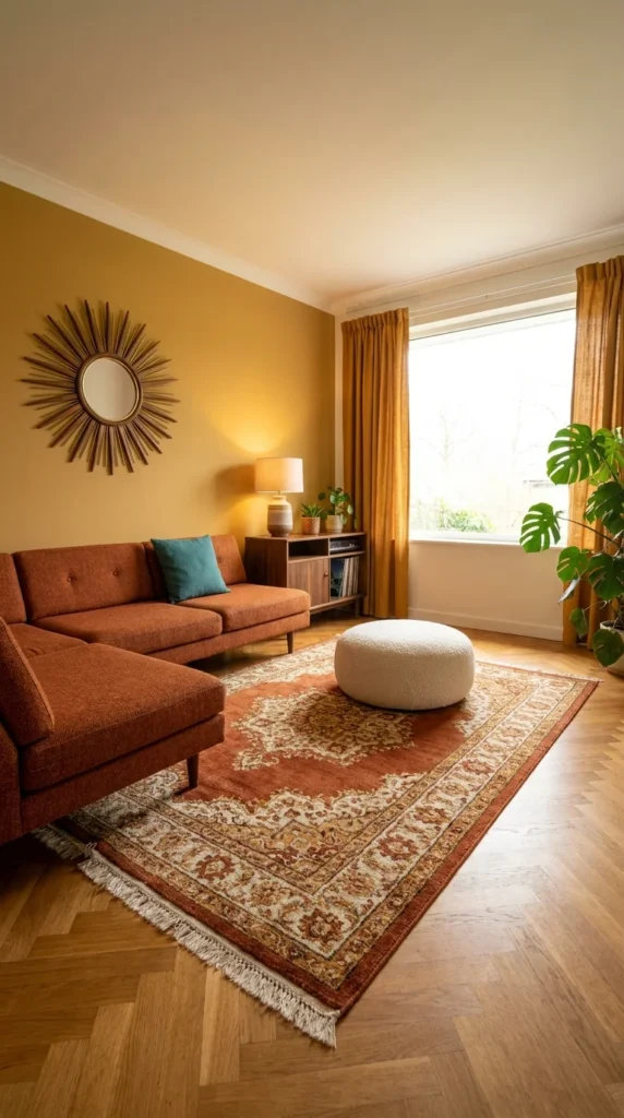
If one image in this list is the textbook definition of mid-century color, it’s this one. A mustard-gold accent wall, a starburst mirror, and a burnt-orange sectional aren’t hedging toward “mid-century inspired”—they’re playing the era straight, and the medallion-pattern rug grounds it in something closer to a lived-in apartment than a showroom set.
This suits someone who wants their apartment to read as a genuine style statement, not a safe neutral base with a few retro accents added later. It’s a confident choice, and confidence is really the deciding factor for whether this fits—a room this color-committed either feels like home immediately or it feels like too much, and there’s not much middle ground.
The strongest advantage is how instantly recognizable and photogenic the palette is; it doesn’t need much else added to feel finished. The tradeoff is resale flexibility—a mustard accent wall this saturated is a bigger repaint job for a future tenant or buyer than a neutral one, which matters more in owned apartments than rentals.
Recreating it starts with the wall color, not the furniture—mustard paint is inexpensive and instantly sets the era, while the sunburst mirror can be found secondhand for a fraction of a new one. If a full sectional feels like too much commitment, a single burnt-orange armchair against the mustard wall carries almost the same visual message. For rug direction that still leans traditional-meets-retro like this one, our guide to rug styles that add coziness breaks down how pattern scale changes a room’s mood.
🎨 Quick Tip: Test mustard paint on a large board, not directly on the wall—it shifts dramatically between morning and lamp-lit evening light.
Common Missteps With a Palette This Strong
- Adding too many additional bold colors, which competes with the wall instead of complementing it
- Choosing a cool-toned white pouf that clashes with the warm undertones in the wall
- Placing the sunburst mirror off-center from the seating group, breaking the room’s symmetry
- Under-lighting the space, which makes a saturated wall feel heavy instead of energizing
Recommended Materials: Painted plaster wall, woven-fringe curtains, boucle upholstery, wool medallion rug, walnut media console
Main Colors: Mustard Gold, Burnt Orange, Teal (accent pillow), Cream
Best Lighting: A ceramic table lamp with a linen shade softens the saturated wall in the evening; during the day, sheer curtains keep the mustard from turning overpowering under direct sun.
4. The Gallery Wall That Turns a Reading Corner Into the Whole Point
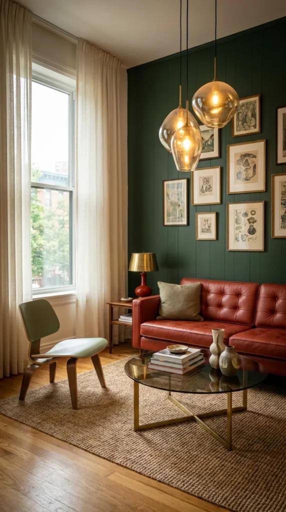
This room’s defining move isn’t the leather sofa or the plywood chair—it’s the tight grid of vintage-style prints against a dark green shiplap wall, lit by a cluster of glass globe pendants hung at three different heights. That lighting cluster is doing more compositional work than a single fixture ever could; it draws the eye upward and gives the gallery wall somewhere to sit within the room’s proportions.
The personality is collected and slightly literary—this reads like an apartment belonging to someone who actually owns the books on that side table, not someone styling for a photo. It suits a smaller seating nook rather than a full open-plan living room, since the density of the gallery wall needs a contained space to feel curated instead of cluttered.
Its biggest strength is how personal and non-generic it feels; no two gallery walls built this way will ever look the same. Its real compromise is commitment—hanging nine or ten framed pieces means real wall damage if you rearrange often, which makes it a poor fit for anyone who moves apartments frequently.
To simplify this for a rental, a smaller four-piece grid using removable picture-hanging strips gets close to the same effect without the wall holes. Keep the frames a consistent color family (here, aged wood and brass) even if the art itself varies—that consistency is what keeps ten different pieces from looking chaotic.
🖼️ Quick Tip: Lay the full gallery arrangement out on the floor first and photograph it from above before a single nail goes into the wall.
Where a Gallery Wall Like This Falls Apart
- Spacing frames unevenly, which reads as messy rather than curated
- Mixing more than two frame finishes, fracturing the collected look
- Hanging the grid too high relative to the sofa back, disconnecting it from the seating area
- Using cool overhead lighting instead of the warm pendant cluster, which flattens the wall’s texture
Recommended Materials: Shiplap-paneled wall, leather upholstery, molded plywood, glass globe pendant shades, brass table lamp
Main Colors: Deep Forest Green, Cognac Leather, Warm Brass, Aged Ivory
Best Lighting: The staggered glass pendant cluster is the star fixture here—keep bulbs warm and slightly dimmable so the gallery wall doesn’t wash out under full brightness.
5. The Monochrome Rust Loft That Makes One Color Do Everything
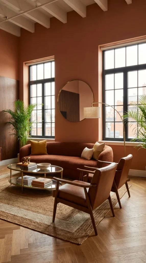
Walls, trim, and upholstery here all live in the same rust-terracotta family, and that’s not a coincidence—it’s the entire design strategy. Tall black-framed industrial windows and herringbone flooring give the room its bones, but the near-monochrome color approach is what makes it feel considered rather than simply “warm-toned.”
This suits loft-style or converted apartment units with real architectural character already built in—exposed brick, oversized windows, high ceilings—because a color scheme this restrained needs strong bones to lean on. It’s a poor fit for a boxier, lower-ceilinged apartment, where the same palette can start to feel flat rather than enveloping.
Would this design work for me? If your apartment already has one or two strong architectural features, near-monochrome is often the fastest way to make them the star. If your unit is architecturally plain, this palette alone won’t add the drama—you’d need to bring in more contrast through furniture instead.
Is the Monochrome Wall Worth It?
Painting walls and trim the same saturated rust as your furniture is a bigger investment than a neutral wall, both in paint and in the primer work dark colors typically need. It’s worth it specifically when a room has architectural features worth unifying—here, the tall windows and structural framing benefit from a single color wrapping around them instead of competing wall colors breaking up the sightlines. In a smaller, plainer apartment, that same investment reads as simply “a dark room,” which is a meaningfully different result for the same amount of paint.
To simplify this on a lower budget, paint a single wall in the rust tone and keep the rest neutral—you’ll lose some of the enveloping effect but keep the core color story. Leather armchairs can be swapped for a more affordable boucle pair without breaking the palette.
🧱 Quick Tip: Dark, saturated wall colors read best with matte or eggshell finishes—high gloss will bounce back every imperfection in the wall.
Common Mistakes With a Monochrome Palette
- Adding one unrelated bright accent color, which breaks the intentional restraint
- Skipping primer on dark paint, leading to patchy, uneven coverage
- Choosing furniture in a slightly different undertone (orange-rust vs. pink-rust), which reads as a mismatch up close
- Leaving windows completely bare, losing the softness the room needs against so much saturated color
Recommended Materials: Herringbone oak flooring, boucle upholstery, saddle leather, brass and glass coffee table, linen lampshade
Main Colors: Rust Terracotta, Warm Walnut, Brass, Cream (accent pillows)
Best Lighting: An arc floor lamp with a linen shade adds warmth without competing with the wall color; the tall industrial windows supply most of the daytime light.
Looking for a place to hang something reflective in a similarly proportioned room? Our wall mirror ideas for small apartments cover where a round mirror like the one on this wall does the most visual work.
Related Guides
- Grey Couch Endless Style: 10 Living Room Looks to Try—useful for comparing how a neutral sofa reshapes the rest of a room’s palette
- 10 Maximalist Living Room Ideas to Steal for a Room Full of Personality—for readers drawn to the bolder, color-block rooms later in this guide
- Top 10 Sectional Sofa Designs for Comfort, Style & Small Spaces—a deeper dive into sectional shapes if you’re weighing one over a standard sofa
- Small-Space, Big Impact: Floating TV Units for Modern Living Rooms—pairs well with any of these layouts once you’re ready to add a media wall
- 10 Wall Mirror Ideas That Make Small Rooms Look Twice as Big—relevant to three of the rooms in this guide that use mirrors as a focal point
6. The Wood-Paneled Room Where Texture Does the Talking Instead of Color
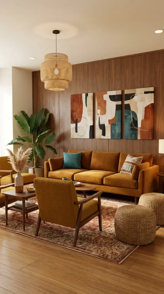
Every surface in this room shares a warm wood undertone—the paneled wall, the coffee table, the woven rattan pendant—and the mustard velvet sofa is really the only saturated color allowed to interrupt it. That restraint is the point: texture, not color contrast, is what gives this room its depth.
This works especially well for apartments with plain drywall and no architectural character to lean on, since wood paneling can be added as a feature rather than requiring you to already have exposed beams or brick. It suits people who want a cozy, enveloping living room over a bright, airy one, and it’s a strong fit for evening-heavy living, since warm wood tones hold up beautifully under lamp light.
The advantage is durability of style—wood paneling and rattan don’t date the way a trend color might. The compromise is scale: a fully paneled wall needs a room with enough width to avoid feeling like a wood box, and it’s a heavier, more permanent choice than paint if you’re renting.
For a renter-friendly version, peel-and-stick wood panel strips applied to a single wall get most of the textural effect without the commitment of real paneling. A rattan pendant swap alone — even over an existing fixture — pulls a plain room a long way toward this look on its own.
🪵 Quick Tip: Mix at least two different wood tones (lighter floor, darker paneling)—matching them exactly flattens the texture this room relies on.
Easy Ways to Get This Look Wrong
- Matching every wood tone in the room exactly, which removes the depth paneling is meant to add
- Choosing a glossy sofa fabric that fights the room’s matte, textural mood
- Skipping a floor lamp in favor of only the pendant, leaving reading corners underlit
- Hanging art that’s too small for the scale of the paneled wall behind the sofa
Recommended Materials: Wood wall paneling, rattan pendant shade, velvet upholstery, jute pouf, solid wood coffee table
Main Colors: Warm Walnut, Mustard Velvet, Teal (accent pillow), Terracotta (rug)
Best Lighting: The woven rattan pendant filters light into a soft, textured glow that suits the wood-heavy palette better than a bare bulb or exposed fixture would.
Maintenance: Real wood paneling should be dusted regularly and kept away from direct radiator heat, which can dry and warp thinner veneer panels over time.
7. The Color-Block Room Built for a Small, Playful Footprint
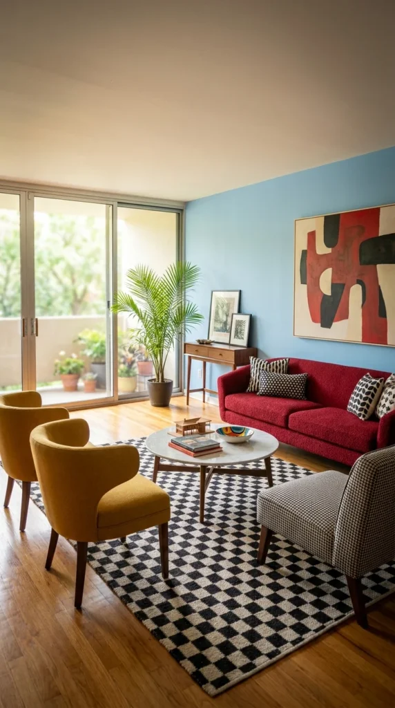
Sky-blue walls, a cranberry-red boucle sofa, and a pair of mustard barrel chairs shouldn’t work together on paper, but they do here because the black-and-white checkerboard rug acts as a neutral base underneath all that color. This is the most playful, least formal room in the group, and it reads that way on purpose.
It suits smaller apartment living rooms that open directly onto a balcony or patio, since the bold interior palette holds its own against natural daylight instead of needing to compete with a dim corner. This is a strong choice for someone who wants their apartment to feel personality-forward rather than resale-neutral and a weaker choice for anyone sharing the space long-term with someone who prefers calmer, quieter rooms.
The clearest strength is how energetic and photograph-ready this room is without needing much additional styling—the color does the work. The tradeoff is exactly that boldness: three saturated colors in one small room leave very little room for error if a fourth color gets introduced later.
To simplify this for a smaller budget, keep the blue wall and checkerboard rug as the two anchor decisions, then treat the sofa and chair colors as swappable—even a single bold chair against the blue wall keeps most of the personality intact.
🔵 Quick Tip: When mixing three bold colors, let one dominate (here, the blue wall) and treat the other two as accents in roughly equal, smaller amounts.
Where Bold Color Combinations Usually Go Wrong
- Introducing a fourth strong color, which tips the room from playful to busy
- Choosing a patterned rug on top of an already patterned checkerboard, doubling the visual noise
- Placing furniture so no piece touches the blue wall, making the color feel disconnected from the seating
- Using cool-white lighting, which mutes the warmth mustard and red need to feel inviting
Recommended Materials: Boucle upholstery, checkerboard wool rug, marble-top coffee table, walnut console
Main Colors: Sky Blue, Cranberry Red, Mustard, Black, and White (rug)
Best Lighting: Sliding glass doors supply strong daylight; keep evening lighting warm and low to balance the room’s cool blue wall rather than adding to it.
Maintenance: The potted palm needs bright, filtered light and regular misting; boucle upholstery in a lighter shade like the sofa here shows soiling faster and benefits from a fabric protector spray.
8. The Neutral Room That Lets Two Eames-Style Chairs Be the Whole Statement
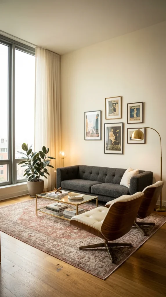
Strip away the pair of molded plywood lounge chairs, and this room becomes a fairly standard neutral apartment living room—a charcoal tufted sofa, a faded pink vintage-style rug, and a small vintage poster gallery. Put the chairs back, and they instantly become the reason the whole room reads as mid-century rather than simply “modern neutral.”
This is the room to study if your apartment budget only stretches to one genuinely investment-worthy piece. It suits minimalists who want one iconic silhouette rather than a room full of smaller decorative choices, and it’s an especially strong option for open, light-filled apartments where a busier palette would compete with the windows.
The advantage is longevity—a neutral base like this ages extremely well and won’t need a repaint if your taste shifts. The compromise is that neutral rooms rely entirely on the quality of their few statement pieces; a lower-quality lounge chair pairing won’t carry the room the way an authentic or well-made reproduction does.
To simplify for a smaller budget, a single lounge chair paired with the sofa still reads as intentional—the pair isn’t strictly required, just the strongest version of the idea. The vintage poster gallery is the next easiest thing to add cheaply, since prints cost far less than furniture.
🪑 Quick Tip: One genuinely good chair silhouette does more for a neutral room than five smaller decorative objects combined.
What Trips People Up Recreating This
- Buying a low-quality lounge chair reproduction where the proportions are visibly off from the original
- Overcrowding the neutral palette with too many small decorative objects instead of trusting the furniture
- Hanging the poster gallery too small relative to the wall, leaving it looking like an afterthought
- Skipping a rug entirely, which leaves a neutral room feeling unfinished and cold
Recommended Materials: Molded plywood, leather cushioning, boucle upholstery, faded vintage-style rug, brass floor lamp
Main Colors: Charcoal, Cream, Warm Walnut, Dusty Pink (rug)
Best Lighting: Full-height windows with sheer curtains supply most of the daylight; a slim brass arc lamp adds a warm reading light without crowding the chair pairing.
9. The Slatted Wood Wall Where Hidden Lighting Changes the Room After Dark
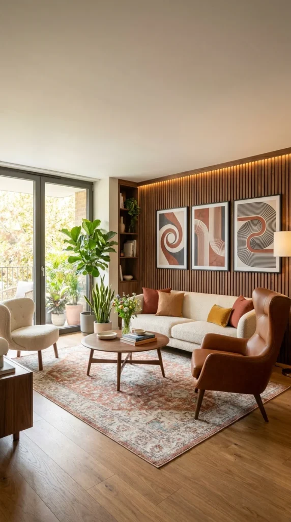
A vertical slatted wood accent wall with a thin strip of hidden LED lighting behind it is the defining feature here, and it’s worth understanding why it works better than a flat painted accent wall would: the slats catch the hidden light and throw shadow lines across the wall, giving depth that paint alone can’t create, day or night.
This suits apartments where the living room does double duty as an evening entertaining space, since the hidden lighting genuinely changes the room’s mood after sunset in a way overhead lighting can’t match. It’s a better fit for a warmer, layered aesthetic than a stark minimalist one—the cream boucle sofa and cognac leather wingback chair both lean soft rather than sharp.
The strongest advantage is how the wall functions as both art and lighting in one installation, reducing the need for extra decorative pieces. The compromise is installation complexity—running LED strip lighting behind a slatted wall is a bigger project than most accent walls, and it’s not something most renters can take with them.
For a renter-friendly simplification, a slatted wood wall panel kit installed without the hidden lighting still adds real texture, and a plug-in LED strip placed along the floor behind furniture can fake some of the same glow without any wiring.
If wood texture like this is genuinely what you’re after, our full breakdown of slatted wood wall designs goes deeper into slat spacing and finish options than we can cover in a single section here.
💡 Quick Tip: Warm white LED strips (2700K–3000K) suit slatted wood far better than cool white, which can make the wood read greenish under close inspection.
Where This Wall Falls Apart in Practice
- Using cool-toned LED lighting, which clashes with the warm wood tone instead of enhancing it
- Spacing slats too widely, losing the shadow-line effect that makes the wall feel dimensional
- Skipping a dimmer, meaning the wall only has one lighting mood instead of adjusting through the evening
- Placing the sofa directly against the wall, blocking the light strip’s glow from reaching the room
Recommended Materials: Vertical wood slat paneling, LED strip lighting, boucle upholstery, cognac leather, geometric line art
Main Colors: Warm Oak, Cream, Cognac Leather, Terracotta (rug)
Best Lighting: The hidden LED strip behind the slats is the standout feature; pair it with one soft table lamp so the room isn’t relying on a single light source after dark.
10. The Graphic Color-Block Room That Matches Its Rug to Its Wall Art
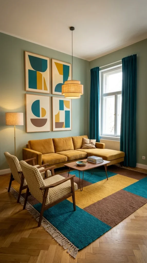
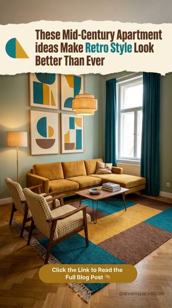
This room takes one visual idea and repeats it deliberately: the geometric color-block wall art and the color-block area rug share the same teal, mustard, and brown palette, turning the floor and the wall into one connected composition instead of two separate decisions.
It suits apartments that want a genuinely graphic, gallery-like living room without needing an actual art collection—the coordinated print-and-rug pairing does that work for you. This is a stronger fit for confident, design-forward renters than for anyone wanting a background-neutral room that won’t date; a matched palette this specific is a statement, not a placeholder.
The advantage is cohesion—few living rooms achieve this level of intentional color-matching between floor and wall without looking overly staged, and this one manages it because the palette stays to just three colors total. The compromise is flexibility: swapping out either the rug or the art later means finding a new match for the piece you keep, which is harder than replacing a single neutral item.
Is this the pairing worth committing to? If you already love a specific color trio, buying the rug and wall art as a coordinated pair—rather than hunting for each separately—is usually the more efficient (and often cheaper) route than assembling the match piece by piece.
To adapt this for a smaller apartment, choose a single large color-block print instead of the four-panel grid shown here, and keep the rug as the primary source of the matching palette.
For more on rooms built around bold, layered color the way this one is, our maximalist living room ideas roundup covers several related approaches worth comparing.
🟨 Quick Tip: When matching a rug to wall art, match the accent colors, not the dominant one—it reads coordinated instead of matchy.
Common Mistakes With a Matched Palette Like This
- Buying the rug and art from different color families that only approximately match
- Adding a fourth strong color anywhere else in the room, breaking the intentional three-color system
- Choosing furniture upholstery in a competing pattern instead of a solid mustard velvet
- Hanging the art grid off-center from the rug’s placement, disconnecting the two elements visually
Recommended Materials: Velvet upholstery, houndstooth-weave chairs, color-block wool rug, rattan pendant shade, hairpin-leg coffee table
Main Colors: Teal, Mustard, Warm Brown, Sage (walls)
Best Lighting: A woven rattan pendant keeps the lighting warm against the sage walls; the tall window and teal curtains bring in strong daylight without washing out the rug’s color-blocking.
Furniture Layout Tips for a Mid-Century Apartment Living Room
- Float the sofa away from the wall when the room allows it—mid-century seating is designed to be seen from multiple angles, not pushed flush against drywall
- Keep coffee table height low and legs visibly thin, since heavier, boxier tables fight the era’s lighter silhouettes
- Anchor the seating group with one rug large enough for at least the front legs of every piece to sit on it
- Leave breathing room around a statement chair (like a sling or lounge chair) rather than boxing it in against other furniture—part of its appeal is the negative space around it
Who Should Choose This Style?
- Best for apartment dwellers who want warmth and personality without major structural renovations
- Best for renters, since most of this style’s impact comes from furniture, paint, and lighting rather than built-ins
- Best for people who prefer a handful of well-chosen statement pieces over many smaller decorative objects
- Not ideal for anyone who prefers stark, all-white minimalism—mid-century leans warm and textural even at its most restrained
Budget Summary
| Budget | Expectation |
|---|---|
| Low | Secondhand boucle throw pillows, a sunburst or single arched mirror, and peel-and-stick wood panel accents |
| Medium | A velvet or boucle sofa, one rattan pendant light, and a patterned wool area rug |
| Premium | Custom wood wall paneling with integrated lighting, genuine leather lounge chairs, commissioned or original abstract art |
FAQ
What makes a mid-century apartment living room different from a mid-century house living room? Apartments generally work with fixed walls, lower ceilings, and rental restrictions, so the style leans harder on furniture, color, and lighting rather than architectural changes like exposed beams or built-in shelving.
Can I get this look in a rental without painting the walls? Yes—several of the rooms above rely more on furniture silhouette, lighting, and textiles than on wall color. Peel-and-stick wood panels, removable picture-hanging strips, and plug-in lighting all get close to the effect without permanent changes.
What colors work best for a mid-century apartment living room? Warm, earthy tones—mustard, rust, forest green, and warm walnut—are the most consistent thread across authentic mid-century palettes, though the bolder color-block rooms above show it can stretch further with the right restraint.
Is mid-century modern furniture expensive? It varies widely. Genuine vintage and licensed reproductions of iconic pieces (like molded plywood lounge chairs) sit at the premium end, but the broader look—boucle sofas, tapered wood legs, rattan lighting—is achievable at nearly every budget level.
How do I mix wood tones without it looking chaotic? Keep it to two tones maximum in one room—typically a lighter floor and a darker piece of furniture or paneling—and let everything else (metal, fabric) act as the neutral in between.
About the Author
This guide was researched and written by the Aesthetic Lifes editorial team, who cover apartment-scale interior design with a focus on ideas readers can realistically source and recreate in a rented or owned space.
Conclusion
Mid-century apartment style isn’t one single look—it’s a set of decisions, and this guide walked through ten different ways to make them. Some readers will land on the quiet, glass-forward room from the start of this list; others will be drawn to the graphic color-blocking at the end. What matters is that you now have language for why each room works, not just an image you liked without knowing what to change about it for your own space. Start with the one decision—a wall color, a chair, a lighting fixture—that felt like the clearest “yes,” and build outward from there.
Explore More
You may also enjoy:
- Biophilic Living Room Guide
- 10 Slatted Wood Wall Designs That Turn Plain Rooms Into Japandi Retreats
- 10 Rug Styles That Make Any Bedroom Feel Cozier

2 Responses