
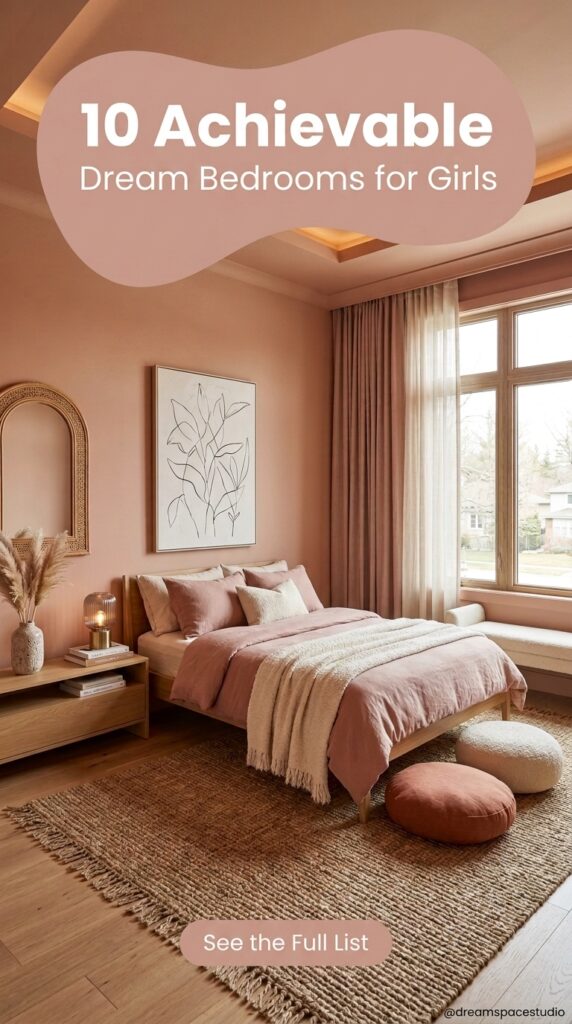
The images used in this post are for illustrative purposes only, meant to represent design concepts and styling ideas rather than real photographed interiors
Most “dream bedroom” roundups show you rooms that only exist in a stylist’s imagination—flawless walls, zero clutter, and furniture that costs more than a used car. That’s not what this list is about.
What follows are ten girls’ bedroom concepts that lean into real design choices: color, texture, layout, and small details that actually change how a room feels to live in. Some are soft and pastel-heavy. Others lean bold, minimal, or a little eclectic. None of them require gutting a room down to the studs.
If you’re decorating for a toddler who’ll outgrow pink in two years, a tween figuring out her own taste, or a teenager who wants her space to finally feel like hers—there’s something here worth stealing. Not as a template to copy exactly, but as a starting point you can adjust for the room, the budget, and the girl actually sleeping in it.
1. The Tree-Branch Headboard Wall That Replaces Art Entirely
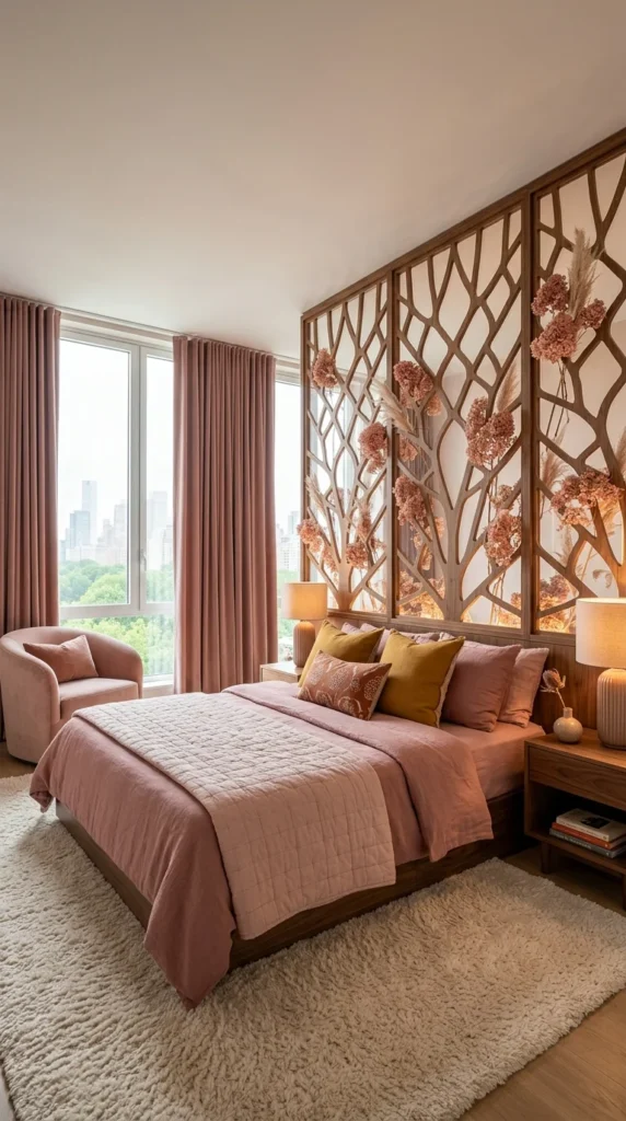
Most bedrooms solve the “what goes above the bed” question with a piece of framed art or a simple upholstered headboard. This room skips that decision altogether and builds an entire sculptural wall instead—three carved wood panels shaped like branching trees, stretching floor to ceiling, with dried pampas grass and pink florals tucked into the openings.
It’s a lot of visual information for one wall, but it doesn’t feel busy. The branch pattern repeats across all three panels, so your eye reads it as one continuous piece rather than three separate decisions stacked side by side. The backlighting built into the panels helps too — it gives the carved wood a warm glow at night instead of leaving it flat and shadowed.
Everything else in the room stays deliberately simple to let that wall stay the star. Dusty rose bedding, mustard and blush pillows, and a single velvet accent chair by the window—none of it competes for attention. The color palette pulls directly from the florals in the panels, which is what keeps the whole room feeling coordinated instead of like two separate ideas got pushed into one space.
💡 Pro Tip
You don’t need custom carved panels to borrow this idea. A single large botanical wall decal or a set of dried-flower wall hooks arranged in a loose branch pattern gets you a similar effect for a fraction of the cost and effort.
📌 Important Note
This kind of statement wall only works if the rest of the room has somewhere to rest visually. Pair it with plain walls elsewhere and solid-color bedding—patterned bedding under a wall this detailed will fight for attention, and the room will start to feel cluttered instead of curated.
2. A Curved Plaster Ceiling That Turns the Bed Into a Cocoon
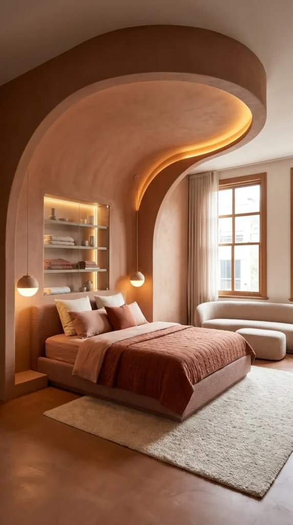
Sharp corners disappear entirely in this room. The ceiling curls down into the wall in one continuous sculpted line, wrapping around the sleeping area like the inside of a shell. There’s no visible seam between wall and ceiling—just one warm, terracotta-toned surface that bends instead of meets.
The lighting is doing something specific here: recessed strips trace the curve of the plaster, so the shape reads clearly even at night without a single visible fixture on the ceiling itself. Two small globe pendants drop down at bed height for actual reading light, which keeps the room from depending on the cove lighting alone.
Built-in shelving is recessed directly into the plaster wall — no separate nightstand, no floating shelf hardware. Towels and ceramics sit lit from within their own niche, which turns storage into something closer to a display case. The rest of the room stays quiet on purpose: a boucle sofa in plain cream, a thick ivory rug, linen curtains that let the window keep its own identity instead of matching the terracotta.
📌 Important Note
Plaster work like this is a structural renovation, not a decorating change—it requires a contractor experienced in curved drywall or actual plaster application, and it’s not something to attempt as a weekend DIY project.
💡 Pro Tip
For a rented space or a lower budget, a curved upholstered headboard that extends partway up the wall — paired with warm cove-style LED strip lighting — gets you a softer version of this cocooned feeling without touching the ceiling at all.
3. Round Windows and an Arched Niche Bring the Ocean Indoors
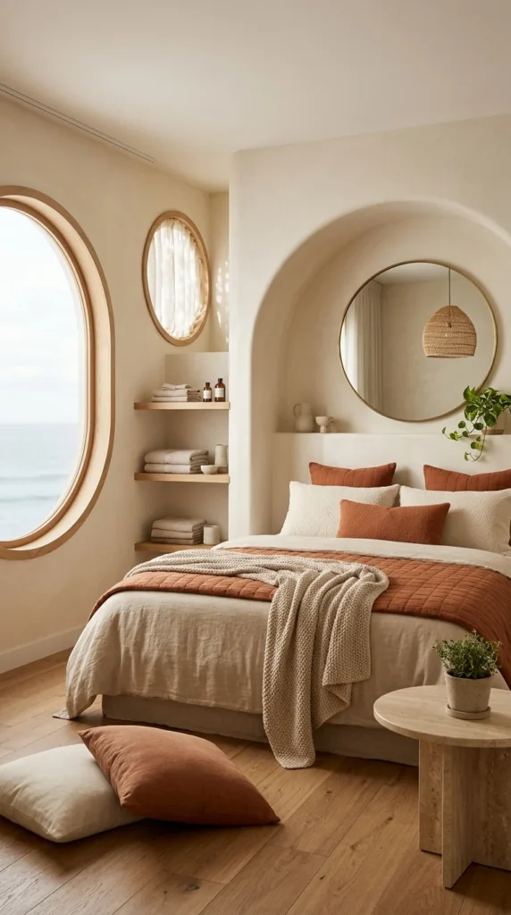
The oval porthole window is the first thing that grabs attention here — it turns an ordinary sea view into something closer to a painting, framed in warm wood instead of a standard rectangle. A smaller matching oval window sits just beside it, letting in a second, softer patch of light through sheer curtains.
The arched wall niche behind the bed does quieter work. It’s carved directly into the plaster, holding a round mirror that bounces the room’s light back into the space and doubles the visual impact of a woven pendant hanging just out of frame. Small ceramics sit in the curve of the arch at headboard height, which fills what would otherwise be dead space without needing a single piece of extra furniture.
Terracotta and cream carry the bedding in a mix that feels coastal rather than desert—linen sheets, a chunky knit throw, and quilted rust-colored pillows layered against boucle cushions. Open wood shelving in the corner holds folded towels and glass bottles in plain view, which keeps the room’s storage from interrupting the curved lines everywhere else.
⚠️ Warning
Arched niches and porthole windows are structural features, not decorative add-ons—attempting to fake this look with paint or applied trim on a flat wall usually looks obviously artificial. If you don’t have the architecture for it, a large round mirror alone can borrow some of the same softness.
💡 Pro Tip
Open shelving only stays this calm-looking if what’s on it is limited to two or three colors and folded neatly. Mixed patterns or overstuffed shelves will undercut the room’s whole reason for working.
4. A Terracotta Archway Cuts Through a Moody Blue Bedroom
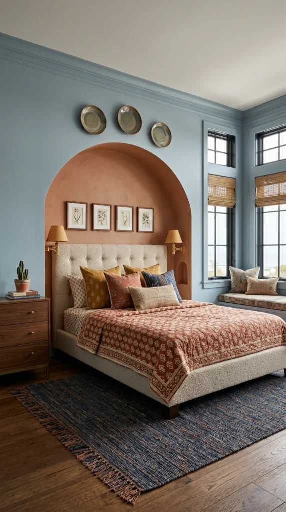
Two color stories collide on purpose in this room. The walls are painted a dusty, almost storm-cloud blue — cool, a little serious, closer to a study than a typical girl’s bedroom. Then an arched terracotta niche interrupts it directly behind the bed, warm enough to pull the whole space back from feeling cold.
The arch isn’t just paint on flat drywall — it’s recessed into the wall, deep enough to hold four small botanical prints and a narrow shelf niche near the base. Two brass swing-arm sconces flank the headboard, mounted low enough to actually read by, and their warm brass tone repeats in the drawer pulls on the nightstand across the room.
Pattern does a lot of the remaining work. A block-printed rust-and-cream coverlet, mismatched mustard-and-indigo pillows, a striped charcoal-and-rust rug underfoot—none of it matches exactly, but the palette stays disciplined enough that it never looks accidental. Three ceramic plates mounted above the arch add a final layer without needing a full gallery wall.
What Makes This Color Pairing Work
☐ One dominant cool tone (the blue) covering the largest surface — walls and ceiling
☐ One warm accent tone (terracotta) contained to a single architectural feature
☐ Metal finishes (brass) repeated in at least two places to tie the room together
☐ Patterned textiles that share a color family, even if the prints themselves differ
☐ A neutral upholstered headboard to keep the two bold colors from touching directly
💡 Pro Tip
If you’re not ready to commit to painting an entire wall a bold color, try this same effect with a single piece of furniture or a large framed textile in the accent tone—it gives you the contrast without the commitment.
5. A Traditional White Bed Anchors a Gallery of Botanical Prints
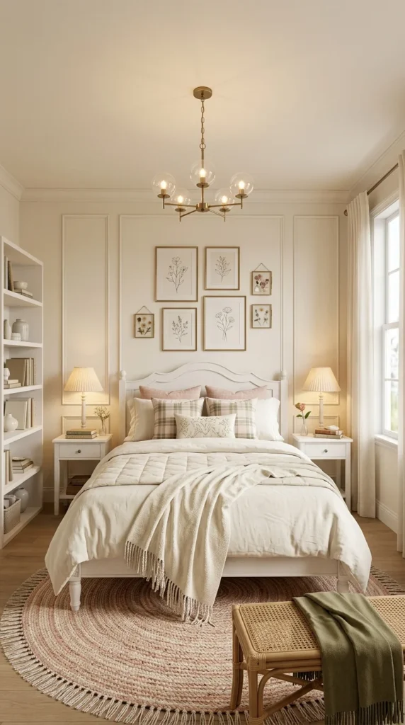
This room plays it straight, whereas the others leaned dramatic—a classic white spindle-post bed, cream walls with picture-frame trim molding, and a symmetrical layout that could belong in any decade. It’s the kind of bedroom that ages well precisely because it isn’t chasing a trend.
The gallery wall above the headboard is the one place this room takes a small risk. Six botanical prints in mismatched gold frames are arranged in a loose grid rather than a rigid one—two frames sit slightly smaller, breaking the pattern just enough to look assembled over time instead of bought as a set. A brass bubble chandelier hangs above it, adding a little modern shape to an otherwise traditional room.
Plaid and floral pillows mix on the bed without clashing, mostly because they share the same washed-out, muted palette—sage, blush, and cream. A round braided rug in pink tones anchors the space, and open bookshelves stand in for a nightstand’s worth of personality, filled with stacked books and small ceramics instead of styled-for-a-magazine accessories.
📌 Important Note
Mismatched frame gallery walls only look intentional when the mismatch has a rule behind it—here it’s consistent gold or brass tones across every frame. Random frame colors and finishes together will read as leftover pieces rather than a curated collection.
💡 Pro Tip
Molding like the picture-frame wall panels here can be recreated with inexpensive MDF trim strips and paint—no need for custom millwork to get the layered, architectural look.
6. Floating Shelves and a Plant-Filled Sill Replace a Traditional Headboard
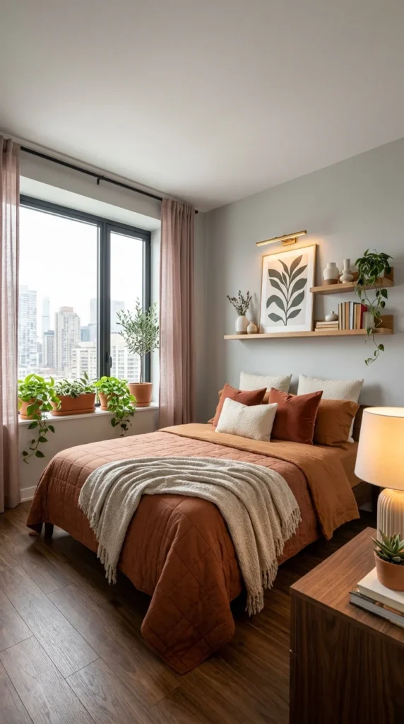
There’s no headboard at all in this room — just two floating wood shelves mounted above the bed, doing that job instead. A framed botanical print leans against the wall between them, flanked by small ceramics and a trailing plant that spills down toward the pillows. A slim brass picture light mounted above the top shelf lights the artwork directly, the way a gallery would.
The windowsill gets the same plant treatment on a bigger scale — a small olive tree and a cluster of potted greenery line the entire ledge, turning what’s usually dead space into the room’s second focal point. Sheer pink curtains soften the city view without blocking it, and the light they let through stays warm instead of harsh.
Rust and terracotta bedding pull the outdoor greenery and the muted sage wall into one palette, with a chunky cream throw breaking up all that warm color with something neutral. A dark walnut nightstand and wood-tone flooring ground the room in something heavier, which keeps all the pale curtains and greenery from making the space feel washed out.
⚠️ Watch Out
Floating shelves need to be anchored into studs, not drywall alone — especially when you’re stacking books, ceramics, and a picture light on them above a bed. Skipping this step is how shelves end up pulling out of the wall months later.
💡 Pro Tip
If your room doesn’t get enough light for an olive tree, pothos and philodendron vines give a similar trailing effect on a windowsill and tolerate lower light without much fuss.
7. A Black Metal Canopy Frame Does the Work of a Whole Headboard Wall
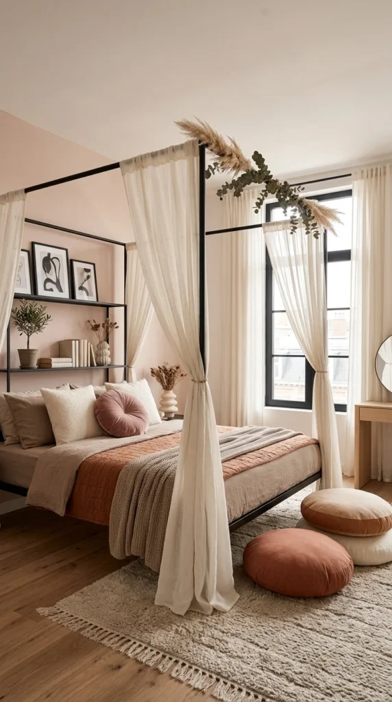
This bed skips walls-as-backdrop entirely and builds its own architecture instead. A slim black four-poster frame holds sheer linen curtains on three sides, with a built-in shelf running along the headboard end—books, a small potted olive tree, and framed line-art prints all tucked into the same structure as the bed itself.
Dried pampas grass and eucalyptus are looped over the top corner of the frame, which keeps the hard black metal from feeling cold against all that soft linen. The curtains aren’t just decorative—pulled back and tied, they still soften the room’s edges even when open, and pulled shut at night, they’d turn the whole bed into its own separate room within the room.
Blush pink walls and terracotta bedding keep the palette warm, while a stack of round floor cushions in rust, cream, and camel sits at the foot of the bed like extra seating that never needed a chair. A woven rug with fringed edges and a round mirror across the room add texture without adding more color into an already busy frame.
📌 Important Note
A canopy frame like this needs real floor-to-ceiling clearance to avoid feeling cramped—in a room with low ceilings, the vertical posts will visually shrink the space instead of adding drama to it.
💡 Pro Tip
Don’t have a canopy bed frame? A simple curtain rod mounted to the ceiling above a regular bed, with the same sheer linen panels hung on either side, gets a similar half-enclosed effect for far less investment.
8. Fluted Wall Paneling in Sage Sets a Calm, Grown-Up Tone
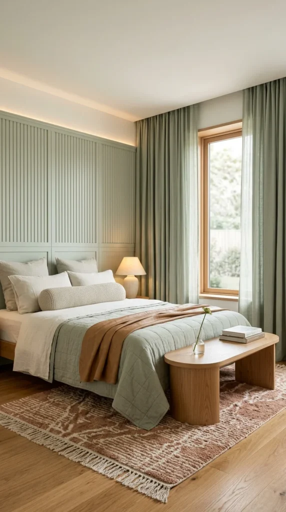
Vertical fluted panels cover the entire headboard wall here, painted a soft sage that reads more mature than most girls’ bedroom palettes. It’s a texture choice more than a color choice—the grooves catch light and shadow differently depending on the time of day, giving one flat wall a sense of movement without a single pattern or print involved.
A thin channel of warm LED lighting runs along the top edge of the paneling, washing the ceiling in a soft glow that keeps the room from feeling clinical despite all that green. The same sage tone repeats in the floor-to-ceiling curtains, so the wall and the window treatment stop competing and start acting like one continuous design decision instead.
The bedding stays almost entirely neutral—white linen, a chunky knit bolster pillow, and one honey-toned throw draped loosely across the foot of the bed. That restraint is what keeps the sage from tipping into something too saturated. A low wooden bench at the foot of the bed and a rust-patterned rug underfoot bring in the only real warmth in the room, grounding all that cool green in something earthier.
💡 Pro Tip
Fluted paneling can be recreated inexpensively using MDF slat panels sold in pre-cut strips — they install directly over drywall and only need paint to match this look.
📌 Important Note
A monochromatic wall like this depends entirely on lighting to avoid looking flat. Without that top LED channel or another light source washing across the texture, the grooves lose their shadow play, and the wall reads as plain and one-dimensional instead of textural.
9. A Glowing Half-Circle Turns a Plain Wall Into the Room’s Centerpiece
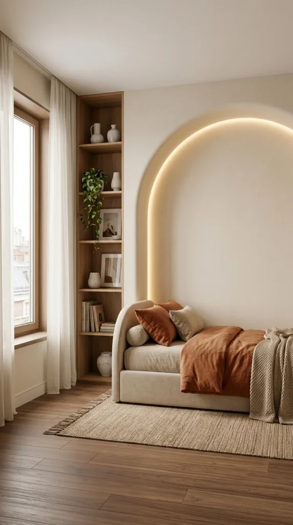
There’s no artwork above this bed—just a single arched line of light, recessed into the plaster and traced in warm LED. It’s a minimal move, but it does more for the room than a gallery wall would, giving the eye one clear shape to land on without adding a single extra object.
The bed itself is low and rounded, with a curved upholstered headboard that echoes the arch above it without copying it exactly — a half-circle answering a full one. Rust-colored bedding and a chunky knit throw bring the only real saturation into an otherwise pale, sand-toned room, which keeps that one color from getting lost.
A built-in wood shelving unit fills the narrow gap beside the window instead of a standalone bookcase, sized exactly to the wall it occupies. Vases, framed art, a trailing plant, and stacked books fill it in loosely—enough to look lived-in, not so much that it competes with the glowing arch across the room.
📌 Important Note
This effect depends on cove or channel LED lighting installed during construction or renovation—a strip light stuck on afterward rarely curves as cleanly or sits as flush against the wall.
💡 Pro Tip
If a recessed arch isn’t possible, a curved LED strip mounted just behind a semicircular wood or MDF cutout, painted to match the wall, can fake the same glow-through effect at a fraction of the cost.
10. A Dropped Ceiling Detail Traces the Room in Warm Light
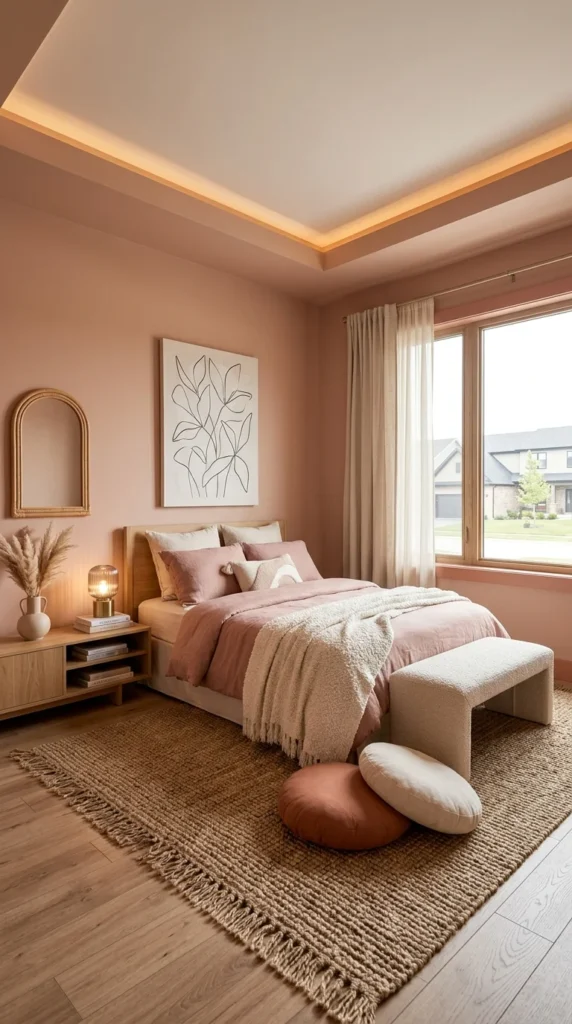
The walls here go all-in on dusty rose, ceiling included—but what makes the room feel finished is the recessed ceiling detail outlining the ceiling perimeter in warm LED. It’s a subtle architectural move most bedrooms skip entirely, and it gives an otherwise simple rectangular room a sense of depth when looking straight up.
A small arched mirror in a warm wood frame sits low on the wall beside the bed, more decorative than functional at that height, paired with a single framed line-art botanical print that keeps the wall from feeling too monochromatic. Dried pampas grass in a ceramic vase on the low wood dresser adds texture without introducing a single new color into the palette.
Bedding stays in the same rose family as the walls, with a chunky cream throw and mixed round floor cushions in terracotta and cream breaking things up at the foot of the bed. A jute rug with fringed edges grounds the whole soft palette in something more textural and less precious—this room could belong to a teenager just as easily as it could a young professional’s guest room.
⚠️ Warning
Painting walls and ceiling the exact same color can flatten a room if the lighting isn’t right — this only works because the cove lighting creates a visible line between the two surfaces. Skip that detail and the ceiling can start to feel like it’s dropping in on you instead of opening the room up.
💡 Pro Tip
A vase of dried pampas grass or bunny tail grass is one of the least expensive ways to add texture to a nightstand or dresser—it never needs water and lasts for years.
Final Thoughts
None of these ten rooms depend on a single “trick” to work. What ties them together is the same idea applied differently each time: pick one architectural or design feature — a curved ceiling, an arched niche, a fluted wall, a canopy frame — and let everything else in the room support it instead of compete with it.
You don’t need a full renovation budget to borrow from any of these. A statement wall, a well-placed light strip, floating shelves instead of a headboard, or even just a disciplined color palette can carry a room a surprisingly long way. Start with whichever idea matches your actual space and budget, then build outward from there.
Frequently Asked Questions
What’s the best color palette for a girls’ bedroom that won’t feel too young over time?
Muted, dusty tones — sage green, terracotta, blush, and warm neutrals — tend to age better than bright primary pink or purple. They read as sophisticated at any age and are easy to update later with new pillows or art rather than repainting.
How can I create a statement wall without a big renovation budget?
Wall decals, MDF slat or trim panels, a bold paint color contained to one wall, or

