
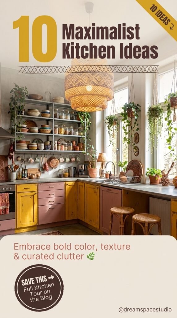
Scrolling through kitchen inspiration usually means an endless stream of white cabinets and quartz counters. These ten kitchens do the opposite. Each one leans into color, pattern, and personality on purpose, and each one solves that problem in a completely different way. If you’ve saved a dozen bold kitchen photos and still can’t decide which direction fits your own home, this is meant to help you actually choose.
Quick Overview
| Style | Maximalist / Eclectic |
|---|---|
| Best For | Bold personalities, character-filled older homes |
| Budget | Medium–High |
| Difficulty | Moderate to advanced DIY |
| Maintenance Level | Medium |
A Checkerboard Floor Doing the Heavy Lifting
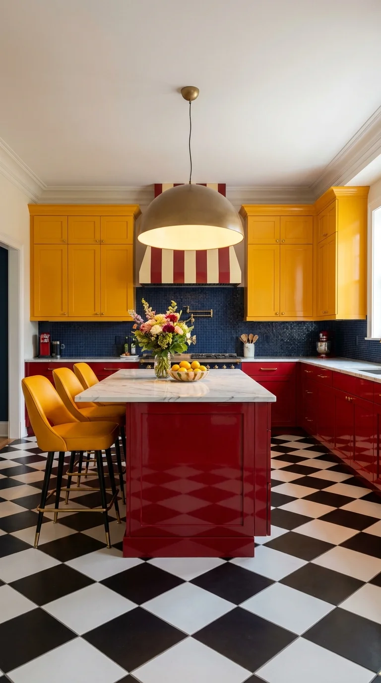
The floor is the reason this kitchen reads as a complete idea instead of a collection of bright colors. A black-and-white checkerboard pattern is a strong visual anchor, and once it’s on the floor, the yellow uppers and the red island stop competing with each other because they’re both reading off the same neutral base. The red-and-cream striped hood above the range picks up the same two-tone logic as the floor, just rotated ninety degrees, which is what keeps the whole room from feeling like three separate decisions stacked together.
This is a good example of a kitchen where the marble island top earns its cost. A patterned, colorful base needs one calm surface to rest on, and if you’re weighing that decision for your own project, this guide to choosing the right kitchen countertop walks through what actually matters versus what’s marketing. A brass dome pendant is the one metal note in the room, which matters more than it looks like it should — a second metal finish here would have pulled attention away from the floor.
Where a Bold Color Pairing Like This Can Go Wrong
- Choosing a checkerboard tile in a size too small for the room, which makes the pattern feel busy instead of graphic
- Painting the island a different red than the stripe on the hood, so the two reds visibly clash instead of matching
- Skipping a neutral countertop and adding a third pattern on top of the floor and cabinets
- Using cool-white lighting instead of a warm bulb, which makes red cabinetry look pink under ambient light
Bringing a Boho Kitchen to Life With Wall Textiles
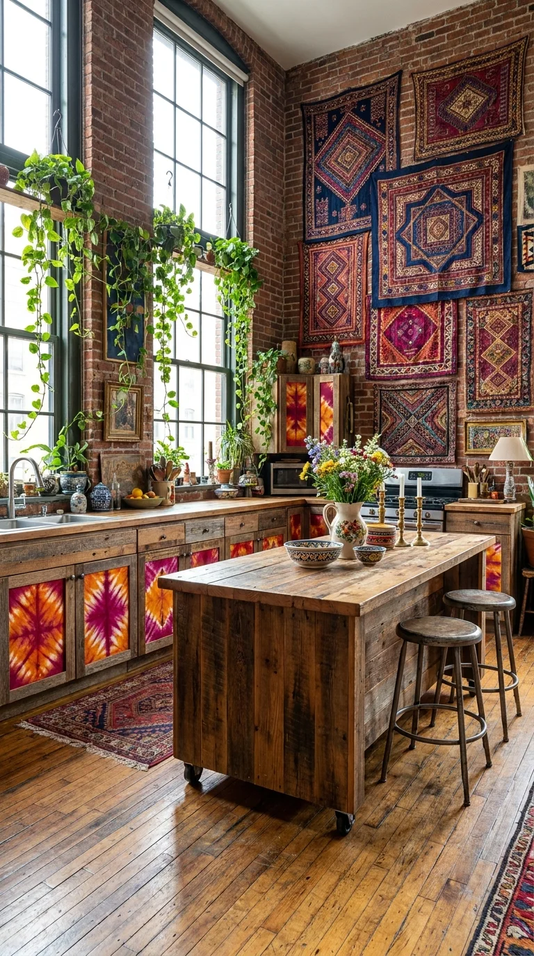
This kitchen uses its brick walls the way a living room might use framed art — a dense arrangement of patterned textiles instead of shelving or cabinetry above the counters. It’s an unusual choice for a kitchen specifically, and it works because the reclaimed-wood island and the tie-dyed cabinet panels are quiet enough in comparison to let the textiles stay the focal moment. If a full wall of rugs feels like too much commitment, this boho kitchen roundup shows several lighter-touch ways to bring the same warmth in.
Why the Tapestries Read as Art, Not Clutter Hanging textiles at slightly uneven heights, rather than in a perfect grid, is what keeps this look feeling collected over years rather than installed all at once. The trailing plants along the window do similar work — they soften the hard brick edges without needing another pattern.
Recommended materials here include reclaimed wood, exposed brick, hand-dyed cotton textiles, cast iron cookware left visible, and unlacquered brass fixtures that will darken naturally with use.
An Emerald Tile Room With One Loud Red Door
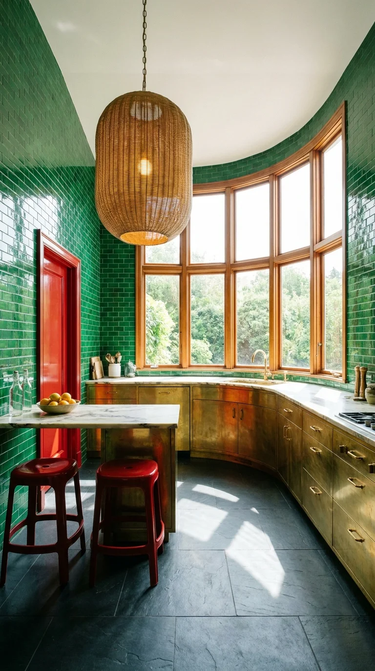
Green subway tile covers nearly every surface in this kitchen, walls and ceiling included, which is a genuinely bold choice most homeowners wouldn’t attempt. What keeps it from feeling like a paint-swatch experiment is the brass cabinetry running underneath — a warm metal against a cool green tile is a pairing that ages well, unlike some color trends that feel dated within a few years. The lacquered red door is the one deliberate rule-break in an otherwise monochromatic room, and it works precisely because there’s only one of it.
If green is the color you keep coming back to but aren’t sure how far to take it, this breakdown of green tones for a room is a useful reference point before committing to tile at this scale.
Best Lighting: The bow window is doing most of the work during the day, and the woven pendant overhead is chosen specifically to stay warm rather than compete with the cool green tile at night — a bright white fixture here would have made the whole room feel clinical instead of inviting.
A Geometric Island in a Double-Height Kitchen
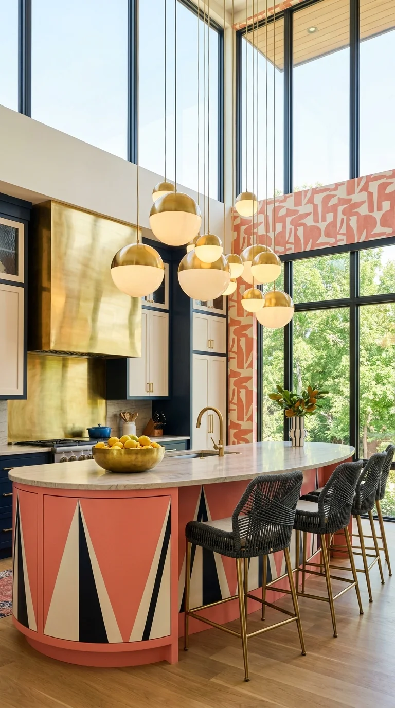
Instead of leaning on wallpaper or open shelving, this kitchen gets its personality from a single hand-painted triangle motif wrapped around the island, in coral, cream, and black. Because the pattern only lives on one piece of furniture, the rest of the room — navy cabinets, brass hood, marble counters — can stay relatively simple without the space losing energy. The cluster of brass globe pendants above the island answers the scale of the double-height ceiling; a single fixture would have looked lost in a room this tall.
Main colors, in order of dominance: navy, warm coral, cream, black, and brass. That’s a genuinely restrained palette for a maximalist kitchen, which is worth noticing — bold doesn’t have to mean many colors, it can also mean one pattern used with confidence.
Pattern Stacked on Pattern in a Scalloped Kitchen
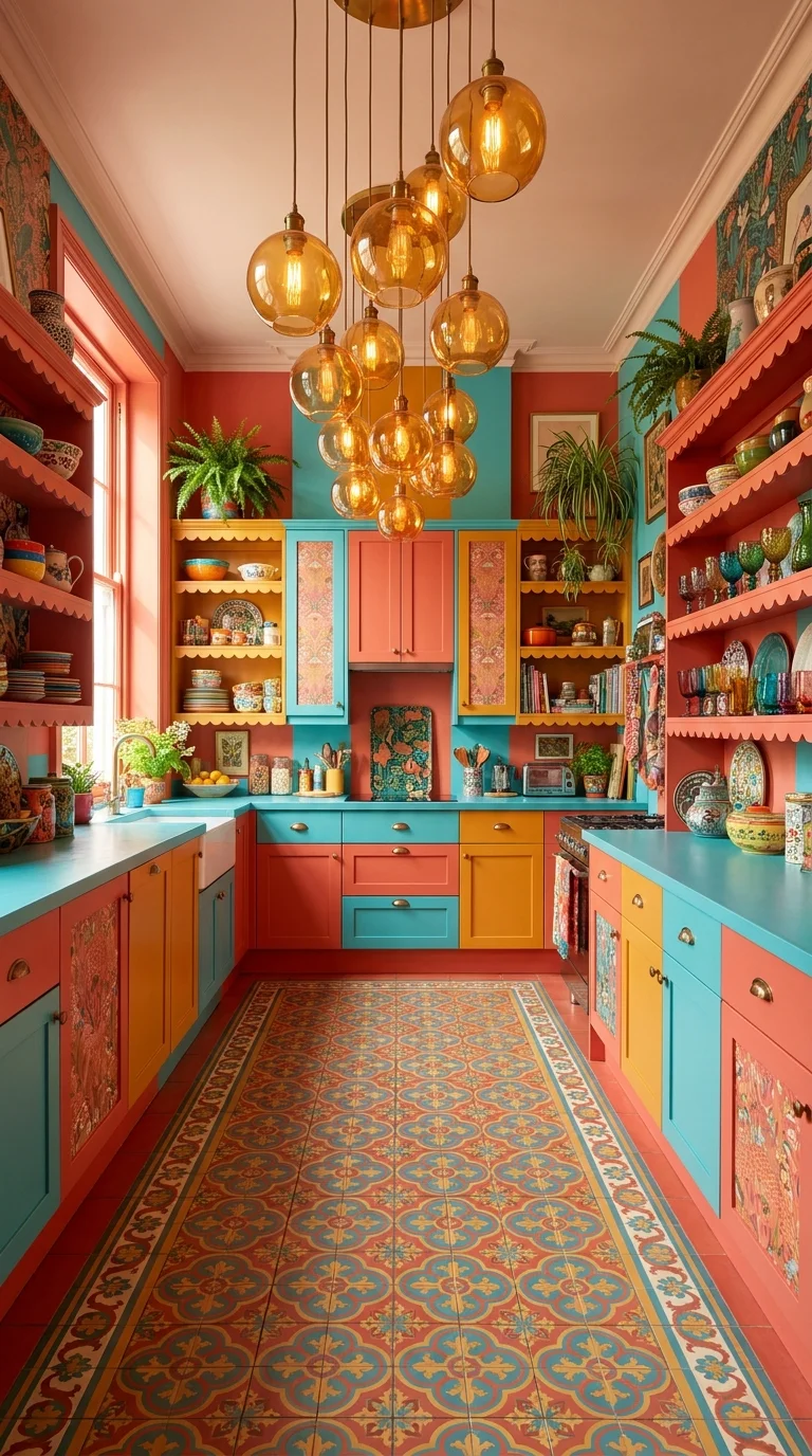
This is the kitchen that comes closest to true pattern-on-pattern maximalism — patterned floor tile, patterned cabinet-door inserts, and scalloped shelf trim, all in the same coral-teal-mustard family. It only holds together because every pattern shares the exact same three colors; swap even one shelf to a different palette and the room would likely feel disorganized rather than layered. Anyone drawn to this level of color density should look at this roundup of maximalist kitchens for more examples of how far the approach can go before it stops reading as intentional.
The Trade-Off Worth Knowing Before You Copy This
- Repainting or re-tiling even one section later is harder when three patterns are already sharing a palette
- Open shelving at this density needs regular dusting, since every surface is on display
- A room this saturated in color photographs beautifully but can feel visually loud for everyday cooking
- Resale buyers tend to be split on rooms this specific — it’s a style that suits the person staying, not necessarily the next owner
One Bold Cabinet Color, Lit From Within
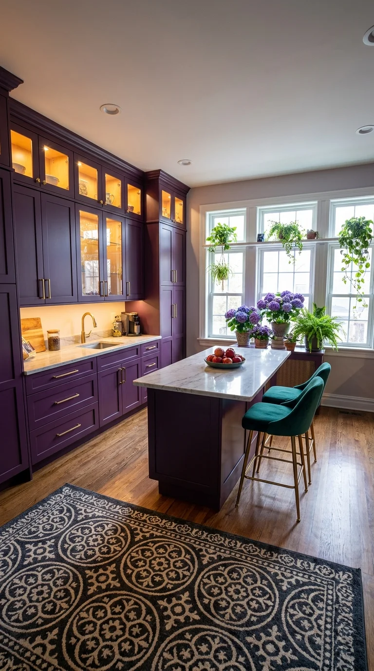
Where the previous kitchens layer several colors together, this one makes its statement with a single deep purple, used on every cabinet, floor to ceiling. The trick that keeps a monochrome scheme like this from feeling heavy is the glass-front upper cabinets with interior lighting — they break up the solid color block and give the eye somewhere to land besides a wall of purple. Teal velvet stools are the one contrast color in the room, chosen because teal sits opposite purple enough to feel intentional rather than random.
Recommended Lighting: Interior cabinet lighting inside glass-front doors, paired with warm under-cabinet task lighting — daylight coming through the window wall handles the rest during working hours.
A Floral Wallpaper Doing the Job of a Backsplash
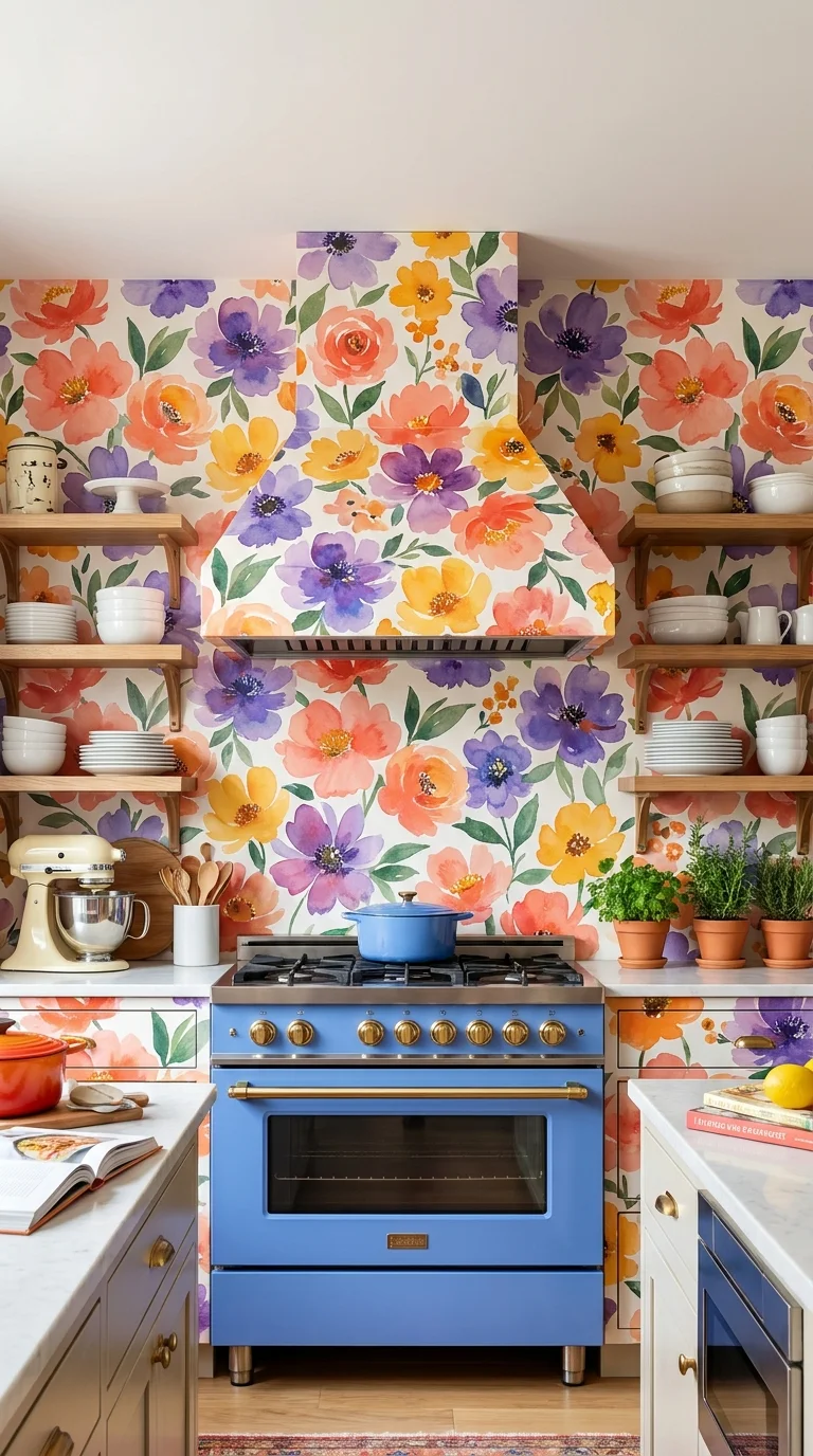
Rather than tile behind the range, this kitchen wraps the entire wall — and the hood above it — in an oversized watercolor floral print. It’s a genuinely practical trade worth understanding: wallpaper here needs a washable, kitchen-rated finish to survive grease and steam near a working range, which is a real maintenance consideration this approach carries that standard tile doesn’t. The blue range is the second bold decision in the room, and it only works because blue and the floral’s purple-and-coral tones sit close enough on the color wheel to feel coordinated rather than competing.
Main Colors: coral, soft purple, golden yellow, sage green, and a mid-tone blue from the range itself.
A Mistake This Look Invites
- Using standard (non-washable) wallpaper directly behind a gas range, where heat and grease will damage it within a year
- Choosing open wood shelving without a plan for keeping dishware dust-free
- Pairing the floral with a second large pattern elsewhere in the room, which competes with the wallpaper instead of supporting it
- Painting the surrounding cabinetry a color pulled from the wallpaper’s background rather than its flowers, which can wash the print out visually
Worn Cabinets, Warm Textiles, and Open Shelving
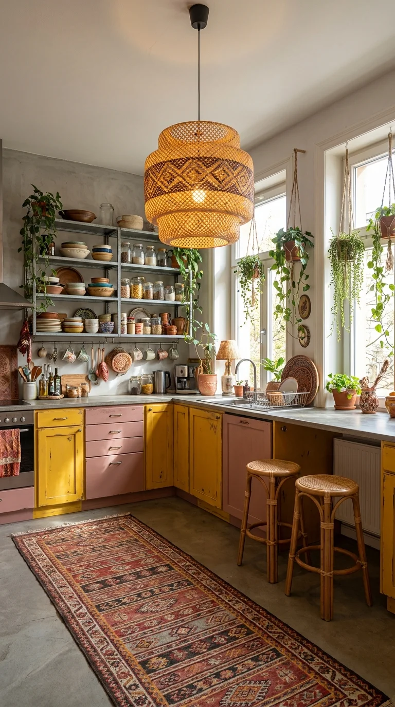
This kitchen gets its character from imperfection rather than precision — the mustard and dusty-pink cabinet fronts show real wear, and the open metal shelving is filled unevenly with mismatched bowls, jars, and plates. That’s a deliberate choice, not a budget shortcut: a brand-new version of this same layout, with matching dishware, would read as generic farmhouse rather than genuinely lived-in. A woven rattan pendant and a well-worn kilim runner complete the feeling that everything here was collected slowly. For more ways to make open storage feel intentional rather than cluttered, this guide to kitchen storage is a useful next stop.
Why Distressed Cabinetry Works Here The visible wear on the cabinet paint repeats the same worn, faded quality already present in the vintage rug, which is what makes the finish feel like a design decision instead of neglect — one distressed surface next to an otherwise pristine room would look like damage instead of style.
A Rainbow Herringbone Floor as the Real Statement
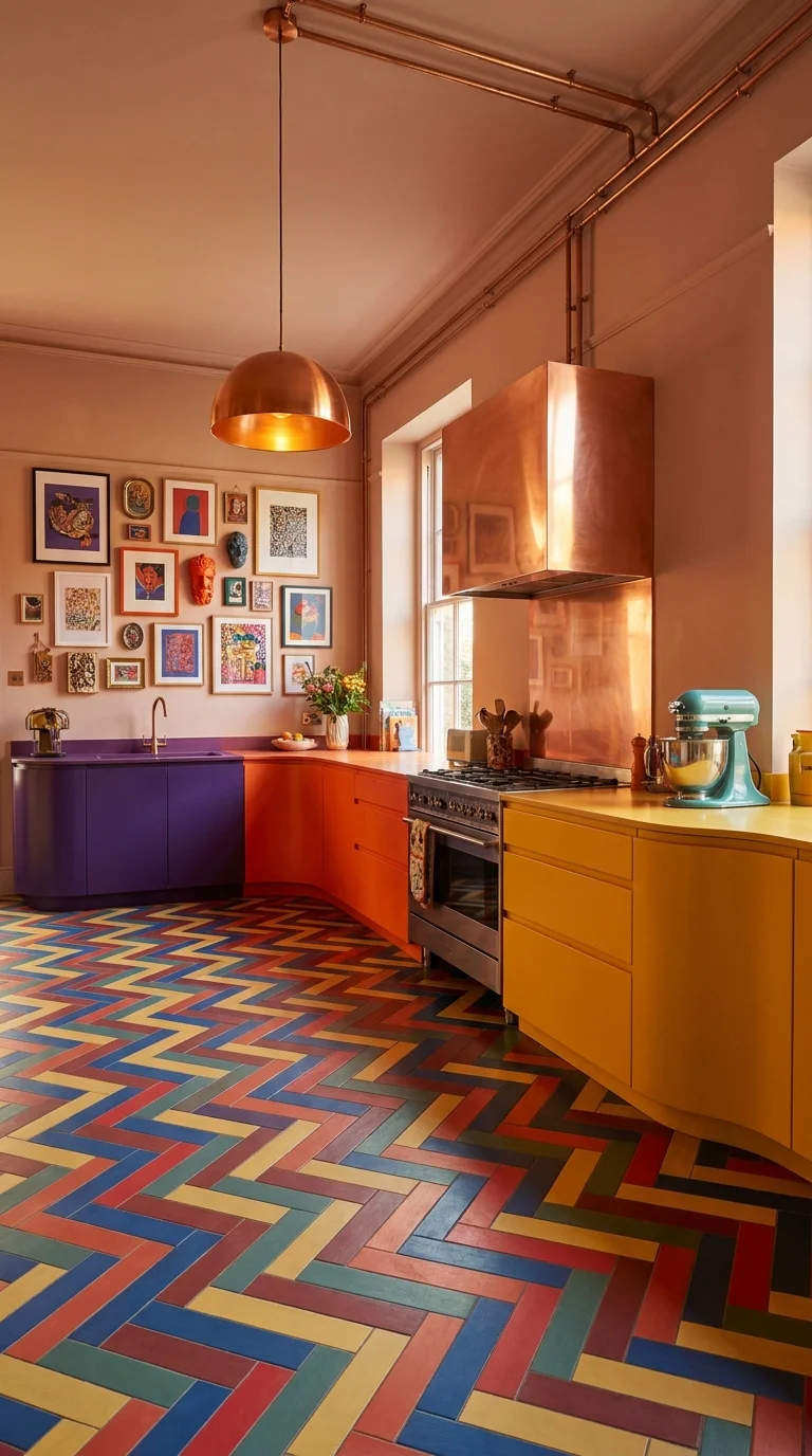
The floor here — a herringbone pattern in red, blue, mustard, and olive — is doing more visual work than anything else in the kitchen, including the copper hood and exposed copper piping running along the ceiling. Splitting the cabinetry into three separate colors (purple, orange, and yellow) rather than one uniform tone lets each zone of the kitchen echo a different color already present in the floor, which is a smarter way to tie a busy floor into the cabinetry than trying to match it exactly.
Is a Floor Like This Worth the Investment?
A custom multicolor herringbone floor is one of the more expensive choices on this list, and it’s also the hardest one to change your mind about later — replacing a full floor is a bigger project than repainting cabinets. It’s worth it if the floor is genuinely the strongest idea in the room and everything else is built to support it, the way it is here. It’s a harder case to make if you’re only lukewarm on bold color, since a floor this specific is difficult to soften down the line without starting over.
A Full-Room Floral Wrap, Ceiling Included
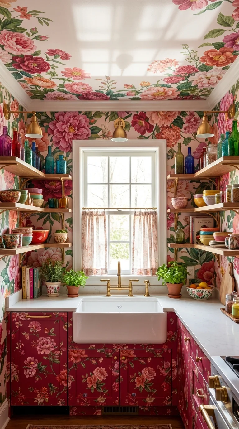
The most committed kitchen in this group covers walls, ceiling, and cabinetry in coordinating pink floral prints, then adds a collection of colored glass bottles along open shelving as the finishing layer. Wrapping the ceiling in the same paper as the walls is the specific decision that makes this feel like one continuous room rather than four decorated surfaces — stopping the pattern at the top of the wall, as most kitchens do, would have made the ceiling feel like an afterthought. Anyone drawn to pink at this intensity should see this collection of pink kitchens for calmer entry points into the same color family.
Recommended Materials: floral wallcovering rated for kitchen humidity, farmhouse apron sink, brass gooseneck faucet, colored glass bottles displayed by hue, and open wood shelving for everyday dishware.
Keeping a Bold Kitchen Functional at Dinner Rush
- Keep at least one large, uninterrupted counter surface clear for actual food prep, even in a kitchen this visually busy
- Choose closed storage for anything used daily so pattern-heavy open shelves stay decorative rather than becoming clutter
- Position the range hood and lighting to genuinely handle steam and odor — a beautiful hood that doesn’t vent well becomes a daily annoyance
- Leave clear walking space around the island; a bold color scheme reads worse in a cramped layout than in an open one
For contrast, it’s worth glancing at how a Scandinavian kitchen handles the opposite instinct — restraint and maximalism are solving for the same daily function in very different ways.
Who Should Choose This Style?
- Best for homeowners who want a kitchen that feels personal rather than showroom-neutral
- Best for older homes with existing architectural character — brick, bay windows, high ceilings — that can visually support strong color
- Not ideal for renters or anyone planning to sell within the next year or two, since undoing bold paint, tile, or wallpaper is a real cost for the next buyer
Budget Summary
| Budget | Expectation |
|---|---|
| Low | One bold cabinet color, peel-and-stick patterned wallpaper, secondhand bar stools |
| Medium | Two-tone cabinetry, patterned cement-look floor tile, a statement pendant light |
| Premium | Custom brass or copper range hood, floor-to-ceiling wallpaper, natural stone island top |
Frequently Asked Questions
Is a maximalist kitchen hard to keep looking put together? It takes more planning up front than a neutral kitchen, mainly around keeping colors and patterns pulled from the same limited palette. Once that palette is set, day-to-day upkeep isn’t meaningfully different from any other kitchen.
What colors actually pair well in a bold, eclectic kitchen? The kitchens here that work best tend to limit themselves to three or four colors used consistently — a dominant color, a supporting color, and one accent — rather than treating every surface as a chance for a new hue.
How do you stop a colorful, pattern-heavy kitchen from feeling chaotic? Give the eye one calm surface to rest on, usually the countertop or the floor, and repeat the same two or three colors across cabinetry, tile, and accessories instead of introducing new ones in each zone.
Can I get this look without repainting every cabinet? Yes — a bold hood, a patterned wallpaper wall, or a single statement pendant can carry a lot of the personality on their own, which is a lower-cost way to test whether you actually like living with this much color.
Does maximalist design work in a small kitchen? It can, but it usually works better with one strong move — a bold color or a patterned floor — rather than several competing patterns at once, since a small room has less visual space to let multiple ideas breathe.
About Aesthetic Life Team
Aesthetic Life Team covers real interior spaces across every room of the home, with a focus on color, material choices, and layouts that hold up to daily use, not just photographs.
Conclusion
What separates these ten kitchens from a Pinterest scroll is that each one made one confident decision and built everything else around supporting it — a floor, a wallpaper, a single cabinet color, a wall of textiles. The lesson worth taking from this collection isn’t “add more color everywhere.” It’s that a maximalist kitchen actually works when one element gets to lead and the rest of the room agrees to follow it.
Explore More
You may also enjoy:

