
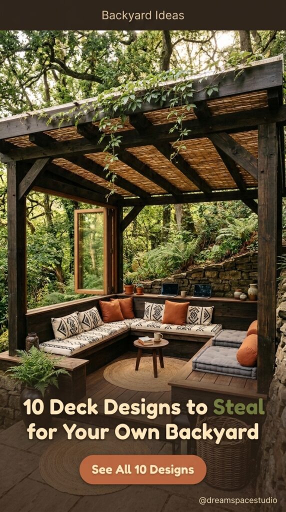
Most deck photos lie a little. The boards look warm, the seating looks arranged, the lights look magical — and then you stand on the real thing and something feels off. Nowhere to set a drink. A railing blocking the view you built the deck for. Boards that looked honey-toned online and feel harsh under real afternoon sun.
“Finished” isn’t about budget. It’s about a deck settling into its yard instead of sitting on top of it — weight, spacing, and material choices working together so the space feels inevitable rather than assembled.
The ten decks below each got one decision right — ten answers to ten specific problems: a floor that forgives fire, a roof that borrows height, a wall that gives seating its back. Find the problem that matches yours, and take its answer.
When the Floor Is Gravel, Not Boards
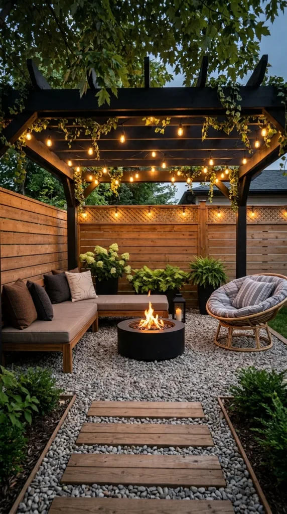
Forget the fire pit for a second and look down. This seating area has no deck boards at all — just gravel, with a few wood planks laid as a path through it. That one decision changes everything about how the space works.
Gravel is the most forgiving floor an outdoor room can have. Heat, ash, spilled drinks, dropped food — all of it disappears into the stone instead of staining wood. Around a working fire pit, that forgiveness is the difference between relaxing and policing every spark. It’s also far cheaper than decking, which is why this whole room probably cost less than the pergola alone suggests.
The trade is underfoot. Gravel shifts — it migrates toward the edges, dips where people walk most, and needs occasional raking to stay level. The wood-plank path through the middle is doing quiet work: it gives feet a stable line from yard to fire, and visually stitches the gravel “room” to the lawn beyond.
The black steel pit anchors the seating — sofa on one side, a low round chair on the other, all angled inward. String lights woven through the vines overhead do what installed fixtures can’t: they look grown-in rather than added. If fire-centered seating is the goal, these fire pit chair ideas think through the seating side of the equation — because a fire pit is only as good as the chairs around it.
Borrow this when your yard has no deck yet, or when the old one’s beyond saving. Gravel won’t impress anyone on its own — but under a pergola, around a fire, with lights in the vines, nobody’s looking at the floor.
Borrowing Height When You Can’t Borrow Width
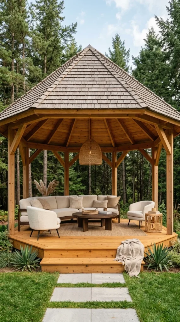
This gazebo sits on a small octagonal platform in the trees, and by every measurement it should feel cramped. It doesn’t, and the reason is overhead: a steeply pitched shingled roof that pulls the eye straight up. When a structure can’t borrow width, it borrows height — and height reads as generosity.
The pitch does two jobs: it sheds weather, and visually it turns a low garden structure into something with presence against the tree line. A flat roof on the same footprint would feel like a lid; this one feels like a room.
Inside, one woven pendant hangs from the peak — dead center — and the placement matters more than the fixture. An eight-sided room has no obvious middle; furniture drifts toward the edges and the center goes vague. The pendant declares the center before a single cushion is placed, and everything else (the curved sectional hugging the walls, the round coffee table beneath it) falls into orbit around that point.
The curved sofa deserves its own note: straight furniture in an octagonal room always leaves dead corners, but the curve follows the walls instead of fighting them. Under a roof, the soft boucle upholstery stays dry; the same fabric in open rain would hold moisture far longer than a tight weave.
The lesson travels beyond gazebos: in any small outdoor structure, give the eye somewhere to go up and mark the middle with light. Square footage stops being the thing people notice.
The Brick Wall Doing the Job of a Fourth Wall
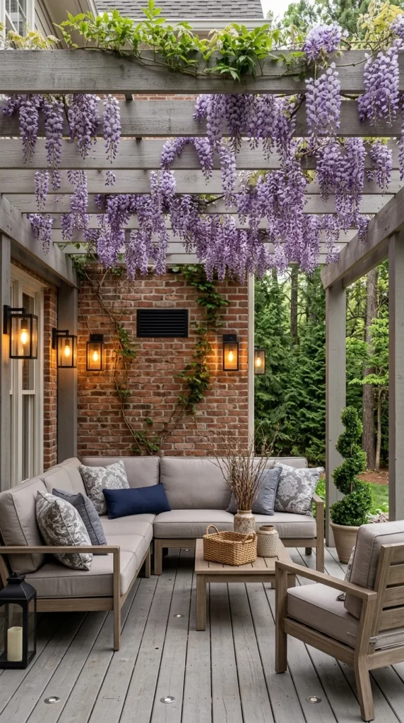
Outdoor seating needs a back. Without something solid behind it, a sofa in a yard feels exposed — like furniture waiting to be put away rather than a place to settle. Here, that back is a brick wall, and it’s doing more structural work than anything else in the frame.
The wall gives the sectional something to lean against visually, blocking the open yard so the seating reads as an enclosed corner instead of chairs in a field. The lantern sconces — evenly spaced, warm — create a left-to-right rhythm, and the wisteria dripping purple from the beams is the ceiling this open-top structure was missing: soft, living, seasonal.
One navy lumbar pillow sits against all that grey and cream — the only cool-toned object in the frame, and the reason the arrangement doesn’t read flat.
The honest costs: wisteria drops petals for weeks after its spring bloom, so this deck needs sweeping a bare pergola never would. And those recessed lights set into the deck boards look clean by day but sit exactly where feet walk after dark.
If your patio furniture floats mid-lawn feeling temporary, give it a back — a wall, a fence, a hedge — and half the “unfinished” feeling disappears before you buy a single cushion.
Painting It Black So the Forest Gets the Attention
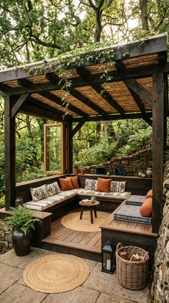
Most garden structures try to look like the garden. This one does the opposite: the pergola frame is stained almost black, and against the forest behind it, the structure nearly disappears. That’s the point. A natural-wood frame here would compete with every tree trunk in sight; the dark frame recedes, and the forest becomes the view.
The reed-slat roof filters daylight into soft stripes across the cushions — by afternoon the space looks completely different than in the morning, which is a feature, not a flaw.
The seating is built in, wrapping the corner in an L. Built-ins do something freestanding furniture can’t: they turn a corner into a room. Nothing can drift out of place, and the platform reads as architecture rather than arrangement. A hinged glass window closes against weather — so this “outdoor” room needs some indoor habits, like cleaning glass and checking seals.
Two round jute rugs — one inside the pergola, one outside on the stone — mark two zones without a single wall, quietly telling visitors where the lounge ends and the threshold begins.
The woodland setting does heavy lifting here, and a garden that feels this settled doesn’t happen by accident — these cottagecore garden ideas are about building exactly that kind of lived-in, half-wild charm around a structure. Borrow the dark-frame move whenever the view beats the structure: if what’s beyond is worth looking at, stop building things that compete with it.
Putting the Fireplace at the Far End of a Long Deck
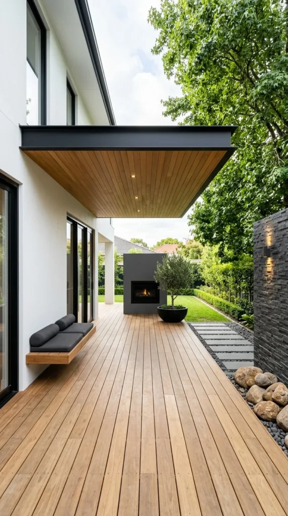
Long, narrow decks have a corridor problem: walk to the end and there’s nothing there, so the whole space feels like a hallway to nowhere. This deck solves it by putting the best thing at the far end — a freestanding fireplace in matte charcoal, set apart from the house entirely, becoming its own destination.
The fireplace’s placement does the organizing: bench, pavers, even the eye — all of it points down the deck toward the fire. A long space with a destination reads as a journey; without one it reads as leftover.
The bench itself is worth studying: cantilevered straight out of the wall with no legs, it keeps the floor completely clear underneath. On a narrow deck, every square foot of visible floor matters, and legs would have chopped this run into segments.
Overhead, the wood-clad soffit repeats the same plank direction as the decking below, and that repetition stretches the space visually instead of letting it feel sliced up. The single potted olive tree is the only planting on the deck — which means all the softness here depends on one plant, a fragile bet before you copy it.
For any long outdoor space: don’t center the feature. Put it at the far end and let the walk toward it become part of the experience.
A Railing You Can See Through on a Roof You Built for the View
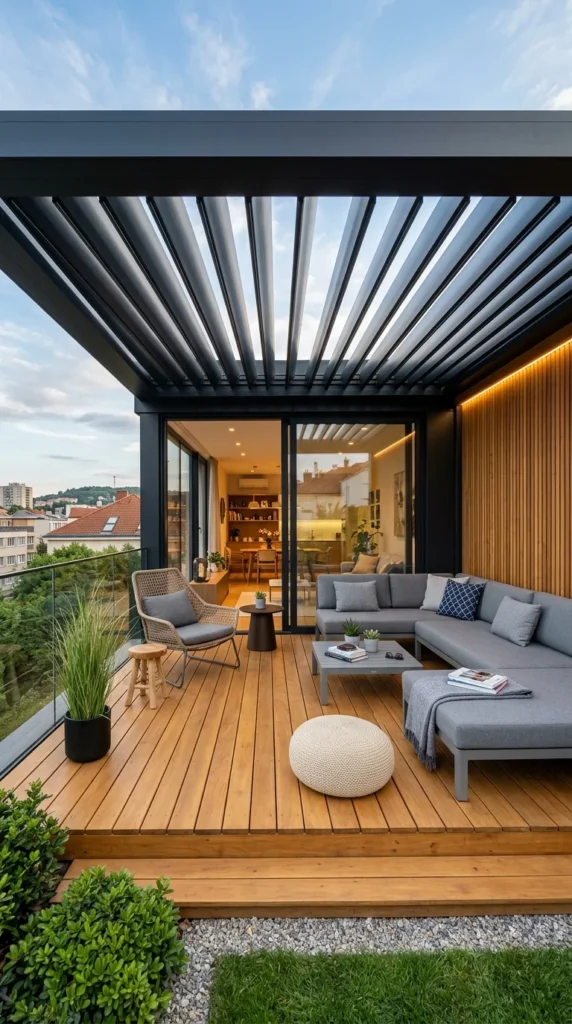
A rooftop deck exists for one reason: the view. So the smartest decision here is the one you barely notice — a frameless glass railing that keeps the skyline completely open. A solid railing at this height would have walled in exactly what the deck was built for.
Everything else is arranged to protect that asset. The louvered aluminium pergola overhead adjusts to weather — the slats pivot, so shade becomes a setting rather than a fixed condition. The sliding glass wall into the living room stays open, visually extending the indoor sofa line straight into the outdoor sectional; the two rooms read as one continuous space, which effectively doubles the entertaining area.
Against the cool aluminium, a wood-slat wall washes warm LED light behind the seating — that contrast keeps the deck from feeling like a showroom. The knit pouf is the honest weak point: soft and inviting, but it’s the first thing carried inside when rain threatens.
Rooftop and small-deck logic has its own constraints — weight limits, wind, exposure — and these apartment deck designs work through what actually functions when the deck is compact and elevated. The principle travels well: identify the single reason the deck exists, then make every other decision protect it. Here that’s the view. On yours it might be the sunset, the garden, or the quiet.
Is a Louvered Pergola Worth the Money?
Only if the deck earns it. A louvered system costs several times what a fixed shade sail does, and it pays off for daily use through variable weather — slats open for sun, closed for rain. If the deck gets used a few weekends a summer, a good sail or a simple fixed pergola with a planted vine delivers most of the comfort for a fraction of the price. Match the hardware to the habit, not the photo.
A Row of Lanterns Giving a Long Porch Its Rhythm
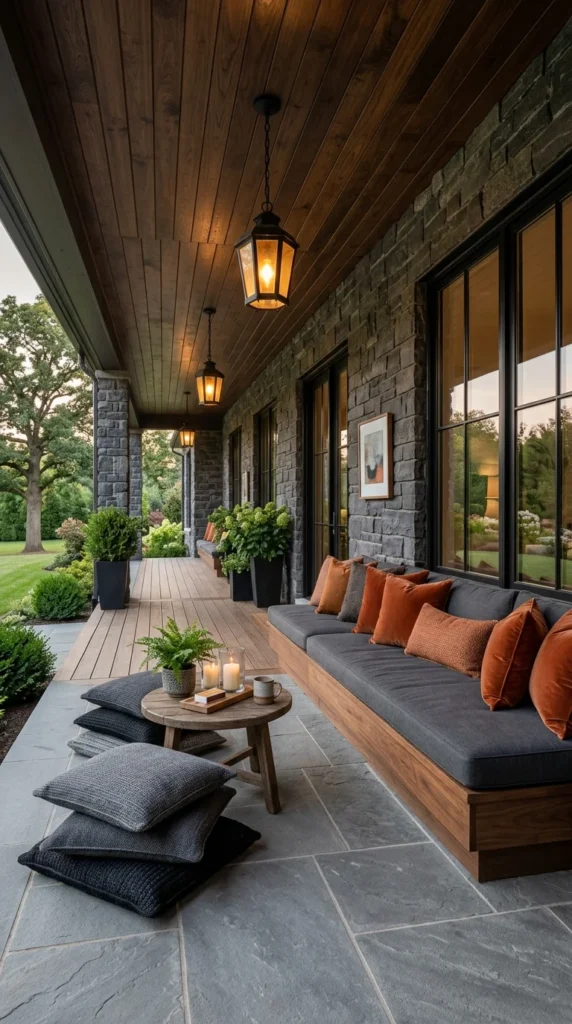
This porch is very long, and long porches have a specific failure mode: they feel like corridors with furniture in them. What saves this one is rhythm — a row of hanging lantern pendants spaced evenly down the wood ceiling, giving the eye a beat to follow from one end to the other. Repetition turns length from a problem into a feature; the porch feels endless in a good way.
The daybed runs the entire stone wall — one continuous seating gesture instead of grouped furniture, which only works because the porch is genuinely long. Here it turns the whole wall into an invitation to stretch out.
Against acres of grey stone and charcoal cushions, rust and orange velvet pillows do all the emotional work — the only warm tones in the frame, and the reason the porch doesn’t read cold. And the single framed art piece hung directly on rough stone is the detail that makes this a living space rather than a covered walkway: one deliberate, indoor gesture that says someone lives here.
Floor cushions stacked by the coffee table solve extra seating without another bulky piece crowding the walkway. One caution: bluestone holds the cold well past sunset, so this porch wants throws and rugs most of the year, not just in winter.
String Lights Tracing the House, Not Just the Patio
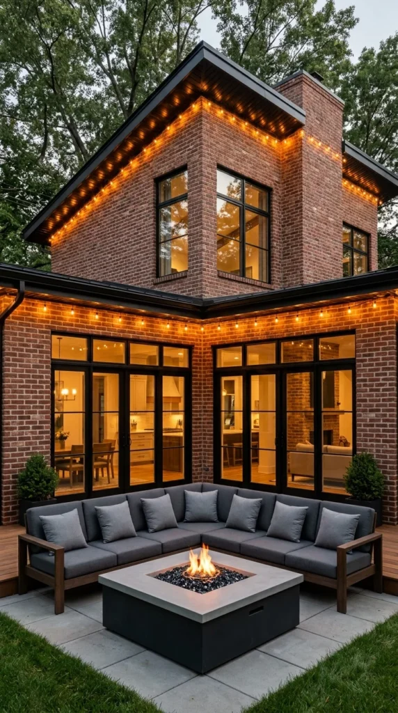
Here’s a lighting decision most people get backwards: they light the patio and let the house disappear. This yard does the opposite — warm string lights trace every roofline of the brick house, drawing its full outline against the dark trees. After dusk, the architecture becomes the backdrop. The patio isn’t floating in blackness; it’s sitting in front of a glowing house.
The squared-off concrete-and-steel fire table picks up the house’s sharp lines instead of fighting them. The L-shaped sectional wraps two sides so every seat faces both flame and lit windows — nobody has their back to the view.
Two honest notes: black steel shows fingerprints and water spots fast with a family using it daily, and seating this close to glass walls means every gathering is visible from indoors — connection for some, a privacy trade for others. The bluestone paver base under the fire pit is also a quiet safety decision: a non-flammable buffer between flame and the wood deck steps away, disguised as a material change.
Outdoor lighting repays planning — these industrial lighting ideas break down how to layer it so a space glows instead of glaring. Start with the architecture, then the table, then the paths.
Dark Furniture Against Red Brick — Contrast Doing the Organizing
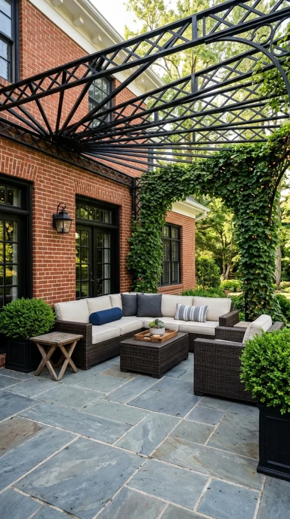
The strongest color decision in this whole set is also the simplest: dark wicker furniture against warm red brick. That contrast is doing the organizing work here. Brick is a busy pattern — without something dark and solid in front of it, seating dissolves into the wall. The near-black wicker holds its own, giving the eye something to land on before it reads the brick.
Overhead, a black steel trellis fans out from the corner in radiating lines, turning a plain brick corner into the patio’s entry point. Climbing ivy and string lights up the corner post blur where structure ends and garden begins.
Underfoot, irregular bluestone flagstones keep the whole thing from going formal. It’s a considered balance: ornate metalwork overhead, uneven natural stone below — neither too stiff nor too casual. One navy bolster pillow breaks up the cream cushions, the same small-cool-note move that steadies any warm palette. And tight-weave wicker like this traps pollen and dust, so it needs brushing down more often than flat cushions suggest.
If a full refresh is on the table, these boho patio ideas show how far texture and contrast alone can carry an outdoor space. When the backdrop is busy, don’t match it — oppose it.
A Vine That Gives Shade Now and Fruit Later
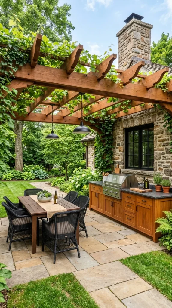
The pergola beams here have scalloped ends — a small curved detail cut into otherwise straight timber. It sounds minor, but against a rigid grid of wood overhead, that curve keeps the whole structure from feeling severe.
Growing across those beams is grapevine — the hardest-working plant in this set: shade now, fruit later. It needs training and pruning, but the payoff is a living roof that earns its keep.
Below it, a stainless grill set into stained wood cabinetry ends the indoor-kitchen-to-yard commute that ruins so many barbecues. Black pendants hang low over the dining table, tying the cooking, dining, and seating zones into one visual family. The stone chimney beside the cabinetry needs no sealing; the wood cabinets will want it yearly — materials with different maintenance appetites, worth knowing before you build.
The planted beds, lawn, and mature trees are what make the whole thing feel settled rather than installed — these boho garden ideas are about building outdoor spaces with exactly that soul. If you’re choosing one plant for a pergola, pick one with a second job — fruit, scent, or shade. Decoration alone is the most expensive thing a plant can do.
Frequently Asked Questions
What’s the cheapest way to make a deck feel finished?
Light it, soften it, plant it — in that order. Warm outdoor string lights, one rug sized to the seating zone, and three potted plants will do more than any single furniture upgrade. All three move with you.
Wood decking or composite — which should I choose?
Wood looks warmer and costs less upfront but needs sealing every couple of years and shows scratches. Composite costs more at the start and needs little beyond cleaning, though some boards look flat next to real timber. Choose by the maintenance you’ll actually do.
How do I light a deck with no outdoor outlets?
Solar path lights for the edges, battery-powered LED strips tucked under benches or steps, and one solar string light strand overhead on a dusk-to-dawn sensor. Keep the color temperature consistent — mixing cool and warm white is what makes budget lighting look cheap.
Can I put a fire pit on a wood deck?
Only with precautions: a non-flammable base extending past the pit’s footprint, clearance from railings and overhangs, and a check of local fire codes first — many areas restrict open flame on decks. When in doubt, a gravel pad beside the deck removes the question entirely.
How do I make a small deck feel bigger?
Give it one clear zone instead of three cramped ones, keep the railing as open as safety allows so the view extends the space, and borrow vertical interest — a tall planter, a wall-mounted light, a vine on a trellis. Small decks feel bigger when the eye travels up and out, not when they’re filled edge to edge.
Conclusion
None of these ten decks started from a catalog page. Each answered its own constraint: the rooftop that protected its view, the long porch that found its rhythm, the dark frame that let the forest lead, the narrow deck that put its fire at the far end. That’s the move worth borrowing — not the louvered roof or the bluestone, but naming what the space lacks before choosing anything else.
So stand on your deck and notice what’s missing: a destination, a back to lean against, light after dusk, a floor that forgives, somewhere to look. Find the deck above with the same problem and take its answer — not the whole deck, just the one decision that solved it. A deck doesn’t need ten good ideas. It needs the right one, fully committed to.
About the Aesthetic Life Team
The Aesthetic Life Team writes practical home design guides — what looks good in photos, and what actually holds up once you live with it.


2 Responses