
Most apartment decks feel like an afterthought — a folding chair, a few sad pots, whatever survived the last move. This blog looks at ten real deck designs that clearly didn’t happen by accident and works out why they actually function instead of just photographing well. None of these spaces are huge. Several are narrow, oddly shaped, or hemmed in by neighbouring buildings, which is closer to most real apartment decks than the sprawling rooftop spreads usually pinned for inspiration.
What separates a deck that works from one that just looks styled usually comes down to a handful of decisions: how the space is planned around its limits, what materials hold up outdoors, where visual weight sits, and whether every choice solves a real problem or just fills a corner. A few of these setups need real construction. Most don’t. By the end, the goal isn’t to copy any single deck outright — it’s to notice the pattern underneath all ten and apply it to whatever footprint is actually available.

1. A Pergola Frame That Holds the Whole Room Together
Hanging blooms and ferns are stacked at different heights across the pergola beams here, creating a canopy effect instead of scattered greenery, softening the hard black frame above without hiding it completely. That dark structure acts as the room’s grounding element, giving the whole seating area a defined ceiling even though it’s technically open-air — remove it, and the space would visually dissolve into the yellow wall behind it. An L-shaped wicker sofa hugs the corner instead of floating in the middle, a smart move for the awkward, narrow footprints most apartment decks actually have. Mustard yellow and pillow tones directly repeat the yellow blooms overhead, a deliberate colour bridge tying furniture to landscaping rather than a coincidence. Hanging candle lanterns sit at seating height instead of string lights overhead, suggesting this space is meant for evening use at eye level, not just ambient glow from above. All that greenery, especially the flowering vine, likely means regular cleanup — fallen petals on cushions and pavers are a maintenance reality worth expecting.
2. A Balcony Designed Around What It Doesn’t Block
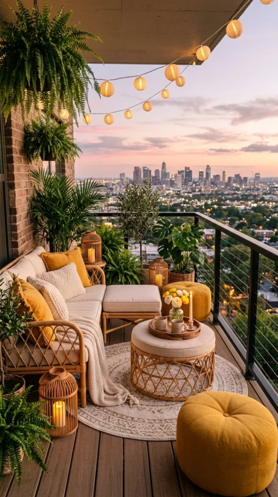
What’s easy to miss here is that almost nothing about this layout is really about the furniture — it’s about what the furniture refuses to obstruct. Nothing competes with the city view: pieces sit low, the railing runs thin and cable-style, and nothing tall interrupts the horizon; the whole arrangement is organised around not blocking the one thing money can’t buy back on a low floor. With no overhead structure like a pergola, a string of paper lanterns defines the space vertically instead, pulling the eye up just enough to create a sense of enclosure without hiding the sky. Every major piece – sofa frame, lanterns, ottoman – is woven rattan rather than solid wood or metal, keeping furniture from feeling heavy against an open skyline. Ferns and palms stacked at the railing and corner act as a soft privacy buffer where neighbours’ windows would otherwise be visible. This much greenery this high up needs real upkeep — wind exposure makes watering and securing lightweight pieces a daily consideration, not just styling.
3. A Sunken Layout That Isn’t a Weekend Project
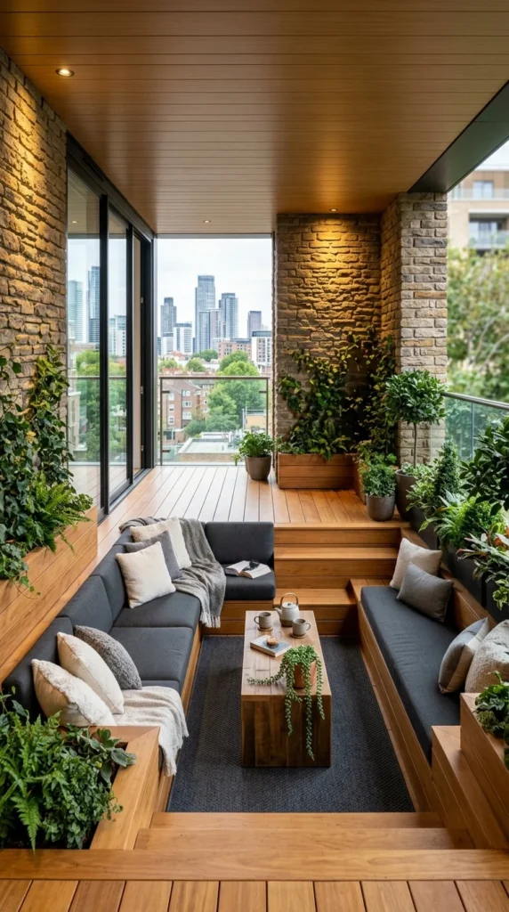
A sunken layout like this needs real carpentry and drainage planning — it’s the kind of design that looks simple in photos but isn’t something to attempt casually, and that’s worth saying before anything else about it. Dropping the seating area a step below the entry creates a natural room-within-a-room feel and stops the eye from travelling all the way to the far wall, making a long narrow deck read as cosier than it actually measures. Both sofas are built directly into the timber decking rather than placed on top of it, a space-compression fix that frees up walking room freestanding furniture this size would otherwise eat into. A rough stone accent wall breaks up what would otherwise be an all-wood box, stopping the warm timber tones from flattening into one continuous surface. A glass panel on the right replaces what could have been another planter wall, keeping the skyline visible even from the lowest seating point. Planters built into the structure suggest this was designed as a permanent installation, not a rental-friendly setup worth copying as-is.
Pro Tip: A built-in bench doesn’t require a full sunken structure to borrow the space-saving benefit — a simple platform deck box against one wall can free up the same walking room without any drainage work.
4. When a Living Wall Replaces the View Entirely
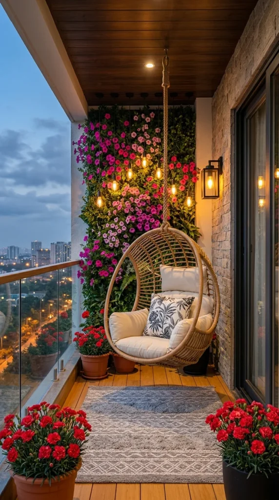
What I find genuinely useful about this deck is how it solves a problem most guides skip past: not every apartment has a view worth designing around. Instead of relying on the skyline for visual interest, this space builds its own — a dense vertical garden of petunias becomes the primary focal point, which matters on floors where the view isn’t the selling point. Small bulb lights are threaded directly into the greenery rather than hung separately above it, so light source and plant become one visual element instead of two competing ones. A single hanging rattan egg chair, with no second seat and no side table, is emphasised through restraint — a small deck with one striking piece often reads richer than one crammed with matching furniture. The thick rope holding the chair pulls attention toward the wood-panelled ceiling, making a narrow deck feel taller than its actual footprint suggests. A vertical flower wall this dense does need consistent watering and trimming, and petunias in particular fade fast without regular care.
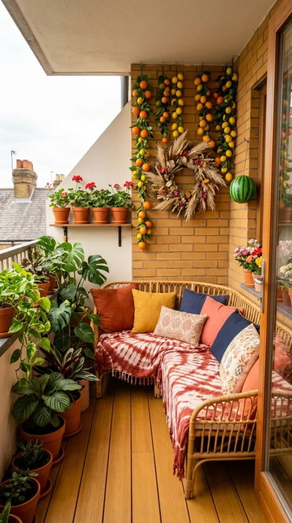
5. A Balcony That Isn’t Trying to Look Like Anything Else
Honestly, this is the deck on this list that looks the least like it was designed for anyone but the person who actually sits on it. Strands of citrus fruit hanging against the brick, alongside a straw wreath and a hanging watermelon, turn a bare wall into a seasonal display, an unconventional choice that gives the space a distinct, unmistakable character. Five matching terracotta pots on a single wall shelf create instant rhythm through repetition, making a narrow, awkward corner feel curated rather than accidental. Rust, mustard, navy, and coral pillows sit together without one unifying tone — colour layering through contrast rather than coordination — and it holds together because a tie-dye throw ties the palette back underneath it. A dense cluster of monstera, pothos, and mixed greenery along the railing does more than decorate, working as a soft privacy screen for balconies facing other buildings directly. That single hanging watermelon isn’t practical decor by any stretch, but it does signal something worth noticing: this space was styled for personal enjoyment, not for a photo shoot.
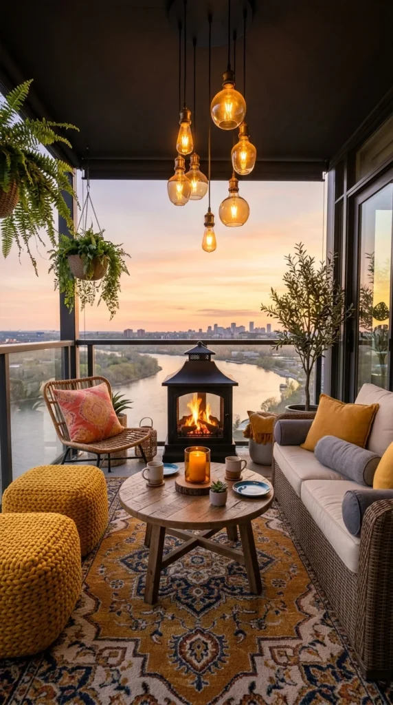
6. Light and Fire Doing More Than One Job Each
What’s easy to overlook at first is that six exposed-filament bulbs hang here at staggered heights instead of one uniform row, turning the light fixture itself into a visual feature, especially against a dark ceiling. Positioned dead centre against the river view, a small black fire lantern becomes the space’s primary visual weight, pulling the eye before the sunset or skyline even registers. Two chunky mustard puffs replace what could have been another bulky seat — anything larger here would have crowded the fireplace and blocked the view from the wicker chair. A medallion-pattern rug anchors the floating furniture pieces together on what would otherwise be a plain grey floor, its warm tones echoing the firelight above it. A rolled-up screen visible at the top edge hints this deck adapts to weather and sun angle, a detail easy to miss but essential to how usable the space stays year-round. An open-flame lantern this close to soft furnishings and a wool rug needs real fire-safety awareness, and it isn’t a detail to copy carelessly on a small enclosed balcony.
Pro Tip: Staggering pendant or bulb heights rather than hanging them in one flat row is a low-cost way to make a lighting fixture read as a design feature instead of a functional afterthought, no rewiring required.
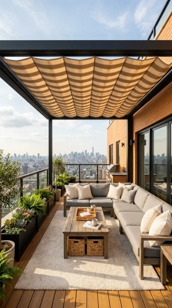
7. A Roof That Filters Light Instead of Blocking It
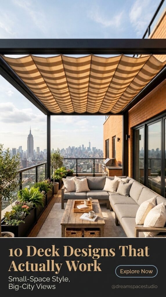
Instead of a solid roof, the pergola here uses a striped fabric shade that lets in dappled light rather than full shade, keeping the seating area bright without exposing it to harsh direct sun overhead. The black pergola frame acts almost like a window border around the city view, turning an otherwise ordinary skyline into a deliberately composed backdrop for the seating area. Two woven baskets tucked under the coffee table quietly solve a real problem — outdoor storage without a bulky cabinet — built into the furniture choice rather than added afterwards. A built-in grill sits tucked near the brick wall rather than centred, staying functional without competing with the lounge area, a clear case of separating cooking zones from resting zones. Grey cushions, cream pillows, and a light rug could easily feel cold, but the warm wood coffee table and brick wall behind them pull enough warmth into the space to keep it inviting rather than sterile. A run of mixed greenery in black planters along the railing marks where the seating area ends, doing quiet boundary work without an actual wall.
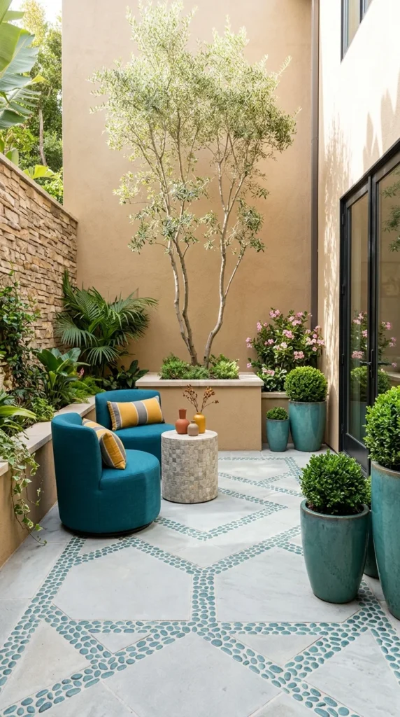
8. When the Flooring Becomes the Focal Point
Most people would look at this courtyard and register the furniture first, but the geometric pebble-inlay pattern set into the stone tiling is arguably the strongest design element in the whole space — proof that flooring itself can act as a focal point when the furniture stays simple. Two rounded teal swivel chairs facing each other allow easy repositioning in a tight courtyard, solving for spaces too narrow for a bulky sectional. Rather than several tall plants competing for attention, a single multi-stem olive tree fills the vertical space, keeping scale intact in a footprint too small for a crowded garden look. The chair upholstery and the large ceramic planters share the same teal tone, visually connecting furniture to landscaping instead of treating the two separately. A rough stacked-stone wall on the left contrasts directly against the smooth stucco wall behind the tree, adding depth without adding clutter. A small mosaic-tiled side table holds only a few decorative vases and nothing else, restraint itself signalling intention. Large ceramic planters this size get heavy and expensive fast — renters copying this look could scale down to two or three pots and still keep the same visual rhythm.
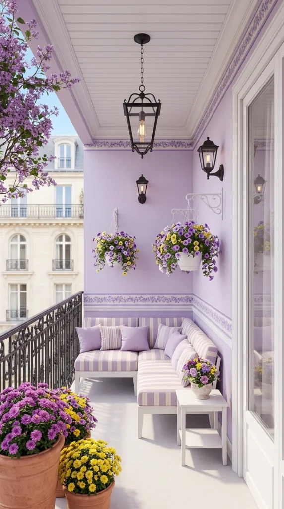
9. A Color-Matched Balcony That’s Harder to Update Later
A fully colour-matched scheme like this is striking in photos but genuinely harder to update down the line — swapping even one furniture piece later means matching an entire palette, not just picking something new, and that’s worth knowing before committing to it. Lavender walls, matching striped cushions, and purple-toned florals sit within one narrow colour family, making a small balcony feel styled top to bottom rather than furnished piece by piece. Hanging wrought-iron lanterns and matching wall sconces echo the ironwork railing outside, tying interior fixtures to the building’s architectural language instead of treating lighting as an afterthought. Two flower baskets mounted mid-wall, not near the ceiling, sit exactly where a seated person would naturally look, rewarding the eye without requiring it to travel far. A striped bench wraps the corner directly against the wall rather than using freestanding chairs, leaving the narrow floor area fully walkable. Against so much purple, yellow blooms in the pots and hanging baskets stop the palette from feeling flat or overly matched.
Pro Tip: Committing to a single accent colour across cushions, planters, and one furniture piece — rather than every surface — gives a small balcony the same styled effect while leaving more room to swap pieces later without matching an entire palette.
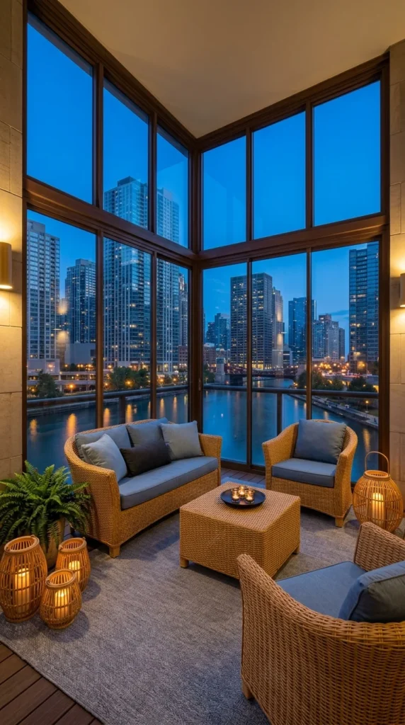
10. A Corner Where the City Becomes the Wallpaper
I keep coming back to this one because it’s the only deck on this list that isn’t really outdoors at all, and that changes what it’s allowed to do. Two full walls of windows meeting at a corner remove almost any visual barrier between seating and skyline, letting the city itself function as the room’s wallpaper rather than an occasional view. All three wicker seats face inward toward the glass corner instead of each other, prioritising the skyline over face-to-face conversation. Bamboo-style lantern candles cluster at floor level near the seating, adding warm, low light that doesn’t compete with the blue-hour glow coming through the windows. Against so much glass, metal framing, and stone flooring, the woven rattan seating introduces the only soft texture in the space, keeping it from feeling clinical. Being fully glassed-in means this space likely stays usable across more weather conditions than an open balcony, though it also traps heat in summer and loses it fast in winter without proper insulation.
🌟 Conclusion: What Ten Decks Actually Teach You
Across all ten of these decks, the strongest spaces weren’t the biggest ones — they were the ones where every choice, from lighting height to plant placement, served a clear purpose instead of just a photo angle. Whether it was a fireplace, a flower wall, a skyline, or patterned flooring, each deck built itself around one dominant feature instead of competing elements, a habit worth borrowing regardless of square footage. Texture did more of the real work than extra decor across nearly every design: rattan against stone, wool against wood, glass against greenery, the pairing itself creating depth that objects alone rarely manage. Even the simplest setups here — a single olive tree, one bold chair, layered candlelight — proved that scale and restraint can carry a small space further than a fully furnished one. The real takeaway isn’t a shopping list. It’s a mindset: figure out what the space is structurally missing — a focal point, a boundary, a layer of light — before adding anything decorative on top of it.
Frequently Asked Questions
What’s the easiest way to make a small apartment deck feel bigger? Keep furniture low, choose one focal point instead of several competing ones, and use vertical elements — hanging plants, a tall single tree, or layered lighting — to draw the eye upward rather than filling floor space.
Do I need permanent installations to get this look as a renter? Not necessarily. Many of the strongest elements across these ten designs – potted greenery, layered textiles, string or lantern lighting, and rugs – are fully non-permanent and can be recreated without altering the space itself.
How much maintenance do plant-heavy deck designs actually require? It depends on density and plant type. Flowering vines and citrus displays need regular watering and trimming, while structural greenery like ferns or olive trees tends to be lower-maintenance and more forgiving for a busy routine.

