

Dark academia has mostly lived in bedrooms and home libraries — leather-bound books, brass lamps, tweed. But the same instincts translate surprisingly well into a bathroom, a room most people default to painting white and forgetting about. The ten rooms below all commit to the aesthetic in different ways: some lean gothic, some lean industrial, some lean botanical. None of them look the same, and that’s the point — by the end, you should know which specific version of “old-world soul” actually fits your own home, not just that you like the mood board.
Quick Overview
| Style | Dark Academia |
|---|---|
| Best For | Older homes, moody renovators, primary baths |
| Budget | Medium–High |
| Difficulty | Moderate, some advanced builds |
| Maintenance Level | Medium |
A Cracked Marble Floor and a Branch of Cherry Blossoms
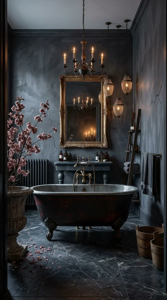
This bathroom is built almost entirely from hard, weathered surfaces — charcoal plaster walls with visible texture, a cracked black marble floor, an oxidized clawfoot tub with a rust-red patina bleeding through its enamel. Against all of that stone and decay, a single branch of pale pink cherry blossoms sits in a stone garden urn, with a few fallen petals scattered on the floor. That contrast is the whole idea: nothing here is trying to look brand new, and the blossoms make the age feel intentional rather than neglected.
The gilt mirror above the console is doing more compositional work than it first appears. Its ornate frame is the only warm-metal element paired with a beaded chandelier and matching pendant lanterns, so the eye is pulled to that one bright cluster of candlelight even in a room otherwise lit low. A ladder rack stacked with towels and wooden buckets sits opposite the tub, giving the room’s only obvious storage a slightly apothecary, “gathered over time” feel rather than a built-in cabinet. If you’re weighing dark academia against other layered, old-world moods, it’s worth comparing it to the tighter dark academia kitchen layouts built for older homes, where the same materials show up under very different lighting demands.
This room suits people who already own or want to collect vintage hardware, apothecary bottles, and stone planters — it rewards patience and a slow accumulation of objects, not a single shopping trip. It’s a poor fit for anyone who wants a bathroom to feel bright first thing in the morning; there’s very little reflected light here by design.
Why the Cracks Are the Point, Not a Flaw
One reason this floor reads as deliberate rather than damaged is that the cracking pattern repeats in the wall’s plaster texture — the same broken, aged quality shows up twice, in two different materials, which is what keeps it from looking like a floor that simply needs replacing. Swap the floor for a flawless polished slab and the tub’s oxidized finish would suddenly look like a mistake instead of a matching choice.
Recommended Materials: Aged charcoal plaster, cracked black marble tile, oxidized cast-iron tub, wrought iron chandelier fittings, reclaimed wood ladder rack, stone garden urn
Main Colors: Charcoal Grey, Aged Black, Rust Patina, Antique Gold, Blush Pink
Best Lighting: Lead with the chandelier and matching pendant lanterns rather than any overhead fixture — candlelight-style bulbs at varying heights do more here than a single bright source, since the walls are dark enough to absorb flat light.
Maintenance Note: The cherry blossom branch is fresh-cut greenery, so budget for replacing it every one to two weeks, and wipe down the stone urn regularly since porous stone left wet at the base can stain.
Where This Look Goes Wrong Fast
- Choosing a flawless, polished floor instead of one with visible age or texture
- Skipping the ladder rack or open storage and hiding everything behind flat cabinetry
- Using bright white towels instead of neutral or aged tones that blend into the palette
- Over-lighting the room with a single bright overhead fixture instead of layered candlelight-style sources
A Chapel-Like Gallery Wall Around an Arched Window
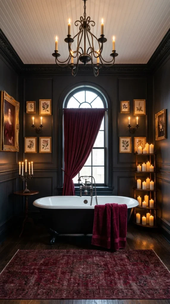
Where the previous room leaned on texture, this one leans on symmetry. An arched window dressed in a single burgundy velvet curtain sits dead center, flanked on both sides by matched pairs of gold-framed botanical prints, sconces, and a portrait — the whole wall behaves like the front of a small chapel, with the tub positioned like an altar beneath it. Every element on the left has a near-mirrored partner on the right, which is unusual for a bathroom and gives the room a formality most people don’t attempt outside a dining room.
The black paneled walls topped with a white beadboard ceiling create a clear horizontal split that keeps all that symmetry from feeling heavy — the ceiling stays light while the walls do the moody work. A tiered candle ladder in the corner and a matching candelabra on a side table repeat the room’s candlelight theme without needing electricity for either. If you’re deciding where sconces should actually sit relative to a mirror or window, the placement logic here lines up closely with the guidance in this breakdown of sconce placements that change how a bathroom feels — flanking a focal point, not scattered around the room.
This is the room for someone who already has (or wants to build) a collection of framed prints and doesn’t mind hunting for matching frames. It’s the wrong call for a rental or a bathroom with an odd, off-center window, since the entire effect depends on that centered arch.
A Wall Built Like It Has a Rule
One reason this wall reads as composed rather than cluttered is the repeated gold frame — it shows up eight separate times across the prints, the portrait, and the mirror, and that single repeated element is doing the job that would otherwise take a matched furniture set. Break that repetition with even one mismatched black frame and the symmetry starts to look like an accident instead of a plan.
Recommended Materials: Black wood wall paneling, white beadboard ceiling, gilt picture frames, cast-iron clawfoot tub, burgundy velvet drapery, worn Persian-style runner
Main Colors: Onyx Black, Antique White, Burgundy, Warm Gold, Botanical Green
Best Lighting: The arched window supplies the room’s only real daylight, so the sconces and candelabra need to carry the evening — mounting sconces at portrait height on either side of the window, as shown here, keeps the symmetry intact after dark too.
What Trips People Up Recreating This
- Hanging the gallery prints slightly off-center from the window, which breaks the chapel effect immediately.
- Mixing frame finishes (gold, black, silver) instead of committing to one metal
- Choosing a patterned rug that competes with the botanical prints instead of a quieter runner
- Leaving the beadboard ceiling unpainted white against very dark walls, which can make the split feel unfinished rather than intentional
An All-Black Herringbone Shower and Bath in One Run
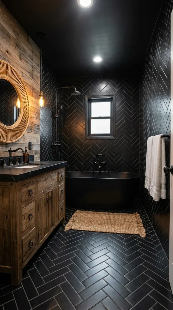
This room does something the others don’t: it wraps the same herringbone tile pattern across the floor and up the walls of both the shower and the tub surround, with no visible grout break between “wet zone” and “dry zone.” The result reads less like a bathroom with a shower in it and more like one continuous dark tiled room that happens to hold a tub and a rain head. A reclaimed wood vanity with a round rattan mirror is the only warm material in the entire space, and it’s positioned at the doorway, so it’s the first thing you see before the black takes over.
The single Edison bulb pendant hanging beside the mirror is a small, almost stingy amount of light for a room this dark, and that’s a deliberate trade — it keeps the vanity area functional while letting the rest of the room stay moody rather than shadow-free. A jute rug in front of the tub is the only soft texture breaking up all that matte black tile.
This works best in a full bathroom with good exhaust ventilation, since matte black tile shows water spots more than gloss finishes would. It’s not the right call for a small windowless powder room, where wall-to-wall black tile with only one dim pendant can feel closer to a cave than a retreat.
Herringbone Wrapping the Corner Is a Scale Decision
The herringbone pattern’s diagonal lines are roughly the same visual weight as the tub and vanity combined, which is a real risk in a narrow room — a pattern this busy can shrink a space instead of unifying it. It works here because the tile color and the wall color are nearly identical, so the pattern reads as texture rather than as a second competing element. If choosing between recreating this or building a warmer vanity-forward version, the piece on upgrading a bathroom with the right vanity covers how much a single reclaimed-wood piece can shift an otherwise dark room.
Recommended Materials: Matte black herringbone porcelain tile, reclaimed wood vanity, rattan mirror frame, matte black plumbing fixtures, jute rug, Edison-style pendant bulb
Main Colors: Matte Black, Warm Oak, Natural Rattan, Brass Accent
Best Lighting: A single warm-toned Edison pendant at the vanity is genuinely enough here because the recessed ceiling lights are doing the ambient work — don’t add a second bright fixture near the tub, or the tile’s uniform darkness will start to look patchy instead of deliberate.
Easy Ways to Get This Wrong
- Using glossy black tile instead of matte, which shows water spots and streaks far more visibly
- Grouting the wet and dry zones in different colors, which breaks the seamless wraparound effect
- Pairing the reclaimed wood vanity with chrome fixtures instead of matte black or aged brass
- Skipping ventilation upgrades, since all-black tile in a humid room shows mildew faster than lighter grout
Oxidized Copper Walls Behind an Oxidized Copper Tub
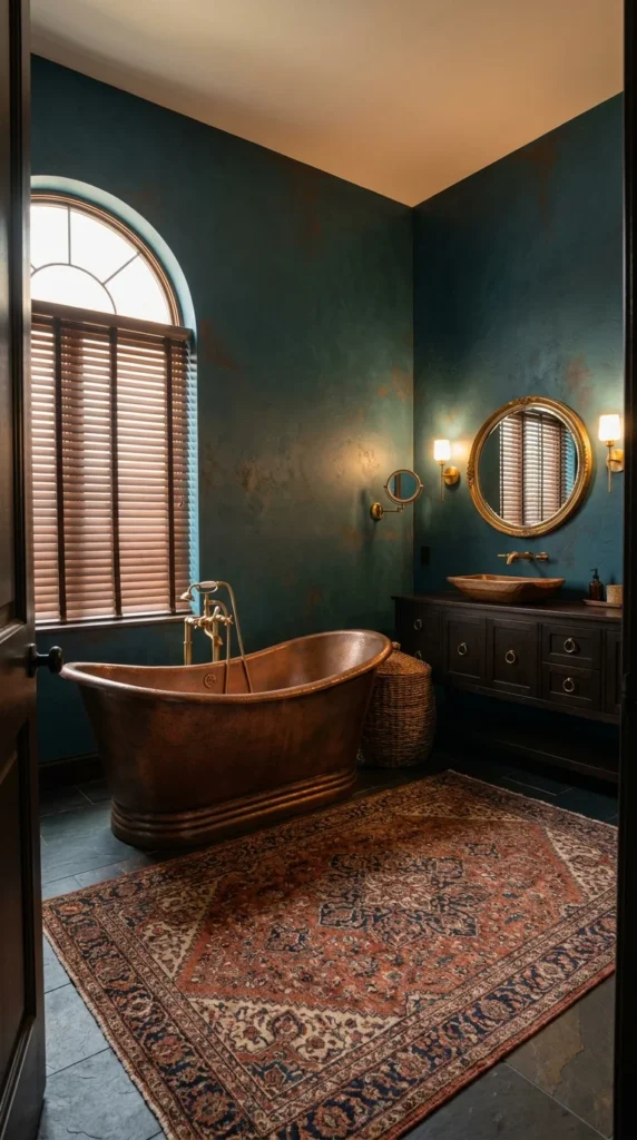
Most bathrooms treat their tub as the one metallic accent against a neutral wall. This room does the opposite — the wall finish itself is a faux verdigris, oxidized copper plaster, in the same teal-and-rust family as the actual copper tub sitting in front of it. The tub isn’t standing out against the wall; it’s echoing it, which is a much harder effect to pull off and a much more expensive one to fake convincingly.
A round gilt mirror flanked by twin sconces sits above a dark wood vanity with a carved wood vessel sink, and a large arched window with wood blinds lets in soft, filtered daylight that catches the wall’s texture at an angle. A rust-and-navy Persian rug covers most of the floor, pulling the room’s warm-cool color tension together in one object. If green-leaning moody bathrooms are more your interest than true black, the direction laid out in these dark green bathroom ideas built around moody, luxurious palettes uses a similar oxidized-teal logic without the copper price tag.
This is a splurge room, realistically — a genuine copper tub is not a budget fixture, and the hand-applied wall finish takes real skill to get right. It suits someone renovating a primary bath and willing to pay for one or two showstopping surfaces rather than spreading the budget evenly.
Recommended Materials: Faux verdigris copper plaster, hammered copper soaking tub, carved wood vessel sink, gilt mirror frame, brass sconces, hand-knotted Persian rug
Main Colors: Oxidized Teal, Aged Copper, Rust Red, Warm Gold, Espresso Wood
Best Lighting: Let the arched window do the daytime work — the wood blinds diffuse light instead of blocking it — then rely on the twin sconces flanking the mirror for evening use rather than a single overhead fixture, which would flatten the wall’s texture.
Maintenance Note: Genuine copper develops more patina over time in a humid room, which most owners want here, but it does mean the tub’s finish will keep shifting color for the first year or two — expect that, don’t try to polish it back to bright copper.
A Wood Vessel Sink Is a Real Commitment
Carved wood vessel sinks look striking, but wood in a room this humid behaves differently than stone or vitreous china — even a sealed one needs re-oiling on a schedule, or it will dull and eventually crack at the rim. That upkeep is a fair trade for how warm it looks against the cool copper wall, but it’s worth going in with eyes open rather than assuming it’s a one-time install.
Where People Underestimate This Room
- Choosing a painted-on teal instead of a genuine textured plaster finish, which loses the depth entirely
- Pairing the copper tub with chrome hardware instead of brass or aged bronze
- Skipping sealant maintenance on the wood vessel sink and letting it dry out or crack
- Assuming the wall finish is a weekend DIY job when it typically needs a plaster specialist
A Loft Where Brick and Beams Do the Decorating
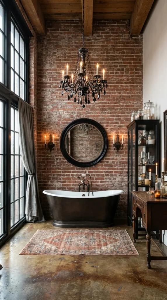
Strip away every piece of furniture in this room, and you’d still have a striking space — exposed red brick running floor to ceiling, heavy timber beams overhead, and a wall of tall black-framed factory windows. That’s rare in a design-ideas gallery, where most rooms depend on their decor. Here, the architecture is the design, and the dark bronze tub, round black mirror, and beaded chandelier are restrained additions layered on top of it rather than the main event.
A worn Persian rug on a raw concrete floor is doing something specific: it’s the only soft, patterned surface in a room that’s otherwise all hard right angles and rough texture, and it keeps the space from feeling like an unfinished renovation. An antique wood console with glass apothecary jars and candles sits beside the tub, echoing the same “gathered over time” feeling as the objects in the first room in this guide, but here it reads more workshop than boudoir. Anyone drawn to this raw-materials mood should also look at these dark academia fireplace ideas that balance mood and function, since brick, timber, and warm firelight solve a lot of the same problems this bathroom’s chandelier is solving.
This is genuinely a converted-loft or old-industrial-building look, and it’s very hard to fake convincingly in a standard suburban build — faux brick veneer reads as faux brick veneer under this much natural light. It suits people who already have the bones (real brick, high ceilings, factory windows) and just need to decorate around them, not people hoping to manufacture the effect from scratch.
What the Eye Sees First, and Why
The eye goes to the chandelier before the tub, even though the tub is larger, because the chandelier is the only warm light source against a wall of cool grey brick and black steel window frames — brightness beats size for grabbing attention first in a room with this much visual noise. Moving the chandelier off-center, away from directly above the tub, would likely pull that focal point away from the room’s actual centerpiece.
Recommended Materials: Exposed red brick, heavy timber ceiling beams, black steel window frames, oxidized bronze tub, raw concrete flooring, antique wood console
Main Colors: Brick Red, Charcoal Steel, Bronze Patina, Warm Amber, Faded Rust
Best Lighting: The wall of factory windows makes this the brightest room in the whole guide during the day — at night, a single statement chandelier low over the tub is enough, since the brick and concrete already scatter warm light well on their own.
Common Ways This Falls Apart
- Attempting the look with faux brick panels in a room with strong natural light, which reads as fake almost immediately
- Over-decorating and burying the architecture under too many accessories
- Painting the exposed brick, which removes the exact texture the room depends on
- Choosing a glossy tub finish instead of a matte or oxidized one that matches the room’s raw materials
A Checkerboard Floor Under a Painted-Over Marble Wainscot
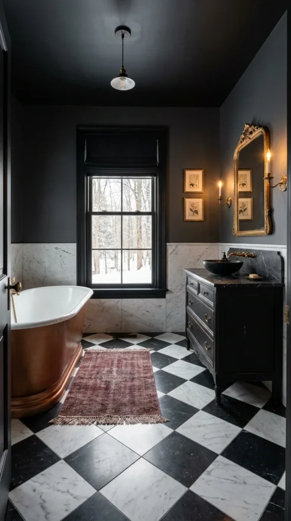
This bathroom takes a classic material — white marble subway tile wainscoting — and does something unexpected with it: the wall above it and the entire ceiling are painted flat black, while the marble itself stays untouched below the chair rail line. Paired with a black-and-white checkerboard marble floor, the effect reads more like a 1920s Parisian pharmacy than a typical farmhouse bathroom, even though farmhouse-style checkerboard floors are common enough on their own.
A copper tub sits against the window wall, picking up warm tones that would otherwise be missing from an almost entirely black-and-white room. The black dresser-style vanity with a black vessel sink and gilt mirror repeats the room’s two-tone logic rather than introducing a third material. A burgundy runner rug is the only saturated color in the whole space, and it’s placed exactly where feet land getting in and out of the tub — a practical choice dressed up as a decorative one.
This suits older homes that already have real marble subway tile wainscoting worth preserving; painting the upper wall and ceiling black is a much smaller commitment than replacing existing tile, and it’s reversible if a future owner disagrees with the choice. For anyone weighing black-and-white schemes against genuinely moody, saturated ones, this guide to moody bathrooms that feel luxurious, not dark is a useful comparison point before committing to full black.
Why Painting Over Half the Wall Works Here
One reason this room feels resolved instead of unfinished is that the black paint stops at a hard architectural line — the top of the existing wainscoting — rather than an arbitrary height. That gives the eye a clean, intentional break instead of a smudged transition, and it’s a big part of why the copper tub against black reads as styled rather than accidental.
Recommended Materials: White marble subway tile wainscoting, black-and-white checkerboard marble floor, hammered copper tub, black painted vanity, brass hardware, wool runner rug
Main Colors: Ink Black, Marble White, Aged Copper, Burgundy, Antique Brass
Best Lighting: The window supplies most of the daytime brightness in this otherwise dark-ceilinged room — a single pendant plus the sconce beside the mirror keeps the black ceiling from swallowing evening light entirely.
Easy Mistakes in a Black-and-White Room
- Painting straight through the existing marble tile line instead of stopping cleanly at the wainscot
- Choosing a warm-toned white for the marble and a cool black for the walls, which fights instead of contrasts
- Skipping the runner rug, which is the room’s only real color and softens the hard tile underfoot
- Mixing metal finishes on the vanity and tub hardware instead of committing to one warm metal
Quilted Black Walls Behind a Pale Marble Tub
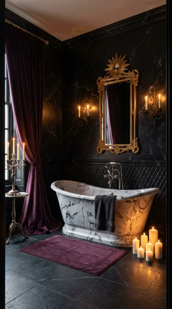
Every wall in this room is painted or plastered black with a faux marble finish, and the lower third is finished in a diamond-tufted, quilted panel — a texture almost nobody puts in a bathroom, since it reads more like an upholstered headboard than a wall. Against all that dark tufted texture sits a genuinely pale, white-and-grey marble soaking tub, and the contrast between the two is the entire reason the room works.
A gilt sunburst-topped mirror anchors the wall above the tub, and a silver candelabra beside plum velvet curtains repeats the room’s only two accent colors — warm gold and deep plum — without introducing a third. A cluster of pillar candles sits directly beside the tub on the floor, which is a genuinely different lighting strategy from the sconces and chandeliers used everywhere else in this guide; the light source is at bath level, not overhead. Rooms this saturated in black are also where a small dose of restraint pays off, and the broader case for that trade-off is laid out in this look at moody bathrooms that feel luxurious rather than simply dark.
This is a bold, adults-only kind of room — the quilted wall panel alone is a custom upholstery job, and floor-level candles aren’t practical in a household with small children. It suits a primary bath in a larger home, not a shared family bathroom.
Worth the Investment? A custom quilted wall panel and a genuine marble tub are two of the most expensive individual choices in this entire guide, and neither is easy to undo later. It’s worth it specifically if the room gets heavy personal use — a primary suite soaking tub someone actually sits in — rather than a guest bath most visitors will see for five minutes. In a lower-traffic room, a faux-tufted wallpaper and a marble-look solid-surface tub get you eighty percent of the visual effect for a fraction of the cost and none of the reupholstery risk down the line.
Where the Eye Lands First in a Wall This Busy
The pale marble tub is the brightest object in a room built almost entirely from black and deep plum, so it pulls focus immediately despite being smaller than the wall behind it — value contrast beats size here, the same way it did with the chandelier in the loft bathroom earlier in this guide. Swap that tub for a black one and the room would likely lose its one clear resting point for the eye.
Recommended Materials: Faux marble black plaster, diamond-tufted quilted wall panel, genuine marble soaking tub, gilt sunburst mirror frame, plum velvet drapery, silver candelabra
Main Colors: Deep Black, Marble Grey-White, Plum Purple, Antique Gold, Candlelight Amber
Best Lighting: Floor-level pillar candles beside the tub are the room’s real light source in the evening, not the sconces — that’s an unusual but effective choice for a soaking-focused bathroom, since it keeps the light warm and low rather than bright and clinical.
What Actually Trips People Up Here
- Attempting the tufted panel in real fabric instead of a marine-grade or moisture-resistant upholstery material
- Choosing a dark-colored tub instead of a pale one, which removes the room’s only real contrast point
- Relying only on candles with no backup electric lighting for everyday practicality
- Pairing plum with cool-toned silver instead of warm gold, which mutes the room’s richest color
A Monolithic Grey Stone Wrap From Floor to Ceiling
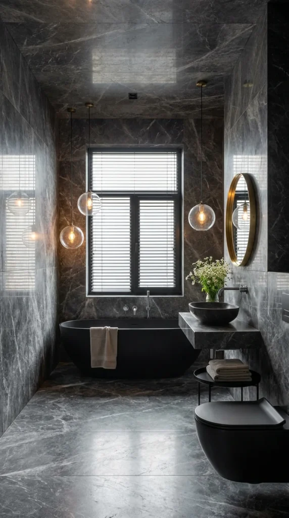
Every other room in this guide mixes at least two or three wall materials. This one doesn’t — the same grey stone slab covers the walls, the ceiling, and the floor, with only the fixtures themselves breaking up the surface. It’s the most architecturally minimal room here, and also the most expensive one to actually build, since large-format stone slab in this quantity is priced by the square foot in a way tile never is.
A matte black oval tub and matching vessel sink sit against all that stone without competing with it — black reads almost like a shadow on grey stone rather than a separate color choice. Three glass globe pendants at staggered heights are the only warm-toned objects in the entire room, and a small vase of white flowers on the vanity is the only soft, organic element. This is the closest thing in the guide to a genuine spa aesthetic rather than a lived-in, collected one.
This suits a full renovation budget and a household that wants a clean, low-clutter bathroom rather than a curated, object-filled one. It’s a poor match for anyone who enjoys displaying vintage bottles, books, or framed art — there’s simply no visual room for those objects to register against a wall this busy with natural stone veining.
Worth the Investment? Wrapping walls, ceiling, and floor in one continuous stone is a genuine investment, both in material cost and in the skill needed to match veining across surfaces so it reads as one slab rather than mismatched panels. It’s worth it in a primary bath meant to feel like a private retreat for years; it’s much harder to justify in a bathroom likely to be updated again within a decade, since removing full-slab stone is a bigger job than swapping tile.
How the Stone Itself Behaves Over Time
Natural stone this dark and heavily veined will develop a slight sheen difference between the areas that get direct water contact and the areas that don’t, even when properly sealed — it’s not damage, but it does mean the tub surround will read slightly different from the ceiling within a year or two. Homeowners who dislike that kind of natural variation are usually happier with a large-format porcelain slab that mimics the look without the same aging behavior.
Recommended Materials: Large-format grey stone slab, matte black solid-surface tub, matte black vessel sink, blown-glass globe pendants, brass round mirror, black wall-hung toilet
Main Colors: Storm Grey, Matte Black, Warm Brass, Soft White
Best Lighting: The staggered glass pendants are essential here, not decorative — flat, even light on a monolithic stone surface tends to flatten the veining that makes the material interesting, while pendants at different heights let shadow do some of that work instead.
Maintenance Note: Natural stone this porous needs periodic resealing, especially around the tub and shower where standing water is most common — skipping that schedule is the fastest way to get staining that flat tile would never show.
Where a Room This Minimal Goes Wrong
- Mixing in a second wall material, which breaks the monolithic effect the whole design depends on
- Choosing a glossy stone finish instead of honed or matte, which can feel closer to a hotel lobby than a bathroom
- Skipping the resealing schedule on porous natural stone
- Adding too many small decorative objects, which get visually lost against heavily veined stone
A Pressed-Tin Ceiling Doing All the Talking
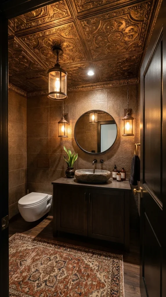
Compared to the rest of this guide, everything below the chair rail in this powder room is relatively simple — a stone vessel sink, a plain wood vanity, a wall-hung toilet. What makes the room is entirely overhead: an ornate pressed-tin ceiling in warm bronze and gold, with a raised medallion pattern that would be the obvious focal point of almost any room it was installed in. Two lantern-style pendants hang down from it, which means even the light fixtures are subordinate to the ceiling itself.
A round mirror in a thin black frame keeps the wall below from competing with all that ceiling detail, and a faded medallion-pattern rug on the floor is the room’s only other patterned surface — chosen quietly enough that it doesn’t fight for attention. If a vanity is doing a lot of the visual work in a smaller bathroom like this one, the piece on choosing the right vanity for a bathroom’s overall style is worth a look before finalizing a simple stone-and-wood pairing like this.
This look suits powder rooms and guest baths specifically — rooms people spend a few minutes in, where a dramatic overhead detail gets noticed without needing to live with it daily the way a primary bath’s owner would. It’s a strange fit for a small windowless bathroom, since pressed tin needs some ambient light bouncing around it to actually read as detailed rather than just dark.
Why Everything Else Had to Stay Quiet
The ceiling’s raised pattern repeats across the entire surface in a tight grid, which is already a huge amount of visual information for one small room — one reason this powder room doesn’t feel overwhelming is that the walls, vanity, and floor were all kept to a single material each, leaving the ceiling as the only busy surface. Adding a second patterned material anywhere else in the room would likely compete with it rather than complement it.
Recommended Materials: Pressed tin ceiling panels, natural stone vessel sink, dark stained wood vanity, matte black wall-hung toilet, lantern-style pendant fixtures, faded medallion rug
Main Colors: Antique Bronze, Warm Gold, Espresso Wood, Charcoal Black
Best Lighting: The lantern pendants are positioned to wash light upward toward the ceiling as much as down toward the vanity, which is the right call here — pressed tin needs raking light across its surface to show its raised pattern instead of going flat and dark.
The Most Common Mistake With This Kind of Ceiling
- Installing a flush-mount fixture instead of pendants, which removes the upward light the ceiling detail needs
- Choosing a busy wallpaper or tile pattern below the ceiling, which competes with the pressed-tin detail
- Painting the tin a flat, matte finish instead of preserving its warm metallic sheen
- Placing the vanity mirror too close to the ceiling line, visually cutting off the medallion pattern
Trailing Ivy and String Lights Against Black Paneled Walls
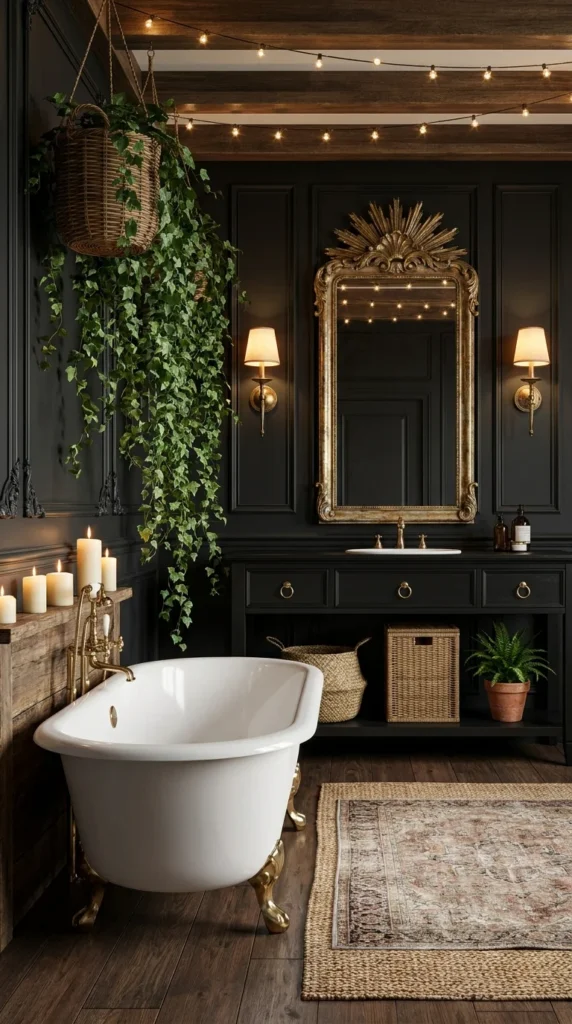
Every dark academia room in this guide uses candlelight, gilt frames, or brass fixtures to warm up black walls. This one uses something none of the others do: live, cascading ivy in a hanging woven basket, spilling down the corner of the room against the black paneling, plus a run of warm string lights woven along the exposed ceiling beams. It’s the softest, most botanical take on the aesthetic in the whole collection — closer to a candlelit greenhouse than a study.
A brass clawfoot tub with a white enamel interior sits at an angle rather than square against the wall, which is a small layout choice that makes the room feel less formal than the symmetrical gallery-wall bathroom earlier in this guide. Wicker baskets tucked under the black vanity and a potted fern on the floor continue the greenery theme in smaller doses, and a jute rug ties the room’s natural textures together underfoot. For anyone drawn to the softer, more livable end of moody design rather than the strictly gothic end, the direction covered in these dark green bathroom ideas built around a moody, timeless palette pairs well with this room’s instincts.
This is genuinely the most beginner-friendly room to recreate in the whole guide — string lights and a trailing plant are inexpensive, reversible additions to walls that could otherwise feel intimidatingly dark on their own. It suits renters and first-time dark-academia decorators far better than the rooms built around custom tufted panels or full stone slabs.
Two Warm Elements, Doing Two Different Jobs
The string lights and the ivy repeat the idea of “life against dark walls” in two different forms — one visual, one literal — and having both rather than just one is what keeps the black paneling from reading as heavy or cold. Removing either one on its own wouldn’t collapse the room, but losing both at once would likely make the space feel closer to the more severe, quilted-wall bathroom earlier in this guide than this softer version of the aesthetic.
Recommended Materials: Black wood wall paneling, exposed wood ceiling beams, brass clawfoot tub, wicker storage baskets, jute rug, gilt sunburst mirror
Main Colors: Matte Black, Brass Gold, Ivy Green, Warm White, Natural Jute
Best Lighting: String lights along the beams do double duty as ambient light and decoration, but they shouldn’t be the only source — the sunburst mirror is flanked by proper sconces for a reason, so there’s still enough real light to actually use the room at night.
Maintenance Note: Trailing ivy in a humid bathroom generally does well with the ambient moisture, but it still needs indirect light and occasional trimming to keep it from getting leggy — a bathroom with no window at all isn’t a realistic spot for it to thrive long-term.
Where This Softer Version Falls Short
- Choosing artificial greenery instead of real trailing plants, which reads noticeably flatter under warm lighting
- Overloading the string lights as the room’s only light source, leaving the space too dim for daily use
- Placing the hanging basket somewhere with no natural light, which real ivy won’t tolerate long-term
- Skipping proper sconces near the mirror, since string lights alone aren’t enough for grooming tasks
Keeping This Style Livable Day to Day
Cleaning and Moisture Tips for a Dark Academia Bathroom
- Wipe down matte black fixtures and tile with a microfiber cloth rather than abrasive sponges — matte finishes show scratches and hard-water spots more visibly than gloss ones
- Run the exhaust fan for at least twenty minutes after every bath or shower in rooms with dark grout, since dark grout can hide early mildew growth longer than light grout, letting it spread before it’s noticed
- Keep porous natural stone and unsealed wood elements (vessel sinks, consoles, ladder racks) away from direct splash zones, or reseal them on a regular schedule
- Choose darker or patterned bath mats and towels over bright white ones — practically, they hide the inevitable water spots and soap residue that show up fast against black tile and dark grout
Who Should Choose This Style?
- Best for older homes with existing architectural character — exposed brick, real marble wainscoting, arched windows — that a dark palette can highlight rather than fight
- Best for primary bathrooms and powder rooms used more for atmosphere than for a family’s daily rushed routine.
- Best for homeowners willing to layer lighting (sconces, pendants, candles) rather than relying on one bright overhead fixture
- Not ideal for small, windowless bathrooms with no natural light, where a fully dark palette can read as cramped rather than moody
- Not ideal for households that need a bathroom to feel bright and energizing first thing in the morning
Budget Summary
| Budget | Expectation |
|---|---|
| Low | Black paint, candles and candelabras, vintage-look rugs, gallery-style framed prints |
| Medium | Matte black herringbone tile, brass sconces and hardware, reclaimed wood vanity, pressed-tin ceiling panels |
| Premium | Genuine copper or marble soaking tub, full-slab natural stone walls, custom quilted wall upholstery, faux verdigris plaster finish |
Frequently Asked Questions
Does a dark academia bathroom always feel small or cramped? Not if there’s a real window or a strong secondary light source — several rooms in this guide rely on an arched window or a wall of factory-style windows specifically to keep a dark palette from feeling closed in. A genuinely windowless room is the harder case, and it’s worth leaning on brighter accent metals and layered lighting rather than going fully dark on every surface.
What’s the difference between dark academia and a general moody or gothic bathroom? Dark academia leans specifically on old-world, scholarly references — gilt frames, botanical prints, candlelight, aged materials — rather than just a dark color palette on its own. A gothic bathroom can share the black-and-brass materials but often pushes further into dramatic ornamentation, while a small, windowless powder room can benefit from checking guidance built specifically for tight footprints, like this look at small powder rooms doing more with less space, before committing to a full dark scheme.
Can this style work in a rental? Some of it, yes — string lights, framed prints, candles, rugs, and removable fixtures like a ladder rack or wicker baskets are all fully reversible. Painted walls, custom tile, and structural changes like a quilted wall panel generally aren’t, so renters get the closest results from the softer, botanical-leaning room in this guide rather than the full stone-slab or custom-plaster versions.
Is a dark bathroom harder to keep clean than a light one? It shows different things, not necessarily more of them. Dark surfaces hide soap scum and water spots less than people expect, but they do hide mildew in grout lines longer, which is why ventilation matters more here than in a bright white bathroom, not less.
What paint color should I start with if I only want to change the walls? A true matte or eggshell black or charcoal reads closest to the rooms in this guide; a warm-undertone black avoids the slightly cold, industrial look a blue-black can create against brass and gold hardware.
Aesthetic Life Team
Aesthetic Life Team covers real-world interior design across every room of the home, with a focus on helping readers translate mood-board inspiration into choices that actually work in their own space — from material selection to layout logic to budget-conscious substitutions.
Conclusion
Dark academia isn’t one look — it’s a shared vocabulary of gilt frames, candlelight, aged materials, and old-world proportion that ten different bathrooms can speak in ten different accents. Some of the rooms above lean fully architectural, letting exposed brick or a monolithic stone wrap do the work. Others lean botanical and soft, using ivy and string lights to keep black walls from feeling severe. The right one for your own bathroom comes down to what you already have to work with — the windows, the bones, the budget — more than which room simply looked the most striking on first pass.
Explore More
You may also enjoy:


One Response