

Ten home bars, ten different reasons someone chose color over caution. Comparing them side by side is more useful than admiring them one at a time — it shows which specific approach, retro nostalgia, tropical greenery, neon restraint, or marble glamour, would still feel right after the novelty wears off. Some of these ideas cost a weekend and a paint can. Others assume a full renovation budget.
Quick Overview
| Style | Maximalist / Eclectic Color |
|---|---|
| Best For | Regular entertainers, awkward corners, renters |
| Budget | Low to high, depending on the direction chosen |
| Difficulty | Paint-and-lighting refresh to full build-out |
| Maintenance Level | Low to medium |
The Retro Diner Bar Built on Repeating Color
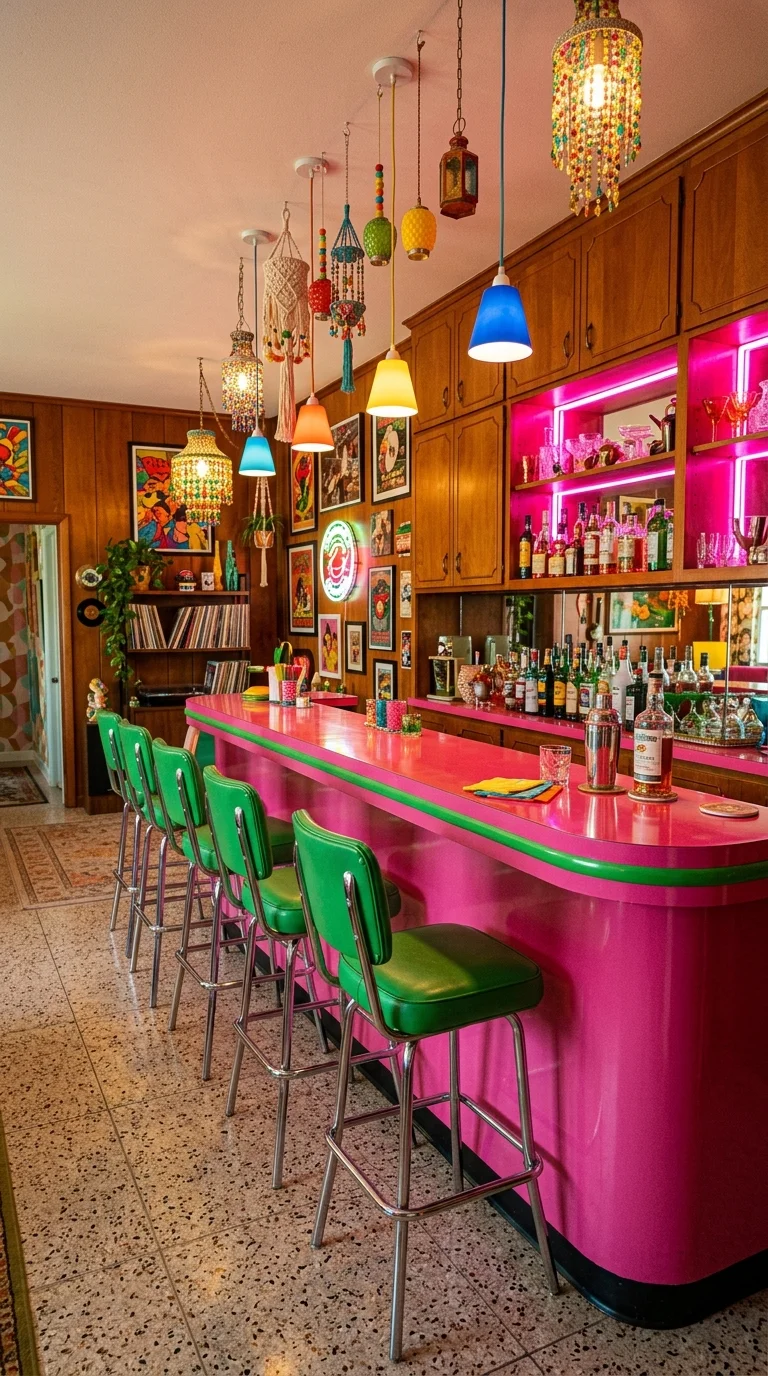
A hot-pink lacquer counter edged in kelly green, matching green vinyl stools, warm wood paneling, and mismatched glass pendants hanging at different heights — this bar commits fully to mid-century diner style. The confetti terrazzo floor underneath keeps two loud colors from fighting each other. For anyone turning an empty corner into a stylish entertaining space, this is a useful reference: the counter is long enough for a real group, yet it fits against one wall.
Recommended Materials: Glossy laminate · vinyl upholstery · confetti terrazzo · honey-toned wood paneling · chrome bases
Main Colors: Hot Pink · Kelly Green · Honey Wood · Confetti Terrazzo
Green Doesn’t Show Up Once Here — It Shows Up Three Times
The stool cushions, the counter trim, and the album spines below the turntable are all some shade of green, and that repeat does more work than the pink counter alone could. A single green accent would read as random; three read as a decision. Swap the stools for a neutral tone and the pink counter would likely look accidental instead of intentional.
This suits someone who wants friends over on a Friday, not a quiet reading corner, and it’s a poor fit for anyone who wants their color choices to fade into the background — diner-era brights are the opposite of neutral.
Small Slips That Flatten a Diner-Style Bar
- Pendant lights that all match instead of a genuinely mismatched cluster
- A matte counter finish instead of high gloss, losing the era’s shine
- Plain tile instead of terrazzo, leaving the palette with no texture underneath
- Cool-white lighting instead of warm amber, which drains the wood paneling
A Jungle-Wrapped Bar Where the Plants Are the Point
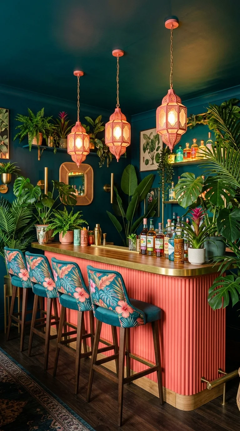
Deep teal walls, a fluted coral-pink bar front, brass Moroccan lanterns, and a wall of live greenery dense enough to nearly hide the shelving behind it — the color here comes from two unrelated sources instead of one dominant paint choice. That’s a different decision from a retro bar’s single saturated palette: this one splits the load between built materials and living ones.
Recreating it starts with the plants. Monstera and pothos, doing most of the visual work here, tolerate the humid, low-light conditions a bar corner usually offers better than something like a fiddle-leaf fig would. Rotate pots toward the light source every few weeks so growth stays even, and check soil moisture near any heat source from bar equipment. A budget version swaps the fluted panel front for flat painted MDF and keeps the plant wall, since the greenery is what actually reads as expensive here.
Maintenance Guide: Wipe dust from broad leaves monthly, watch for root rot in low-light corners, and use a drip tray under any pot near the bar to protect the wood shelf.
Where a Jungle Bar Like This Goes Wrong
- Overcrowding the shelf until leaves block labels and glassware
- High-light species in a corner that only gets indirect daylight
- Vines left unchecked into the hanging lanterns
- No drainage trays, risking water damage to the wood underneath
A Bar That Proves Color Can Come From Light Alone
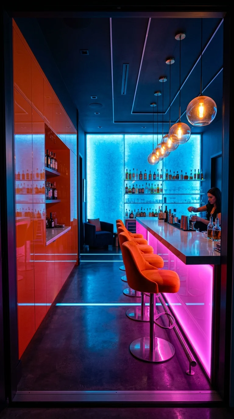
Strip the lighting out of this room and there’s barely a design left — concrete floor, plain white counter, one run of orange cabinetry. Everything bold about it comes from three light sources layered together: a cool blue wash on the back wall, a hot-pink glow under the counter edge, and warm amber pendant bulbs hanging low over the bar. It’s proof that color doesn’t have to live in paint or upholstery, which makes this idea genuinely useful alongside other industrial lighting ideas that add bold style and warmth to any room on a tight budget.
The pendant cluster is where the eye lands first, and it’s not by accident — that’s the one spot where warm amber overlaps with the cool blue wall wash, creating a soft halo neither color produces alone. Remove that overlap and the room would likely read as a nightclub rather than a bar someone spends evenings in. This is a smart direction for a rental, since LED strips and plug-in fixtures do the entire job without touching a wall permanently.
Best Lighting: A cool blue LED wall wash, a warm amber pendant cluster, and a low pink under-counter strip working in layers rather than one flood of a single color.
A Bar Where Every Color Has a Job
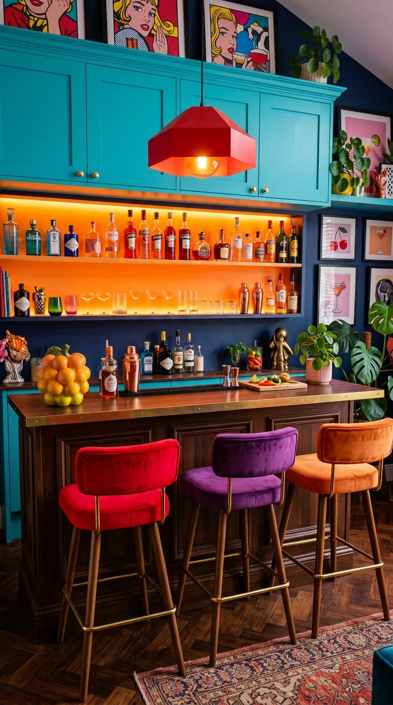
Teal cabinetry, an orange backlit liquor shelf, and three stools in red, purple, and orange velvet sit under one chunky red lantern pendant, with pop-art prints on the wall and a bowl of fresh citrus adding one more unplanned burst of color. Nothing here is neutral, yet the room doesn’t feel chaotic, largely because each color stays confined to its own object rather than spreading across multiple surfaces.
Main Colors: Teal · Burnt Orange · Ruby Red · Deep Purple
That red pendant is the smallest fixture in the room, but its saturated color and hexagonal shape give it enough weight to anchor everything below it — a pale fixture in the same spot would likely disappear against the busy shelving. For readers already drawn to the funky, maximalist direction of a bold kitchen renovation, this bar is a lower-stakes way to test that instinct in one small zone first.
What Actually Loses the Pop-Art Effect
- Stools in one color instead of three separate jewel tones
- Soft, muted art instead of graphic, high-contrast prints
- Plain warm-white backlighting instead of amber-orange
- A cluttered counter competing with the citrus bowl
An Art Deco Bar Where the Materials Do the Talking
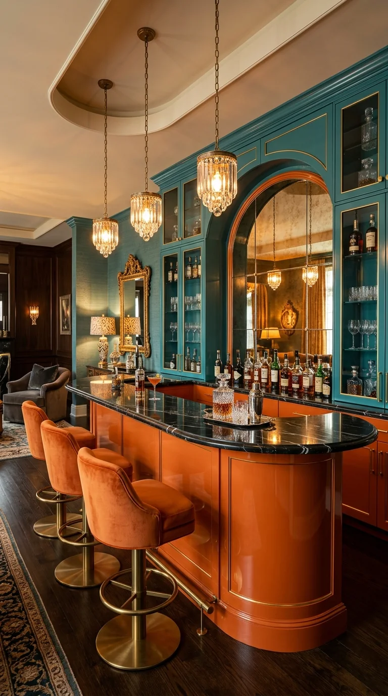
A curved burnt-orange front meets a black marble counter, framed by teal cabinetry with brass inlay and an arched antique mirror, with crystal pendants hanging above orange velvet stools on brass footrests. Every material here is chosen to catch light rather than absorb it, closer to the glamour of an old-world art deco kitchen than to anything casual.
Recommended Materials: Black marble · brass trim and hardware · antique mirrored glass · orange lacquer cabinetry · crystal-drop pendants
High-gloss lacquer wipes clean easily, but it shows fingerprints faster than matte or satin, especially near the curved edge where hands land most. Unlacquered brass won’t stay mirror-bright — it develops a soft patina over months, a change many people choosing a period-inspired room actually want, since it reads as age rather than wear.
Is the Marble and Brass Actually Worth It?
Laminate and plated metal cost meaningfully less than the real materials here, and in a room this small, that price difference is easy to feel every time a hand runs along the counter. The premium makes sense specifically because every surface sits close enough to touch — a sprawling kitchen island might not justify it, but a compact bar where guests lean in for hours makes the tactile upgrade worth what it costs.
A Speakeasy Where One Line of Light Runs the Whole Room
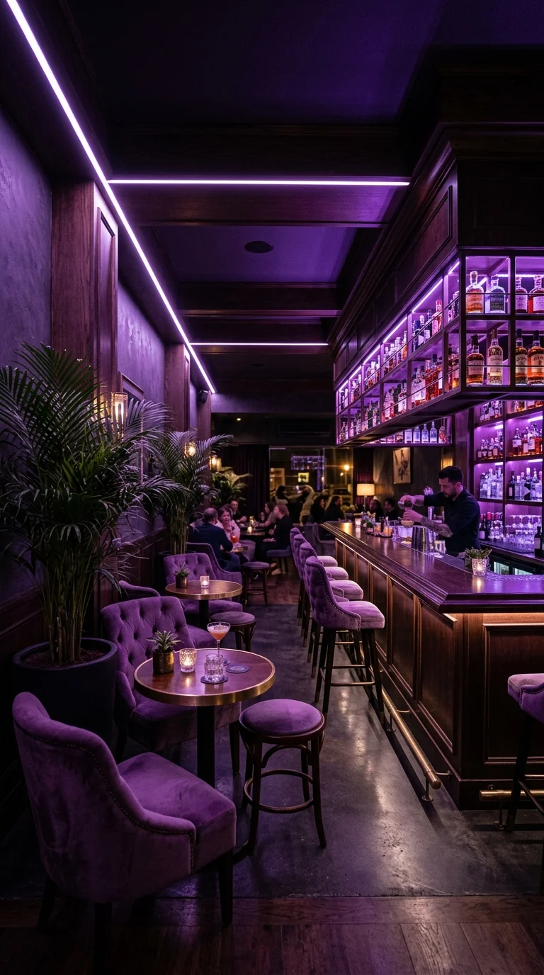
Dark wood shelving, backlit bottle displays, and a thin purple LED strip along the ceiling give this room a low, intimate glow closer to a cocktail lounge than a living room. Purple velvet chairs pull that color down to seating height, and brass sconces add small flickers of warmth against the cool tone. It shares an instinct with dark, earthy living rooms built on real character, just carried out in jewel purple instead of black.
Main Colors: Deep Purple · Espresso · Brass · Charcoal
That purple ceiling strip does more organizing work than any single piece of furniture in the room. It draws one continuous line the eye follows from the entry to the bottle wall, keeping a fairly dim, cluttered space from feeling scattered. Take the strip away and the room would likely split into several disconnected dark corners.
Where This Mood Gets Hard to Recreate
- Bright white task lighting near the seating, breaking the atmosphere
- Black or navy furniture instead of true jewel-toned purple
- Skipping the backlit bottle display, which handles most of the ambient light
- Seating placed too far from the bar for this close-distance layout
A Rooftop Bar Built Around Daylight Instead of Drama
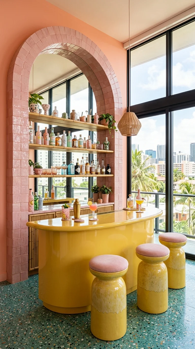
Floor-to-ceiling windows and a skyline view carry a lot of this room’s appeal, but the bar itself still holds its own — a glossy butter-yellow counter, a pink-tiled arched niche, and squat two-tone ceramic stools on blush-and-seafoam terrazzo. This is the only bar here built for daytime use first, closer to a playful pastel pink bathroom than to any moody evening lounge.
Main Colors: Butter Yellow · Blush Pink · Seafoam Terrazzo · Warm Terracotta
Best Lighting: Mostly natural daylight through the full-height windows, with one woven pendant adding warmth after sunset.
Each stool has a wide, rounded base that tapers to a smaller cushioned top — a proportion that reads as sculptural rather than purely functional, giving the seating enough presence against the tall arched niche. Slim metal stools here would likely look underscaled next to that much glass. This works best where there’s an actual view to build around; on a windowless wall, the same palette would need a different anchor.
A Gallery Wall That Turns Framing Into the Real Design Decision
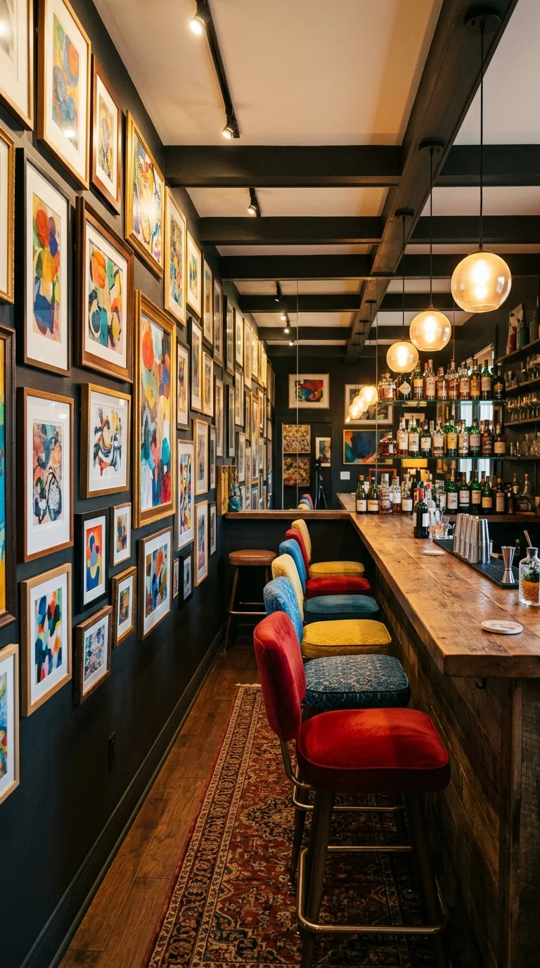
Dozens of small abstract paintings cover nearly every inch of wall space floor to ceiling, while the bar itself stays simple: reclaimed wood counter, black walls, warm glass pendants, stools in blue, yellow, and red velvet. Almost all the color comes from framed art rather than paint or cabinetry, making this one of the more rental-friendly ideas here — nothing requires a landlord’s permission.
What actually holds dozens of mismatched paintings together isn’t the art itself but the frames — every one shares a similar warm wood tone and a roughly consistent size, even though the paintings vary wildly. Mix in gold, black, and natural wood frames at random and the same collection would likely look cluttered instead of curated.
Where a Gallery Wall Like This Falls Apart
- Mixed frame finishes instead of one unifying choice
- Pieces hung at inconsistent heights with no shared baseline
- Stool colors that clash with the art instead of pulling from it
- Too much bare wall between pieces, breaking the layered effect
A Floral Nook That Works Because Everything Else Stays Quiet
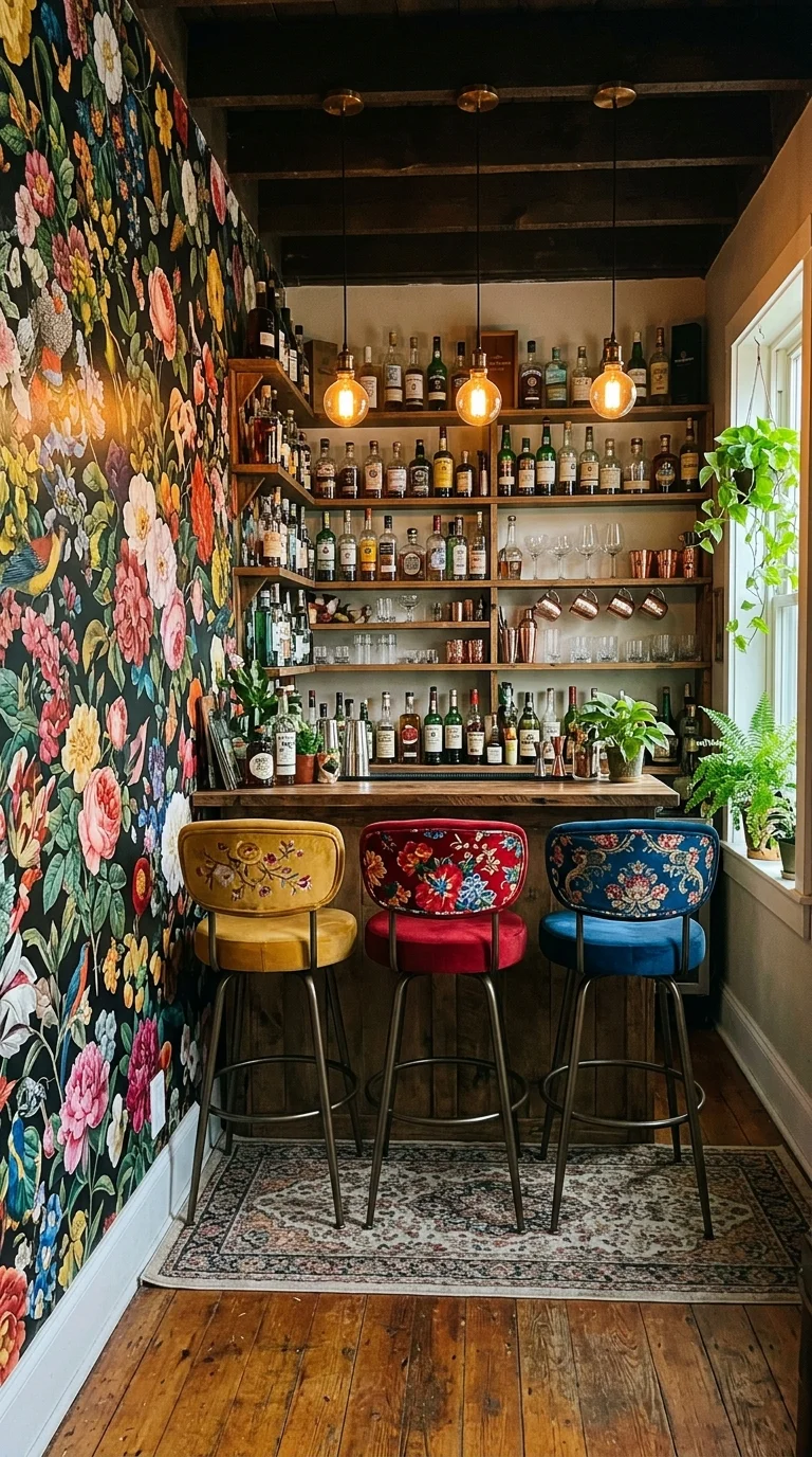
Oversized botanical wallpaper — roses, peonies, songbirds — covers one wall floor to ceiling in this small nook, while a compact wood shelving unit under warm hanging bulbs keeps everything else plain. Three swivel stools in mustard, red, and blue floral velvet pull their colors straight from the wallpaper, tying the corner together without adding a second pattern.
This is the smallest footprint in the whole lineup, and it works because of what it leaves out. The wood shelving, floor, and ceiling beams stay warm-toned and unpainted, giving the eye somewhere calm to land between glances at the pattern. Busier shelving in the same nook would likely feel cramped rather than cozy — a bold wallpaper choice needs restraint everywhere else to succeed in a tight space. It’s the same instinct behind floral-printed furniture that reads as sophisticated instead of fussy, scaled down to nook size.
Maintenance Guide: Choose a wipeable, vinyl-coated wallpaper rather than raw paper this close to a bar, since spills are far more likely than in a hallway.
How This Floral Look Backfires
- A delicate, non-wipeable wallpaper where spills are inevitable
- Upholstery colors that don’t actually appear in the wallpaper
- Overfilled shelving that loses its clean lines against the busy wall
- Cool-white lighting, which drains warmth from florals and wood alike
A Ceiling That Asks to Be Noticed Before Anything Else
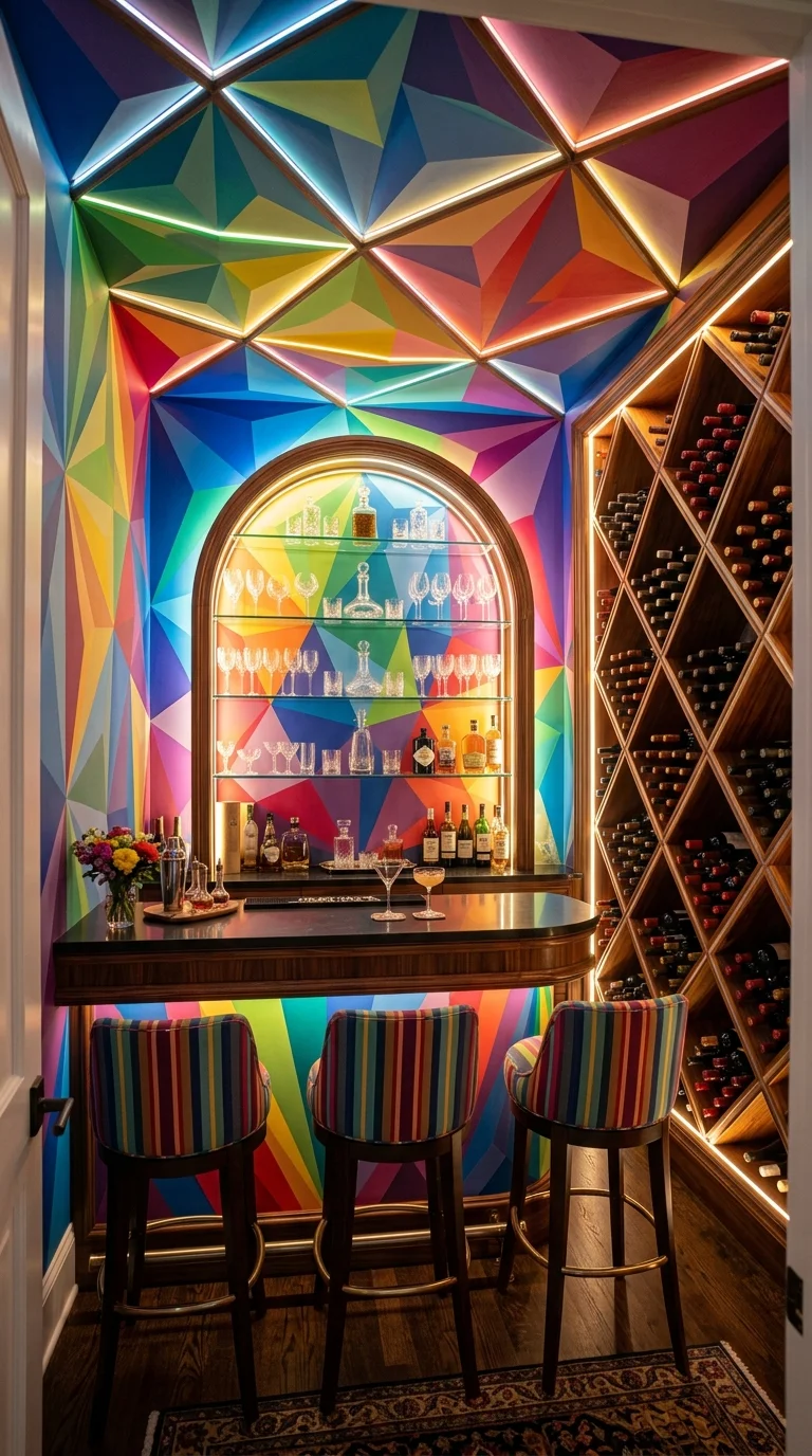
A faceted, stained-glass-style ceiling running through every color of the spectrum turns this small wine nook into the most dramatic space in the group, lit from within by hidden LED strips along each triangular seam. Below it, the bar stays deliberately quiet — dark wood counter, arched glass shelving, striped multicolor stools that echo the ceiling without trying to outdo it.
Main Colors: Rainbow Spectrum · Espresso Wood · Warm Gold · Deep Burgundy
Most rooms put their boldest color choice at eye level. This one sends it overhead instead, changing the entire experience of walking in — a guest looks up before looking at the bottles or the counter. That sequencing only works because everything below stays intentionally restrained, leaving the geometric panels nowhere to compete for attention.
The Fastest Way to Flatten This Ceiling
- More bold color elsewhere in the room, competing for attention
- Flat, even lighting instead of edge-lit LED strips, which makes the panels glow
- A busy patterned rug below, doubling the visual noise
- Skipping the arched shelving, which softens an otherwise geometric room
Keeping a Home Bar Ready for Actual Guests
- Position the bar so the room’s main walking path doesn’t cut behind a seated guest’s stool
- Keep glassware, mixers, and garnishes within one step of the pour zone
- Add a small undercounter fridge or ice bin if the bar sits more than a few steps from the kitchen
- Leave at least 24 inches behind each stool so guests can stand without bumping the counter
Who Should Choose This Style?
- Best for people who host often and want a space that clearly signals where the party happens
- Best for small apartments or leftover corners that need one confident focal point rather than scattered decor
- Best for renters who want boldness through paint, lighting, and textiles rather than permanent changes
- Not ideal for households who want a calm, neutral backdrop for daily life, since these palettes are built to be noticed
Budget Summary
| Budget | Expectation |
|---|---|
| Low | Paint, peel-and-stick wallpaper, a secondhand bar cart, string or paper lanterns |
| Medium | Laminate or tile counter, velvet-upholstered stools, pendant lighting, framed art prints |
| Premium | Marble or quartz counter, lacquered cabinetry, brass hardware, commissioned art or mural wallpaper |
Frequently Asked Questions
What’s the easiest way to add color to a small home bar without renovating? Paint, lighting, and textiles carry most of the visual weight in nearly every example above. A bold accent wall, colorful stool cushions, and warm pendant bulbs can transform a plain cart or shelf setup without touching a fixed surface.
Does a bold color palette make a home bar feel smaller? Not necessarily. The floral nook and the rainbow-ceiling bar both use saturated color to make a tight footprint feel intentional rather than cramped, largely because the rest of each room stays quiet.
What lighting works best for a colorful home bar? Warm amber bulbs generally flatter wood tones and saturated paint better than cool-white light. Layering two or three sources — ambient, a pendant, and a low accent strip — reads as more considered than one overhead fixture.
Should a home bar’s colors match the rest of the house? Not necessarily. Most of the boldest examples above treat the bar as its own contained moment, often with a doorway or a flooring change marking where one palette ends and the other begins.
How much does a colorful home bar actually cost to build? It depends heavily on finish level. A paint-and-lighting refresh can run a few hundred dollars, while a full build-out with real marble and custom cabinetry can run into the tens of thousands. See the Budget Summary above for what to expect at each tier.
About the Author
Aesthetic Life Team covers livable interior design across every room of the house, with a focus on color, layout, and the small decisions that separate a styled room from a lived-in one.
Conclusion
None of these ten bars are competing for the same reader. One works because of what’s on the walls, another because of what’s plugged into the ceiling, another because of what was left out entirely. That’s really the takeaway: a colorful home bar doesn’t need every trick at once — it needs one clear idea, carried through consistently, with everything else in the room built to support it rather than compete with it.
Explore More
You may also enjoy:

