
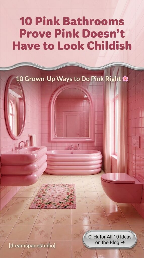
Pink bathrooms have a reputation problem. Say the phrase, and most people picture a dated 1950s tile job their grandmother never updated—not something you’d actually choose in 2026. But pink as a bathroom color spans an enormous range, from barely-there blush to neon fuchsia to deep raspberry, and each version sends a completely different message about the room.
This guide breaks down ten distinct pink bathroom directions, not as eye candy to scroll past, but as a decision tool. Some of these are quiet and spa-like, some are maximalist and loud, and one leans so hard into nightclub energy it barely reads as a bathroom at all. By the end, you’ll know which pink actually belongs in your home—and which one to avoid.
Quick Overview
| Style | Pink & Color-Forward Bathrooms |
|---|---|
| Best For | Statement powder rooms, primary bathrooms, renters wanting a bold accent |
| Budget | Low–High (paint vs. full tile/fixture commitment) |
| Difficulty | Easy (paint) to Advanced (custom tile, lacquered panels) |
| Maintenance Level | Low–Medium |
1. A Glossy Blush Shower Suite Lit by a Skylight
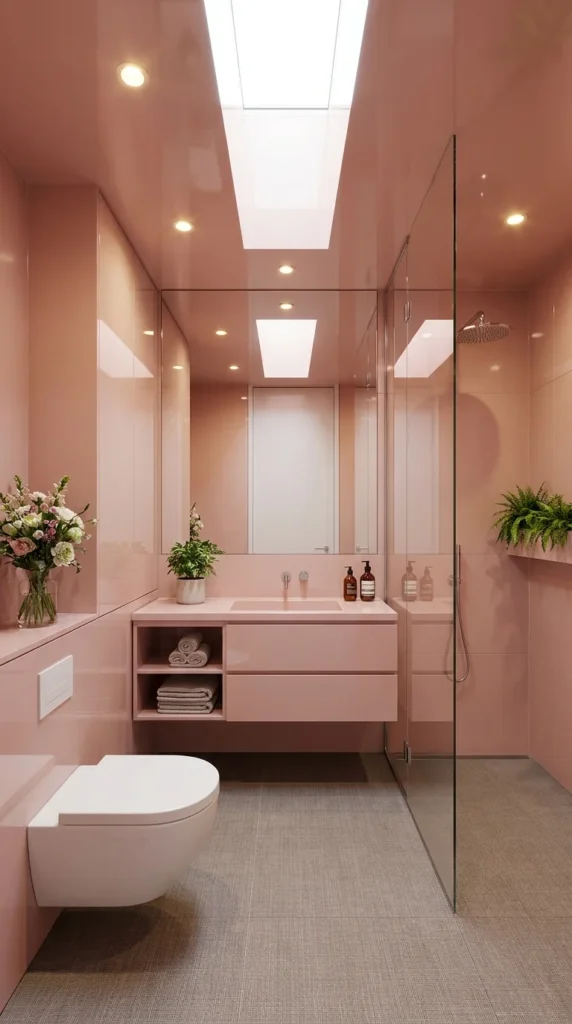
This narrow bathroom wraps every surface—walls, ceiling, even the shower enclosure frame—in the same glossy blush lacquer, then lets a full skylight flood the room with daylight. It’s a useful starting point because it shows pink at its most restrained: one tone, high-gloss finish, and almost no competing color.
Should you commit to a monochrome glossy finish or break it up with a different material? Choose full monochrome gloss if your bathroom genuinely lacks natural light, because the glossy surface bounces available daylight (or a skylight, as seen here) around the room instead of absorbing it the way matte tile would. Skip it in a windowless bathroom, since gloss without a real light source can start to feel like standing inside a closed box.
This direction suits homeowners who want their bathroom to feel more like a private spa suite than a purely functional room, and it works particularly well in narrow layouts where a single continuous color helps the space feel less cramped than a room broken up into multiple materials. It’s not for anyone chasing a “textured” or layered look.
The advantage is visual continuity—with one glossy tone everywhere, there’s very little else to plan or coordinate. The compromise is that high-gloss lacquer shows water spots and fingerprints far more readily than matte tile, so it needs more frequent wiping to stay looking sharp. To recreate this on a budget, paint just the walls in a high-gloss enamel and keep the ceiling a simple matte white—the skylight will still do most of the visual work.
Where the Skylight Actually Sets the Scale A vertical skylight strip like this one is proportioned to run almost the full length of the shower and vanity zone, not just sit centered over one fixture—that continuous run is part of why the glossy pink reads as bright and spa-like rather than closed-in, even without any windows in the walls.
Recommended Materials: High-gloss lacquered panels, tempered glass shower screen, woven floor tile, ceramic wall-mount fixtures
Main Colors: Glossy Blush Pink, Warm White, Natural Fern Green
Best Lighting: Let the full-length skylight carry daytime light; add small recessed spots along the ceiling edge for evening use rather than one central fixture, which would create harsh reflections on the gloss.
Cleaning & Moisture Tips
- Wipe down glossy panels with a microfiber cloth after each shower to prevent water-spot buildup
- Keep the glass shower screen squeegeed dry to avoid mineral streaking against the pink backdrop
- Use a bathroom-safe mold inhibitor spray in the shower niche where the ferns sit, since greenery adds ambient humidity
- Avoid abrasive cleaners on lacquered panels, which can dull the glossy finish over time
Where This Look Falls Apart
- Mixing in a second bold accent color, which breaks the monochrome effect the whole room depends on
- Choosing a matte ceiling paint that doesn’t reflect the skylight’s daylight the way gloss does
- Overfilling open shelving with too many products, cluttering an otherwise clean sightline
- Skipping a squeegee routine, letting water spots accumulate visibly on the glossy walls
2. A Rose and Mint Color-Block Bathtub Room
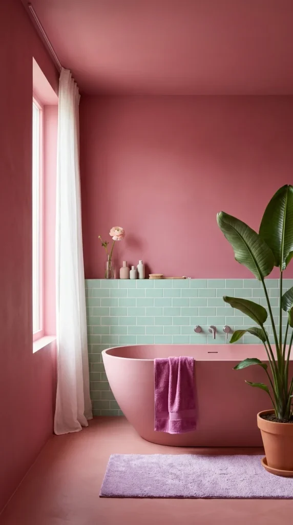
This bathroom pairs a deep rose wall-to-floor palette with a half-height mint green subway tile behind a matching pink freestanding tub—a genuine color-block decision rather than a single-tone room. It’s a useful contrast to the first entry because it shows pink working as one half of a duo, not the whole story.
Should you pair pink with a second bold color, or keep it solo? Pair it if you want the room to feel like a deliberate style statement rather than “a pink bathroom”—the mint tile here is doing real work, breaking up what would otherwise be an overwhelming amount of rose. Keep it solo if you’re nervous about color commitment; two saturated colors together is a bigger visual risk than one.
This style suits homeowners drawn to a retro-modern aesthetic — think 1970s Palm Springs rather than Victorian pink — and it’s best in a bathroom that gets natural light, since the window here is what keeps the rose walls from reading as heavy or cave-like. It’s less suited to anyone who wants resale-neutral finishes, since two-tone color blocking is more polarizing than a single soft shade.
The advantage is that the mint tile line gives the room a built-in visual break, so the eye has somewhere to rest rather than facing wall-to-wall saturated color. The compromise is that both colors need to be right—get the undertones slightly wrong (too cool a mint against too warm a rose), and the pairing can clash rather than complement. If you’re weighing other bold color pairings for a bathroom, 10 bathroom colors that turn a plain room into a statement space covers several more combinations worth comparing before committing.
A palette repeated at three different weights: rose shows up as wall, ceiling, and floor color, then again in the tub itself, then a third time in a deeper magenta hand towel—the same hue at three different intensities is what keeps the room feeling coordinated instead of like three separate color decisions stacked together.
Recommended Materials: Mint subway tile, matte pink solid-surface tub, linen curtain, terracotta planter, cotton bath mat
Main Colors: Deep Rose, Sage Mint, Terracotta, Soft Lavender
Best Lighting: Rely on the tall window for daytime light—sheer white curtains diffuse it evenly across both the rose and mint surfaces without washing either color out.
Easy Ways to Get This Wrong
- Choosing a mint tone that’s too cool or too saturated, which fights the warm rose instead of balancing it
- Skipping the tile break entirely, leaving one overwhelming wall of solid rose from floor to ceiling
- Using a cool-white towel that clashes with the room’s warm undertone
- Placing the tub against the plain rose wall instead of the mint tile, which loses the intended focal contrast
3. A Dusty Rose Powder Room With a Trio of Backlit Mirrors
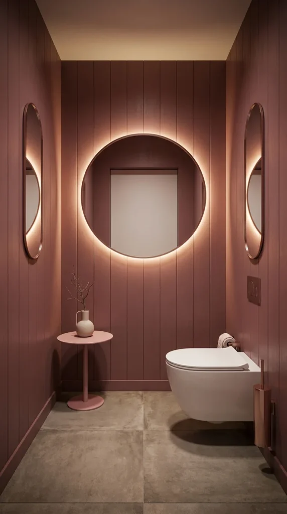
This powder room uses vertical wood-look paneling in a muted dusty rose, then centers the whole composition on a large circular backlit mirror flanked symmetrically by two smaller oval mirrors. Unlike the brighter, glossier entries on this list, this one leans moody and intimate—proof that pink can read sophisticated rather than sweet.
Should a small powder room go moody instead of bright? Yes, if the room has no natural window—a windowless powder room like this one benefits from warm backlighting doing the work daylight can’t, rather than fighting for brightness it will never fully achieve. If your powder room does have a window, a brighter pink will likely serve the space better than this deep, warm-lit tone.
It suits homeowners who want their guest bathroom to feel like a considered design moment rather than an afterthought, and it’s especially effective in older or more traditional homes where the vertical paneling reads as classic rather than trendy. It’s a poor fit for a small room used daily by the whole household, since this look depends on low, dramatic lighting that’s less practical for everyday grooming tasks.
The advantage is atmosphere—backlit mirrors and warm paneling make even a tiny room feel intentional and finished. The compromise is that a powder room this dim isn’t ideal for tasks needing accurate lighting, like applying makeup. If you’re planning a similarly compact space, small powder rooms doing more with less space have more layout-specific ideas for making a tight footprint work harder.
Three Circles Pulling the Eye to the Center The large round mirror and its two smaller oval companions form a deliberate triangular symmetry on the wall—your eye naturally settles on the biggest, most brightly backlit circle first, which is exactly the focal point the room is built around, rather than the toilet or sink below it.
Recommended Materials: Vertical wood-look paneling, backlit mirror glass, copper/rose gold fixtures, polished concrete flooring
Main Colors: Dusty Rose, Warm Copper, Soft Amber Light, Concrete Grey
Best Lighting: The backlit mirror ring is the primary light source here—pair it with one small warm accent light rather than a bright overhead fixture, which would flatten the intentional moodiness
A Small-Scale Risk That Pays Off Here
- Choosing mirrors too small for the wall, which loses the intended trio-symmetry effect
- Mixing cool-toned chrome fixtures with the room’s warm copper accents
- Skipping the backlighting and relying on a single overhead bulb, which loses the atmosphere entirely
- Overcrowding the small side table with decor that competes with the mirror wall’s simplicity
4. A Glossy Pink Spa Suite With Fern-Filled Shower Niches
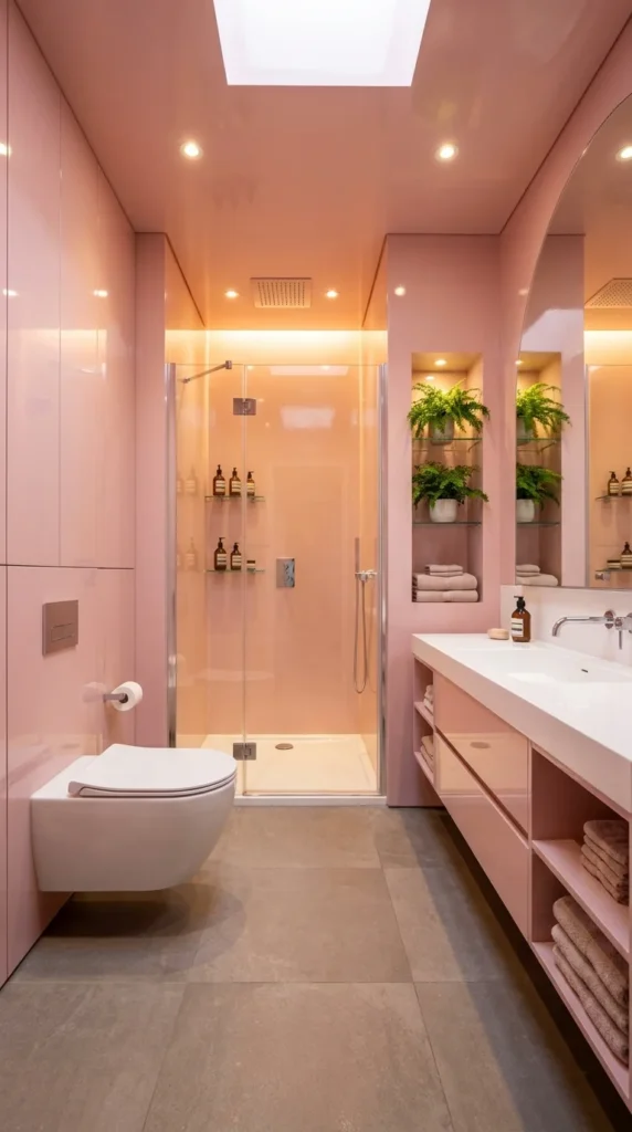
This bathroom takes the same glossy lacquered approach as the first entry but scales it up into a full spa-style suite—a separate glass shower, a long double vanity, and two lit shelf niches holding live ferns. Where Image 1 keeps things narrow and minimal, this room shows what the glossy pink treatment looks like with real square footage and storage to work with.
Should you add live plants to a glossy, high-humidity bathroom? Yes, if you choose humidity-loving varieties like ferns, which are shown here thriving in a shower-adjacent niche—the steam actually benefits them rather than working against them. Avoid this with plants that prefer drier conditions, which will struggle in a steam-heavy shower zone regardless of how good the lighting looks.
This style suits larger primary bathrooms where a double vanity is already a given, and it’s a strong fit for households who want their bathroom to feel like a genuine retreat rather than a purely practical space. It’s overkill for a small guest bathroom, where this much surface area and lit shelving aren’t achievable or necessary.
The advantage is that the lit fern niches double as both storage and living decor, doing two jobs in the same square footage. The compromise is real upkeep—live plants in a shower zone need regular care, and the glossy panels throughout this much larger room take considerably longer to wipe down than a smaller version would. To simplify this on a budget, skip the built-in lit niches and use a simple freestanding shelf with one low-maintenance plant instead.
How Gloss Behaves Differently at This Scale Across a room this large, glossy lacquer starts reflecting light between opposite walls rather than just bouncing it off one surface—which is part of why this room reads as bright even with the shower enclosure blocking part of the skylight’s direct path. That reflective bounce is a real advantage in bigger glossy rooms that a small one-wall application won’t replicate.
Recommended Materials: High-gloss lacquered panels, tempered glass shower door, quartz vanity counter, live fern plantings, woven bath towels
Main Colors: Glossy Blush Pink, Warm White, Fern Green
Best Lighting: Recessed ceiling spots plus dedicated shelf lighting in the fern niches—layering these two sources is what keeps a room this size from feeling flat under one overhead fixture.
Maintenance Guide Live ferns in a shower niche need indirect light, regular misting between showers if the steam alone isn’t enough, and monthly trimming of any yellowing fronds. Choose a variety genuinely suited to high humidity (Boston fern, bird’s nest fern) rather than a plant that merely tolerates it.
What Trips People Up Recreating This
- Choosing plants that need dry conditions for a genuinely humid shower niche
- Skipping the double vanity in favor of a single sink, which undersells the “suite” scale this look depends on
- Under-lighting the shelf niches, leaving the ferns and towels in shadow
- Letting soap and shampoo bottles Clutter the open niches instead of keeping them edited
5. A Blush Soaking Tub Set Beneath a Cherry Blossom Mural
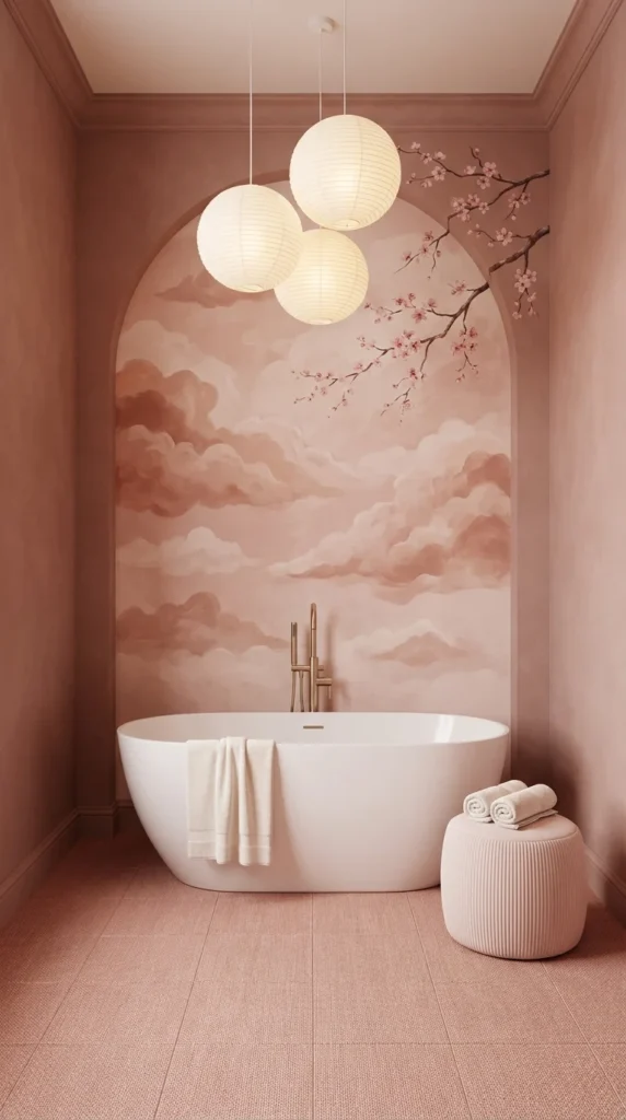
This bathroom centers an oval soaking tub inside an arched niche painted with a soft cloud-and-cherry-blossom mural, lit by a cluster of three paper lantern pendants. It’s the most artful, least tile-dependent entry on this list—the “pink” here comes almost entirely from paint and lighting rather than any hard material.
Should you paint a mural or keep the walls plain and let fixtures carry the color? Paint the mural if the bathroom has one clear focal wall, like the arched niche here—a mural needs a defined boundary (an arch, a recessed panel) to look intentional rather than like an unfinished accent wall. Skip it if your bathroom is boxy with no architectural framing, since a mural without a natural edge tends to look like it’s spilling randomly across the room.
This direction suits homeowners drawn to a Japandi or soft zen aesthetic who still want a distinctly pink room, and it works especially well as a primary bathroom retreat where a long soak is part of the daily routine. It’s a poor fit for a busy family bathroom, since a hand-painted or high-quality mural is a genuine investment that a young family’s daily bathroom traffic will wear down faster than it deserves.
The advantage is that a mural this soft gives the room genuine artistic character without needing a single piece of framed art anywhere else. The compromise is cost and permanence—a well-executed mural is pricier than paint or tile and much harder to update if your taste changes in a few years. To simplify this on a budget, use a large framed cloud-and-blossom print instead of a hand-painted mural, and keep the arched niche a simple plain blush.
Three Lanterns Doing What One Statement Fixture Couldn’t The cluster of three paper lantern pendants, hung at slightly different heights, mimics the soft rounded cloud shapes painted just behind them—that repetition of round, diffused forms between the lighting and the mural is what makes the ceiling and wall feel like one composed scene rather than two separate design decisions.
Recommended Materials: Painted plaster mural, solid-surface soaking tub, paper lantern pendants, ribbed concrete floor tile, cotton pouf ottoman
Main Colors: Soft Blush, Warm Cream, Muted Rose Cloud Tones
Best Lighting: The three paper lanterns are the intended light source—keep them on a warm dimmer rather than adding a bright overhead fixture, which would flatten the mural’s soft cloud gradients.
Where This Look Falls Apart
- Choosing a mural without a defined architectural frame, which can look unfinished rather than intentional
- Hanging all three lanterns at the same height, losing the organic, cloud-like arrangement
- Skipping a warm dimmer, leaving the mural under harsh, flat light
- Adding busy patterned towels or bath mats that compete with the mural’s soft palette
6. A Neon-Lit Wet Room That Reads More Nightclub Than Bathroom
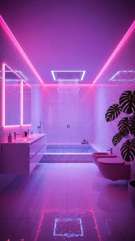
This is the most extreme entry on the entire list—a sunken wet-room tub, a rain shower, and white subway tile all bathed in magenta and violet neon strip lighting, with a wet reflective floor doubling every color. It’s less a “pink bathroom” in the traditional sense and more a demonstration of how far artificial lighting alone can transform a neutral tiled room.
Should your bathroom’s color come from tile or from light? Choose light if you want maximum flexibility—the white subway tile underneath this neon scheme is completely neutral, meaning the color can be dimmed, changed, or turned off entirely with a switch, unlike a permanent pink tile commitment. Choose tile instead if you want the pink to be a fixed, unchanging feature of the room rather than a mood you can dial up or down.
This style suits a very specific homeowner: someone who wants their bathroom to double as an experience space, not just a functional room—a converted loft, a design-forward rental, or anyone genuinely drawn to a maximalist, nightlife-inspired aesthetic. It’s a poor fit for almost everyone else; this look prioritizes drama over the calm, restful quality most people actually want from a bathroom.
The advantage is total reversibility—swap the LED strip’s color setting, and the entire room’s personality changes instantly; no renovation required. The compromise is that this is genuinely a niche, high-commitment aesthetic that will alienate most future buyers and doesn’t photograph the same in daylight as it does at night. It also needs real electrical planning—waterproof-rated LED strips near a wet room aren’t a casual DIY add-on.
Who Should Skip This Style? Honestly, most homeowners should skip this one—and it’s fine to say plainly. This look works brilliantly as a design statement or a rental amenity meant to photograph well, but it asks a lot of anyone living with it daily: no natural light softness, no neutral “off” mode without additional fixtures, and resale value that depends entirely on finding a buyer who wants exactly this. If you’re drawn to the idea but not the commitment, a single pink LED accent strip in an otherwise neutral bathroom gets you a taste of the effect without betting the whole room on it.
Recommended Materials: White subway tile, waterproof-rated LED strip lighting, sunken tile tub, polished porcelain flooring
Main Colors: Magenta Neon, Violet Neon, Neutral White Tile
Best Lighting: This entire room’s identity is the lighting—use waterproof, dimmable RGB LED strips along the ceiling perimeter, since standard indoor LED strips aren’t rated for a wet room’s humidity.
Where This Look Falls Apart
- Installing non-waterproof-rated LED strips in a high-moisture wet room, a genuine safety issue
- Relying on neon lighting alone with no backup neutral-white lighting option for everyday tasks
- Choosing colored grout or tile underneath, which locks the “neutral canvas” advantage away
- Underestimating how different this room looks in daylight versus at night before committing
7. A Fuchsia Bathroom Anchored by Striped Roman Shades
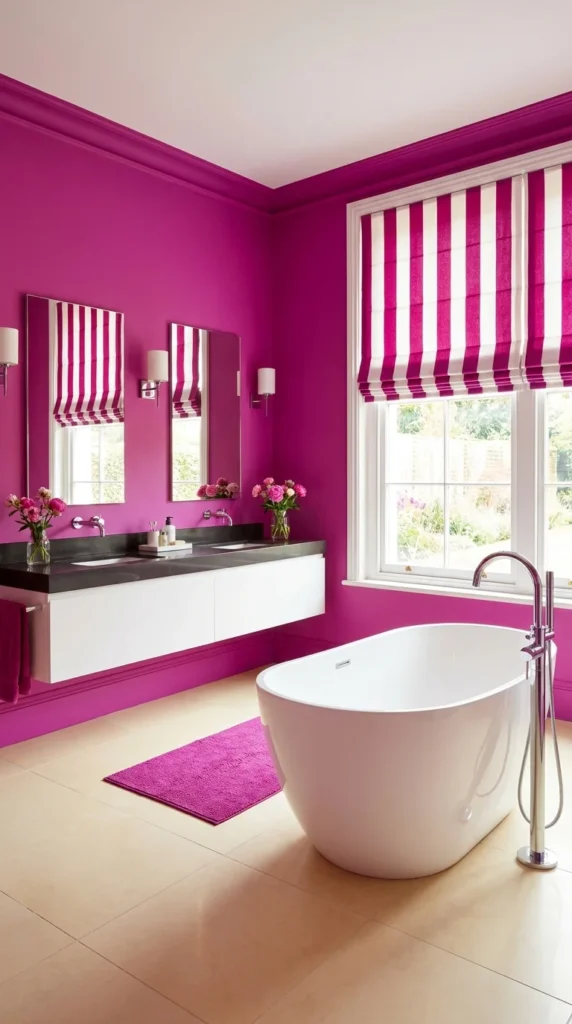
This bathroom commits to a saturated fuchsia on every wall, then ties the whole look together with matching pink-and-white striped Roman shades on the window and mirrored on the mirror trim above the double vanity. It’s the boldest, most maximalist “wall color” entry here—proof that a single saturated pink can carry an entire room when paired with a confident pattern.
Should your window treatment match your mirror trim, or stay neutral? Match them if you want the room to feel fully designed, like a boutique hotel bathroom—the repeated stripe here on both the shade and the mirror surrounds is what elevates this from “a pink room” to “a coordinated scheme.” Keep window treatments neutral instead if you’re not ready to commit to a secondary pattern alongside a saturated wall color; two bold decisions together raise the stakes if either one is wrong.
This direction suits homeowners who genuinely love maximalist, English-country-meets-modern styling and have a primary or guest bathroom with good natural light to support it—the window here does real work softening the fuchsia’s intensity. It’s a poor fit for anyone nervous about resale value, since a wall color this saturated is one of the first things a future buyer would repaint.
The advantage is unmistakable personality—a room like this needs almost no additional decor to feel finished, since the color and stripe pattern are doing all the work. The compromise is longevity: fuchsia this saturated is a bigger commitment than a softer blush, and repainting it down the line is a bigger job than most neutral colors. To simplify this on a budget, paint just one wall fuchsia instead of all four, and use the striped shades as the sole pattern element.
Where the Eye Lands First in This Room The window wall, with its striped shade and the two mirrors repeating that same stripe, is deliberately the brightest and most pattern-dense part of the room—everything else (the black countertop, the plain floor) stays quiet specifically so your eye goes straight to that coordinated corner first.
Recommended Materials: Painted plaster walls, black quartz countertop, cotton-linen striped Roman shades, chrome floor-mount tub filler
Main Colors: Saturated Fuchsia, Crisp White, Matte Black
Best Lighting: The garden-facing window is essential here—sheer or light-filtering shades (not blackout) keep enough daylight moving through the fuchsia to stop it from feeling heavy.
Common Mistakes Recreating This Room
- Choosing a duller or muddier pink than true fuchsia, which loses the room’s confident, saturated effect
- Skipping the matching mirror trim, leaving the striped shade as an isolated pattern rather than a coordinated scheme
- Using warm brass fixtures against this particular cool-leaning fuchsia, which can clash rather than complement
- Adding more than one additional pattern (patterned rug, patterned towels), which overwhelms the striped focal point
8. A Retro All-Pink Tile Bathroom With Ribbed Fixtures
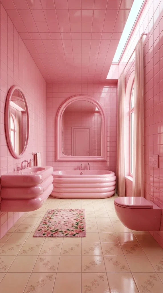
This bathroom goes fully retro—pink ceramic tile from floor to ceiling, a ribbed channel-front tub and matching ribbed sink, arched and oval mirrors, and a floral pink rug underfoot. It’s the most deliberately nostalgic entry on this list, referencing the mid-century pink bathrooms this whole color got its dated reputation from—but done with clean, considered detailing instead of a genuinely worn original.
Should you go fully monochrome pink tile, or use pink as an accent within a neutral room? Go fully monochrome if you want an authentic retro statement—this room only works because the tile commitment is total, not partial; a room that’s half-pink-tile and half-neutral would read as unfinished rather than intentional. Use pink as an accent instead if you’re not ready for a whole-room tile commitment, which is a genuinely bigger investment and a much harder undo than paint.
This style suits homeowners specifically chasing a mid-century or vintage-revival aesthetic, and it’s a natural fit for older homes where a fully modern bathroom would feel out of place architecturally. It’s a poor fit for anyone planning to sell within a few years, since full pink tile is the single hardest finish on this entire list to neutralize for resale.
The advantage is authenticity—nothing else on this list reads as genuinely retro the way full-ribbed ceramic tile and channel-front fixtures do. The compromise is cost and permanence: retiling an entire bathroom in a specific ribbed ceramic is a significant renovation, not a weekend project, and it commits the room fully to one era’s aesthetic. To simplify this on a budget, source a vintage or vintage-style pink pedestal sink alone and pair it with simpler modern white subway tile instead of a full retro tile package.
Is a Full Retro Tile Commitment Worth It? This is worth thinking through carefully before committing. Full ceramic tile in a specific ribbed, retro profile is genuinely expensive and genuinely permanent—closer to a kitchen renovation in cost and disruption than a simple paint refresh. But if you’re in a period-appropriate home and you’re chasing an authentic look rather than a trend, it’s also one of the only ways to actually get it; faux finishes and paint can’t fully replicate the dimensional, glossy ribbed ceramic shown here.
How Ceramic Tile Like This Actually Ages Glossy ribbed ceramic fixtures from this era were built to be genuinely durable—the finish resists staining and yellowing far better than many modern acrylic alternatives, which is part of why original mid-century pink bathrooms often survive in good condition decades later. A well-made reproduction in the same material should age similarly well.
Recommended Materials: Glossy ribbed ceramic tile and fixtures, floral wool-blend rug, oval and arched framed mirrors
Main Colors: Bubblegum Pink, Soft Cream, Muted Floral Accents
Best Lighting: The narrow skylight strip works alongside the room’s existing recessed lighting—retro tile like this reflects light well, so avoid over-lighting, which can make the glossy surfaces feel clinical rather than warm.
Easy Ways to Get This Wrong
- Mixing in modern matte-black fixtures, which clash with the room’s genuinely vintage material language
- Choosing a tile finish that’s matte rather than glossy, losing the period-accurate reflective quality
- Skipping a floral or patterned rug, leaving the floor feeling understyled against so much pattern-free wall tile
- Underestimating the cost and disruption of a full-room retile before starting
9. A Coral Accent Wall in an Otherwise White Bathroom
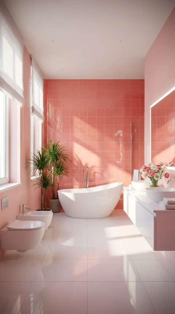
This bathroom keeps most surfaces crisp white—floor, vanity, sinks—and lets a single coral-pink tiled wall carry all the color, brightened by two tall sheer-curtained windows. It’s the most restrained, resale-friendly approach on this list, showing how far one accent wall of pink tile can go without committing the whole room.
Should pink be a whole-room commitment or a single accent wall? Choose the accent-wall approach if you want the flexibility this list’s other extremes don’t offer—everything here besides the tiled wall is genuinely neutral, meaning the room reads as a modern white bathroom with one bold decision rather than a themed pink space. Go bolder and more saturated (like the fuchsia or retro entries) if a single wall feels too safe for what you’re picturing.
This style suits homeowners who want a bright, resale-conscious bathroom with just enough personality to feel considered, and it’s especially strong in a bathroom with genuine natural light, since the coral here needs daylight to read as warm and citrusy rather than dusty. It’s a fine fit for almost any household—this is the safest, most broadly appealing option in the entire lineup.
The advantage is flexibility with almost no commitment risk found elsewhere on this list—one wall of tile is a far smaller renovation than a full retile, and the surrounding white keeps the room feeling current. The compromise is that a single accent wall, by design, has less visual drama than a fully committed pink room; if you want the color to dominate the space, this restrained approach won’t deliver that.
Two Rounded Forms Echoing Each Other The oval freestanding tub and the round vessel sinks on the vanity share the same soft, curved silhouette, which is a quiet repetition that ties the white fixtures together visually even though they sit on opposite sides of the room from each other.
Recommended Materials: Coral ceramic tile, solid-surface white tub, round vessel sinks, sheer linen curtains, potted dracaena plants
Main Colors: Warm Coral, Crisp White, Soft Pink Undertone
Best Lighting: Two tall windows do the real work—sheer Roman shades diffuse strong daylight evenly across the coral wall without letting direct sun fade the tile’s saturation over time.
What Trips People Up Recreating This
- Choosing a coral tile with too much orange, which can clash with the room’s cooler white fixtures
- Adding a second accent color, which dilutes the intended single-wall focal effect
- Skipping sheer curtains in favor of heavy drapes, cutting off the daylight the coral tile depends on
- Using warm-white fixtures against a cool-leaning coral tone without checking they actually complement each other in person
10. A Raspberry Powder Room With Brass Jewel-Tone Accents
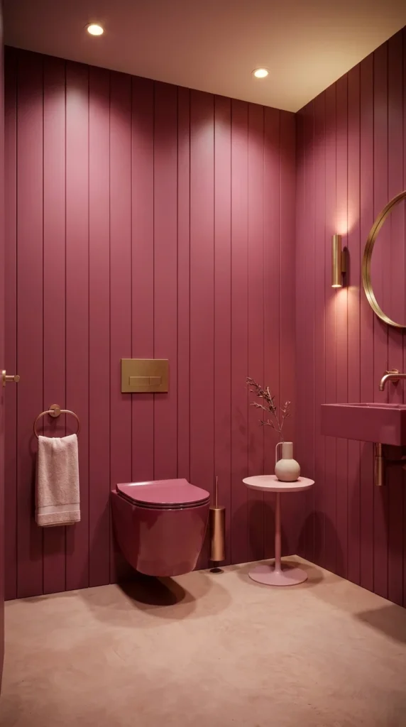
This small powder room goes deep and moody with a raspberry-wine vertical paneled wall, then pairs it with warm brass fixtures—a round mirror, a wall sconce, and a toilet-roll holder—for a genuinely jewel-toned, glamorous finish. It’s the darkest, most saturated pink on this entire list, and it closes out the guide by showing pink at its most dramatic and grown-up.
Should a tiny powder room go this dark or stay light to feel bigger? Go dark and saturated if the room is genuinely small and used briefly, like a true powder room—a space this size doesn’t need to visually expand the way a daily-use bathroom does, so committing to a deep, dramatic color here has almost none of the downside it would in a primary bathroom. Stay lighter if the room doubles as a full bathroom used for actual grooming tasks, where a color this dark can make daily tasks harder without strong supplemental lighting.
This direction suits homeowners who want their guest powder room to feel like a genuine styling flex—something a visitor remembers—and it pairs naturally with warm brass hardware throughout the rest of the home for a cohesive material story. It’s a poor fit for anyone who wants every room in the house to feel light and airy without exception.
The advantage is that a color this rich needs almost no additional styling to feel finished—one small round table and a single stem in a vase, as shown here, is genuinely enough. The compromise is that raspberry this deep absorbs light rather than reflecting it, so the room depends entirely on well-placed brass sconces and recessed lighting to avoid feeling like a dim, closed-in box.
Where a Round Mirror Pulls the Room Together The round brass-framed mirror and the round side table use the same soft circular shape against all those straight vertical panel lines, which is a deliberate contrast—the repetition of that one round form is what keeps the paneled walls from feeling rigid or overly linear.
Recommended Materials: Vertical wood paneling, brass fixtures and mirror frame, ceramic pink wall-mount toilet, concrete flooring
Main Colors: Raspberry Wine, Warm Brass, Soft Blush Ceramic
Best Lighting: A single brass wall sconce plus overhead recessed lighting is essential in a room this dark-toned—skip a central pendant alone, which won’t provide enough even light for a windowless powder room.
Where This Look Falls Apart
- Under-lighting the room, since raspberry-toned walls absorb far more light than pale pink ones
- Mixing in cool chrome fixtures instead of committing fully to warm brass throughout
- Choosing a mirror too small for the wall, losing the intended focal balance against the paneling
- Skipping the small side table, which is what keeps the room from feeling purely utilitarian
More Bathroom Directions Worth Comparing
Pink pairs naturally with a few other bathroom styling choices covered elsewhere on the site:
Related Guides
- 10 Bathroom Colors That Turn a Plain Room Into a Statement Space—more bold color pairings if fuchsia or coral caught your eye
- 10 Pink Kitchen Ideas That Feel Bold, Not Overdone—see how the same color family plays out in a very different room
- 10 Moody Bathroom Ideas That Feel Luxurious, Not Dark—helpful if the raspberry or dusty rose powder rooms appealed to you
- Small Powder Rooms: Doing More With Less Space—layout-specific advice for a compact pink powder room
- 9 Sconce Placements That Change How a Bathroom Feels useful if you’re planning the brass or backlit lighting shown in several rooms here
Cleaning & Moisture Tips
- Squeegee glass shower screens and glossy tile after every use to stop water spots and mineral streaking before they set in
- Choose a bathroom-safe mold inhibitor for any live plants or fern niches, since added humidity needs active moisture management
- On saturated or dark-toned walls (fuchsia, raspberry), check grout lines regularly—discoloration shows up faster against bold color than it does on neutral tile
- Reseal natural or concrete flooring annually in high-moisture rooms to keep water from soaking into the surface over time
Budget Summary
| Budget | Expectation |
|---|---|
| Low | Blush or fuchsia paint on existing tile, budget bath mat, simple white fixtures |
| Medium | Coral or mint accent tile wall, brass or copper hardware upgrade, statement mirror |
| Premium | Full retro ceramic tile package, custom mural, high-gloss lacquered panel walls, waterproof LED lighting system |
Who Should Choose This Style?
- Best for homeowners who want a bathroom with real personality, not a purely neutral resale-safe space
- Best for guest powder rooms and primary bathrooms alike, since pink scales range from bold to barely there
- Best for anyone who already loves warm metals (brass, copper, rose gold), which pair naturally with pink
- Not ideal for anyone planning to sell within a year or two and wanting maximum neutral appeal
- Not ideal for a windowless daily-use bathroom paired with very dark, saturated pink tones without strong supplemental lighting
FAQ
Does a pink bathroom make a room feel smaller? Not necessarily—lighter blush and coral tones can feel just as open as neutral white, especially with good natural light or a skylight. Deep, saturated pinks like raspberry or fuchsia do read cozier and more enclosed, which works well in a small powder room but is worth considering carefully in a larger daily-use bathroom.
What fixture finish pairs best with pink? Warm metals—brass, copper, and rose gold—generally complement pink’s warm undertones better than chrome or matte black, which can read cooler and starker against the color. That said, black hardware can work well with cooler, more saturated pinks like fuchsia.
Is pink tile a bad idea for resale value? A single pink accent wall or a soft blush paint color is easy for future buyers to repaint or tile over. A full-room pink tile commitment, like the retro ceramic look, is a bigger renovation to reverse and is worth weighing carefully if you plan to sell within a few years.
How do I keep a glossy pink bathroom from showing every water spot? Squeegee glass and glossy tile surfaces after each shower, and keep a microfiber cloth nearby for a quick daily wipe-down. Gloss finishes show moisture more readily than matte ones, so this small habit makes a real difference in how the room looks day to day.
Author Box
Written by the Aesthetic Lifes Editorial Team—home decor writers and stylists covering real, buildable bathroom and living space ideas, from budget-friendly paint swaps to full renovation-level design overhauls.
Conclusion
From a single glossy blush wall to a full raspberry-and-brass powder room, these ten bathrooms prove pink was never really one color decision—it’s ten different ones, each with its own mood, upkeep, and ideal home. Some of these you could recreate this weekend with a can of paint; others are genuine renovations worth planning carefully. Either way, the right pink bathroom isn’t the boldest one on this list—it’s the one that matches how you actually want to feel stepping into the room each morning.
Explore More
You may also enjoy:

