
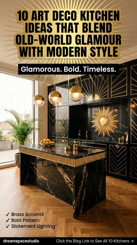
Art Deco doesn’t whisper. It’s brass catching the light, black lacquer polished to a mirror finish, a sunburst motif repeated until it becomes architecture. Ten kitchens later, one thing is clear: this isn’t a style you accessorize your way into—it’s built from geometry, metal, and a handful of confident materials working in concert. Here’s what makes each of these ten rooms genuinely Deco and how to bring the parts that fit your own kitchen home.
Quick Overview
| Style | Art Deco |
|---|---|
| Best For | Kitchens, dining-adjacent islands, statement cooking spaces |
| Budget | Medium–High (brass and stone are the two big line items) |
| Difficulty | Medium often needs a contractor for cabinetry and tile. |
| Maintenance Level | Medium (lacquer, brass, and natural stone all need upkeep) |
When Black Lacquer Meets Gold Geometry
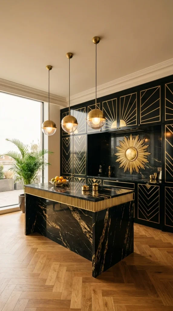
Chevron and sunburst patterns traced in gold metal inlay across black lacquered cabinetry turn ordinary cabinet doors into the room’s real artwork—and a matching gold sunburst medallion on the back wall repeats that same motif at architectural scale.
This is Art Deco in its most literal, textbook form: repeating geometric linework in a metallic accent against a dark, glossy base. Chevron patterns on the upper cabinets, a radiating sunburst on the lower ones, and the medallion above the range all draw from the same visual vocabulary, which is what keeps a room this bold from feeling like three separate design decisions.
It suits readers who want an unmistakably Deco kitchen and aren’t afraid of a dark, dramatic base color. It’s a strong choice for an open-plan kitchen with good natural light, since black cabinetry this saturated needs daylight to keep the room from feeling heavy rather than glamorous.
The lifestyle fit is someone who entertains and wants a kitchen that photographs and performs as a statement space, not just a workspace. Its strongest advantage is that the geometric inlay pattern reads as custom and high-end while actually being achievable with routed cabinet fronts or applied metal trim—it doesn’t require full custom millwork to get right.
The compromise is that black lacquer shows fingerprints, water spots, and dust more visibly than a matte or lighter finish, so this look asks for more frequent wiping down than most kitchen finishes. To simplify for a smaller budget, apply the chevron gold-line detailing to just the island rather than the full run of cabinetry, keeping perimeter cabinets a simpler solid black or dark wood.
The most common mistake is pairing this much black lacquer with cool-white lighting, which flattens the gold inlay’s warmth and makes the whole room feel colder than intended—warm-toned bulbs are essential here, not optional.
One practical recommendation: if considering the full sunburst medallion as a backsplash feature, have it fabricated as one panel rather than assembled from smaller tiles—it keeps the radiating lines perfectly aligned, which is where a tiled version most often falls short.
Why the Pattern Reads as Intentional, Not Busy
The chevron cabinetry uses a consistent line weight and spacing throughout, which is what separates a genuinely Deco geometric pattern from something that just looks “patterned.” Three brass globe pendants at staggered heights echo the room’s circular sunburst motif from above, tying the lighting choice back to the same geometric language as the cabinetry and backsplash.
💡 Small Space Tip: If a full wall of chevron cabinetry feels like too much, apply the gold linework to just the island—it delivers the same Deco signature in a fraction of the surface area.
Recommended Materials: Black lacquer (cabinetry) · Brass inlay and hardware · Black-and-gold marble (island) · Brass globe pendants · Herringbone wood flooring
Main Colors: Black · Antique Gold · Warm Brass
Best Lighting: Warm-white bulbs (2700K) are essential to keep the gold inlay glowing rather than looking cool and flat—natural daylight from a nearby window helps balance the room’s dark palette during the day.
Maintenance Note: High-gloss black lacquer shows water spots and fingerprints readily—a microfiber cloth and a quick daily wipe-down keep the finish looking intentional rather than neglected.
This bold, pattern-forward direction pairs well with our roundup of maximalist funky kitchens, which covers several other kitchens built around confident, repeating patterns.
Where This Look Falls Apart
- Lighting the room with cool-white bulbs, which kills the gold inlay’s warmth
- Skipping a strong exhaust and cleaning routine, letting black lacquer show grease buildup
- Mixing in a second unrelated metal finish instead of keeping brass consistent throughout
- Choosing tile for the sunburst medallion without carefully planning the radiating grout lines
Emerald Lacquer Against Bold Chevron Tile
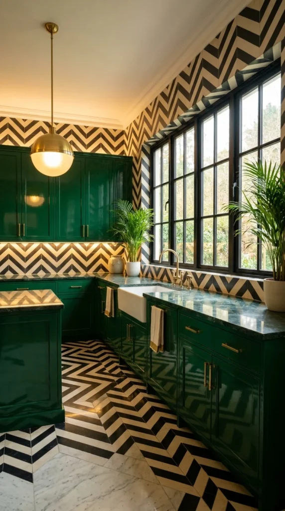
Glossy emerald green cabinetry is dramatic enough on its own, but it’s the black-and-cream chevron tile—climbing the walls and continuing straight onto the floor—that makes this kitchen unmistakably Deco.
The defining move here is letting one bold graphic pattern run continuously across two different surfaces. Most kitchens treat wall tile and floor tile as separate design decisions; this one uses the same chevron motif for both, which visually stitches the whole room together into a single, confident statement.
It suits kitchens with good structural bones for a genuine floor-to-ceiling tile investment, since a continuous pattern like this only reads well when it’s installed with real precision. It’s a strong choice for readers who want maximum drama from a relatively contained material palette—really just two colors of tile and one cabinet color doing all the work.
The lifestyle fit is someone drawn to jewel-toned, high-gloss interiors who wants their kitchen to feel more like a 1930s supper club than a farmhouse. Its strongest advantage is that the emerald-and-black-and-cream palette stays sophisticated even at this level of pattern intensity—it’s bold without tipping into busy.
The compromise is cost and complexity: continuous chevron tile across walls and floor is a significant tile and labor investment, and any misalignment where the two planes meet will be immediately visible. To simplify for a smaller budget, apply the chevron tile to just the backsplash wall and choose a simpler floor, like a plain marble or wood, to anchor the room without doubling the tile budget.
The most common mistake is choosing a grout color that’s too stark against the tile, which emphasizes every grout line instead of letting the chevron pattern read as one continuous sweep.
One practical recommendation: work with a tile installer experienced in pattern-matching across a wall-to-floor transition specifically—this is a detail that separates a professional-looking result from an obviously seamed one.
The Color Strategy That Makes This Work
High-gloss emerald cabinetry and a strictly black-and-cream tile palette is a genuinely disciplined color choice — three tones total, doing everything. That restraint is exactly what lets the chevron pattern carry the room without competing against a fourth or fifth color fighting for attention. Brass hardware and a single brass pendant provide the room’s only metal accent, which keeps the material palette from getting any busier than the pattern already is.
Recommended Materials: High-gloss lacquer (cabinetry) · Black-and-cream chevron tile (walls and floor) · Brass (pendant, hardware, faucet) · Marble (countertops)
Main Colors: Emerald Green · Black · Cream · Brass
Best Lighting: A single warm brass globe pendant is enough ambient light here, since the tile pattern itself does most of the visual work—avoid additional fixtures that would compete with it.
Maintenance Note: High-gloss lacquered cabinetry in a working kitchen benefits from a dedicated cabinet-safe cleaner rather than an all-purpose spray, which can dull the sheen over repeated use.
Readers drawn to a bold green kitchen palette may also enjoy our guide to shades of green for a dining room, which explores several adjacent green tones in a related space.
Common Mistakes With Continuous Tile Like This
- Choosing a grout color too stark against the tile, emphasizing every seam
- Attempting a wall-to-floor pattern match without an experienced tile installer
- Adding a second bold pattern elsewhere in the room, competing with the chevron tile
- Introducing a second metal finish instead of keeping brass consistent throughout
A Velvet Canopy Turns the Kitchen Into a Stage
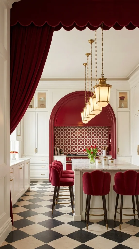
A scalloped burgundy velvet canopy drapes across the ceiling like theater curtains, framing an arched, richly patterned niche below it—nothing else in this list treats a kitchen with quite this much theatrical flourish.
This is Art Deco pulled toward its most glamorous, supper-club roots—the era’s love of velvet, drapery, and dramatic lighting fixtures, applied to a space that’s usually treated as purely functional. The scalloped canopy is doing work that a normal kitchen valance never would: turning a cooking alcove into a genuine focal point worth walking toward.
It suits larger kitchens with an architectural niche or alcove already built in or a renovation budget that includes adding one. It’s a strong fit for a formal, entertaining-forward home where the kitchen is expected to make an impression rather than stay purely utilitarian.
The lifestyle fit is someone who hosts seated dinners or cocktail gatherings and wants the kitchen itself to feel like part of the event, not a backstage prep area. Its strongest advantage is unmatched drama for a relatively contained footprint—the canopy and archway do most of the visual work, leaving the rest of the cabinetry simple and classic white.
The compromise is practicality: velvet drapery near an active cooking area needs real thought around grease and heat exposure, and a canopy this elaborate is a genuine upholstery investment, not a simple curtain swap. To simplify for a smaller budget, skip the full ceiling canopy and use a single scalloped valance across just the archway opening—it borrows the theatrical framing without the full drapery commitment.
The most common mistake is positioning heavy drapery too close to an active cooktop, creating both a grease-staining problem and a genuine fire-safety consideration.
One practical recommendation: if drapery is going anywhere near cooking heat, choose a flame-retardant-treated velvet specifically rated for proximity to heat sources, and keep at least a few feet of clearance from any open flame.
An Archway That Frames a Second Room-Within-a-Room
The burgundy arch, patterned tile backsplash, and velvet canopy together create a distinct “room within the room” effect—a cooking alcove that feels separated from the white cabinetry surrounding it, almost like a jewel box set into a plainer frame. The tiered brass-and-glass lantern chandelier hanging over the island echoes the same warm brass tone used throughout the archway, so the two focal points—the archway and the lighting—feel connected rather than competing.
⚠️ Watch For: Keep any fabric canopy or drapery a safe distance from an active cooktop, and choose flame-retardant-treated fabric specifically rated for kitchen proximity—this is not a spot to use standard home decor velvet.
Recommended Materials: Velvet (canopy drapery, barstool upholstery) · White painted cabinetry · Patterned ceramic tile (backsplash) · Brass-and-glass lantern chandelier · Black-and-cream checkerboard marble flooring
Main Colors: Burgundy · Cream · White · Brass
Best Lighting: The tiered brass lantern chandelier provides warm, layered light at multiple heights—a good match for the room’s theatrical, dinner-party mood.
For readers drawn to this checkerboard-floor, old-world glamour direction, our roundup of vintage 1950s kitchen ideas explores a closely related black-and-white flooring approach.
Where People Get This Wrong
- Positioning velvet drapery too close to an active cooktop’s heat and grease
- Choosing a non-flame-retardant fabric for anything near a kitchen’s cooking zone
- Skipping the archway’s structural framing, so a flat canopy loses its theatrical effect
- Overcrowding the alcove with too many additional decorative elements
Curves, Brass Banding, and a Machine Age Silhouette
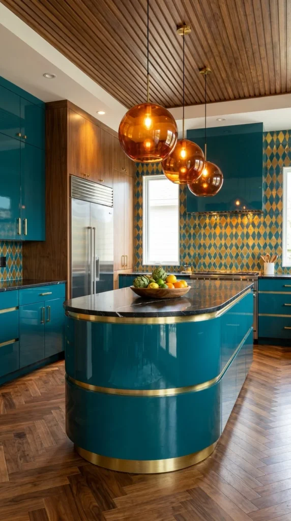
A glossy teal island with a fully curved end and horizontal brass banding looks less like standard cabinetry and more like a piece of streamlined 1930s machinery—which is exactly the design lineage Art Deco pulled its silhouettes from.
The defining idea is the curved, banded silhouette itself. Where most kitchen islands are simple rectangles, this one has a rounded end wrapped in a brass band, echoing the streamlined “Machine Age” aesthetic that ran alongside classic Deco geometry—think ocean liners and early industrial design as much as sunburst motifs.
It suits kitchens with enough floor space for an island large enough to justify a curved silhouette, since the shape only reads clearly at a certain scale. It’s a strong direction for readers drawn to Deco’s more sculptural, less strictly geometric side.
The lifestyle fit is someone who wants their kitchen’s furniture-grade pieces — specifically the island — to feel like statement objects rather than built-in cabinetry. Its strongest advantage is that a curved, banded island reads as custom and high-end even in a kitchen that otherwise keeps things fairly simple, like the wood-paneled walls and ceiling here.
The compromise is cost: a curved cabinet carcass with applied metal banding is a more complex (and expensive) build than a standard rectangular island, and it’s not a modification most stock cabinetry lines offer. To simplify for a smaller budget, keep the island rectangular but add a straight brass band around its base—it borrows the metal-banding detail without the added cost of a curved carcass.
The most common mistake is pairing a curved, glossy island like this with matte, rustic countertops—the contrast in finish sheen fights the island’s sleek, polished identity rather than complementing it.
One practical recommendation: if the budget only allows one splurge, put it into the brass banding rather than the curve itself—even a straight island with a well-executed brass band captures much of this look’s Machine Age character.
A Diamond Pattern That Matches the Room’s Energy
The teal-and-gold diamond harlequin tile behind the range picks up both colors already established by the island and the amber pendant glass, which is what keeps this room’s several bold elements reading as one coordinated palette rather than three separate choices competing for attention. Warm wood paneling on the walls and ceiling grounds the glossy, metallic elements in something more textural and organic.
Recommended Materials: High-gloss lacquer (curved island) · Brass banding and hardware · Walnut paneling (walls, ceiling) · Diamond harlequin tile (backsplash) · Amber glass pendants
Main Colors: Teal · Warm Amber · Brass · Walnut Brown
Best Lighting: Amber glass globe pendants cast a warm, honeyed light that flatters both the teal lacquer and the wood paneling—a good template for balancing a cool cabinet color with warm architectural materials.
Maintenance Note: Brass banding on furniture-grade pieces like this island will patina naturally over time unless lacquer-sealed—decide upfront whether you want that aged look or a consistently bright polish, since the maintenance routine differs for each.
Easy Ways to Get This Wrong
- Pairing a glossy curved island with matte, rustic countertop materials
- Choosing a diamond tile pattern in colors unrelated to the island and lighting
- Skipping a lacquer seal on brass banding, then being surprised by natural patina
- Underestimating the cost premium of a curved cabinet carcass versus a standard rectangular build
A Backsplash Built Like a Sunburst Mural
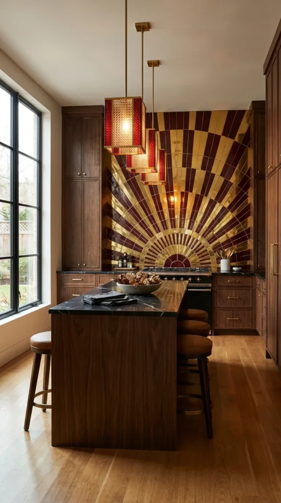
Gold and burgundy tile fans out from a central point behind the range in a full architectural sunburst, turning what’s usually the most overlooked wall in the kitchen into the room’s single boldest gesture.
This is the most graphic, mural-scale tile statement in this entire guide. Rather than a repeating pattern or a small accent detail, the sunburst here is treated as one continuous composition, radiating outward across dozens of individually placed tiles to form a single cohesive image.
It suits readers who want one unmistakable focal point and are willing to keep everything else in the room quiet to support it. It’s a strong fit for a kitchen with a naturally central range wall, since the whole design depends on having one clear surface large enough to host a mural at this scale.
The lifestyle fit is someone who thinks of their range wall as prime real estate for a genuine art statement, not just a practical backsplash. Its strongest advantage is sheer visual impact—few single design moves make as strong a first impression as a full sunburst mural exactly where the eye naturally lands while cooking.
The compromise is that this is a real fabrication and installation project, not an off-the-shelf tile purchase—the radiating pattern needs to be planned and cut specifically for the wall’s dimensions, and any misalignment is highly visible given how symmetrical the design is meant to be. To simplify for a smaller budget, scale the sunburst down to a smaller focal area—just behind the range hood rather than the full wall—while keeping the rest of the backsplash a simple, complementary tile.
The most common mistake is choosing a tile installer without mural or radial-pattern experience, which risks visible misalignment at the sunburst’s center point—exactly where the eye is drawn first.
One practical recommendation: request a full-scale paper template or digital mockup of the sunburst before tile installation begins—this is the kind of design where seeing the exact proportions in place first prevents costly rework.
Why Everything Else Stays So Quiet
Walnut cabinetry, a black marble countertop, and simple wood flooring surround the sunburst without competing with it—every other material choice here is deliberately restrained so the mural gets the room’s full attention. The red glass lantern pendant cluster above the island is the only other bold color in the room, and its red tone directly echoes the burgundy tiles in the sunburst, tying the lighting back to the wall it illuminates.
Recommended Materials: Custom-cut ceramic tile (sunburst mural) · Walnut cabinetry · Black marble (countertops) · Brass (pendant hardware) · Red glass (lantern shades)
Main Colors: Gold · Burgundy · Walnut Brown · Black
Best Lighting: Warm red glass lantern pendants at staggered heights add color that echoes the mural directly below them—a good example of choosing lighting that reinforces, rather than competes with, a room’s main focal point.
What People Get Wrong Recreating This
- Hiring a tile installer without experience in radial or mural-scale pattern work
- Skipping a full-scale mockup before installation, risking a misaligned center point
- Adding a second bold pattern elsewhere in the room, diluting the mural’s impact
- Choosing a range hood that obscures too much of the sunburst’s lower half
A Brass Range Hood Sculpted Like Deco Architecture
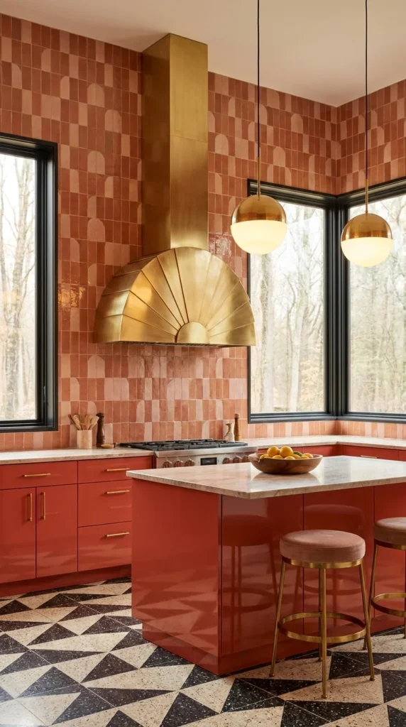
A fan-shaped brass range hood, its surface pleated like a sunburst, is sculpted rather than simply mounted—it reads as a piece of Art Deco architecture in its own right, not just a functional exhaust cover.
The defining feature is treating the range hood itself as the room’s sculptural centerpiece. Most kitchens minimize their hood or hide it inside cabinetry; this one does the opposite, using pleated brass panels fanning outward to make the hood the single most eye-catching object in the room.
It suits kitchens where the range wall is the natural visual anchor and where the budget allows for a genuinely custom metal fabrication rather than an off-the-shelf hood cover. It’s a strong choice for readers who want maximum Deco impact from one dramatic object rather than a pattern spread across multiple surfaces.
The lifestyle fit is someone who wants a kitchen with one unmistakable “wow” piece—a hood this sculptural does a lot of the room’s visual heavy lifting on its own. Its strongest advantage is that it delivers real architectural drama without needing to commit to bold cabinetry color or wall-to-wall tile pattern elsewhere in the room.
The compromise is cost and lead time—a custom pleated brass hood like this is a genuinely bespoke metalwork commission, generally more expensive and slower to source than a standard range hood insert. To simplify for a smaller budget, look for a manufactured fan-shaped hood cover in a brass or brass-look finish rather than a fully custom pleated design—several kitchen hardware brands now offer Deco-inspired hood shapes as a standard product line.
The most common mistake is pairing a dramatic sculptural hood like this with a busy, competing backsplash pattern—the arched terracotta tile here stays in a tight, tonal color family specifically so it doesn’t fight the hood for attention.
One practical recommendation: confirm ventilation performance specs before falling in love with a decorative hood shape—a beautiful sculptural hood still needs to move air effectively, so check CFM ratings against your range’s actual output.
A Warm, Tonal Palette Doing Quiet Work
The terracotta cabinetry and the arched terracotta tile behind it stay within one warm tonal family, which is exactly what lets the brass hood stand out as the room’s one true focal point rather than getting lost in competing color. The geometric terrazzo-style floor introduces the room’s only other pattern, and it stays low-contrast enough not to distract from the hood above.
Recommended Materials: Brass (sculpted range hood) · High-gloss lacquer (cabinetry) · Arched ceramic tile (backsplash) · Terrazzo-style tile (flooring) · Marble (island countertop)
Main Colors: Terracotta · Brass · Cream · Warm Pink (barstool upholstery)
Best Lighting: Two brass globe pendants echo the hood’s material without competing with its sculptural shape—keep additional fixtures simple when a room’s focal point is this dramatic.
Maintenance Note: A polished brass hood positioned directly above a working range will need more frequent polishing than decorative brass elsewhere in the kitchen, since it sits closest to cooking grease and heat.
Common Ways This Gets Misread
- Pairing a sculptural hood with an equally busy, competing backsplash pattern
- Choosing a decorative hood without confirming its actual ventilation performance
- Underestimating the lead time for a custom metal fabrication piece like this
- Skipping regular polishing, letting grease dull the hood’s reflective brass finish
Hammered Copper as the Room’s Defining Material
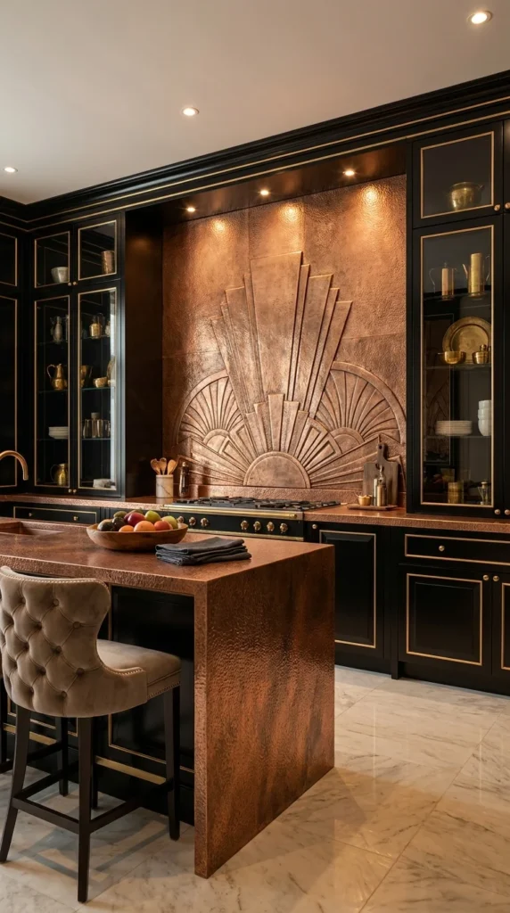
A relief-carved copper panel, its surface hammered into a stepped Deco sunburst, anchors the range wall—and a matching copper waterfall island repeats the same warm metallic material at floor level.
This is the room in the set most committed to treating one non-traditional material as the entire design’s backbone. Where other kitchens on this list lean on brass trim or tile patterns, this one uses hammered copper as both sculptural wall art and functional island surface—a much bigger material commitment than a simple accent.
It suits readers genuinely drawn to metalwork as a primary kitchen material, not just a lighting or hardware accent. It’s a strong fit for a formal, moody kitchen already built around black cabinetry, since the warm copper tone provides essential contrast against that dark backdrop.
The lifestyle fit is someone who wants a kitchen that feels closer to a private members’ club than a typical home cooking space—glass-front cabinets displaying brassware reinforce that same collected, curated feeling. Its strongest advantage is a genuinely unique material identity; hammered copper at this scale is uncommon enough that it makes the whole kitchen instantly memorable.
The compromise is real cost and maintenance: hand-hammered copper at this scale is a serious artisan commission, and copper as a working countertop surface needs specific care to prevent excessive tarnishing or scratching from daily use. To simplify for a smaller budget, apply the hammered copper treatment to just the range wall panel and keep the island in a more standard stone or wood, capturing the sculptural focal point without the added cost of a full copper island.
The most common mistake is choosing unsealed copper for an island surface without understanding the maintenance commitment—copper left unsealed will develop a natural patina relatively quickly under daily food prep use, which some readers love and others find frustrating if they expected it to stay bright and polished.
One practical recommendation: decide upfront whether you want copper’s natural aging patina as a design feature or prefer to maintain a consistently polished look—the sealing and care routine are completely different depending on which you choose, so it’s worth settling before installation, not after.
Where This Splurge Actually Pays Off
Here’s an honest take: a full hammered-copper wall panel and matching island is one of the more expensive material choices in this entire guide, and it’s not necessary to achieve a convincing Art Deco kitchen. But in a room built around black-and-gold cabinetry, this dramatic copper does something brass alone can’t— it adds genuine warmth and material depth without competing with the room’s existing metal tones. If the cost gives you pause, a single hammered copper panel behind the range, without the matching island, still delivers most of this room’s sculptural impact at a meaningfully lower investment.
Recommended Materials: Hand-hammered copper (wall panel, island) · Black lacquer with gold trim (cabinetry) · Glass-front display cabinetry · Marble flooring · Tufted velvet upholstery (barstool)
Main Colors: Copper · Black · Gold · Warm Grey Marble
Best Lighting: Recessed warm-white downlights aimed directly at the copper relief panel bring out its hammered texture and shadow detail—angled lighting matters more here than in a flat-finish room.
For readers drawn to this dramatic black-and-metallic pairing, our black bedroom inspiration guide explores a closely related dark-and-metallic material balance in a different room.
Where People Trip Up With Copper Like This
- Choosing unsealed copper for a work surface without understanding the patina commitment
- Underestimating the cost and lead time of hand-hammered artisan metalwork
- Skipping angled lighting, which flattens the copper relief’s sculptural texture
- Pairing copper with a second warm metal in a clashing tone rather than a complementary one
Gold Leaf Botanicals on a Navy Canvas
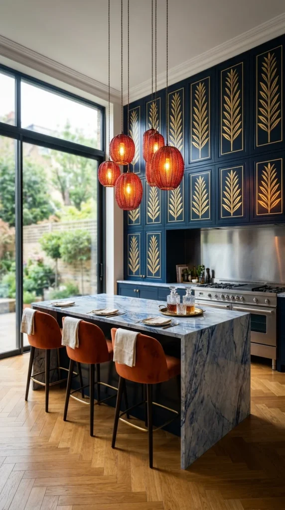
Gold leaf fern and palm motifs, hand-detailed onto navy cabinet panels, bring a botanical softness into a style that’s usually defined by hard geometry—a genuinely different Deco reference point than the sunburst and chevron patterns seen elsewhere in this guide.
The defining idea is decorative painted or inlaid botanical patterns as the cabinetry’s main feature, rather than the more common geometric fan or chevron. Art Deco did draw on stylized nature motifs alongside its geometric ones, and this kitchen leans specifically into that softer, more organic side of the movement.
It suits readers who want Deco glamour without quite as much hard-edged geometry—the fern motif reads as elegant and detailed rather than sharply angular. It’s a strong fit for a kitchen that’s otherwise fairly simple in shape, letting the cabinetry’s painted detail carry all the visual interest.
The lifestyle fit is someone drawn to a slightly more romantic, botanical take on old-world glamour. Its strongest advantage is that the navy-and-gold palette reads as sophisticated and timeless without leaning as hard into “loud” as some of the more maximalist kitchens in this guide.
The compromise is that hand-detailed or gold-leafed cabinet panels are a genuine specialty finish, generally requiring a decorative painter rather than a standard cabinet shop, which adds both cost and lead time. To simplify for a smaller budget, apply the botanical gold-leaf detailing to just a few feature panels—around a range or display area—rather than the full run of cabinetry.
The most common mistake is choosing a busy, high-contrast lighting pendant that competes with the fern motif’s intricate detail instead of letting the cabinetry itself stay the star.
One practical recommendation: if a decorative painter isn’t in budget, a high-quality botanical wallpaper in a similar navy-and-gold palette applied to just the upper cabinet panels can approximate the look at a fraction of the cost.
A Cluster of Red Lanterns Doing Unexpected Work
Woven red glass lantern pendants, clustered in an irregular grouping rather than a straight line, add a warm, slightly unexpected color note against the cool navy cabinetry—red and navy aren’t an obvious Deco pairing, but the gold threading through both the cabinet motif and the lantern frames ties them together convincingly. The blue-grey waterfall marble island introduces a third, more neutral material, giving the eye a resting point between the detailed cabinetry and the bold pendant cluster.
Recommended Materials: Navy lacquer with gold leaf detailing (cabinetry) · Blue-grey waterfall marble (island) · Woven glass (lantern pendants) · Stainless steel (range) · Herringbone wood flooring
Main Colors: Navy · Gold · Burnt Red · Blue-Grey Marble
Best Lighting: The clustered red lantern pendants provide warm, layered ambient light—their irregular grouping (rather than a straight line) is part of what keeps the lighting from feeling too formal against the cabinetry’s detailed pattern.
Easy Ways to Get This Wrong
- Choosing a lighting fixture busy enough to compete with the fern motif’s fine detail
- Skipping a decorative painter’s expertise and attempting hand gold-leaf detailing without experience
- Pairing navy-and-gold botanical cabinetry with a cool, clinical stone rather than a warmer marble
- Lining up pendant lights in a rigid row instead of a more organic cluster
When a Kitchen Is Paneled Like a Grand Salon
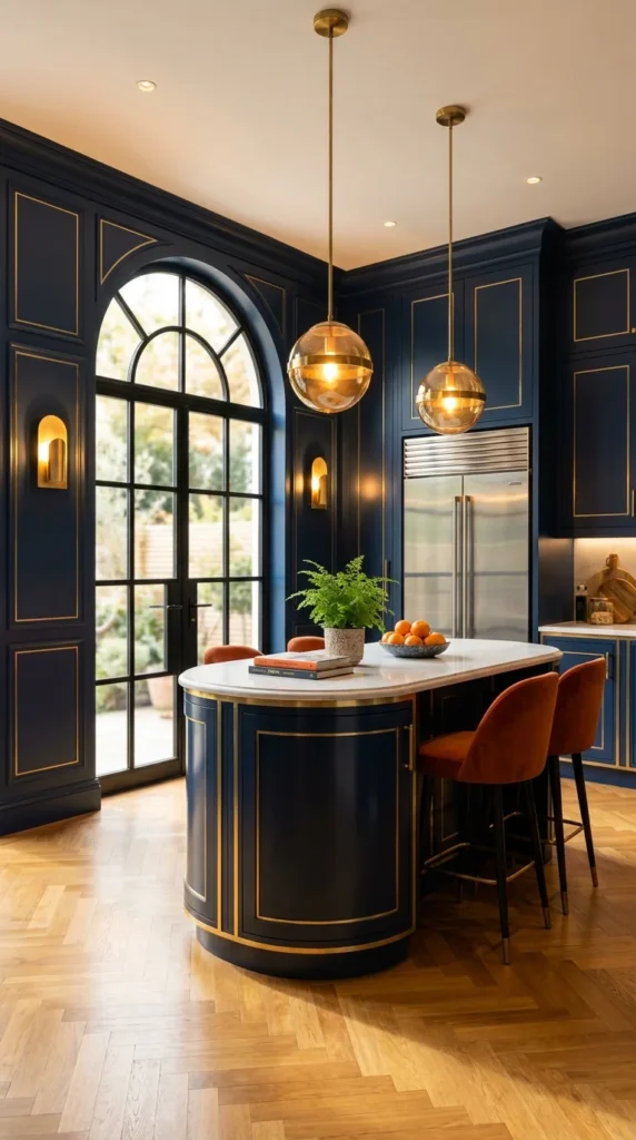
Navy boiserie-style paneling, trimmed edge to edge in gold lines, wraps this entire kitchen the way it would a formal drawing room—right down to the arched glass door and matching brass wall sconces flanking it.
The defining move is treating the kitchen exactly like a formal reception room, architecturally speaking. Full-height paneled millwork with gold trim lines is a treatment usually reserved for dining rooms or libraries; applying it to a kitchen elevates the whole space into something closer to a grand salon that happens to have a refrigerator in it.
It suits larger kitchens with real ceiling height and a budget for genuine millwork, since the paneling effect depends on continuous, well-executed trim running the full height of the walls. It’s the most architecturally ambitious idea in this entire guide, more a full-room renovation than a decorating update.
The lifestyle fit is someone who wants their kitchen to feel indistinguishable from the rest of a formal, well-appointed home, rather than reading as a separate, more casual zone. Its strongest advantage is total cohesion—every wall, not just the cabinetry, participates in the room’s identity, which very few kitchens achieve.
The compromise is significant cost and complexity: continuous gold-trimmed paneling across an entire kitchen is custom millwork at a scale most kitchen renovations never attempt, and it needs to be planned around appliances, windows, and doors from the very start of a renovation. To simplify for a smaller budget, apply the paneled, gold-trimmed treatment to just one wall — ideally the one most visible from the main living space — rather than wrapping the entire room.
The most common mistake is adding this level of architectural paneling without first confirming the room’s proportions can support it—a lower-ceilinged kitchen can feel overwhelmed rather than elevated by full-height gold-trimmed millwork.
One practical recommendation: work with a millwork specialist from the earliest planning stages of a kitchen renovation if this is the direction you want — retrofitting this level of paneling after cabinetry and appliances are already installed is far more difficult and expensive than planning it in from the start.
The Curved Island That Softens All This Architecture
Against so much straight-lined paneling, the curved, gold-banded island is what keeps the room from feeling rigid—its rounded profile echoes the arched door across the room, giving the whole space one consistent curved counterpoint to all the straight millwork lines. Burnt orange velvet barstools add the room’s only warm, saturated color against an otherwise navy-and-gold palette, a deliberate contrast that keeps the space from reading as too monochromatic.
Recommended Materials: Navy lacquer paneling with gold trim (walls) · Brass (sconces, pendants, hardware) · Marble (island top) · Velvet (barstool upholstery) · Herringbone wood flooring
Main Colors: Navy · Gold · Burnt Orange · Cream
Best Lighting: Brass wall sconces flanking the arched door add symmetry and warmth at eye level, supplementing the two pendant lights over the island—layering light at multiple heights matters more in a room this architecturally formal.
Readers planning a similarly ambitious full-room transformation may find our maximalist living room ideas guide useful for extending this same confident, saturated approach into an adjoining space.
Where This Level of Ambition Goes Wrong
- Attempting full-height paneling in a room with insufficient ceiling height to support it
- Planning millwork after cabinetry and appliances are already installed, rather than from the start
- Skipping a curved or softening element, leaving the whole room feeling rigidly geometric
- Underestimating the total project cost of custom, continuous gold-trimmed millwork
A Gold Archway as the Room’s Grand Entrance
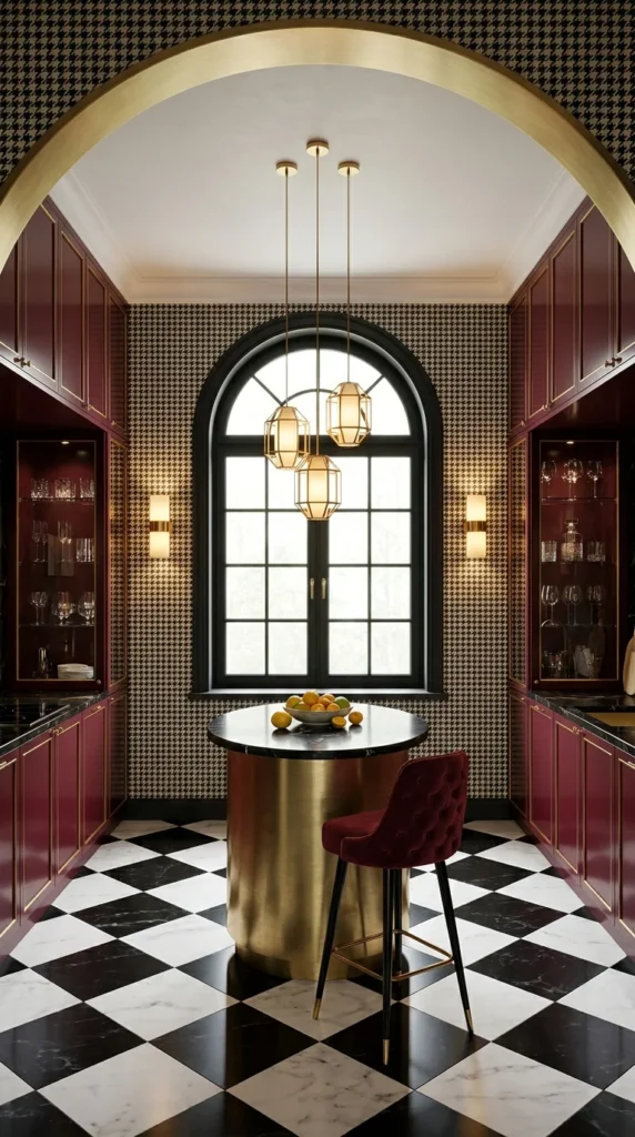
A barrel-vaulted archway, wrapped entirely in brushed gold, frames the entrance to this burgundy kitchen like a threshold into somewhere special—and houndstooth wallpaper on the walls beyond adds a second, more textural pattern layer.
The defining feature is the gold archway itself, used as architectural framing rather than a simple doorway. Most kitchens treat an entrance as a functional pass-through; this one turns it into a genuine design statement, with the barrel vault’s gold surface catching light from every angle as you walk beneath it.
It suits kitchens with a natural transitional threshold—from a hallway, dining room, or pantry—worth architecturally emphasizing. It’s a strong fit for a formal home where the kitchen deserves a proper “entrance” moment rather than just an open doorway.
The lifestyle fit is someone who appreciates a sense of arrival and ceremony even in everyday spaces. Its strongest advantage is that the archway does an enormous amount of visual work for a relatively contained construction footprint—it’s a threshold treatment, not a full room renovation.
The compromise is that a fully gold-clad barrel vault is a specialty architectural and metalworking project, needing both structural framing for the arch shape and a durable, tarnish-resistant gold finish that can handle daily passage underneath it. To simplify for a smaller budget, apply a simpler gold trim line along the edge of a standard arched doorway rather than fully cladding the entire vault surface in gold.
The most common mistake is pairing a bold archway treatment like this with an equally busy floor pattern without enough breathing room between the two—here, the black-and-white checkerboard floor is large-scale and high-contrast specifically so it doesn’t visually fight with the houndstooth wallpaper’s smaller, denser pattern.
One practical recommendation: if planning a gold-clad archway, specify a durable, low-maintenance metal laminate or coated finish rather than raw brass for a high-traffic threshold—it will hold up to daily contact far better than a finish meant for lower-touch surfaces.
Two Patterns at Two Different Scales
The houndstooth wallpaper and the checkerboard floor are both black-and-white, but they work together specifically because they operate at very different scales—one small and dense, one large and bold—which is a reliable way to combine two patterns in the same room without them visually competing. Burgundy cabinetry, glass-front and glossy, provides the room’s one saturated color, keeping the black-and-white patterns from feeling cold or clinical.
Recommended Materials: Brushed gold (archway cladding) · Burgundy lacquer with gold trim (cabinetry) · Houndstooth wallpaper · Black-and-white checkerboard marble (flooring) · Brass lantern pendants
Main Colors: Burgundy · Gold · Black · Cream
Best Lighting: A cluster of brass-and-glass lantern pendants over the central table adds warm light exactly where the archway’s gold surface can catch and reflect it, amplifying the whole entrance’s glow after dark.
For readers who love this pairing of bold pattern with rich jewel-tone cabinetry, our dark academia kitchen layouts guide covers a related moody, richly detailed direction for older and new-build homes alike.
Common Ways This Gets Misread
- Pairing two busy patterns at the same visual scale, causing them to compete rather than complement
- Choosing raw, high-maintenance brass for a high-traffic archway surface
- Skipping structural planning for a barrel-vaulted shape, which needs proper framing before finishing
- Under-lighting the archway itself, losing the dramatic reflective effect the gold cladding is built for
Keeping an Art Deco Kitchen Practical for Daily Use
- Wipe down high-gloss lacquered cabinetry with a cabinet-safe cleaner rather than an all-purpose spray, which can dull the sheen over repeated use
- Decide early whether brass and copper elements should stay bright-polished or develop a natural patina—the sealing routine differs, and switching later means redoing the finish
- Choose grout in a color that won’t show grease and daily wear too readily, especially on bold graphic tile near an active cooking zone
- Keep any fabric or velvet elements—canopy drapery, barstool upholstery—a safe distance from direct heat and grease splatter, and choose flame-retardant-treated fabric near the cooktop specifically
Who Should Choose This Style?
- Best for readers who entertain often and want a kitchen that reads as a genuine design statement, not just a workspace
- Best for larger kitchens or open-plan spaces with enough wall and ceiling height to support bold patterns and architectural detail
- Not ideal for anyone who wants a strictly low-maintenance kitchen, since lacquer, brass, and natural stone all need regular care
- Not ideal for a small, low-light kitchen, where this much dark cabinetry and pattern can feel heavy rather than glamorous
Budget Summary
| Budget | Expectation |
|---|---|
| Low | Brass hardware swap, one bold accent wall or tile backsplash, warm-toned pendant lighting |
| Medium | Lacquered cabinetry, a patterned tile floor or wall, a marble or marble-look island |
| Premium | Custom hammered metal panels, full architectural millwork or archway treatment, a sculptural custom range hood |
FAQ
Is Art Deco too dark or dramatic for a small kitchen? Not necessarily, but it does need planning. Full black or navy cabinetry across a small, low-light kitchen can feel heavy rather than glamorous. A smaller space can still borrow Deco details—brass hardware, a geometric backsplash, one bold accent wall—without committing to the darkest, most saturated version of the style.
How do I keep brass and copper looking good long-term? The key decision is between bright-polished versus natural patina, made early. Sealed, lacquer-coated brass stays bright with minimal upkeep. Unsealed brass or copper will develop a natural aged patina over time—a look many people love, but one that changes the metal’s appearance gradually, so it’s worth deciding upfront which effect you actually want.
Can I get this look without full custom cabinetry or millwork? Yes. Brass hardware, a bold geometric tile backsplash, warm globe or lantern pendant lighting, and a rich jewel-tone paint color on existing cabinetry can capture a meaningful amount of Art Deco character without a full renovation.
Does Art Deco work with stainless steel appliances? It can, as seen in a few of the kitchens here—stainless steel reads as a neutral, functional material against Deco’s bolder cabinetry and metal accents. If a fully coordinated look matters more, brass or black appliance finishes blend more seamlessly into the style’s overall palette.
Conclusion
Ten kitchens, all speaking the same design language through entirely different accents—a sunburst mural here, a velvet canopy there, a gold-clad archway somewhere else. What ties them together isn’t any single motif; it’s a shared confidence: bold geometry, warm metal, and rich color, all handled with enough restraint elsewhere in the room to let those choices actually shine. If one of these ten kitchens felt like it was speaking directly to you, that’s usually the clearest signal of where to start.
Explore More
You may also enjoy:
- 10 Pink Kitchen Ideas That Feel Bold, Not Overdone—another confident, color-forward take on kitchen design
- What Makes a Pantry Actually Functional: 10 Examples—practical planning ideas to pair with a statement kitchen like these
- Powder Room Wallpaper Ideas That Make a Small Space Unforgettable — bold pattern applied to a smaller, adjacent room

One Response