A funky kitchen isn’t shy about anything — not the cabinet color, not the floor pattern, not the ceiling. These ten rooms all commit fully to maximalist color, but none of them read as chaotic; each one is built on a clear color logic, even when that logic is “everything, all at once, on purpose.” If a beige kitchen has ever felt a little too quiet, here’s what the opposite looks like done well.
Quick Overview
| Style | Maximalist / Funky Colorpop |
| Best For | Bold personalities, statement renovations, entertaining spaces |
| Budget | Medium–High |
| Difficulty | Moderate–High (custom paint, tile, and millwork) |
| Maintenance Level | Low–Medium |
A Kitchen With Five Skylights and a Checkerboard Floor to Match
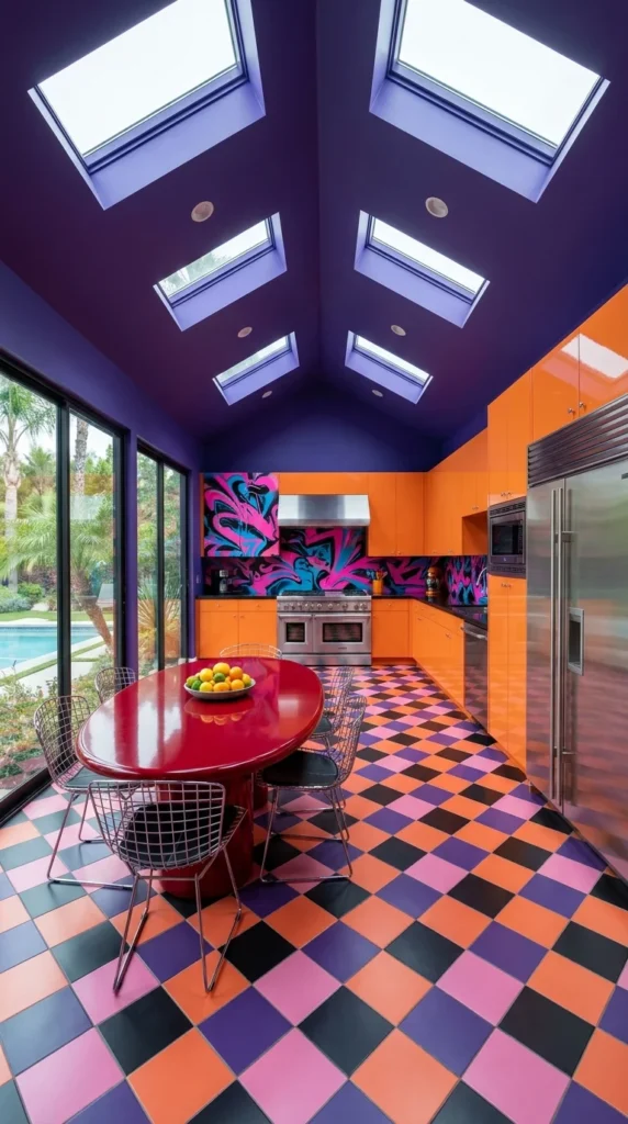
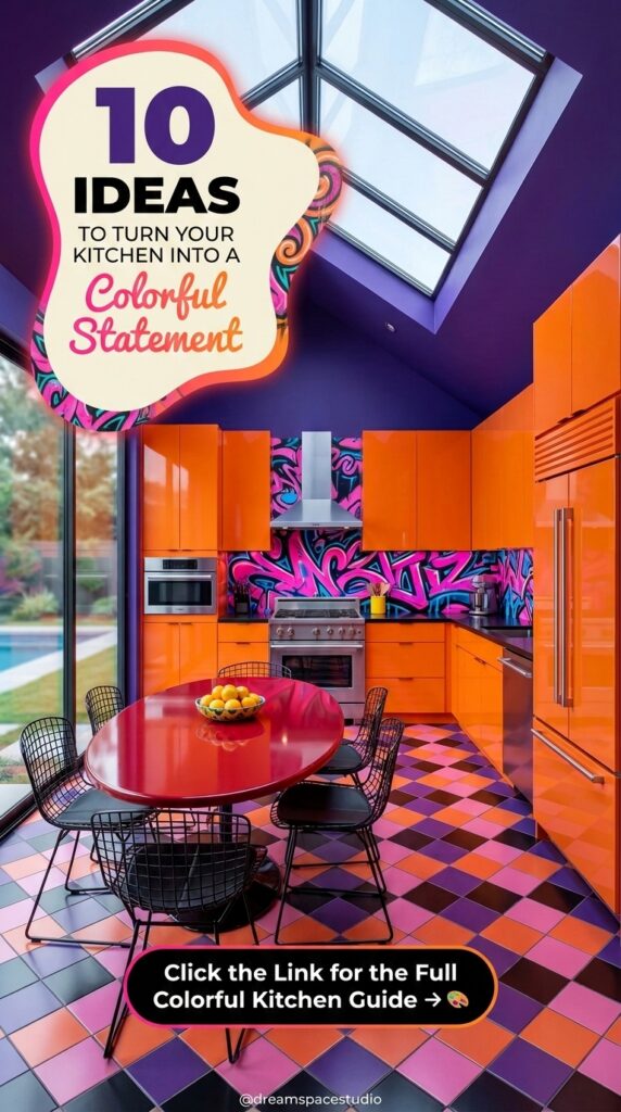
This kitchen opens with a deep violet vaulted ceiling punctured by five separate skylights, flooding daylight straight down onto a diagonal checkerboard floor in orange, pink, black, and purple. Glossy orange cabinets line one wall, paired with a hand-painted pink-and-blue graffiti-style backsplash behind the range. A glossy red oval dining table sits at the center on slim wire chairs, with sliding glass doors opening onto a pool and palm trees just past the tile.
Nothing here is trying to be subtle, and that’s the point — the ceiling color, the floor pattern, and the cabinet finish are all working from the same saturated palette, so the room reads as one confident decision rather than several competing ones.
Why the Checkerboard Floor Doesn’t Fight the Skylights
The floor’s diagonal pattern repeats the same four-color palette used on the ceiling and cabinets, which is likely why a floor this busy doesn’t compete with five skylights pulling the eye upward at the same time — same colors, different surfaces, one cohesive room. Drop in a fifth or sixth color underfoot and that balance would probably tip toward visual noise instead of rhythm.
Recommended Materials: glossy lacquered cabinetry, ceramic checkerboard floor tile, hand-painted mural backsplash, powder-coated wire chairs, glossy resin dining table
Main Colors: Deep Violet · Tangerine Orange · Hot Pink · Charcoal Black
Best Lighting: Five skylights are doing almost all the work here, flooding the room with strong, even daylight that keeps the saturated colors from feeling heavy or dark.
Where This Skylight-and-Color Combo Falls Apart
- Painting the ceiling a color that doesn’t appear anywhere else in the room, breaking the palette’s continuity
- Choosing a floor pattern in a completely different color family than the cabinets
- Skipping window treatments where privacy matters, since skylights this large offer none
- Adding a patterned backsplash that clashes rather than harmonizes with the wall mural
Where Diner Culture Never Actually Left the Kitchen
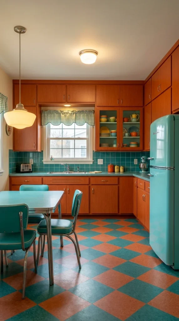
This kitchen leans into a genuine 1950s diner palette — warm wood-toned cabinets paired with a teal tile backsplash, a matching teal refrigerator, and teal vinyl-and-chrome dining chairs pulled up to a matching table. The orange-and-teal checkerboard floor ties the whole room together, while a gingham café curtain and a milk-glass pendant complete the period-accurate detailing.
Unlike the more chaotic maximalist rooms in this list, the color story here stays disciplined to just two hues — proof that “funky” doesn’t always require a five-color palette to feel like a statement.
Recommended Materials: wood veneer cabinetry, glazed ceramic subway tile, chrome-and-vinyl dinette set, checkerboard vinyl flooring, milk glass pendant shade
Main Colors: Teal · Burnt Orange · Warm Wood Brown
Best Lighting: A single milk-glass pendant and a flush ceiling fixture give the room its warm, nostalgic glow, supplemented by strong natural light from the window above the sink.
Maintenance Note: Vinyl checkerboard flooring holds up well underfoot but shows scuffs on light grout lines, so it benefits from regular sweeping in a high-traffic kitchen.
The Repeated Curve That Makes This Kitchen Feel Cohesive
The refrigerator’s rounded corners echo the same soft curve found on the dinette chairs and the pendant’s glass shade — a small, consistent shape repetition that keeps a room built from very different materials (metal, wood, vinyl, glass) feeling like one connected era rather than a mismatched assortment of vintage finds.
Easy Ways to Get the Retro Diner Look Wrong
- Introducing a third accent color that dilutes the disciplined two-tone palette
- Choosing modern, sharp-edged hardware that clashes with the room’s rounded, retro shapes
- Skipping the checkerboard floor for a plain tile, losing the room’s most defining detail
- Using cool-white LED bulbs instead of warm-toned ones, which flattens the nostalgic mood
A Ceiling Painted Like Marbled Ink
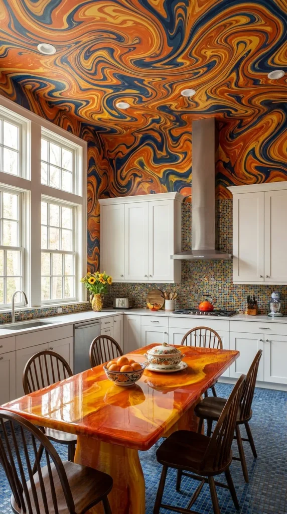
The centerpiece here isn’t the cabinetry — it’s a hand-painted marbled ceiling and upper wall, swirling orange, blue, and gold together like ink dropped in water. White shaker cabinets stay deliberately restrained below it, letting a colorful mosaic tile backsplash and floor carry the secondary color story. A glossy resin dining table in matching orange and gold tones sits at the room’s center, surrounded by simple wood Windsor chairs.
Tall windows flood the space with daylight, which catches the ceiling’s high-gloss swirl pattern and makes it shift subtly depending on where you’re standing in the room.
Recommended Materials: hand-painted marbled plaster ceiling, glazed mosaic tile flooring, white shaker cabinetry, glossy epoxy resin table, solid wood Windsor chairs
Main Colors: Burnt Orange · Cobalt Blue · Golden Yellow · White
Best Lighting: Tall double-hung windows bring in abundant natural light, which is essential here — the ceiling’s marbled effect depends on daylight catching its glossy swirl to read properly.
What the Eye Finds First in All That Swirl
Even with a ceiling this visually loud, the eye tends to land first on the resin table, since its warm orange tone directly matches the ceiling’s dominant color — a deliberate sightline connection between the room’s two boldest surfaces, tying floor-level attention back up to the mural above it.
What Trips People Up With a Painted Ceiling This Bold
- Choosing patterned cabinets that compete with an already-busy ceiling instead of staying quiet
- Using a cool-toned backsplash that clashes with the ceiling’s warm orange-and-gold swirl
- Skipping enough natural light, which mutes the marbled effect this technique depends on
- Overcrowding the counters with clutter that distracts from the ceiling’s intended focal role
A Kitchen That Grew In, Not Just Decorated
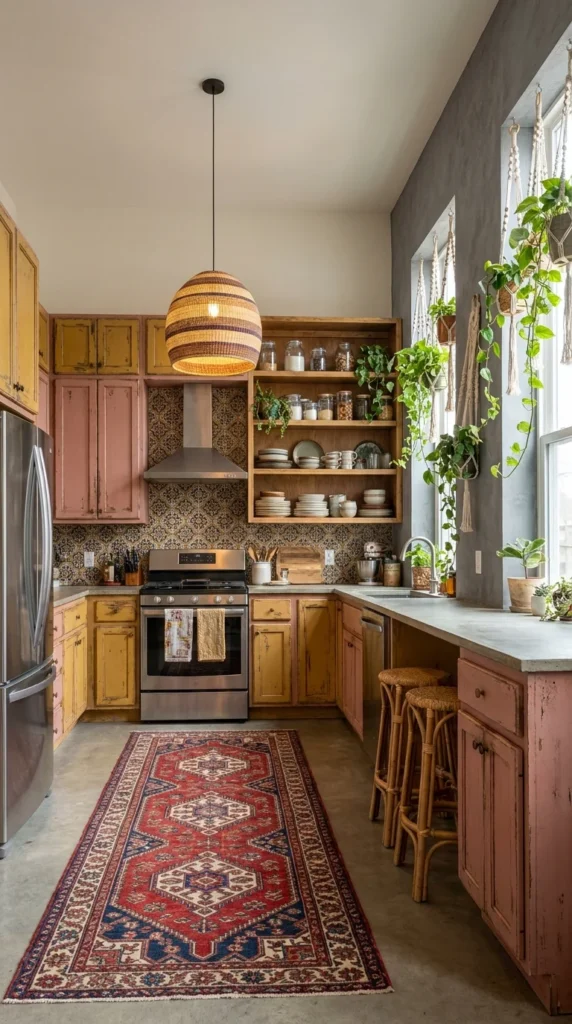
This kitchen swaps polished maximalism for a warmer, lived-in boho-funky version — distressed yellow and dusty pink cabinets, a hand-tiled patterned backsplash, and open wood shelving stacked with mismatched ceramics. A woven rattan pendant hangs above a vintage kilim runner, while trailing plants in macramé hangers spill down from the window, softening every hard surface in the room.
Concrete countertops and rattan counter stools keep the palette grounded, proving that funky color doesn’t require glossy, high-shine finishes to land — a worn, textured version works just as well.
Recommended Materials: distressed painted wood cabinetry, hand-glazed patterned tile, concrete countertops, rattan pendant and stools, wool kilim rug
Main Colors: Dusty Pink · Mustard Yellow · Terracotta
Best Lighting: A single rattan pendant provides warm, filtered light, while a large window brings in strong natural daylight that the trailing plants partly filter as they grow across it.
Maintenance Note: Distressed painted cabinetry actually benefits from visible wear over time, but concrete counters should be resealed periodically to resist staining from acidic foods.
A Kitchen Built on Repetition, Not Matching
Almost nothing in this room matches exactly — the mugs, the tile pattern, the kilim’s motifs are all different — yet the repetition of warm, muted tones (mustard, dusty pink, terracotta) across every one of those mismatched pieces is what keeps the room feeling curated rather than cluttered. It’s a good reminder that funky doesn’t require matching, just a consistent underlying palette.
Mistakes That Undercut a Boho-Funky Kitchen
- Choosing cabinet hardware that’s too polished or modern for the room’s worn, layered feel
- Skipping the plants entirely, losing the softness that balances all the patterned tile
- Mixing in a stark white appliance that jars against the warm, earthy palette
- Overcrowding the open shelving so the mismatched ceramics read as messy instead of collected
Pink Cabinets Under a Wall-Sized Word
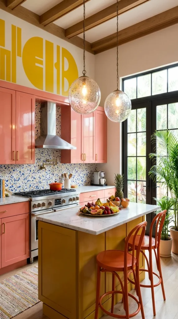
Glossy coral-pink cabinetry wraps this kitchen, paired with a mustard-yellow island topped in white marble. A speckled blue-and-white terrazzo-style backsplash runs behind the range, while an oversized yellow typographic mural stretches across the upper wall — bold enough to read from across the room, abstract enough not to demand a literal reading. Two mercury-glass globe pendants hang above the island, their speckled glass catching light from the black-framed French doors nearby.
Exposed wood ceiling beams keep the room from feeling purely modern, grounding all that saturated color in something more textural and warm.
Recommended Materials: glossy lacquered cabinetry, marble island countertop, terrazzo-effect tile backsplash, mercury glass pendant shades, exposed wood beams
Main Colors: Coral Pink · Mustard Yellow · Golden Yellow (mural)
Best Lighting: Mercury glass pendants cast a warm, dappled glow over the island, while black-framed French doors bring in strong, direct daylight from the garden side of the room.
The Typography’s Real Job on This Wall
The oversized letterforms on the mural are abstracted enough that most people won’t stop to actually read them — their real function is scale, filling an otherwise plain upper wall with enough visual weight to balance the heavy cabinetry below. A smaller, more literal sign in the same spot would likely have felt lost against cabinets this saturated.
Is the Typographic Mural Worth It?
A custom hand-painted wall mural like this is a real investment, and it’s the kind of feature that’s hard to walk back if the homeowner’s taste shifts. That said, in a kitchen already committed to pink cabinets and a mustard island, a plain wall above would probably have felt like an unfinished thought — the mural is doing the job a smaller piece of art simply couldn’t at that scale. A large-format printed wallpaper version could deliver a similar impact for meaningfully less cost and commitment.
Where the Bold Typography Idea Goes Wrong
- Choosing a mural color that doesn’t relate to anything else already in the room
- Making the lettering too legible, which can feel more like a sign than an abstract design element
- Pairing it with additional wall art nearby, crowding out the mural’s intended impact
- Skipping the exposed beams or texture elsewhere, leaving the room feeling flat rather than layered
When the Cabinets Become the Abstract Art
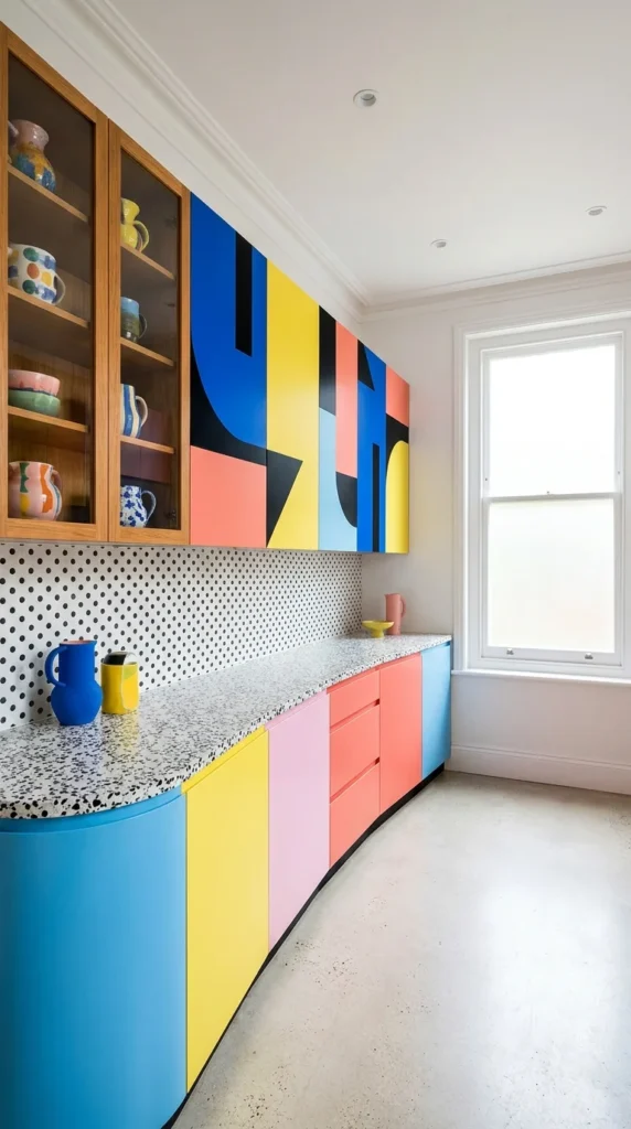
Here the cabinetry itself is the artwork — upper cabinets painted in an abstract geometric mural of cobalt blue, coral, yellow, and black, set against a polka-dot backsplash and a terrazzo-look countertop. Below, curved base cabinets continue the same palette in solid color blocks, their rounded corners softening what could otherwise feel like a very graphic, hard-edged room.
A single wood-and-glass cabinet breaks the pattern, displaying a collection of colorful mismatched mugs and bowls — the one spot in the room allowed to look collected rather than designed.
Recommended Materials: hand-painted abstract cabinet fronts, terrazzo-effect laminate counters, curved lacquered base cabinetry, glass-front wood display cabinet
Main Colors: Cobalt Blue · Coral · Golden Yellow · Black
Best Lighting: A large double-hung window is the room’s main light source, chosen deliberately plain so it doesn’t compete with the cabinetry’s graphic pattern.
Designer’s Verdict: A Palette That Repeats Without Repeating Itself
This is the boldest cabinet treatment of the ten, and it earns that boldness by staying disciplined — every color on the abstract mural reappears somewhere on the solid curved cabinets below, so despite looking spontaneous, the palette is actually tightly controlled. Fewer than four colors here would likely have felt timid against a backsplash this graphic; a fifth would probably have tipped the room into visual overload. Four seems to be the room’s real ceiling.
Common Slip-Ups With Abstract Cabinet Art
- Introducing a fifth accent color that isn’t already part of the mural’s established palette
- Choosing straight-edged base cabinets instead of curved ones, losing the room’s softening counterpoint
- Overfilling the open glass cabinet, which competes with the mural for attention
- Selecting hardware in a finish that doesn’t relate to any color already used in the room
Leopard Print Takes Over the Countertop
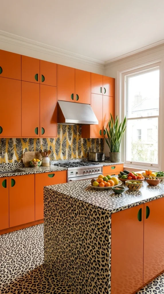
This kitchen commits to animal print as its main pattern — leopard spots cover the countertops, backsplash trim, and floor tile, wrapping all the way up the island’s face. Bright orange lacquered cabinets with green half-moon pulls sit above it, paired with a feather-print wallpaper accent behind the range. A single snake plant and a scattering of colorful ceramic bowls are the only softening details in an otherwise maximalist, pattern-heavy room.
The result reads more playful than chaotic, mostly because the leopard print stays confined to one consistent surface family (counters, backsplash, floor) rather than spreading into the cabinetry too.
Recommended Materials: leopard-print laminate countertops and flooring, glossy lacquered orange cabinetry, feather-motif wallpaper, half-moon cabinet pulls
Main Colors: Tangerine Orange · Black · Cream (leopard base)
Best Lighting: A tall window brings in strong daylight that keeps the busy leopard pattern from reading as dark or heavy across such a large surface area.
Why the Green Handles Aren’t Random
The green half-moon pulls are the only cool tone in an otherwise entirely warm palette — a small, deliberate contrast that keeps the orange cabinetry from reading as one flat block of color. Swap them for orange or black hardware and the cabinet fronts would likely lose the crisp visual break that currently makes each door read as a distinct shape.
Getting Animal Print in the Kitchen Wrong
- Extending the leopard print onto the cabinetry as well, which removes the pattern’s needed contrast surface
- Choosing a second bold pattern (like the feather wallpaper) in a clashing rather than complementary palette
- Using metallic or glossy hardware that competes with the pattern instead of grounding it
- Skipping a plain wall or ceiling somewhere, leaving the eye with nowhere to rest
A Curved Teal Ceiling Over an Orange Island
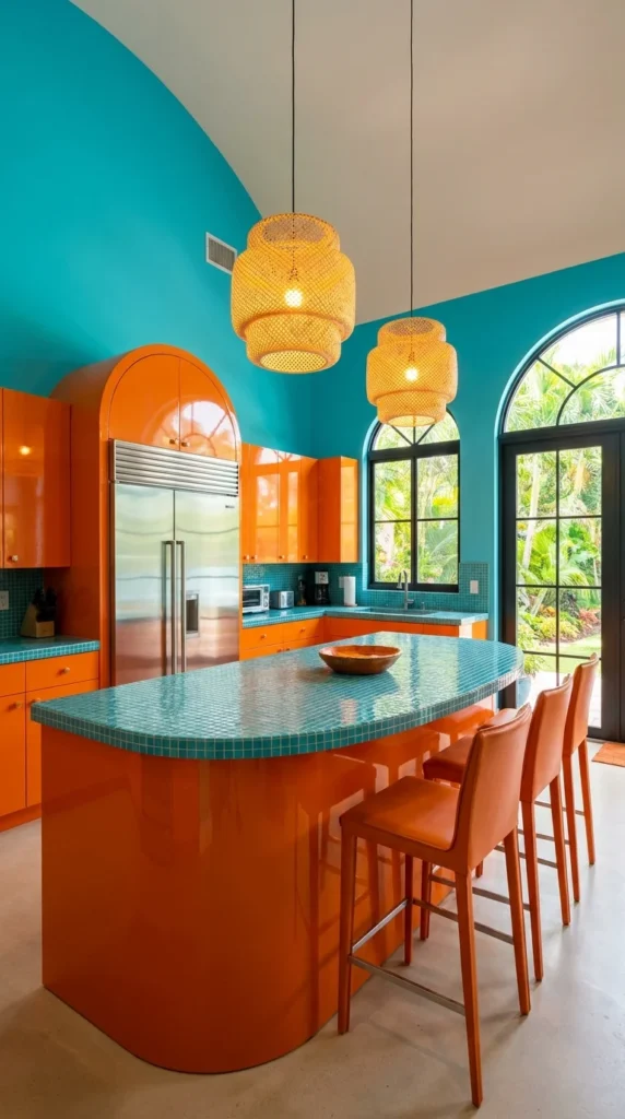
A sweeping curved teal ceiling arcs overhead in this kitchen, meeting glossy orange cabinetry at a soft, rounded corner rather than a hard architectural line. The island’s teal mosaic tile top continues the ceiling’s color into the room’s working surface, while two woven rattan pendants add warmth against all that cool, saturated blue-green. Arched black-framed doors open to a lush garden view, echoing the room’s own curved lines.
Nothing about this room uses more than two dominant colors, which is likely why a ceiling this saturated doesn’t overwhelm the cabinetry beneath it.
Recommended Materials: curved plaster ceiling, glossy lacquered cabinetry, glazed mosaic tile countertop, woven rattan pendant shades, arched steel-framed doors
Main Colors: Turquoise Teal · Tangerine Orange
Best Lighting: Rattan pendants supply warm ambient light against the cool ceiling color, while arched doors and windows bring in abundant natural daylight from the garden side.
The Curve Doing More Than One Job
The ceiling’s curve doesn’t stop at the wall — it repeats in the arched doorways and the island’s rounded end, so the same soft shape shows up in three different places at three different scales. That kind of repeated form, more than the color itself, is probably what keeps a two-tone room this saturated from feeling like a simple paint job rather than a designed space.
Where the Curved-Ceiling Look Backfires
- Introducing straight-edged furniture or fixtures that fight the room’s consistent curved language
- Choosing a third dominant color, which dilutes the disciplined two-tone impact
- Skipping the mosaic tile detail on the island, losing the connection between ceiling and counter color
- Using cool-toned pendant lighting instead of warm, which would make the whole room feel clinical
Three Pendant Lights, Three Different Personalities
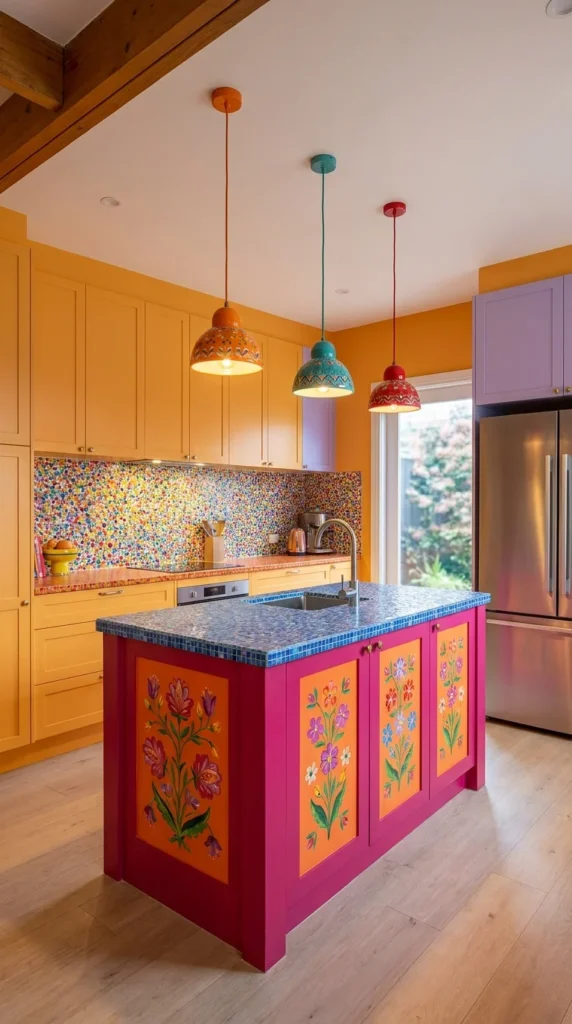
This kitchen pairs golden mustard cabinetry with a lavender accent cabinet and a confetti-speckled backsplash dense enough to read as its own pattern. The real focal point, though, is the island — hand-painted with magenta and orange floral panels and topped in a mosaic blue tile, it looks more like a piece of folk art furniture than a built-in fixture. Above it, three pendant lights in orange, teal, and red hang at slightly different heights, each with its own patterned ceramic shade.
None of the three pendants match, and none of the wall colors repeat exactly elsewhere in the room — yet the overall effect reads as festive rather than disorganized.
Recommended Materials: hand-painted floral cabinetry, mosaic glass tile countertop, speckled confetti backsplash, ceramic pendant shades in mixed colors
Main Colors: Golden Mustard · Magenta · Lavender
Best Lighting: Three mismatched ceramic pendants in different colors are the room’s clear centerpiece, supplemented by natural daylight from a window beside the refrigerator.
A Trio of Lights That Shouldn’t Work Together (But Does)
Each pendant is a different color and shade shape, which by most conventional design logic shouldn’t cohere — but all three sit at a similar warm color temperature and roughly matching scale, so the variation-within-consistency is what keeps them from reading as mismatched rather than deliberately eclectic. A cooler-toned fourth pendant added to the mix would likely break that fragile balance.
Mistakes That Undercut Mismatched Pendant Lighting
- Adding a fourth pendant in a cool tone that doesn’t match the warm color temperature of the other three
- Choosing shades in wildly different sizes, which reads as inconsistent rather than intentional
- Pairing mismatched pendants with an already busy backsplash pattern, overloading the ceiling zone
- Hanging them at identical heights, losing the playful, staggered effect that makes the trio work
A Ceiling Painted Like a Rainbow Got Poured Across It
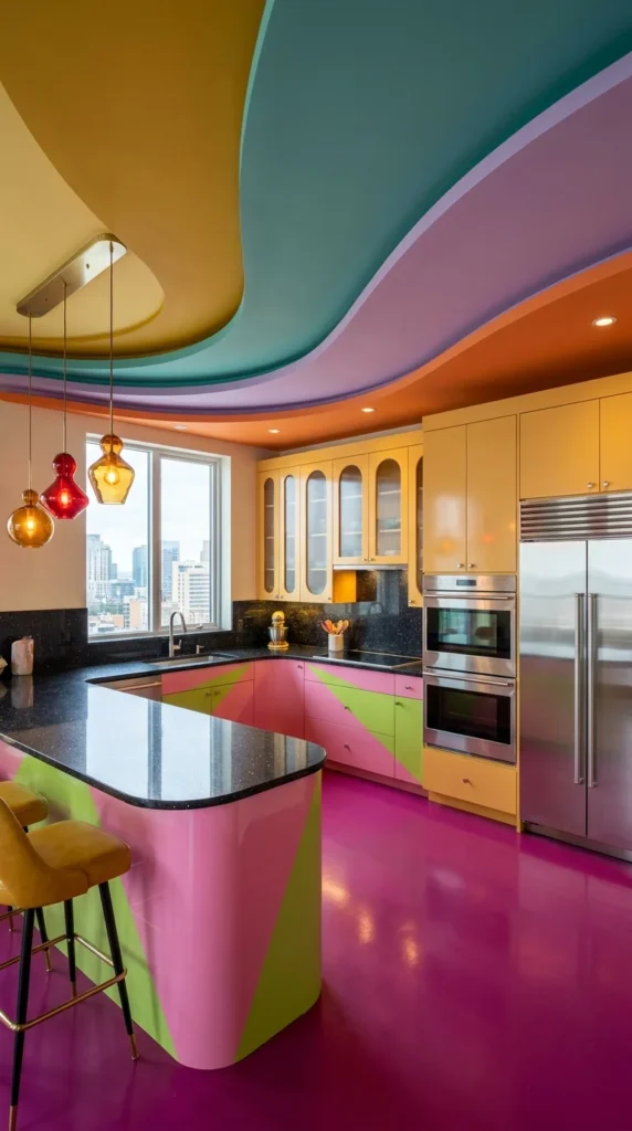
The final kitchen goes all-in on a sculptural, multicolor ceiling — sweeping curved sections in mustard, teal, lavender, and orange flow into each other like poured paint, hovering over a much calmer kitchen below. Mustard cabinetry and a black speckled countertop stay relatively restrained, letting a magenta glossy floor and a hand-painted pink-and-green geometric island carry the remaining color. Three colored glass pendants — red, amber, and clear — hang at staggered heights beside a floor-to-ceiling city view.
It’s the most architecturally ambitious room of the ten, relying on the ceiling’s shape as much as its color to make the statement.
Recommended Materials: sculpted painted plaster ceiling, glossy epoxy resin flooring, hand-painted geometric island panels, colored glass pendant shades, honed black speckled countertop
Main Colors: Magenta · Mustard Yellow · Teal · Lavender
Best Lighting: Colored glass pendants in warm amber and red tones add jewel-like accents, while a full-height city-view window brings in strong daylight that plays differently against each curved ceiling section throughout the day.
Why the Ceiling Gets to Be This Loud
With a floor this saturated in magenta, the room needed something equally bold overhead to keep the eye moving through the whole space instead of getting stuck at floor level — the ceiling’s multicolor curves essentially rebalance the room’s visual weight from bottom to top. A plain white ceiling here would likely have made the magenta floor feel like the room’s only decision, rather than one of several.
What Ruins a Sculptural Ceiling Like This
- Pairing it with a plain, single-color floor, losing the top-to-bottom balance the room depends on
- Choosing cabinetry in a color that doesn’t appear anywhere in the ceiling’s palette
- Adding busy wall art or a patterned backsplash, which competes with an already complex ceiling
- Using stark white or cool-toned lighting instead of warm glass pendants, flattening the room’s mood
Image 10 — Media Library Fields
Image: sculptural-multicolor-ceiling-magenta-floor-kitchen.webp Alt Text: Kitchen with a sculptural curved multicolor ceiling and glossy magenta floor Caption: A poured-paint ceiling rebalances a room already committed to a magenta floor. Title: Sculptural Ceiling Kitchen
Related Guides
- 10 Pink Kitchen Ideas That Feel Bold, Not Overdone — more single-color commitment for anyone drawn to the coral cabinets above
- 10 Maximalist Living Room Ideas to Steal for a Room Full of Personality — the same maximalist confidence applied beyond the kitchen
- Retro Never Left: 10 Vintage 1950s Kitchen Ideas — a deeper dive into the diner-era palette from the second room above
- 10 Scandinavian Kitchens That Show What Minimalism Really Looks Like — the opposite end of the color spectrum, worth comparing against
- What Makes a Pantry Actually Functional? 10 Examples — practical storage ideas to pair with a bold kitchen renovation
Cooking Workflow Tips
- Keep at least one work surface in a neutral tone (white marble, black granite) even in the boldest color scheme, so food prep never fights with the countertop for visibility
- Choose glossy lacquered finishes over matte in high-splash zones — they wipe clean faster and reflect more light back into a saturated room
- If mixing multiple bold patterns (tile, wallpaper, upholstery), limit yourself to two “busy” surfaces and let the rest of the room stay solid
- Position the boldest color or pattern where it’s seen on entry, not hidden behind an island or peninsula, so the room’s personality reads immediately
Who Should Choose This Style?
- Best for homeowners who entertain often and want a kitchen that photographs and feels like a statement
- Best for anyone renovating a windowless or low-light kitchen, since strong color and pattern can add energy where natural light can’t
- Not ideal for anyone planning to sell within a few years — this level of color commitment narrows buyer appeal more than a neutral renovation would
Budget Summary
| Budget | Expectation |
|---|---|
| Low | Colorful pendant lights, patterned wallpaper accent, painted cabinet hardware swap |
| Medium | Lacquered cabinet refinishing, patterned tile backsplash, a bold checkerboard floor |
| Premium | Custom hand-painted cabinetry or ceiling murals, sculptural ceiling millwork, full mosaic tile installations |
FAQ
Will a funky, colorful kitchen go out of style? Bold color trends do shift, but kitchens built on a disciplined palette (two to four repeated colors, as most of these rooms use) tend to age better than ones that chase every trend at once.
How many colors is too many for one kitchen? Most of the rooms above stay within a three-to-four color palette, even when the patterns look chaotic at first glance — that discipline is usually what keeps a maximalist kitchen from feeling messy.
Can I get this look without repainting cabinets? Yes — a bold backsplash, colorful pendant lighting, and a patterned floor can deliver much of the same energy without committing to full cabinet refinishing.
Is a hand-painted mural ceiling or cabinet front expensive to maintain? A quality sealed finish generally holds up well, but hand-painted surfaces should be cleaned with non-abrasive products to avoid dulling the artwork over time.
Author Box
Written by the Aesthetic Lifes Design Team — an editorial team covering interior design, décor trends, and real-world styling advice for every room in the home.
Conclusion
What separates a genuinely great funky kitchen from a chaotic one almost always comes down to restraint hiding inside the boldness — a repeated color, a consistent curve, a palette that never quite exceeds four hues even when it looks like more. These ten rooms prove that maximalism isn’t the absence of a plan; it’s a plan built around confidence instead of caution. For anyone tired of a beige kitchen, that’s likely the real takeaway: pick your colors, then commit to them everywhere.
Explore More
You may also enjoy:
- 10 Bathroom Colors That Turn a Plain Room Into a Statement Space
- 10 Shades of Green That Change How a Dining Room Feels
- Small Space, Big Coffee Bar: 10 Design Ideas That Fit
Tags
funky kitchen, colorful kitchen ideas, maximalist kitchen design, bold kitchen cabinets, retro kitchen decor, statement kitchen island, colorful backsplash ideas, eclectic kitchen design