Most camper van content shows you a finished build and calls it inspiration. It rarely tells you why the layout works—or what happens when you try to copy it in a van that isn’t a perfectly staged 200-square-foot Sprinter. If you’ve spent any time actually living in 60 square feet, you know the real challenge isn’t finding pretty ideas. It’s figuring out which decisions make the space usable and which ones just look good in photos. These ten layouts were picked because each one solves a specific spatial problem—not because they’re trendy.
1. The Table Extension That Turns a Dinette Into a Second Counter
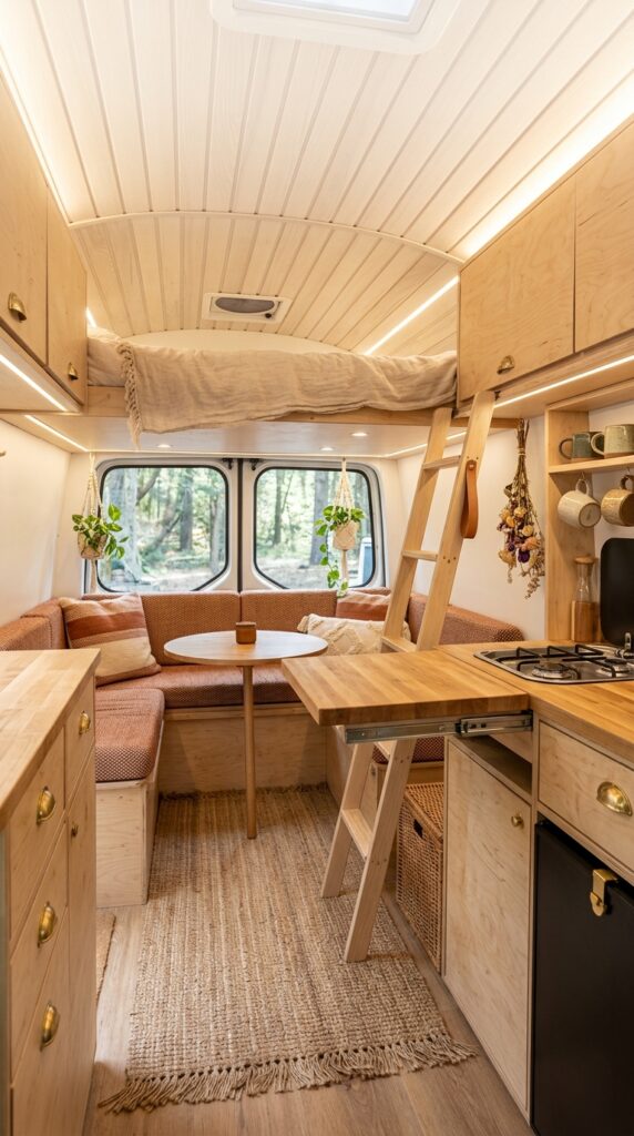
The round dinette table here isn’t fixed — it slides out on a rail to butt directly against the kitchen counter, turning a two-person eating nook into extra prep space when needed. It’s a small mechanical detail, but it solves a real problem: in 60 square feet, a table that only does one job is a table that’s wasting space.
The loft bed above the dinette does similar double duty. Instead of building a fixed bed platform that eats into headroom permanently, the sleeping area sits up and out of the way, reached by a removable wooden ladder. The trade-off is a lower ceiling over the seating area, but the U-shaped bench below still feels open because nothing is competing with it at eye level.
💡 Pro Tip If you’re adding a slide-out table extension, mount the rail slightly lower than counter height. Once the leaf is fully extended, it should sit flush—a few millimeters off—and the seam becomes a catch point for spills and crumbs.
2. Two Rows of Ceiling Light Instead of One Central Fixture
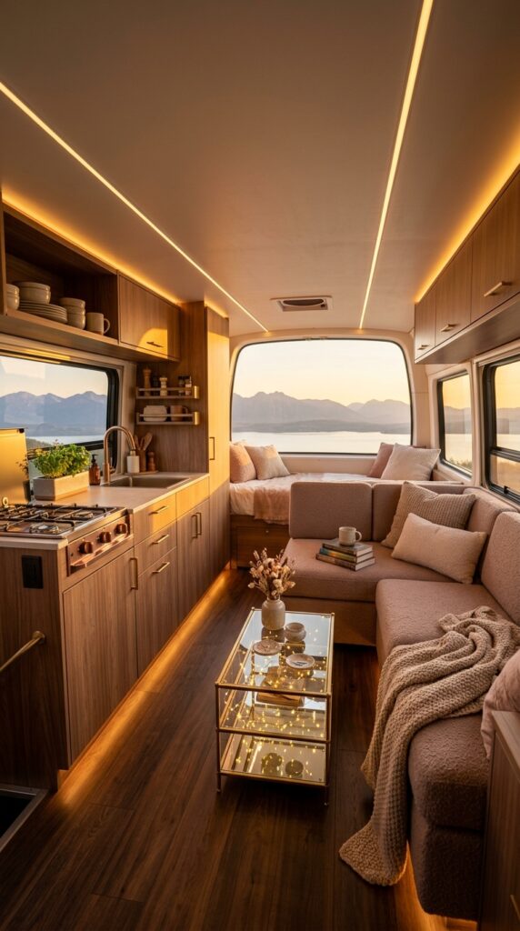
Running LED strip lighting along both edges of the ceiling, rather than a single overhead fixture in the middle, changes how the whole room reads at night. Light hitting the walls and corners fills in the shadows that make small spaces feel like they end abruptly—instead, the room looks like it keeps going past where the eye can actually see.
The dark wood flooring here is doing something counterintuitive too. Conventional wisdom says light floors make small spaces feel bigger, but paired with warm lighting and the big windows facing that mountain view, the dark tone actually grounds the room and stops it from feeling like a stark white box on wheels.
⚠️ Warning The most common mistake with edge lighting is running a single warm-white strip at full brightness everywhere. That flattens the room instead of shaping it. Vary the intensity—brighter near the kitchen task areas, dimmer near the seating—so the eye still reads depth instead of one flat glow.
3. A Fold-Down Wall Table That Disappears When It’s Not Needed
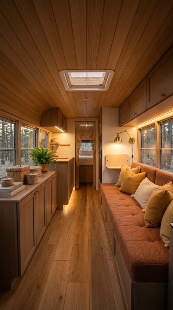
Mounted flush to the wall beside the bench seating, this small drop-down table folds flat when not in use, leaving the walkway completely clear. It’s a tighter version of the fold-down desk concept, sized for one person rather than a full meal—a spot for a laptop, a coffee, or a book, not a dining setup.
The curtain doorway leading to the bedroom is a deliberate choice over a solid door. In a van this narrow, a swinging door needs clearance on both sides to open — clearance this layout doesn’t have. A curtain gives the same sense of separatiopen—clearanceithout stealing any floor space when it’s tied back.
📌 Important Note Fabric room dividers only work well when the two spaces they separate serve different functions at different times — like a bedroom you close off at night and a living area you use during the day. If both spaces need privacy simultaneously, a curtain won’t cut it.
4. Why Symmetry Works Here When It Fails in Most Vans
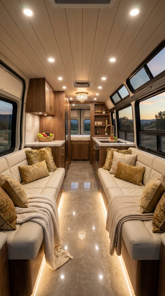
Two identical bench seats facing each other down a straight center aisle is a layout most van builds should avoid—it usually reads narrow and formal. It works in this one because the aisle is fully open all the way to the cab, with no galley or bathroom wall breaking the sightline, so the eye travels the full length of the van instead of stopping short.
The glossy marble-look flooring reinforces that same trick. A matte or textured floor would have grounded the space and shortened it visually; the reflective surface does the opposite, bouncing the recessed lighting and doubling the sense of depth down the aisle.
⚠️ Warning Symmetrical bench seating only reads as spacious when the aisle stays completely clear. The moment a table, ottoman, or storage bin gets added between the seats — which most owners eventually do — the openness this layout depends on disappears, and the van feels narrower than an offset layout would have.
5. A Circular Skylight That Turns the Ceiling Into a Focal Point
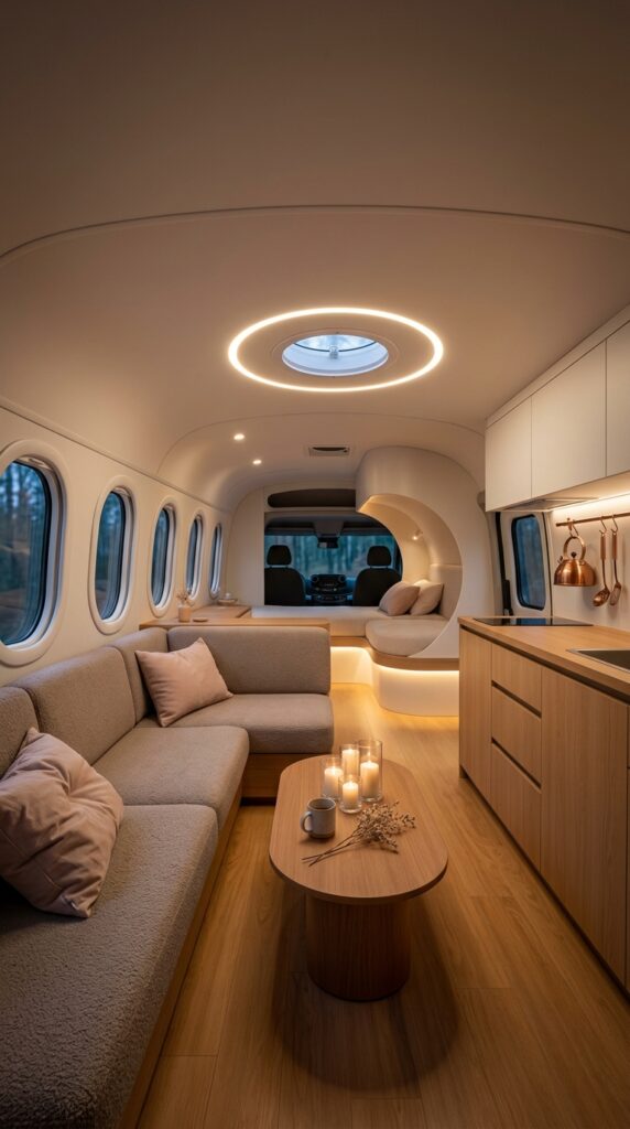
Instead of a flat-panel skylight tucked into a corner, this one sits dead center and is ringed with a halo of LED light—turning what’s usually a functional opening into the visual anchor of the whole room. It draws the eye upward first, which is exactly what a low-ceilinged space needs.
The curved, tunnel-like nook near the cab does something similar for the horizontal sightline. Rather than a hard wall separating the cab from the living area, the rounded pod flows into a built-in seat, softening the transition and making the whole van feel like one continuous shape instead of three boxed-off zones.
💡 Pro Tip Round furniture—the oval coffee table here is a good example—works harder than square pieces in tight aisles. Without corners, you can walk closer to it without bumping a hip, which effectively widens the usable floor space even though the table itself isn’t smaller.
6. Why the Space Above the Bed Matters More Than the Headboard Itself
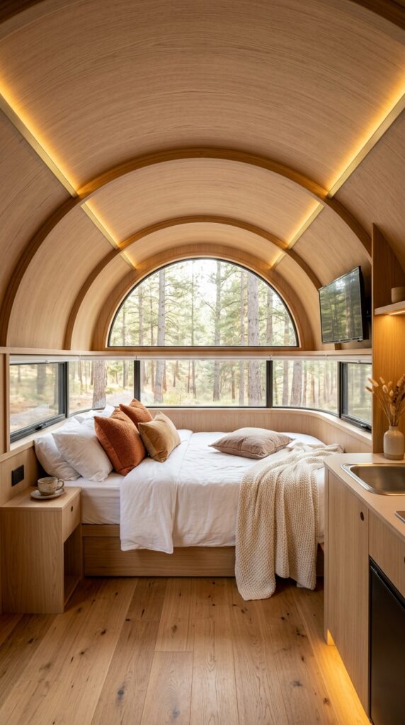
This bed doesn’t have a headboard at all—instead, the entire wall behind it curves up into a half-circle window with a domed ceiling above. That’s the real design decision here. Rather than adding furniture at the head of the bed, the layout removes it entirely and lets the arched window do the job, pulling the treeline right up to the pillows.
The recessed lighting tracing the ceiling ribs adds warmth without a single lamp taking up nightstand space. A mounted TV tucked into the corner and a slim built-in nightstand round out the room without adding anything freestanding—nothing here could get knocked over or need to be moved when the space needs to double as a walkway.
📌 Important Note A curved half-circle window like this only works structurally in a van shell built for it — it’s not something you retrofit into a flat-walled panel van. If your build has standard rectangular windows, the same effect can be approximated with a wide single window set low, right at pillow height.
7. What Happens When the Living Area and the Cab Aren’t Separated
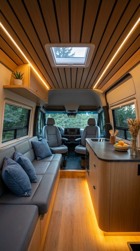
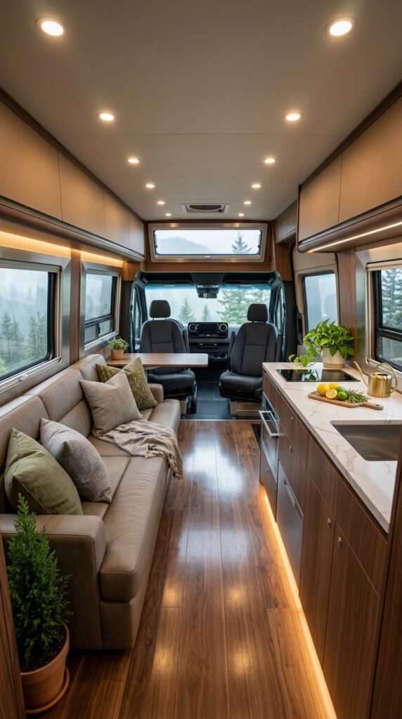
There’s no divider, curtain, or wall between the driving seats and the lounge here—the front cab and the living space are treated as one continuous room. The swivel captain’s chairs face into the layout, so instead of losing that square footage to a driving cockpit, it reads as two extra armchairs.
The under-cabinet lighting along the base of the kitchen units is doing a specific job here too: it lights the floor without adding any glare to the countertop above, which matters when the counter is being used for prep at the same time someone’s sitting a few feet away in the lounge.
⚠️ Warning Leaving the cab open to the living space only feels intentional when the seats swivel and the dashboard is kept clutter-free. If the front seats stay fixed forward and the dash collects gear, the same open layout just reads as a van with a messy front end, not an extended living room.
8. The White Countertop That Makes a Dark Kitchen Feel Lighter
Everything below counter height in this galley — cabinets, drawers, flooring — runs in a deep walnut tone. The countertop is the one break from that: a pale marble-look surface that catches light from both the window above and the under-cabinet strip below. That single light-colored pane keeps the whole kitchen wall from reading as heavy.
The potted plants stacked at floor level, rather than up on a shelf, work slightly against the usual small-space rule of keeping the floor clear. It works here because they’re placed in the one corner that’s otherwise dead space next to the sofa arm—filling a gap that would just be empty floor instead of competing with the walkway.
💡 Pro Tip If your galley uses a dark lower cabinet run, keep the counter and backsplash in a lighter, reflective material. It’s a smaller investment than repainting cabinetry, and it does most of the work of keeping the kitchen from feeling like a dim corner of the van.
9. How This Van Holds Dozens of Plants Without Losing Floor Space
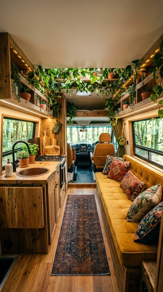
Every plant here lives on open shelving built above head height, running the full length of the ceiling on both sides. None of it touches the counters, the seating, or the floor; the greenery reads as abundant without stealing a single inch of usable surface because it was never competing with function in the first place.
The patterned runner rug does a different job. Against all the warm wood tones and the mustard velvet bench, a busy jewel-toned rug could easily tip the room into visual chaos—but because it’s the only strongly patterned element in the room, it reads as intentional rather than cluttered.
What This Look Actually Requires:
Ceiling-height shelving on both sides, not just one
A mix of trailing and upright plants for varied depth
String lighting tucked behind the shelf edge, not the plants
One patterned textile—and only one—to anchor the palette
Warm wood tones throughout to keep the greenery from clashing
10. A Pegboard Wall Doing the Job an Entire Cabinet Usually Does
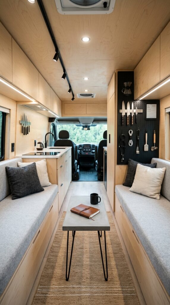
Instead of closed cabinetry to store knives, tools, and kitchen gear, this wall uses a black pegboard with magnetic strips and hooks. Everything stays visible and grabbable without opening a single door — which matters in a van, where every open cabinet door temporarily blocks the aisle.
The black pegboard panel also does quiet visual work against all the pale birch plywood around it. It’s the one dark, matte surface in an otherwise light room, and it keeps the space from feeling like a uniform wood box by giving the eye one clear place to land.
What This Wall System Actually Requires:
A rigid pegboard panel, not a thin decorative one
Magnetic knife strips rated for actual daily use
Mixed hook sizes for tools of different weights
At least 6 inches of clearance around each tool for removal
A contrasting dark panel color to anchor a light room
Conclusion: What Actually Makes 60 Square Feet Feel Bigger
Looking across these ten builds, the pattern isn’t really about any single trick—it’s restraint applied consistently. The layouts that work keep the aisle clear, let furniture do more than one job, and use light and color to guide the eye rather than fighting the space they’ve got. None of them rely on gadgets or gimmicks. They rely on decisions made early, before a single cabinet went in. That’s the real takeaway if you’re planning your own build: the layout choices you make before you touch materials matter more than any finish you pick after.
Frequently Asked Questions
Does a lighter color palette always make a camper van feel bigger?
Not always. Several of these layouts use dark wood or dark cabinetry successfully by pairing it with strong edge lighting and large windows. What matters more than color alone is contrast and where the light falls—a dark van with good lighting can feel just as open as an all-white one.
Is it better to separate the cab from the living area or leave it open?
It depends on how the seats are used. Leaving the cab open works well when the front seats swivel to face the lounge, effectively adding two seats to the living space. If the seats stay fixed forward, a divider usually makes the living area feel more intentional.
How much ceiling height do I need for a lowered bed platform or curved dome ceiling?
Most of these tricks—a lowered bed platform and a domed sleeping nook—need at least 50 inches of interior height to avoid feeling cramped. In shorter vans, the same effect can often be approximated with lighting and window placement instead of structural changes.
Do plants actually work in a space this small?
Yes, but only when they’re kept off the counters and floor. The builds here that use plants successfully mount them on shelving above head height, so they add greenery without ever competing with usable surface space.



2 Responses