
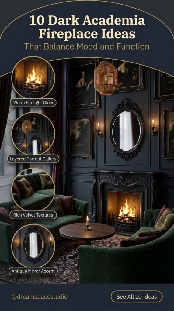
Introduction
A fireplace photo can lie in a quiet way. The room looks moody, the fire looks warm, the books look read. Then you copy the pieces and the room feels like a set: dark walls, dark furniture, a fire that warms nothing but the photograph. The gap is rarely the color. It is the decision underneath each fireplace — where people sit, where light comes from, which material gets to be loud, and which corners get left alone.
Dark academia, in these rooms, is not a costume. It is a set of habits: books within reach, wood that shows age, light kept low and in more than one place, and surfaces that look used. A fireplace fits that mood because it gives the room a reason to gather. The ten fireplaces below share a mood but little else. One leans on two sofas pointed at each other. One gives a single chair the whole wall. One lets firewood do the decorating. Each one carries a different lesson, and each lesson holds up without a renovation. Read them for the decision, not the shopping list, and the style gets easier to use in a room you already have.
Two Sofas Facing Each Other, With the Fire in Between
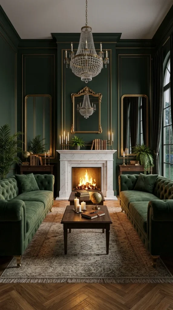
Deep green paneling covers the walls here, and a white marble surround cuts through it. Two green tufted sofas face each other across a wood coffee table, with a crystal chandelier overhead and a gilt mirror centered above the mantel, flanked by two tall side mirrors. The seating does the work. Two sofas pointed at each other turn the fireplace into something you sit around, not something you look at. The fire sits at the midpoint of a conversation, not at the end of a sightline.
The white marble matters because everything around it is dark green. Against paneled walls, a pale surround acts as a break in the color, so the fire becomes the room’s bright middle. Rooms that build their fireplace feature walls from one pale material against dark paneling get the same break without adding another color to the room.
The mirrors pull their weight too. The center gilt mirror and the two side mirrors throw chandelier light back into the room, so the corner stays lit even when the fire burns low. One honest tradeoff: pale stone near a working fire tends to show soot and scorch marks over time, and darker veining ages with less visible marking in that exact spot.
A Single Reading Chair Against a Wall of Carving
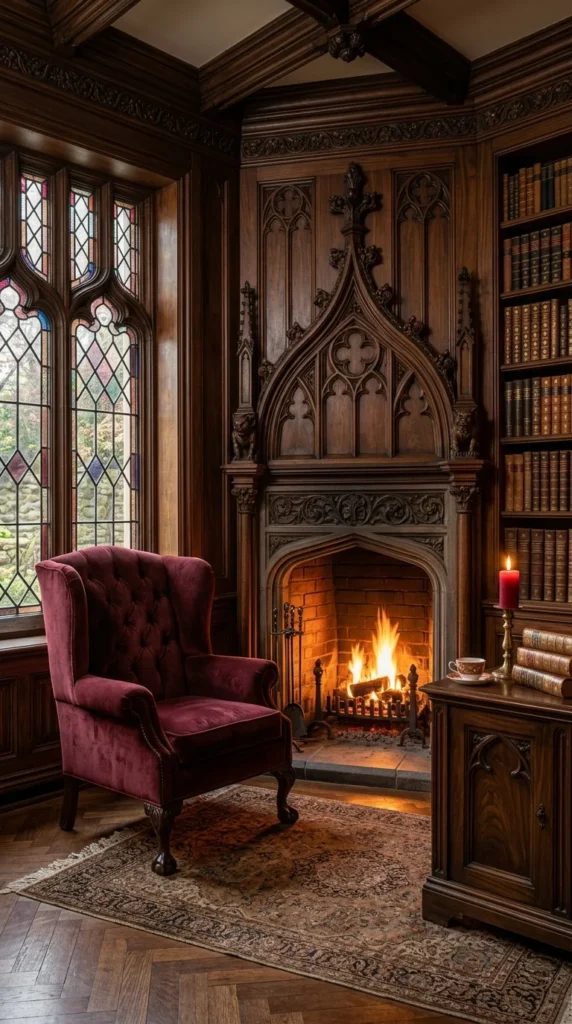
Carved wood covers this corner, pointed arches shape the windows and the mantel, and one burgundy velvet wingback sits angled toward the fire. Bookshelves fill the right wall, and a small wood cabinet holds a red candle and a stack of books. One chair, not a seating set. The room is built for one person reading beside a fire, and the carving gives that single chair a backdrop big enough to hold the wall.
The stained glass earns its place by changing through the day. Morning light through colored panes cools the corner; evening firelight warms it. The arch shapes repeat across window, mantel, and firebox, but they stay in the background. The chair stays the subject, and the room feels like a place to sit alone with a book rather than a place to entertain.
Carved grooves collect dust, so a corner like this asks for more frequent cleaning than a flat mantel would. If you want this corner to work as a reading nook, the chair and a small side surface matter more than the carving. A single arched mirror or a dark bookcase beside a plain fireplace can borrow the same vertical, book-lined feeling without genuine Gothic millwork.
Herringbone Brick Against a Wall of Straight Shelves
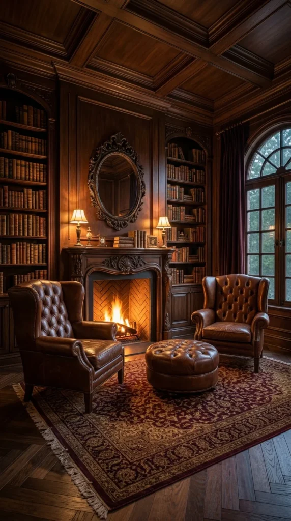
Two brown leather wingbacks face each other across a round tufted ottoman, with an oval mirror above the mantel and a lamp on each side. Floor-to-ceiling bookshelves frame the whole wall. The ottoman holds a tray or a pair of feet, and the lamps keep the corner usable after the fire dies down. Nothing here is complicated. The seating faces the fire, the shelves hold the wall, and the room works because each piece stays in its own lane.
Why the Brick Pattern Deserves a Second Look
The firebox is lined in herringbone brick, and that diagonal pattern is the one surface in the room that is not straight. Shelves, paneling, chair backs, and the mantel all run vertical or horizontal. The brick’s diagonal keeps the firebox from disappearing into the wood around it. It is a small patch of pattern, and it does the job precisely because it stays small.
The oval mirror returns lamplight into a corner that would otherwise go dark at the edges. In a smaller room, drop the ottoman to leave a walking path clear. The chairs and the fire still hold the corner without it.
A Room Lit Almost Entirely by Candlelight
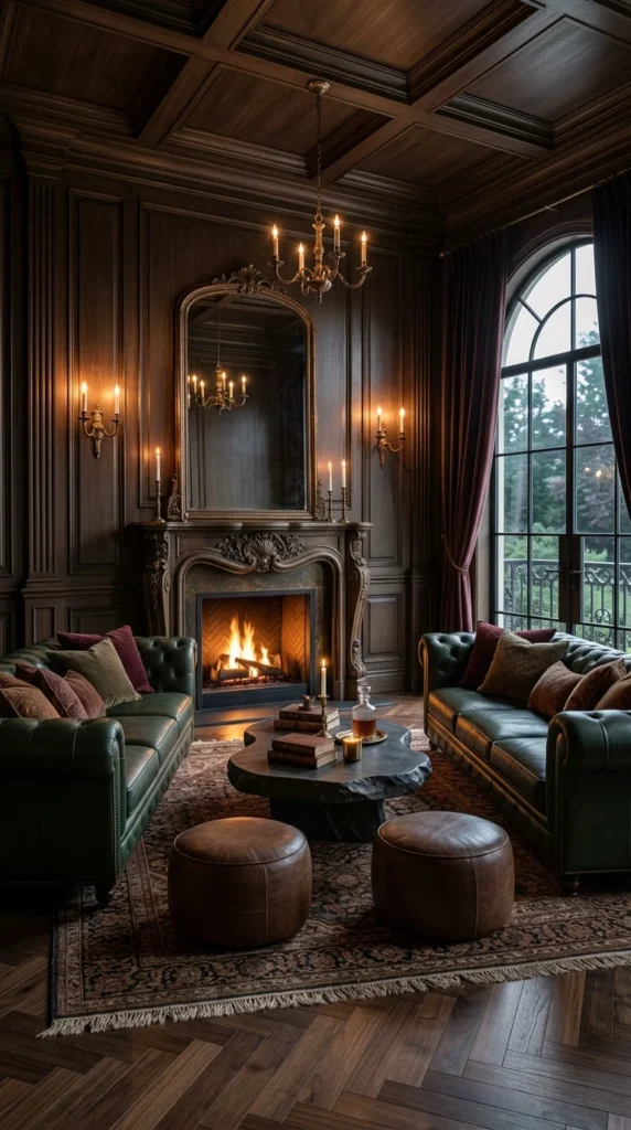
Two green leather sofas face each other across a raw-edge stone coffee table, with leather ottomans tucked at the sides and an arched mirror above a carved mantel. Sconces with candles flank the mirror, a chandelier with candles hangs overhead, and the fire adds a third flame. Light comes from flames and candles in several places, not from one overhead fixture. That spread stops the dark wood from going flat, and it lets the room stay readable after sunset without a bright ceiling light.
The stone table’s raw edge breaks the room’s straight lines. It is the one irregular shape in a room of matching sofas and matched sconces, and that single break keeps the space from feeling staged. A stone table this heavy is hard to move later, so confirm the walking path before placing one. Layered lighting ideas that mix candle, sconce, and fire keep a dark room readable after sunset, and this room shows why the mix matters more than any single fixture.
- Fire in the firebox, the warmest and least steady source
- Sconce candles flanking the mirror; reflection turns one candle into two points of light
- Chandelier candles overhead, spreading light across the seating
- The arched window, carrying daylight while it lasts
The arched mirror doubles the chandelier’s candlelight, so the room gets more from the flames it already has.
The Same Green, Twice: Once Framed, Once Alive
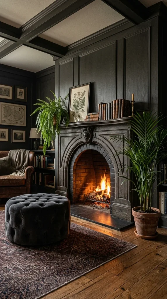
Charcoal paneling covers the walls, an arched brick firebox sits at the center, and green shows up twice: once in botanical prints on the mantel and the wall, and once in a trailing fern and a tall palm. The pairing looks unplanned because the two greens differ in shade and texture. The prints are flat and pale; the plants are glossy and deep. The room repeats one color without matching it, and that near-match is what keeps the corner from feeling decorated to a formula.
The matte charcoal walls absorb light, so the fire becomes the brightest point in the room. The arch curve and the tall palm pull attention upward. The corner avoids feeling boxed in, even with paneling running floor to ceiling. A dark tufted ottoman and a patterned rug hold the floor, and books stacked on the mantel leave the shelf looking used.
Plants near a working fire dry out faster than plants elsewhere in the room, so this spot needs closer watering attention than it looks like it does. Indoor plant styling that puts the tallest plant where the eye stops gives a dark corner a vertical line for free, and the fern here does that work from the mantel down.
Firewood Stacked Like It Belongs on Display
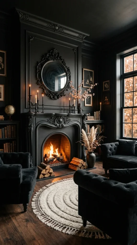
Nearly every surface in this room is black: paneled walls, a carved fireplace, velvet seating, a round ornate mirror. Firewood is stacked on both sides of the hearth, and those stacks do more than hold fuel. They fill two corners that would otherwise sit empty, and they signal warmth in parts of the room far from the flame. The wood’s rough ends and bark edges give the wall a texture that paint and velvet cannot, and the stacks cost nothing beyond the firewood itself.
The round ivory rug gives the eye one pale resting place on the floor, and the round mirror repeats that circle on the wall. Pale cherry blossom stems and pampas grass in dark vases do more than a full arrangement would, because their lightness shows clearly against black paneling. Black rooms that balance drama and warmth need one strong daylight source by day, or the mood closes in. This room has a big window, and that window carries the daylight half of the bargain.
One Swap This Black Room Could Use
The one change worth making sits outside the fireplace. A sheer layer on that big window would let daylight in without the hard glare on bright days, and it would stop the black paneling from going flat at noon. Everything else in the room already earns its place. The stacks hold the mood. So do the rug and the mirror. A soft filter on the window would let them hold it through the afternoon too.
Two Lamps Doing All the Evening Work
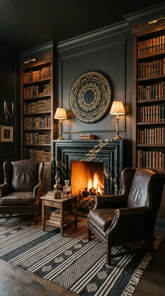
A black marble surround with gold veining stands between two floor-to-ceiling bookshelves, with a circular gold geometric artwork above the mantel and a table lamp on each side. Two brown leather wingbacks face the fire, and a small side table holds books and a decanter. No overhead fixture is doing the work here. The two lamps carry the evening, and the room is built around that fact.
Reading Light That Stays Off the Ceiling
Twin lamps put light at chair height, where books sit and hands rest. The marble’s gold veining does the decorating that carving would do in another room, trading ornament for raw material presence. Circles repeat across the artwork, the lamp shades, and the drawer pulls without matching exactly, and that loose repetition keeps the wall feeling settled rather than themed.
Dark honed marble shows fingerprints and firebox soot less than pale stone over years of use, which is a practical reason to choose it beyond the look. The side table matters too. Books and a decanter within reach turn the chairs into a place to stay, not a place to pose.
When Tall Windows Rescue a Wall Full of Portraits
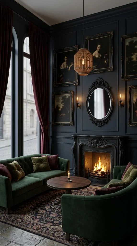
Portraits in gilt and dark frames crowd the wall above a carved fireplace, with an oval mirror at the center and a rattan pendant hanging in front of the group. Two green velvet sofas face each other across a round wood coffee table. Tall arched windows with burgundy curtains stand beside the seating, and a pale street view shows beyond them. The portraits crowd the wall; the windows give the room air. Without that daylight, a wall this full would press inward.
The rattan pendant breaks the formality of a salon-style hang. One warm woven shape against many gilt frames pulls the whole cluster back toward livable, and the oval mirror gives visitors one place to land before moving across the portraits. The green velvet leaves the seating feeling collected rather than somber against the deep blue-grey walls.
A dense hang needs planning, because uneven spacing and mismatched frame widths show fast once the work is up. Laying the frames out on the floor first makes spacing errors easier to fix than they are in drywall. The curtains stay heavy and dark, and the room can carry them because the windows stay tall and uncovered at the top.
A Mirror Frame That Matches the Mantel Carving
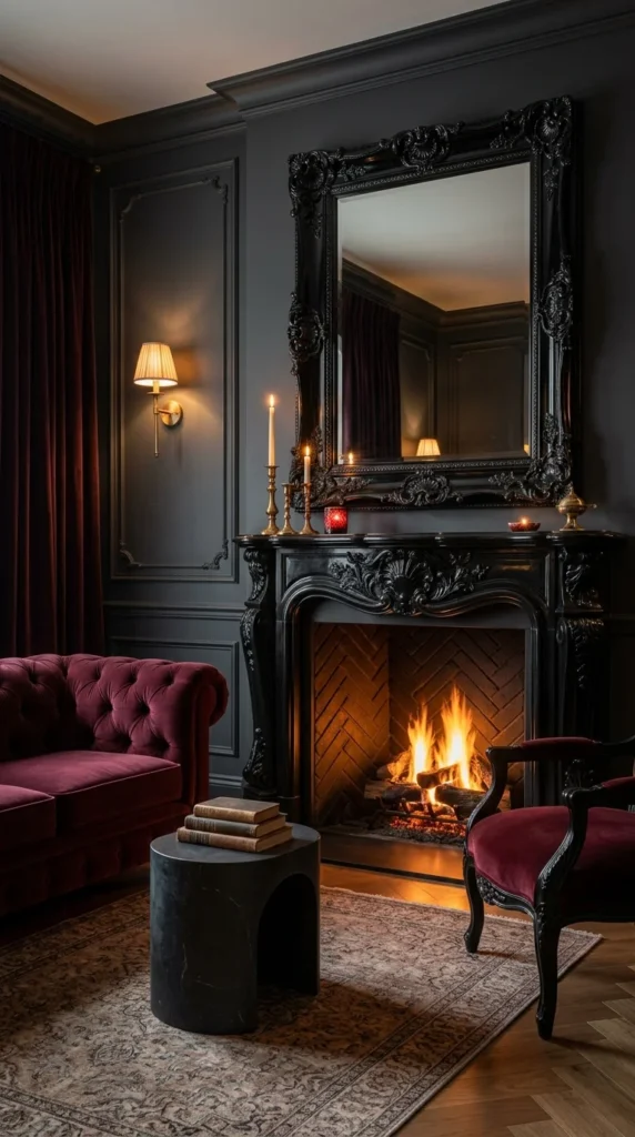
An oversized black ornate mirror hangs above a black carved mantel, with a burgundy velvet sofa on one side and a matching chair on the other. The mirror’s carved frame and the mantel’s carving look like one piece. The frame extends the mantel upward instead of sitting on it, so the whole wall reads as a single carved unit with a fire at its base. That continuity is the room’s main idea, and it works because the frame and the mantel share the same black finish and the same depth of carving.
The mirror catches the sconce flame, so one candle shows up twice. Burgundy velvet against charcoal paint feels formal but not cold, doing some of the warming work that candlelight does elsewhere in the room. The firebox is lined in herringbone brick, a quiet pattern that stays out of the mirror’s way.
- A low stone side table holds books and a drink at arm height
- The table’s dark cylinder breaks the vertical line of mirror, sconce, and curtain
- Its low height gives the room a low resting place near the floor
Wall mirror ideas that treat scale as the first decision stop a big mirror from swallowing the wall it hangs on. Here the scale is right because the mirror matches the mantel it stands on.
A Mantel Shelf That Looks Used Every Day
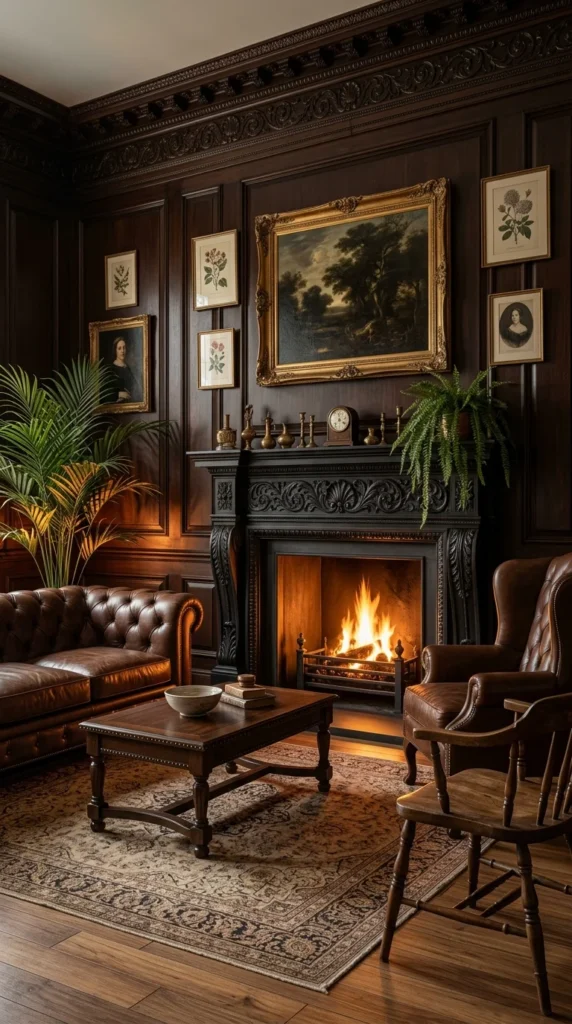
Dark wood paneling covers the walls, a black carved fireplace stands at the center, and a wide countryside painting in a gilt frame hangs off-center above the mantel. Smaller botanical prints and portraits fill the wall around it. Gold-toned candlesticks, a small clock, low vases, and books line the mantel edge. A brown leather sofa and a wingback face the fire across a wood coffee table, and plants flank the hearth on both sides.
The painting sits off-center above a tidy grid of smaller prints. The off-center hang breaks the grid without breaking the wall, and the gilt frame pulls focus before the smaller pieces flanking it register. The plants on both sides soften the paneling, and the leather seating gives the room a place to land after the wall has had its say.
The mantel itself is the section to copy. Candlesticks, a clock, vases, and books sit along its edge like objects that get handled, not styled once for a photo. Dark wood paneling gains a deeper patina over years rather than looking dated, while painted surfaces tend to show wear sooner. A shelf that looks used earns the room’s mood more than a shelf that looks arranged.
Frequently Asked Questions
Can a dark academia fireplace work with a gas or electric fire instead of wood?
Yes. The mood comes from seating, light, and materials, not from the fuel. A gas fire still gives a moving flame, and an electric insert still gives the glow. What changes is the side detail: no firewood stacks, no soot marks, and the mantel styling has to carry more of the warmth. Put the effort into lamps and the mantel shelf, and the corner still comes across the same way.
How do I style a mantel without it looking like a shop display?
Use fewer objects than you think, and let one of them look handled — a stack of books with a cracked spine, a clock that runs, a vase with water in it. Leave empty space between groups. If every inch holds something, the shelf looks like a display. If two or three groups sit with air around them, it looks like a shelf someone uses.
What if my fireplace wall is plain drywall with no carving or marble?
Start with paint and one big object. A dark accent color on the fireplace wall plus an oversized mirror or one large framed print gives the wall weight without construction. A painted MDF surround can borrow the shape of a mantel for far less than stone. The seating and the lamps do the rest.
Conclusion
The ten rooms agree on one thing: a fireplace earns its mood from a single clear decision, not from a full set of matching pieces. Two sofas pointed at each other. One chair given the whole wall. Firewood treated as decoration. A mirror that matches its mantel. Pick the decision that fits the room you have, let the rest stay plain, and the fire does what it does in every one of these rooms — it gives people a reason to sit down.
That restraint is also what makes the style affordable to try. These rooms tend to change one thing — seating, light, a rug, a mirror — and leave the rest alone. Start with the change that fixes the room’s weakest spot: seating if nobody sits there, light if the corner goes dark at night, a pale surface if the walls swallow the fire. One honest fix beats a full redo, and it leaves the room feeling lived in rather than decorated.
About the Author
The Aesthetic Life Team covers home decor and interior design, with a focus on rooms that look considered and live comfortably.

2 Responses