

Introduction
A walk-in closet is the first room that tests a house. Not the kitchen, not the entry — the closet, at seven in the morning, when you need one outfit and the room gives you a pile. Closet advice usually starts with buying more storage. The ten rooms below start somewhere else: with the one move that makes each layout work, whether that move is a mirror, a partition, an island, or a rug.
None of these rooms needs copying whole. Each one solves a particular problem — a corridor with no direction, a dark room with no plan for light, a bedroom with no spare square feet. Match your problem to a room below, take its one move, and leave the rest. That is the whole method here: one move per room, explained well enough to use on Monday morning.
A Vanity and an Ottoman Doing the Room’s Real Work
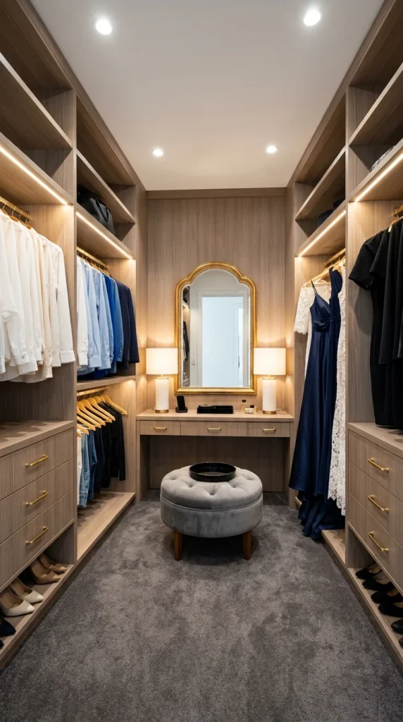
Wood shelving lines both walls of this closet, with a vanity set into the far wall: an arched gold mirror, two lamps, and a low drawer unit. A round grey ottoman sits in the middle on grey carpet. Clothes hang on both sides — pale shirts and creams on the left, blues and blacks on the right — with shoes lined up on low shelves below.
The vanity and the ottoman are the room’s working pair. The vanity gives the room a place to finish getting ready, and the ottoman gives it a place to sit while doing it. Without those two pieces, the closet would be a corridor with clothes. With them, it is a room you can stand in, sit in, and finish in.
- One tray for the things that land there daily — keys, watch, earrings
- Drawers kept for grooming, not for overflow storage
A vanity like this borrows its logic from dressing table designs that treat the mirror as a workstation, not a decoration. Give it a job, and it stays clear. Leave it jobless, and it becomes the room’s junk drawer.
Getting Dressed Without Leaving the Bedroom
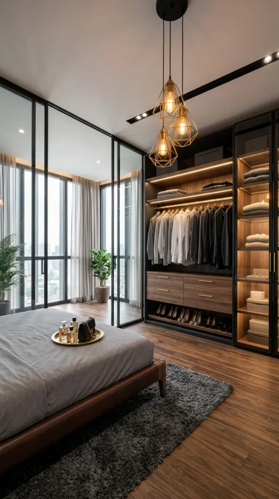
A black-framed glass partition separates the sleeping area from the dressing wall in this room. The bed sits a few feet away on wood flooring, and a dark wood wardrobe fills the far wall end to end, with lit shelves, hanging clothes, and drawers. Cage-style pendant lights hang over the bed side. There is no closet door. There is no closet room.
- Dressing becomes a single stretch of movement — no trip to another room, no belt left behind
- The bedroom keeps its long view, so the room feels whole
- The wardrobe becomes bedroom decor, so its colors have to behave
The price is honesty. Everything on the open shelves is on show all the time. This layout looks calm because the clothes hold to a tight palette — neutrals, greys, soft whites. A colorful, overflowing wardrobe would crowd the bedroom instead. The discipline is the design: fewer colors, folded stacks, and nothing left on the floor.
An Island That Gives the Room a Landing Surface
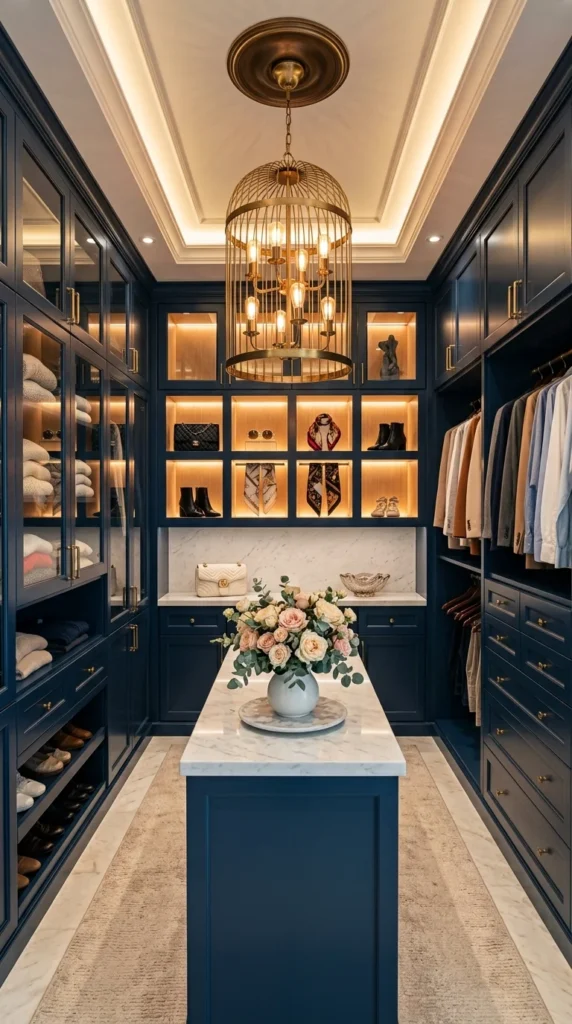
Navy cabinetry wraps this closet, and a navy island topped with white marble stands in the middle of the room. Behind it, backlit niches hold handbags and scarves, plus boots, behind glass. A brass birdcage chandelier hangs above the island, and a vase of flowers sits on the marble. Nothing else in the room offers a clear place to lay things out.
Why a Flat Surface Matters More Than Another Drawer
You lay out an outfit on the island and decide there. Without it, the bed or a chair does that job, and clothes pile up wherever they land. The island gives the room a place for decisions — lay it out, look at it, change it — and that pause is what makes the room a dressing room, not just storage. The island’s drawers take the pieces that don’t get hung; the tall cabinets take everything else.
The storage logic here borrows from kitchens: deep drawers, tall cabinets, open niches for the pieces worth seeing. The same thinking shows up in what makes a pantry actually functional — landing surfaces, visible stock, and a place for everything to go back to.
Upkeep is the honest cost. Marble marks easily, glass shows every smear, and the lit niches had to be planned into the build, not added later. This room suits someone who likes the ritual of dressing and does not mind the wiping.
A Daybed Taking the Place of a Whole Wall
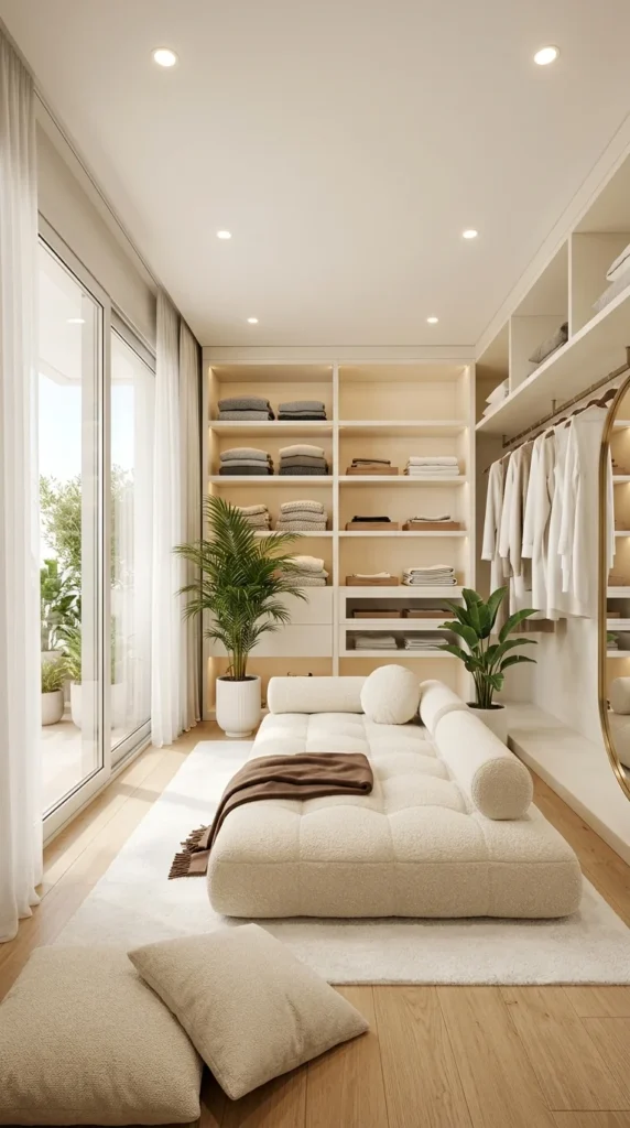
A cream tufted daybed stands at the center of this white dressing room, with cylindrical cushions, a brown throw, and floor pillows at its base. Sheer curtains wrap the glass doors, and daylight floods the room. Open cubbies hold folded stacks, and two leafy plants soften the straight lines. The closet is arranged around the daybed, not the other way around.
- Costs: a full wall of shelving, traded away for one seat
- Buys: a place to sit, a surface to lay an outfit on, and a room that feels calm at seven in the morning
Light fabrics are the other cost. Cream fabric marks fast where shoes and bags pass through daily. This layout works when the wardrobe is trimmed back or kept elsewhere too. Borrow it when mornings feel rushed and the closet is part of the problem — a comfortable seat and good daylight add no storage, but they change how the whole routine feels.
Two Moves That Stop a Corridor From Feeling Like a Hallway
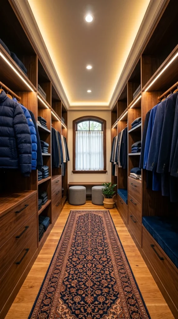
Walnut cabinetry with brass hardware runs down both sides of this long, narrow closet, with LED strips under the shelves. A patterned navy runner covers the floor for the full length of the room. An arched window with a sheer curtain closes the far end, with two round stools and a plant beneath it. The room is a corridor, and it knows it.
Two moves fix the corridor problem. The runner gives the room one continuous line to follow from door to window. The window gives that line a destination. Without the runner, the room would feel like a hallway. Without the window, it would feel like a dead end. Together, they turn a walk-through into a walk-toward.
The patterned wool underfoot does quiet practical work: pattern forgives dust and lint between cleanings, which helps where fibers shed all day. The walnut and brass repeat down both sides in near-mirror symmetry, and that repetition holds a long room together. The bench on the right side is the one spot wide enough to pause, and two round stools under the window give the corridor a place to sit and pull on shoes without blocking the walkway — though two people dressing at once will still bump elbows along the runner.
Stone on Every Surface, Clothes Kept Quiet
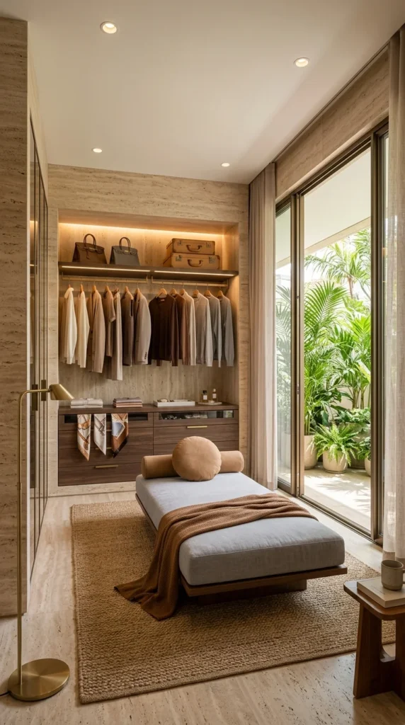
Warm textured stone covers the walls of this dressing nook, with an open hanging rail, a low drawer unit, and a backlit shelf holding handbags and suitcases. A daybed with a grey cushion and a tan throw sits in the middle, and glass doors open to greenery. The wardrobe hangs in cream and tan, with brown — colors that match the stone instead of competing with it.
A single strong material, used hard on one surface, can do the work of five smaller ideas. The stone does the visual work here, so the rail, the drawers, and the daybed can stay plain. The garden view helps too: glass doors to real greenery stop the nook from feeling shut in.
The palette stays earthy on purpose. Rooms that follow earthy bedroom ideas for a warm, cozy, natural retreat work the same way — let the material set the color, and let the clothes follow it. That calm holds while the wardrobe stays limited and color-matched. Clashing colors would turn the stone into a busy background.
Hats on Hooks, Baskets on Shelves
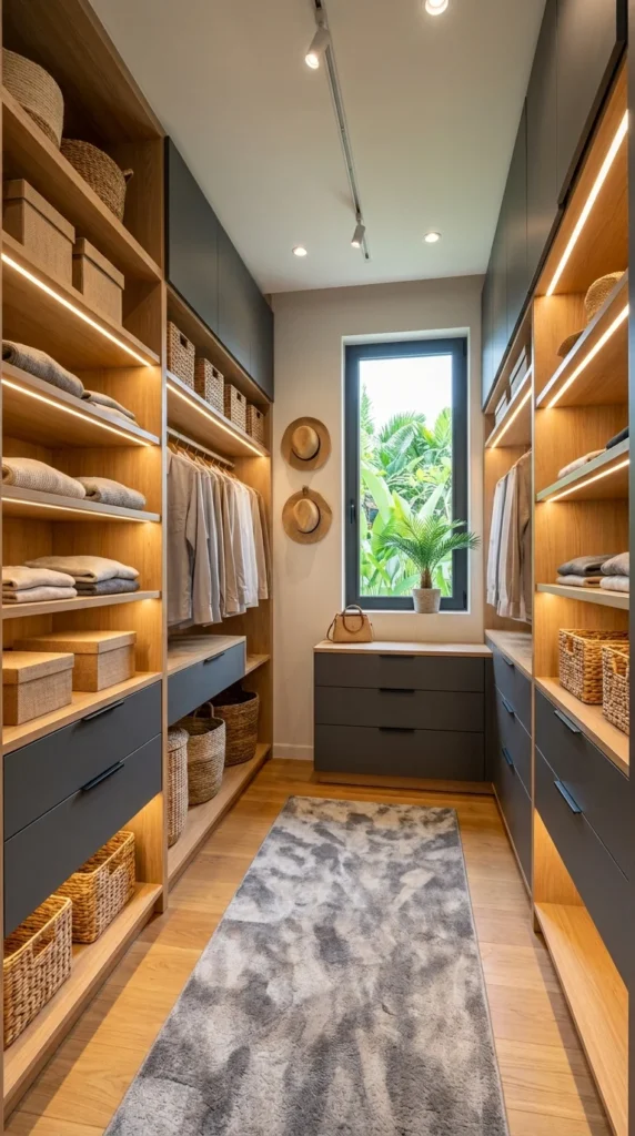
Oak shelving lines both walls of this closet, with woven baskets and boxes on nearly every shelf, charcoal drawer fronts, and under-shelf LED strips. A window at the far end looks onto green leaves, with two straw hats hung on the wall beside it and a small handbag on the sill. A grey patterned rug covers the floor. Closed storage is nearly absent here, and nobody misses it.
The Hook Solves the Hat Problem
A hat folds badly, stacks worse, and slips off a shelf the moment you turn away. A hook on the wall gives each hat a spot, and puts an empty stretch of wall to work. It is the smallest idea in the room, and the one that pays off daily.
Then the baskets take over. The same woven boxes appear on shelf after shelf, so a shelf of mixed odds and ends looks like one tidy choice. The material mix — warm oak, matte charcoal, rough rattan — works because none of the three fights for attention. The tradeoff is dust: open baskets give up their contents at a glance and a reach, but they do not shield contents the way a closed drawer does. Daily items belong here; seasonal storage belongs behind a door.
A Skylight and a Lit Niche Sharing the Work
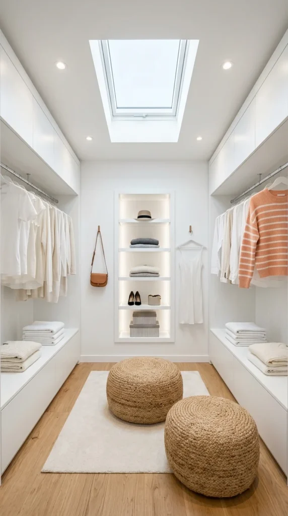
A skylight drops daylight down the center of this white closet, with white cabinetry, white walls, and white clothing on both sides. Two jute poufs sit on a white rug over wood flooring. A backlit niche in the far wall holds a hat and folded knits, plus shoes and handbags, like a small gallery. The palette barely exists, and that is the point.
The skylight and the niche split the job. Daylight handles the middle of the day, and the lit niche handles the edges — the hat, the shoes, the bag you need tonight. Against all that white, a single orange-striped sweater draws every glance. In a quiet room, one strong color carries far.
- Check key pieces under evening light too — a skylight shifts how colors look as the day moves
- Wipe cabinet fronts at handle height — white shows scuffs faster than a mid-tone finish
The room’s minimal palette and wood floor follow the same line as japandi bedroom design for a minimalist, cozy retreat — little color, honest materials, and light doing the main share of the work.
Black Cabinets With Warm Wood Inside Every Door
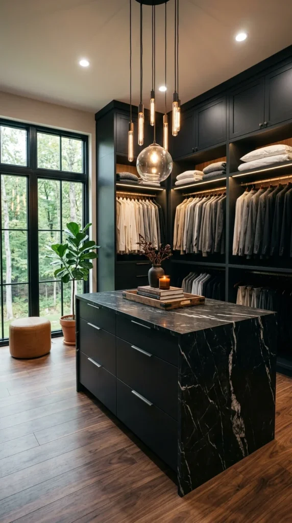
Matte black cabinetry wraps two walls of this closet, with a veined black marble island at the center and pendant bulbs hanging at staggered heights above it. A big window looks onto green trees, and a fiddle-leaf fig stands beside it. The wardrobe sticks to cream and grey, with black. The island holds deep drawers, and a tray with books and a candle sits on top.
Open a cabinet and the inside tells the real story. Inside, the shelves wear a warm wood lining that catches the light each time a door opens. That lining is what stops the black from feeling like a box. The black does the outside work — calm, uniform, quiet — and the wood does the inside work, warming the moment you reach for something.
Matte black asks for wiping. Water spots show, dust shows, and the marble top needs sealing and a soft cloth. If the closet runs small, dark, or shared with someone whose wardrobe runs wild, a dark palette will punish you daily. The room has to earn the black first — with a big window or genuinely generous light — and the light has to come before the color.
A room this dark leans on its light. Pendants at staggered heights, recessed spots, and a big window share the load, and no one source could carry it alone. The clothes stay disciplined for the same reason: an all-black room with a multicolored wardrobe would work against itself.
The black-and-wood pairing follows the same logic as black and brown bedroom decor for small and large rooms — dark finishes outside, warm wood where the eye lands, and the pairing doing the decorating.
Shoes and Drawers at Floor Level, Color Above
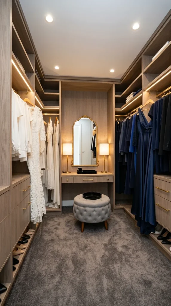
Wood shelving lines both walls of this closet, with an arched gold mirror and a vanity set into the far wall and a round grey ottoman in the middle. Ivory lace dresses hang on the left, deep navy gowns on the right, and shoe rows tuck under the hanging rods on both sides. Drawers sit under the shelves, and the carpet is grey.
Color does the organizing here. Ivory on one side, navy on the other, mirror in the middle — the room splits into two color families with a boundary line between them. Getting dressed starts by picking a side: tonight, the navy side. The mirror sits on the boundary, so each half feels like its own zone.
The floor level does the quiet work. Shoe rows under the rods keep footwear visible without a separate unit, and drawers under the shelves hold the small things that would otherwise drift onto the vanity. Color gets the attention; the floor level gets the function. The tradeoff is real: color sorting is quick when you want a white top, and slow when you want one particular navy blouse hidden among ten near-identical ones.
Frequently Asked Questions
How do I keep an open-shelf closet tidy without daily effort?
Edit first, then contain. Open shelves stay calm when the wardrobe behind them is small and roughly color-matched. Baskets and boxes give every category a home, and a five-minute reset at night beats a weekend overhaul. If a shelf slides into chaos, it is holding too much — move the overflow behind a closed door and let the shelf breathe.
What do I do when two people share one walk-in closet?
Split the room, not the shelves. Give each person one side and one stretch of rail, with a mirror or an island as the boundary. Shared drawers fail; separate drawers hold. Agree on one rule — nothing on the floor, nothing on the other person’s side — and the room stops being a negotiation.
Should the closet match the bedroom, or can it have its own color?
It depends on the door. A closet with a door can be any color you like — nobody sees it unless you open it. A closet that opens straight off the bedroom, or sits behind glass, shows in the bedroom, so its color has to get along with the bedroom’s. When in doubt, match the wardrobe’s colors to the bedroom’s, even if the cabinetry differs.
Conclusion
Every closet here answers three questions: can you see what you own, can you reach it without a step stool, and is there somewhere to set things down? The mirror answers the first. The island answers the third. The baskets, the rails, and the drawers answer the second. A closet that answers all three feels finished, even if it is small.
Start with the question your closet fails. If you cannot see what you own, add light and a mirror. If you cannot reach it, move the daily pieces to rail height and the rest behind doors. If you have nowhere to set things down, add a bench, an ottoman, or an island. One fix, aimed at the right question, does more than a full refit aimed at none.
About the Author
The Aesthetic Life Team writes about home design for real rooms — the layouts, storage, and light that hold up on ordinary mornings.

