
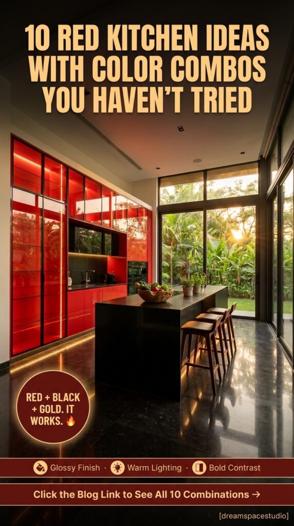
Red doesn’t do subtle, and that’s exactly the point. Across these ten kitchens, the color shows up as glossy lacquer, backlit glass, a single retro fridge, even a hand-painted floral wallpaper—proof that “red kitchen” isn’t one look but a whole range of moods, from sleek and architectural to warm and collected. Here’s what makes each of these rooms work and how to figure out which version of red actually belongs in your own kitchen.
Quick Overview
| Style | Red / Bold Color Kitchen |
|---|---|
| Best For | Kitchens ready for a genuine statement color |
| Budget | Low–High (paint to full custom lacquer cabinetry) |
| Difficulty | Easy–medium, mostly a cabinetry and finish decision |
| Maintenance Level | Medium (gloss finishes show fingerprints and dust) |
When the Kitchen’s Red Doesn’t Stop at the Doorway
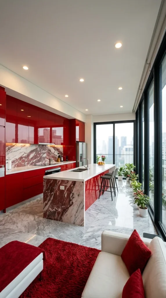
Glossy red cabinetry and a red-veined marble island don’t stay contained to the kitchen here—a red shag rug and red throw pillows on the adjoining sofa carry the same color straight into the living space, so the whole open-plan room reads as one continuous color decision.
This is red used as a genuine whole-space strategy, not just a kitchen finish. Extending the palette past the kitchen’s own footprint and into the connected living area is what keeps a color this bold from feeling like an isolated design choice—instead, the whole floor plan commits together.
It suits open-plan homes where the kitchen and living area share sightlines, since the whole effect depends on being able to see both spaces at once and register them as one cohesive statement. It’s a poor fit for a fully separated, closed-off kitchen, where there’s no adjoining room to extend the color into.
The lifestyle fit is someone who wants their whole main living floor to feel intentional and coordinated, not treated as separate rooms with separate palettes. Its strongest advantage is that it makes a bold color choice feel considerably less risky—when red appears in more than one room, it reads as a deliberate design language rather than a single loud decision that might not age well.
The compromise is that committing this much square footage to one saturated color is a bigger design decision than confining red to cabinetry alone, and it’s genuinely harder to walk back later if your taste shifts. To simplify for a smaller budget, keep the kitchen cabinetry red but limit the living room’s red to just one or two textiles—a single rug or a pair of pillows—rather than a full furniture and rug commitment.
The most common mistake is choosing two different reds for the kitchen and living room that don’t actually match—a warm brick red cabinet paired with a cooler, more crimson-toned rug will read as a mismatch rather than a coordinated palette.
One practical recommendation: bring a cabinet door sample or paint chip with you when shopping for rugs or upholstery—matching red tones in person, under the same lighting, is far more reliable than trying to match from memory or a photo.
Why the Marble Keeps This Room From Feeling Like Too Much
The red-and-white veined marble on the island and backsplash is doing important work here—its pattern breaks up what would otherwise be a very large expanse of flat, solid red, giving the eye some visual texture to rest on. White countertops throughout the rest of the kitchen provide additional breathing room, so the red cabinetry reads as bold rather than overwhelming.
💡 Small Space Tip: If extending red into an adjoining room feels like too much, a single piece—one accent chair or a runner rug—placed just past the kitchen’s threshold still creates a visual bridge between the two spaces.
Recommended Materials: High-gloss lacquer (cabinetry) · Red-veined marble (island, backsplash) · White quartz (perimeter countertops) · Polished marble (flooring) · Cotton-blend upholstery (living room seating)
Main Colors: Deep Red · White · Warm Marble Veining
Best Lighting: Recessed ceiling lights keep the room evenly lit without competing with the glossy cabinetry’s natural reflectivity—floor-to-ceiling windows supply strong natural light throughout the day in this setup.
Maintenance Note: High-gloss red lacquer shows fingerprints and water spots more readily than a matte finish—a daily wipe-down with a soft microfiber cloth keeps the sheen looking intentional.
This kind of confident, color-carried-through-the-floor-plan approach pairs well with our roundup of maximalist living room ideas, which explores the same whole-space commitment to bold color and pattern.
Where This Look Falls Apart
- Choosing two different, mismatched shades of red for the kitchen and adjoining room
- Skipping a daily wipe-down routine, letting high-gloss lacquer show fingerprints and dust
- Overcommitting to red in a fully closed-off kitchen with no adjoining space to extend the color into
- Losing the white marble’s breathing room by adding too many additional bold colors
A Circular Skylight Over a Sculpted Red Island
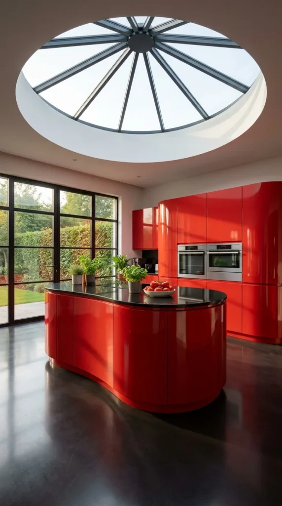
A round skylight, its steel frame radiating outward like spokes, floods this kitchen with natural light directly onto a glossy red island with a genuinely curved, organic silhouette—no straight edges, no sharp corners, just one continuous sculpted shape.
The defining move is pairing architectural drama overhead with an equally sculptural piece of cabinetry below it. Most kitchens treat the ceiling and the island as separate design decisions; this one makes them feel like they were conceived together, with the round skylight’s shape echoed loosely in the island’s own soft, rounded curves.
It suits kitchens with the ceiling structure and budget to support a genuine skylight installation, since the whole effect depends on that architectural intervention, not just the cabinetry choice. It’s a strong fit for a single-story addition or a home already undergoing a significant renovation, where adding a skylight is a natural extension of the existing scope.
The lifestyle fit is someone who wants their kitchen to feel genuinely sculptural and architect-designed, not simply decorated. Its strongest advantage is the quality of natural light a round skylight delivers—it changes throughout the day in a way no window alone can replicate, constantly shifting the room’s mood.
The compromise is significant cost: a structural skylight of this size is a real construction project requiring careful waterproofing and framing, well beyond a standard renovation’s typical scope, and a curved cabinet carcass for the island adds further fabrication cost on top of that. To simplify for a smaller budget, keep a standard rectangular island in the same glossy red finish and add a smaller, simpler skylight or a large clerestory window instead of the full round dome.
The most common mistake is under-budgeting for a skylight’s waterproofing and structural framing, treating it as a simple ceiling cutout rather than the significant construction project it actually is.
One practical recommendation: if a full round skylight isn’t feasible, even a rectangular fixed skylight positioned directly above the island captures much of the same dramatic top-down lighting effect at a lower structural cost.
Is a Sculptural Island and Skylight Combination Worth the Investment?
Here’s an honest take: a curved cabinet carcass and a structural round skylight together represent one of the more expensive combinations in this entire guide, and neither is necessary to achieve a striking red kitchen. But together, they create something genuinely difficult to replicate any other way—a kitchen that feels sculpted as a single architectural gesture, with light and form working in concert rather than as separate decisions. If the scope feels like too much, start with the skylight alone over a simpler rectangular island; the lighting effect is the harder element to fake, while a curved cabinet front is something you can always add in a later renovation phase.
Why Black Countertops Ground This Much Curve and Light
A black countertop on the island provides real visual weight and contrast against both the glossy red cabinetry and the bright skylight above, keeping the room from feeling like it’s floating away entirely into light and color. Dark polished concrete flooring throughout the rest of the kitchen extends that same grounding effect, giving the eye a stable, neutral base beneath all the room’s brighter, more sculptural elements.
Recommended Materials: High-gloss lacquer (curved island, cabinetry) · Black stone (countertops) · Structural glass and steel (skylight) · Polished concrete (flooring) · Stainless steel (built-in ovens)
Main Colors: Deep Red · Black · Natural Skylight White
Best Lighting: The round skylight is the room’s primary light source during the day, changing character with the sun’s position—supplement with simple recessed downlights for evening use rather than competing statement fixtures.
Common Mistakes With a Skylight-Anchored Kitchen Like This
- Under-budgeting for the skylight’s structural framing and waterproofing requirements
- Choosing a light-colored countertop that washes out under the skylight’s strong overhead light
- Skipping proper glare management, leading to an uncomfortably bright midday kitchen
- Attempting a curved cabinet carcass without a fabricator experienced in non-standard shapes
When Red Is the Accent, Not the Whole Kitchen
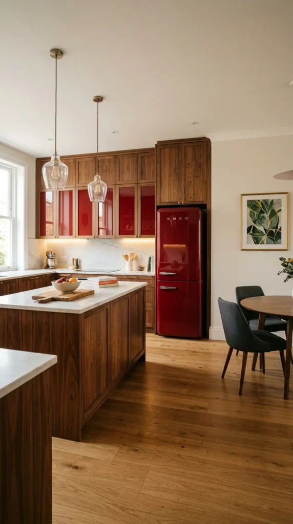
Rich walnut cabinetry sets a warm, classic tone throughout this kitchen, and red only appears in two carefully chosen spots—glass-front upper cabinets and a retro-style red refrigerator—proving the color doesn’t need to cover every surface to make an impression.
This is the most restrained, accent-only approach to a red kitchen in this entire guide. Rather than committing the whole cabinetry run to red, this kitchen uses the color the way a good outfit uses a bold accessory: sparingly, in exactly the right places, so it reads as a deliberate styling choice rather than an overwhelming commitment.
It suits readers drawn to warm, classic kitchens who still want a genuine pop of personality without going fully saturated. It’s a particularly smart direction for anyone nervous about committing to red at full cabinetry scale or for a kitchen where the existing wood tones are worth preserving rather than covering up.
The lifestyle fit is someone who wants their kitchen to feel timeless and collected, with just enough unexpected color to keep it from reading as purely traditional. Its strongest advantage is flexibility—because red only appears in two swappable elements (the fridge and the cabinet glass), this look is far easier to adjust or tone down later than a kitchen built entirely around red cabinetry.
The compromise is that this approach delivers a much gentler visual impact than the fully saturated kitchens elsewhere in this guide—if you want maximum drama, this isn’t the direction to choose. To simplify further, skip the red glass cabinet inserts and let the retro-style refrigerator alone carry the entire red accent—it’s a single, contained purchase that still delivers real personality.
The most common mistake is choosing a red refrigerator in a tone that doesn’t match the red glass cabinetry nearby, creating an accidental mismatch rather than a coordinated accent.
One practical recommendation: a retro-style colored refrigerator is one of the lowest-commitment ways to test whether you actually like red in your kitchen before investing in cabinetry—it’s a single appliance purchase, fully reversible if your taste changes.
A Lesson in Restraint Worth Borrowing
Everything about this kitchen’s base palette—warm walnut cabinetry, white marble countertops, brass pendant lighting—stays deliberately classic and neutral, which is exactly what makes the two red elements pop as clearly as they do. If even half the cabinetry were red, the fridge and glass inserts would lose their status as a special, considered accent and just blend into a busier overall palette.
Recommended Materials: Solid walnut (cabinetry) · Glass-front cabinet doors (red-backed) · White marble (countertops, backsplash) · Retro enamel (refrigerator) · Brass (pendant lighting)
Main Colors: Walnut Brown · Cream White · Red (accent only)
Best Lighting: Simple brass pendant lights with warm-white bulbs suit this kitchen’s classic, understated character—avoid dramatic or colored lighting, which would compete with the deliberately quiet base palette.
For readers who love this warm, retro-accented direction, our roundup of vintage 1950s kitchen ideas explores several other kitchens built around a similar classic-meets-retro-appliance approach.
Easy Ways to Get This Restrained Look Wrong
- Choosing a red refrigerator tone that doesn’t match nearby red accents
- Adding too many additional red elements, diluting the intentional “just two spots” restraint
- Pairing warm walnut with cool-toned countertops that clash with the wood’s natural warmth
- Skipping proper appliance ventilation clearance when fitting a retro-style refrigerator into an existing cabinet run
An Egg Chair, a Koi Pond, and a Kitchen That Doesn’t Take Itself Too Seriously
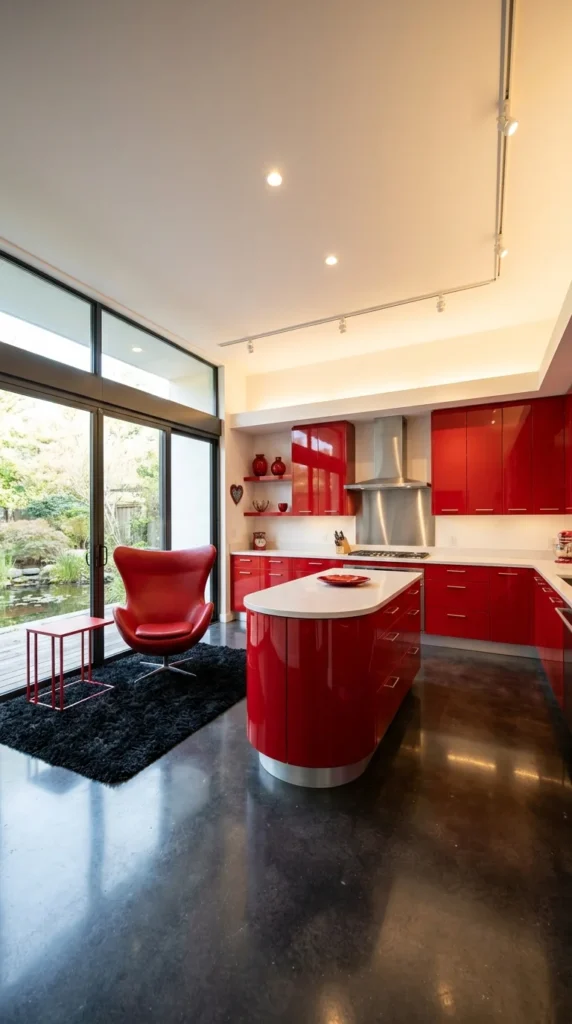
A red leather egg chair sits on a black shag rug in the corner of this kitchen, angled toward a full glass wall overlooking an indoor-adjacent koi pond—furniture and view working together to turn a functional cooking space into somewhere worth lingering.
The defining idea is treating one corner of the kitchen as genuine lounge space, complete with a statement mid-century-style chair, rather than dedicating every square foot to cabinetry and counters. Pairing that seating corner with a view onto water and greenery makes the whole kitchen feel less purely functional and more like a room to actually spend time in.
It suits larger kitchens with enough floor space to dedicate a genuine corner to seating beyond the standard island stools, and ideally a view worth sitting toward—a garden, a pond, or simply good natural light. It’s a strong fit for a home that already treats outdoor and water features as part of its everyday living experience.
The lifestyle fit is someone who wants their kitchen to double as a casual retreat, not just a cooking zone passed through on the way to somewhere else. Its strongest advantage is that a single statement chair does an enormous amount of personality work for very little added square footage or renovation complexity.
The compromise is that dedicating real floor space to a chair rather than an additional counter or storage is a genuine functional trade-off in a working kitchen—it’s a choice that prioritizes atmosphere over maximum practicality. To simplify for a smaller budget, skip the designer egg chair specifically and use any comfortable accent chair in a similarly bold red—the corner-lounge idea works regardless of which exact chair fills it.
The most common mistake is placing a lounge chair directly in a kitchen’s main traffic path, where it becomes an obstacle rather than a genuine destination.
One practical recommendation: if your kitchen doesn’t have a water feature or garden view to angle the chair toward, orient it toward the best natural light source in the room instead—the corner still reads as a deliberate retreat even without a dramatic outdoor view.
Why a Black Rug Works Harder Than It Looks
The black shag rug beneath the egg chair does two things at once: it visually separates the lounge corner from the kitchen’s working zones, and its dark, textural surface makes the red chair pop even more clearly against it than a plain floor would. Track lighting overhead, rather than fixed recessed cans, lets light be aimed specifically at both the cooking zone and the seating corner independently—a small detail that supports the room’s dual function.
Recommended Materials: High-gloss lacquer (kitchen cabinetry) · Leather (accent chair) · Wool shag (area rug) · Stainless steel (range hood, appliances) · Quartz (countertops)
Main Colors: Bright Red · Black · White
Best Lighting: Adjustable track lighting lets you direct light toward the cooking zone during meal prep and dim or redirect it toward the lounge corner for a more relaxed evening mood.
Readers with a garden water feature of their own may enjoy our koi pond design guide, which explores several ways to bring a pond view into daily living spaces like this one.
Where People Get This Setup Wrong
- Placing a lounge chair directly in the kitchen’s main traffic path
- Choosing a chair color that clashes with, rather than complements, the cabinetry’s exact red tone
- Skipping adjustable lighting, leaving the seating corner either too dim or too harshly lit
- Underestimating the floor space a genuine lounge corner requires beyond standard kitchen clearances
Red, Florals, and a Jungle of Plants Sharing One Room
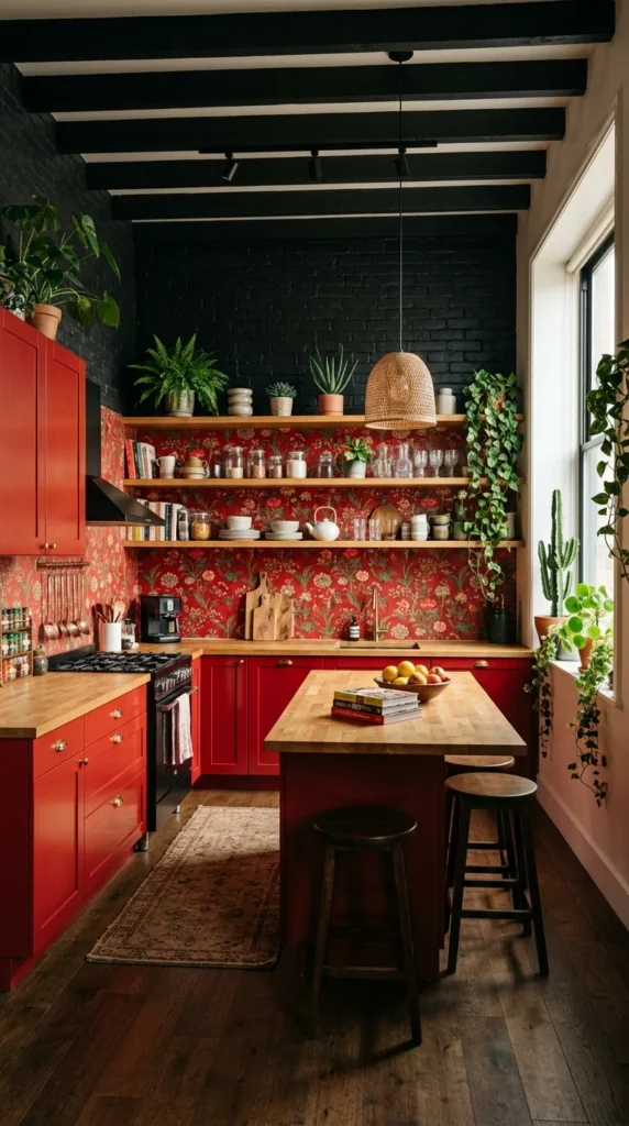
Red shaker cabinets sit beneath open wood shelving and a densely floral wallpaper backsplash, while black ceiling beams and a genuine crowd of houseplants fill in every remaining surface—this kitchen layers pattern, color, and greenery with real confidence.
This is red at its most eclectic and maximalist, built more like a well-loved, collected room than a single coordinated design scheme. Floral wallpaper, open shelving stocked with real cookbooks and glassware, and plants trailing from the windowsill all coexist because the room commits fully to a lived-in, gathered-over-time feeling rather than a showroom finish.
It suits readers who genuinely love pattern-on-pattern layering and don’t want a minimalist kitchen. It’s a strong fit for a smaller, cozier kitchen, since the density of pattern and greenery here works best in a contained space where everything can feel close and abundant rather than sparse.
The lifestyle fit is someone who cooks and entertains casually, wants open shelving for everyday use rather than hidden storage, and enjoys tending houseplants as part of daily life. Its strongest advantage is genuine warmth and personality—this kitchen reads as a real home, not a photo shoot, which is a harder feeling to achieve than pure visual polish.
The compromise is that open shelving and this much pattern require ongoing maintenance and styling discipline—dishes need to stay reasonably tidy since they’re always on display, and this many houseplants need real care to thrive rather than look neglected. To simplify for a smaller budget, apply the floral wallpaper to just the backsplash area rather than a full wall, and start with two or three hardy plants rather than the full jungle shown here.
The most common mistake is letting open shelving become genuinely cluttered rather than intentionally styled—there’s a real difference between “lived-in” and “messy,” and this look depends on staying on the right side of that line.
One practical recommendation: choose a wallpaper specifically rated for kitchen use, with a wipeable or moisture-resistant coating, since a backsplash location will inevitably face cooking splatter and steam over time.
The Black Ceiling Beams Are Doing More Than You’d Think
Painting the ceiling beams black, rather than leaving them a natural wood tone, gives the eye a clear stopping point at the top of the room—without that darker anchor, the floral wallpaper and red cabinetry below might feel like they’re competing for the room’s entire visual space instead of working together. The warm wood countertops and open shelving introduce a third material texture, which keeps this pattern-heavy room from relying on color and print alone to carry its personality.
Recommended Materials: Painted wood (shaker cabinetry) · Wallpaper (floral backsplash) · Open wood shelving · Butcher block (countertops) · Painted wood beams (ceiling)
Main Colors: Brick Red · Floral Multi-Color · Black · Warm Wood
Best Lighting: A single woven rattan pendant adds warmth without competing with the wallpaper’s busy pattern—natural light from the window supports the many houseplants clustered along the sill.
This kind of confident, pattern-layered kitchen pairs naturally with our roundup of maximalist funky kitchens, which covers several other rooms built around the same collected, no-rules approach.
Common Ways This Gets Misread
- Letting open shelving drift from intentionally styled into genuinely cluttered
- Choosing a non-wipeable wallpaper for a backsplash location exposed to cooking splatter
- Overwhelming a small kitchen with too many competing patterns without a grounding neutral
- Underestimating the ongoing care this many houseplants require to look thriving rather than neglected
Backlit Glass Cabinetry With an LED Glow
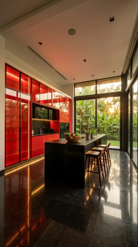
Red glass-front cabinets, lit from within by warm LED strips, glow like display cases rather than simply reflecting the room’s overhead lighting—paired with dark polished stone flooring and a tropical sunset view, this kitchen leans fully into mood and drama.
The defining feature is the backlit glass cabinetry itself, which transforms red from a surface color into something closer to a light source. Rather than depending entirely on external lighting to catch and reflect the cabinet’s glossy red surface, the LED strips built directly behind the glass make the cabinets glow on their own, day or night.
It suits readers who want a kitchen with genuine evening drama—this look is built to be seen after dark as much as during the day, when the backlighting effect reads most dramatically. It’s a strong fit for an open, high-ceilinged kitchen with large windows, since the daytime version of this room depends on that natural light balancing against the artificial glow.
The lifestyle fit is someone who entertains in the evening and wants their kitchen to set a genuinely moody, atmospheric tone rather than stay brightly, evenly lit. Its strongest advantage is versatility across the day—bright and functional during daylight hours, then transforming into something closer to a lounge or bar space once the sun goes down and the backlighting becomes the dominant light source.
The compromise is that backlit glass cabinetry is a specialized electrical and cabinetry installation, needing LED strips wired directly behind translucent or frosted glass panels—a meaningfully more complex build than standard solid cabinet doors. To simplify for a smaller budget, apply the backlit glass treatment to just a few upper cabinets near the range or sink, rather than the full run shown here, keeping the rest of the cabinetry in solid, non-lit red lacquer.
The most common mistake is choosing fully clear glass rather than frosted or translucent glass for the cabinet fronts, which shows the LED strip hardware itself rather than diffusing it into an even, ambient glow.
One practical recommendation: have an electrician confirm dimmer compatibility for the LED strips at installation—being able to adjust the glow’s intensity between a bright, functional cooking mode and a dim, atmospheric evening mode meaningfully extends how well this feature works across different times of day.
Why Dark Flooring Matters More Here Than in Most Kitchens
Polished black stone flooring throughout this kitchen reflects the glowing red cabinetry back up into the room, effectively doubling the backlighting’s visual impact without adding any additional fixtures. That reflective quality is a genuinely useful trick for any kitchen leaning into dramatic, glowing lighting—a matte or pale floor would absorb much of that same effect rather than bouncing it back.
Recommended Materials: Frosted glass-front cabinetry (with integrated LED) · High-gloss lacquer (solid cabinet sections) · Polished black stone (flooring) · Black stone (countertops, backsplash) · Wood (barstools)
Main Colors: Deep Red · Black · Warm Amber (LED glow)
Best Lighting: Warm-white LED strips behind frosted glass provide the room’s signature glow—pair with dimmable recessed ceiling lights so the room can shift between a bright, functional daytime mode and a moodier evening atmosphere.
Maintenance Note: LED strip drivers behind cabinetry occasionally need replacement over the fixture’s lifespan—confirm the installation includes accessible wiring rather than being fully sealed behind permanent glass, so future maintenance doesn’t require removing cabinet doors entirely.
Where This Look Can Go Wrong
- Choosing clear rather than frosted glass, exposing the LED hardware instead of diffusing its glow
- Skipping dimmer compatibility, losing the ability to shift between daytime and evening moods
- Pairing backlit cabinetry with a light, non-reflective floor that absorbs rather than amplifies the glow
- Sealing the LED wiring in a way that makes future strip replacement difficult
A Curved Retro Diner, Reimagined
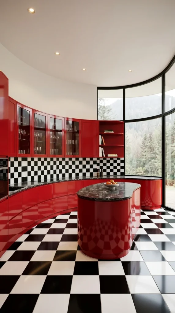
A gently curved run of red cabinetry wraps this kitchen’s perimeter, paired with a black-and-white checkerboard tile wall and floor that pulls the whole room straight out of a classic American diner—reinterpreted here with a more refined, architectural finish.
The defining move is combining a curved architectural cabinetry layout with checkerboard tile at full scale, rather than using the pattern as a small accent. Both the wall tile and the floor tile share the same black-and-white checkerboard, which is what gives this kitchen its unmistakable retro diner energy, while the curved glass window wall and glossy lacquer finish keep it feeling current rather than costume-like.
It suits kitchens with an open, curved floor plan or a genuine architectural willingness to move away from straight walls and standard rectangular layouts. It’s a strong fit for readers who love mid-century and retro references but want them delivered through a polished, high-end finish rather than literal vintage decor.
The lifestyle fit is someone who wants a kitchen with real personality and nostalgic warmth but styled with contemporary materials and craftsmanship rather than actual vintage furnishings. Its strongest advantage is that the checkerboard pattern and curved cabinetry together create an unmistakable, highly memorable identity—this is not a kitchen anyone would describe as generic.
The compromise is that a curved cabinetry run is a genuinely custom fabrication, and full-scale checkerboard tile across both walls and the floor is a substantial tile and labor investment on top of that. To simplify for a smaller budget, keep the cabinetry in a standard straight layout and apply the checkerboard pattern to just the floor, saving the more complex curved millwork for a future renovation phase.
The most common mistake is choosing checkerboard tile at an inconsistent scale between the wall and floor applications, which breaks the seamless, continuous pattern this look depends on.
One practical recommendation: work with a tile installer to plan the checkerboard’s exact starting point and grid alignment before installation begins—getting the pattern centered and consistent across a curved room is considerably more complex than a standard rectangular layout.
Black Marble Countertops Anchor All This Curve and Pattern
A black marble countertop, running the full length of the curved cabinetry, provides one continuous dark surface that visually settles the busy checkerboard pattern above and below it. Without that solid, unbroken material serving as a resting point, the combination of curved cabinetry and full-room checkerboard tile could easily tip from playful into overwhelming.
Recommended Materials: High-gloss lacquer (curved cabinetry) · Black-and-white checkerboard tile (walls and floor) · Black marble (countertops) · Glass and steel (curved window wall) · Glass-front upper cabinets
Main Colors: Bright Red · Black · White
Best Lighting: Simple recessed downlights keep the room evenly lit without competing with the checkerboard pattern’s own strong visual presence—natural light from the curved window wall supplements generously during the day.
What Trips People Up Recreating This
- Choosing checkerboard tile at inconsistent scale between wall and floor applications
- Attempting a curved cabinet layout without a fabricator experienced in non-standard shapes
- Skipping a solid, unbroken countertop material, leaving the room without a visual resting point
- Underestimating the tile planning required to keep the pattern centered around a curved layout
LED Strip Lighting as the Cabinetry’s Quiet Signature Detail
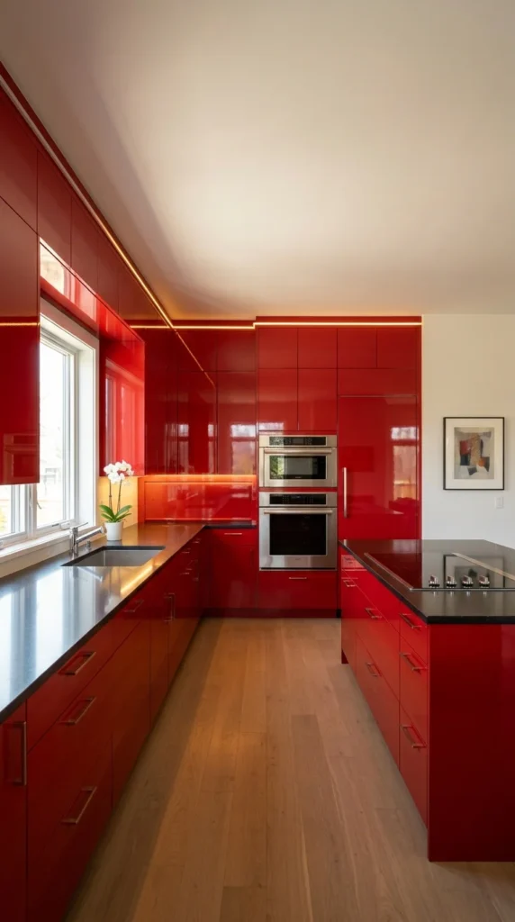
A thin strip of warm LED lighting traces the underside of the upper cabinets in this otherwise sleek, minimal red kitchen—a small, understated detail that adds a genuine glow without any of the more elaborate architectural moves seen elsewhere in this guide.
This is red delivered in its most streamlined, minimalist form. No pattern, no curves, no backlit glass—just clean-lined glossy red cabinetry, black countertops, and one quiet strip of integrated lighting doing all the room’s atmospheric work. It proves a red kitchen doesn’t need multiple bold gestures stacked together to feel considered.
It suits readers who want a genuinely modern, minimal kitchen and see red purely as a strong, confident color choice rather than a launching point for additional pattern or texture. It’s a strong fit for a smaller or more compact kitchen, since the streamlined cabinetry and single lighting detail keep the room feeling clean rather than visually busy.
The lifestyle fit is someone who prefers a pared-back, contemporary kitchen and wants color, not decoration, to carry the room’s personality. Its strongest advantage is how achievable it is relative to the more elaborate ideas in this guide—glossy red cabinetry and a simple LED strip are both realistic additions to a fairly standard kitchen renovation.
The compromise is that this look delivers a quieter, less dramatic impact than the more architecturally ambitious kitchens elsewhere in this list—if maximum visual drama is the goal, this minimalist approach won’t deliver it. To simplify further, the LED strip lighting alone is a relatively low-cost addition to any existing glossy cabinetry, making this one of the more accessible upgrades in the entire guide.
The most common mistake is choosing a cool-white LED strip instead of a warm-white one, which can make glossy red cabinetry look artificially cool and slightly clinical rather than warm and inviting.
One practical recommendation: if adding LED strip lighting to existing cabinetry, choose a dimmable strip specifically—the ability to adjust brightness matters more in a minimal kitchen where this lighting detail is doing more of the room’s atmospheric work on its own.
Why Simplicity Is the Whole Point Here
Every surface in this kitchen stays deliberately unadorned—no pattern, no mixed materials beyond cabinetry and countertop, no additional decorative lighting fixtures—which is exactly what lets the red color itself, rather than any applied decoration, be the room’s entire statement. The warm wood flooring is the only material that breaks from the room’s black-and-red palette, softening what could otherwise feel like a fairly cool, hard-edged space.
Recommended Materials: High-gloss lacquer (cabinetry) · Black stone (countertops) · Integrated LED strip lighting · Engineered wood flooring · Stainless steel (built-in appliances)
Main Colors: Bright Red · Black · Warm Wood
Best Lighting: A single warm-white LED strip beneath the upper cabinets provides the room’s signature ambient glow—keep additional overhead lighting simple and functional rather than decorative, letting the strip lighting be the one atmospheric touch.
Easy Ways to Get This Minimal Look Wrong
- Choosing cool-white rather than warm-white LED strips, making the red cabinetry feel clinical
- Adding decorative patterns or textures that undercut the room’s deliberate simplicity
- Skipping dimmer compatibility on the LED strip, losing flexibility between bright and ambient modes
- Introducing a second bold accent color, diluting red’s status as the room’s singular statement
Two-Tone Red and White With a Black Marble Anchor
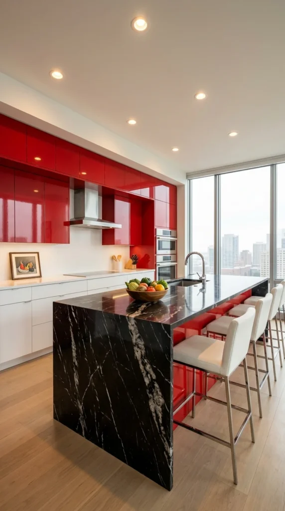
Upper cabinets in glossy red sit above lower cabinets in crisp white, and a black-veined marble waterfall island cuts straight through the middle of the room—three distinct materials, each given real space to register, rather than blending into one continuous surface.
The defining strategy here is deliberate two-tone cabinetry, splitting red and white cleanly between upper and lower cabinets rather than committing the whole kitchen to one or the other. That division is a reliable way to introduce a bold color without the visual weight of floor-to-ceiling saturation—the white lower cabinets keep the room feeling light and grounded even with a genuinely bold red running along the top.
It suits readers who want red’s energy but are hesitant about a fully saturated cabinetry commitment. It’s a particularly strong fit for a city apartment kitchen with a striking skyline view, since the lighter lower half keeps the room from feeling visually heavy against all that glass and natural light.
The lifestyle fit is someone drawn to a modern, high-contrast kitchen that still feels approachable and bright rather than dark or enclosing. Its strongest advantage is genuine balance—this two-tone strategy delivers real color impact without any of the maintenance or visual weight concerns that come with an all-red kitchen.
The compromise is that a black marble waterfall island, while stunning, is a significant natural stone investment, and pairing three distinct materials (red lacquer, white lacquer, and black marble) successfully takes real color-matching precision to avoid looking disjointed. To simplify for a smaller budget, keep the two-tone red-and-white cabinetry but choose a quartz countertop with a marble-look pattern rather than genuine natural stone for the island.
The most common mistake is choosing a red and a white that don’t share the same underlying warmth or coolness—a warm red paired with a stark, cool white can look mismatched rather than intentionally contrasted.
One practical recommendation: bring cabinet finish samples together in the same room, under the same lighting, before finalizing both colors—red and white need to be evaluated as a pair, not chosen independently, to ensure they genuinely complement each other.
Why the Island Reads as a True Centerpiece
Running the full length of the seating area, the black marble waterfall island is large enough to function as the room’s clear anchor, with the red-and-white cabinetry providing a colorful backdrop rather than competing for the same visual attention. White upholstered barstools echo the lower cabinets’ white tone, tying the seating directly back into the room’s two-tone color logic rather than introducing a fourth unrelated material.
Recommended Materials: High-gloss lacquer (red upper cabinets, white lower cabinets) · Black-veined marble (waterfall island) · Engineered wood flooring · Chrome and leather (barstools)
Main Colors: Bright Red · Crisp White · Black Marble Veining
Best Lighting: Recessed ceiling lights keep the room evenly, brightly lit, letting the strong natural light from the floor-to-ceiling windows do most of the work during the day.
For more ideas on balancing a bold color choice with a lighter, more neutral counterpart, our guide to bathroom colors that turn a plain room into a statement space explores several similar high-contrast color pairings in a different room.
Common Mistakes With Two-Tone Cabinetry Like This
- Choosing a red and white that don’t share the same underlying warmth or coolness
- Selecting a natural stone island without confirming its veining complements both cabinet colors
- Placing the darker or bolder tone on the lower cabinets, which can make the room feel heavier than intended
- Skipping in-person, same-lighting comparison of both cabinet finishes before finalizing the order
Black and Red in High-Contrast Harmony
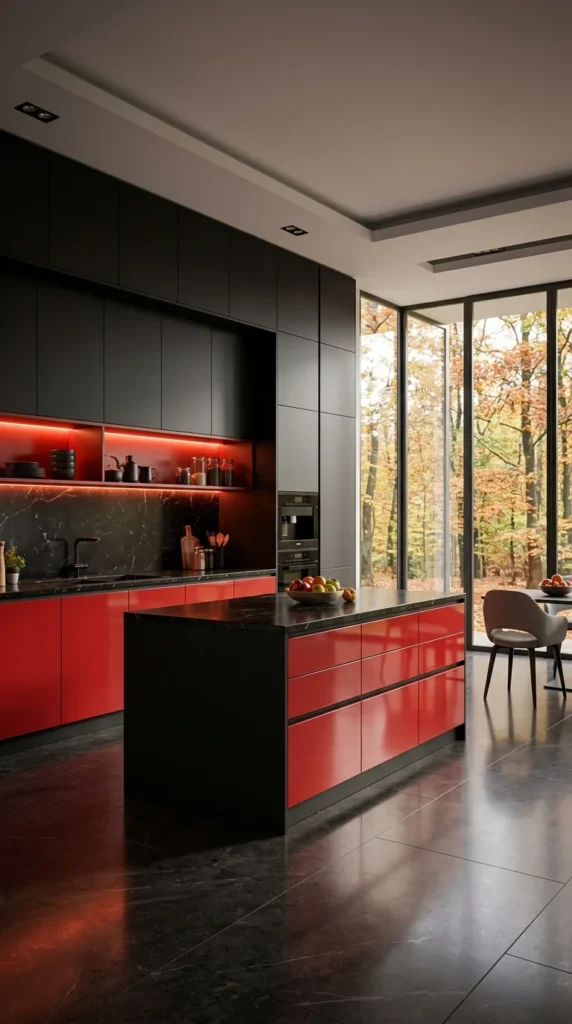
Matte black upper cabinetry frames glossy red lower cabinets and a matching red island, with a strip of red LED lighting glowing beneath open black shelving—this is the most dramatically high-contrast kitchen in the entire guide, and it fully commits to that intensity.
The defining pairing is matte black against glossy red, two colors and two finishes, both doing maximum visual work at once. Where most kitchens choose one dominant statement color, this room treats black and red as equal partners, each given real surface area and neither one relegated to a supporting role.
It suits readers genuinely comfortable with a dark, moody, high-drama kitchen—this is not a soft or gentle look, and it works best for someone actively seeking that intensity rather than easing into bold color gradually. It’s a strong fit for a kitchen with excellent natural light or floor-to-ceiling windows, since that much black and red together needs real daylight to keep the room from feeling too enclosed.
The lifestyle fit is someone drawn to moody, atmospheric interiors who wants their kitchen to match that same intensity found elsewhere in a dramatically styled home. Its strongest advantage is unmatched visual impact—few color combinations read as more confident or memorable than matte black paired with glossy red at this scale.
The compromise is that this much dark cabinetry, even with strong natural light, genuinely needs that light to avoid feeling heavy—the same kitchen with smaller windows or less daylight could tip from dramatic into oppressive. To simplify for a smaller budget, keep the black cabinetry limited to just the upper run and use the red primarily on the island and lower cabinets, matching this room’s actual proportions without needing custom LED strip lighting throughout.
The most common mistake is attempting this level of black-and-red contrast in a kitchen without strong natural light, where the combination can feel dark and closed-in rather than dramatic and intentional.
One practical recommendation: if your kitchen’s natural light is more limited, balance the drama with strategic warm lighting layered throughout—under-cabinet strips, pendant fixtures, and recessed downlights together can help recreate some of this look’s intensity without relying entirely on daylight.
The Autumn View That Completes the Mood
Floor-to-ceiling windows looking out onto a forest in autumn color genuinely complete this kitchen’s palette—the warm oranges and reds of the trees outside echo the room’s own red cabinetry, blurring the line between the interior color scheme and the view beyond it. Red LED lighting beneath the open black shelving adds one more layer of warm glow, tying the room’s artificial lighting back to both the cabinetry and that autumn view outside.
Recommended Materials: Matte lacquer (upper cabinetry) · High-gloss lacquer (lower cabinetry, island) · Black marble (backsplash, countertops) · Integrated red LED strip lighting · Polished black stone (flooring)
Main Colors: Matte Black · Glossy Red · Warm Amber (LED glow)
Best Lighting: Red-toned LED strips beneath open shelving add a distinctive glow that ties directly back to the cabinetry color—pair with strong natural light during the day and warm recessed lighting for evening use.
Readers drawn to this dramatic, high-contrast palette may also enjoy our black bedroom inspiration guide, which explores a closely related dark, moody material pairing in a different room.
Where This High-Drama Combination Goes Wrong
- Attempting this much black-and-red contrast in a kitchen without adequate natural light
- Choosing cool-toned LED lighting instead of warm, which clashes with the room’s overall warmth
- Skipping layered lighting, relying entirely on daylight and leaving the room dim in the evening
- Underestimating how much this combination depends on strong window views to feel intentional rather than closed-in
Keeping a Red Kitchen Looking Sharp
- Wipe down high-gloss lacquer daily with a soft microfiber cloth—this finish shows fingerprints, water spots, and dust more readily than a matte surface, and staying ahead of it keeps the sheen looking intentional
- Choose a grout color for checkerboard or patterned tile that won’t show daily wear too visibly, especially near an active cooking zone
- Confirm any integrated LED lighting includes accessible wiring for future maintenance, since drivers and strips do occasionally need replacement over a kitchen’s lifespan
- If mixing red with a second bold color (black, white, or a natural stone), bring finish samples together under the same lighting before finalizing the combination—colors that look coordinated separately can clash once installed side by side
Who Should Choose This Style?
- Best for readers who want a kitchen with genuine visual energy and aren’t afraid of a bold, committed color choice
- Best for kitchens with strong natural light, which keeps saturated red or black-and-red combinations feeling vibrant rather than heavy
- Not ideal for anyone who wants a strictly neutral, resale-ready kitchen, since red at the cabinetry scale is a genuinely personal, committed choice
- Not ideal for a very small, low-light kitchen without careful planning, where the boldest red combinations can feel overwhelming rather than energizing
Budget Summary
| Budget | Expectation |
|---|---|
| Low | A red-accented refrigerator or red cabinet hardware, one bold red accent wall |
| Medium | Full glossy red lacquer cabinetry, a black or marble-look countertop, warm LED accent lighting |
| Premium | Backlit glass cabinetry, a custom curved cabinet layout, a structural skylight, or a genuine natural stone island |
FAQ
Does a red kitchen feel dated after a few years? It depends heavily on the specific shade and how it’s paired with other materials. The kitchens here that feel most timeless pair red with genuinely classic materials—marble, black stone, warm wood—rather than relying on red alone or pairing it with more clearly trend-driven finishes.
Is red too intense for a small kitchen? Not necessarily, but it does need planning. A two-tone approach, with red limited to upper or lower cabinets only, tends to work better in a compact space than full saturation. Strong natural light also matters more in a small red kitchen than a larger one, since there’s less room for the color to visually recede.
What countertop colors pair best with red cabinetry? Black and white both appear repeatedly across the kitchens in this guide, and both work reliably well. Black creates a bolder, more dramatic contrast, while white keeps the overall room feeling brighter and airier despite the saturated cabinetry.
How do I keep glossy red cabinetry looking good long-term? Daily wiping with a soft microfiber cloth is the single most effective habit, since high-gloss finishes show fingerprints and water spots readily. Avoid abrasive cleaners, which can dull the sheen over time—a cabinet-safe cleaner formulated for lacquer finishes is worth the investment.
Conclusion
Ten kitchens, ten different reasons red works—sometimes as a full architectural commitment, sometimes as a single retro fridge doing all the talking. What separates the kitchens that feel considered from ones that might feel like a fleeting trend is usually the same thing: pairing red with materials that have their own staying power and giving the color enough restraint elsewhere in the room to actually be seen clearly. If one of these ten kitchens felt like it was speaking directly to your own space, that’s usually the clearest sign of where to start.
Explore More
You may also enjoy:
- 10 Pink Kitchen Ideas That Feel Bold, Not Overdone—another confident, color-forward approach to kitchen design
- What Makes a Pantry Actually Functional: 10 Examples—practical planning ideas to pair with a statement kitchen like these
- 10 Bathroom Colors That Turn a Plain Room Into a Statement Space—bold color strategy applied to a smaller, adjacent room

One Response