
Walk into enough newly renovated homes, and a pattern starts to emerge—bathrooms are quietly ditching the all-white, all-gray minimalism that dominated the last decade. In its place: checkerboard floors, colored tile, brass fixtures, and curved mirrors that look pulled straight out of 1974. It is not nostalgia for its own sake. Retro design is showing up because it solves a problem modern bathrooms often create—spaces that feel clinical instead of lived-in.
What makes this comeback different from a passing trend is how selectively homeowners are borrowing from the past. Nobody is recreating a full vintage bathroom brick for brick. Instead, one or two retro elements—a scalloped mirror, a pastel vanity, or patterned tile on a single wall—get dropped into an otherwise contemporary layout. The result reads as intentional rather than themed, which is exactly why it works in real homes and not just design magazines.
This roundup pulls together bathrooms where that balance is done well. Each one takes a different piece of retro design language and applies it in a way that still feels usable today.
Section 1: A Floral Wallpaper That Makes Brown Tile Feel Warm Instead of Heavy
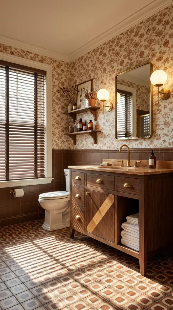
Brown tile has a reputation problem. On its own, a full wainscot of chocolate-brown tile can feel dated in the wrong way—heavy, dim, closer to a basement than a bathroom. This space avoids that entirely by pairing the tile with a rust-and-cream floral wallpaper that runs floor to ceiling above it. The pattern does something the tile alone could not: it softens the room and gives the eye somewhere to travel besides one flat expanse of color.
The patterned tile floor is doing a similar kind of work at ground level. Its geometric diamond motif in tan, brown, and dusty rose pulls the same warm palette down to the floor without repeating the wallpaper’s print, which keeps the room from feeling like two competing patterns fighting for attention. Afternoon light through the wood-slat blinds throws long shadow lines across the tile, and on a floor this busy, that kind of natural texture only adds to it rather than distracting from it.
The vanity is where the room shifts from vintage to genuinely well-built. Rich walnut-toned wood, a diagonal inlay detail on the cabinet door, and unlacquered brass cup pulls give it the weight of custom furniture rather than a stock bathroom cabinet. Twin brass sconces with round milk-glass globes flank an arched brass-framed mirror above it—a fixture choice that ties directly back to the vanity hardware instead of introducing a third metal finish into the room.
💡 Pro Tip: When mixing a bold wallpaper with patterned flooring, keep the wainscot tile in a solid, uninterrupted color. A busy print above and a busy pattern below can work, but only if the horizontal band between them stays visually quiet.
Section 2: An Ornate Gold Mirror That Turns Subway Tile Into Something Grander
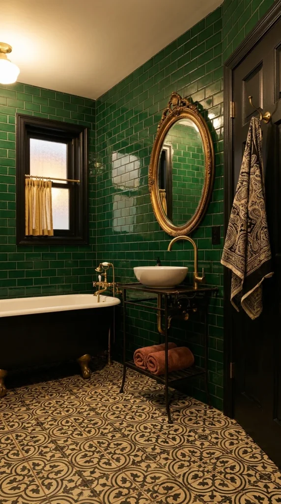
Emerald-green subway tile covers nearly every wall in this bathroom, and on its own that much glossy color could feel like a single decorative gesture. What elevates it past that is the mirror hanging above the vessel sink—an oval gold frame with carved Rococo detailing that belongs more to a formal dining room than a bathroom. That single ornate object changes how the whole tiled wall reads, giving the green surface the job of backdrop to something more decorative rather than being the room’s only statement.
A freestanding clawfoot tub anchors the far end of the room in matte black with brass ball-and-claw feet, paired with a wall-mounted brass tub filler that has the exposed-pipe look of genuinely old plumbing hardware. The black-framed window beside it, dressed in a simple mustard-colored curtain, keeps the room from feeling overly precious—there is enough plain, functional material here to balance out the more elaborate pieces.
The floor carries a black-and-cream Moroccan-style tile pattern that pulls double duty: it grounds the deep green walls without competing with them, and its intricate scrollwork gives the room a second layer of pattern that never has to raise its voice next to the tile above it. A slim iron-and-marble console holds the vessel sink, its dark metal legs echoing the black tub and window frame so the room’s darker tones tie together across three different surfaces.
📌 Important Note: Glossy subway tile in a saturated color like this deep green needs strong, warm-toned lighting to avoid feeling cold or aquatic. Brass fixtures and warm bulb temperatures are doing real work here to keep the green from tipping cool.
Section 3: A Coral Ceiling That Commits to Color Instead of Playing It Safe
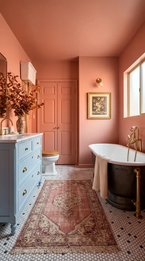
Most bathrooms treat the ceiling as an afterthought—a flat white plane nobody is meant to notice. This one paints it the exact same coral as the walls, and that single decision is what makes the room feel enveloping rather than simply painted. There is no white break anywhere overhead to remind the eye it is looking at four separate surfaces; the color just continues, and the effect is closer to standing inside a warm-toned box than standing in a room with painted walls.
A powder-blue vanity sits against that coral backdrop, and the pairing works because both colors are muted rather than saturated—a dusty blue against a warm terracotta, not a primary blue against a bright orange. Brass drawer pulls and a marble countertop keep the piece from reading as purely decorative; it still functions as real cabinetry with real storage behind those doors. A matching brass sconce above a small gilt-framed still-life painting on the opposite wall pulls the same metal tone across the room, so the color scheme has a consistent thread running through it beyond just the walls.
The black clawfoot tub near the window brings the room’s only dark note, and it earns its place by pairing with an exposed brass floor-mounted filler that has real weight and presence—the kind of fixture that looks substantial rather than decorative. A faded vintage-style rug in dusty rose and cream sits over honeycomb floor tile, adding a textile layer that softens all the hard surfaces in the room without introducing a new color the palette has not already established.
⚠️ Warning: Painting a ceiling the same saturated color as the walls only works in a room with strong natural or warm artificial light. In a dim space, the same choice can make the ceiling feel like it is closing in rather than opening up.
Section 4: A Peach-Colored Tub—the Detail That Ages a Room in the Best Way
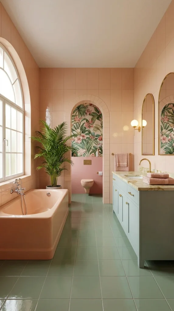
Colored porcelain fixtures are one of the clearest signals of retro design, and this peach-toned built-in tub commits fully to it. Where a white tub would simply sit inside the room, this one becomes part of the color story itself—its warm blush tone picking up the same undertone as the peach wall tile surrounding it, so the fixture and the surface behind it almost merge into one continuous field of color rather than an object against a backdrop.
An arched niche at the end of the room breaks up what could otherwise be a very long, narrow run of matching tile. Inside it, a botanical tropical wallpaper covers the wall behind the toilet, and the arch shape framing that wallpaper gives the space a destination—the eye travels the length of the room toward it instead of drifting along a flat corridor. Sage-green floor tile runs underfoot through the entire space, a cooler tone that keeps all that peach and blush from tipping into something overly sweet.
At the far end, a powder-blue double vanity with a pale marble-look countertop introduces the room’s third color note, and gold hardware on the cabinet doors ties back to the brass fixtures used throughout—the tub filler, the sconces, and the mirror frames. A tall potted palm beside the tub adds the kind of loose, organic texture that a room this deliberately color-coordinated needs, keeping it from feeling like a styled set rather than a bathroom someone actually uses.
💡 Pro Tip: When working with three pastel tones in one space — as this room does with peach, sage, and blue — keep every tone at the same saturation level. Mixing a soft pastel with one bright, saturated color breaks the cohesion this kind of palette depends on.
Section 5: Black Walls With Gold Trim — A Palette That Reads as Formal, Not Cold
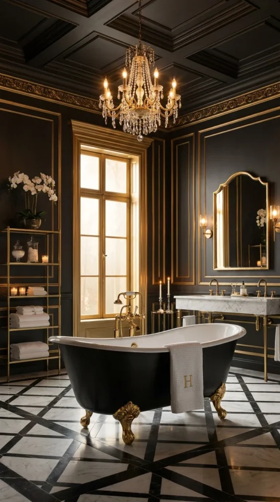
Black paneled walls could easily tip a bathroom into feeling stark or cave-like, but gold trim outlining every panel edge here changes that entirely. The metal traces the room’s architecture—door frames, wall panels, and the coffered ceiling grid—so the black becomes a canvas for the gold rather than a dominant, oppressive color on its own. It is a pairing that borrows more from a formal dining room or library than anything typically associated with a bathroom.
The crystal chandelier hanging in the center of the room confirms that this space was never meant to feel utilitarian. Multiple tiers of candle-style bulbs and cut-glass drops throw warm light across the black ceiling coffers, and that light is doing real work—without it, a room this dark could feel heavy rather than dramatic. A tall arched window dressed in the same gold trim brings in daylight during the day, giving the room two very different moods depending on the hour.
Down at floor level, a black-and-white marble mosaic in a bold geometric pattern keeps the room from feeling like one solid block of darkness. The clawfoot tub sits in matching black with ornate gold ball-and-claw feet, and a gold wall-mounted tub filler with an exposed shower attachment adds another layer of period-correct detail. An open brass shelving unit against the far wall holds folded towels and glass apothecary jars, giving the room storage that still reads as furniture rather than function bolted onto the wall.
📌 Important Note: A palette this dark and formal depends entirely on layered lighting. A single overhead fixture without the wall sconces and window light this room uses would leave most of the space in shadow, no matter how much gold trim is present.
Section 6: A Sage-Green Tub That Softens a Fully Pink Room
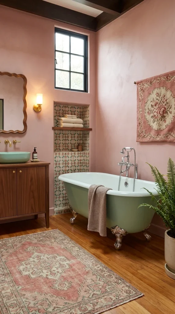
Pink walls covering every surface in a bathroom can start to feel like a single overwhelming gesture, but a sage-green clawfoot tub breaks that up immediately. Placed against the dusty rose plaster, the muted olive-green porcelain acts almost like a piece of furniture rather than a fixture—its cooler, earthier tone gives the eye a place to rest that the warm pink walls alone could not provide.
A tiled niche beside the tub carries a different pattern entirely — a small-scale Mediterranean motif in terracotta, cream, and sage that echoes the tub’s green without copying the wall color at all. Folded towels sit on an open wood shelf inside that niche, turning what could have been a purely decorative recess into working storage. Dark wood ceiling beams overhead add a rustic, almost farmhouse weight to a room that could otherwise feel entirely soft and pastel.
Warm-toned wood flooring runs beneath everything, and a faded vintage rug in matching pink and cream tones sits over it near the vanity — the kind of worn, patterned textile that gives an otherwise smooth plaster room some texture and age. A mint-green vessel sink drops into a walnut vanity on the opposite wall, picking up the same cooler green note as the tub so the two fixtures feel like a deliberate pair rather than two unrelated color choices in the same space.
⚠️ Warning: Pairing a saturated wall color with a colored fixture only works if the fixture leans toward a different temperature — warm wall, cool fixture, or vice versa. Two saturated colors in the same temperature range can compete instead of complementing each other.
Section 7: A Bronze-Finished Tub That Looks Cast From Metal, Not Painted
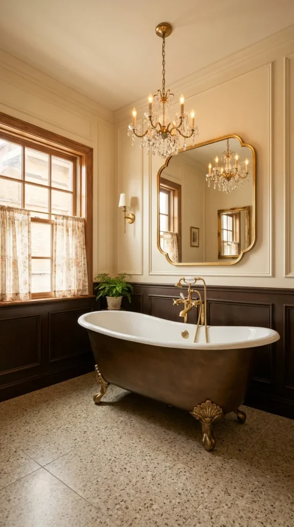
Most clawfoot tubs stick to white, black, or a soft pastel exterior—this one breaks from all three with a mottled bronze finish that looks closer to aged metal than painted porcelain. The uneven, burnished tone catches light differently across its curved surface, giving the tub a weight and presence that a flat single color could not achieve. Paired with gilt ball-and-claw feet, the whole fixture reads less like a bathroom tub and more like a piece of cast sculpture that happens to hold water.
Dark wood wainscoting runs along the lower half of the walls, meeting a cream upper wall trimmed in raised panel molding—a classic proportion split that gives the room formal structure without needing color to do it. Above the tub, a gilt-framed mirror with scalloped edges catches the reflection of a crystal chandelier hanging from the ceiling, and the mirror’s ornate shape works because its gold tone directly matches the tub’s brass fixtures rather than introducing a competing metal finish.
A speckled terrazzo floor in warm gray and cream tones grounds the room in something with genuine texture underfoot, its subtle fleck pattern reading as neutral without falling flat the way a plain tile floor might. Natural light through a wood-framed window, dressed in a soft floral curtain, adds the room’s only overtly patterned textile—a quiet detail against all the wood and stone surfaces elsewhere.
💡 Pro Tip: A finish this unusual on a clawfoot tub works best against a restrained backdrop. Dark wood, cream walls, and a neutral floor let the tub’s texture stay the focal point instead of competing with busier surfaces.
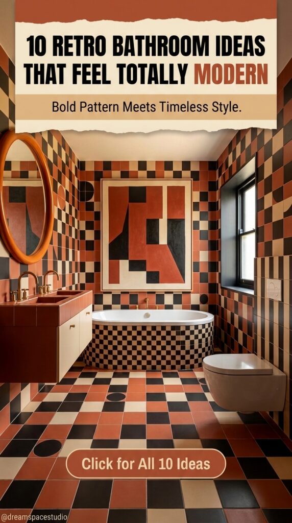
Section 8: A Checkerboard Pattern That Covers Every Surface and Somehow Still Works
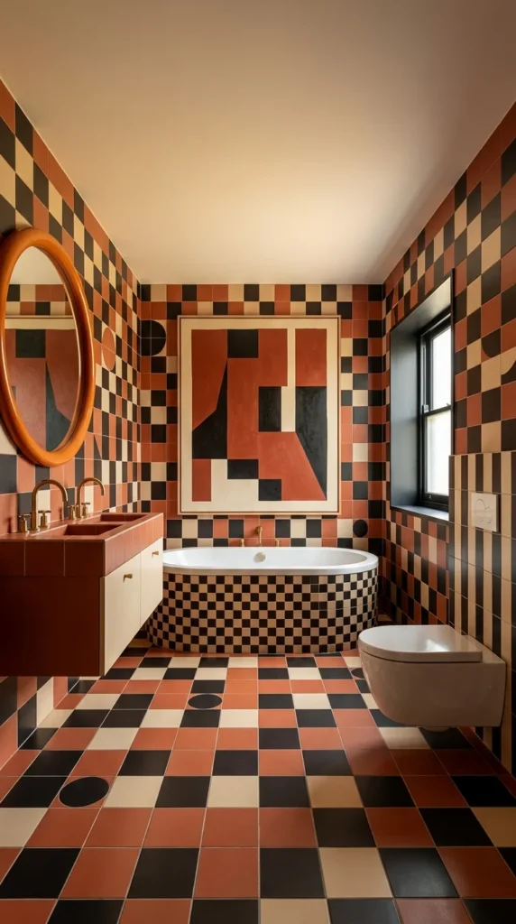
Most bathrooms use a bold pattern in one place—a floor or an accent wall—and leave the rest neutral to let it breathe. This one refuses that restraint entirely, running the same terracotta, black, and cream checkerboard across the walls, the floor, and the built-in tub surround all at once. The reason it does not collapse into visual chaos is scale variation: the wall tiles run larger and looser, the floor grid tightens up, and the tub’s checkerboard shrinks smaller still, so each surface reads as related but distinct rather than one continuous, disorienting print.
A geometric abstract artwork hangs above the tub in the same three-color palette, and rather than adding a fourth pattern to compete with the tile, it functions almost like a punctuation mark — a single large-scale shape that gives the eye one place to land amid all that repetition. An oval mirror in a warm copper frame does similar work on the opposite wall, its plain, curved outline offering a moment of visual quiet against the hard angles surrounding it.
The wall-hung sink in matching terracotta tile commits to the room’s palette completely, right down to the brass gooseneck fixtures mounted above it, while a plain white wall-hung toilet stays deliberately neutral—a practical decision that keeps at least one fixture from adding another surface of pattern to track. A tall window with black metal framing lets in daylight without a curtain, keeping the sightline toward the checkerboard walls uninterrupted.
⚠️ Warning: A pattern this intense across every surface only holds together with a strict, limited color palette. Three colors, repeated consistently at different scales, read as designed. A fourth color introduced anywhere in the room would likely tip the whole space into looking overcrowded rather than bold.
Section 9: An Antique Dresser Doing Double Duty as a Bathroom Vanity
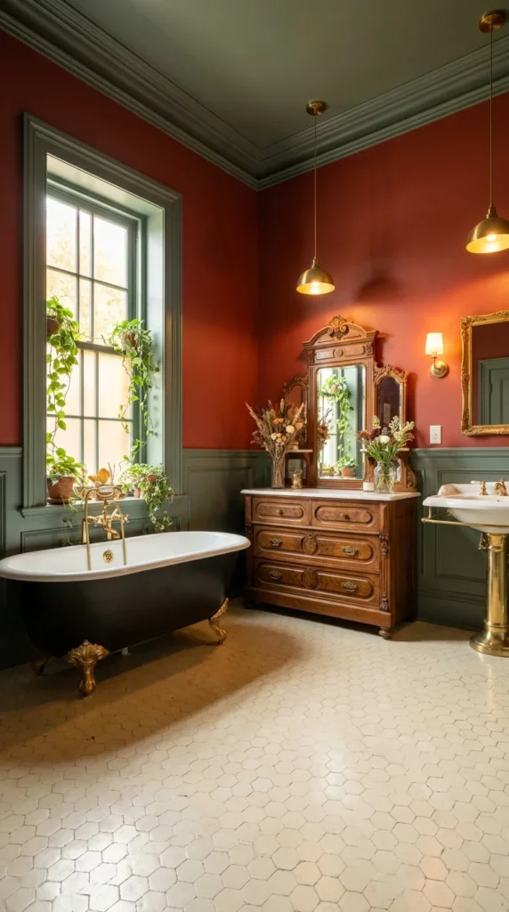
Nothing in this room looks purpose-built for a bathroom, and that is exactly the point. A carved wood dresser with a triple mirror and burl-front drawers sits where a vanity would normally go, its scale and detail closer to a bedroom heirloom than anything sold as bathroom furniture. Repurposing a real antique this way gives the room a collected-over-time quality that no matching fixture set could replicate.
Terracotta-red walls meet sage-green wainscoting at a clean chair-rail line, and that same sage carries up into the crown molding and ceiling trim, tying the two-tone wall scheme to the room’s upper edge. A pair of brass pendant lights drop from the ceiling on long stems rather than sitting flush-mounted, adding a warmth and informality that recessed lighting could not offer in a room already this layered with pattern and material.
A black clawfoot tub with gold ball-and-claw feet sits beneath a tall window framed in the same sage tone as the wainscoting, and the windowsill is crowded with trailing plants that soften the corner considerably. Beside the dresser-vanity, a freestanding brass pedestal sink picks up the same metal tone as the pendant lights and window hardware, while a small hexagonal floor tile in warm cream runs underfoot—a subtle, low-contrast pattern that lets the room’s color and furniture carry the visual weight instead.
📌 Important Note: Using found or antique furniture as a vanity requires checking if the piece can handle moisture exposure. A solid wood dresser like this one typically needs a sealed or treated top surface to hold up in a humid bathroom environment long-term.
Section 10: A Patterned Toilet Seat That Matches the Wallpaper on Purpose
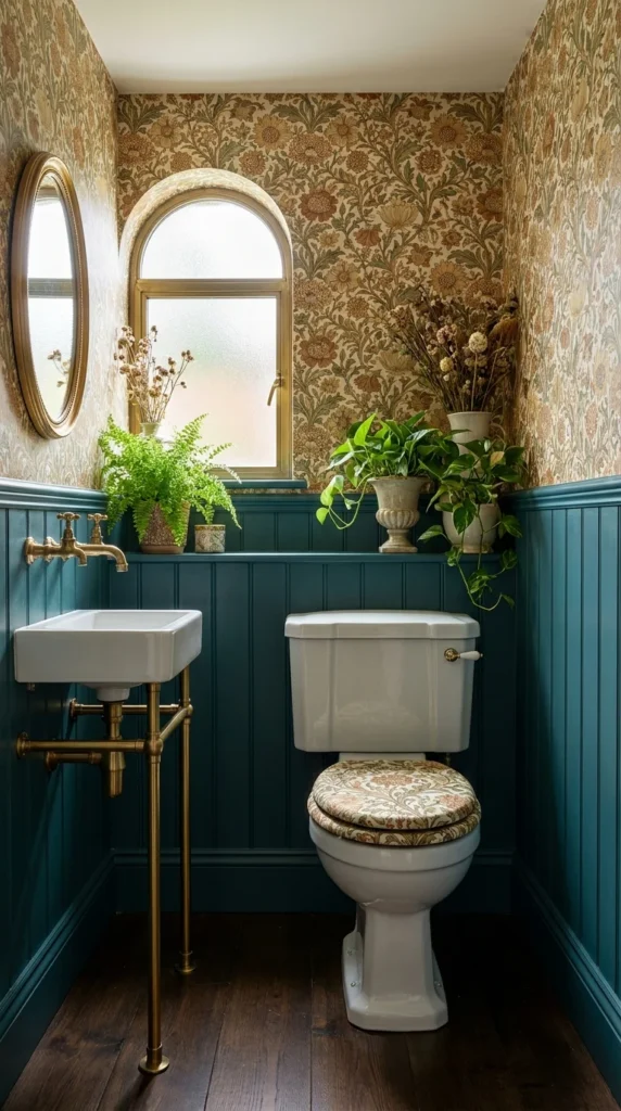
Most bathrooms treat the toilet as purely functional—plain white, with no design input at all. Here, the seat lid is upholstered in the same William Morris-style floral print running across the walls above, a small detail that turns an overlooked fixture into part of the room’s overall design rather than something visually separate from it. It is a tiny gesture, but in a room this compact, every surface gets noticed.
That floral wallpaper covers the upper half of the walls in a dense arrangement of golden marigolds, thistles, and trailing green stems—the kind of maximalist botanical print that would overwhelm a larger room but works here precisely because the space is so small and enclosed. Deep teal beadboard wainscoting below it gives the pattern somewhere to stop, and the color pulls one of the cooler green tones directly out of the wallpaper’s print rather than introducing something unrelated.
A brass wall-mounted sink with exposed leg supports sits opposite the toilet, its slim industrial-looking frame keeping the room from feeling cluttered despite how much pattern surrounds it. An arched window with a gold frame lets in soft, diffused light through frosted glass, and its curved top echoes the oval mirror hanging beside it. Dried and potted greenery lines the narrow shelf along the wainscoting, adding texture without requiring floor space this size of room simply does not have.
💡 Pro Tip: In a small powder room like this, a bold wallpaper works best when paired with a dark, solid lower wall. The contrast keeps the pattern from feeling like it is closing in on every side.
Conclusion
What ties all ten of these bathrooms together is not a single style choice but a shared confidence with color, pattern, and material. None of these rooms play it safe with an all-white palette, and none of them feel like a themed set piece either. Each one takes something from the past—a colored fixture, a bold tile pattern, an antique piece of furniture, ornate lighting—and lets it sit naturally alongside modern layouts and finishes.
The biggest takeaway for anyone planning their own retro bathroom is restraint paired with commitment. The rooms that work best usually pick one or two strong retro elements and build the rest of the space around supporting them, rather than piling on every vintage idea at once. Whether that means a single colored tub, one wall of patterned tile, or a repurposed antique vanity, the same principle holds: a retro detail reads as intentional when the rest of the room gives it room to stand out.
Frequently Asked Questions
FAQ 1: Is a retro bathroom design hard to maintain?
Not typically. Most of the elements shown here—tile, porcelain fixtures, and painted walls—are as easy to clean and maintain as any modern bathroom. The exception is repurposed antique furniture used as a vanity, which needs a properly sealed top surface to handle daily moisture.
FAQ 2: Will a retro bathroom design lower my home’s resale value?
A tastefully done retro bathroom, especially one that mixes vintage elements with modern layouts, generally appeals to buyers rather than putting them off. The risk comes from overcommitting to one narrow era with cheap materials, not from using color or pattern itself.
FAQ 3: What is the easiest way to start a retro bathroom design on a budget?
Start with one high-impact, lower-cost element — a patterned wallpaper, a colored vanity, or updated brass hardware — rather than replacing every fixture at once. Several of the rooms in this list get most of their retro character from paint, wallpaper, and hardware rather than expensive custom tile work.
FAQ 4: Are colored bathtubs and sinks still available to buy new?
Yes. Several fixture manufacturers still produce clawfoot tubs and vessel sinks in colored and finished glazes, alongside a strong market for restored vintage originals. Both options were used as reference points for the colored fixtures shown in this roundup.
FAQ 5: How do I keep a retro bathroom from looking like a themed costume rather than a real design?
Limit yourself to one clear era or color story per room, and pair any bold retro element with at least one quiet, neutral surface nearby—a plain floor, a solid wall, or a simple fixture. Nearly every room in this list uses that kind of balance to keep the retro details feeling deliberate rather than overwhelming.

3 Responses