
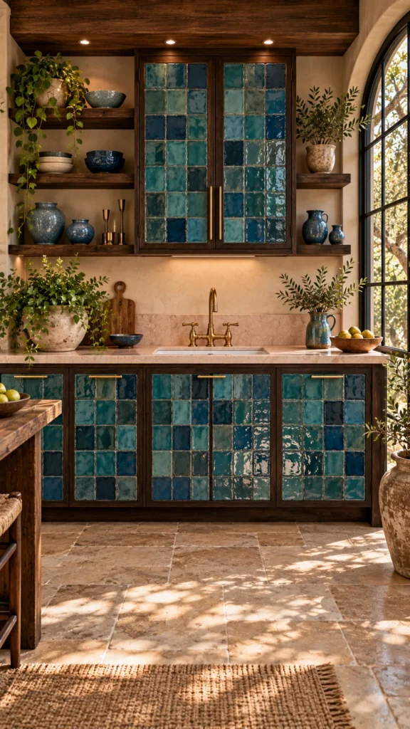
Blue might be the hardest-working color in a farmhouse kitchen. It can sit back like a neutral, or it can run the whole room — and the difference usually comes down to the shade you pick and where you put it. The ten kitchens below cover that full range, from a pale dusty blue that barely raises its voice to a saturated cobalt covered in hand-painted flowers.
What ties them together isn’t a single paint color. It’s the way each kitchen gives its blue cabinets a clear job: grounding a tall timber ceiling, warming up beside brass, splitting the difference between white walls and a wood floor. Look past the pretty pictures and each one is really a decision about light, contrast, and how much color a room can hold.
If you’re weighing blue for your own cabinets, start with the light your kitchen gets and the wood tones already in it, then find the kitchen below that matches those conditions. That’s the one worth studying.
Cabinet Doors Made of Glazed Tile Instead of Paint
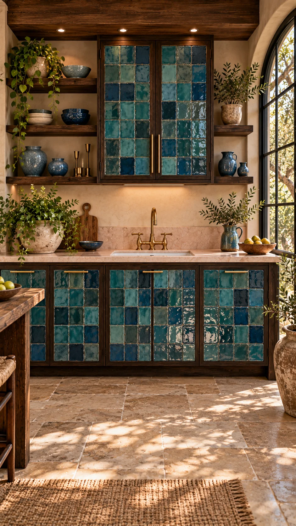
The first thing to understand about this kitchen is that the blue didn’t come out of a paint can. Every cabinet front here — uppers and lowers — is covered in small glazed tiles in shifting shades of turquoise and teal, set into dark stained-wood frames with slim brass pulls.
Paint gives you one flat color. Glaze gives you dozens of small variations, and each tile catches the light a little differently as you move through the room. That’s why this kitchen reads as textured rather than simply blue, even though blue covers most of the wall. The dark wood framing does quiet work too: it keeps all that turquoise from drifting toward beach-house territory and plants the whole wall firmly in Mediterranean farmhouse ground.
There’s a practical side to this. Glazed tile wipes clean and doesn’t chip the way painted doors do around handles — but the grout lines will collect cooking grease if tile sits right behind a range. Here the tile fronts cluster around the sink wall and the uppers, which is the sensible placement. Open wood shelves on either side hold blue pottery and trailing plants, repeating the palette without adding another material. If storage planning is on your mind too, our pantry cabinet ideas that make kitchen storage more stylish and functional show how to get that same collected look on the cabinet interiors too.
The decision this helps with: whether your blue should be a flat color or carry texture. If your kitchen gets strong natural light like this one does through the arched window, a glazed surface pays you back all day. In a dim kitchen, the same tile would sit flatter and you’d get more from paint.
Blue Cabinets Painted Like Folk Art
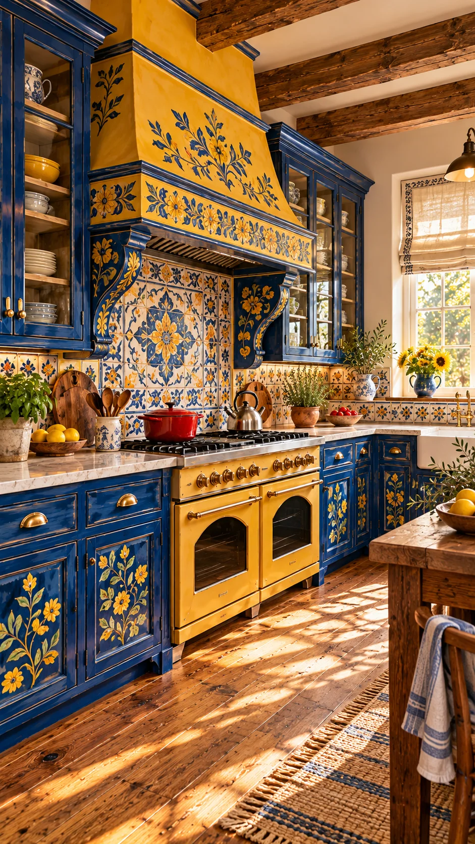
This is the boldest kitchen in the set, and it doesn’t apologize for it. The cabinets are a saturated cobalt blue, and someone hand-painted yellow floral sprigs across the doors, the drawer fronts, and the big plaster range hood. The backsplash tile picks up the same blue-and-yellow pairing in a repeating pattern, so the painted cabinets don’t sit alone.
The reason it works — instead of reading as a novelty — is restraint everywhere else. The walls are plain warm plaster, the ceiling beams are bare wood, and the counters are a quiet stone. All the pattern lives on the cabinetry and the hood, which means the eye knows where to land. It’s also worth noticing the scale of the motifs: the flowers are large and spaced out, more like a textile print than fussy detail work.
Where Hand-Painted Cabinets Go Wrong
- Painting the pattern onto every surface, including walls and ceiling, until there’s nowhere for the eye to rest.
- Mixing motif sizes — large flowers on the doors and tiny ones on the hood would fight instead of rhyme.
- Choosing the artwork colors without checking them against the fixed elements: the floor, the beams, the stone counters. The yellow here was clearly picked against the warm wood, not in isolation.
A look this personal only makes sense if you plan to stay a while. Painted folk-art cabinetry is the opposite of a safe resale choice, and that’s fine — not every kitchen needs to be one. If a bold, all-in color attitude is your thing, our red kitchen ideas that bring drama, energy and personality home explore the same fearless approach in a different hue.
Dusty Blue That Carries the Whole Color Story
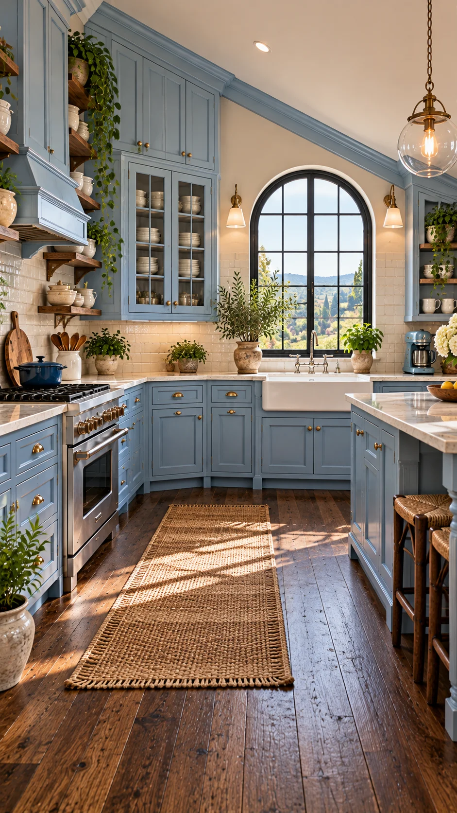
Some kitchens need their color to whisper. This one gets a full wall of pale dusty-blue shaker cabinets, and it’s the only real color in the room — everything else is white tile, warm wood, and brass. Because the blue is desaturated, it behaves almost like a neutral: it doesn’t advance toward you the way cobalt would, and it doesn’t darken the corners.
The details keep it from feeling flat. Brass cup pulls warm up each drawer front, open wood shelves break the run of uppers on one side, and a glass-front cabinet shows stacked white dishes that echo the subway tile. The arched black window does more than look good — its dark frame gives the pale blue something to lean against, a bit of contrast that stops the whole wall from washing out in daylight.
This is the blue to study if your kitchen is short on natural light or on the small side. Deeper navies would press the walls in; this shade holds the room open. And if you’re torn between blue and green for that one colored element, our guide on how to style sage green kitchen cabinets for a cozy farmhouse kitchen walks through the same decision from the green side.
Keeping the Blue to the Island
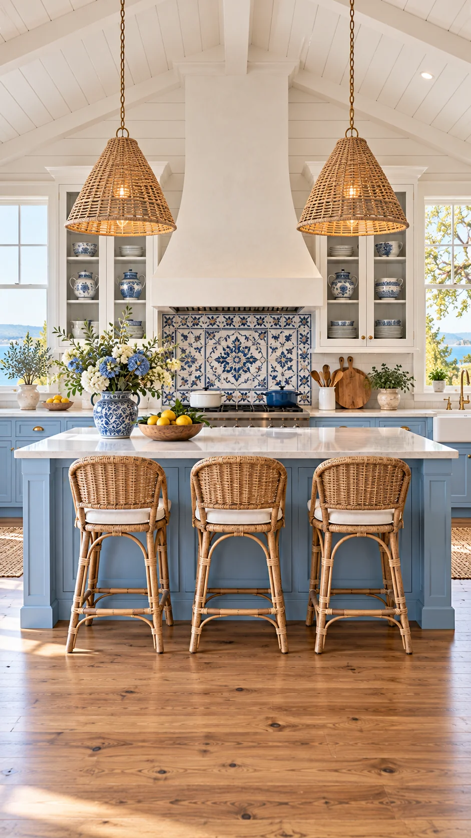
If painting every cabinet blue feels like too much, this kitchen shows the middle path: the blue lives on the island and the base cabinets along the range wall, while everything else — shiplap walls, upper cabinets, the big plaster hood — stays white. You get the color at the level where your hands are, and brightness at eye level where you need it.
Two-tone kitchens work when the split follows a logic, and here the logic is simple: white where the room needs light, blue where it needs grounding. The blue-and-white patterned tile behind the range stitches the two halves together so the island doesn’t look like furniture from another kitchen. Rattan pendants and bar stools add a natural texture that keeps the blue from feeling cold, and the blue-and-white porcelain on the open shelves repeats the palette in small doses.
There’s also a practical argument for starting here. An island is the cheapest cabinetry to repaint if you change your mind, and in an open plan it’s the piece everyone sees first. Readers drawn to bright, pared-back rooms will find the same light-first thinking in 10 Scandinavian kitchens that show what minimalism really looks like — a useful second opinion before you commit to color.
Navy Cabinets, Brass Lines, and Glass That Glows
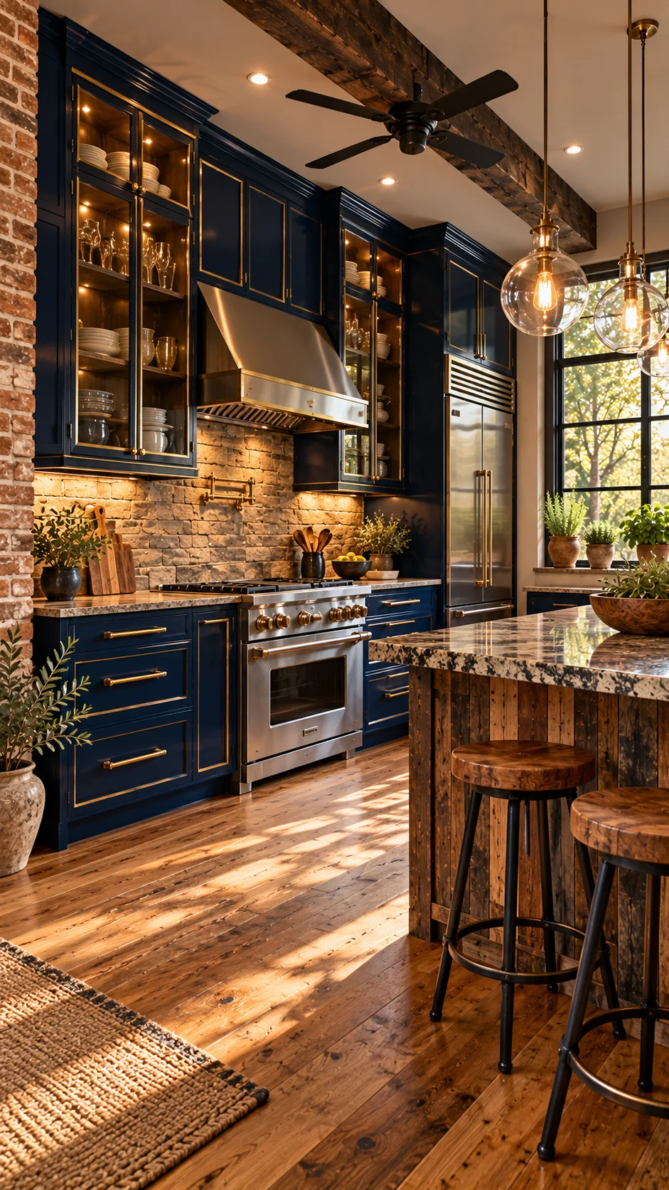
Navy is the most popular dark blue for kitchens, and also the easiest to get wrong — flat navy in a dim room can go muddy. This kitchen avoids that three ways. First, thin brass trim outlines the doors and drawer fronts, so each navy panel gets a crisp edge that catches light. Second, the glass-front uppers have interior lighting, which turns closed storage into part of the lighting plan after dark. Third, the backsplash is a rough natural stone in warm beige, not a cool tile, so the wall behind the range throws warmth back at the cabinets.
The stainless range and the wood-and-stone island keep the room from tipping formal. Notice how the island wood looks reclaimed and rough — it stops the brass-and-navy combination from feeling like a hotel bar. That tension between polished and rough is doing a lot of the room’s personality work.
If the brass-and-glass pairing is what caught your eye, 10 art deco kitchen ideas that blend old-world glamour with modern style push that same material language further, with more geometry and more shine.
Navy Below, White Above
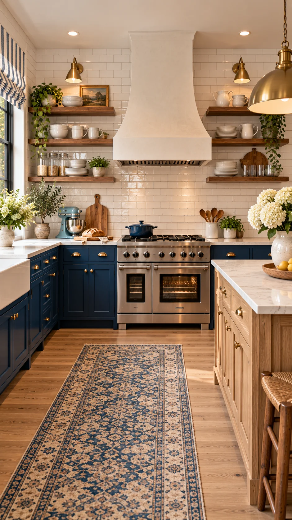
Here’s the same navy-or-white question answered differently than the island kitchen above. In this galley, the navy runs along all the base cabinets while the uppers disappear entirely — replaced by open wood shelves and a white plaster hood against white subway tile. Dark at the bottom, light at the top, and the room stays bright because your eye meets white first.
This split suits galleys and smaller kitchens better than full-height navy, which can press in from both sides. The brass sconces and the striped roman shade add pattern and metal without adding another color, and the long blue-patterned runner pulls the navy down to the floor so the base cabinets don’t look stranded.
Why the Dark Color Sits Low Here
It comes down to visual weight. Dark colors read as heavier, and heavy things feel natural near the floor — the same reason dark wood floors under light walls rarely feel wrong. Putting navy at counter height and below lets the color hold the room down the way the floor does, while everything above stays open. Flip it — navy uppers, white lowers — and the room would feel top-heavy and smaller.
Blue That Holds Its Own in a Timber Great Room
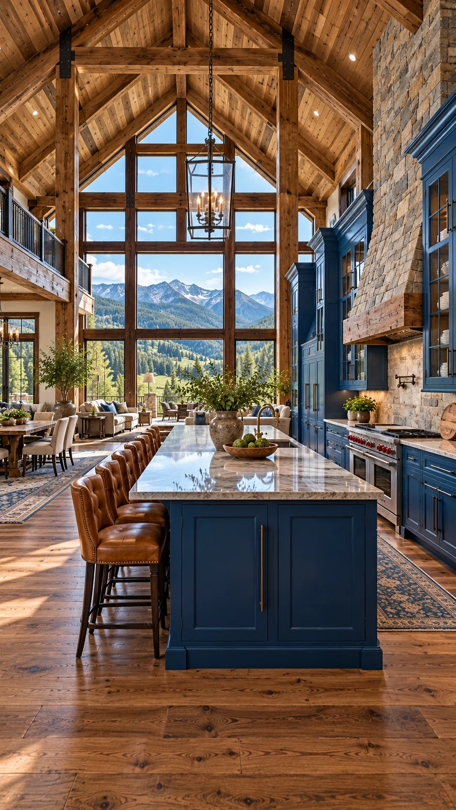
Scale changes what a cabinet color has to do. In this mountain lodge great room, the kitchen shares one soaring timber-frame volume with the dining and living areas, under a ceiling two stories up. Pale cabinets would have washed out against all that wood and glass. The saturated navy island and perimeter cabinets give the kitchen enough visual weight to hold its corner of the room.
Everything around the blue is warm and rough — hand-hewn beams, a stone chimney, leather bar stools, wide-plank floors — so the smooth painted navy reads as the tailored element in the room. The veined marble island top lightens the composition from above, and the big bowl of greenery keeps the island from feeling like a monument. Through the window wall, the blue-gray of the distant mountains picks up the cabinet color, which may be luck or may be the whole point.
The lesson travels even if you don’t have a great room: the bigger and wood-heavier the space, the deeper your blue can go. Small white kitchens want dusty blue; rooms with this much timber want navy.
Committing to Aqua Everywhere
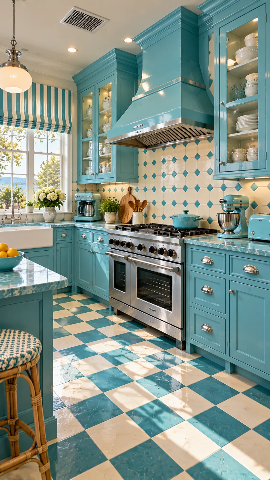
Every other kitchen on this list rations its blue. This one doesn’t. Glossy aqua cabinets, an aqua range hood, an aqua-and-white checkered floor, aqua small appliances, even a striped aqua roman shade. It’s a full-commitment color story, and it works because the commitment is total — half measures would have made it look accidental.
The checkered floor is the move that makes or breaks this room. It takes the cabinet color and puts it underfoot at double the scale, which turns “blue kitchen” into a designed scheme rather than a paint choice. The diamond-pattern backsplash in cream and aqua mediates between the glossy cabinets and the matte floor, and the stainless range is the one cool, neutral element that keeps the whole thing from feeling like a themed set.
The Honest Question: Could This Tire You Out?
Maybe — and that’s worth sitting with before you copy it. A color this present doesn’t fade into the background on a tired Tuesday. The reason it sustains here is that aqua is genuinely cheerful in daylight, and this kitchen gets plenty. In a north-facing room with gray light, the same aqua could feel chilly by February. If the retro spirit of this kitchen appeals to you, retro never left: 10 vintage 1950s kitchen ideas shows where this look comes from and how far to take it.
A Gray-Blue That Gets Along With Wood
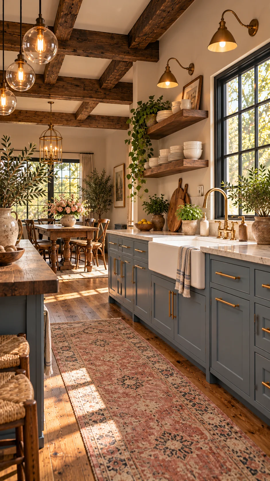
If your kitchen already has a lot of warm wood — beams, floors, a farm table — a clean bright blue can fight it. This kitchen’s answer is a grayed slate blue on shaker cabinets: the gray in the blue shakes hands with the brown in the wood, and neither one has to win.
The room around the cabinets leans traditional: a white farmhouse sink with a brass faucet, open wood shelves with trailing plants, a faded floral runner, brass bar pulls. Nothing here is trying to be modern, and the cabinet color doesn’t try either. It’s the blue for people who want color without contrast — present, but not the loudest thing in the room.
One detail worth copying: the rug. Plenty of blue-cabinet kitchens skip a runner, but here the faded red-and-blue pattern ties the slate cabinets to the wood floor and gives the whole run of cabinetry a finished base. It’s a small piece doing real connective work.
Teal Cabinets Against a Mustard Hood
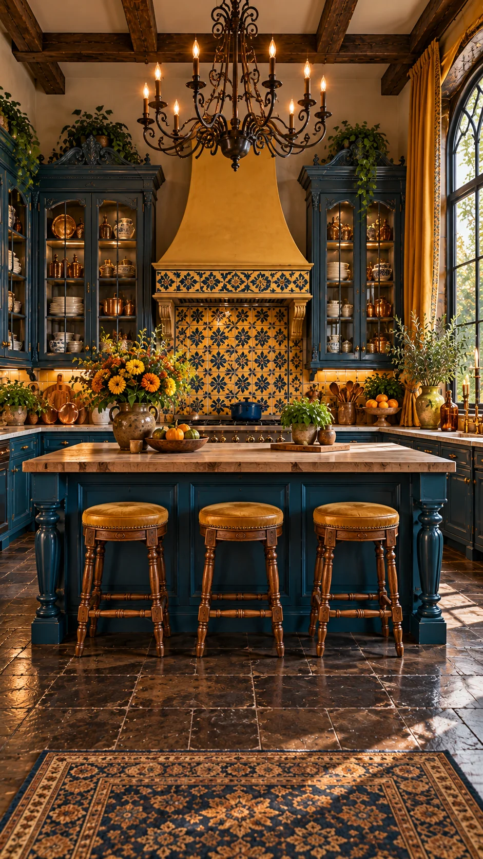
Blue and yellow sit opposite each other on the color wheel, and this kitchen uses that tension on purpose. Deep teal cabinets, a mustard-ochre plaster hood, and a blue-and-yellow patterned tile backsplash that negotiates between them. The tile is the diplomat: it contains both colors in one pattern, so the hood and the cabinets read as a pair instead of a clash.
The supporting cast stays in the warm family — copper pots glowing inside lit glass vitrines, turned-wood island legs, cognac leather stools, a wrought-iron chandelier. Warm metals matter here: brass or copper against teal usually look richer than chrome, because the warm metal picks up the yellow side of the pairing. The dark stone floor keeps everything grounded and a little moody, which suits the formality of the chandelier.
If you’re planning the surfaces around a bold cabinet color, how to make the right kitchen countertop choice from start to finish is worth reading before you order slabs — the counters have to mediate between the cabinet color and everything else, and getting that wrong is expensive to fix.
Frequently Asked Questions
What blue works best for farmhouse kitchen cabinets?
There’s no single winner — it depends on your light and your wood. North-facing or small kitchens do better with dusty, desaturated blues that won’t darken the room. Big rooms with lots of warm wood can carry navy or teal. If you’re unsure, a mid-tone slate blue is the safest middle ground: gray enough to sit quietly, blue enough to read as a color.
Will blue cabinets make my kitchen look smaller?
Deep shades can, in a small or dim kitchen — dark colors visually advance. But blue isn’t automatically shrinking: the dusty blue and two-tone kitchens above keep small rooms bright by pairing color with plenty of white. As a rule, keep dark blues low (base cabinets, island) and light colors up high if space is tight.
What hardware finish goes with blue cabinets?
Warm metals — brass, copper, bronze — are the natural partner; they warm up blue the way sunlight warms water. Black hardware works too, especially with navy, for a crisper look. What tends to fall flat is cool chrome against warm-leaning blues, which can make the cabinets look colder than they are.
Can I just paint my existing cabinets blue?
Yes, and it’s the most common way people get this look — but the prep decides the result. Clean and degrease thoroughly (kitchen cabinets hold years of airborne grease), sand lightly, use a bonding primer, and choose a paint made for cabinetry, not wall paint. Spraying gives the smoothest finish; brushing works if you use a careful hand and thin coats. Give the doors a full week to cure hard before daily use.
What countertop goes with blue cabinets?
White marble or quartz keeps blue kitchens bright and classic; butcher block warms them up and suits the farmhouse side; dark soapstone or honed granite leans moody with navy. The counter is doing mediation work — it sits between the cabinet color and the backsplash — so bring a cabinet door sample when you shop slabs.
Conclusion
The kitchens above don’t agree on a single blue, and that’s the point. Blue works in a farmhouse kitchen when it has a clear job — grounding a tall room, warming up next to brass, splitting the difference with white, or carrying a whole retro scheme on its own. Pick the shade by the light you have and the wood you’re keeping, decide how much of the room the color should own, and give it one good partner material. Do that, and the cabinets stop being a paint choice and start being the reason the kitchen feels finished.
About the Aesthetic Life Team
The Aesthetic Life Team writes practical home design guides — what looks good in photos, and what actually holds up once you live with it.

