You finally got the attic. More square footage, a door that closes, maybe even a window with an actual view. Then you stood in the middle of it and realised the ceiling drops to four feet on both sides, the furniture you own does not fit the angles, and every photo you saved for inspiration seems to ignore the beam running straight through the middle of the room.
This is the part nobody warns you about. Sloped ceilings are not a small styling detail — they change where a bed can go, how a closet works, and whether a lamp will ever sit flush against a wall. Most general bedroom advice simply does not apply here.
What follows are ten real attic bedroom layouts, each one working with the slope instead of fighting it. Some solve storage problems. Others solve light problems. A few just prove that a low ceiling does not have to mean a small-feeling room.
One idea at a time. No wasted space, no wasted advice.
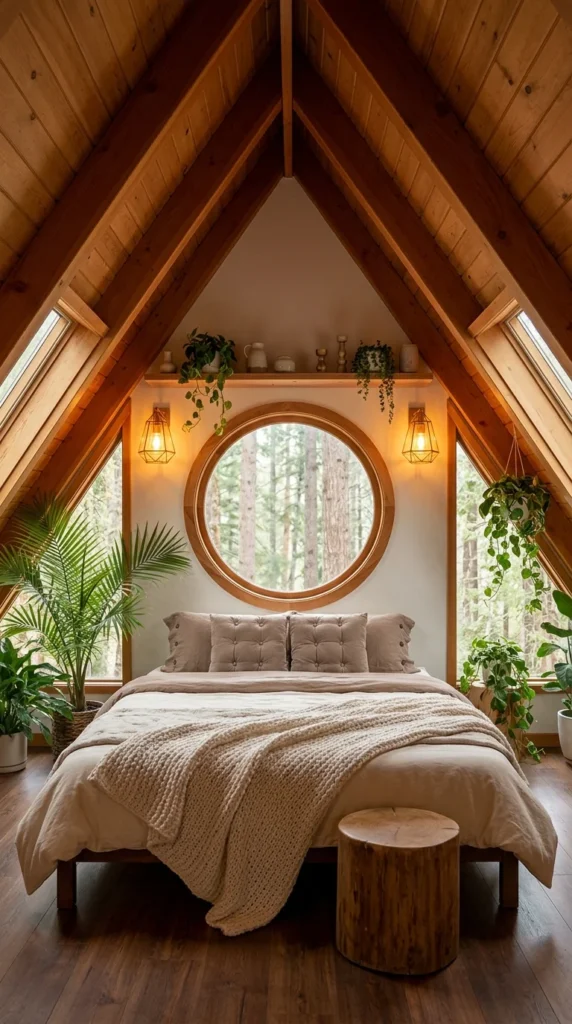
1. The Round Window Does More Than Let Light In
The bed sits exactly where the roofline stops fighting you — dead centre, under the peak, with just enough headroom for the tufted pillows stacked against the wall. That circular window above the headboard is not decorative filler. It anchors the entire wall, giving the eye one fixed point to return to instead of getting lost in the diagonal beams crossing overhead.
This is a grounding element at work: in a room built entirely from angles and slanted glass, one perfect circle interrupts the pattern just enough to keep the space from feeling chaotic.
The hanging plants earn their spot too. Trailing greenery near a low slope softens a ceiling line that would otherwise feel like it’s closing in on the pillows below. Worth noting — that stump-shaped side table works here specifically because nothing else in the room is boxy enough to compete with it.
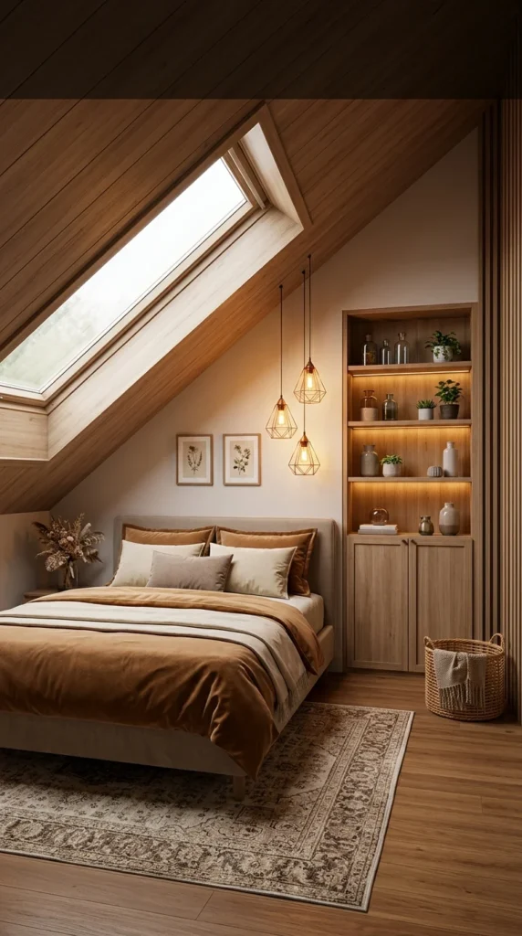
2. Built-In Storage Solves the Problem Freestanding Furniture Never Could
The dresser that fits perfectly in a normal bedroom simply will not work here — the slope eats too much vertical space, and a boxy piece shoved against that angle wastes half its own depth. This room skips the problem entirely by building storage into the one wall that’s actually straight.
That shelving unit does real work: open cubbies up top for display and closed cabinets below for anything you’d rather not style. The three geometric pendants hanging at staggered heights are doing more than adding warmth — they’re filling the dead air next to the skylight, a spot that would otherwise feel empty every time you walked past it.
Honestly, a rug this patterned is a bold choice against a duvet this saturated. It works here mostly because the wood tones never compete with either one.
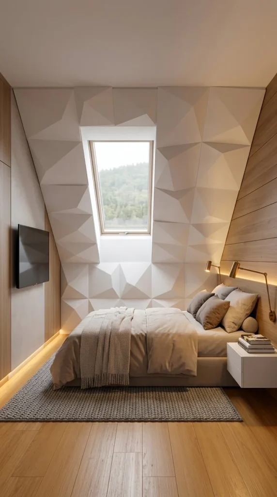
3. A Textured Wall Panel Turns the Slope Into the Feature, Not the Flaw
This is not a subtle choice, and it shouldn’t be. Faceted panels cover the entire sloped ceiling, wrapping around the skylight instead of stopping at its frame — a decision that either commits fully or looks unfinished, with no comfortable middle ground.
It commits. The geometric texture catches light differently throughout the day, which means the wall itself changes character depending on when you’re lying in bed looking up at it. That’s a detail no flat painted ceiling could ever offer.
The floating nightstand and recessed lighting along the floor keep the rest of the room quiet on purpose — visual weight stays concentrated on that one dramatic surface instead of getting split across multiple statement pieces. A wall-mounted TV on the opposite side saves floor space a dresser would have claimed instead. This is the kind of design that photographs beautifully and asks a fair amount of upkeep in return; those many-angled surfaces mean dusting corners you’d never think about in a standard room.
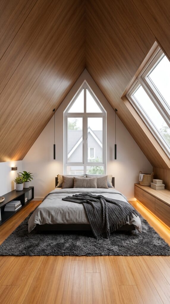
4. Low Built-Ins Replace the Furniture the Slope Won’t Allow
Where the first room in this list solved storage with a tall cabinet, this one takes the opposite route entirely. The low bench-style cabinetry running along the right wall sits exactly where the ceiling gets too low for anything taller — a space compression check that most people skip until they’ve already bought furniture that won’t fit.
Long linear pendant lights hang down instead of out, a small adjustment that matters more than it looks. In a room this steep, a standard pendant with a wide shade would clip the slope before it even reached a useful height.
That triangular window at the peak is doing quiet work too — it echoes the shape of the roofline instead of fighting it, which keeps the whole wall feeling intentional rather than accidental. The grey shag rug and dark bed frame ground a room that could otherwise feel like it’s all roof and no floor.
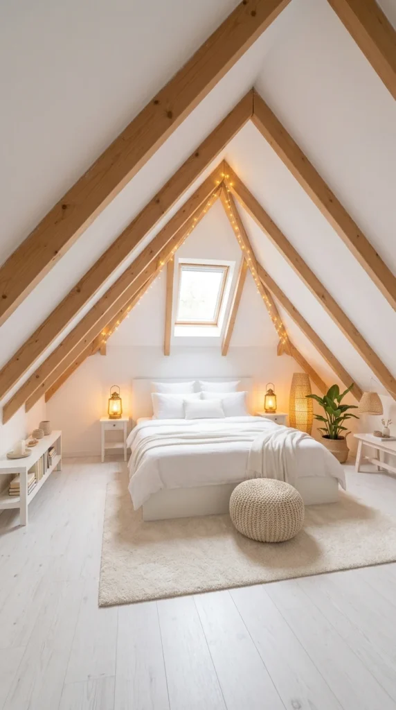
5. White Walls Let the Exposed Beams Do All the Talking
Sometimes the simplest choice is the right one. Every surface here — walls, ceiling, floor, bedding — stays close to white, which means the raw wooden beams crossing overhead become the only real colour story in the room. Nothing competes with them.
That’s a deliberate restraint, not a lack of ideas. A visual noise index this low means the eye has nowhere else to land except up, toward the exposed structure. Most attic renovations try to hide behind drywall.
The string lights woven along the rafters add warmth without adding clutter, and the two lantern-style lamps flanking the bed pick up that same amber tone at a lower, more liveable height. A chunky knit pouffe and matching rug soften a room that could otherwise feel a little sparse. Where the geometric room a few sections back leant into pattern, this one leans into quiet — proof that either direction can work in a sloped space.
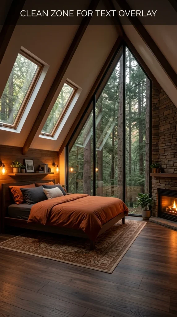
6. A Fireplace Changes the Slope From a Constraint Into a Reason to Stay
Most attic bedrooms treat the sloped wall as something to work around. This one turns it into a floor-to-peak window instead, letting the roofline frame an entire wall of trees rather than hiding behind curtains or blinds. That is a different kind of confidence — the room has nothing to apologise for, so it does not try to soften the angle at all.
The stone fireplace tucked into the corner is doing more than adding heat. It introduces a grounding element heavy enough to balance all that glass, keeping the room from feeling like it’s floating in the forest rather than sitting inside it.
Rust-coloured bedding against dark wood floors picks up the warm light from both the fireplace and the pendant bulbs along the shelf. Honestly, a setup this dependent on natural surroundings only works if the view holds up in every season — worth considering before committing to a wall this exposed.
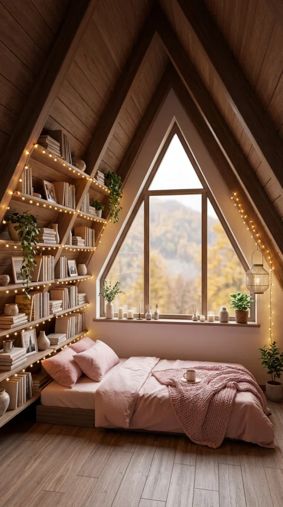
7. Bookshelves Follow the Slope Instead of Fighting Its Angle
This is a straightforward setup, and it does not need a hidden insight to work. The shelving on the left is simply built to match the roofline exactly — each shelf shorter than the one above it, stepping down in a way that follows the slope’s own geometry instead of forcing a rectangular unit into a triangular space.
The windowsill deep enough to hold a full row of candles and small vases is a small architectural gift most attics don’t offer. Someone clearly planned around it rather than ignoring it.
What struck me first here was the pink bedding against all that warm wood — a combination that sounds risky on paper and reads as soft in person, mostly because the string lights keep everything at the same amber temperature. A cup left on a saucer next to the throw is a small, unstaged detail that makes the whole scene feel lived in rather than styled for a single photo.
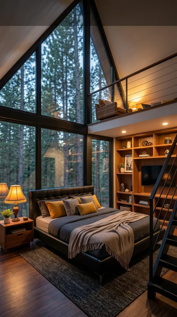
8. A Loft Level Adds a Second Room the Roofline Never Advertised
Two floors of usable space inside an attic is not something every roof shape can support, and it comes with a trade-off worth naming upfront: that open metal staircase eats floor area a simpler attic layout would have kept for the bed itself. The room accepts that cost because what it gains is a genuine second seating zone above, visible through the cable railing rather than sealed off.
Floor-to-peak glass runs the full height of both stories, so the tree line reads as one continuous view instead of two separate windows stacked on top of each other. That continuity is the real trick — space compression usually happens where a slope meets a wall, but here the glass skips the problem by replacing the wall entirely.
Warm brass lamps and mustard pillows keep the lower level from reading as cold, despite all that black steel and dark leather. A built-in media wall tucked beside the stairs uses awkward leftover space that a freestanding dresser never could.
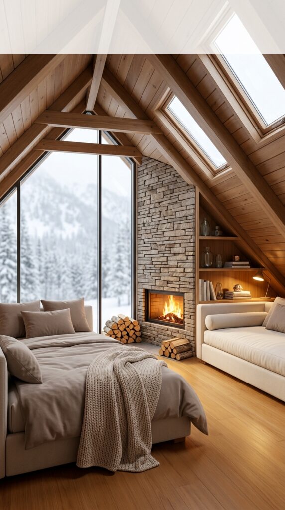
9. A Second Seating Area Proves an Attic Bedroom Doesn’t Have to Choose One Function
The stone fireplace stacked into the slope does double duty — it heats the room, yes, but it also acts as the wall that separates two distinct zones without a single piece of drywall involved. A bed on one side, a low daybed built into the eave on the other. That distinction matters more than it seems once you realise most attic layouts force everyone into one shared footprint.
Stacked firewood sitting right beside the hearth is a practical touch as much as a stylish one — nobody wants to climb down a narrow attic staircase mid-winter for more logs. Floor-to-ceiling glass on the left keeps the mountain view as the room’s real focal point, with the skylights above adding a second light source that shifts the mood from morning to evening.
Where the loft room solved extra space with a second floor, this one solves it sideways – proof that a sloped ceiling can still make room for more than just a bed, as long as the layout respects where the roofline actually allows it.
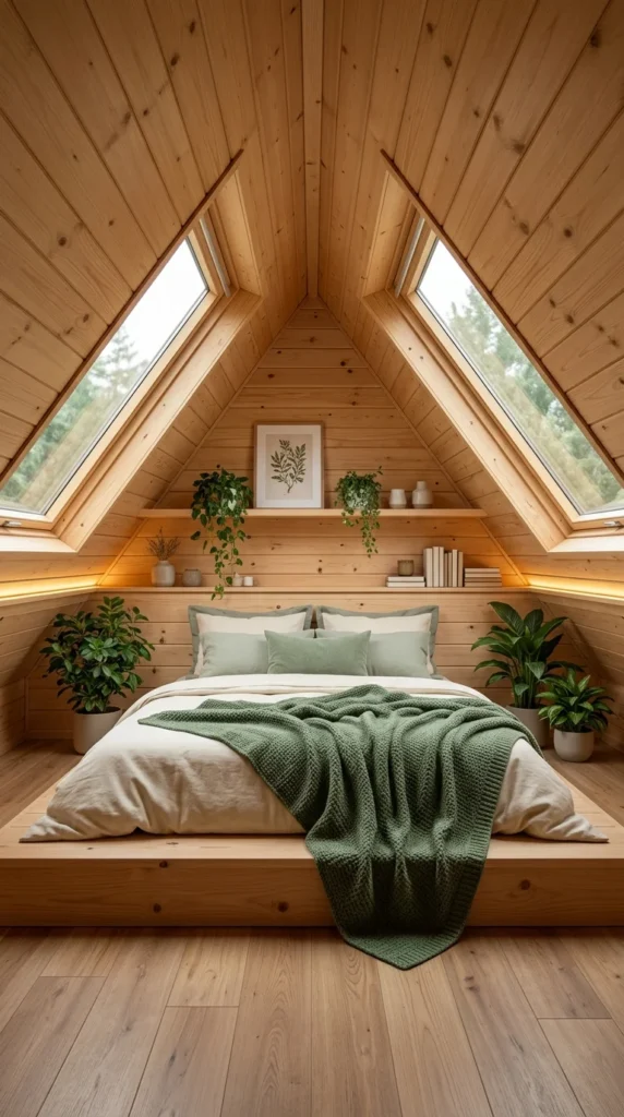
10. A Raised Wood Platform Gives the Bed Somewhere to Belong
Instead of a bed frame with legs, this room builds a simple wooden platform straight into the floor — a solution that works specifically because the roofline overhead already reads as one unbroken triangle of wood. Adding a separate frame underneath would have introduced a material break the room doesn’t need.
Recessed lighting tucked beneath the low shelf edges is a small detail easy to walk past without noticing, but it’s doing real work at night: instead of one overhead source flattening the whole room, the light spills low and sideways, keeping the peak above in soft shadow rather than glare.
Every plant in the room sits at floor level or on that single shelf, never anywhere the sloped ceiling would clip its leaves. That’s a scale integrity check most people skip — a plant that’s slightly too tall for its spot ends up looking cramped rather than lush, no matter how healthy it is. Green and cream keep the palette calm, letting the wood grain stay the actual star.
Bringing the Slope Into the Design, Not Around It
Ten rooms, ten completely different roof pitches, and one thing every single one of them shares: none of them tried to disguise the slope as a flaw. The round window worked because it interrupted the angle on purpose. The bookshelves worked because they stepped down with the roofline instead of ignoring it. Even the loft and the fireplace-divided room found extra function by building into the shape of the ceiling rather than fighting for space it never had.
That’s really the one insight worth carrying forward. An attic is not a bedroom with a design problem — it’s a bedroom with a different set of rules, and the spaces that feel the most finished are usually the ones that stopped trying to make the ceiling behave like a normal one.
If there’s a single takeaway before you start moving furniture in, it’s this: measure the slope before you buy anything, not after.
A Few Questions Worth Answering
How low does an attic ceiling need to be before it affects furniture placement? Most furniture starts to feel cramped once the ceiling drops below about five feet at the edges. That doesn’t mean the space is unusable — it usually means storage, seating, or a low platform bed belongs there instead of anything meant to be walked around or stood next to.
Is it better to paint a sloped ceiling the same colour as the walls or a contrasting one? Both approaches show up in this list, and both work. A matching tone, like the all-white room, tends to make the slope feel less noticeable. A contrasting material, like exposed wood or a textured panel, turns the slope into the room’s focal point instead of something to minimise.
What’s the most renter-friendly way to deal with an awkward attic angle? Skylights and built-ins usually aren’t an option for renters, but low furniture, floor-level plants, and lighting placed under the slope rather than above it can recreate a lot of the same effect without touching the structure at all.