
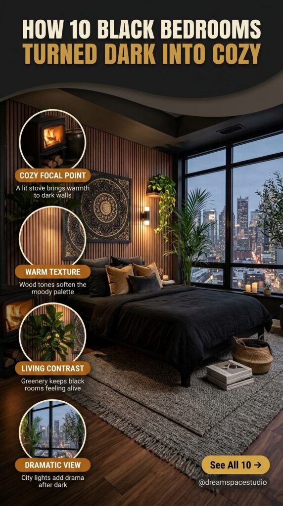
You paint the walls black; add a few candles, maybe a velvet throw — and somehow the room still feels flat instead of moody. That gap between the Pinterest version of a black bedroom and the one people actually end up living in is more common than most design blogs admit. A black bedroom is not just a colour choice; it is a lighting decision, a texture decision, and often a scale decision that gets skipped in the rush to look dramatic.
What follows are 10 real bedrooms that manage to feel warm rather than heavy and intimate rather than cave-like. Some lean into contrast, others rely on texture layering, and a few make their case through restraint alone. None of them depend on expensive furniture or a full renovation — most of the ideas here translate to a rental-friendly approach just as easily as a permanent one.
The goal is not to convince you that black is the safest choice for a bedroom. It usually is not. The goal is to show where it actually earns its place — and where a smaller adjustment would make the whole room work better.
1. A Wall That Does More Than Decorate
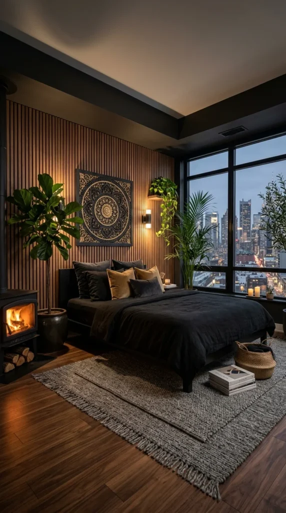
The wood slat wall is doing the real work in this room, not the black bedding everyone notices first. Vertical wood panelling behind a black bed frame creates a warm backdrop that keeps the darker tones from swallowing the space, which is the actual reason this room reads as inviting instead of heavy. The fireplace anchors the left side visually, while the floor-to-ceiling window on the right pulls the eye toward the city skyline, so the room ends up with two competing focal points instead of one — and that tension is intentional.
Olive and mustard velvet pillows against black linen keep the palette from feeling one-note. The woven jute rug underfoot adds a textural break from the dark wood flooring, something easy to miss in photos but immediately noticeable underfoot. A real fireplace like this is a luxury constraint most renters will not have, though a similar wood-slat accent wall is achievable without one.
2. Red as the Only Decision That Matters Here
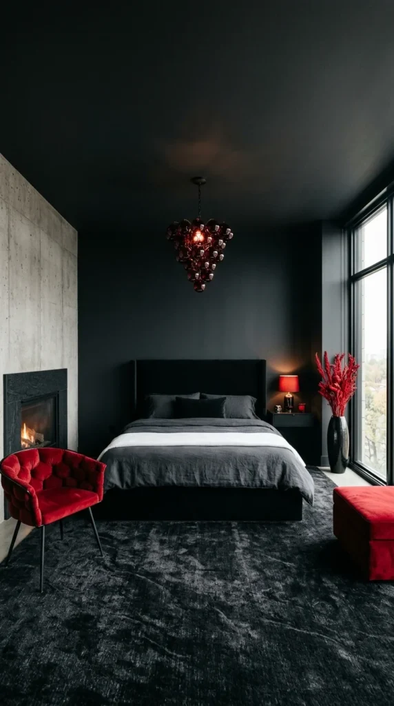
Personally, I would hesitate before painting an entire bedroom matte black floor to ceiling — it is the kind of choice that photographs beautifully and can feel disorienting to actually sleep in. What saves this room is restraint elsewhere: only three objects carry colour, the velvet armchair, the ottoman, and the dried red stems in the corner, and every one of them is the same saturated red. That repetition is what makes the room feel designed rather than accidental.
The grape-cluster pendant light doubles as sculpture and light source, which matters more than it first appears — without it, the ceiling would swallow the room entirely. A concrete accent wall beside the fireplace breaks up the monochrome without introducing a second colour, keeping the palette disciplined. This is a high-commitment look, and most people who try an all-black room this dark end up adding at least one lighter element within the first year, whether they planned to or not.
3. White Bedding Changes Everything About This Room
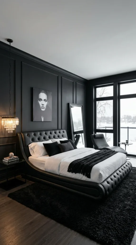
The tufted leather bed frame curves at both ends instead of standing flat, giving the room a silhouette that reads as furniture design first and colour scheme second. What actually keeps this bedroom from feeling like the previous two is the white bedding — a single choice that resets the entire tone of the room. Where the earlier spaces leaned into red and gold to soften black, this one uses plain white linen instead, and the effect is sharper, almost architectural rather than warm.
The panelled wall moulding behind the headboard adds dimension without adding colour, something a flat painted wall could not achieve on its own. A full-length mirror beside the window does double duty, reflecting the lake view back into a room that otherwise has no natural light source on that side. The black-and-white portrait above the bed is the only piece of visual noise allowed, and it works precisely because nothing else in the room competes with it.
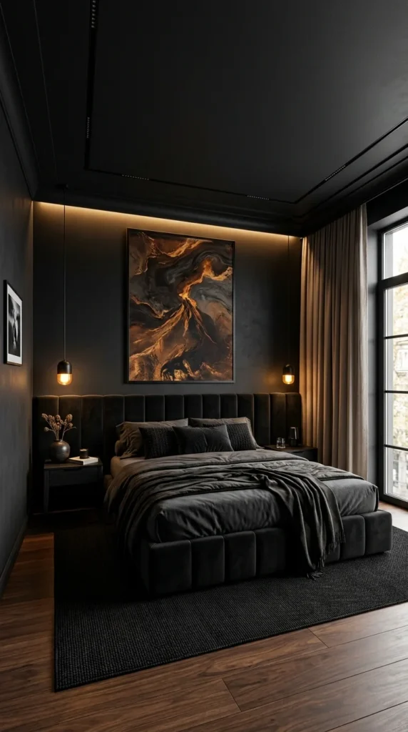
4. Hidden Lighting Doing the Job of a Second Window
This room has no overhead fixture doing the heavy lifting, and that is worth noticing on its own. A cove lighting channel runs along the ceiling edge above the headboard, and two pendant lights drop low on either side of the artwork. Together they replace the need for a lamp on every surface, which is a practical detail as much as an aesthetic one. The abstract gold and charcoal artwork becomes the visual centre of the room simply because it is the only thing lit directly.
The channel-tufted headboard runs the full width of the wall rather than stopping at the bed frame, a small-scale decision that makes the room feel considered rather than furnished piece by piece. Linen curtains in a warm taupe are the only material in the room that is not black, grey, or wood-toned, and that single break in the palette keeps the space from feeling like a stage set. A jute rug underfoot repeats the texture idea from earlier rooms in this list, proving it is not a one-off trick but a pattern worth borrowing.
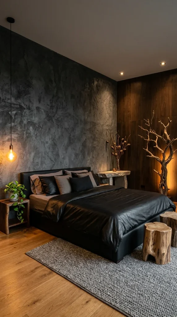
5. Raw Plaster Meets a Driftwood Sculpture
A raw plaster wall covers most of the left side of this room, textured and uneven in a way that catches the single pendant bulb hanging beside it. The bed itself is simple — a black leather headboard, grey and black pillows layered without much pattern, and a satin throw folded at the foot of the bed. On the right, a dark wood accent wall and a tall driftwood branch sculpture lit from below give the room its second personality, more rustic than the polished bedrooms shown earlier.
Two tree-stump side tables sit at the foot of the bed, unfinished bark still visible along the edges. A small stone side table holds a vase of dried branches, echoing the driftwood piece across the room. The wool rug underfoot is looped rather than flat-woven, adding texture at floor level that the walls handle at eye level. Nothing in this room is trying to look expensive — it is trying to look found, and that distinction matters more than it seems.
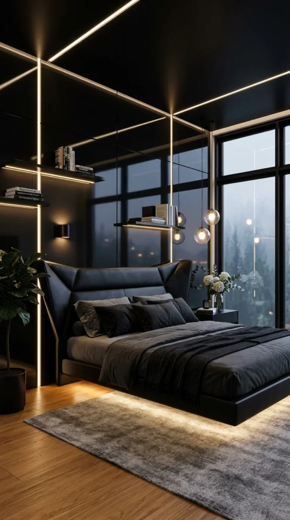
6. The Bed That Appears to Float
Under-bed LED strips create a gap of light between the frame and the floor, making the entire bed look like it is hovering rather than resting on the ground. It is a striking trick and also a genuinely impractical one for anyone who wants to store anything underneath a bed. A grid of thin linear ceiling lights repeats the same geometry across the walls and ceiling, turning the whole room into something closer to an architectural drawing than a place to fall asleep.
The angular leather headboard has sharply folded panels instead of the soft tufting seen in earlier rooms, giving it a harder edge that suits the room’s overall geometry. Two floating bookshelves hold real books rather than styled objects, a small detail that keeps the room from feeling entirely staged. Outside the floor-to-ceiling windows, a foggy pine forest replaces the usual city skyline, and that view alone changes the mood of the whole space more than any single piece of furniture could.
Pro Tip: Under-bed lighting looks striking in photos, but it also means giving up the storage space most bed frames are built to offer – worth weighing before committing to it.
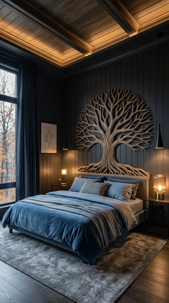
7. A Carved Tree That Refuses to Be Ignored
This is not a room built around subtlety, and honestly, that is fine — some spaces are meant to have one thing you look at first. A hand-carved wooden tree sculpture spans nearly the full height of the headboard wall, its branches spreading into an arch that frames the bed below. The coffered wood ceiling, lit from recessed channels along each beam, is the only other element competing for attention, and the two work together instead of against each other because both are wood against black.
Slate blue velvet bedding is the one colour decision that keeps the room from feeling like a single material study. Where earlier rooms in this list used red or gold to warm up black walls, this one reaches for a cooler, quieter blue instead — a different answer to the same problem. A pair of mismatched bedside lamps, one glass globe and one classic drum shade, adds a lived-in irregularity that a matched set would not. The wide-plank wall panelling running vertically behind the tree carving keeps the wall from reading as flat, even in the sections the sculpture does not cover.
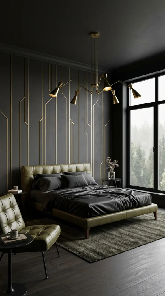
8. Brass Lines Traced Into a Plaster Wall
Thin inlaid brass channels run vertically up this wall in an irregular, branching pattern, catching light differently depending on where you stand in the room. It is a wallcovering treatment rather than paint or wood, and it gives the room a decorative focal point without needing any artwork at all. An olive leather bed frame and a matching tufted armchair pick up the warmer, muted tone of the brass, tying the furniture to the wall instead of leaving it as a separate decision.
A sculptural brass pendant light with multiple articulated arms hangs low over the bed, each shade angled independently rather than pointing the same direction. The floor-to-ceiling window brings in a foggy forest view similar to a few other rooms on this list, though here the darker olive and charcoal palette makes the outside light read as colder by contrast. A small round table beside the armchair holds a coffee cup and a stack of books, the kind of ordinary detail that keeps a highly styled room from feeling untouched.
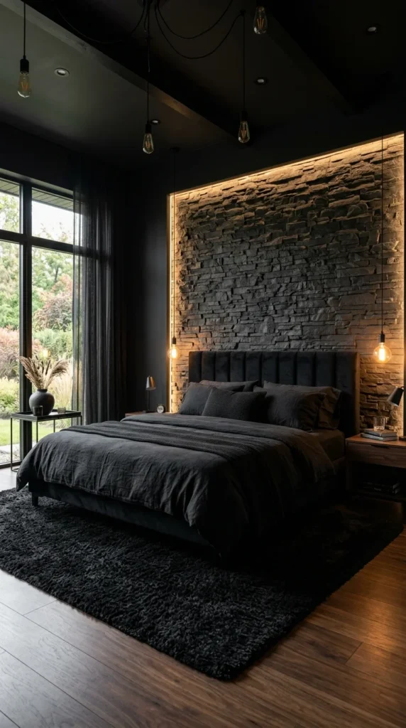
9. Backlit Stone That Looks Older Than It Is
A stacked stone accent wall rises behind the bed with a strip of hidden light running along its top edge, throwing shadows across every uneven ridge in the rock. That backlighting is the entire trick — the same wall under flat overhead light would look heavy and closed in, but lit from behind, it gains depth instead of just mass. Exposed Edison bulbs hang at staggered heights in front of the stone, their filaments doing double duty as both light source and visual texture against the rough surface.
A channel-tufted headboard in charcoal velvet sits directly against the stone, and the contrast between smooth fabric and jagged rock is the one design decision holding this whole wall together. Sheer linen curtains on the left let daylight in without fully exposing the garden view, a softer answer than the heavier drapery seen in a few other rooms on this list. The shag rug underfoot is the deepest pile of any room here, and it is the kind of detail that reads as an afterthought in photos but changes how the whole room feels the moment bare feet hit the floor.
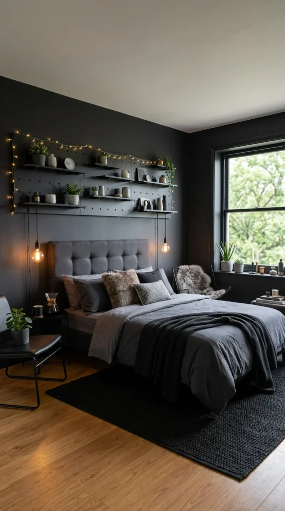
10. A Pegboard Wall Doing the Work of Ten Shelves
This is the most rental-friendly room on the list, and it is worth saying plainly instead of dressing it up. A pegboard wall system replaces built-in shelving entirely, holding a mix of small planters, candles, a clock, and framed photos on floating shelves that can be rearranged or removed without patching a single hole. String lights woven along the top shelf add a soft glow that a hardwired fixture could not replicate, and two hanging pendant bulbs on either side of the headboard add reading light without a permanent installation.
The grey tufted headboard and knit throw blanket keep the bedding softer and more textured than the leather and velvet seen in earlier rooms, which suits a space built around layering small objects rather than a single statement piece. A faux fur pillow and throw on one side of the bed add warmth without needing real fireplaces or stone walls to do it. The window seat holds a small collection of plants and candles, proving that even a rented room with basic white trim can look intentional with the right combination of low-cost additions.
Bringing It All Together
Looking back across these ten rooms, the one thing that never changes is this: black works when something else is doing the warming. Sometimes that job falls to a wood accent wall, sometimes to velvet in a saturated colour, and sometimes to nothing more than a single string of warm-toned bulbs. The rooms that felt the coldest were not the darkest ones — they were the ones missing that second element entirely.
What surprised me most, honestly, was how often texture did more heavy lifting than colour. A jute rug, a raw plaster wall, a shag pile carpet — these showed up again and again, almost more consistently than any specific shade of black. That is probably the real takeaway here: a black bedroom is rarely a paint decision alone. It is a layering decision, built from lighting, material, and one or two colours that are allowed to stand out precisely because everything else stays quiet.
FAQs About Black Bedrooms
1. Will a black bedroom make a small room feel smaller? Not necessarily — it depends heavily on lighting and contrast. Rooms with hidden or layered lighting (like cove lighting or pendant bulbs) tend to hold depth even in dark colours, while a flat, unlit black wall can feel more confining. Adding one lighter element, like white bedding or a pale rug, also helps keep the space from feeling boxed in.
2. Is a black bedroom a good idea for renters? It can be, if approached carefully. Full wall painting usually is not renter-friendly, but black bedding, dark rugs, black furniture, and accent lighting can achieve a similar mood without any permanent changes — similar to the pegboard-and-string-lights approach shown in one of the rooms above.
3. What is the easiest way to keep a black bedroom from feeling cold? Introduce warmth through material rather than colour — think velvet, wood, wool, or leather — and add at least one warm light source, such as a pendant bulb or lamp with an amber tone, rather than relying on cool overhead lighting alone.

3 Responses