You walk into the living room, and your eye lands on the same spot every time — the bulky base of a traditional TV stand, sitting heavy on the floor and quietly shrinking the room around it. In smaller apartments and rentals, every square foot of floor space genuinely matters, yet a traditional stand works against that. A floating unit lifts the TV off the ground and gives the eye an uninterrupted line across the wall, so the room reads as more open even when nothing else in the layout has changed.
This isn’t a rental trick or a passing trend. It works because it shifts how visual weight gets distributed across a room, changing perception more than it changes appearance. What follows are ten real floating TV walls, examined for what actually makes each one work, not just how it photographs. The focus stays on material choices, layout logic, storage behaviour, and daily usability — ideas translated for real homes, not showroom staging.
1. A Carved Wall That Makes the TV Secondary
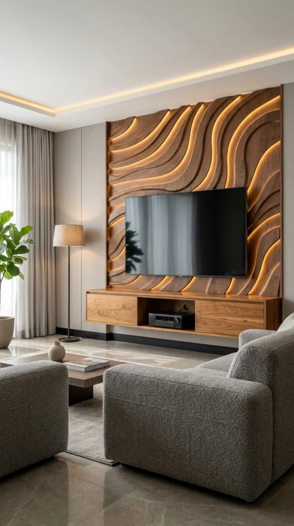
A sculpted walnut backdrop isn’t decoration layered on top of this wall — it’s the actual focal point, with the TV and floating console sitting almost secondary to it. Warm LED strips tucked into each carved channel create a rhythm effect, pulling the eye across the wall in waves rather than letting it settle flat. Walnut’s deep, warm tone anchors the space, while the flat grey wall around it stays quiet, letting texture do the work instead of colour. Against this much visual movement, the black screen reads almost as a calm void, a rare case where the TV isn’t the star of its own wall. The floating console below carries the actual daily function — a closed cabinet on one side, an open shelf for the receiver on the other — while the wall above stays purely sculptural. Deep-carved grooves collect dust in ways a flat panel never would, so this look genuinely needs a duster with reach, not a quick wipe.
2. One Curved Line Doing the Work of a Divider
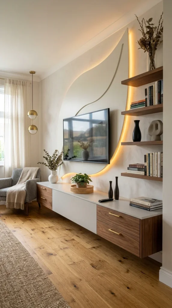
A single glowing curve traces up this wall like a freehand sketch, separating the TV zone from the shelving without a single physical divider. White lacquered panels and walnut-toned drawers alternate across the same console, creating rhythm through material rather than through shape. Floating shelves on the right balance the horizontal console below, giving the wall a vertical anchor so nothing feels bottom-heavy. What’s easy to miss on a first look is that the curved lighting channel almost certainly conceals wiring for the TV and shelf lights, quietly solving a problem most floating units leave visibly exposed. The drawer pulls and the pendant lights above share the same warm brass tone, tying two unrelated zones of the room together without announcing it. A jute rug and warm oak flooring keep the room grounded, so the sculptural wall detail doesn’t feel like it’s floating in isolation. Open shelving photographs effortlessly, but it demands ongoing dusting and rearranging to keep that curated look intact.
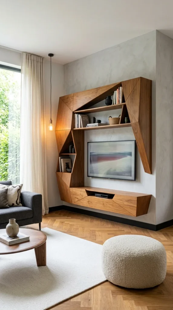
3. When Sharp Angles Ask for Careful Placement
Those angular points look striking, but they demand careful furniture placement nearby, since low-hanging edges near seating can become an actual bump hazard — worth knowing before this design gets copied into a tight layout. The walnut structure here is built from angular, cut-plane surfaces, so the entire unit reads as sculpture first and shelving second. Shelves shift in size and angle instead of repeating uniformly, creating a visual tension that keeps the eye moving instead of resting flat. Set inside its own angled recess, the screen looks closer to a piece of wall art than an appliance mounted for function. Honey-toned walnut sits against a marbled grey backdrop, a deliberate temperature contrast that keeps the unit from blending into the wall. Books, ceramics, and a woven basket sit exposed rather than hidden, turning storage into part of the room’s styling. Multiple angled surfaces and open compartments also mean more corners to dust than a single flat shelf would ever ask for.
Pro Tip: A design built from large angular panels only holds together visually at a certain scale – shrinking the same geometric shape onto a smaller wall tends to read as cramped rather than sculptural.
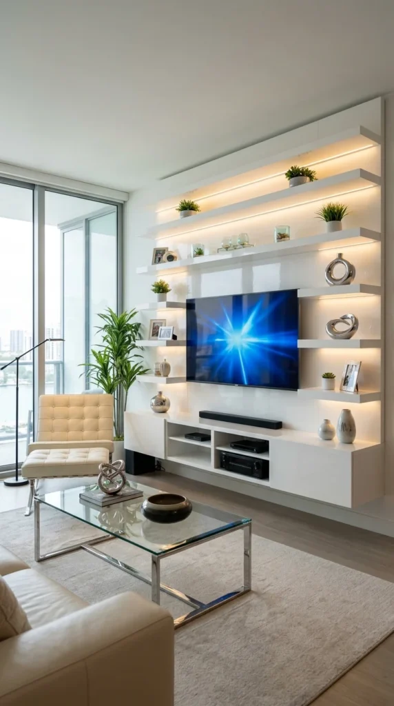
4. An All-White Wall Kept From Feeling Sterile
Every shelf, panel, and console on this wall runs in the same glossy white, so the whole thing reads as one continuous structure instead of stacked furniture pieces. Each ledge sits at a slightly different length and height, breaking what could easily become a rigid grid into something closer to natural rhythm. Warm LED strips tucked beneath each shelf create small glow pools that make the white surfaces feel dimensional rather than flat. Small potted plants scattered across the shelves interrupt the white-and-chrome palette, keeping the wall from tipping into sterile territory. The soundbar and AV components sit in open cubbies on a lower shelf, kept accessible without needing to be hidden behind closed doors. That reflective white finish photographs beautifully but shows fingerprints and dust noticeably faster than a matte surface would. The wall of windows beside the unit is doing as much visual work as the shelf lighting itself — in a room without that natural light, this same white scheme could read flat instead of luminous.
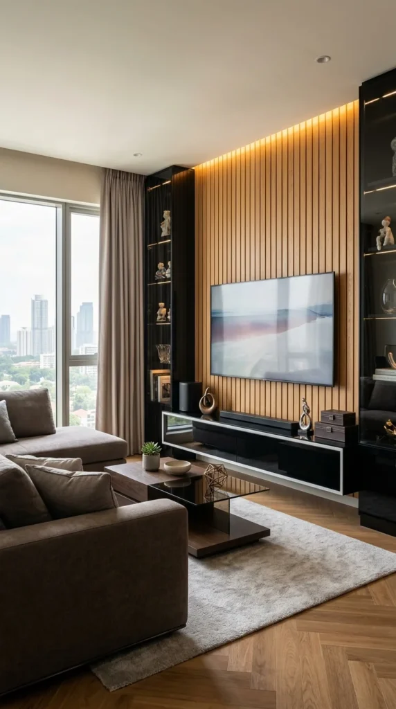
5. Shadow Gaps That Change With the Light
What’s easy to miss walking past this wall quickly is that the narrow grooves between each slat catch shadow at different angles through the day, so the texture actually shifts with the light rather than staying static. Vertical slats run in evenly spaced ridges across the wood-panelled wall, and that repetition alone creates a sense of height, pulling the eye upward before it even reaches the TV. A glossy black console floats beneath the warm slats on purpose, a contrast move that keeps the wood from feeling like the only material in the room. Black glass-front cabinets flank the main wall symmetrically, framing the TV zone with a sense of intentional boundary. Floor-to-ceiling windows bring in a city skyline that pulls visual energy away from the TV wall, meaning this design only fully works in a room where both focal points can genuinely coexist. Those slat grooves are excellent at catching dust, and cleaning them properly takes more time than a flat panel ever would.
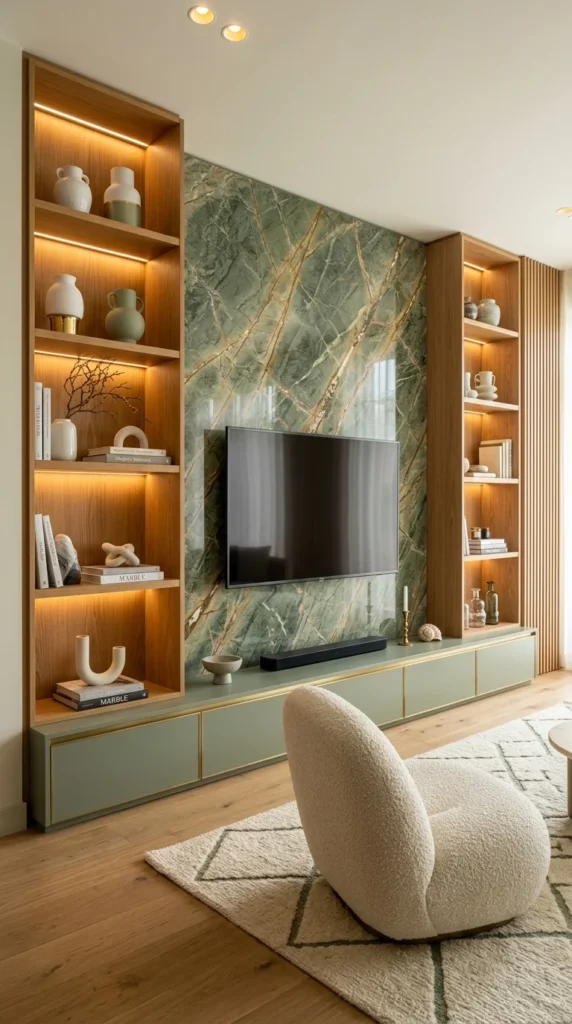
6. Where Green Marble Gets to Be the Only Star
I find myself drawn back to how little this room needed beyond one slab of stone. A veined green marble panel commands the middle of the wall, its gold-toned streaks catching light in a way no painted surface could replicate. Matching walnut shelving units flank the marble on both sides, creating a balanced composition where the eye naturally settles in the centre. The floating console below picks up the marble’s muted green tone, so the storage unit feels like an extension of the wall rather than a separate piece of furniture. Warm strip lighting inside each wooden compartment gives the open shelves a gallery-like glow, turning everyday objects into something closer to displayed pieces. A bouclé chair softens the room’s hard surfaces, its rounded, textured form sitting in direct contrast to the marble’s cool sheen. That glossy marble finish shows fingerprints and smudges faster than a matte alternative, especially at TV-remote height, and matching cabinets on both sides mean less flexibility for future rearranging than an asymmetrical layout would allow.
Pro Tip: Repeating one accent metal — brass, gold, or chrome — across both the wall material and the console hardware is what makes a stone feature wall feel connected to its furniture instead of just being placed in front of it.
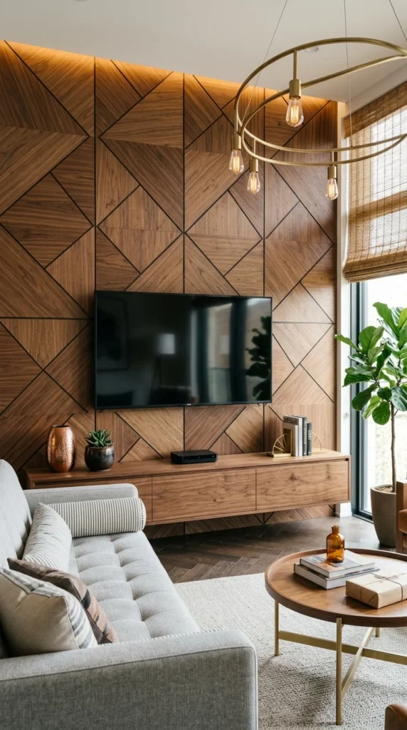
7. A Geometric Wall Without a Single Curve
What most people don’t register consciously is that each triangular panel across this wall has its wood grain running in a different direction, so the surface catches light unevenly rather than uniformly — a deliberate choice, not a manufacturing inconsistency. The walnut wall itself is built from repeating angular panels with visible seam lines, working like a large-scale geometric pattern rather than a solid slab. Dark grout lines between each wood segment give the pattern crisp definition, keeping the geometry from blurring into a soft wood texture. Because the panel grid continues right up to the screen’s edge, the TV reads as embedded rather than mounted separately onto the wall. Light glows from behind the top edge only, letting the geometric pattern below stay in natural shadow and highlight without artificial strips breaking up the wood itself. A brass chandelier’s curved, organic form is the only round shape in an otherwise angular room, and that single contrast keeps the geometry from feeling too rigid.
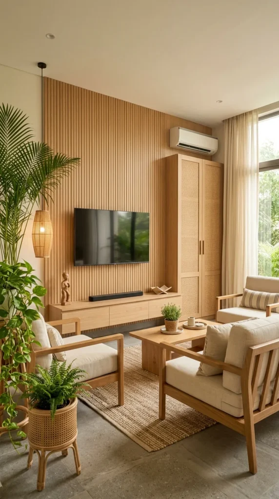
8. A Wall That Feels More Grown Than Built
Honestly, of all ten walls in this guide, this is the one I’d live with longest. Light oak slats reflect light rather than absorbing it, unlike the darker wood walls seen earlier, keeping the whole corner feeling airy instead of heavy. A tall cabinet beside the TV wears a woven cane texture that echoes the vertical slats without repeating them exactly, so the two pieces feel related rather than matched. A cylindrical rattan pendant introduces a rounded silhouette into an otherwise straight-lined wall, giving the eye somewhere to land before it reaches the screen. Layered greenery on the left visually extends the wood tones outward, blurring the line between furniture and nature. A wall-mounted AC unit sits directly above the cabinet, worked into the panelling rhythm instead of disguised – an honest nod to how real homes layer mechanical needs into design. Woven cabinet fronts collect dust in their texture just like carved wood does, needing more frequent light cleaning than a flat lacquered door would.
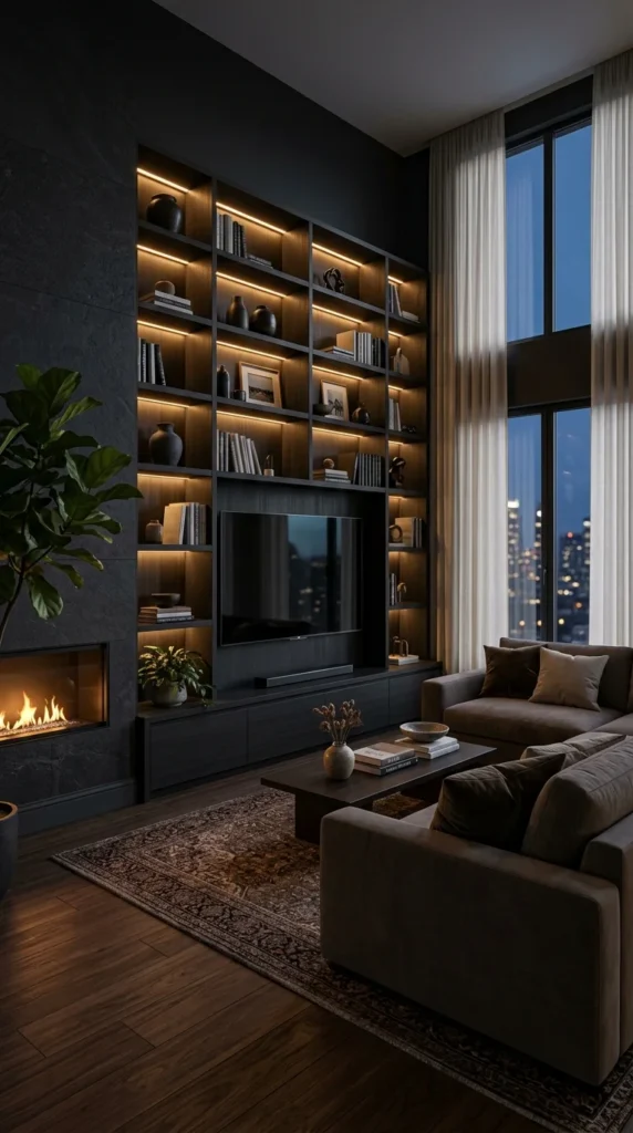
9. A Room Willing to Go Dark for the Right Payoff
This design depends entirely on artificial light doing the emotional work, and that’s worth knowing before committing to it — in daylight, a wall this dark would likely feel heavy and closed-in. Nearly every surface here, wall, shelving, and cabinetry, sits in deep matt black, letting the room rely on contrast rather than colour for its visual interest. Each shelf cube is individually backlit, so instead of one wall glowing, the eye reads dozens of small illuminated boxes, each holding a single curated object. Positioned beside the TV wall rather than beneath it, a fireplace introduces movement and warmth, competing gently with the screen for attention. A floor-to-ceiling window doesn’t just bring in a view – it adds a third light source, layering the distant skyline glow against the warm shelf lighting. Dust and fingerprints read more visibly against dark matte surfaces than against wood or white, especially near the shelf edges people touch most often.
Pro Tip: When a room relies on more than one glowing feature — a fireplace and backlit shelving, for example — placing them beside rather than beneath each other keeps them from visually competing for the same spot on the wall.
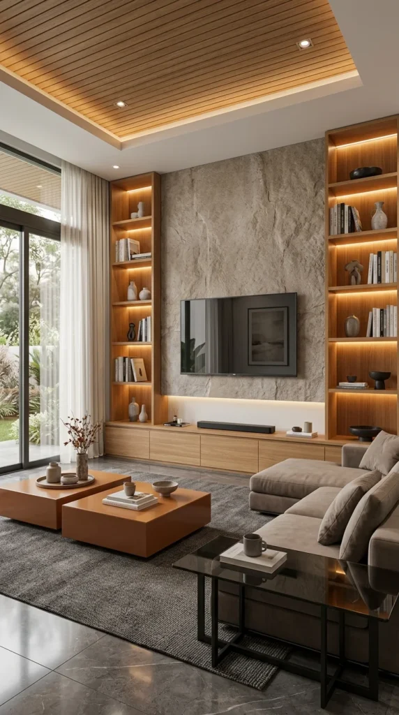
10. The Stone Wall That Refused to Match Everything Else
My first reaction to this wall was that the terracotta coffee tables shouldn’t work here, and yet they’re doing the most important job in the room. A rough, natural-finish stone slab behind the TV brings a tactile roughness that every other material in the space, from the wood shelving to the lacquer coffee tables, is deliberately smoother than. Matching walnut units on either side act like bookends, giving the textured wall a defined edge instead of letting it stretch uninterrupted across the space. A hidden light strip beneath the console throws a soft glow onto the floor, making the entire unit appear to hover slightly above the ground. Against a room built almost entirely from neutrals, wood, and stone, those burnt-orange coffee tables act as the one deliberate colour statement. A wood-panelled ceiling recess mirrors the horizontal lines of the shelving, tying the room together vertically, not just across the TV wall. That rough stone finish hides fingerprints better than the glossy marble seen earlier in this guide, but it’s genuinely harder to keep dust from settling into its grooves.
What Ten Walls Have in Common
Looking back across all ten of these walls, the TV never actually carries the room alone. It fades into carved wood, marble veining, angular geometry, or shelf lighting, always secondary to whatever surrounds it. That’s really the point most people miss when copying a floating TV unit for the floor space alone: lifting furniture off the ground matters, but the real decision is what the wall is actually for — display, warmth, contrast, or calm. The console’s job is to support that decision, not compete with the wall for attention. A full marble slab or carved panel isn’t realistic for every budget or rental, but the underlying logic behind each one translates to almost any space, floating or not. The one habit worth borrowing from all ten: decide what should hold the eye’s attention before deciding what should hold the remote. Everything else on the wall — texture, lighting, storage — tends to fall into place once that one decision gets made first.
Frequently Asked Questions
Is a floating TV unit a good fit for a rental? Many floating designs can be adapted using wall-mounted brackets or freestanding consoles styled to look built-in, avoiding permanent wall changes. It’s worth checking with a landlord before drilling into walls for heavier stone or wood panel installations.
Does a floating TV unit actually make a small room look bigger? Lifting the unit off the floor creates an uninterrupted sightline across the bottom of the wall, which tends to make the floor area feel larger. The effect tends to be strongest when paired with lighter materials or under-shelf lighting, as seen in several of the walls above.
How much maintenance do textured or carved wall panels really need? Grooved, slatted, or carved surfaces collect more dust than flat panels and typically need a duster with reach rather than a quick wipe. Glossy finishes like marble or lacquer tend to show fingerprints faster, while matte or rough textures usually hide them better.