Green is the color people are most afraid of in the dining room and most delighted by once it’s up. These ten rooms show why: green can be a backdrop, a mood, a jolt of energy, or all three at once. The shade you choose — and where you put it — decides which one you get.
What runs through all ten is that green doesn’t behave like a neutral here. Beige recedes; green participates. It changes how the wood looks next to it, how the light feels at dinner, even how the food on the table reads. That’s the real subject of this list — not ten pretty rooms, but ten demonstrations of what a single color does to a space built for gathering.
Watch the placement as much as the shade. Full-room green, one green wall, green only in the furniture — each choice creates a different kind of evening. The room you want is the one whose placement matches how you actually use the space. And don’t skip the ceiling: in rooms this saturated, a white ceiling isn’t a cop-out, it’s the relief valve that keeps the color from pressing down.
Emerald Against Terracotta
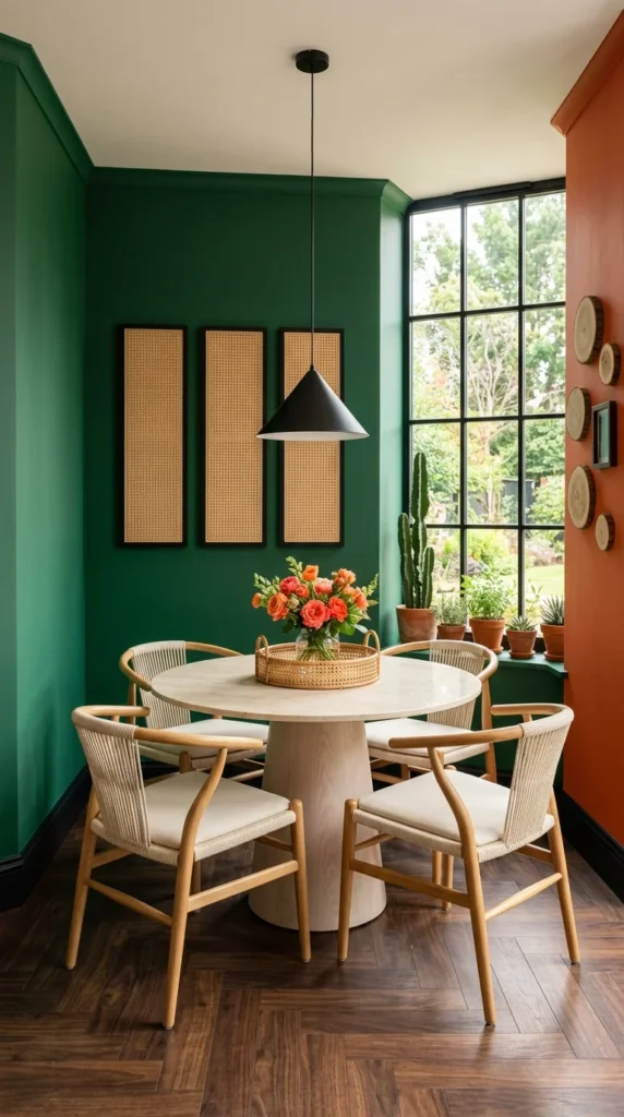
Emerald green walls, a round white table, wishbone chairs — and then the terracotta accent wall on the right, which is the decision that makes this small dining nook sing. Green and terracotta sit near-opposite on the color wheel, so each one makes the other look more itself: the green goes richer, the terracotta goes warmer.
The rattan panels on the green wall keep the deep color from feeling flat — natural texture against saturated paint is one of the most reliable combinations in decorating. And the round table is the right call for a nook this size: no corners to bump, everyone faces everyone, and the pedestal base means chair legs and table legs stay out of each other’s way.
Small dining spaces benefit enormously from one bold wall rather than four timid ones. If the emerald-and-warm pairing appeals to you, emerald green and gold living room ideas explore the same depth of green with a more metallic counterpoint.
Deep Green as a Gallery Wall
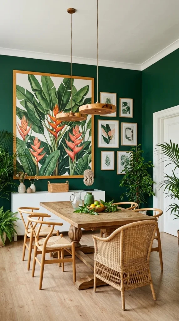
This room treats deep green the way galleries treat charcoal: as a backdrop that makes art look expensive. The oversized botanical print — orange heliconia against dark leaves — would be pretty on white; on deep green it’s dramatic. Dark walls push art forward, and the effect is closer to a museum than a dining room.
The furniture stays in the natural register — a rustic wood table, woven and rattan chairs, simple pendants — which keeps the room from going formal. The frames are thin and dark, nearly disappearing, so the art does all the talking — heavy gilded frames would have competed with the wall color instead of floating on it. That’s the balance this shade needs: deep green plus tailored furniture reads as a private club; deep green plus natural textures reads as a home. The gallery wall of smaller botanical prints on the right extends the idea without competing with the big piece.
One practical note: dark green needs light to show its depth. This room has it — big windows, pale floor — and the green glows rather than sinks. In a windowless dining room, the same shade would need the lighting plan to do the work the windows do here. Dining room wallpaper ideas that set the perfect backdrop for gatherings cover more ways to give a dining wall this kind of presence.
Mint, Layered Tone on Tone
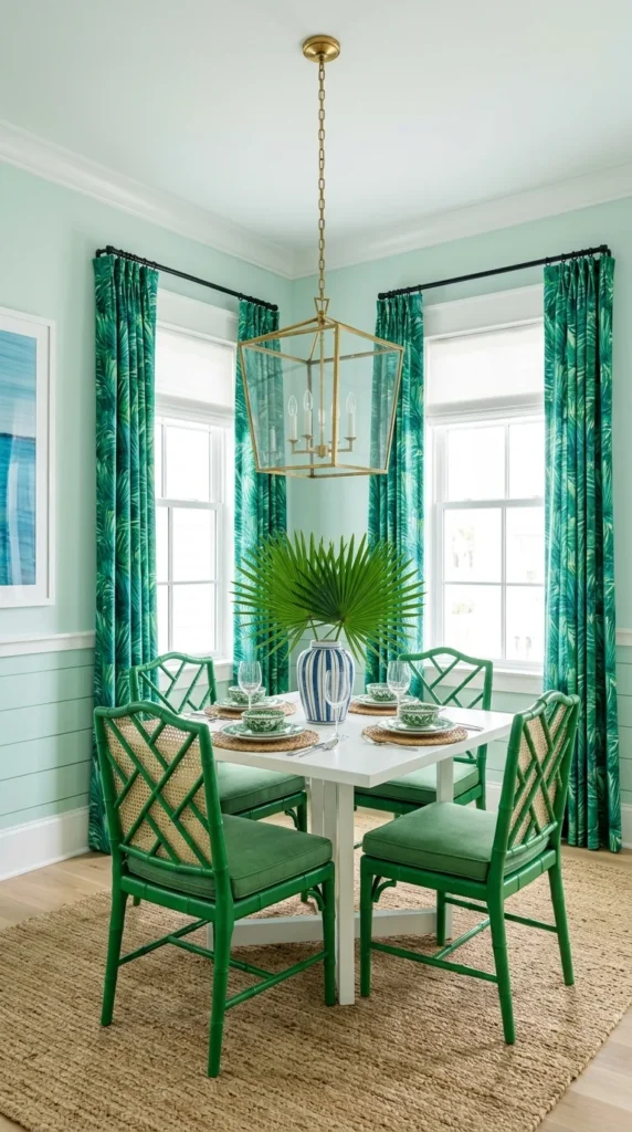
Mint walls, deeper green chairs, palm-print curtains in the darkest green of all — this room layers one color in three values, and the layering is what keeps it from feeling like a theme. Tone-on-tone is the safest way to use a lot of a strong color: the eye reads harmony instead of repetition.
The white table is doing important work as the visual break — without it, green on green on green could feel relentless. White gives the eye a resting place and makes the greens around it look intentional rather than accidental. The brass lantern pendant adds the one warm metallic note, which keeps the cool greens from feeling chilly.
Round dining tables deserve their reputation in rooms like this. Round dining table decor ideas that make every meal feel special show how the shape changes both the traffic flow and the table styling — a round top asks for a central arrangement, not a runner.
Who Mint Suits
Mint and pale greens love natural light — they’re at their freshest in bright rooms where the color can stay crisp. In a dark dining room, pale green can go murky; that’s when the deeper shades on this list earn their keep.
Going Full Monochrome
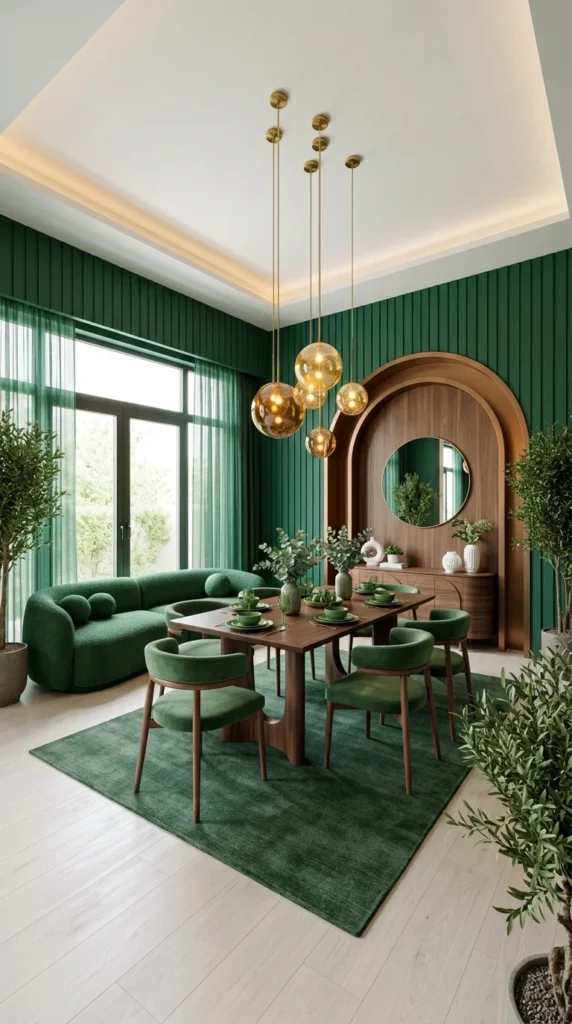
Green paneled walls, green velvet chairs, a green banquette, a green rug — this room commits to one color everywhere, and it’s the most enveloping dining space in the set. Monochrome like this works the way a cocoon works: the room holds you, and the outside world recedes.
The reason it doesn’t feel flat is texture variation. The wall paneling is smooth, the velvet is soft and light-hungry, the rug is nubby, the wood arch is grained — four greens, four textures, and the light behaves differently on each. Monochrome without texture is a paint chip; monochrome with texture is a room. The amber glass pendants are the single warm contrast, and they’re essential — without them, the green would have no counterpoint at all.
This is evening green. In daylight it’s handsome; after dark, with the pendants glowing, it’s magnetic. If you host dinners more than breakfasts, that’s an argument for going deep — dining rooms do their finest work in the evening. The velvet seating makes the same case as green velvet sofa living room ideas, just pointed at the dining table instead of the sofa.
The Single Green Wall
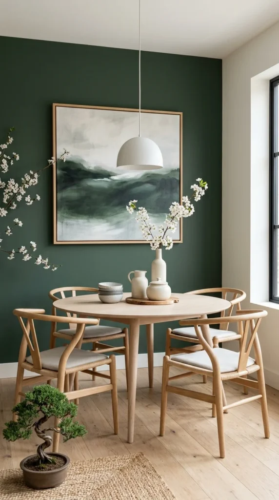
One dark green wall, everything else white — this is the lowest-commitment green on the list, and it might be the smartest. The green wall anchors the round wood table and gives the abstract art a ground to sit on, while the white walls keep the small space bright and the bonsai on the floor adds a living accent.
The mandala artwork is scaled generously against the table, which matters: small art on a big colored wall looks lost, while art that fills the wall’s presence makes the color feel chosen. The two green velvet chairs pull the wall color down to seating level, so the green doesn’t float unconnected above the table.
If you’re green-curious but not green-committed, this is the entry point: one wall, painted in a weekend, reversible in a weekend. Live with it for a season and you’ll know whether you want more.
Sage as a Neutral
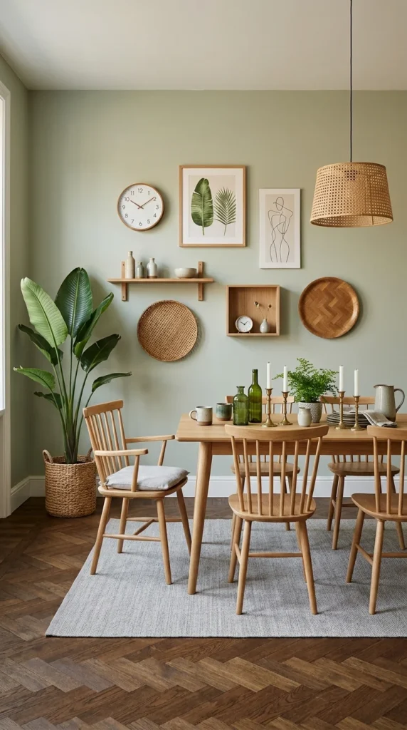
Not all greens shout. This soft sage sits on the walls like a neutral with a pulse — quieter than beige is boring, livelier than gray is cold. It’s the green for people who want the feeling without the drama, and it might be the most livable shade on this list.
The room around it stays in the natural palette: a light wood table and chairs, a rattan pendant, woven wall hangings, green glass bottles on the table. Nothing competes with the wall color because nothing needs to — sage is content to be the background. The gallery arrangement of baskets, shelves, and prints gives the wall interest at eye level without adding another color.
Rattan and sage are a natural pairing — both sit in the warm-organic register. 10 rattan furniture ideas that bring relaxed style to your home show how the material warms up every shade it sits next to, sage included.
Forest Green and Dried Botanicals
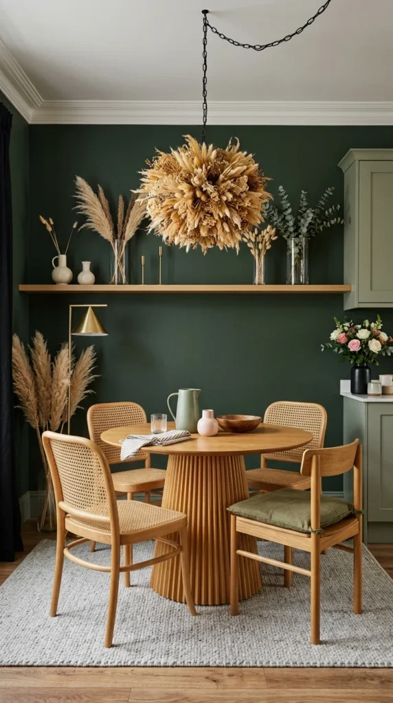
Forest green walls, a fluted wood table, cane chairs — and overhead, a chandelier made of dried grasses that steals the whole room. It’s the most organic moment in the set: the dried botanicals pick up the room’s earthy undercurrent and turn the ceiling into part of the composition.
Dried arrangements have a practical advantage over fresh in a dining room: they don’t drop petals on the table and they last for months. Against deep green, their wheat tones glow — the same reason the wooden shelf and the brass lamp work here. Warm naturals suit deep green better than anything; they keep it from going cold or flat.
This is also a lesson in scale: the chandelier is oversized for the table, deliberately. A small fixture would have disappeared against the dark walls; the big dried arrangement holds its own and gives the ceiling its moment, where dining rooms often go empty. Dark green living room ideas work the same deep shade with a different set of companions.
Candlelight Green for Two
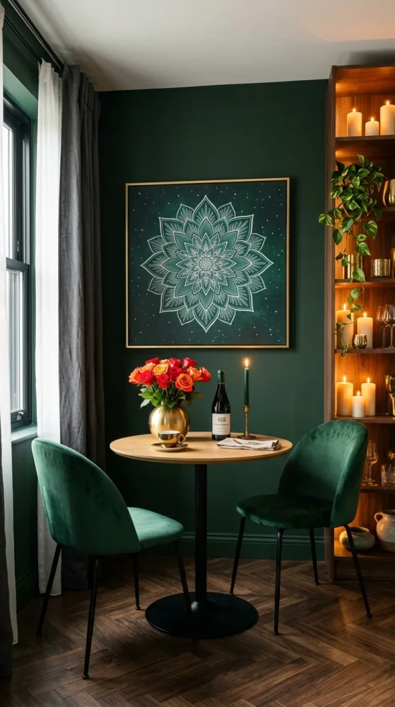
The smallest dining setup here — a table for two against a dark green wall — and possibly the most romantic. The mandala art glows over the table, the built-in shelving holds a small constellation of candles, and the two green velvet chairs face each other across roses and wine. Green does something specific after dark: it goes intimate.
Every element serves the evening mood. The candles in the shelving aren’t just decoration; they’re the lighting plan, supplemented by the room’s ambient glow. Dark green walls absorb light, which sounds like a drawback until you realize it also absorbs distraction — the world narrows to the table, which is exactly what a dinner for two wants.
The lesson scales up: if your dining room hosts evening gatherings, deep green with layered low light (candles, small lamps, dimmed pendants) creates an atmosphere no bright room can match. Save the pale greens for breakfast rooms; give the dinner parties the dark ones. And note the practical side of the candle shelving: real candles mean wax, smoke marks, and fire awareness. Good LED pillar candles have reached the point where guests can’t tell the difference — in a room built around candlelight, they’re worth considering.
Texture on the Green Wall
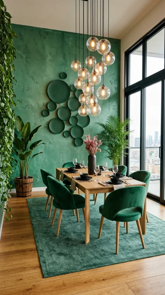
This green wall isn’t flat paint — it has a mottled, limewash-like texture that catches light unevenly, giving the color a depth no flat coat can match. Against it, a constellation of green plates climbs the wall like art, and a cluster of glass globe pendants hangs at varying heights over the table.
Textured paint is green’s secret weapon. Flat dark green can look one-dimensional; a limewash or plaster effect gives it movement, so the wall feels alive as the light changes through the day. The plates — all green, all different sizes — extend the wall’s color story into three dimensions without introducing a new hue.
The pendant cluster deserves study: multiple small globes at staggered heights light the table more evenly than one big fixture, and the clear glass keeps them visually light against the saturated wall. 10 pendant light designs that steal the show in your dining space break down why clusters beat singles over dining tables.
The Half Wall: Green for the Cautious
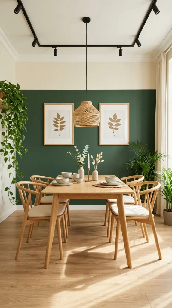
The final shade is barely a shade at all — a half-height band of green running behind the table, white above and below, with botanical prints hung on the line. It’s the most renter-friendly green on the list and the easiest to undo, but it still changes the room: the green band grounds the table the way a rug grounds furniture, giving the dining zone a boundary without walls.
The trick is the crisp horizontal line. A wavy or ragged edge would look unfinished; the sharp line reads as architecture, like a dado rail rendered in paint. The botanical prints sit exactly on the color boundary, which ties the art to the wall treatment instead of letting them float separately.
Half walls, single walls, full rooms — the list has run the whole spectrum of commitment. The right amount of green is the amount you’ll still love when the novelty fades, which is worth more thought than the shade itself.
Frequently Asked Questions
What shade of green works best in a dining room?
It depends on the room’s light and its hours. Bright rooms handle pale greens like mint and sage beautifully; dimmer rooms want deeper shades — emerald, forest, deep green — that glow in low light rather than going murky. Evening-heavy dining rooms earn the dark shades; breakfast rooms earn the pale ones.
Will a dark green dining room feel too dark?
Only without enough light. Dark green absorbs light, so the lighting plan has to compensate: layered sources (pendants, candles, wall washers), light-colored ceilings, and pale floors or rugs to bounce light back up. The monochrome green room above shows it done right — the amber pendants are doing as much work as the paint.
What colors go with green in a dining room?
Warm naturals — wood, rattan, brass, terracotta — are green’s most reliable partners; they keep it from feeling cold. White gives it breathing room. For contrast, terracotta and warm rust sit opposite green on the wheel and make it look richer. What tends to fight green is cool gray, which can make the combination feel flat.
Can I use green in a small dining room?
Yes — the emerald nook and the table-for-two above are both small spaces. In tight quarters, try one green wall rather than four, keep the ceiling white, and let a mirror or window do the expanding. Dark green in a small room feels enveloping rather than cramped, as long as the light is layered.
How do I test a green before committing?
Paint a large board — at least two feet square — and move it around the room at different times of day. Greens shift dramatically between morning and evening light, and a shade that looks fresh at noon can go muddy at dusk. Live with the board for a few days before you buy the gallons. And test it next to your wood tones: green reacts strongly to the furniture around it, and the same paint can read olive next to oak and emerald next to walnut.
Conclusion
Ten greens, ten different evenings. The emerald nook’s energy, the monochrome room’s embrace, the candlelit corner’s intimacy, the sage room’s calm — each one is the same color doing a different job, and that’s the point the list keeps making. Green doesn’t decorate a dining room; it directs it.
So choose by the evenings you want. Bright and lively calls for mint or sage with natural textures. Intimate and lingering calls for forest or emerald with candlelight. And if you’re not sure, start with one wall — the smallest commitment on this list — and let the room tell you whether it wants more. It probably will.
About the Aesthetic Life Team
The Aesthetic Life Team writes practical home design guides — what looks good in photos, and what actually holds up once you live with it.