Most bathroom photos cheat. The tile gleams, the towels are folded like origami, and there’s never a damp bath mat in sight. Then real life moves in — cold floors on winter mornings, steam on the mirror, a towel bar placed where no wet hand can actually reach it.
“Earthy” gets mistaken for a color trend. It isn’t. It’s a material honesty: clay, stone, wood, and warm neutrals that don’t fight daily use — they absorb it. A bathroom that looks good on day one is easy. One that still feels calm in year five is the actual test.
The ten bathrooms below each passed that test in one specific way — ten decisions worth stealing: a rug that keeps stone human, a wall that divides without doors, a floor you feel before you see. Find the one that matches your bathroom’s problem.
One Warm Stone Everywhere, and One Rug to Keep It Human
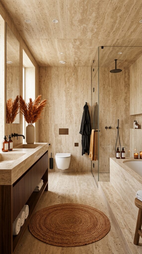
This room commits to a single material with unusual confidence: travertine on the walls, the ceiling, the floor — one continuous sweep with no tile breaks and no trim lines. The effect is calm, because the eye never stops at a corner. Five competing finishes would have made this busy; one finish makes it quiet.
Warm stone is doing deliberate work. The default bathroom is white and cool — clean in photos, clinical at 6 a.m. Travertine’s beige veining warms the room with no color at all, which is why it ages well: no trend to date, just stone.
But a room of uninterrupted stone has a failure mode, and it’s temperature — visual and literal. Stone underfoot is cold on winter mornings, and all those straight hard lines can read severe. That’s why the round jute rug matters more than its size suggests. It’s the only curve in the room and the only soft thing underfoot; it breaks the geometry and gives the eye somewhere to rest. One rug doing the work of all the coziness.
The fluted walnut vanity is the room’s one interruption in the stone — dark wood against pale travertine — and an interruption only works when there’s exactly one. Travertine is porous, so it needs sealing around the sink, and it will never be as wipe-clean as porcelain. What you get is a room that doesn’t need decorating — the material is the decoration.
When the Bathroom Thinks It’s a Courtyard
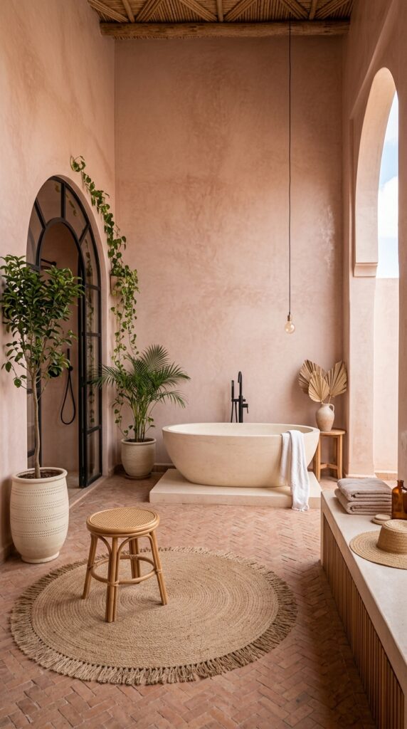
Nothing about this room behaves like a normal bathroom. The walls are hand-troweled rose plaster, the ceiling is woven thatch, and the tub sits in the open under a single hanging bulb — like a courtyard that happens to have plumbing.
Three arches — window, doorway, open arch — repeat the same curve at different scales, and the tub sits centered in the largest opening. One arch is a feature; three are a language, and that repetition is why the room feels designed instead of decorated.
The plants aren’t decoration here; they’re load-bearing. A palm, a potted tree, dried fronds in a vase — they connect the plaster and thatch to something living, which keeps all that handmade texture from feeling like a theme restaurant. Without the green, this would be a set. With it, it’s a room.
That handmade quality is the whole bet — these Moroccan bathroom ideas use arches and plaster the same way, to make a small room feel crafted rather than assembled. Raw plaster and thatch want ventilation, and a floor-mounted faucet is harder to clean around than a wall-mounted one. This room works because someone accepted the maintenance that comes with the romance.
A Wall That Divides Without Closing Anything Off
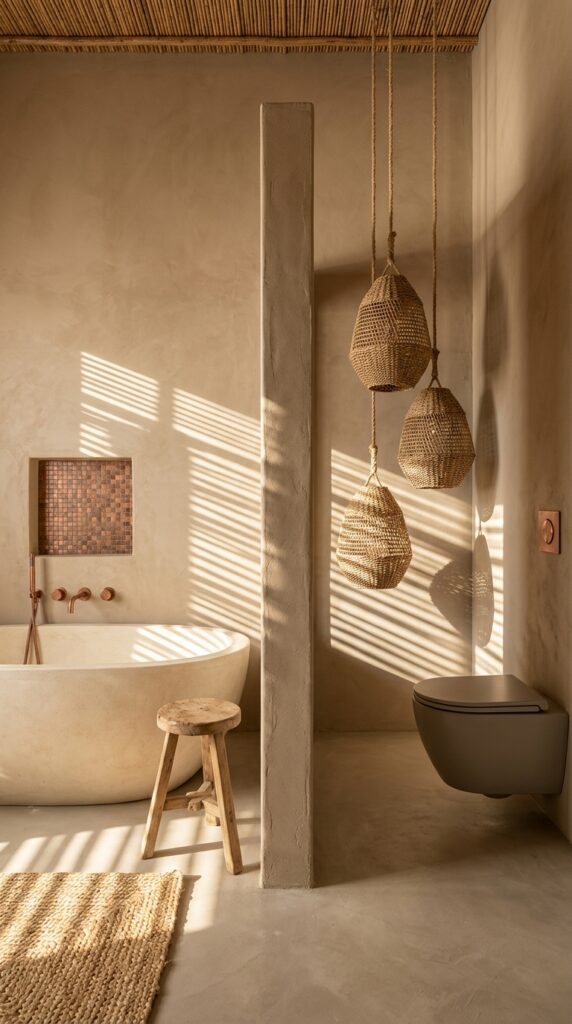
Most bathrooms divide wet and dry with a door, a curtain, or a glass panel. This one uses a freestanding plaster fin — a single concrete blade standing in the middle of the room, splitting the tub zone from the toilet zone without closing anything off.
It only works when the plumbing cooperates: tub on one side, toilet on the other. But the payoff is a room that feels twice its footprint — no doors swinging, no glass to squeegee, no visual stops.
The light does the rest of the decorating. A slatted bamboo ceiling throws striped sunlight across the plaster, so the walls change through the day — though that also means this room likely goes flat and grey by late afternoon, when the sun angle dies. The three woven rattan pendants hang at different heights, their shadows echoing the ceiling stripes.
The small copper mosaic niche above the tub matches the exposed copper faucet exactly — a material echo that makes both look intentional. And the woven, natural-fiber language here — rattan, jute, basket textures — is the same one these boho bathroom ideas build whole rooms from, if the pendants are what caught your eye. One caution: woven pendants and steam are a slow-burn problem. Keep natural fiber lighting near the tub with airflow, not over the shower, or humidity will shorten its life fast.
Letting One Found Object Carry the Room’s Character
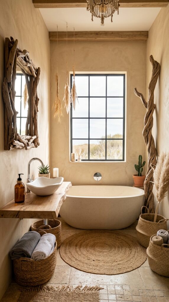
The most interesting thing in this bathroom wasn’t bought from a bathroom store. It’s the mirror — a frame of twisted driftwood, irregular and unmilled, hanging on smooth plaster like something the sea delivered. Everything else in the room is quiet enough to let it lead: a plain round tub, a simple vessel sink, calm stone underfoot.
One wild, found object needs a calm room around it; two would be a collection, and a collection needs curating. The twisted branch in the corner repeats the mirror’s line just enough to connect the room’s two sides — a rhyme, not a repeat.
The tub sits centered on the big steel-framed window rather than on the vanity, which tells you what the room values: the view out, not the fixtures in. And the live-edge wood shelf holding the vessel sink offers no hidden storage — the three woven baskets on the floor are doing that job instead, which is honest about how bathrooms actually work.
If storage is the part you’re solving for, these small bathroom storage ideas think through the same problem with less romance and more square inches. But for character, the lesson is simpler: find one object with a past — driftwood, a vintage stool, a market basket — and let the room stay quiet around it.
A Wall That Refuses to Meet the Ceiling at an Angle
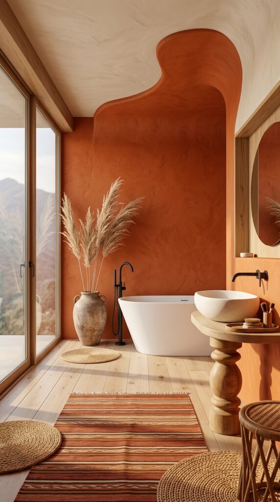
Rooms are built from corners, and corners are where the eye stops. This bathroom removes one entirely: the terracotta plaster wall curves organically up into the ceiling, so there’s no hard angle anywhere — the room feels molded rather than assembled, like the inside of a clay vessel.
One saturated wall against everything else neutral works because the restraint is real: pale oak floor, white tub, simple wood pedestal sink — nothing competes. The striped rug pulls the wall’s colors underfoot — rust, cream, warm brown — so the two surfaces feel connected instead of coincidental.
Terracotta tied to wood, clay, and dried grass ages differently than a trendy paint color. It reads as a material choice rather than a color moment, because it echoes earth rather than fashion. That’s the difference between a wall you’ll still love in five years and one you’ll repaint.
The practical side: a freestanding tub this close to full-height glass gets real heat and glare at peak sun, and pale wood near a tub wants a bath mat in daily use or it’ll spot. But the big move — one curved, saturated wall — is also the most borrowable: a deep terracotta paint on a single wall gets you most of the feeling for very little.
A Backlit Niche Doing the Job of a Fireplace
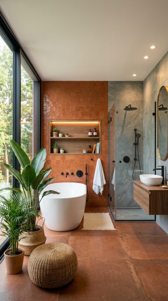
Every room wants a hearth — one warm, glowing thing the eye returns to. In this bathroom, it’s not a fixture. It’s a niche: a built-in shelf with a wood back and warm light, set into the terracotta tile wall, holding small plants and amber bottles like a little altar.
The niche works because the room is split into two materials — terracotta zellige on the bathing side, cool grey stone on the shower side — and the warm wood-and-light box belongs clearly to the warm half. It tells you, without a word, which side is for lingering and which is for rinsing. Materials can zone a room the way walls do.
The gold oval mirror on the grey side is the quiet diplomat: the only warm metal over there, tying the cool stone back to the terracotta and black fixtures across the room. Without it, the two halves would feel like separate rooms.
Zellige’s handmade glaze is beautiful and honest about its upkeep — glossy handmade tile shows water spots faster than matte, so this wall wants wiping. And the wicker pouf by the full-height window will fade in direct sun; natural fiber near glass is always a trade. But the lesson stands: give a bathroom one glowing thing, and the whole room feels warmer than its materials.
A Floor You Feel Before You See
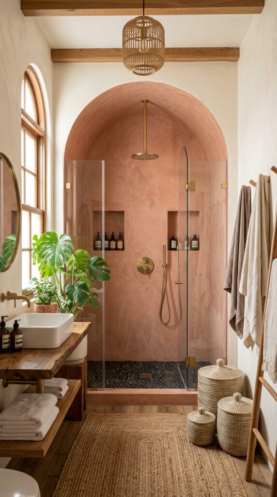
Bathrooms are experienced barefoot, and this one designs for the feet first. The shower floor is pebble stone — rounded, uneven, grippy — so every shower starts with a texture that wakes you up. It’s the most sensory square meter in this whole set, and it’s the part no photo can sell.
The pebble works because everything around it is smooth: flat plaster walls, a sleek glass enclosure, the clean line of the tub. One rough texture in a smooth room reads as intention; rough everywhere would read as unfinished. Contrast needs a quiet background.
The dusty-pink plaster arch framing the shower gives the eye the architecture while the feet get the pebbles — and the arch shape repeats in the window across the room, the quiet rhyme that makes the room feel composed. Brushed brass runs through every fixture, one metal tying three zones together, and the built-in niches hide the bottles from the doorway sightline so the shower reads clean from outside.
Pebbles aren’t for everyone — the grout lines need scrubbing, and anyone unsteady on their feet will prefer flat tile. But the principle is free: design one surface for touch, not sight. If the shower is the part you’re rethinking, these shower design ideas cover the rest of the decisions around it.
Letting the Metal’s Own Variation Be the Pattern
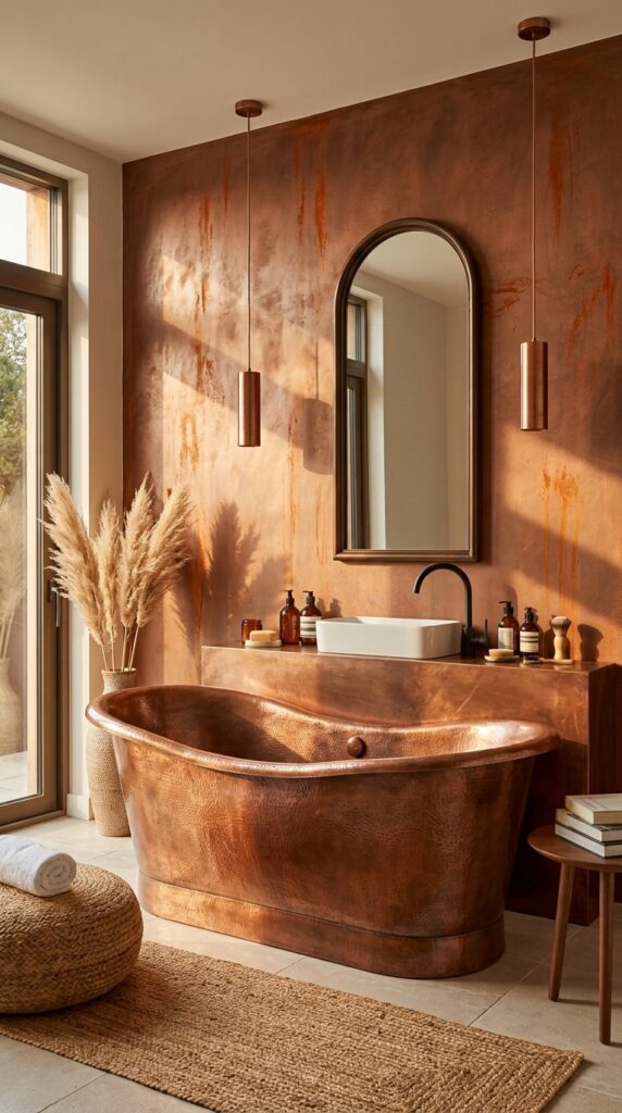
This room’s entire decoration is the metal itself. A hammered copper tub against a mottled copper-toned wall, copper pendants hanging above — no tile pattern, no wallpaper, no art. The variation in the finish does what pattern would do: the hammer marks catch light unevenly, the wall’s mottling shifts with the afternoon sun, and the room never looks flat.
Committing to one material this fully is a different bet than mixing. Mixing is safe — if one finish bores you, another entertains. One material has nowhere to hide, so it has to be interesting on its own. Copper earns it: it reads warm even in photographs, it ages with patina instead of wearing out, and it makes everything around it — the black faucet, the pale floor — look deliberate.
The two slim copper pendants repeat the tub’s tone top to bottom, one unbroken material story. And the arched mirror is the room’s only real shape-break, a soft curve against all that warm metal. The honest cost of the look: copper wants wiping, because fingerprints show on it fast.
Should You Actually Buy a Copper Tub?
Only as a forever decision. A copper tub costs several times what a good acrylic or cast-iron tub does, and it only makes sense when the whole room commits with it — the wall finish, the fixtures, the palette. Bought alone and dropped into a standard white bathroom, it reads as an expensive prop. If this is your long-term home and you love how metal ages, the patina will repay you for decades. If you might move in three years, put the money in the stone or the light instead — both travel better to the next owner.
Raising the Tub Onto a Stage
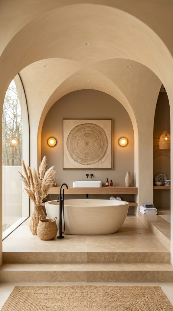
The tub here sits on a raised stone platform — two steps up from the bathroom floor — and that small elevation changes the whole psychology of bathing. Stepping up marks a threshold: below is the bathroom, above is the bathing place. Ritual needs a threshold, and most bathrooms don’t have one.
The nested plaster arches frame the platform like a stage set, each arch smaller than the last, drawing the eye inward to the tub. The tree-ring artwork on the back wall rhymes with the round tub — concentric circles answering a circular form — the kind of quiet echo that makes a room feel composed without anyone knowing why.
Everything else stays low and calm: a floating wood vanity, warm sconces, pampas in a woven vase. Nothing competes with the platform, because the platform is the point.
A raised tub isn’t a small renovation — it needs plumbing planning, and it’s a step to climb, which matters for accessibility. But the idea scales down: a deep, beautiful bath mat, a low wooden bath caddy, or a dedicated stool beside the tub can all mark bathing as separate from washing. The platform is just the most committed version. If the ritual side of bathing is what you’re after, these spa bathroom ideas are built around exactly that separation.
A Ceiling That Glows Instead of a Light You Look At
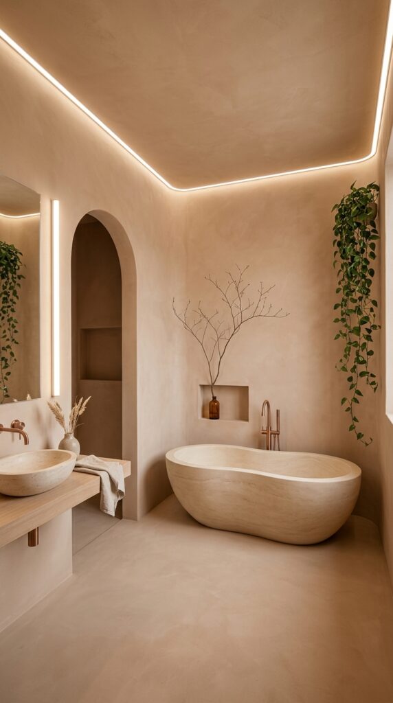
There’s barely a fixture in this room, and that’s the point. The main light source is a line: an LED cove tracing the ceiling’s perimeter, washing warm light down the plaster walls. You never look at the light itself — you only see what it does. In a room this minimal, a visible fixture would be a distraction; an invisible one is the architecture.
The cove flatters the materials. The curved stone tub, the hand-troweled walls, the bare branch in the amber bottle — all of it looks softer under indirect light than any downlight could manage. Minimal rooms live or die on light quality, because there’s nothing else to look at.
The restraint here is total: one branch as the only “art”, one hanging plant, one small niche. It’s the same discipline these minimalist bathroom ideas practice — fewer objects, better light, and the confidence to leave walls empty. The practical note: cove lighting is a build-in decision, not an add-on — it has to be planned with the ceiling. And indirect light flatters but stays dim for tasks, so this room would still want a brighter mirror light for actual grooming. As evening light goes, though, a glowing ceiling edge beats a fixture every time.
Frequently Asked Questions
How do I get an earthy bathroom without renovating?
Start with what touches you daily: a woven bath mat instead of a synthetic one, warm-white bulbs instead of cool, one large plant, and wood accessories — a stool, a tray, a lidded basket — in place of plastic. None of it touches a wall, and together it shifts the whole temperature of the room.
Is travertine practical in a real bathroom?
It’s beautiful and honest about its needs: the stone is porous, so it must be sealed — especially around sinks — and resealed every year or two, and it’s cold underfoot in winter. If that maintenance sounds like a chore, a large-format porcelain tile with a travertine print gets close to the look with none of the sealing.
What colors actually count as “earthy”?
Think materials, not paint chips: clay and terracotta, sand and warm stone, wood tones from pale oak to walnut, muted sage and olive greens. What to skip: cool greys and blue-greys, which read the opposite of earthy no matter how they’re styled.
How do I keep earthy tones from making a small bathroom feel dark?
Keep the big surfaces light-warm — sand plaster, pale stone, warm white — and put the deeper tones (terracotta, walnut, copper) in smaller doses: one wall, the vanity, the fixtures. Add one mirror and one warm light source, and a small earthy bathroom reads cozy, not cave-like.
Are open baskets and wood shelves hygienic in a bathroom?
They’re fine with two habits: ventilation and washable liners. Bathrooms stay humid, so run the exhaust fan and choose lidded baskets for anything that shouldn’t collect moisture. Line open baskets with a washable cloth, and treat wood shelves near water like cutting boards — wipe them down and reseal occasionally.
Conclusion
None of these ten bathrooms started from a trend board. Each one answered its own constraint: the stone room that needed one soft curve, the long shower that deserved a floor with feeling, the minimal room that let light be the architecture, the copper room that trusted one material completely. That’s the move worth borrowing — not the travertine or the pebbles, but the habit of naming what the room lacks before choosing anything else.
So stand in your bathroom and notice what’s missing: warmth underfoot, something to look at, a threshold between washing and bathing, light that flatters instead of interrogates. Find the room above with the same problem and take its answer — not the whole room, just the one decision that solved it. A bathroom doesn’t need ten good ideas. It needs the right one, fully committed to, with everything else quiet enough to let it work.
About the Aesthetic Life Team
The Aesthetic Life Team writes practical home design guides — what looks good in photos, and what actually holds up once you live with it.