Pink in a kitchen tends to split opinion fast—it either reads as playful and confident or, done wrong, tips into something closer to a dollhouse. The difference almost always comes down to what pink gets paired with. On its own, saturated pink can feel overwhelming across dozens of square feet of cabinetry; balanced against black, stone, brass, or a quieter cream, it becomes one of the more versatile colors a kitchen can use.
The ten kitchens below range from glossy and futuristic to softly vintage, and each one shows a different way to commit to pink without letting it take over completely. Here’s what makes each approach work.
1. Glossy Pink Lacquer With a Neon-Lit Ceiling to Match
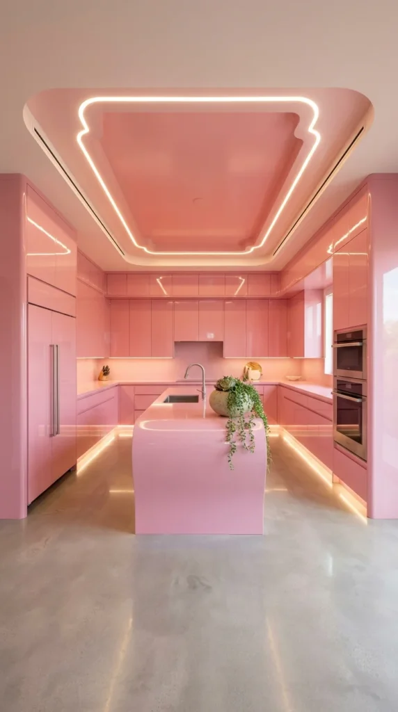
Every surface in this kitchen—cabinets, island, even the sculpted ceiling—shares the same high-gloss coral-pink finish, with a glowing light channel tracing the ceiling’s shape like a piece of architecture rather than a fixture. The effect leans closer to a design showroom than a typical kitchen, committing fully to one saturated color across the entire room.
⚠️ Warning
High-gloss lacquer finishes like this one show fingerprints and smudges far more readily than a matte cabinet surface, especially across a large uninterrupted area. Anyone considering this level of gloss should plan on wiping cabinets down more frequently than a standard matte finish would require, particularly around handles and high-touch surfaces.
The polished concrete floor and stainless steel double ovens are the only materials that break from pink entirely, and that restraint is what keeps the room from feeling like a single flat block of color.
2. Cherry Blossom Relief Art Softening an All-Pink Kitchen Wall
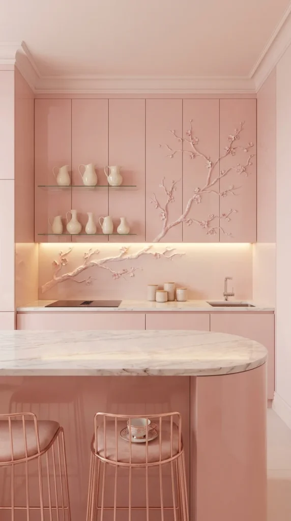
A sculpted branch of cherry blossoms climbs across this kitchen’s pink cabinetry, raised slightly off the surface to catch shadow and texture rather than sitting flat as a painted pattern. Glass shelves holding white ceramic pitchers break up the expanse of pink with a lighter, more neutral layer.
💡 Pro Tip
Pairing a saturated blush pink with warm metallics—rose-gold hardware, brass fixtures, and gold-rimmed dishware—tends to read as more sophisticated than pairing the same pink with cool silver or chrome. The warm undertones in both materials reinforce each other rather than competing.
The white marble island introduces the only cool material in the room, and its curved edge softens what would otherwise be a very linear, angular cabinet layout.
3. Cream Cabinetry Letting Two Retro Pink Appliances Lead
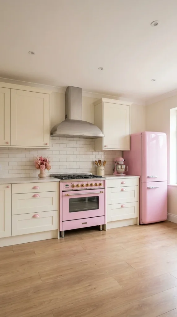
Rather than pink cabinetry, this kitchen keeps its cabinets in a soft cream and lets a pink range and matching refrigerator carry the entire color story. Small pink cabinet pulls tie the two appliances back to the surrounding cabinetry without needing to repaint a single door.
📌 Important Note
Choosing standalone colored appliances like this pink range and fridge locks in a specific shade that’s harder to update later than a painted cabinet would be. Before committing, it’s worth checking that the exact pink matches across both pieces—appliance colors can vary slightly between manufacturers and even between product lines from the same brand.
Classic subway tile and a neutral wood floor keep the rest of the kitchen deliberately quiet, so the two retro appliances read as a deliberate style choice rather than mismatched additions.
4. Blush Cabinets Paired With a Waterfall Marble Island
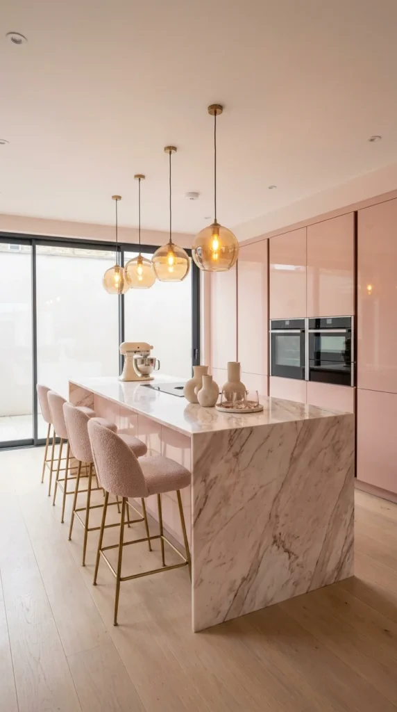
Glossy blush-pink cabinetry wraps this kitchen’s perimeter, while a marble waterfall island introduces cooler grey veining that keeps the pink from dominating the whole room. Amber glass globe pendants hang above the island, their warm glow echoing the same undertone running through the cabinetry.
Boucle bar stools in a matching soft pink continue the color into the seating area without adding a second competing shade. The overall effect stays cohesive because every material in the room—from the pendant glass to the stool upholstery—sits somewhere on the same warm color spectrum, rather than introducing a cooler or more saturated tone that would fight with the pink cabinetry.
5. Black Cabinetry Grounding a Bubblegum Pink Backdrop
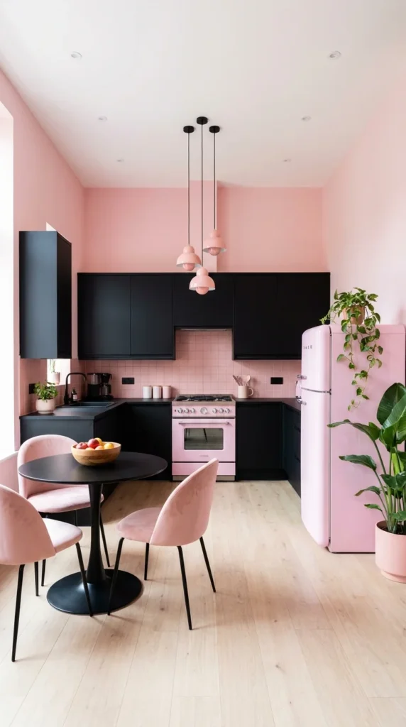
Matte black upper and lower cabinets anchor this kitchen against walls and tile painted in a much brighter bubblegum pink, creating one of the strongest light-dark contrasts among pink kitchen designs. A matching pink refrigerator and a trio of pink pendant lights repeat the wall color at a smaller scale, tying the palette together.
What Keeps a Bold Pink-and-Black Kitchen Balanced
☐ At least one large neutral surface—floor, ceiling, or countertop ☐ Black used in roughly equal visual weight to the pink, not just as trim ☐ Metal or wood accents to prevent the palette from feeling purely two-tone ☐ Greenery or natural texture to soften the graphic contrast
Pink velvet dining chairs and potted plants nearby add texture that a purely flat black-and-pink combination would otherwise lack, keeping the high-contrast palette from feeling too stark.
6. Dusty Rose Cabinetry Dressed Up With Crystal and Marble
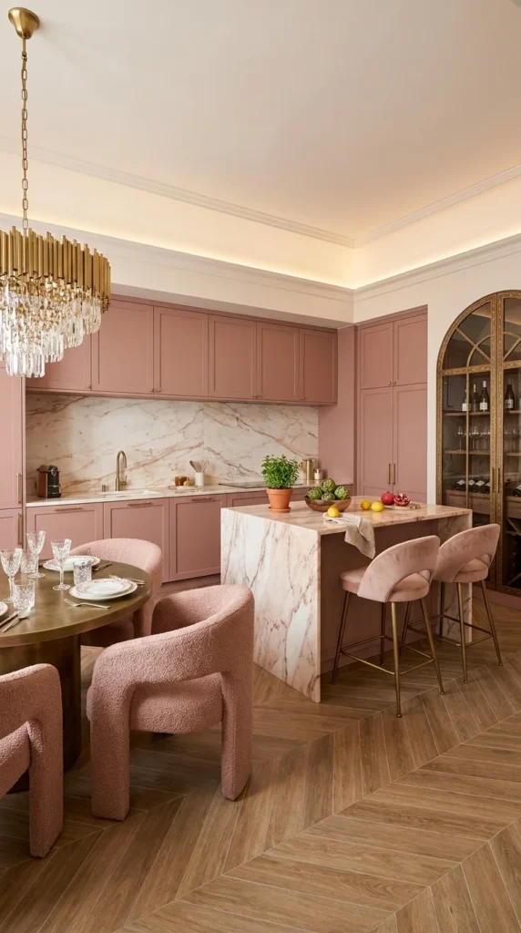
A muted, dusty rose tone covers this kitchen’s cabinetry—softer and more grey-toned than a true pink, which allows it to read as sophisticated rather than playful. A crystal tube chandelier and a veined marble backsplash add a layer of formality that a brighter pink would struggle to match.
Dusty Rose vs. Bubblegum Pink
| Factor | Dusty Rose | Bubblegum Pink |
|---|---|---|
| Undertone | Muted, grey-leaning | Bright, saturated |
| Best paired with | Marble, brass, boucle | Black, chrome, bold pattern |
| Overall mood | Formal, elegant | Playful, energetic |
| Room type suited | Full kitchens, dining spaces | Accent zones, smaller kitchens |
Boucle dining chairs and an arched glass wine cabinet round out the room’s more refined character, treating the dusty rose as a backdrop for other materials rather than the room’s single focal point.
7. Farmhouse Cream Cabinetry With One Confident Pink Island
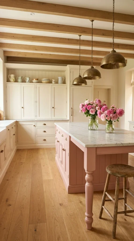
Cream shaker cabinetry lines most of this kitchen, with a single pink island—complete with turned wood legs—acting as the room’s only real color statement. Brass dome pendants and a beamed wood ceiling keep the overall mood warm and traditional rather than overtly modern.
Using pink on just one piece of furniture, rather than across an entire cabinet run, is one of the lower-commitment ways to bring the color into a kitchen. It lets the rest of the room stay flexible and neutral while still giving the space a clear focal point—in this case, an island that would otherwise blend into the cream cabinetry around it if painted the same tone.
8. Ornate Victorian Pink Built From Carved Wood and China
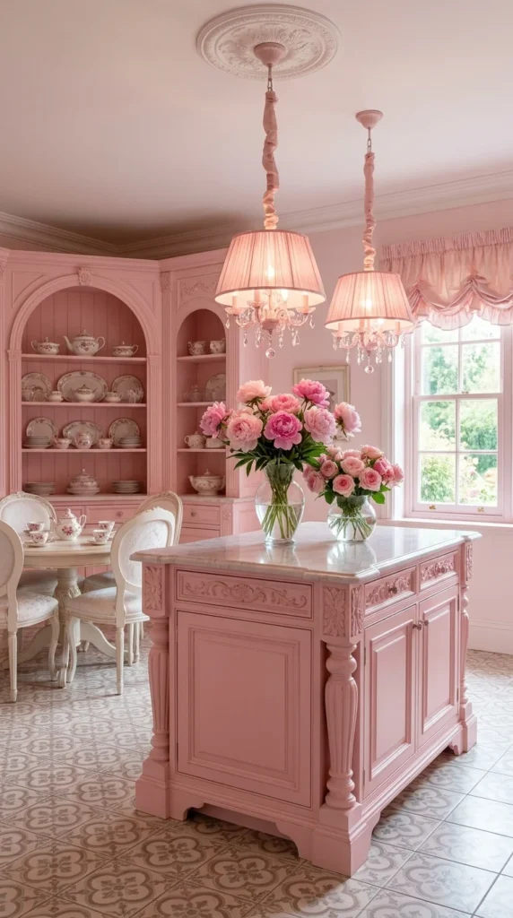
Deep pink covers nearly every surface in this kitchen—carved cabinetry, arched display shelving stacked with china, and even the patterned tile floor all stay within the same rose-toned family. Crystal chandeliers and ruffled curtains push the room firmly into traditional, almost formal territory rather than anything playful or modern.
⚠️ Warning
Committing to this much saturated pink across carved millwork, floors, and window treatments all at once risks feeling heavy rather than elegant if the details aren’t kept consistent in tone. This kitchen manages it by keeping every pink surface within a narrow, closely matched shade range—mixing several noticeably different pinks in the same room would read as mismatched rather than intentional.
The white china displayed throughout gives the eye a resting point among all the pink, breaking up what would otherwise be an unbroken wall of color.
9. Retro Glossy Pink Paired With a Checkerboard Terrazzo Floor
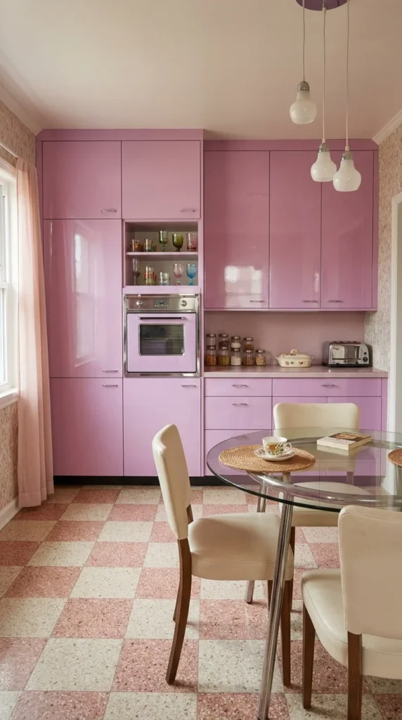
Glossy orchid-pink cabinetry fills this kitchen with a distinctly vintage feel, reinforced by a pink-and-cream checkerboard terrazzo floor and simple bare-bulb pendant lighting. A glass-and-chrome dining table keeps the seating area feeling light against the deeply saturated cabinetry.
💡 Pro Tip
When aiming for a specific decade’s aesthetic, matching the pink’s undertone to that era matters more than the shade’s intensity. Mid-century pinks tend to lean slightly purple or mauve, like the tone used here, while 1950s diner-style pink usually leans warmer and closer to true bubblegum—mixing the two eras’ undertones can undercut an otherwise convincing retro look.
Patterned wallpaper and colored glassware displayed on open shelving add period-appropriate detail that reinforces the retro mood without needing any additional major surfaces painted pink.
10. Muted Pink Cabinetry Balanced by Black and Concrete
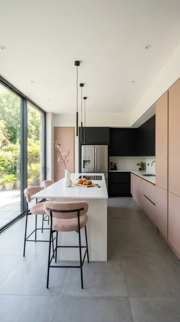
Dusty, muted pink cabinetry runs along one wall of this kitchen, while black cabinets and a white island introduce enough neutral weight to keep the pink from reading as the room’s dominant feature. Large-format concrete floor tiles and black pendant lighting give the whole space a distinctly modern, understated feel.
Recreating This Look: Budget Tiers
💚 Affordable: Painting a single wall of existing cabinetry in a muted pink, paired with black hardware, can approximate the look without replacing an entire kitchen. 💛 Mid-Range: Semi-custom cabinetry in a matched matte pink finish, paired with a simpler white or black island, gets closer to this room’s balance without full architectural changes. 💎 Investment: A fully custom kitchen with mixed cabinet finishes—pink, black, and white handled as distinct zones, as shown here—offers the most precise material control and finish quality.
Boucle bar stools in the same muted pink tie the seating back to the cabinetry, while the black stool frames match the room’s darker cabinetry, keeping the two color zones connected rather than feeling like separate design decisions.
Final Thoughts
Across all ten kitchens, pink never behaves quite the same way twice—it goes futuristic against glossy lacquer and neon light, formal against carved wood and crystal, and playful against black and bubblegum brights. What separates a pink kitchen that feels bold from one that feels overdone usually isn’t the shade itself, but what it’s paired with: enough contrast, enough neutral material, and a consistent undertone throughout. Committing to pink doesn’t have to mean committing to only pink.
Frequently Asked Questions
What colors pair best with a pink kitchen? Black, white, and warm wood tones are some of the most reliable pairings, since they add contrast and weight without competing with pink’s saturation. Brass and gold-toned hardware also tend to work well, particularly with warmer, blush-leaning pinks.
Is a pink kitchen a passing trend? Muted, dusty pink tones have shown more staying power than bright, saturated shades, largely because they read closer to a neutral and pair easily with a wide range of other colors. Bolder, brighter pinks tend to feel more tied to a specific design moment, which is worth considering for anyone planning a kitchen meant to last well beyond a single trend cycle.
Should pink be used on all cabinets or just an island? Using pink on a single element, like an island, is a lower-commitment way to introduce the color while keeping the rest of the kitchen neutral and easy to update later. A full commitment across all cabinetry creates a much bolder, more immersive look, but it’s a bigger investment to change if preferences shift over time.
What finish works best for pink kitchen cabinets? Matte finishes tend to hide fingerprints and daily wear better than high-gloss lacquer, making them a more practical choice for a heavily used kitchen. Glossy finishes create a more dramatic, reflective look, but they generally require more frequent cleaning to stay looking sharp.
How do I keep a pink kitchen from feeling too sweet or juvenile? Pairing pink with black, dark wood, or stone tends to add enough visual weight to keep the palette from feeling overly soft, especially compared to pairing it only with white or pastel accents. Choosing a muted, grey-leaning pink over a bright, saturated one also generally shifts the mood toward sophisticated rather than playful.