Scandinavian kitchens look deceptively simple in photos — a few open shelves, one pendant light, maybe a wood cutting board leaning against the backsplash. Then you try to recreate it, and your counter still looks cluttered, your cabinets still feel too busy, and somehow the room never gets that same quiet, breathing feeling. That gap between the photo and the actual room is exactly where most people get stuck.
Minimalism in Scandinavian design was never about owning less for the sake of it. It is about deciding what actually earns a place on the counter and letting everything else disappear into storage. The kitchens in this list were chosen because each one solves that problem a little differently — through material choice, light, negative space, or simple restraint in what stays visible.
This is not a list of unattainable, luxury-only kitchens. Each space here works within real constraints – rental limitations, mid-range budgets, and everyday cooking mess – while still holding onto that unmistakable Scandinavian calm. By the end, you should have a clearer sense of what minimalism actually requires and what it quietly leaves out.
1. The Blue Wall Doing More Work Than the Cabinets
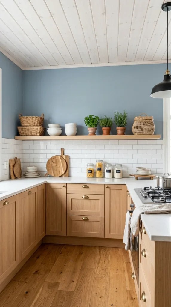
The dusty blue wall is the first thing that registers here, and that is intentional — it is the only saturated colour in the entire room. Everything else stays in a tight, warm register: honey-toned oak cabinets, white subway tile, a pale wood ceiling. That restraint is what makes the blue read as a design decision rather than decoration. It grounds the open shelf above it, giving the woven baskets and terracotta herb pots something to sit against instead of floating on white.
The open shelving itself is a practical bet. No upper cabinets means less visual bulk in a fairly compact L-shaped layout, but it also means everything on that shelf has to earn its spot — there is nowhere to hide a mismatched bowl. In a rental, this look translates easily: paint is reversible, and a single floating shelf costs far less than a full cabinet run. The gold hardware is a small detail, but it is the one element tying the black pendant light back to the warmth of the wood floor below.
2. Two Pendants, Two Heights, One Reason
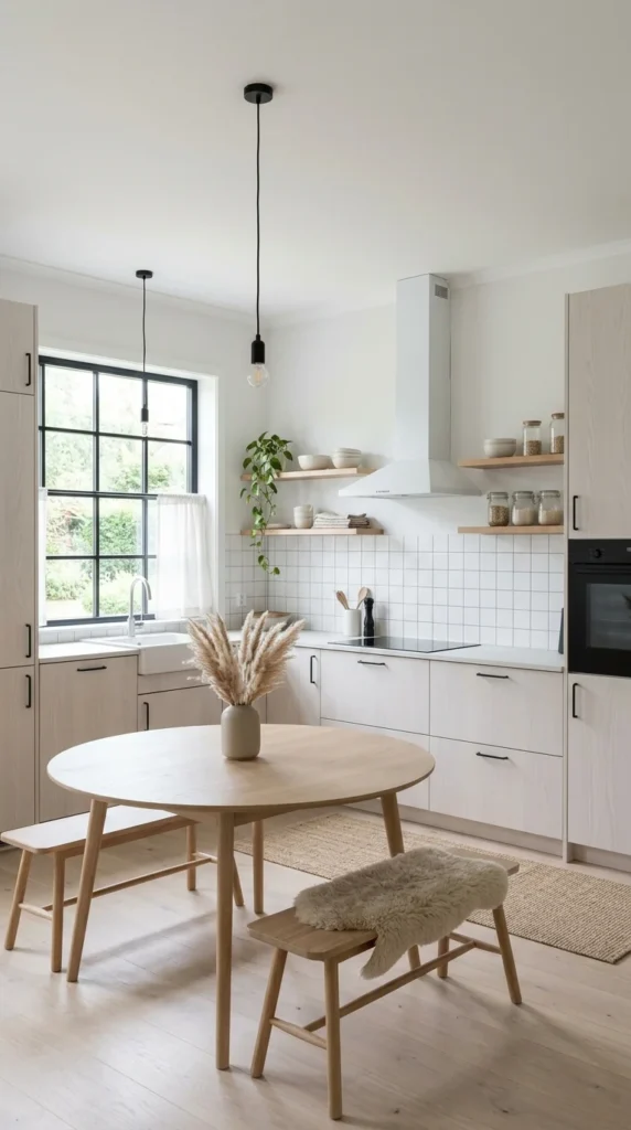
Sheer white cabinetry and a bare white hood dominate this kitchen, but what actually organises the room is the pair of black pendant lights hung at two different heights above the window and the prep area. That is not an accident of installation — it separates the sitting zone from the working zone without a single wall or step doing the job. The pampas grass on the round table softens what could otherwise feel like a fairly clinical, all-white space, and the sheepskin thrown over one bench does the same for the seating.
Honestly, the open shelving here carries more risk than the earlier kitchen’s did — jars and stacked bowls sit in full view against plain white tile, so any inconsistency in glassware shows immediately. Function-first thinking, sinking from stovetop to oven in one line, keeps the layout efficient even with a full dining table pulled into the same room.
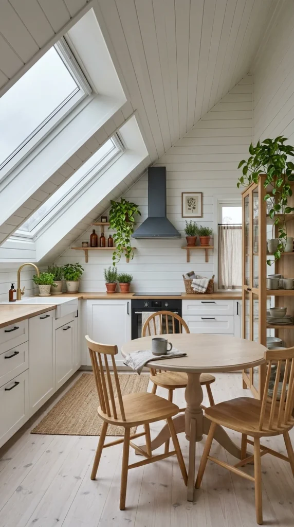
3. Working Around a Ceiling That Refuses to Cooperate
A sloped ceiling like this one is not something most people would choose if given a flat alternative — it eats headroom exactly where you need to reach a cabinet, and it forces the whole layout to hug one wall. And yet the two skylights turn that constraint into the best feature in the room, pulling in far more daylight than a vertical window at this size ever could. That is the tradeoff worth noticing: less usable wall space and considerably more light.
The charcoal-grey range hood stands out as the only dark object in an otherwise pale room, and it works precisely because nothing else competes with it. Open shelves stay shallow on purpose here, deep enough for jars and small plants, not much else, because the ceiling angle would make anything larger impossible to reach comfortably. It sounds like a small compromise. In an attic kitchen, it is actually the whole design brief.
Pro Tip: Angled ceilings work best with shallow, open storage rather than deep cabinetry – the slope limits reach long before it limits depth.
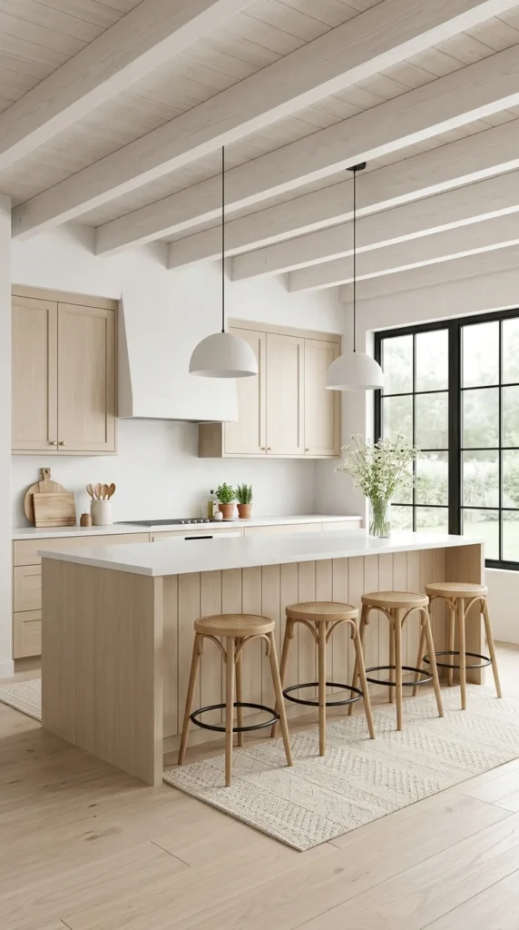
4. Four Stools, One Long Island, No Extra Noise
This kitchen leans almost entirely on repetition to hold itself together. The exposed wood beams above match the tone of the cabinets, which match the tone of the island, which matches the four rattan-seated stools lined up along it. Nothing here fights for attention, and that is really the whole point of this particular room. Two matte white dome pendants hang at different lengths, breaking the symmetry just enough to keep the ceiling line from feeling flat.
The island itself is doing double duty as both prep space and the only seating in the room, which is a common real-world compromise in open-plan kitchens where a separate dining table simply will not fit. Four stools tucked under one long counter uses the space efficiently, though anyone hosting more than four people will feel that limit quickly. The black-framed window on the right is the one hard-edged element in a room built almost entirely from soft, rounded shapes, and it keeps the whole thing from feeling shapeless.
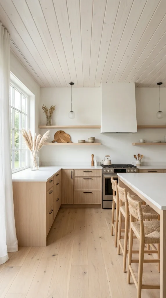
5. Pampas Grass Again, and That Is Fine
Fluted-front cabinets are the detail that separates this kitchen from most of the others on this list — the vertical ribbing catches light differently than a flat panel would, giving the lower cabinets a subtle texture without adding a single extra colour. Two globe pendant lights hang bare and unshaded, which is a smaller commitment than the black hood pendants seen earlier, and honestly, I would take this quieter version in a narrow galley layout like this one.
The pampas grass shows up again here, and at this point in the list it starts to feel less like a trend and more like a genuine Scandinavian staple — dried, low-maintenance, and forgiving of neglect in a way fresh flowers never are. Woven rush-seat stools soften the mostly hard surfaces along the island. The counter along the window doubles as a bench-height workspace, a detail easy to walk past but genuinely useful for anyone who preps standing near natural light rather than under a pendant.
Pro Tip: Fluted or reeded cabinet fronts add texture without adding colour – a useful trick when you want visual interest but still want the palette to stay tight.
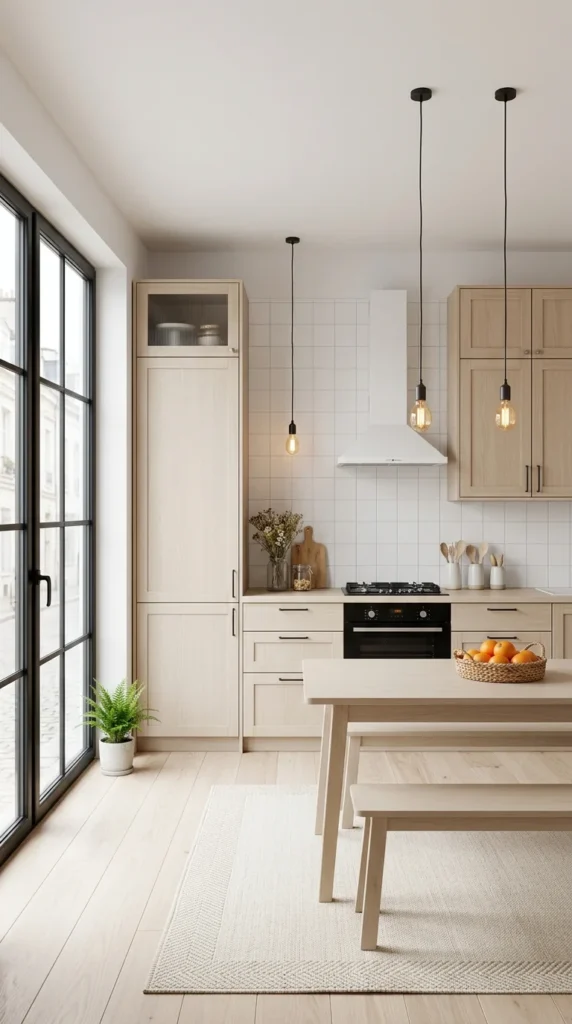
6. Three Pendants That Do Not Match, and Do Not Need To
Uneven pendant heights are a small risk few people take on purpose — hang three bulbs at different drops, and the wall can start to look unplanned instead of stylish. Here it works because the difference in height mirrors the difference in the wall behind it: white subway tile on one side, tall panelled cabinetry on the other. The exposed filament bulbs stay bare, with no shades, which keeps the light source itself part of the decoration rather than something hidden away.
Floor-to-ceiling steel-framed windows are doing the real work in this room, pulling in enough daylight that the pale oak cabinets never look flat or grey. That kind of glazing is a genuine renovation cost, not something achievable with paint or hardware swaps, so it is worth naming as the one element in this list a renter simply cannot replicate. A woven basket of oranges on the table is the only saturated colour in the frame, and the room needed exactly that much.
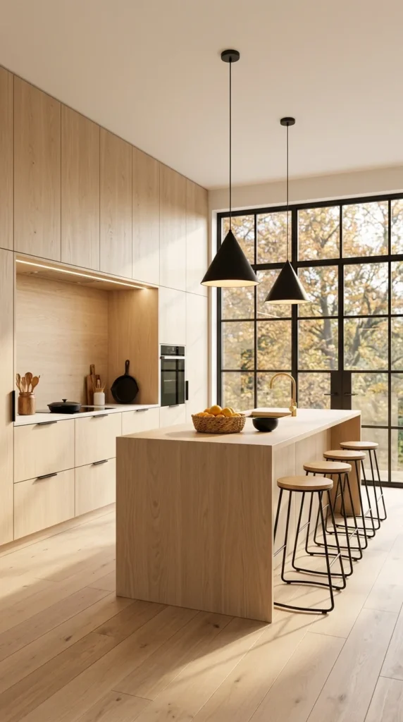
7. No Handles Anywhere, and a Good Reason Why
The cabinetry wall here has almost no visible hardware at all — no pulls, no knobs, just a continuous run of oak veneer broken by a single recessed light strip above the cooking niche. That is a harder look to pull off than open shelving, because every seam and grain line has to line up cleanly or the whole wall reads as unfinished rather than intentional. It clearly works here, but it is worth knowing this is a push-to-open system, which trades visible hardware for slightly more resistance every time you reach for a drawer.
Two black cone pendants hang low over the island, angled just enough to feel deliberate rather than centred and symmetrical. The black-framed steel doors behind them lead straight outside, turning what could have been a plain window wall into something closer to a glass room addition. A brass faucet is the one warm metal note against all that matte black, and it keeps the kitchen from tipping into a colder, more industrial feeling than the rest of this list has shown so far.
Pro Tip: Push-to-open cabinetry gives a cleaner look than any handle style can, but it is worth testing in person – the extra resistance is noticeable with daily use.
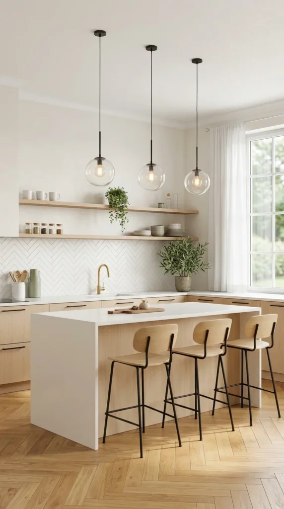
8. The Floor and the Backsplash Are Speaking the Same Language
Herringbone shows up twice in this kitchen — once underfoot in the parquet, once vertically in the chevron-tiled backsplash — and that repetition is the entire visual strategy here. Three clear glass globe pendants hang at staggered heights above the island, echoing the same staggered logic as the wood planks below them. Nothing about this pairing looks accidental; it is the kind of detail a stylist plans for weeks before a shoot.
A brass gooseneck faucet is the lone warm-metal accent against an otherwise white-and-oak palette, paired with black-framed counter stools that keep the room from feeling too soft. The island itself splits into two materials: white lacquer on the outer face and oak on the side facing the seating, a small choice that adds visual interest without adding another colour to track. Open shelving stays lightly styled: mugs, a small stack of bowls, and one trailing plant are proof that Scandinavian minimalism tolerates a little imperfection as long as nothing crowds the next item over.
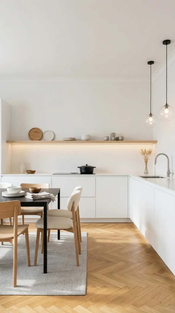
9. Where All That White Finally Meets Its Match
This kitchen pushes handleless cabinetry as far as it will go — flat white fronts run the entire length of the room with nothing but a subtle finger-pull edge breaking the surface. A hidden LED strip tucked beneath the floating shelf is the kind of detail that photographs almost invisibly but changes how the whole wall feels once the sun goes down, casting a soft glow across the ceramics displayed above it.
Visual weight balance is the principle doing the heaviest lifting here: without the black dining table and matching cast-iron pot on the stovetop, this room would have almost nothing to anchor the eye against so much white. That single dark table, paired with black pendant cords overhead, keeps the space from drifting into feeling sterile. The wishbone-style chairs mix light oak with a cream boucle seat, a pairing that reads as considered rather than mismatched. It is a clean look, but maintaining fingerprint-free handleless cabinets in a home with daily cooking is its own quiet task.
Pro Tip: In an all-white kitchen, one deliberately dark object, a table, a pot, or a chair frame, does more to anchor the room than any amount of extra white ever could.
What Ties All Ten Kitchens Together
Look back across these ten spaces and one thing becomes obvious: not one of them relies on more stuff to feel finished. Every kitchen here gets its character from a handful of repeated decisions — one accent colour, one material contrast, and one lighting choice — rather than a long list of decorative objects. That is really the whole definition of Scandinavian minimalism, and it has very little to do with owning fewer things.
What might be worth taking away, more than any single cabinet style or pendant shape, is how often restraint showed up as the actual design move. The blue wall in the first kitchen worked because nothing else competed with it. The handleless cabinets in the last one worked because a single black table gave the eye somewhere to land. None of these rooms are empty. They are just edited.
If there is one habit to borrow before your next kitchen update, it is this: before adding something new, ask what it is replacing. Scandinavian kitchens rarely add. They usually just decide what stays.
FAQs
Is Scandinavian kitchen design only achievable in large, open-plan spaces? No. Several kitchens in this list, including the sloped-ceiling attic layout, work within genuinely tight or awkward footprints. The style tends to rely more on light, material consistency, and reduced visual clutter than on square footage, which is part of why it translates reasonably well to smaller rentals and older homes.
Can renters realistically recreate this look without permanent renovations? In many cases, yes. Elements like open shelving, pendant lighting, dried pampas grass, and woven textures are usually non-permanent or easily reversible. Structural features like skylights, steel-framed windows, or built-in range hoods are harder to replicate without ownership, so it helps to separate cosmetic choices from architectural ones when budgeting a rental update.
Why do so many of these kitchens use light oak instead of painted cabinetry? Light wood tones tend to add warmth without introducing another colour to coordinate, which supports the pared-back palette central to this style. It is not a strict rule, though — a few kitchens in this list paired oak with all-white or handleless cabinetry instead, suggesting the wood itself is a preference rather than a requirement of the aesthetic.