

Boho bedrooms look effortless in photos. Then you try to recreate one, and suddenly your room feels less like a curated retreat and more like a thrift store threw up on your bed. That gap between inspiration and reality is where most people get stuck — not because they lack taste, but because “boho” gets mistaken for more is more. Pile on enough macramé, rattan, and mismatched textiles, and the line between layered and cluttered disappears fast.
What actually separates a boho room that feels intentional from one that feels chaotic isn’t the number of objects in it. It’s restraint – knowing which pieces earn their place and which ones are just filling space. The ten rooms ahead each solve that balance differently, whether it’s through a single grounding element, a disciplined colour palette, or simply knowing when to stop adding.
If you’ve ever second-guessed a boho pin because your version never looked quite right, this is for you. No fantasy budgets. No perfect lighting. Just what’s actually working — and why.
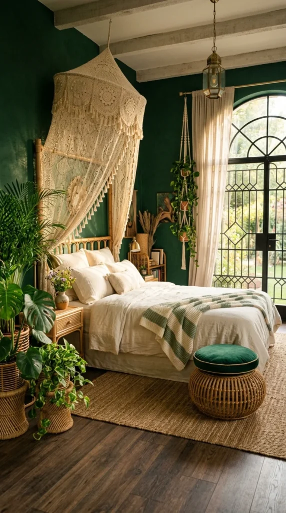
The Canopy Is Doing More Work Than the Green Walls
The deep green walls are the first thing that registers here, but they’re not actually the hardest-working element in this room. That title belongs to the crochet canopy hanging above the bed – an open, lace-like structure that lets light and colour pass through it instead of blocking either. A solid curtain in this spot would have flattened the room into two zones: a green wall and a white bed. Instead, the canopy softens that transition without hiding it.
What’s easy to miss is how much the rattan bench at the foot of the bed is pulling weight, too. Its round shape and warm tone repeat the same material language as the plant stands scattered across the floor, which keeps twelve or so individual objects from reading as clutter. That’s the real trick of a boho room this dense — not fewer things, but things that agree with each other.
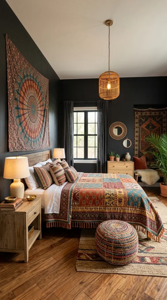
This Room Bets Everything on Pattern — And It Almost Loses
Honestly, this is not a combination I would attempt without a dark backdrop already in place. The mandala tapestry, the patchwork quilt, and the striped pillows are three distinct pattern families stacked on top of each other, and on a white wall this would collapse into visual noise within seconds. It’s the near-black paint that holds everything together, acting as a kind of frame that stops the eye from ricocheting between patterns.
That’s the grounding element doing the real work in this room – not an object, but the wall colour itself. The honey-toned wood furniture and floor pull the temperature back down after all that colour, which is the only reason the space still reads as restful instead of overwhelming. Strip out the dark wall, and this whole layered approach would need to be rebuilt from the ground up.
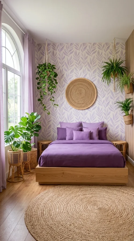
A Purple Bedroom That Doesn’t Try Too Hard
There’s no trick here. This room simply commits to one colour and lets the rest of the space stay quiet. The lilac wallpaper, the deep purple bedding, and the pale curtains all sit close enough on the colour wheel that nothing fights for attention. That’s it. That’s the whole idea.
The round jute plate mounted above the headboard is a smart substitute for artwork — it breaks up the patterned wall without introducing a second colour or competing pattern. Its circular shape also softens all the straight lines around it, from the rectangular bed frame to the arched window.
The plants scattered across three different heights — floor, hanging, and mid-level shelf — create a vertical rhythm that keeps the eye moving instead of stalling at the bed. In a smaller room like this one, that kind of layered height matters more than square footage ever will.
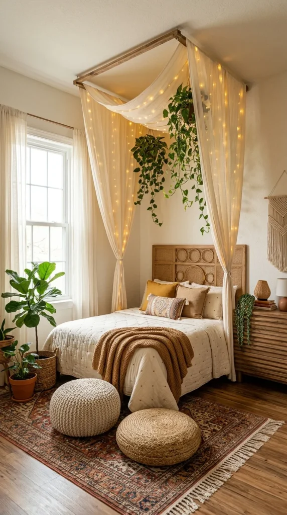
Fairy Lights Look Magical in Photos — Here’s the Catch
The string lights woven through this canopy are the first thing that sells the room, but they’re also the detail most likely to disappoint once you actually live with it. Untangling and re-hanging that many lights every time the sheer fabric needs washing is a genuine chore, not a one-time setup. This is the kind of feature that looks effortless in photos and takes real patience to maintain in an actual bedroom.
That said, the payoff is hard to argue with. The draped canopy frame turns a plain ceiling into a defined sleeping zone, which matters most in a room without any architectural detail to lean on otherwise. The trailing plants hung inside the canopy repeat that same soft, cascading motion, tying the greenery to the fabric instead of leaving it to compete with it.
Down at floor level, the knit and jute pouffes add texture without adding visual weight — a small, easy substitution for anyone who wants the layered look without committing to more furniture.
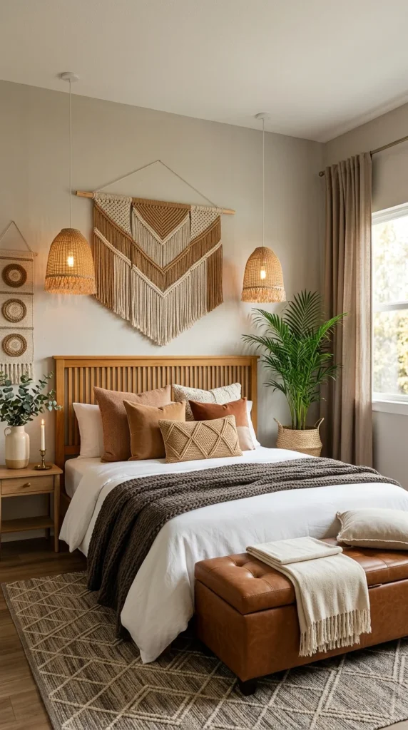
The Macramé Wall Hanging Isn’t Boho by Accident
Where the previous room let colour carry the boho feel, this one leans almost entirely on texture. Strip away the macramé panel and the knit throw and diamond-stitched pillow, and what’s left is a fairly standard tan-and-white bedroom. It’s the fibre work — woven, knotted, braided — that pushes this into boho territory at all.
The leather storage bench at the foot of the bed is the one element that doesn’t quite match that logic, and it’s worth noting because most boho spaces avoid anything this structured. It works here mainly because the cognac tone matches the wood headboard closely enough that it reads as warm rather than out of place. Swap it for a black leather piece and the whole balance would shift.
The pendant lights flanking the macramé are a budget-friendly stand-in for wall sconces, and they solve a real problem: reading light on either side of the bed without the cost or commitment of an electrician.
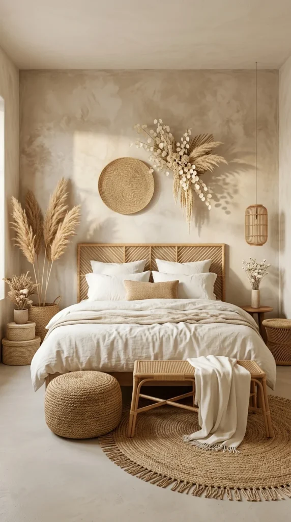
Everything Here Is Almost the Same Color, and That’s the Point
There’s no colour contrast to analyse in this room. The plastered walls, the rattan headboard, the pampas grass, the jute rug — all of it sits within one narrow tan-to-cream range. This is a tonal palette taken about as far as it can go, and it works because texture is left to do the job colour usually would.
The dried pampas and the woven wall plate above the bed read as almost sculptural against a wall with little going on. That’s a direct result of the empty space surrounding them – negative space that a busier wall colour would have swallowed. Notice how the shadows cast by the pampas arrangement become part of the composition, shifting throughout the day as the light moves.
This look photographs beautifully, but it demands more upkeep than it lets on: dust shows fast against pale rattan and jute, and pampas grass sheds fine fibres that need regular sweeping to keep the floor looking this clean.
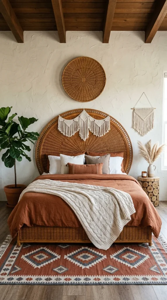
A Round Headboard This Big Is Not a Small Commitment
Personally, I would think twice before bringing a peacock-style rattan headboard this large into an average bedroom. It’s a genuinely striking piece, and the fan shape gives the whole wall a focal point that a rectangular headboard never could — but it also eats a huge amount of visual space, which only works because the ceiling height and exposed wood beams here can absorb it.
The terracotta bedding picks up the same warm tone as the rattan, which keeps the headboard from feeling like a separate statement piece bolted onto a plain bed. Two small macramé hangings, one draped across the headboard and one on the adjacent wall, repeat that fringe detail at a smaller scale without competing with it.
The diamond-patterned kilim rug at the base introduces the only cool tones in the room — greys and blues woven into the reds — and that small shift keeps the space from tipping into an entirely one-note orange palette.
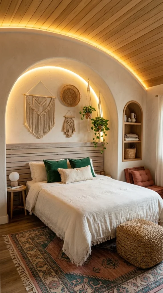
The Architecture Is Boho Here — the decor barely has to try.
Unlike the earlier rooms, where boho came almost entirely from styling choices, this one starts with the bones. The arched alcove and curved wood-slat ceiling do so much of the visual work that the decor inside it — a few macramé pieces and a couple of hanging plants — almost feels secondary. That’s rare, and it’s worth noticing before getting distracted by anything else in the frame.
The warm LED strip lighting traced along the arch is what makes this room photograph so well after dark, but it’s also doing a quieter job during the day: outlining the curve of the alcove so it registers as a shape, not just a wall. Without it, that architectural detail would likely disappear into shadow.
The green velvet pillows are the one real departure from the neutral palette everywhere else, and they earn that departure by picking up the green in the hanging plants a few feet away – a small connection that keeps the colour from feeling random.
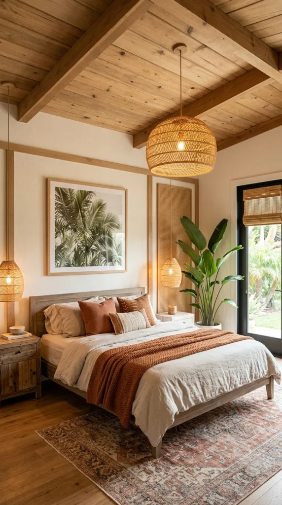
Three Rattan Pendants Do What One Statement Piece Couldn’t
Where the alcove room earlier relied on one architectural gesture, this space builds its identity from repetition instead. Three rattan pendant lights hang at different heights around the bed, and it’s that repetition — not any single fixture — that ties the room together. One pendant would just be a light fixture. Three of them, echoing each other across the space, become a design decision.
The palm leaf artwork on the wall is a quiet but deliberate choice: it doesn’t compete with the real bird-of-paradise plant a few feet away and instead reinforces the same botanical language in flat form. That kind of doubling — real plant, printed plant — is a detail most people wouldn’t plan for on purpose, but it changes how cohesive the room feels.
The exposed wood ceiling beams set the temperature for everything below them, which is likely why the terracotta throw and rust-toned pillows lean warm rather than cool. In a room with this much natural wood overhead, a cooler palette would have felt like it was fighting the architecture instead of working with it.
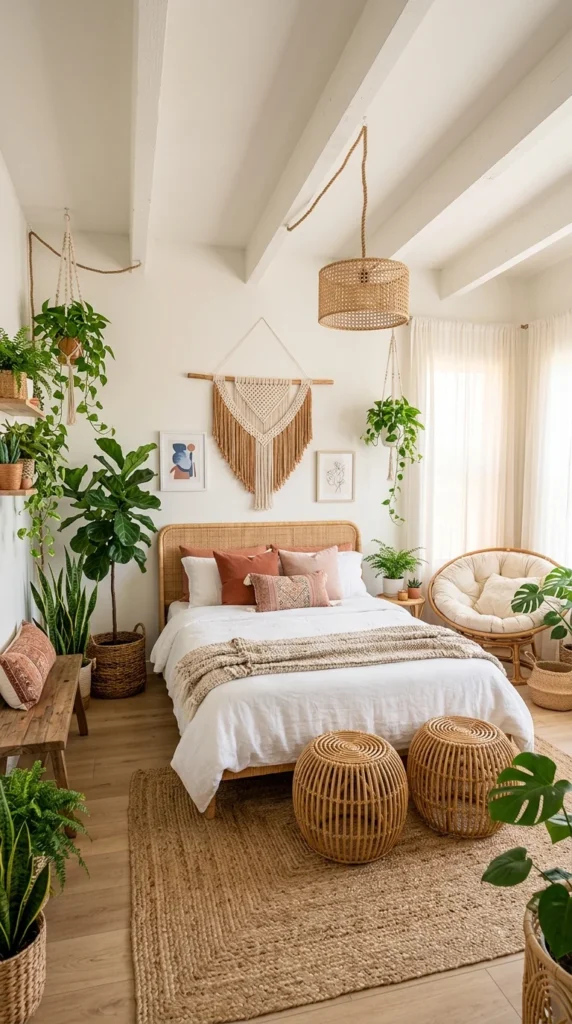
This Is What “More Plants” Actually Looks Like Done Right
This room doesn’t hide how many plants it contains — there are easily fifteen, spread across shelves, hanging planters, and floor pots. Most spaces would buckle under that many, but the tan-and-white walls stay completely neutral, which gives every single plant room to register instead of blurring into a green mass.
The rattan papasan chair tucked in the corner is a nice addition, but it’s worth flagging a real friction point: chairs this deep and round eat far more floor space than they look like they need in photos, and in a room already this full of furniture and planters, it can turn the path around the bed into a tight squeeze. Worth measuring the actual footprint before committing to one.
The macramé wall hanging centred above the bed anchors the whole arrangement, giving the eye one still point in a room that’s otherwise full of movement — climbing vines, trailing pothos, and layered textures on the bed. Without that single anchor, the space would likely feel busier than it does.
What Ten Boho Bedrooms Actually Have in Common
After looking at all ten of these rooms side by side, the pattern isn’t what most people expect. It’s not the plants, the rattan, or the layered textiles that make a boho bedroom feel intentional. It’s a restriction — every single room here picked one or two elements to carry the visual weight and let everything else support quietly in the background. The green-walled room leaned on its canopy. The tonal room leaned on texture alone. Nothing tried to be the star of every layer at once.
That’s really the whole lesson, and it’s a more useful one than any specific product or colour combination. Boho isn’t about how much you add. It’s about knowing which one or two choices are allowed to be loud and letting the rest of the room agree with them instead of arguing for attention.
If your own space still feels a little off, that’s probably the place to start — not with more objects, but with fewer voices trying to speak at once.
Frequently Asked Questions
Is boho decor still relevant, or is it considered outdated? Boho has shifted rather than faded. The current version tends to favour a tighter colour story and fewer competing patterns compared to the maximalist boho look that was popular several years ago. Most of the rooms above reflect that shift — one dominant material or palette, with everything else playing a supporting role, rather than an anything-goes approach.
How do I keep a boho bedroom from looking cluttered? The rooms that felt curated rather than chaotic all shared one habit: they repeated the same one or two materials or tones throughout the space instead of introducing something new with every object. A rattan bench that echoes a rattan headboard, or pillows that pick up a colour already in the rug, tends to read as cohesive. New textures and colours added without any connection to what’s already there are usually what tips a room into feeling cluttered.
Can this style work in a small bedroom or a rental? It tends to work well in smaller spaces, mainly because so much of it relies on layering rather than large furniture. Hanging plants, wall textiles, and rugs are typically renter-friendly, since none require permanent changes to the walls or floor. In a small room specifically, keeping the colour palette tighter — as in a few of the neutral or tonal rooms above — usually helps the space feel calm rather than tight.

One Response