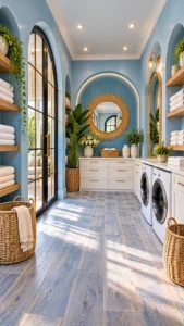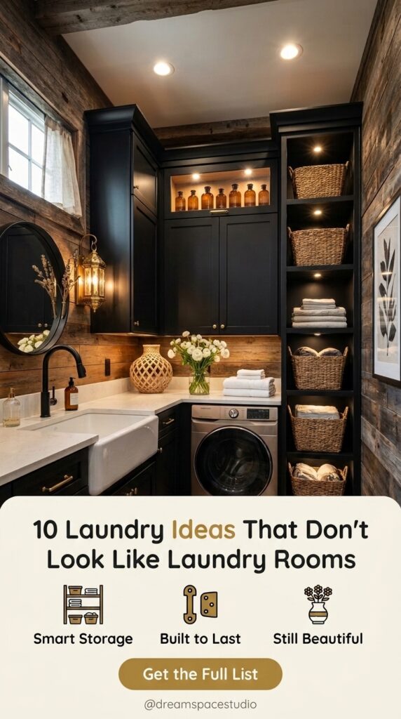
The laundry room is the hardest-working room in the house and the least thanked for it. It handles the family’s chaos in a space that’s usually small, often windowless, and almost never designed with any love. The ten rooms below reject that deal. Each one treats the laundry as a real room — with light, color, art, and materials chosen on purpose — while keeping the workflow ruthlessly practical.
What you’ll notice across all ten is that style and function aren’t competing here; they’re the same decision made well. The open shelf that looks good also keeps detergent within reach. The rug that warms up the tile also catches lint. The wallpaper that makes you happy also hides scuffs. That’s the standard: everything beautiful has to earn its keep, and everything practical has to look like it belongs.
As you scroll, pay attention to the machines as much as the decor. Top-loaders versus front-loaders, singles versus pairs versus triples — the machine choice shapes the whole room, and each of these rooms was clearly designed around its machines, not despite them.
Going Dark Without Going Gloomy
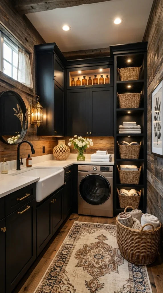
Black cabinets, dark wood walls, a white farmhouse sink — on paper this should feel like a cave. It doesn’t, because the room has its own light plan: recessed spots overhead, a lantern sconce by the mirror, and warm LED strips inside the tall open shelving. Dark rooms don’t fail from dark colors; they fail from one lonely ceiling light.
The open shelving is doing double duty as the room’s lighting feature and its storage. Woven baskets hide the ugly necessities (stain sticks, spare sponges) while folded towels stay visible and tidy. The wood walls are the quiet hero — they keep the black cabinetry from feeling stark the way black on white drywall would. Texture warms up darkness; flat paint doesn’t.
This is also a one-wall workflow done right: sink, counter, and machine in a single run, so sorting, treating, and loading happen without crossing the room. In a narrow space, the straight line beats the L every time.
Jewel Tones and Real Art
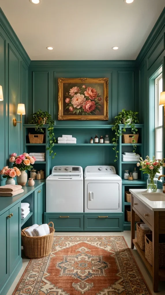
Teal paneling, brass hardware, and — the surprise — a framed floral oil painting hung where most laundries put a wire shelf. That’s the whole philosophy of this room: it’s decorated like a room people actually spend time in, because people actually spend time in it.
The top-loading washer and dryer pair deserves a note for the practical-minded. Top-loaders need lid clearance above, which rules out a counter over the machines — but this room turns that constraint into a design feature, with open shelving rising above instead. The shelves hold baskets, folded linens, and trailing plants, all within arm’s reach of the machines. And the patterned rug does what rugs do in workrooms: warms the floor, catches the lint, and makes the space feel finished.
Color is doing emotional work here too. Teal is deep enough to feel intentional and saturated enough to feel cheerful — a combination that matters in a room associated with chores. If you’re weighing bold color for a workhorse room, 10 bathroom colors that turn a plain room into a statement space make the same case for committing to a shade with presence.
Modern Farmhouse, Done Without Cliché
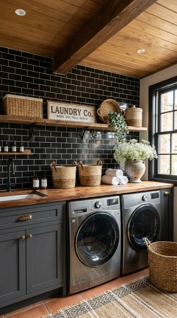
Black subway tile, a wood plank ceiling, gray shaker cabinets, and a hand-painted “Laundry Co.” sign — this is modern farmhouse speaking its native language. The sign could be kitsch; here it reads as charming, because everything around it is genuinely well made. Kitsch only works as the single playful note in a serious room.
The material contrast is the real design: glossy black tile against warm wood, cool gray cabinets against woven baskets. Each surface gets a counterpoint, so nothing sits in an unbroken field. The open wood shelf holds the daily supplies (detergent bottles decanted into matching containers — a small effort with a large visual payoff), while the closed cabinets below swallow the rest.
Front-loaders under a continuous wood counter give this room its folding station — the single most undervalued feature in any laundry. A counter over front-loaders turns the machines into a worktable; without it, you’re folding on the bed upstairs. If the machines are due for replacement, that’s the moment to plan the counter height around them. One measurement matters more than any other here: counter depth. Standard machines are about 27 inches deep, and the counter needs to clear them with room for hoses behind — plan 30 inches of depth and you won’t be fighting the wall every time a machine needs service.
The Sign Question
Word art in a laundry divides people. The rule that keeps it on the right side: one sign, well made, hung with intent — not five competing slogans. This room’s single hand-painted board earns its place; a gallery wall of laundry puns would not.
The Greenhouse That Does Laundry
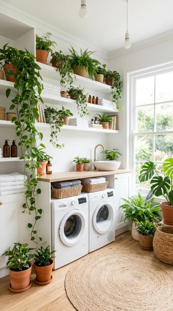
White walls, white machines, a wood counter — and roughly thirty plants. This laundry doubles as an indoor garden, and it isn’t mere decoration: laundry rooms run humid, which is exactly what tropical houseplants want. The room’s byproduct becomes the plants’ climate.
The storage is all open shelving, which works here because the plants do the visual softening — rows of detergent bottles would look stark, but bottles interspersed with trailing pothos read as styled. The vessel sink on the wood counter is a quiet indulgence: deep enough for hand-washing delicates, pretty enough to leave visible. And the big window does what no decor can — it makes a workroom feel like a morning room.
The honest maintenance note: plants near a washer collect lint on their leaves. A monthly wipe-down keeps them breathing, and choosing humidity-lovers (ferns, pothos, monstera) over desert plants means the room’s climate works for them instead of against them. Indoor plant ideas: the plant styling guide covers which varieties forgive the realities of a working room.
The Dressing-Room Laundry
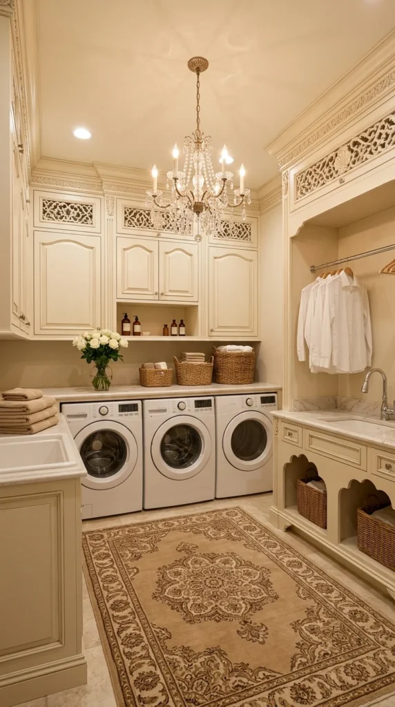
A crystal chandelier, paneled cream cabinetry, a marble-topped sink run — and three full-size machines in a row. This is the laundry of a large household that refused to let scale kill elegance. The chandelier is the thesis statement: this room gets the same consideration as any other.
Three machines change the workflow math. With a washer, a second washer (or a dedicated delicates machine), and a dryer running simultaneously, laundry day compresses dramatically — but only if the room gives each machine landing space. Here the long marble counter and the sink run absorb the output, and the hanging rod on the right gives delicates somewhere to drip-dry immediately.
The paneled cabinet fronts with their fretwork detail would be fussy in a kitchen; in a laundry, where the eye isn’t competing with cooking activity, they read as polished. The lesson: a laundry can carry more ornament than a kitchen, because less is competing for attention.
Bold Wallpaper in the Hardest-Working Room
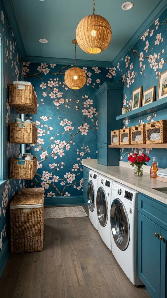
Cherry-blossom wallpaper in saturated blue, wrapping a galley laundry wall to wall — this is the boldest pattern in the set, in the room where you’d least expect it. It works because the rest of the room stays quiet: blue-gray cabinets, a pale stone counter, white machines. One loud wall, total calm everywhere else.
The galley layout is a workflow masterclass: three front-loaders in a row under one continuous counter, wicker baskets on open shelves above, the wash-dry-fold line running in a single direction. You never cross your own path. The rattan pendants warm up the blue, and their woven texture echoes the wicker baskets — one natural material, repeated, tying the room together.
Wallpaper in a laundry raises the practical question, and it has a practical answer: modern vinyl and wipeable papers handle humidity and the occasional splash far better than their reputation suggests. Save the delicate grasscloths for the bedroom; in here, choose scrubbable. Powder room wallpaper ideas that make a small space unforgettable cover the durability question in detail — the same rules apply.
Soft Sage and a Shirt Rail
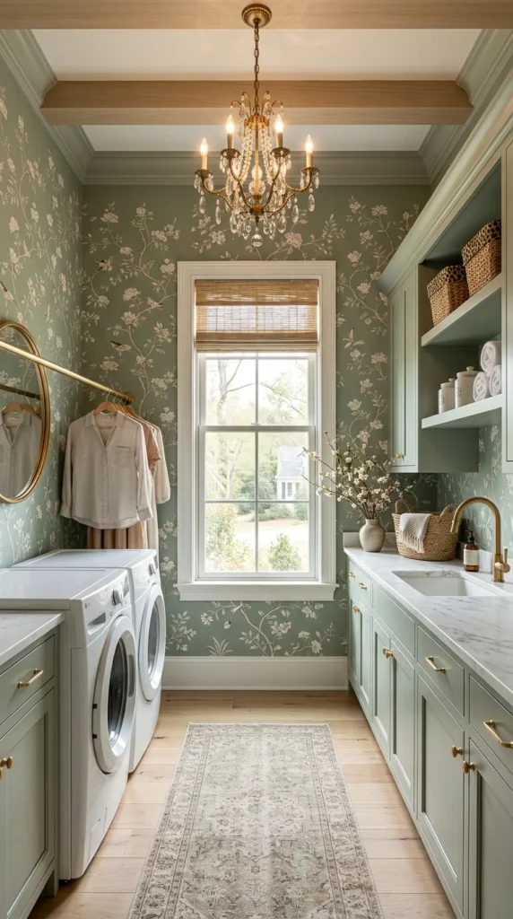
Sage cabinetry, delicate chinoiserie wallpaper, a brass hanging rail with shirts already on it, marble counters — this room understands that half of laundry is drying, and it designs for the drying half as carefully as the washing half. The rail, mounted at a comfortable height by the window, means shirts go from machine to hanger without leaving the room.
The chandelier (the room’s second) makes its case again: a pretty light fixture is the cheapest transformation in any utility room. Swapping a builder-grade flush mount for something with presence changes the room’s register on the spot, for the price of one fixture and an hour’s work. The wallpaper stays pale so the narrow galley keeps its light, and the runner rug softens the long walk between machines and sink.
Brass shows up in the faucet, the rail, and the cabinet pulls — one metal, three appearances, the same discipline that makes any room feel designed rather than assembled.
Navy, Brass, and the Deep Sink
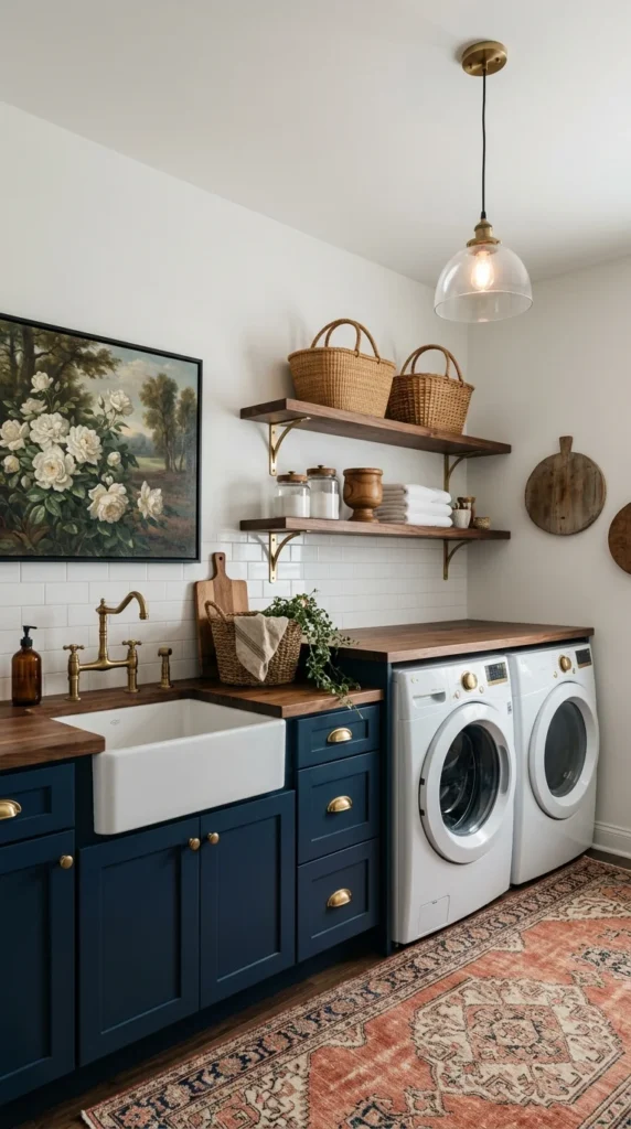
Navy shaker cabinets, a white farmhouse sink with a brass bridge faucet, open wood shelves on brass brackets — this is the classic farmhouse laundry executed with unusual discipline. Every element is familiar; the quality is in the restraint.
The deep farmhouse sink is the functional star. A standard laundry tub is shallow and awkward; a deep apron sink swallows a bucket, soaks a stained shirt, and rinses muddy boots without flooding the counter. If you’re renovating a laundry and can only upgrade one thing, upgrade the sink — you’ll touch it more than any other fixture.
The open shelves hold baskets and canisters at eye level, keeping daily supplies visible and reachable, while the navy base cabinets hide the rest. And the floral painting — the room’s second piece of real art — confirms the pattern: the best laundries are decorated like rooms, not equipped like workshops. For the storage logic behind rooms like this, pantry cabinet ideas that make kitchen storage more stylish and functional apply the same thinking to the kitchen’s hardest-working storage.
Small, Rustic, and Completely Honest
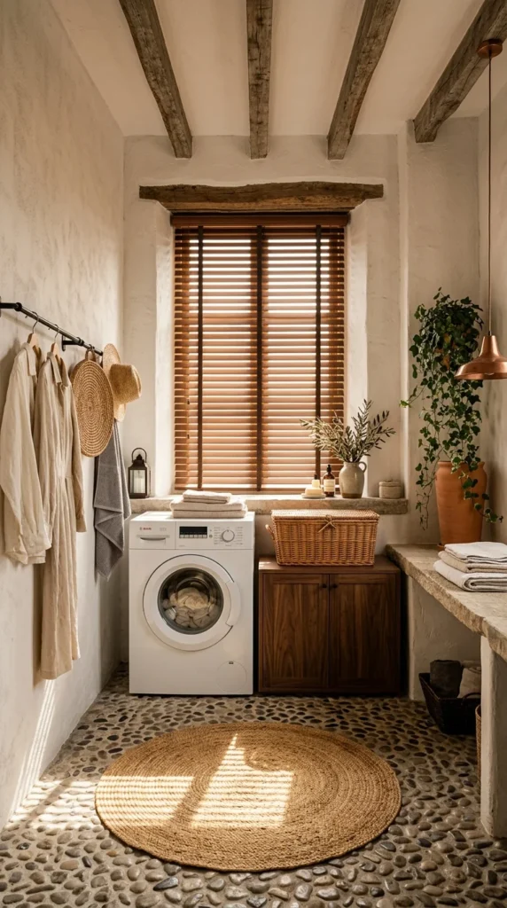
One washer, a pebble floor, rough plaster walls, wood beams — this is the smallest laundry in the set, and it makes no apology for it. Instead of pretending to be bigger, it commits to being a beautiful small room: a wall-mounted hanging rail for drying, a wooden cabinet for supplies, a jute rug underfoot.
Small laundries fail when they try to fit big-room features. This one succeeds by going vertical: the rail uses wall space instead of floor space, the cabinet is tall rather than wide, and the single machine is simply accepted — most households run one load at a time anyway. The pebble floor is the wildcard: beautiful, forgiving of drips, and honest about the room’s wet nature.
The lesson for tight spaces generally: claim the walls, accept the single machine, and spend your budget on materials with character rather than features you can’t fit. Small powder rooms doing more with less space apply the same small-footprint thinking to the bathroom.
The Compact That Has Everything
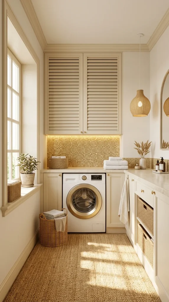
Cream cabinetry, a mosaic tile backsplash, one washer, and a footprint barely bigger than a closet — yet this room wants for nothing. The louvered upper cabinets ventilate (important where damp clothes sit), the pull-out wicker baskets sort lights from darks at the source, and the mosaic tile gives the compact space a finished, intentional feel.
The rattan pendant and the woven runner keep the palette warm and natural, which matters in a small room — hard, cold surfaces would make it feel institutional. Every inch is assigned: the window sill holds a plant, the counter holds folded towels, the baskets hold the workflow. Nothing is decorative without also being useful, and that’s the highest compliment a small room can earn.
For anyone working with a laundry closet rather than a laundry room, this is the template: ventilated storage up high, sorting at the machine, one warm material to keep it human, and light — always light.
Frequently Asked Questions
Can I put wallpaper in a laundry room?
Yes — choose vinyl or otherwise scrubbable wallpaper, and make sure the room has ventilation (an exhaust fan or a window that opens). Modern wallpapers handle humidity far better than old paper-backed ones. Avoid delicate natural fibers like grasscloth right next to the machines, where splashes happen.
Front-loaders or top-loaders — which is better for the room design?
Front-loaders let you run a continuous counter over the machines. That counter becomes a folding station — the biggest workflow win in laundry design. Top-loaders need lid clearance, so plan open shelving above instead of a counter. Either works; the mistake is planning the room for one and buying the other.
How do I make a small laundry feel bigger?
Light colors, one continuous counter line, open shelving instead of upper cabinets, and a mirror or glass-front element to bounce light. Go vertical with hanging rails and tall narrow storage rather than trying to fit wide features. And keep the floor visible — a rug sized to the walking path, not wall to wall.
Is a farmhouse sink worth it in a laundry?
If you hand-wash, soak stains, or rinse anything muddy — absolutely. The depth and the apron front make it far more useful than a standard shallow laundry tub. Pair it with a high-arc faucet and you’ll wonder how you managed before. It’s the single highest-impact upgrade in most laundry renovations.
How do I keep open shelves in a laundry from looking messy?
Decant supplies into matching containers, use baskets for the ugly necessities, and follow the one-in-one-out rule for products. Open shelves stay tidy through curation, not willpower — if a shelf holds only what you actually use weekly, it can’t get messy.
Do I need a sink in the laundry room?
Not strictly — but once you’ve had one, you won’t go back. A sink handles stain treatment, hand-washing, bucket filling, and muddy-boot rinsing without a trip to the kitchen or bathroom. If plumbing allows, even a small sink changes how the room works. If it doesn’t, a stretch of counter next to the machines covers most of the same ground.
Conclusion
Ten laundries, one shared conviction: the room where the work happens deserves the design, not the leftovers. Whether it’s the drama of black cabinetry, the cheer of cherry-blossom wallpaper, or the quiet competence of a well-planned galley, each of these rooms was designed around its machines and its workflow first — and then given the light, color, and materials to make the work feel less like work.
Start with your machines and your drying reality, plan the counter and the storage around them, and then — this is the part most people skip — decorate it like a room. Hang the art. Choose the light fixture. Lay the rug. You’ll spend hours of your life in there; it might as well be somewhere you don’t mind being.
About the Aesthetic Life Team
The Aesthetic Life Team writes practical home design guides — what looks good in photos, and what actually holds up once you live with it.