Most attempts at an 80s bedroom end up in one of two places. Either the whole decade shrinks into a single mauve throw pillow, or it takes over so completely that the room feels like a set built for a party. Neither survives past the first week, and the second one is exhausting to sleep in.
The rooms below take a different route. They borrow what the decade got right: curved furniture, warm lighting, and patterns that repeat instead of compete. If you’re also thinking about the living room, the retro living room trend follows the same warm-tone, rounded-shape logic.
Each room is read through one decision: the single choice that keeps a bold idea from tipping over. Some of those decisions are about color, some about light, and one is about a stack of family photos. For a looser, more playful take on the same era, retro funky bedrooms that still feel livable is a good companion read.
A Loud Brick Wall Needs One Heavy, Quiet Thing in Front of It
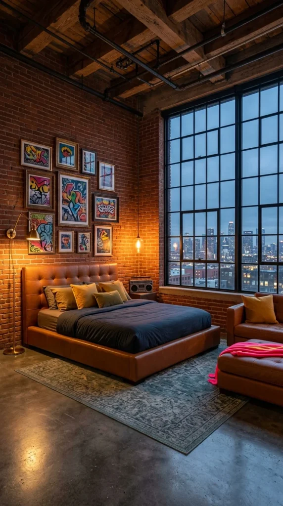
Exposed brick covered in neon graffiti is about as far from subtle as a wall gets. What keeps it from running the room is the low cognac-leather bed frame parked directly in front of it. Warm brown leather looks solid and matte next to all that color, so the eye has somewhere calm to land. A useful rule for your own room: the louder the backdrop, the plainer and heavier the first object in front of it should be.
Painted walls are the natural cousin of this idea, and wall mural ideas that look professionally designed shows how far a single wall can go when the furniture stays quiet.
Behind the bed, factory-style windows run floor to ceiling and frame a city skyline. That cool glow outside seems to balance the warm brick and leather, and without it the room would be warm from top to bottom. The gallery wall uses deliberately mismatched frame sizes, which gives it an uneven rhythm that reads as collected rather than planned. A small vintage boombox on the nightstand adds the era with no paint required.
Scale matters here too. Graffiti-style art reads as bold partly because it’s large and runs edge to edge, so a handful of small neon prints on a plain wall won’t do the same job. If you only have room for one oversized piece, let it be the single loud thing in the room and keep the bedding in leather, denim, or another matte, muted material. The bed does the calming, the wall does the shouting, and neither has to compete.
Pro Tip: A faux-brick panel plus three or four mismatched art prints gets you most of this look without a demolition project.
When the Walls Swallow Light, the Chandelier Has to Do the Work
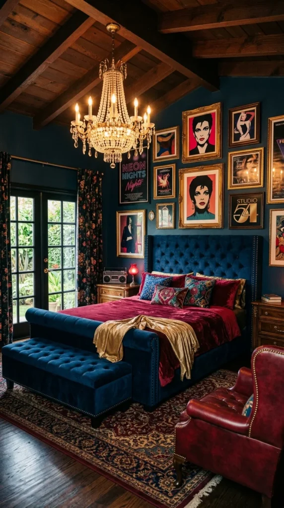
Navy velvet walls tend to absorb light instead of bouncing it, so almost nothing in this room is bright. That puts the crystal chandelier in charge of the entire mood. Everything else is arranged to send your eye back up to it: the gold-framed pop-art portraits, the tufted velvet bench at the foot of the bed, even the way the metallics catch its glow.
Burgundy, gold, and teal sit on the navy base at roughly the same intensity, and that’s why none of them shouts over the others. Moody doesn’t have to mean cold, either. Dark feminine bedrooms take the same velvet-and-gold logic in a softer direction.
Look at the floor, too. A neutral rug sits under all that saturated color, and it’s likely the reason the room reads as designed instead of overwhelming. A small red lamp and a vintage boombox on the nightstand keep the decade in the room without a caption.
In a room this dark, one approach worth considering is putting the chandelier on a dimmer. A single bright overhead light would flatten velvet fast, while a low setting lets it look rich.
Repeat the Colors, Don’t Match Them
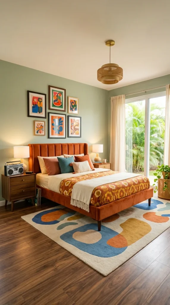
Sage-green walls aren’t where most people expect an 80s-inspired room to land, and that’s the reason this one works. The channel-tufted burnt-orange headboard supplies the warmth, but the abstract organic-shape rug does the heavier lifting. Orange, mustard, teal, and blue all appear in it, then show up again in the pillows and the Matisse-style art, never in exactly the same shade twice.
That’s a method you can copy. Choose the rug first, pull three or four of its colors into the bedding and art, and let each one land a little differently. If you’re shopping for one, bedroom rug styles that make a room feel cozier breaks down sizes and textures worth considering.
A wicker pendant light softens the space through texture rather than color, and a pair of mid-century nightstands keeps the retro palette tied to shapes that still look current. Sliding doors let in a lot of natural light, which probably keeps all that saturation from feeling heavy by mid-afternoon.
I’d hesitate to copy every color here exactly. The part worth borrowing is the restraint: let the palette echo itself rather than repeat note for note.
Let the Bedding Be Busy and the Wall Behind It Stay Blank
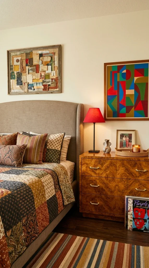
Paisley, stripes, and florals on one quilt is a gamble. Plenty of beds in that situation read as visual noise. This one holds together because everything around it has been told to be quiet. The wall behind the bed is completely plain, and the burl-wood dresser, with its swirling natural grain, becomes the room’s one calm piece of art.
A geometric abstract painting adds a graphic counterpoint to the soft quilt. It can afford to be loud because nothing nearby is competing for the same attention. A vintage record sleeve leaning against the dresser and a striped runner that echoes the quilt’s palette both add a little extra character without asking for more.
There’s a simple way to test this in your own room. Make the bed with the busiest bedding you own, stand in the doorway, and look at the wall behind the headboard. If your eye keeps drifting between the bed and the wall, one of them has to go quiet. Usually it’s the wall, since swapping a paint color or taking down a frame is easier than replacing a quilt you love. A single piece with a strong grain, like a burl-wood dresser, gives the eye a second place to land without adding another pattern.
If your bedding is already doing the busy work, the same idea shows up in boho bedroom looks that feel collected rather than cluttered. The wall behind a patterned bed has one job, and that job is staying out of the way.
Why All That Pink and Orange Doesn’t Fight: It’s Temperature
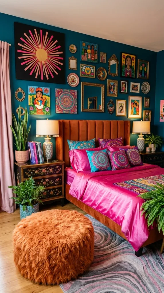
A teal accent wall, a gallery of Frida-inspired folk art, and a cluster of mismatched mirrors is already a lot. Add hot-pink satin bedding, mandala-print pillows, and a burnt-orange velvet headboard, and a room like this should fall apart. What stops it is color temperature. Pink, orange, and gold all lean warm, and that shared undertone ties them together. The teal wall is the lone cool note, which likely gives the eye a place to rest.
A room with this many layers probably wasn’t finished in a single weekend. Pieces like these tend to be added one at a time, and the mismatched vintage frames give it an age it would lose if everything matched. If the idea appeals to you outside the bedroom, the case for maximalist living rooms lays out how to build one without losing control.
A sunburst wall piece acts as the largest single shape, while a faux-fur pouffe and a cluster of layered plants soften the saturation with texture instead of more color.
Pro Tip: Odd-shaped mirrors break up flat framed art and bounce light back into a dark accent wall that might otherwise swallow it. And satin shows every wrinkle by evening, so a textured throw on top hides creases a camera never catches.
A Narrow Room Gets Calmer When Every Light Is Soft and Round
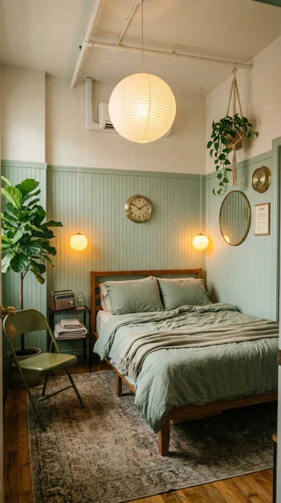
After that much color, this room is a relief, and it’s meant to be. Sage-green beadboard covers the lower half of the wall, and the lighting is soft on purpose. A round paper pendant hangs overhead and two small orb sconces flank the bed, giving off a gentle glow instead of anything harsh.
Count the circles and you’ll see the real pattern: pendant, orbs, and a round mirror all repeat the same shape, so the room feels deliberate with almost nothing in it. The vintage wall clock adds function, and a macrame plant hanger with a fiddle-leaf fig brings life into what looks like a narrow space. For more earthy, plant-friendly rooms in this spirit, earthy bedroom ideas for a warm, natural retreat is worth a look.
Sconce height is worth planning before you drill anything. Lights that sit near shoulder level when you’re propped up on pillows spread a soft pool around the bed, while fixtures mounted much higher tend to throw light at the ceiling instead of onto a book. In a narrow room, wall-mounted lights also free up both nightstands, which matters when there’s barely a foot of floor beside the bed. Plug-in versions with a cord cover are an option if you rent.
A pale ceiling and a light rug keep the narrowness from feeling boxed in. The folding metal chair, painted to match the wall, is a small decision that either gets noticed or disappears entirely, and disappearing is the point.
Dark Wood and Green Walls Only Work Because of the Skylight
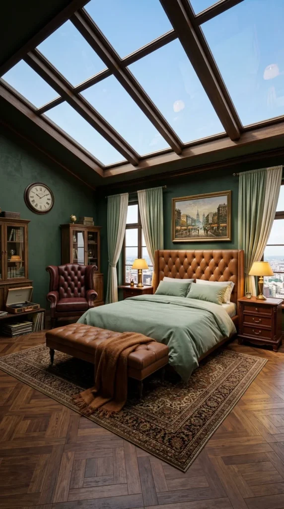
Forest-green walls, dark wood, and tufted leather on the headboard, bench, and armchair would feel closed in within a week. What prevents it here is a skylight with exposed wood beams pouring daylight down from above. Take that skylight away, and the same furniture in the same room would likely feel heavy.
If you don’t have a skylight, the lesson is to plan your light sources first, ideally several lamps at different heights, before committing to dark finishes. Black bedroom inspiration that balances drama and warmth goes deeper on that trade-off.
Herringbone parquet adds texture underfoot, and a record player plus built-in bookshelves give the room a study-like feel. The cityscape painting echoes the skyline visible just outside the window, a detail that’s easy to miss at first glance. This room probably reads bright and studious at noon, then turns warmer once the lamps come on.
Repeating the same leather tone across the headboard, bench, and chair looks intentional. Mismatched leather tones tend to look like leftover furniture.
Symmetry Keeps Dark Teal and Wood From Turning Into a Hunting Lodge
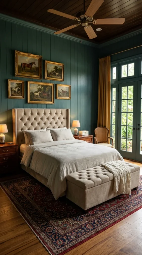
The last room used daylight to soften dark materials. This one solves the same problem with order. Deep teal shiplap meets a dark wood-paneled ceiling, and gold-framed equestrian oil paintings hang in an even grid above the bed. Matching lamps sit on either side of a centered headboard, and that alignment is the main reason the room reads as formal instead of heavy.
The tufted headboard is soft beige linen, an interesting call. A lighter fabric keeps a room this rich from sliding toward hunting-lodge territory. Mustard-gold curtains pick up warmth from the wood and brass frames, and a Persian-style rug in deep jewel tones grounds everything underfoot. The cane-back armchair by the window brings in the one casual shape in the room, which helps loosen the formality without undoing it.
A grid like this only looks formal if the gaps between frames stay consistent. Even a small difference in spacing shows up fast when the frames are the same size and the rows are straight, so lay the pieces out on the floor first and trace each one onto paper before you hang anything. Painters’ tape on the wall works as a quick preview. If the grid feels too stiff for your taste, swap one frame for a slightly different size and the room loosens up while the symmetry still reads.
If an art grid appeals to you, above-bed art ideas that make a bedroom feel finished covers spacing and sizing options. Pair it with matching nightstand lamps and you get a polished look without spending a weekend rearranging furniture.
Family Photos in Mismatched Frames Do What a Matched Set Can’t
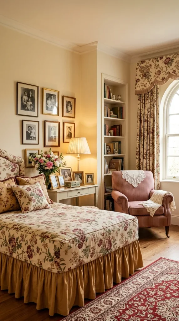
This is the room I’d want to sit in longest, and it would be easy to ruin by overthinking. Floral chintz bedding covers the headboard, and an arched window with matching floral drapery lets in soft, filtered light. Above the built-in bookshelf, black-and-white family portraits cluster together in gold frames of different sizes and finishes.
Those frames carry more emotional weight than any other object in the room. Matched frames would likely have flattened the effect into something closer to a showroom display. Instead, the uneven sizes read as photos added over years, which is exactly what they probably are.
A blush-striped armchair with a lace-edged throw and a small vase of fresh-cut flowers on the nightstand round out a space that feels lived in rather than decorated. The rest of this collection asks you to notice a material or a color. This room just asks you to notice a family.
Pro Tip: Mixing frame sizes and finishes for personal photos reads as authentic. Matching them all tends to flatten the feeling.
What the 80s Actually Left Behind
The part of the decade that survived isn’t the excess people remember from old photographs. It’s the confidence underneath it. Every room above pairs one loud idea with one quiet partner: a leather bed against graffiti brick, a plain wall behind a busy quilt, a skylight over dark walls. That pairing, more than any single color or object, is what makes a retro bedroom feel lived in instead of staged.
So skip the checklist of decade-accurate details. Look at what your eye reaches for first in your own room, then decide what quiet thing should sit next to it. Retro mostly means borrowing nerve, one honest decision at a time.
Frequently Asked Questions
Which single change makes the biggest difference if I only have a small budget? Lighting. Swapping one overhead fixture for a chandelier or a paper pendant, then adding a lamp or sconces, changes a room’s mood more than paint tends to. Several rooms here, including the navy one and the sage-green narrow room, get most of their character from how the light falls.
How do I keep a dark bedroom from feeling heavy? Plan the light before the finishes. The forest-green room uses a skylight, and the teal room uses symmetry and a lighter linen headboard. If you can’t add a window, use lamps at different heights and keep at least one surface, such as the rug or the ceiling, noticeably lighter.
Can I get this look in a rental? Most of it travels well. Rugs, lamps, gallery walls, velvet or leather furniture, and plug-in sconces can all move with you. Faux-brick panels with adhesive backing work for the brick look in some cases, but check your lease before attaching anything to the wall. Paint and wall paneling are the only elements here that really lean permanent.
Will an 80s-style bedroom work in a small room? It can, with one rule: pick one loud element and let everything else stay pale. The narrow sage-green room does this with a light ceiling, a light rug, and round fixtures that repeat one shape. Bold wall color is the harder choice in a small space, so if you want it, keep the floor and ceiling light and let one wall carry the color rather than all four.
Explore More
You may also enjoy:
- Ideas to build a bedroom around a black bed frame
- Retro bathroom trends making a stylish comeback
- Mid-century apartment ideas that blend retro charm with modern comfort
About the author: Aesthetic Life Team covers home décor and interior styling, breaking down real rooms into ideas readers can adapt to their own spaces.